
Bold SaaS FAQ Section: Divi 5 Layout
High-contrast SaaS FAQ layout for Divi 5 with three-column cards covering pricing, security, and onboarding. Bold orange accents on a black background.
Rate this element
Download this section, free
- Divi 5 JSON, imports in seconds
- Commercial license included
- No account needed
Click to view the full page
Overview
This FAQ section trades the usual stacked accordion for a three-column grouped grid that lets buyers scan pricing, security, and setup questions side by side. The section sits on a near-black #0a0a0a canvas with 100px vertical padding (64px on phone), so it drops cleanly between a hero and a footer without a hard color change. A centered intro row caps at 900px: a tiny orange eyebrow (FAQ, 14px, 4px letter-spacing, #ff4d00), a heavy 56px Outfit H2 that scales to 36px on phone, and a short 18px muted sub-line explaining the three topics.
Below the intro, three equal 1/3 columns sit in a flex row with a 24px gap and align-items: stretch, so the cards match heights regardless of copy length. The outer two cards use a dark #141414 fill with a 1px rgba(255,77,0,0.25) hairline border and 16px radius; the middle card flips to a solid orange #ff4d00 fill with cream #fff1e6 body text. A deliberate weight shift that anchors the security topic as the center of gravity. Each card carries a small uppercase category label, then three Q/A pairs built from paired Heading (H4, 19px white) + Text (15px, 1.65 line-height) modules, with 8px between question and answer and 24px between pairs.
On phone, the flex row switches to flex-direction: column, so the three cards stack full-width in reading order (pricing, security, setup) with the 24px row gap preserved. Padding, radii, and border treatment stay identical, only the H2 shrinks. A closing full-width row adds a centered text line with an inline orange link and a pill CTA button (Start free trial, 999px radius, orange fill on dark) to convert scanners who never opened a question.
What’s inside
- Full section on `#0a0a0a` with 100px desktop / 64px phone vertical padding, drops in between existing sections without color conflicts
- Centered intro row (max-width 900px): orange uppercase eyebrow + 56px Outfit H2 (36px on phone) + 18px muted sub-line
- Three-column card grid (`1_3, 1_3, 1_3`) using Divi 5 row flex layout with 24px column and row gaps, `align-items: stretch` so cards match heights
- Two dark cards (`#141414`, hairline orange-tinted border, 16px radius) framing one solid orange card (`#ff4d00`, cream body copy) for a deliberate visual anchor in the middle
- Nine Q/A pairs total (3 per card) built from paired Heading + Text modules: real, editable structure, no accordion JS
- Per-card uppercase category label (`Pricing & Plans`, `Security & Data`, `Setup & Support`) in 13px tracked Outfit
- Closing conversion row: centered text with inline orange link + pill Divi Button (999px radius, orange on dark) auto-centered via `margin: auto`
- Phone breakpoint flips the flex row to `column`, cards stack full-width in the intended reading order with padding and borders intact
Who it’s for
Built for SaaS product pages that need to answer objections without breaking the page's dark, high-contrast rhythm: think B2B tools, developer platforms, AI products, fintech dashboards, and analytics apps where trust, pricing, and onboarding questions all block signup. The three-topic grouping fits any company whose FAQ naturally splits into commercial (pricing, plans, discounts), technical (security, compliance, data residency), and operational (setup, integrations, support) buckets. It also works for agencies and productized services with tiered offers, cybersecurity vendors leaning into a compliance story, and API/infra companies that want to lead with the orange security card. If your FAQ is a single flat list of ten unrelated questions, a stacked accordion serves you better than this grid.
Customization tips
Swap the palette at the section and card level: change #ff4d00 to your brand accent everywhere it appears (eyebrow, middle-card background, hairline border color, link, button fill), keep #0a0a0a/#141414 for the dark surfaces, or invert to a light theme by flipping section bg to white, cards to #f6f6f6, and body copy to #333. Keep questions to ~30 characters so H4s stay on one line at desktop, and answers to ~180 characters (2 short sentences). That's what makes the three cards stretch to equal heights. If you need a fourth topic, duplicate a dark card and switch the row structure to 1_4, 1_4, 1_4, 1_4; cards below three columns collapse gracefully on phone anyway. This section has no images, so nothing to resize: just watch the middle card contrast if you pick a lighter accent (drop body text to #1a0a00 for readability, like the eyebrow already does).
How to install this layout
- Download the layout JSON file from this page.
- Open the target page in the Divi 5 builder.
- Open the portability panel (up/down arrows icon) and choose the Import tab.
- Upload the JSON. Tick “replace existing content” only for full-page imports.
- Check the page at desktop and mobile widths, then swap in your copy and images.
Full walkthrough with troubleshooting: How to Import a Divi 5 Layout.
Questions about Bold SaaS FAQ Section: Divi 5 Layout
Is this really an FAQ if there's no accordion?
Correct. It's an open grid, not a click-to-expand accordion. All nine answers are visible at once, grouped in three cards. That's the whole point: buyers scan pricing, security, and setup in parallel instead of hunting through a list. If you need collapse behavior, swap the Text modules for a Divi Toggle module inside each card.
Why is the middle card orange when the others are dark?
It's a deliberate visual anchor. The `#ff4d00` fill pulls the eye to the security column, which is usually the highest-stakes objection for SaaS buyers. If security isn't your lead concern, move a different category (e.g. pricing) into the middle column, the layout doesn't care which card is which.
How does it behave on mobile?
The flex row flips to `flex-direction: column` at the phone breakpoint, so the three cards stack full-width in order: pricing, security, setup. The 24px row gap is preserved, padding and 16px card radius stay identical, and the H2 scales from 56px down to 36px so it doesn't overflow.
What should I edit first?
The nine question strings and their answers: everything else (colors, spacing, typography) is already tuned. Keep questions short so H4s stay on one line, and keep answers to two short sentences so the three cards match heights. Then swap `#ff4d00` for your brand accent and update the button link from `#signup` to your actual CTA URL.
Does the section use any images or icons?
No. It's pure type and color. That's why it loads fast, stays crisp on any screen, and doesn't need image swaps when you rebrand. If you want icons above each category label, drop a Divi Icon module above the H3 in each card; the card padding already accommodates one.
Which Divi version does this layout need?
Divi 5. The layout is generated natively for Divi 5 and validated against its real module structure before publication, so it imports clean into the current builder.
Can I use this layout on client websites?
Yes. Every download includes a commercial license covering unlimited sites you own or build for clients. Only reselling or redistributing the layout file itself is prohibited.
More faq sections
Browse all faq sections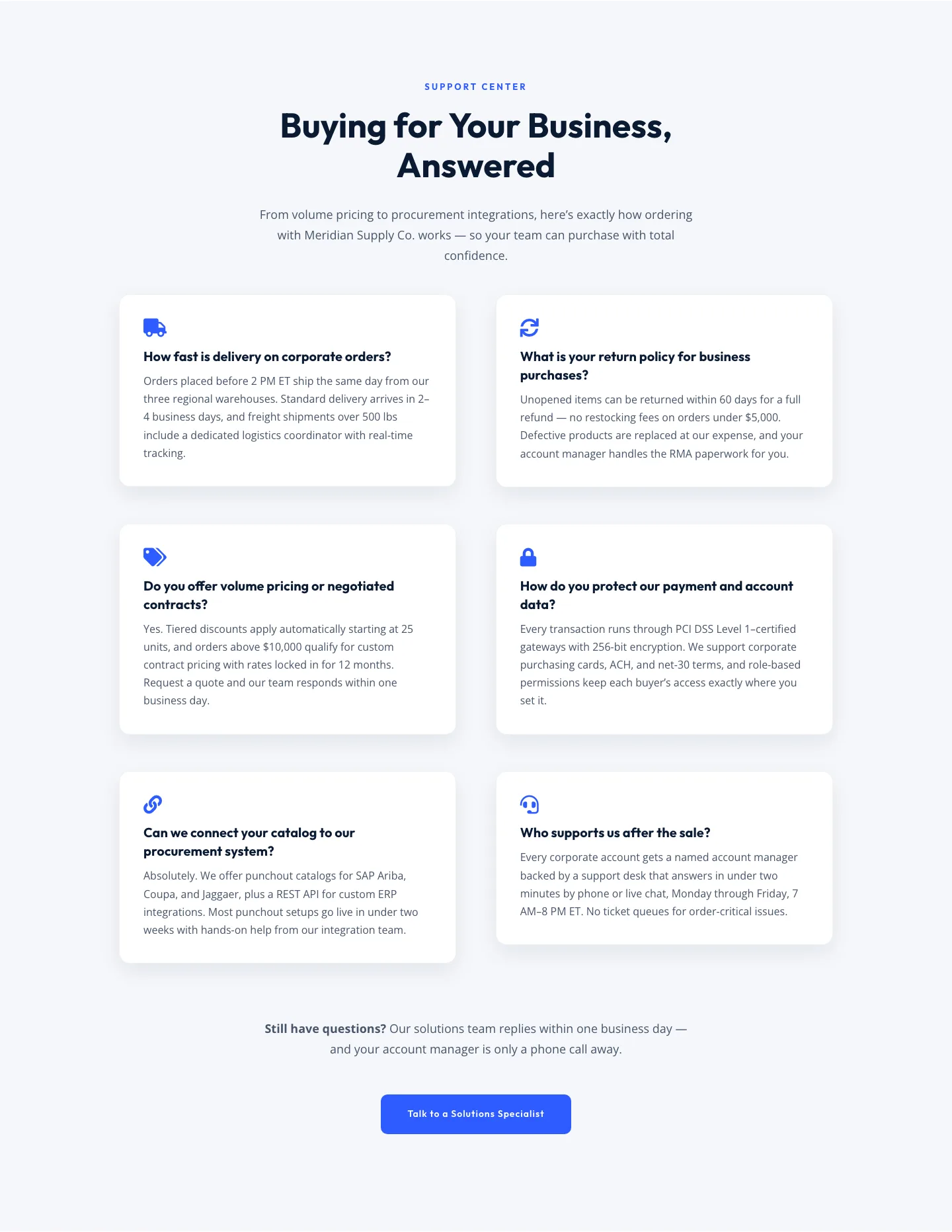
Corporate Ecommerce FAQ Section: Divi 5 Layout
faq · ecommerce · corporate
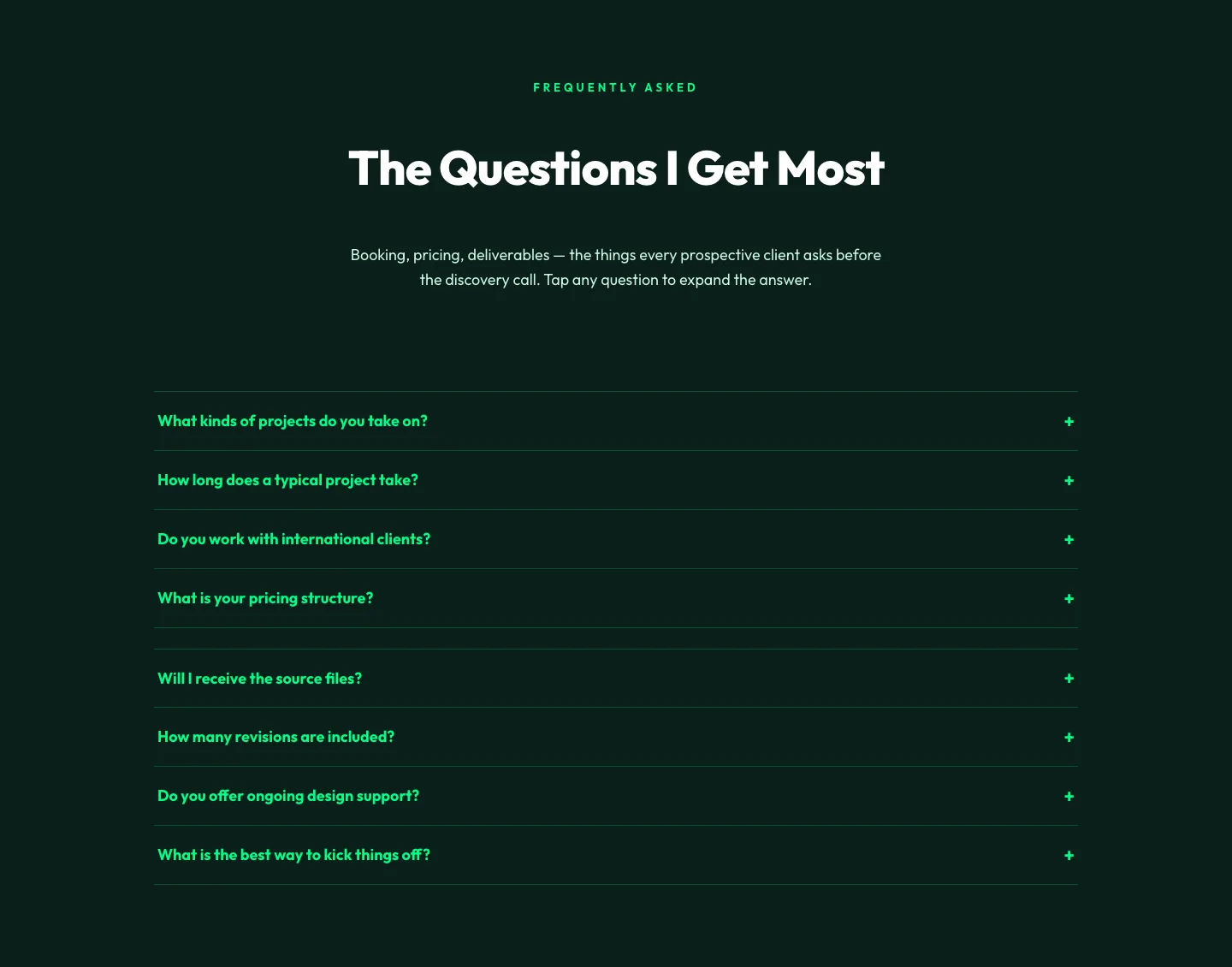
Bold Portfolio FAQ Section: Divi 5 Layout
faq · portfolio · bold
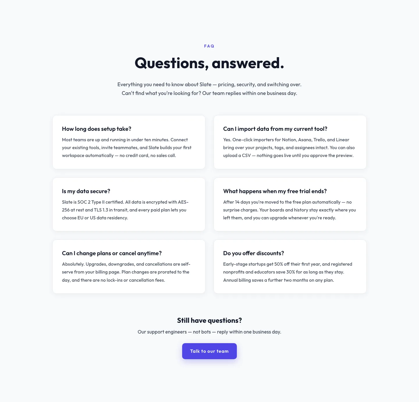
Minimal SaaS FAQ Section: Two-Column Card Layout for Divi 5
faq · saas · minimal
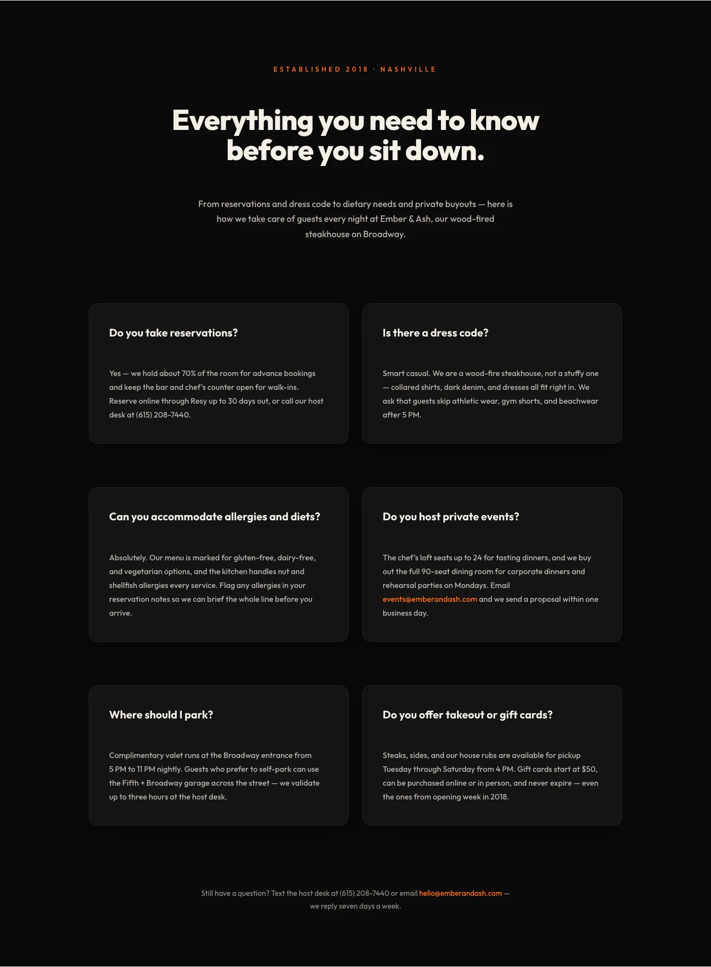
Bold Restaurant FAQ Layout: Wood-Fired Steakhouse Guest Questions | Divi 5
faq · restaurant · bold
Playful Agency FAQ Section: Free Divi 5 Layout
faq · agency · playful
Bold SaaS FAQ Section: Two-Column Accordion Divi 5 Layout
faq · saas · bold