
Bold SaaS FAQ Section: Two-Column Accordion Divi 5 Layout
Free Divi 5 FAQ layout for SaaS sites. Bold dark theme with red accents, two-column card grid, and six conversion-focused Q&As. One-click import.
Rate this element
Download this section, free
- Divi 5 JSON, imports in seconds
- Commercial license included
- No account needed
Click to view the full page
Overview
The section opens on a deep vertical gradient (#0A0A0A into #190707) with 110px of vertical breathing room, so the FAQ cards read like a distinct 'answers' zone rather than another content block. A red 'FREQUENTLY ASKED' eyebrow (Outfit 800, 14px, 4px letter-spacing) anchors the top. Beneath it, the 56px white headline ('Everything you wanted to know.') caps at 820px so the line lands as one confident sentence, and a 680px intro paragraph in soft grey (#D4D4D8) softens the density before the questions begin. Everything in the header is centered and stacked, so the eye lands on the eyebrow, the promise, then the reassurance. In that order.
Below the header, six FAQ cards fill three rows in a strict 1_2 / 1_2 split with equal 24px column and row gaps. Each card is a self-contained #141414 tile with 32px of interior padding, a #27272A hairline border, and a 14px rounded corner. The signature detail is a 3px red (#EF4444) left border that pops each card off the black canvas and turns the grid into a rhythmic, code-editor-like column of questions. Question headings sit in white Outfit 700 at 22px; answers drop to 16px grey (#A1A1AA) at 1.65 line-height so long paragraphs stay scannable without feeling like fine print.
On phones the section retunes rather than shrinks: vertical padding drops to 72px, the headline scales to 34px (tablet lands at 44px), and every FAQ row flips to flexDirection: column so the two-column grid unstacks into a single vertical stream of full-width cards. Outfit carries every string (eyebrow, headline, question, answer) so the whole section compiles into one type family and reads as one confident design decision.
What’s inside
- Six FAQ cards in a 3-row two-column grid (1_2 / 1_2) with equal 24px column and row gaps
- Signature 3px red (#EF4444) left-border accent on every card against a dark #141414 tile with 14px rounded corners
- Dark vertical gradient section background (#0A0A0A → #190707) with 110px desktop / 72px phone vertical padding
- Centered eyebrow + 56px H1 + intro paragraph header block, max-widths of 820px and 680px so lines land clean
- Full Outfit typography system (800 for eyebrow/H1, 700 for questions, 400 for body): one font family, no imports to add
- Responsive heading ladder: 56px desktop → 44px tablet → 34px phone, plus row-level column-to-stack switch on mobile
- Native Divi 5 blocks only (section / row / column / heading / text) no third-party modules or shortcodes
- Six pre-written SaaS-flavored Q&A pairs (onboarding, trial, security, integrations, support, plan changes) as production-ready starter copy
Who it’s for
Built for SaaS marketing sites where the FAQ is doing real conversion work: B2B tools, developer platforms, analytics dashboards, DevOps products, cybersecurity vendors, AI startups, and anywhere the brand voice leans bold and technical. The dark canvas plus red accent reads as confident and product-forward rather than corporate, so it fits challenger brands, launch pages, and pricing-page appendices better than it fits pastel wellness or luxury sites. It's also a strong fit for landing pages that need to absorb objections before checkout: pre-sales enterprise pages, trial signup flows, seat-based pricing pages, and integration or security sub-pages. If your audience skims for reassurance on security, trials, integrations, and support. That's exactly the shape this section is built for.
Customization tips
Palette is preset-driven: swap the red #EF4444 in the eyebrow color and in every card's left border to re-key the whole section (teal, amber, or violet all work against the dark gradient). To go light-mode, invert the section background to a warm off-white, set cards to #FFFFFF with a subtle #E5E5E5 hairline, and darken the question/answer text. The 3px accent stripe still carries the design. Copy discipline matters more than styling here: questions read best at 25–45 characters (one line on desktop, two on phone), and answers land cleanly between 35 and 60 words. Much longer and the card heights start diverging visibly across the row. There are no images or icons in this layout, so aspect ratios are a non-issue. To add or remove questions, duplicate or delete a full row (each row = two cards) so the grid stays symmetrical; odd counts leave a visible gap on desktop.
How to install this layout
- Download the layout JSON file from this page.
- Open the target page in the Divi 5 builder.
- Open the portability panel (up/down arrows icon) and choose the Import tab.
- Upload the JSON. Tick “replace existing content” only for full-page imports.
- Check the page at desktop and mobile widths, then swap in your copy and images.
Full walkthrough with troubleshooting: How to Import a Divi 5 Layout.
Questions about Bold SaaS FAQ Section: Two-Column Accordion Divi 5 Layout
Is this a real accordion or are the answers always visible?
The answers are always visible. It's a static two-column card grid styled to look like an opened accordion, not an interactive collapse. That's deliberate: FAQ sections convert better when the answers can be scanned without a click, and it removes the JavaScript layer entirely. If you need click-to-expand behavior, swap each card's Text module for Divi 5's native Accordion module inside the same column shell.
What if I only need four questions, or need eight?
Duplicate or delete a full row rather than a single card. Each row is a 1_2 / 1_2 pair, so removing one card from a row leaves a visible gap on desktop. For four questions, delete one row entirely. For eight, duplicate any row and edit the copy. The 24px row gap keeps the rhythm consistent no matter how many pairs you add.
How do I change the red accent to match my brand?
Two places: the eyebrow heading color (#EF4444) and the left border color on each of the six card columns (also #EF4444). Use Divi 5's Find & Replace on the layout after import to swap the hex globally in one pass: nothing else in the section relies on that red, so the change is clean.
Does it hold up on mobile without extra tweaking?
Yes. Rows flip to column direction on phone, so the two-column grid unstacks into a single vertical stream of full-width cards. Section padding drops from 110px to 72px vertical, the headline scales from 56px to 34px through a tablet step at 44px, and card padding stays at 32px so the touch targets don't shrink.
What should I edit first before publishing?
Replace the six question/answer pairs (they're written for a fictional SaaS called Pulsegrid), then update the intro paragraph under the headline and any brand-specific references like 'trust.pulsegrid.com'. After that, decide whether to keep or swap the red accent: everything else (spacing, type, structure) is production-ready as shipped.
Which Divi version does this layout need?
Divi 5. The layout is generated natively for Divi 5 and validated against its real module structure before publication, so it imports clean into the current builder.
Can I use this layout on client websites?
Yes. Every download includes a commercial license covering unlimited sites you own or build for clients. Only reselling or redistributing the layout file itself is prohibited.
More faq sections
Browse all faq sections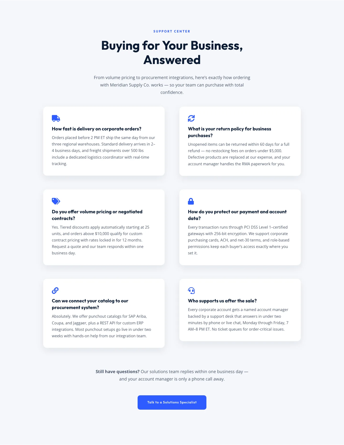
Corporate Ecommerce FAQ Section: Divi 5 Layout
faq · ecommerce · corporate
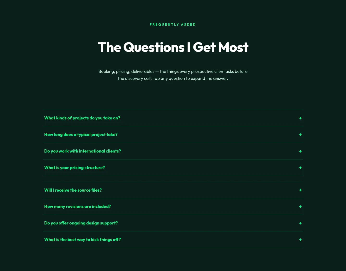
Bold Portfolio FAQ Section: Divi 5 Layout
faq · portfolio · bold
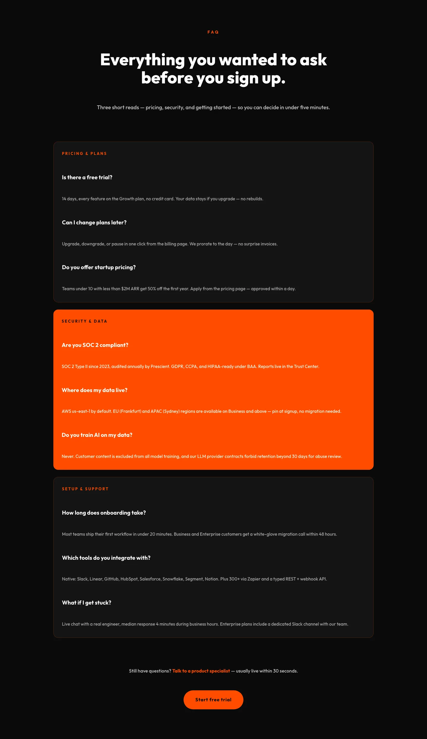
Bold SaaS FAQ Section: Divi 5 Layout
faq · saas · bold
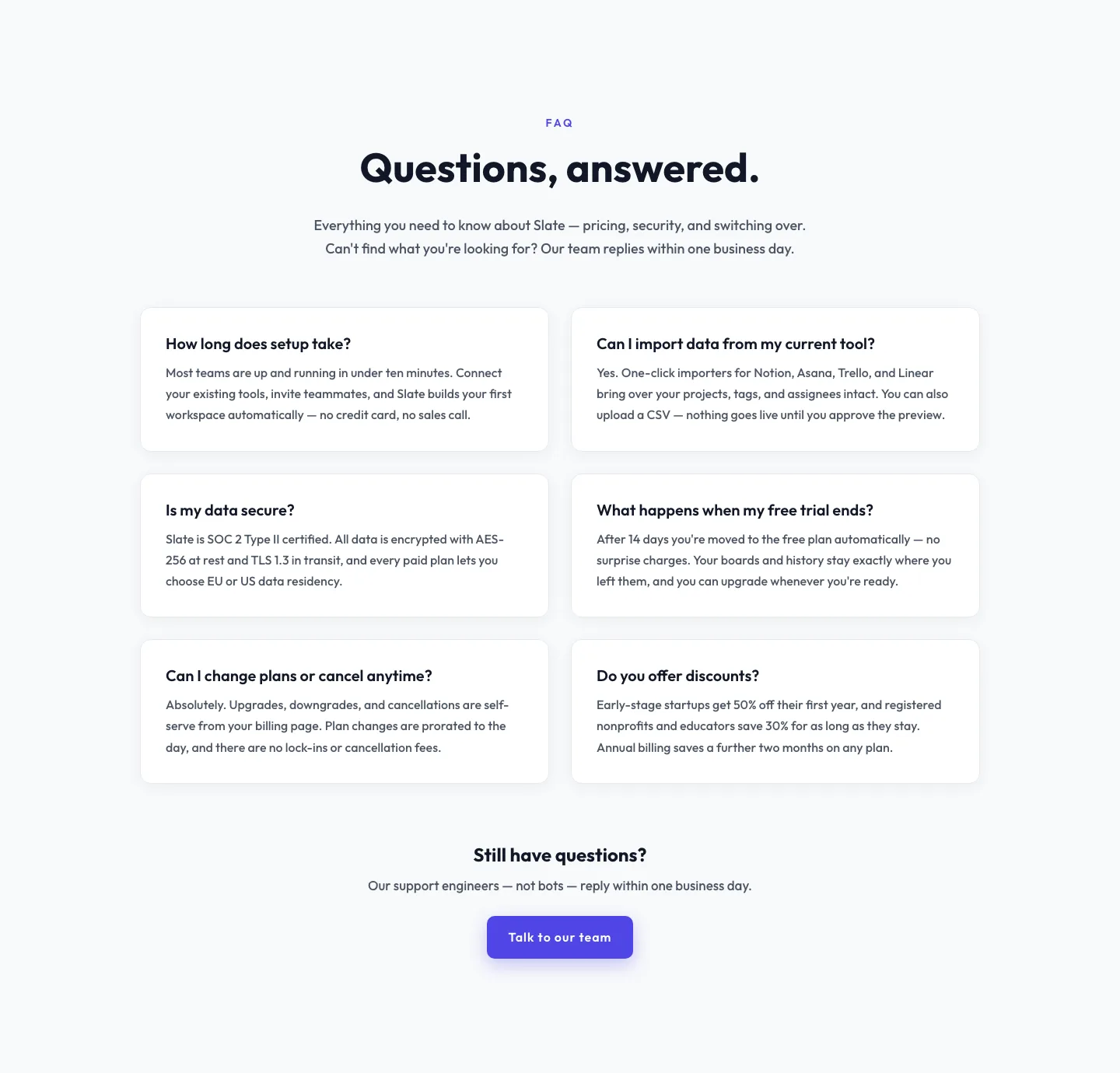
Minimal SaaS FAQ Section: Two-Column Card Layout for Divi 5
faq · saas · minimal
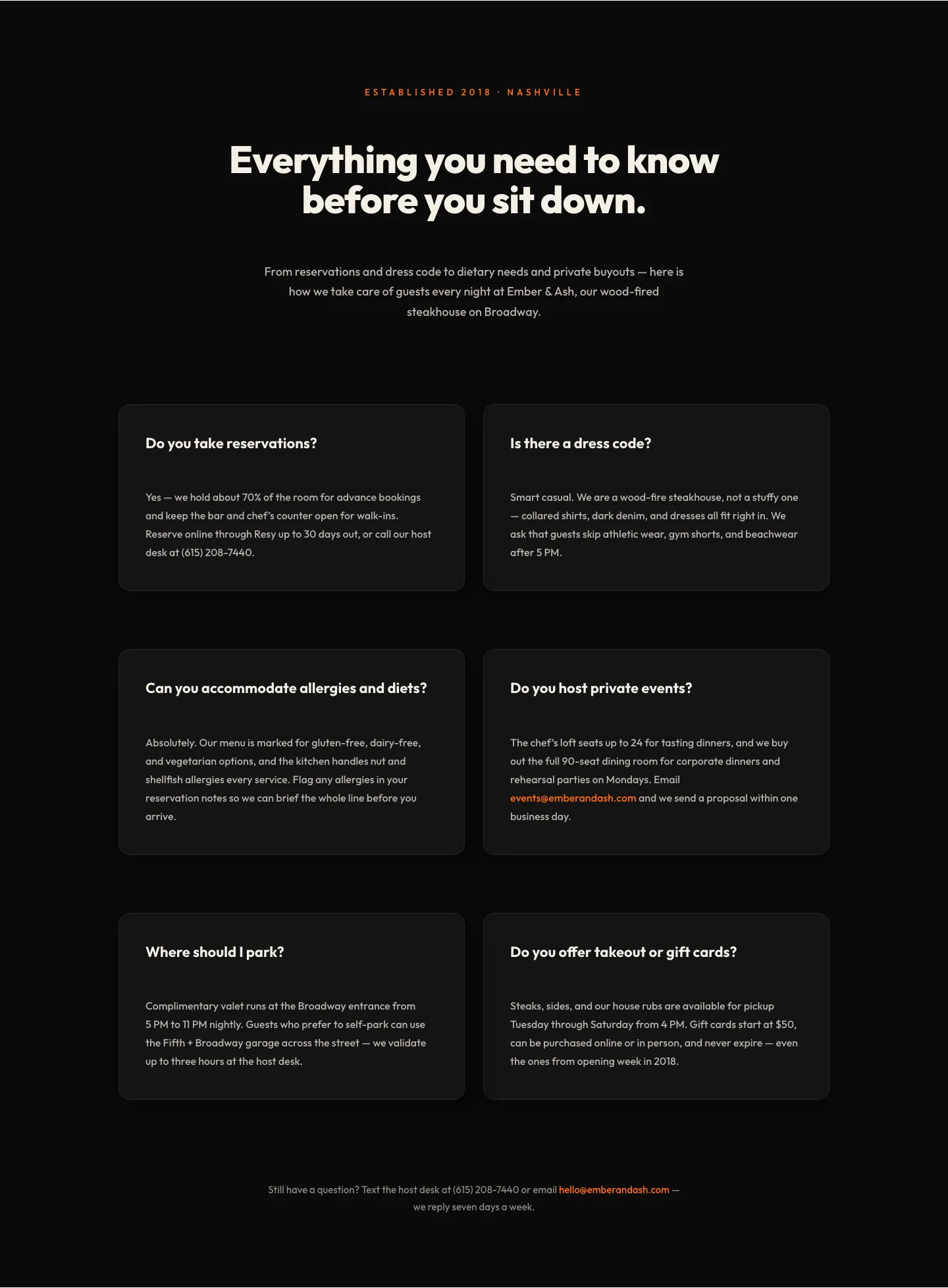
Bold Restaurant FAQ Layout: Wood-Fired Steakhouse Guest Questions | Divi 5
faq · restaurant · bold
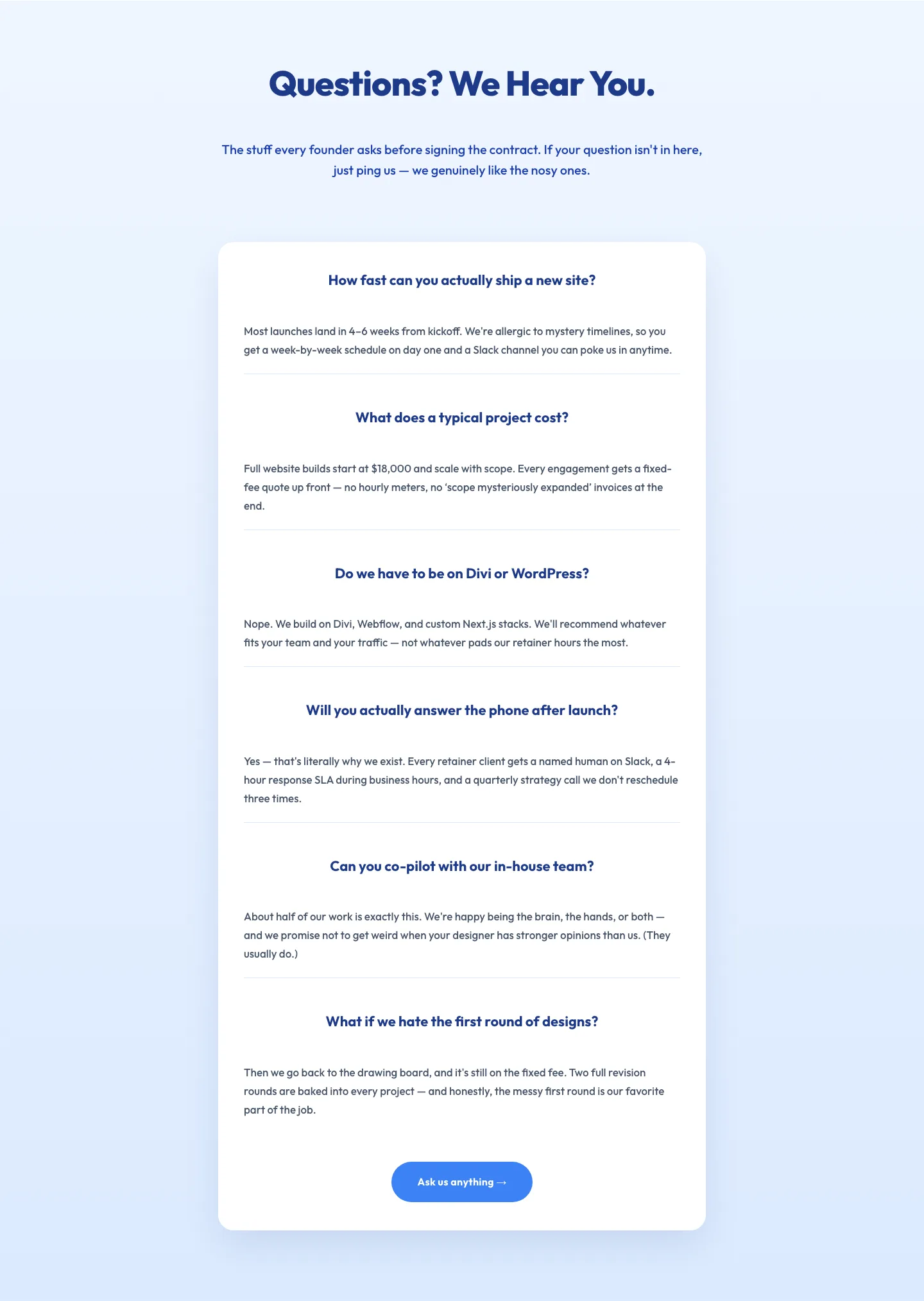
Playful Agency FAQ Section: Free Divi 5 Layout
faq · agency · playful