
Meridian & Co.: Elegant Executive Coaching Landing Page for Divi 5
An elegant Divi 5 full landing page for executive coaches and advisors. Includes hero, problem cards, method, engagement, testimonials, tiered pricing, and CTA.
Rate this element
Download this section, free
- Divi 5 JSON, imports in seconds
- Commercial license included
- No account needed
Click to view the full page
Overview
The Meridian & Co. landing page is built around restraint. Five stacked sections flow from a warm cream hero (#F7F5F0) to progressively cooler off-whites (#FBFAF7, #FAF8F5, #FAFAF7, #FAF7F2), so the eye moves down the page without any hard breaks. A single deep-teal accent (#0F3D3E) carries the brand across the eyebrow labels, icons, buttons, borders, and one dark comparison card. Playfair Display handles every heading at generous sizes (64px in the hero, 46–52px on section H2s) while Inter and Outfit keep body copy at a comfortable 15–19px with 1.65–1.85em line-height.
Structure is deliberate and slow. The hero uses a 3/5 + 2/5 asymmetric row (copy left, a portrait image right with a 14px rounded frame and a soft 60px-blur teal shadow) capped at 1240px. Below it, three white problem cards sit in a 1/3 grid with 32px gaps, 16px radii, subtle rgba(15,61,62,0.08) borders, and a −4px hover lift. The method section pairs a cream 'usual way' column with a dark teal 'Meridian method' column at 1/2 + 1/2, so the argument reads left-to-right. Numbered pillars (01, 02, 03) in serif display type introduce three approach cards, then three icon blurbs and a pill-shaped CTA close the engagement section. Three testimonial cards with portraits, quotes, and titles round it out.
Section padding is heavy on desktop (120–140px top/bottom, 6vw horizontal) and tightens to 70–72px vertical / 20–24px horizontal on phone, where every multi-column row collapses to a single flex column and headings step from 64→48→38px on the hero and 46→36→30px on section H2s. Nothing fights for attention; everything is paced.
What’s inside
- Asymmetric 3/5 + 2/5 hero row: eyebrow, 64px Playfair headline, 19px body paragraph, teal primary button with soft box-shadow, trust-line micro-copy, and a portrait image with 14px rounded corners
- Problem section: centered eyebrow + 46px H2 + subhead, followed by three white problem cards in a 1/3 grid with Font Awesome icons, hairline teal borders, and a −4px hover translate
- Method comparison row: 1/2 + 1/2 columns, a cream 'usual way' card against a deep teal 'Meridian method' card, each with a bulleted list at 16px / 1.85em
- Three-column numbered pillars (01, 02, 03) in 34px Playfair display type introducing the approach with 22px H3s and 15px supporting copy
- Engagement outcomes: centered header, three white blurb cards with 40px icons, centered H3s and copy, plus a pill-radius (999px) CTA underneath
- Testimonial row: three cards with portrait, quote, name, and job title in native Divi Testimonial modules, 20px radius, 1px cream border, and a 40px blur soft shadow
- Warm neutral palette system (#F7F5F0, #FBFAF7, #FAF8F5, #FAFAF7, #FAF7F2) with a single deep-teal accent (#0F3D3E) that carries every interactive element
- Full responsive treatment: rows collapse to column flex on phone, section padding drops from 140/120px to 70–72px, headings step 64→38px, columns become full-width
Who it’s for
Executive and leadership coaches, boutique advisory firms, fractional CxOs, and small consultancies whose brand rests on discretion, gravitas, and long relationships rather than funnel volume. It also fits private wealth advisors, mediators, executive search boutiques, mental-performance consultants, therapists working with high-earners, and independent operators offering premium 1:1 engagements. The elegant serif type, restrained cream palette, and generous whitespace read as 'quiet money' (not startup-bright) so it flatters services priced at the top of the market. Anyone selling considered, high-trust work to founders, senior operators, or board members will feel at home here. Not the right fit for high-volume SaaS marketing or price-led e-commerce.
Customization tips
Start with the palette. The whole design hangs off one accent (#0F3D3E): swap it in the hero button, the eyebrow text, the icons, the dark comparison card, and the pill CTA and the page will re-theme cleanly. Copy length matters: the 64px hero headline works best at 6–10 words so it holds two lines; the three problem cards each want 25–35 words to keep card heights matched, and the two comparison lists sit best at 4–5 bullets each. Image aspect ratios: the hero portrait is a 1100×1300 vertical crop (roughly 5:6) framed by 14px rounded corners, supply a real headshot at that ratio, not a landscape one. Testimonial portraits are square (~300×300). If you want a different feel, swap Playfair Display for Cormorant or Fraunces through Divi's global font settings. The layout still holds. Keep the button box-shadow presets; the whole design leans on that soft lift.
How to install this layout
- Download the layout JSON file from this page.
- Open the target page in the Divi 5 builder.
- Open the portability panel (up/down arrows icon) and choose the Import tab.
- Upload the JSON. Tick “replace existing content” only for full-page imports.
- Check the page at desktop and mobile widths, then swap in your copy and images.
Full walkthrough with troubleshooting: How to Import a Divi 5 Layout.
Questions about Meridian & Co.: Elegant Executive Coaching Landing Page for Divi 5
Which native Divi 5 modules does this page use?
Text, Heading, Button, Image, Icon, Blurb, and Testimonial. All first-party Divi 5 modules. Nothing depends on a third-party addon, so the layout will keep working after Divi updates.
How does the hero behave on mobile?
The 3/5 + 2/5 hero row flips flex-direction to column on phone, so the copy stacks on top and the portrait image sits below it. Section padding drops from 140px to 70px vertical, and the headline steps from 64px on desktop to 48px on tablet and 38px on phone.
Where should I start editing?
Hero eyebrow → headline → subhead → button label first (that's the whole above-the-fold pitch), then rewrite the three problem cards to match your audience's actual 2 a.m. concerns, then the comparison bullets, then swap testimonial names, titles, portraits, and quotes.
The hero uses a Pexels stock image and pravatar portraits, do I have to replace them?
Yes. Replace the hero with a real portrait of the coach (5:6 vertical crop, ~1100×1300) and the three testimonial portraits with real headshots from clients who agreed to be quoted. Pravatar and open stock aren't fine to ship as-is on a service business.
Why is the 'Meridian method' column dark teal while the 'usual way' column is cream?
It's a deliberate visual argument: the darker, more saturated card carries the winning side of the comparison so the eye lands there. If you re-theme, keep that balance: one restrained neutral card and one solid brand-colored card, not two similar shades.
Can I remove sections I don't need: say, the comparison or the numbered pillars?
Yes. Each block is a Divi Section, so you can delete, duplicate, or reorder them from the Layers panel without breaking anything. The warm background sequence still reads well if you drop one section, since the neutrals are all closely related.
Which Divi version does this layout need?
Divi 5. The layout is generated natively for Divi 5 and validated against its real module structure before publication, so it imports clean into the current builder.
Can I use this layout on client websites?
Yes. Every download includes a commercial license covering unlimited sites you own or build for clients. Only reselling or redistributing the layout file itself is prohibited.
More full landing pages
Browse all full landing pages
Brightwell Family Dental: Minimal Medical Landing Page for Divi 5
full_landing · medical · minimal

Aurelia Smile Studio: Bold Medical Landing Page for Divi 5
full_landing · medical · bold

Caldwell & Pierce: Corporate Legal Landing Page for Divi 5
full_landing · legal · corporate
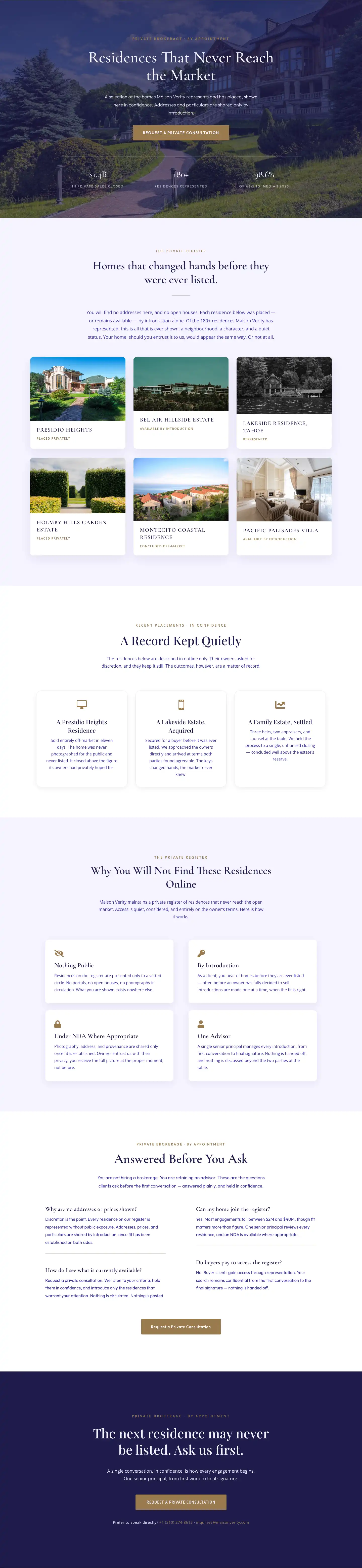
Maison Verity: Elegant Real Estate Residences Page for Divi 5
full_landing · real_estate · elegant
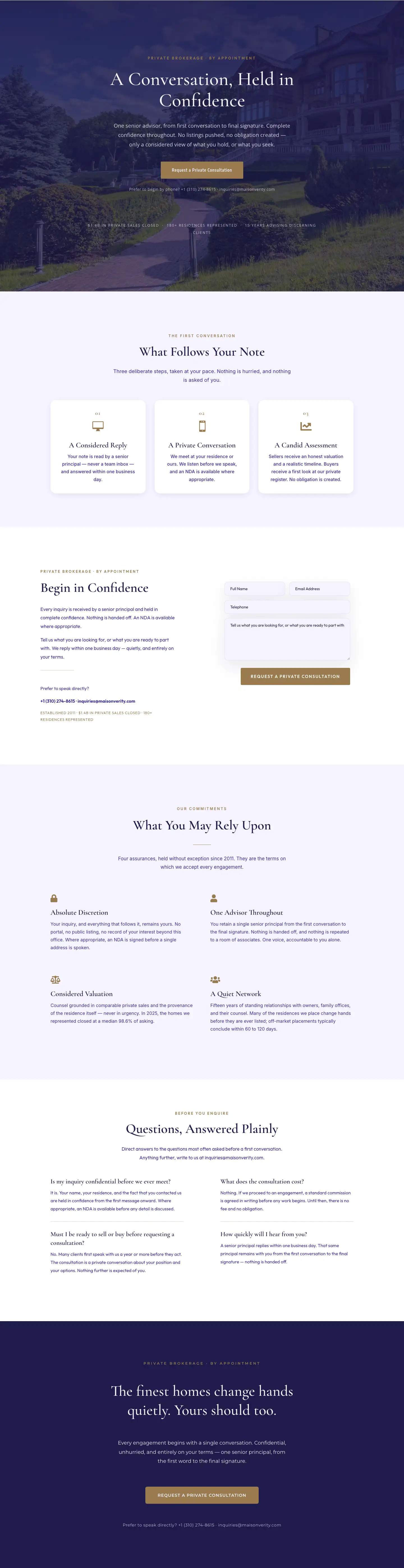
Maison Verity: Elegant Real Estate Private Consultation Page for Divi 5
full_landing · real_estate · elegant
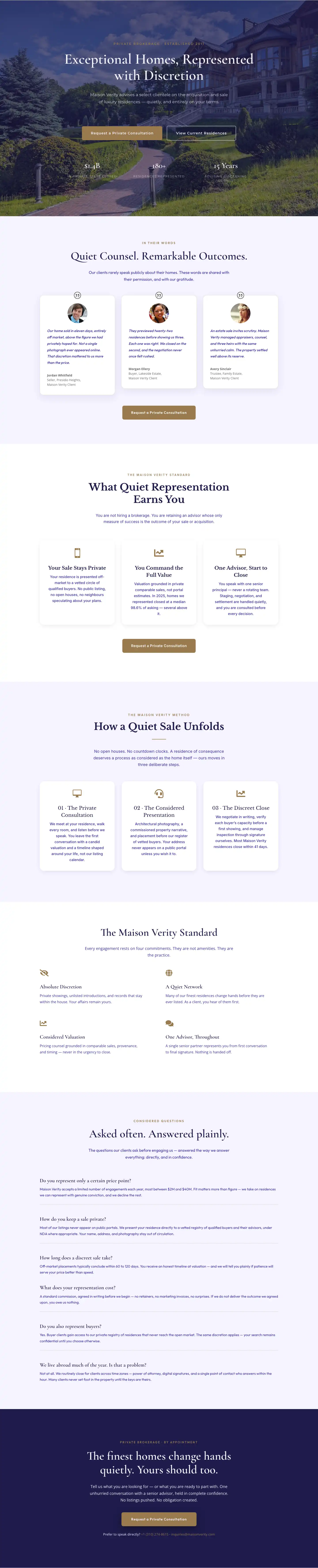
Elegant Luxury Real Estate Landing Page: Divi 5 Layout
full_landing · real_estate · elegant