
Brightwell Family Dental: Minimal Medical Landing Page for Divi 5
A minimal, teal-accented Divi 5 landing page for family and pediatric dentists: hero, services, process, gallery, team, FAQ, testimonials, and contact CTA.
Rate this element
Download this section, free
- Divi 5 JSON, imports in seconds
- Commercial license included
- No account needed
Click to view the full page
Overview
Brightwell Family Dental is a full landing page built around a single, unfussy idea: make a nervous patient feel like they've already been seen. The hero opens with a 3/5 + 2/5 asymmetric row: an eyebrow line ("Now accepting new patients") in the teal accent (#0D9488), an oversized Inter headline at 60px on desktop that steps down to 46px on tablet and 36px on phone, a 19px supporting paragraph capped at 560px, and a matched CTA pair (solid teal "Book an Appointment," outlined phone-number button). A small stat row underneath (4.9★, Same-day, Ages 2–92) sits above a 1px divider and gives the hero a quiet proof line without a testimonial module. Right column carries a rounded-24px portrait image with a soft shadow, nudged +4% on desktop and reset on tablet and phone.
Below the hero, a mint (#F0FDFA) trust strip runs four icon blurbs edge-to-edge on desktop and stacks to a column on phone. Then a Services section repeats a 3-up card grid twice (Checkups & Cleanings, Fillings & Crowns, Whitening, Children's, Invisalign, Emergency Care): each card is a white column with a 1px #E2E8F0 border, 20px radius, a soft preset3 shadow, and a −6px hover translate for a light lift. The "Why families choose" split section pairs a rounded image with four blurb rows (comfort, on-time, transparent pricing, one-roof), and the "How It Works in 3 Simple Steps" section uses mint cards with a circular teal number badge and centered copy. A photo mosaic (2/3 + 1/3 alternating), a three-card team block with icon avatars, a six-card FAQ grid (two per row), a testimonial trio with pravatar avatars in mint cards, and a dark teal (#134E4A) closing CTA with contact block and hours round out the page.
The palette is deliberately narrow: warm-teal accent, dark slate (#0F172A) headings, muted slate (#334155) body copy, mint tint for supporting sections, deep teal for the final CTA. Section rhythm is generous (120px vertical padding on desktop, 80px on tablet, 56–64px on phone) so every module has room to breathe. Everything is Inter (with Outfit picking up the FAQ and testimonials sections), the row max-widths are pinned at 1200–1240px, and every column drops to flexType 24_24 on phone so the layout collapses cleanly on mobile.
What’s inside
- Full-page composition of eleven sections: hero, four-icon trust strip, six-card services grid, benefits split, 3-step process, photo mosaic, three-person team, six-question FAQ, three-column testimonials, and a dark closing CTA with hours + address
- Asymmetric 3/5 + 2/5 hero with dual CTA (solid teal button + outlined tel: button) and an in-hero mini stat row (rating, same-day, ages) divided by a hairline top border
- Six service cards using native Divi 5 columns with icon + heading + body, matched styling (20px radius, 1px #E2E8F0 border, preset3 soft shadow, −6px hover translate)
- Three-step "How It Works" section built from mint (#F0FDFA) columns with a 56px circular teal number badge, centered heading, and a body paragraph
- Photo mosaic across two rows (2/3+1/3 then 1/3+2/3) using six rounded 20px images with matching preset2 shadows, plus a three-card team block using Divi icon glyphs as avatar stand-ins
- Six-card FAQ in a 1/2 + 1/2 grid, each card boxed with a subtle teal-tinted border and lifted shadow: real answers about new patients, insurance, nervous visitors, kids, emergencies, and payment plans
- Testimonial row using pravatar circular avatars, italic Outfit body copy on mint cards, and a shared "Book an Appointment" button underneath
- Dark teal (#134E4A) closing section with headline + supporting copy, primary CTA, and a two-block contact/hours panel (phone, email, address, weekly hours)
Who it’s for
Best fit for general and family dental practices: the copy and structure assume a mixed patient base of kids, adults, and older adults, with emphasis on gentle care, sedation options, and same-day emergencies. It also translates naturally to pediatric dentists, cosmetic/Invisalign-focused practices, orthodontists, and small multi-provider clinics. Outside dentistry, the module set (services grid, 3-step process, team, FAQ, testimonials, contact CTA) works for chiropractors, physical therapy, dermatology and med spa, optometry, veterinary clinics, and mental-health practices where the same trust cues (clear pricing, gentle first visit, easy booking) carry the page. It's less suitable for pure e-commerce or SaaS product pages, which need pricing tables and feature comparisons this layout doesn't include.
Customization tips
Swap the palette at the source: change #0D9488 (accents, buttons, icons), #0E7490 (hover), and #F0FDFA (mint fill) to move the whole page to a different medical brand color. Body ink (#334155) and headings (#0F172A) usually stay put. Keep the hero H1 under about 70 characters so it doesn't wrap past two lines on desktop at 60px; the supporting paragraph is happiest at 25–45 words inside its 560px cap. Services and FAQ text works best at 15–30 words per card, longer copy breaks the equal-height row alignment. Photos: the hero portrait wants a 5:6 vertical crop (1000×1200 in the JSON), the mosaic images are landscape 940×650, and every image already has 20–24px radius applied, so upload clean rectangles rather than pre-rounded assets. Replace the pravatar testimonial avatars with real headshots at 160×160 minimum, the circular mask is set to 999px radius. All eleven sections are independent, so hide anything you don't need (team, mosaic, or trust strip) without breaking the flow.
How to install this layout
- Download the layout JSON file from this page.
- Open the target page in the Divi 5 builder.
- Open the portability panel (up/down arrows icon) and choose the Import tab.
- Upload the JSON. Tick “replace existing content” only for full-page imports.
- Check the page at desktop and mobile widths, then swap in your copy and images.
Full walkthrough with troubleshooting: How to Import a Divi 5 Layout.
Questions about Brightwell Family Dental: Minimal Medical Landing Page for Divi 5
Which Divi 5 modules does this layout actually use?
Everything is stock: Section, Row, Column, Text, Heading, Button, Image, Blurb, Icon, and Group. No custom code, no third-party modules, no shortcodes. You can open every element in the visual builder and edit it directly.
How does the page behave on tablet and phone?
Section padding drops from 120px → 80px → 56–64px, hero H1 steps from 60/46/36px, and every row's columns are set to flexType 24_24 on phone so they stack full-width. The hero's asymmetric 3/5 + 2/5 row also becomes a column stack, and the trust strip switches to flexDirection column below 768px.
Where do the images come from and can I replace them?
Placeholder photography is pulled from Pexels (dental scenes, family visits) and the testimonial avatars use pravatar.cc. All eight images are standard Divi 5 Image modules: swap the src, keep the surrounding radius/shadow decorations, and use 940×650 landscape for the mosaic, 1000×1200 for the hero portrait, and 160×160 square for testimonial avatars.
What should I edit first?
The phone number appears in six places (hero CTA, trust strip, emergency card, process step 1, team card, and the closing contact block). Search and replace once. Then update the address (128 Cedar Street, Suite 4, Portland OR), hours block, and the six service names to match your actual practice.
Does the FAQ use the Divi Accordion module?
No. It's a static six-card grid in two rows of two columns, each card a bordered white block with a heading and a text answer. Keeps the answers scannable, avoids a JavaScript toggle, and lets Google index every answer directly. Convert it to an Accordion module if you'd rather have collapsible items.
Can I drop sections without breaking the design?
Yes. Every section is self-contained with its own background and padding, so you can safely hide the team, mosaic gallery, or testimonial row and the vertical rhythm still holds. The hero and closing CTA are the only two you should keep to preserve the funnel.
Which Divi version does this layout need?
Divi 5. The layout is generated natively for Divi 5 and validated against its real module structure before publication, so it imports clean into the current builder.
Can I use this layout on client websites?
Yes. Every download includes a commercial license covering unlimited sites you own or build for clients. Only reselling or redistributing the layout file itself is prohibited.
More full landing pages
Browse all full landing pages
Aurelia Smile Studio: Bold Medical Landing Page for Divi 5
full_landing · medical · bold

Caldwell & Pierce: Corporate Legal Landing Page for Divi 5
full_landing · legal · corporate
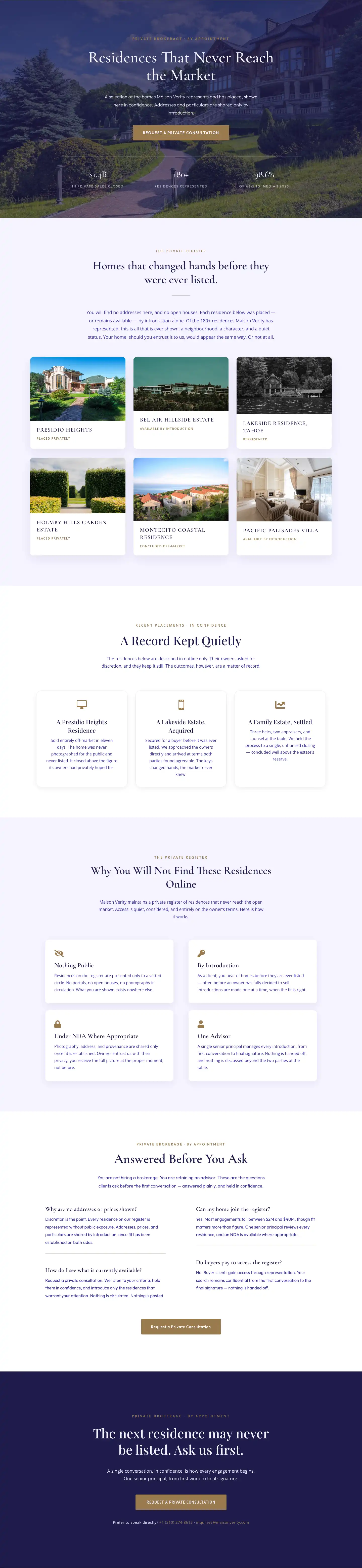
Maison Verity: Elegant Real Estate Residences Page for Divi 5
full_landing · real_estate · elegant
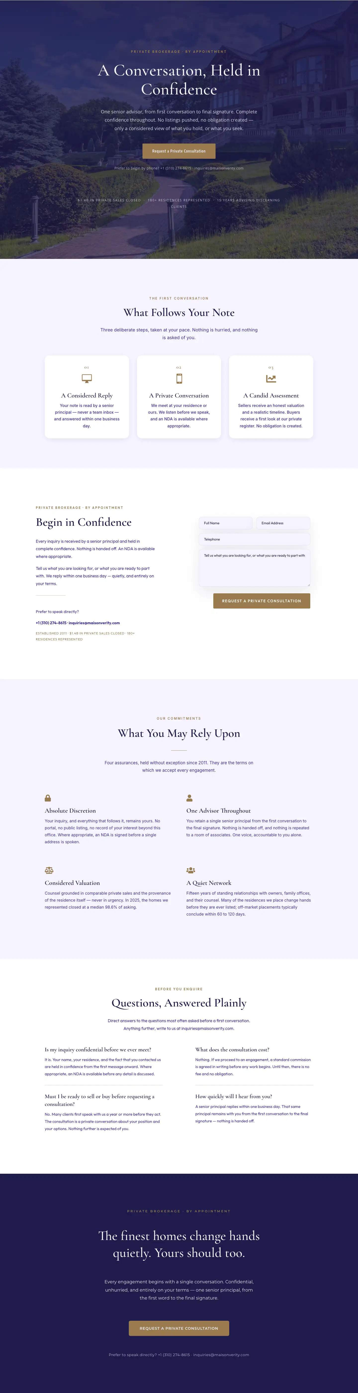
Maison Verity: Elegant Real Estate Private Consultation Page for Divi 5
full_landing · real_estate · elegant
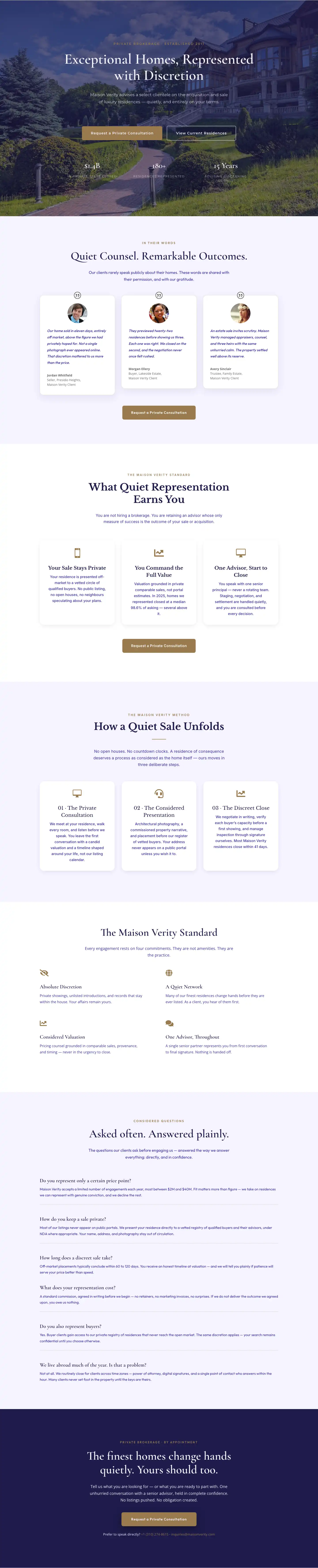
Elegant Luxury Real Estate Landing Page: Divi 5 Layout
full_landing · real_estate · elegant

Meridian Imaging: Minimal Medical Landing Page for Divi 5
full_landing · medical · minimal