
Meridian Imaging: Minimal Medical Landing Page for Divi 5
A calm, minimal Divi 5 landing page for outpatient radiology and medical imaging centers: hero, services, referring-physician panel, FAQ, testimonials, and CTA. ACR-accredited feel, teal palette, ready for MRI, CT, and mammography practices.
Rate this element
Download this section, free
- Divi 5 JSON, imports in seconds
- Commercial license included
- No account needed
Click to view the full page
Overview
Meridian Imaging opens on a split hero where a credibility eyebrow ("ACR-Accredited · Established 2014") sits above a 52px H1 promising 24-hour results, backed by an 18px explanatory paragraph and a two-button row. A solid teal primary ("Request an Appointment") paired with a bordered outline call button. Below the buttons, a three-column stats strip with a hairline top divider surfaces the numbers that matter: 24 hrs to your doctor, 6 modalities under one roof, and ACR accreditation. The right column holds a single rounded, softly shadowed photograph, so the whole hero reads as text-forward without feeling austere.
The rhythm downstream alternates white and slate-100 (#F1F5F9) backgrounds to give the page air. A four-column trust bar (icon + title + one-line proof) is followed by a services grid where the middle "Low-Dose CT" card wears a slate fill and teal border to guide the eye. The "Why patients choose Meridian" section drops into two rows of three white cards with 16px radii and soft shadows: icons stay left-aligned, and each card carries a headline plus a two-line explainer. Finally, a numbered three-step "Your visit" row uses circular teal badges (64×64, 50% radius) to walk a first-time patient from booking to scan.
The palette is intentionally clinical: a single teal accent (#0E7C86) over deep slate (#0F172A) text, muted slate-700 (#334155) body copy, and slate borders (#E2E8F0), no gradients, no imagery in cards, nothing that fights for attention. On tablet the H1 drops to 40px and section padding compresses to 80px; on phone every row flips to a vertical stack, padding shrinks again to 64px, and the H1 lands at 32px so the layout stays scannable on a five-inch screen.
What’s inside
- Split hero (1/2 + 1/2) with uppercase eyebrow, 52px headline, intro paragraph, two-button row, and a three-cell stats strip beneath a slate hairline divider
- Rounded, softly shadowed hero photograph on the right column (Divi Image module, 20px radius, preset3 shadow)
- Trust bar of four icon + title + one-line-proof blurbs using native Divi Blurb modules with Font Awesome icons in the teal accent
- Three-card services grid where the middle "Low-Dose CT" card wears a slate fill and teal border to signal the primary offer, with hover-lift translate transforms
- Six-card "Why patients choose Meridian" grid split across two three-column rows: white cards, 16px radius, left-aligned icon, H3 + two-line explainer
- Numbered three-step "Your visit" row with 64×64 circular teal badges, centered headings, and centered body copy
- Two Divi Button modules per CTA row, a solid teal primary and an outline click-to-call button that inherit the same palette
- One accent color system throughout: teal (#0E7C86) over slate-900 text, slate-100 section fills, slate-200 hairline borders. No gradients
Who it’s for
This layout is built for outpatient imaging centers, radiology practices, and diagnostic clinics that want to feel calm and credentialed rather than clinical or corporate. The tone (ACR accreditation, subspecialty reads, 24-hour turnaround, low-dose CT, wide-bore MRI) is tuned to referring physicians and patients arriving with an order in hand, but the same structure drops cleanly onto a dental imaging suite, women's health center, cardiology diagnostic office, physical therapy clinic, or specialty medical practice by swapping the modality copy. Solo-practice sites also fit: the numbered visit-flow and services grid work as a first-appointment guide for a dermatologist, orthopedist, or urgent-care franchise that wants trust signals and a clear next step above the fold.
Customization tips
Start with the teal accent (#0E7C86): swap it in Divi's Global Colors and it re-flows through the hero eyebrow, buttons, stat numbers, icons, step badges, and the highlighted services card border. Everything shares that one hex. If you're not ACR-accredited, rewrite the eyebrow and the third stat cell; the strip is a Divi row-inner, not a widget, so replacing "ACR" with your own proof point takes seconds. Keep the H1 to ~10–14 words so it doesn't wrap to four lines on tablet (it drops from 52px to 40px there and 32px on phone). Hero image aspect: the placeholder is 1200×1000 (roughly 6:5), anything from 5:4 to 4:3 lands in the same rounded frame without visual shift. Card body copy should stay under two lines (~28 words) so the three-across grid keeps equal-height columns; if you need more room, either shorten the copy or let the row wrap on tablet.
How to install this layout
- Download the layout JSON file from this page.
- Open the target page in the Divi 5 builder.
- Open the portability panel (up/down arrows icon) and choose the Import tab.
- Upload the JSON. Tick “replace existing content” only for full-page imports.
- Check the page at desktop and mobile widths, then swap in your copy and images.
Full walkthrough with troubleshooting: How to Import a Divi 5 Layout.
Questions about Meridian Imaging: Minimal Medical Landing Page for Divi 5
Is this layout fully responsive across all breakpoints?
Yes. Every row is set to flexDirection: column on phone. The hero H1 steps down from 52px desktop to 40px tablet to 32px phone. Section vertical padding compresses from 120px to 80px to 64px, and the two-button hero row stacks vertically at phone width. The services and "why" grids re-flow to single columns automatically.
What Divi 5 modules does it use, anything custom?
Only native modules: Section, Row (with row-inner for the button and stats groups), Column, Heading, Text, Button, Image, Icon, and Blurb. No third-party plugin dependencies and no custom CSS classes, everything is built with stock Divi 5 module options.
The hero uses a Pexels photo, do I need to license anything?
The Image module points at a Pexels-hosted stock URL, which is royalty-free under Pexels' terms. For a production site, download the image, upload it to your own Media Library, and swap the Image module's source to your local URL so you're not hotlinking someone else's CDN.
Which copy should I edit first for a real clinic?
The three hero stats (24 hrs / 6 modalities / ACR) carry the entire promise. Rewrite those before touching anything else: every downstream section (services grid, why-us cards, visit steps) reinforces what you claim in that strip, so any mismatch there will echo through the rest of the page.
Does the phone number button actually dial on mobile?
Yes. It's a Divi Button with linkUrl set to tel:+13124428730. Change the visible text and the tel: URL to your own number and it will keep working as a click-to-call link on iOS and Android, no plugin or shortcode needed.
Can I remove a section without breaking the layout?
Yes. Each section is independent, connected only by the shared palette. You can safely delete the "Your visit" steps, the trust bar, or one of the two card grids without cascading style breaks: vertical padding is set per section, and no section relies on the one before it for spacing.
Which Divi version does this layout need?
Divi 5. The layout is generated natively for Divi 5 and validated against its real module structure before publication, so it imports clean into the current builder.
Can I use this layout on client websites?
Yes. Every download includes a commercial license covering unlimited sites you own or build for clients. Only reselling or redistributing the layout file itself is prohibited.
More full landing pages
Browse all full landing pages
Brightwell Family Dental: Minimal Medical Landing Page for Divi 5
full_landing · medical · minimal

Aurelia Smile Studio: Bold Medical Landing Page for Divi 5
full_landing · medical · bold

Caldwell & Pierce: Corporate Legal Landing Page for Divi 5
full_landing · legal · corporate
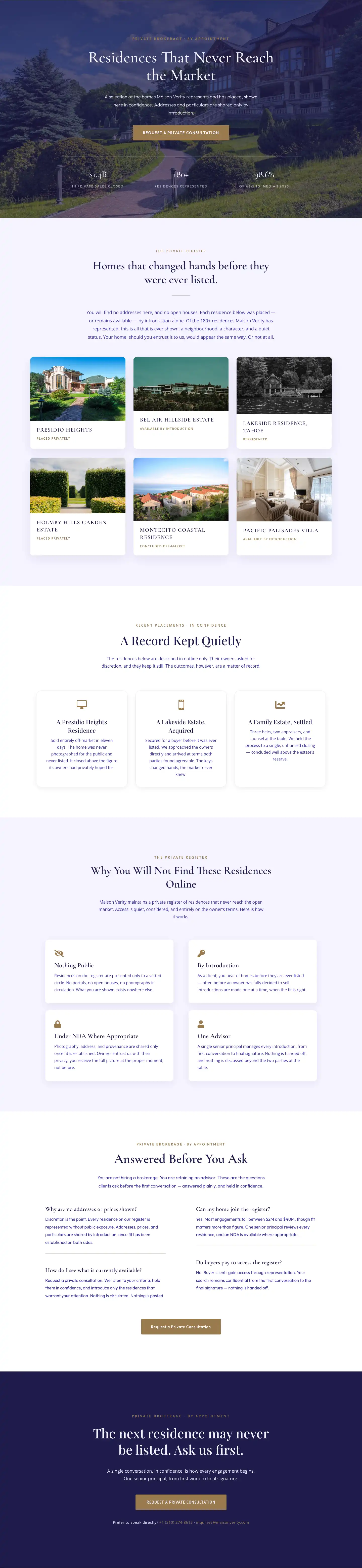
Maison Verity: Elegant Real Estate Residences Page for Divi 5
full_landing · real_estate · elegant
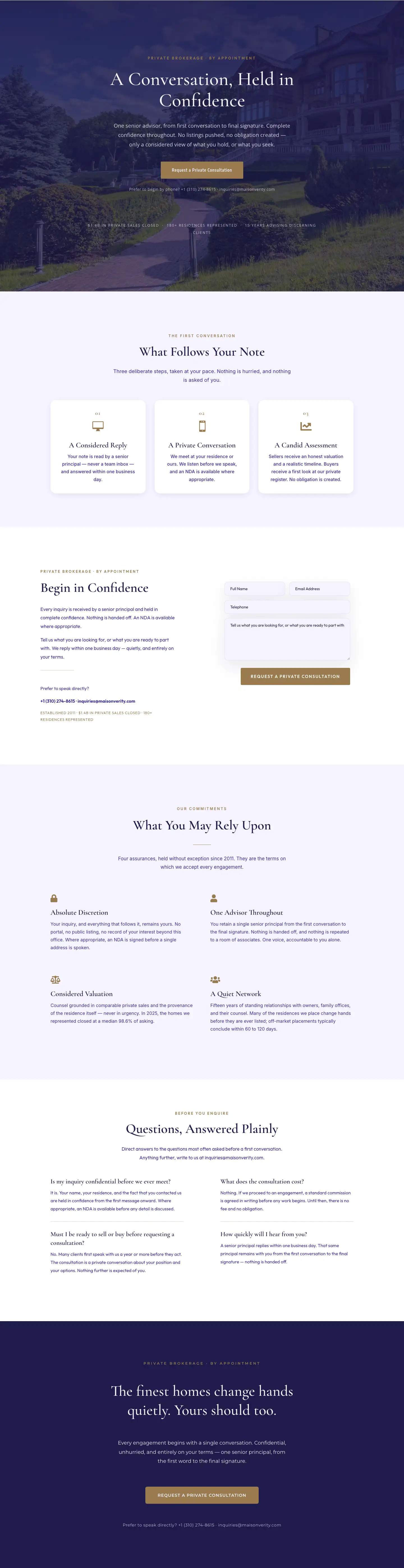
Maison Verity: Elegant Real Estate Private Consultation Page for Divi 5
full_landing · real_estate · elegant
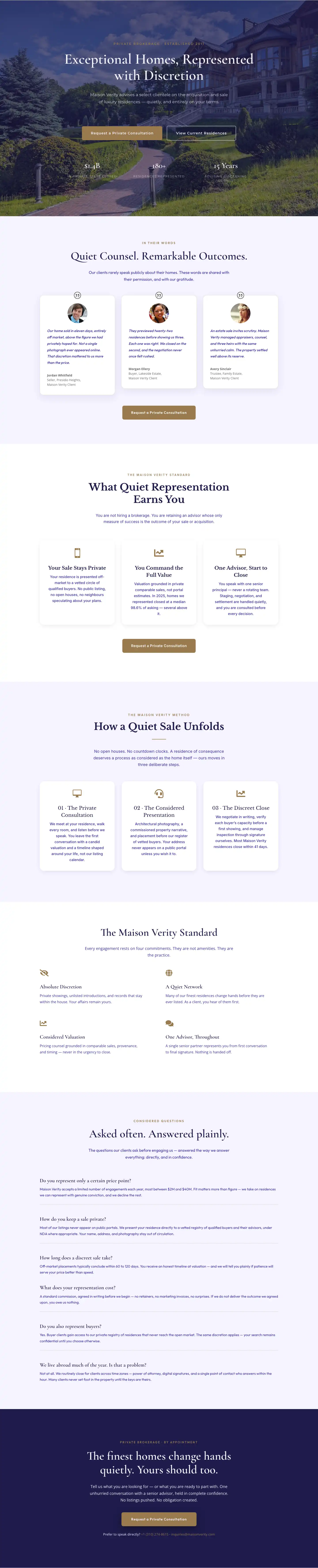
Elegant Luxury Real Estate Landing Page: Divi 5 Layout
full_landing · real_estate · elegant