
Bold Agency Pricing Page: Blackline Studio Divi 5 Layout
Bold dark-mode Divi 5 agency pricing layout with three-tier plans, guarantees, FAQ, testimonial, and CTA. Fixed-scope pricing in a high-contrast red accent theme.
Rate this element
Download this section, free
- Divi 5 JSON, imports in seconds
- Commercial license included
- No account needed
Click to view the full page
Overview
The Blackline Studio pricing page opens with a centered eyebrow label in the accent orange (#ff3b1f, uppercase, 4px letter-spacing), then a 64px white headline capped at 900px wide, a 760px supporting paragraph at 72% white opacity, and a solid orange CTA with a soft glow shadow. That single-column hero sets the tone: dark canvas (#0a0a0a), 140px top and bottom padding, everything centered on a max-width axis so the eye lands on the headline before it drops into the price cards.
The pricing block itself is a three-column row (1/3 · 1/3 · 1/3) capped at 1280px with a 28px column gap and align-items: stretch so all three cards match in height even when the copy differs. The two outer cards sit on #141414 with a 1px hairline border at 8% white; the middle card sits on #161616 with a 2px solid orange border, a -12px Y-translate to lift it above the row, a warm orange-tinted shadow, and a pill-shaped “MOST CHOSEN” badge at the top. Inside every card the rhythm is identical: eyebrow label, tier name (32px, weight 800), grey “from” label, 48px price, one-line positioning sentence, a divider with the duration in orange caps, then a checkmark list where the ✓ glyphs are inline-styled in the accent color for scannability.
Below the pricing grid, the guarantees section reuses the same dark surface but pairs cards in a 1/2 · 1/2 grid with 32px gaps and 20px radii. Each card carries a numeric label (01–04) in accent-orange caps and a 28px title, so the four promises feel like a system, not a list. The FAQ block that follows switches to full-width stacked rows (one question per row on #141414 with 48px vertical padding, a small orange eyebrow like “01) What isn’t included in the fee?”, a 30px answer headline, and an 18px body paragraph in warm grey. The final FAQ row swaps its hairline border for the accent orange to visually flag the guarantee question.
On tablet the hero headline steps down to 48px and the price headings hold; on phone the row flexDirection flips to column, every card becomes full-width (flexType: 24_24), the hero drops to 36px with tightened letter-spacing, and section padding reduces from 140px to 80px. The middle tier keeps its elevation on mobile but no longer breaks the row rhythm because the cards stack, the border and shadow do the work instead.
What’s inside
- Three-tier pricing row (Brand Sprint · Full Partnership · Embedded Team) with matched-height cards, 28px radii, and independent tier accents
- Elevated middle tier: -12px Y-translate, 2px #ff3b1f border, warm orange shadow, and an inline “MOST CHOSEN” pill badge for the recommended plan
- Six- to eight-item checkmark benefit lists per tier, using inline-styled ✓ glyphs in the accent color so the eye can scan value fast
- Four-card guarantees section in a 1/2 × 1/2 grid with numeric labels 01–04, isolating your promises from the pricing math
- Full-width FAQ block with five stacked rows (eyebrow label, question headline, and answer paragraph) plus one visually flagged row for the guarantee
- Centered hero with orange eyebrow, 64px headline, 760px supporting paragraph, and a solid CTA button with layered box-shadow presets
- Inline contact block at the bottom with mailto and phone link styled in the accent orange for a soft close
- Fluid vw-based horizontal padding (5–8vw) and responsive typography ramps at 48px tablet / 36px phone for the hero and price headings
Who it’s for
Built for creative studios, brand agencies, product design shops, and independent consultancies that sell high-ticket engagements and need to state prices without apologizing for them. The three-tier structure (project sprint, full retainer-style partnership, and monthly embedded team) fits agencies that offer both fixed-scope and ongoing work: brand studios, growth-marketing shops, dev agencies, motion houses, or fractional-CMO practices. The bold black-and-orange palette suits founders selling to other founders, especially Series A–C startups, so anyone chasing that same audience will find the tone matches. It also works for solo operators pricing above $10k who want a page that looks like a $200k studio built it. Skip it if your brand voice is soft, pastel, or wellness-adjacent. The aesthetic is deliberately assertive.
Customization tips
Swap the accent orange (#ff3b1f) at the preset level and it propagates through eyebrows, pricing highlights, the ✓ bullets, the middle-tier border, the CTA background, and the FAQ eyebrows in one change. There is only one accent color across the layout. The dark surface uses three near-blacks (#0a0a0a for sections, #141414 and #161616 for cards, #111111 for guarantee cards); keep them distinct so the depth stacking still reads. Keep tier names to two words max and positioning lines to a single sentence, the 32px heading and 16px body were tuned for that length. Benefit lists work best at 6–8 rows; more than 8 and the middle card grows taller than the outer two, breaking the align-items: stretch symmetry. The hero headline is capped at 900px and the FAQ headlines at 30px, resist pushing either past two lines. No imagery is used in the layout, so there are no aspect-ratio constraints to manage; if you add a logo strip below the hero, keep it monochrome to protect the single-accent system.
How to install this layout
- Download the layout JSON file from this page.
- Open the target page in the Divi 5 builder.
- Open the portability panel (up/down arrows icon) and choose the Import tab.
- Upload the JSON. Tick “replace existing content” only for full-page imports.
- Check the page at desktop and mobile widths, then swap in your copy and images.
Full walkthrough with troubleshooting: How to Import a Divi 5 Layout.
Questions about Bold Agency Pricing Page: Blackline Studio Divi 5 Layout
How does the pricing row behave on mobile?
The row switches to `flexDirection: column` on phone and every card becomes full-width via `flexType: 24_24`. The middle card keeps its -12px Y-translate and orange border, but since the cards are stacked instead of side-by-side, elevation reads as an accent rather than a broken grid line.
Which Divi 5 modules is the page built from?
Only four: Section, Row, Column, and the Text, Heading, and Button modules. The checkmarks, the “MOST CHOSEN” pill, and the /mo unit on the Embedded Team price are inline HTML inside Text modules. No icon modules or third-party add-ons are used.
Are there any images or hero visuals to replace?
No. The layout is intentionally image-free: the visual weight comes from typography, the accent orange, card depth, and the elevated middle tier. You can drop a logo cloud or metric strip below the hero if you need social proof, but nothing in the base layout requires image assets.
What should I edit first when I import it?
Change the three prices, the tier names, and the checkmark bullets. That is the buyer-facing math. Then update the CTA link from `#contact` to your actual form or scheduling URL, and swap the mailto and phone number in the bottom contact block. The palette and type system can stay untouched.
Can I add a fourth pricing tier?
You can, but the column structure changes from 1/3 · 1/3 · 1/3 to 1/4 · 1/4 · 1/4 · 1/4, the max-width should grow from 1280px to about 1440px, and the 40px card padding should drop to around 32px so the tier names still fit on one line. Otherwise a fourth card starts to feel cramped.
How is the FAQ section structured, accordion or open?
It is five open rows stacked vertically, each a full-width Row with its own dark card styling. Nothing collapses on click. Answers are visible on load, which is the intent for a pricing page. Buyers do not have to click to see how you handle money.
Which Divi version does this layout need?
Divi 5. The layout is generated natively for Divi 5 and validated against its real module structure before publication, so it imports clean into the current builder.
Can I use this layout on client websites?
Yes. Every download includes a commercial license covering unlimited sites you own or build for clients. Only reselling or redistributing the layout file itself is prohibited.
Included in these packs

More pricing tables
Browse all pricing tables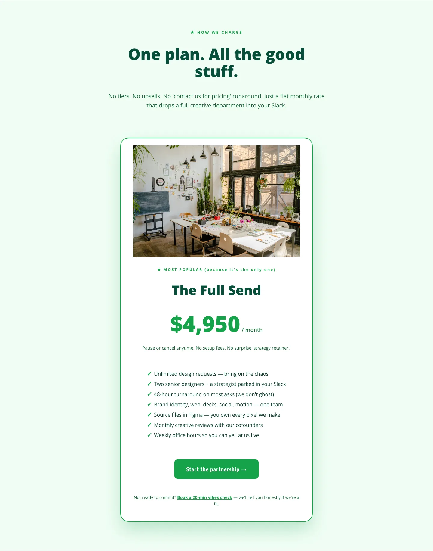
Playful Agency Pricing Section: Flat-Rate Divi 5 Layout
pricing · agency · playful
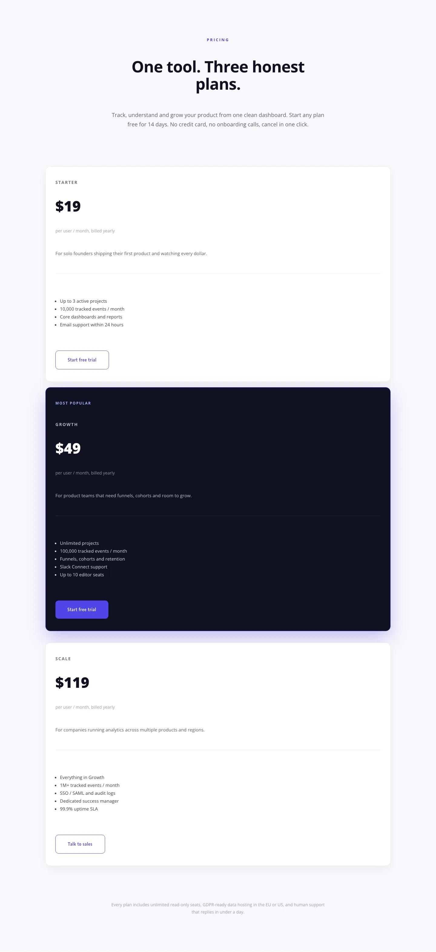
Minimal SaaS Pricing Section: 3-Tier Plan Cards with Featured Dark Tier | Divi 5 Layout
pricing · saas · minimal
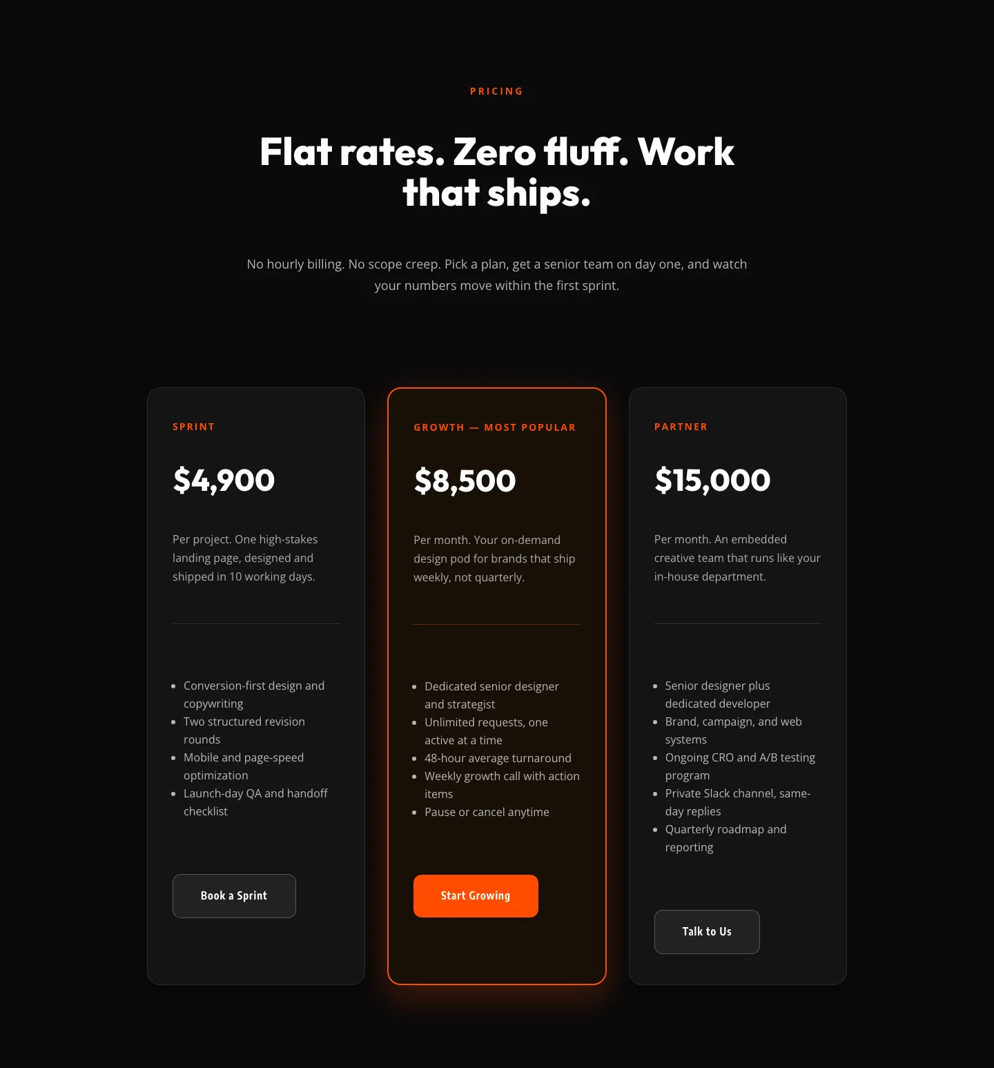
Bold Agency Pricing Section: Dark 3-Tier Divi 5 Layout
pricing · agency · bold
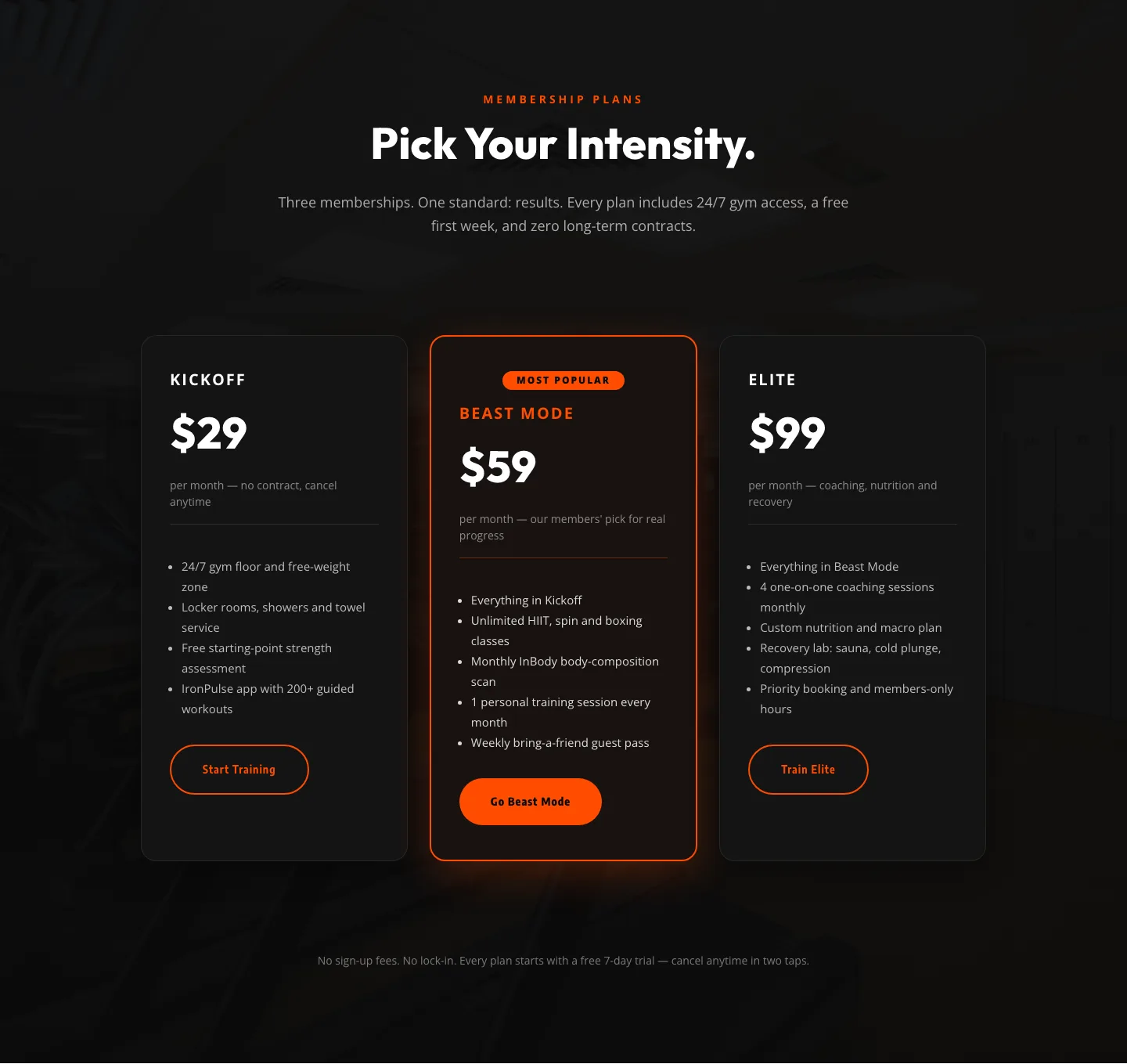
Bold Fitness Pricing Table: Dark Gym Membership Plans Divi 5 Layout
pricing · fitness · bold
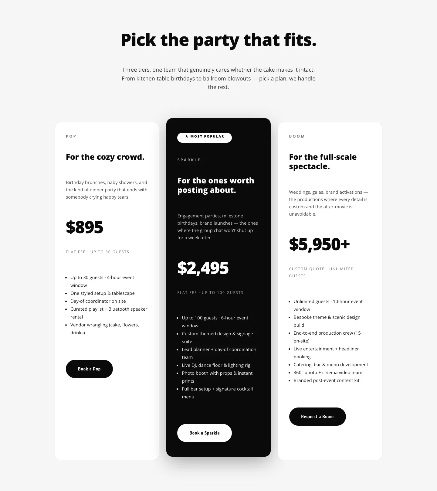
Playful Three-Tier Event Pricing Section for Divi 5
pricing · events · playful
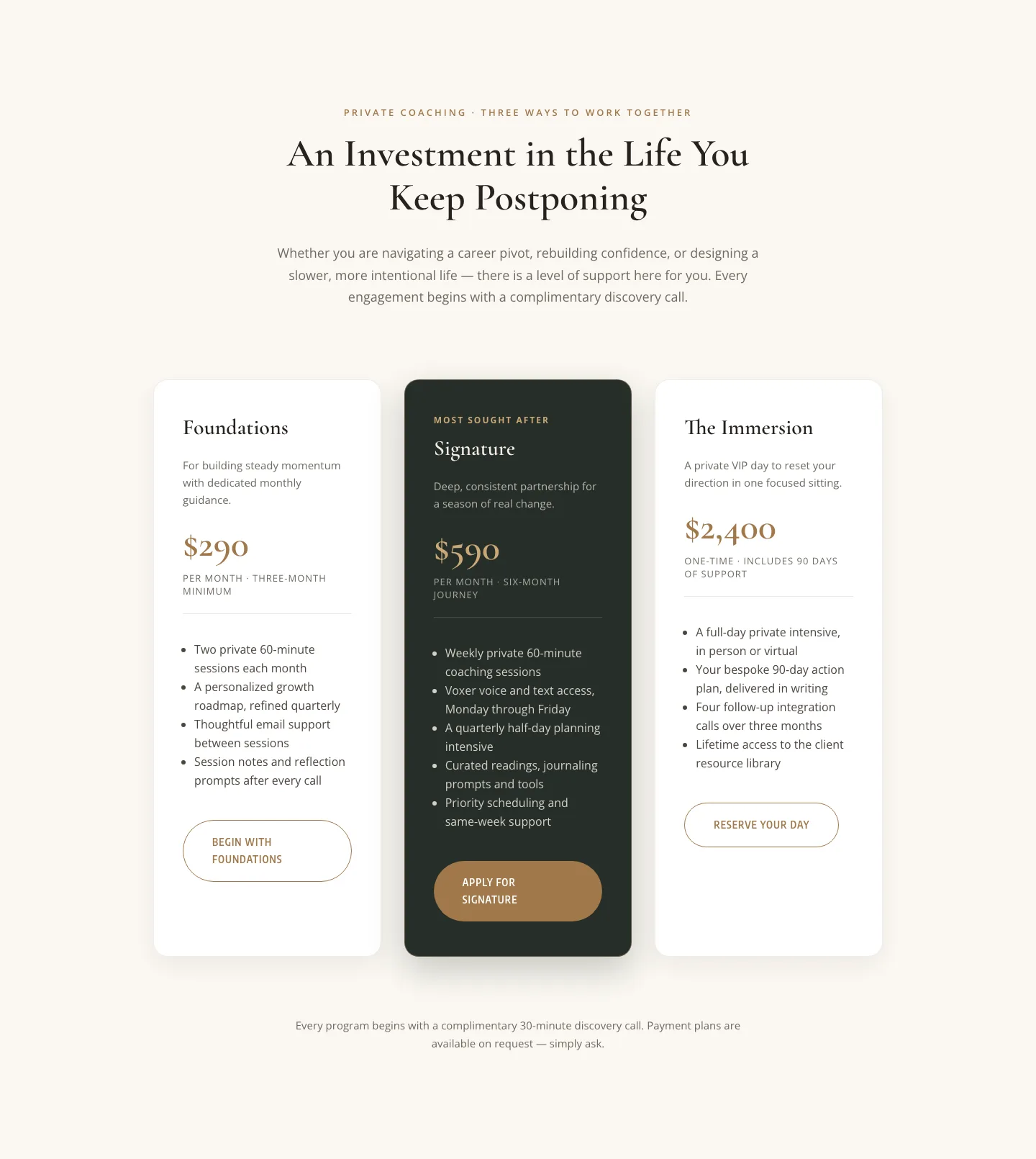
Elegant Coaching Pricing Section: 3-Tier Divi 5 Layout
pricing · coaching · elegant