
Bold Agency Pricing Section: Dark 3-Tier Divi 5 Layout
A bold, dark pricing section for agencies built in Divi 5. Three flat-rate tiers with a highlighted popular plan, orange accents, hover effects, and mobile-ready columns.
Rate this element
Download this section, free
- Divi 5 JSON, imports in seconds
- Commercial license included
- No account needed
Click to view the full page
Overview
This pricing section is built around one decision: make the middle tier impossible to miss without shouting. The section sits on a near-black #0a0a0a canvas with generous 120px vertical padding, and opens with a centered intro stack (an orange uppercase eyebrow with 3px letter-spacing, an 800-weight Outfit headline at 56px, and a muted supporting paragraph) all constrained to a 760px row so the copy stays readable rather than sprawling across the viewport.
Below that, a three-column row (1/3 + 1/3 + 1/3) holds the plan cards with a 32px gap and alignItems: stretch, so all three cards stay equal height regardless of how many list items each plan carries. The two outer cards use a slightly lifted #141414 surface with a 1px white-at-10% border and 20px radius, visible against the black background but clearly secondary. The featured middle card breaks the pattern three ways: a warm-tinted #181008 background, a 2px solid #ff4d00 border, and an orange-tinted glow shadow instead of the neutral black one. The hierarchy is structural, not decorative: no "popular" ribbon graphic to fight with, just the label folded into the eyebrow text.
Each card follows the same internal rhythm: eyebrow, 44px price heading, one-line description, a hairline divider, a feature list at 1.9em line-height, then a full button. The featured card gets the only solid orange button; the outer cards use ghost buttons (6% white fill, 1px border) that flood orange on hover, so the CTA hierarchy holds even during interaction. On phones the card row switches to flexDirection: column and every column expands to full width (24/24 flex sizing), while the headline steps down from 56px to 38px, the cards simply stack in order with the featured plan second, keeping the reading sequence intact.
What’s inside
- Three equal-height pricing cards in a 1/3-1/3-1/3 flex row with 32px gaps and stretch alignment
- Featured middle tier styled structurally: 2px #ff4d00 border, warm #181008 surface, and an orange glow box-shadow
- Consistent card anatomy per tier: uppercase eyebrow, 44px Outfit price heading, description, hairline divider, feature list, button
- Hover states wired throughout: outer card borders shift to orange, shadows deepen, ghost buttons fill solid #ff4d00
- Centered intro stack (eyebrow + 56px headline + subcopy) constrained to a 760px row for readable line lengths
- Solid-orange primary CTA on the featured plan vs. ghost-style secondary CTAs, preserving a single visual priority
- Phone breakpoints included: cards stack vertically at full width and the headline drops to 38px
- Built entirely from native Divi 5 modules (heading, text, divider, and button) with no third-party dependencies
Who it’s for
This section fits any service business selling productized or tiered engagements: design and development agencies, marketing and CRO studios, branding consultancies, and freelancers moving from hourly billing to flat-rate packages. The three-tier shape maps naturally to a project / retainer / embedded-team ladder, and the placeholder copy already follows that pattern. The dark, high-contrast styling suits brands positioning on confidence and craft (creative studios, dev shops, video production teams) more than conservative sectors like law or finance, where the near-black palette would feel off-brand. Because the price headings are plain heading modules, it also works for SaaS-adjacent services with monthly pricing, though a true SaaS plan grid with toggles would need additions.
Customization tips
Start with the accent color: #ff4d00 appears in the eyebrows, the featured card's border and glow, the divider tint, and every button hover. Swap it everywhere at once and the whole section rebrands cleanly. Keep the featured card's background (#181008) in the same family as your new accent; it's a dark tint of the orange, and a mismatched tint breaks the "warm spotlight" effect. Price headings are set at 44px, so figures up to about seven characters (e.g. "$15,000") fit on one line: longer strings like "$4,900/mo" will wrap on narrower screens, so put the billing period in the description line below instead. Feature lists are equalized by the stretch layout, but aim for 4–5 items per card; a card with 8 items forces its neighbors to stretch with empty space at the bottom. The headline holds well up to roughly 45 characters at 56px. No images are used anywhere, so there are no assets to replace. Palette and copy are the whole job.
How to install this layout
- Download the layout JSON file from this page.
- Open the target page in the Divi 5 builder.
- Open the portability panel (up/down arrows icon) and choose the Import tab.
- Upload the JSON. Tick “replace existing content” only for full-page imports.
- Check the page at desktop and mobile widths, then swap in your copy and images.
Full walkthrough with troubleshooting: How to Import a Divi 5 Layout.
Questions about Bold Agency Pricing Section: Dark 3-Tier Divi 5 Layout
How does the highlighted "Most Popular" tier work, is it a badge overlay?
No overlay. The emphasis is built into the middle column itself: a 2px solid orange border, a warm-tinted background, and an orange glow shadow, with "Most Popular" appended to the tier's eyebrow text. That makes it easy to move the emphasis to a different tier, copy those three column settings across and edit two eyebrow strings.
Do the cards stay equal height if my plans have different numbers of features?
Yes. The row uses flex layout with alignItems set to stretch, so all three columns match the tallest card automatically. The buttons aren't pinned to the bottom edge, though (they sit after the feature list) so keep list lengths within a couple items of each other for the tidiest result.
What happens on mobile?
The card row switches to a vertical flex direction on phones and each column expands to full width, so the tiers stack in order: Sprint, Growth, Partner. The 56px headline steps down to 38px. Tablet inherits the desktop three-across layout, which stays workable because of the 32px gaps, but you can add a tablet breakpoint to stack earlier if your feature lists run long.
Which Divi 5 modules does this use?
Only core ones: Section, Row, and Column for structure, plus Heading, Text, Divider, and Button modules inside each card. The feature lists are standard <ul> markup inside Text modules, so you edit them like any rich-text content. No specialized pricing-table module to learn.
What should I edit first after importing?
The three price headings and the feature lists. They're placeholder agency pricing ($4,900 / $8,500 / $15,000). Then the three button labels and their link URLs, since the buttons ship without destinations. The palette can wait; it works as-is if orange suits your brand.
Are there any images or icons I need to source?
None. The section is entirely typographic: hierarchy comes from the Outfit font at varying weights, borders, and shadows. That means zero image licensing concerns and nothing to compress; the section adds almost no page weight beyond markup and one Google Font.
Which Divi version does this layout need?
Divi 5. The layout is generated natively for Divi 5 and validated against its real module structure before publication, so it imports clean into the current builder.
Can I use this layout on client websites?
Yes. Every download includes a commercial license covering unlimited sites you own or build for clients. Only reselling or redistributing the layout file itself is prohibited.
More pricing tables
Browse all pricing tables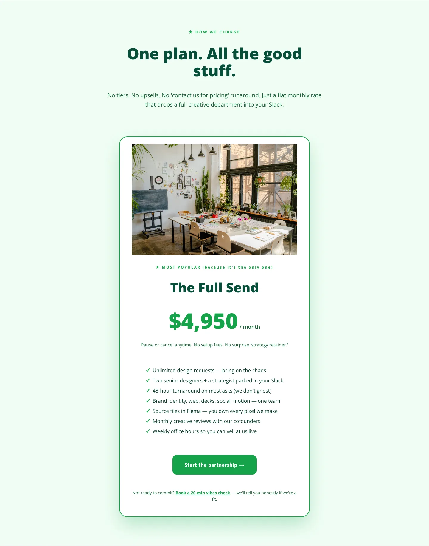
Playful Agency Pricing Section: Flat-Rate Divi 5 Layout
pricing · agency · playful
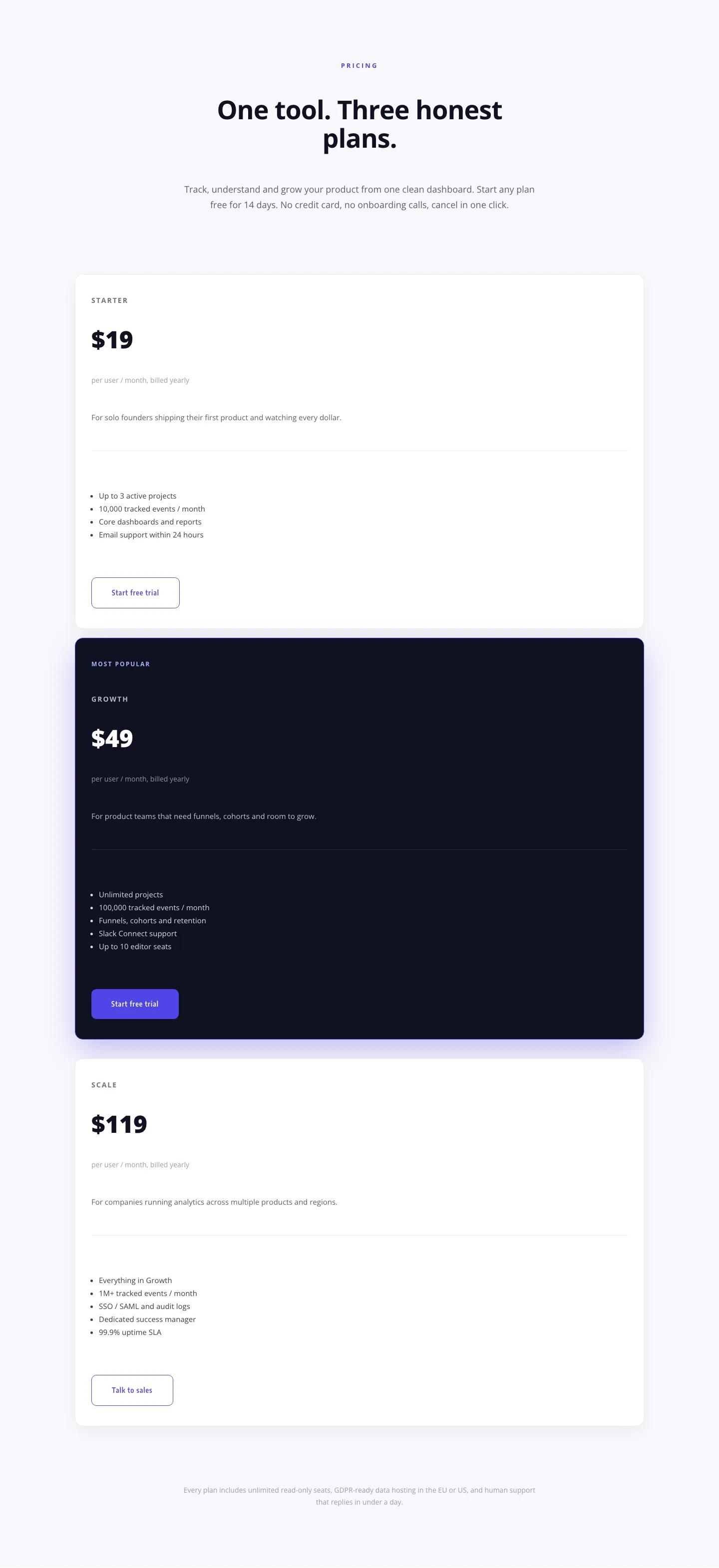
Minimal SaaS Pricing Section: 3-Tier Plan Cards with Featured Dark Tier | Divi 5 Layout
pricing · saas · minimal
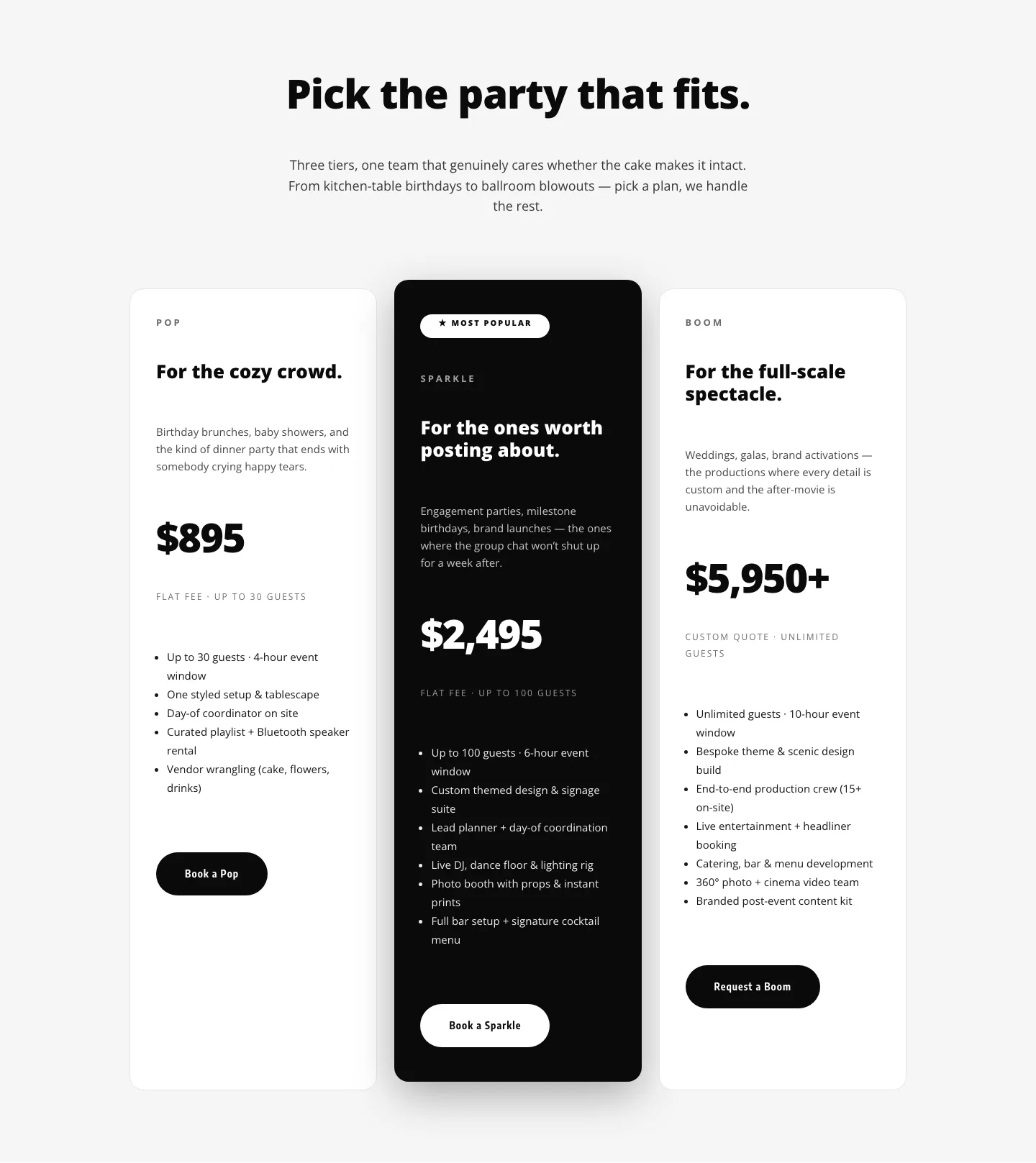
Playful Three-Tier Event Pricing Section for Divi 5
pricing · events · playful
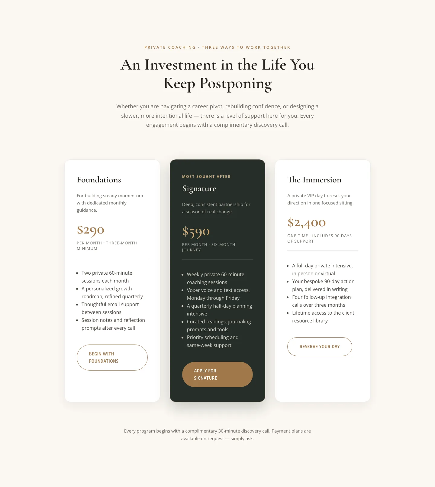
Elegant Coaching Pricing Section: 3-Tier Divi 5 Layout
pricing · coaching · elegant
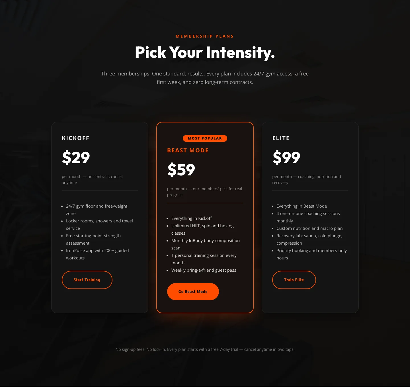
Bold Fitness Pricing Table: Dark Gym Membership Plans Divi 5 Layout
pricing · fitness · bold

Bold Agency Pricing Page: Blackline Studio Divi 5 Layout
pricing · agency · bold