
Bold Fitness Pricing Table: Dark Gym Membership Plans Divi 5 Layout
High-impact Divi 5 pricing section for gyms and fitness studios. Three dark membership tiers with a highlighted 'Most Popular' plan, electric orange accents, feature lists, and bold CTA buttons. Fully responsive and ready to import.
Rate this element
Download this section, free
- Divi 5 JSON, imports in seconds
- Commercial license included
- No account needed
Click to view the full page
Overview
The section is anchored by a dense #0a0a0a base with a 94%→98% gradient layered over a Pexels gym photo, so the room's texture reads through without stealing focus from the pricing cards. Above the cards, a narrow 760px header column keeps the eyebrow, headline and one-line promise centered: a small orange Membership Plans kicker (14px, 4px letter-spacing, uppercase) sets the accent, the 56px Outfit headline Pick Your Intensity. carries the weight, and a 65%-white subtext explains what every plan already includes. That vertical rhythm (kicker → headline → subtext with a 20px row gap) repeats inside every card so the tier hierarchy reads instantly.
Three equal 1_3 columns sit on a 28px gap with alignItems: stretch, so cards match height regardless of feature-list length. The two flanking tiers (Kickoff $29, Elite $99) use a #141414 fill, a 1px 8%-white border and a soft 12/40 black shadow. Quiet containers. The middle Beast Mode tier is turned up: a warmer #181210 fill, a 2px solid orange border, a 16/56 orange-glow shadow, and a rounded Most Popular pill in solid orange with dark type sitting above the tier name. Prices land at 56px in Outfit 800, followed by a hairline divider and a bulleted list at 15px/2em line-height. Buttons are role-differentiated: outline orange pills for the standard tiers, solid orange with black type for the featured one. One visual answer to which one should I click?.
Section padding is 120px top and bottom on desktop and drops to 72px on phone, so the block still breathes on small screens without swallowing the fold. The pricing row switches from a three-column flex to a stacked column layout at the phone breakpoint, keeping the 28px gap as vertical rhythm, and the headline scales from 56px to 36px so it lands cleanly on ~375px viewports. A final 56px-top row carries a low-emphasis reassurance line (No sign-up fees. No lock-in. Every plan starts with a free 7-day trial…) in 14px white-at-45%, the fine print stays honest without competing with the cards above it.
What’s inside
- Three-tier pricing row with equal-height `1_3` columns and a highlighted middle tier (2px orange border, orange-glow shadow, `Most Popular` pill badge)
- Header block capped at 760px with an orange uppercase eyebrow, 56px Outfit heading and supporting body copy
- Four to five feature bullets per card in a 15px / 2em line-height list, ready to swap for your own inclusions
- Two button styles pre-wired: outline pill for standard tiers, solid orange fill for the featured plan
- Full-bleed dark background stacking a 94%→98% gradient over a Pexels fitness image (drop-in swap)
- Hover states on every card: border shifts to orange and shadow deepens for tactile feedback
- Dedicated reassurance row underneath (`no sign-up fees, no lock-in, 7-day trial`) in low-emphasis 14px text
- Mobile stack: cards drop into a single column with 28px vertical gap; headline scales from 56px to 36px
Who it’s for
Built for gyms, boxing and CrossFit boxes, HIIT studios, personal-training brands and fitness apps that sell tiered memberships: the entry / most-popular / premium ladder maps cleanly to gym access, classes + coaching and full concierge. It also works for adjacent recovery, sauna or cold-plunge studios, martial arts academies, and combat-sports gyms where a bold, dark aesthetic reads on-brand. Because the tier structure is generic, online coaches, nutritionists and challenge-based training programs can reuse it for coaching packages or program tiers with only a copy pass. Swap the background photo and it fits most strength-forward, high-energy brands that want urgency without a neon arcade look.
Customization tips
The palette runs on two variables: flip the orange (#ff4d00) to your brand accent everywhere it appears (eyebrow, featured price, Most Popular pill, both button fills/borders, and the featured card's border and glow shadow), then nudge the two card fills (#141414 and #181210) if you want a slightly warmer or cooler read. Tier names look best as one to two short uppercase words (Kickoff, Beast Mode, Elite); prices should stay in the $XX–$XXX range so the 56px Outfit numbers stay balanced across cards. Keep feature bullets to 4–6 items and roughly 4–8 words each, anything longer wraps and breaks the equal-height alignment. If you replace the background photo, pick a 1600×900+ landscape image with the subject in the darker mid-tones; the gradient overlay swallows highlights but muddy foregrounds still fight the cards. To move the featured emphasis, delete the pill, orange border, glow shadow and solid button from the middle column and add them to whichever tier you want to sell.
How to install this layout
- Download the layout JSON file from this page.
- Open the target page in the Divi 5 builder.
- Open the portability panel (up/down arrows icon) and choose the Import tab.
- Upload the JSON. Tick “replace existing content” only for full-page imports.
- Check the page at desktop and mobile widths, then swap in your copy and images.
Full walkthrough with troubleshooting: How to Import a Divi 5 Layout.
Questions about Bold Fitness Pricing Table: Dark Gym Membership Plans Divi 5 Layout
Is the middle tier locked as the `Most Popular` one?
No: the pill badge, orange border, glow shadow and solid-fill button live on whichever column you want to feature. Strip them off the middle card and copy them onto the tier you actually want to push.
How does the layout behave on mobile?
The three pricing columns stack into a single column at the phone breakpoint with a 28px vertical gap. Section padding drops from 120px to 72px, and the headline scales from 56px to 36px so it stays readable on ~375px viewports.
What modules does it actually use?
Only native Divi 5 modules: Section, Row, Column, Text, Heading, Divider and Button. No third-party plugins, no shortcodes; everything edits inside the standard Divi 5 builder.
Can I add a fourth tier?
Yes: switch the row's column structure from `1_3,1_3,1_3` to `1_4,1_4,1_4,1_4` and drop the card padding from 44/36px to roughly 32/24px so the feature bullets don't wrap on desktop.
What should I edit first?
Prices, tier names and feature bullets. The three things that actually convert. Then the accent color if orange isn't your brand, then the background image. Leave the typography, spacing and shadow system alone unless you're doing a full re-skin.
Which Divi version does this layout need?
Divi 5. The layout is generated natively for Divi 5 and validated against its real module structure before publication, so it imports clean into the current builder.
Can I use this layout on client websites?
Yes. Every download includes a commercial license covering unlimited sites you own or build for clients. Only reselling or redistributing the layout file itself is prohibited.
More pricing tables
Browse all pricing tables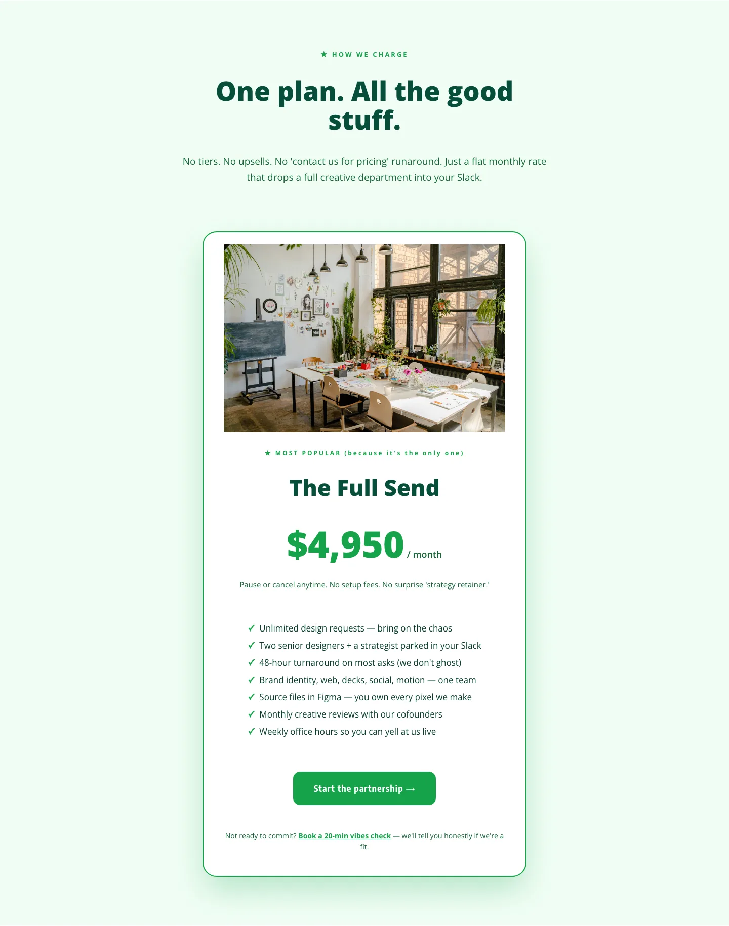
Playful Agency Pricing Section: Flat-Rate Divi 5 Layout
pricing · agency · playful
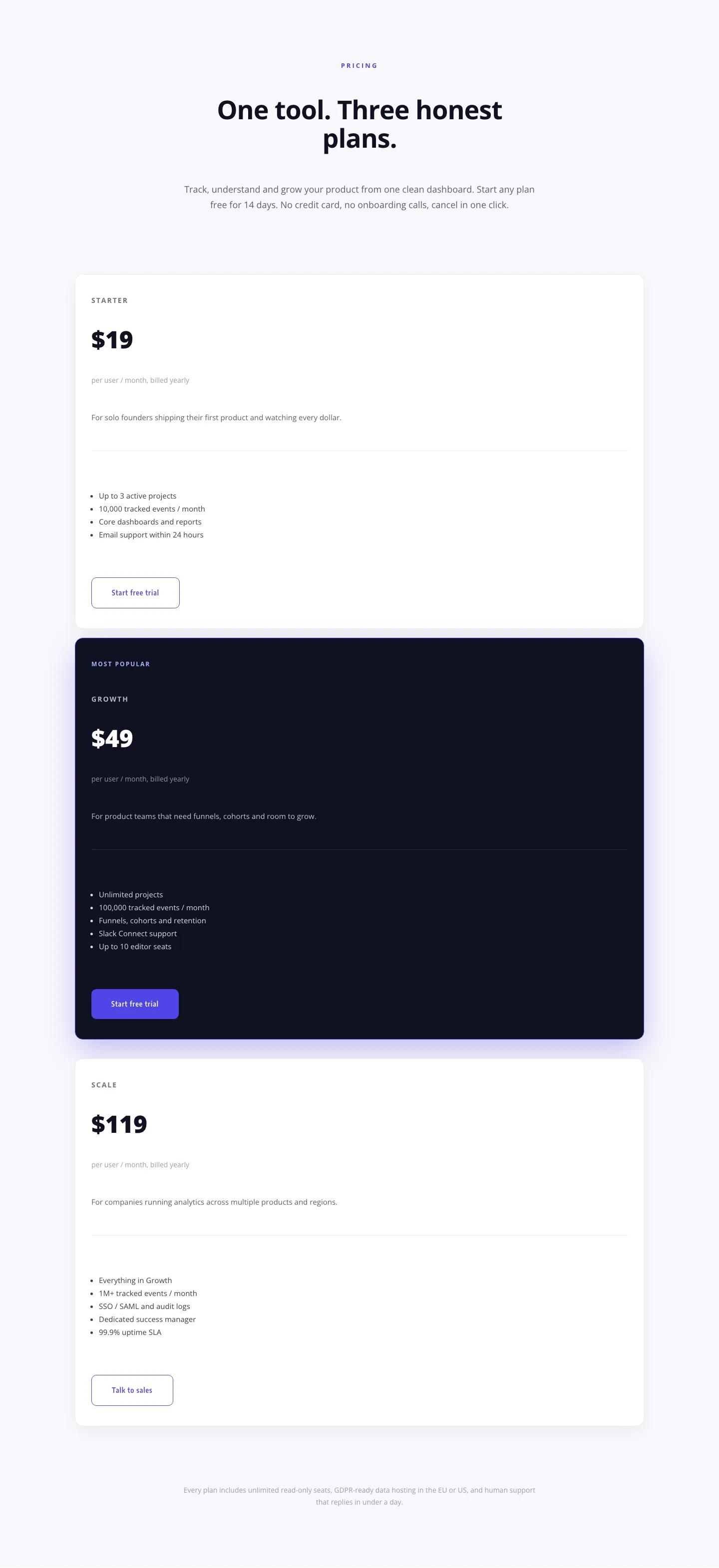
Minimal SaaS Pricing Section: 3-Tier Plan Cards with Featured Dark Tier | Divi 5 Layout
pricing · saas · minimal
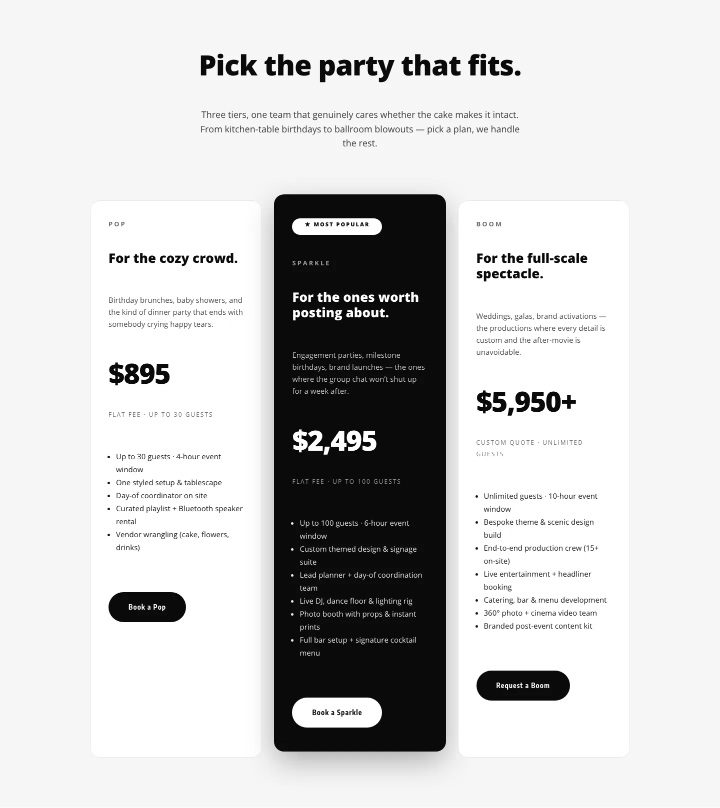
Playful Three-Tier Event Pricing Section for Divi 5
pricing · events · playful
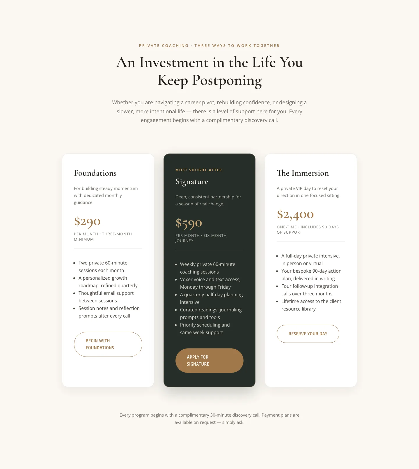
Elegant Coaching Pricing Section: 3-Tier Divi 5 Layout
pricing · coaching · elegant
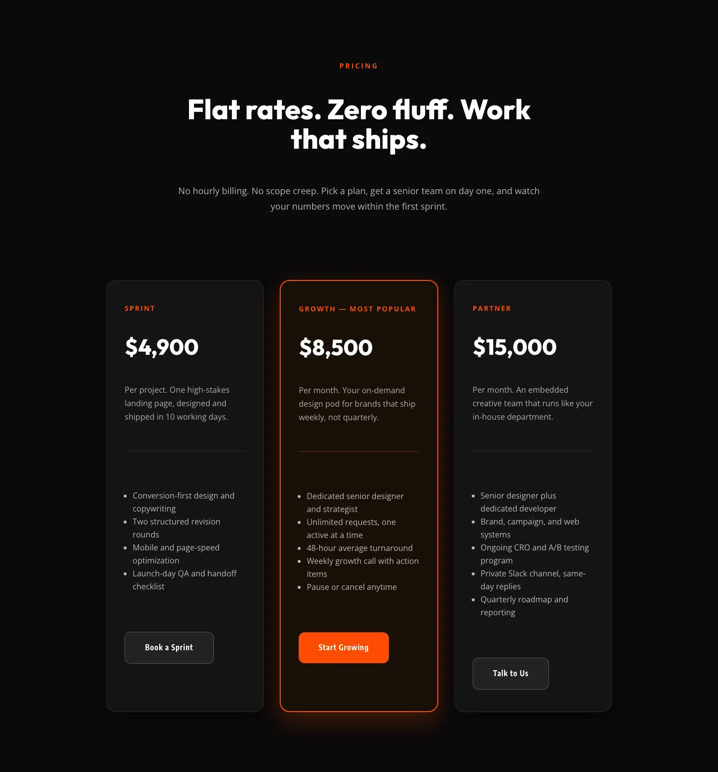
Bold Agency Pricing Section: Dark 3-Tier Divi 5 Layout
pricing · agency · bold

Bold Agency Pricing Page: Blackline Studio Divi 5 Layout
pricing · agency · bold