
Elegant Coaching Pricing Section: 3-Tier Divi 5 Layout
An elegant three-tier pricing section for coaching websites, built for Divi 5. Serif typography, warm gold accents, a featured dark plan card, hover lift effects, and fully responsive columns.
Rate this element
Download this section, free
- Divi 5 JSON, imports in seconds
- Commercial license included
- No account needed
Click to view the full page
Overview
This is a single Divi 5 section built around three pricing cards that sit inside a warm cream frame (#FBF8F3) with generous 120px vertical breathing room. Above the cards, a centered intro block caps at 720px and stacks three layers of hierarchy: a 13px uppercase eyebrow in muted brass (#A0784A, 3px letter-spacing), a 54px Cormorant Garamond H2 in near-black (#26221C), and an 18px body paragraph in warm gray (#6F6A61) at 1.7em line-height. The typography does most of the elegance here, the serif display face against the neutral sans body reads editorial rather than salesy.
The pricing row is a true CSS flex row (row-gap: 32px, column-gap: 32px, align-items: stretch) capped at 1180px, so all three cards stay equal height regardless of copy length. The outer two tiers (Foundations, The Immersion) share the same treatment: white background, 1px hairline border at rgba(38,34,28,0.08), 20px radius, and a soft 0 12px 36px shadow. The middle tier (Signature) inverts to a deep evergreen (#262E29) with a brass-toned border and heavier shadow to draw the eye without needing a scale transform or ribbon. Each card is a flex column with a 12px row-gap, 48/40 padding, an eyebrow-optional label, an H3 program name, a 15px positioning line, a 52px serif price in brass, a billing-cadence caption, a 1px divider, a features list at 1.9em line-height, and a pill-shaped CTA (100px radius): outline on the light cards, solid brass on the featured one.
On hover, cards lift 6px with a deeper shadow and the border warms toward brass. A restrained interaction that matches the tone. Mobile behavior is explicit: at tablet the row switches to flexDirection: column, cards stack full-width with the same 32px gap, and the section padding relaxes to 80px top/bottom on phone. The H2 also drops from 54px to 36px on phone so the headline never breaks awkwardly. A closing 640px-wide reassurance line about the discovery call and payment plans sits 56px below the cards, keeping the section self-contained.
What’s inside
- Three equal-height pricing cards in a flex row with a highlighted middle tier (dark evergreen `#262E29` with brass accents), no ribbon or scale hack needed
- Editorial header stack: Cormorant Garamond H2 (54px desktop, 36px phone), uppercase brass eyebrow with 3px letter-spacing, and a supporting 18px lede
- Per-card anatomy built from native Divi 5 Text, Divider, and Button modules: no premium plugins, no custom HTML blocks
- 52px serif prices in brass (`#A0784A` / `#C9A876`) paired with 13px uppercase cadence captions (per month, six-month journey, one-time)
- Feature lists using standard `<ul>` markup at 1.9em line-height, separated from the price block by a 1px hairline divider
- Pill-shaped CTA buttons (100px radius) with two treatments: outlined brass on light cards, solid brass on the featured card, both with hover color inversions
- Restrained hover state: 6px lift via transform, deeper box-shadow, and a warmer border color. Applied at the column level
- Centered closing note (640px max-width) explaining the discovery call and payment plans, sitting 56px below the pricing row
Who it’s for
This section was designed for one-to-one coaches and consultants who sell packaged engagements rather than hourly time: life coaches, career and executive coaches, leadership and business mentors, therapists in private practice, and clarity or transition specialists. The three-tier structure (recurring monthly, longer-term signature program, one-time VIP intensive) mirrors how most premium coaches actually package their offers, so the copy scaffolding is genuinely useful, not decorative. The muted cream-and-brass palette with serif display type also translates cleanly to adjacent luxury-service niches: high-end nutritionists, doulas and postpartum specialists, midlife and menopause coaches, spiritual directors, image and personal-brand consultants, wedding and event planners, boutique interior designers, and private art or music instructors. It is not the right fit for high-volume, low-ticket SaaS pricing or anything that needs a feature comparison matrix.
Customization tips
Swap the palette at the section level first: the cream (#FBF8F3), the brass accents (#A0784A and #C9A876), the featured-card evergreen (#262E29), and the ink text (#26221C) are the five colors that carry the whole look. Change those globally before touching individual modules. Keep tier names to a single word or short phrase (Foundations, Signature, The Immersion) so the 30px H3 doesn't wrap and break card heights. Position lines want 8–14 words; feature lists work best at four to five bullets of similar length so cards stay balanced. Prices set in the 52px serif look intentional at 3–5 characters ($290, $2,400). Very long numbers will crowd the cadence line beneath. There are no images in this section, so you do not need to worry about aspect ratios; if you want to add a background texture, apply it to the section (not the cards) at low opacity so the hairline borders still read. To rename the middle tier's badge, edit the small uppercase Text module at the top of the featured column. Keep it under 20 characters.
How to install this layout
- Download the layout JSON file from this page.
- Open the target page in the Divi 5 builder.
- Open the portability panel (up/down arrows icon) and choose the Import tab.
- Upload the JSON. Tick “replace existing content” only for full-page imports.
- Check the page at desktop and mobile widths, then swap in your copy and images.
Full walkthrough with troubleshooting: How to Import a Divi 5 Layout.
Questions about Elegant Coaching Pricing Section: 3-Tier Divi 5 Layout
How does the featured middle tier stand out without breaking the row?
The Signature card uses background, border, and shadow. Not scale or ribbon overlays. The column background is `#262E29`, the border is `rgba(201,168,118,0.35)`, and the shadow is heavier (`0 18px 48px`). Because it is styled at the column level and the row is `align-items: stretch`, all three cards stay the same height.
How does the three-column pricing row behave on tablet and mobile?
The row is defined as `display: flex` with `flex-direction: row` on desktop, then explicitly switches to `flex-direction: column` on tablet with a 32px `row-gap`, so cards stack in order (Foundations → Signature → The Immersion) at full width. Section padding also relaxes from 120px to 80px top/bottom on phone, and the H2 drops from 54px to 36px.
Which modules should I edit first when I drop this into my site?
Start with the intro Text modules at the top (eyebrow, H2, lede), then work down each column: tier name (H3), position line, price, cadence caption, feature `<ul>`, and CTA label/link. The closing reassurance paragraph below the row is the last piece. Everything is a standard Divi 5 Text, Divider, or Button module. No synced globals to unlink.
Are there any images or icons I need to source?
No. The section is entirely typographic: no image modules, no icon modules, no background photos. That is intentional for a premium coaching aesthetic and it also means the layout loads fast and you don't need to hunt for imagery before publishing.
Can I add a fourth tier or drop to two?
Yes, but re-balance the row structure. For two tiers, change the row's column structure from `1_3,1_3,1_3` to `1_2,1_2` and let the flex row handle the widths. For four, switch to `1_4,1_4,1_4,1_4` and consider reducing the card padding from 48/40 to 36/32 so the price and CTA still breathe.
How do I keep the card heights matched if my feature lists are uneven?
The row already uses `align-items: stretch`, so columns match the tallest card automatically. Keep bullet counts within one of each other (four-to-five items) and keep each bullet on a single line at desktop width. If one tier genuinely needs more items, trim the position line above the price on the shorter cards to visually rebalance.
Which Divi version does this layout need?
Divi 5. The layout is generated natively for Divi 5 and validated against its real module structure before publication, so it imports clean into the current builder.
Can I use this layout on client websites?
Yes. Every download includes a commercial license covering unlimited sites you own or build for clients. Only reselling or redistributing the layout file itself is prohibited.
More pricing tables
Browse all pricing tables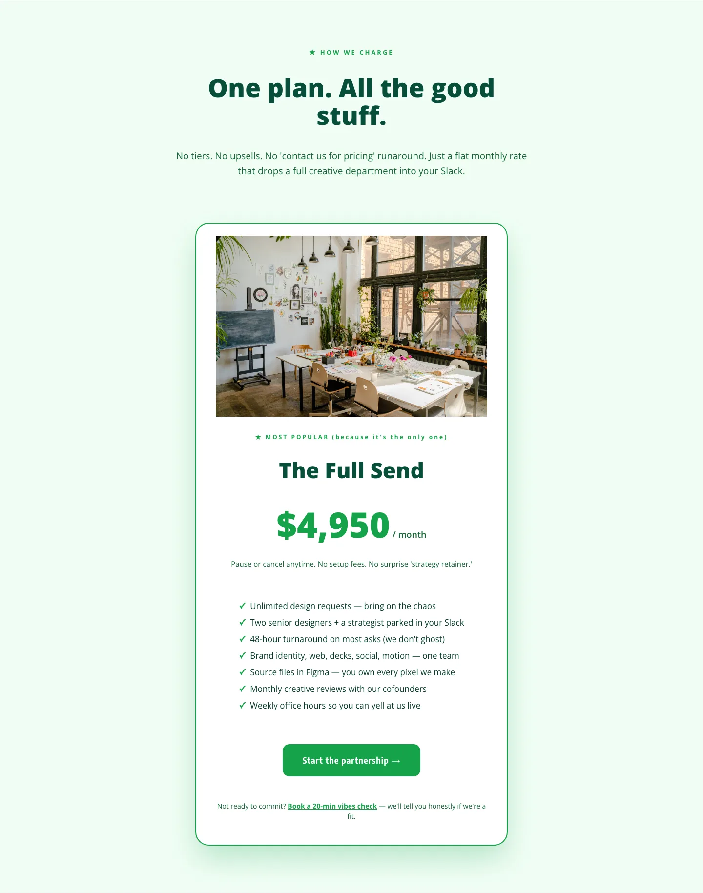
Playful Agency Pricing Section: Flat-Rate Divi 5 Layout
pricing · agency · playful
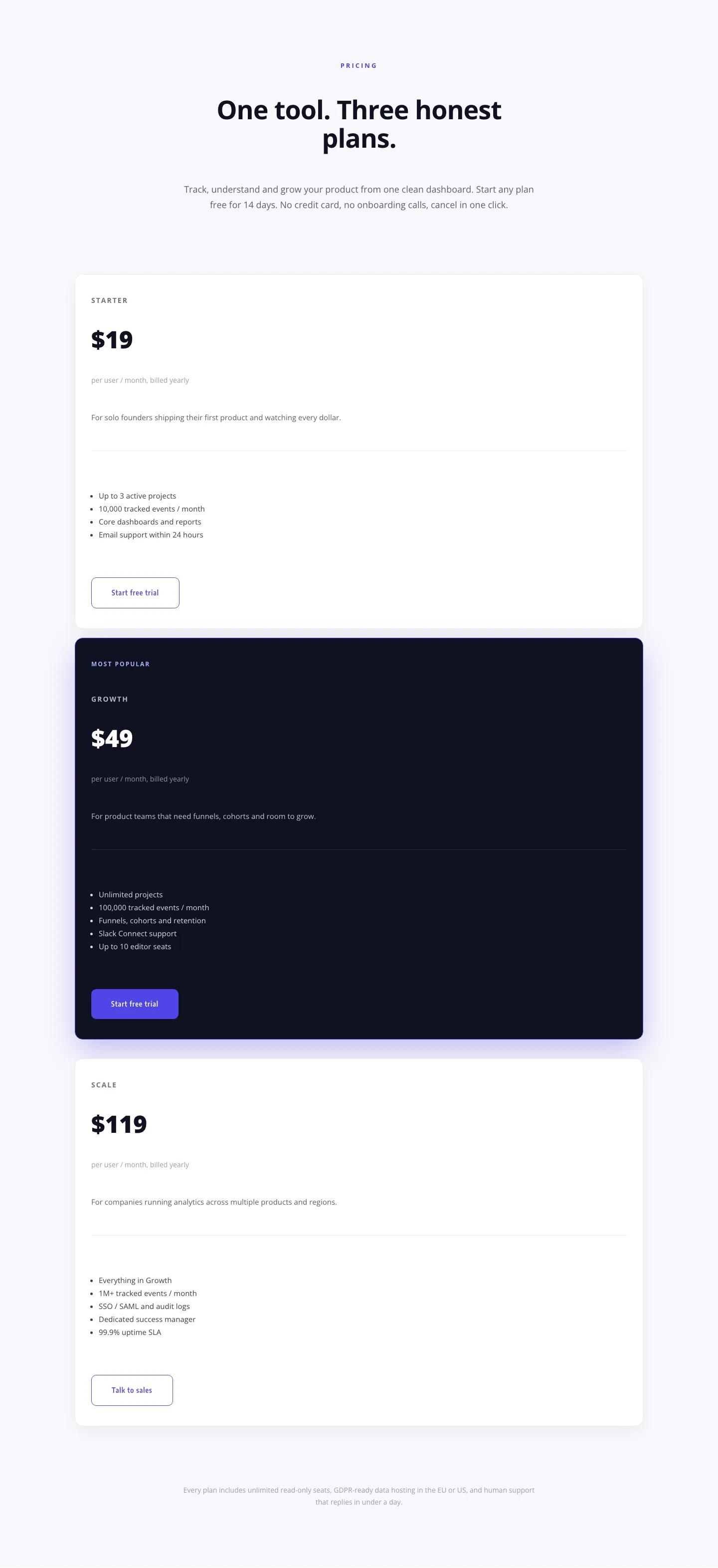
Minimal SaaS Pricing Section: 3-Tier Plan Cards with Featured Dark Tier | Divi 5 Layout
pricing · saas · minimal
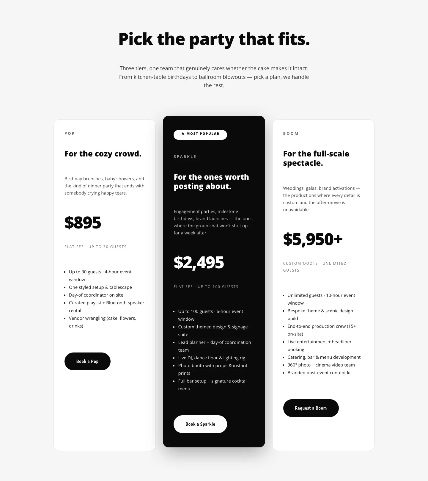
Playful Three-Tier Event Pricing Section for Divi 5
pricing · events · playful
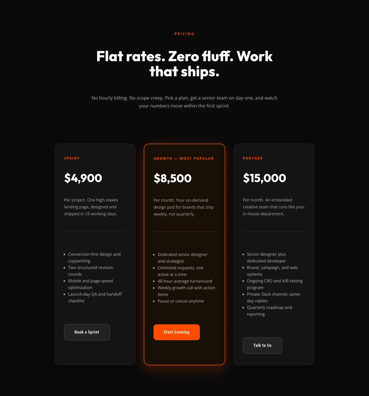
Bold Agency Pricing Section: Dark 3-Tier Divi 5 Layout
pricing · agency · bold
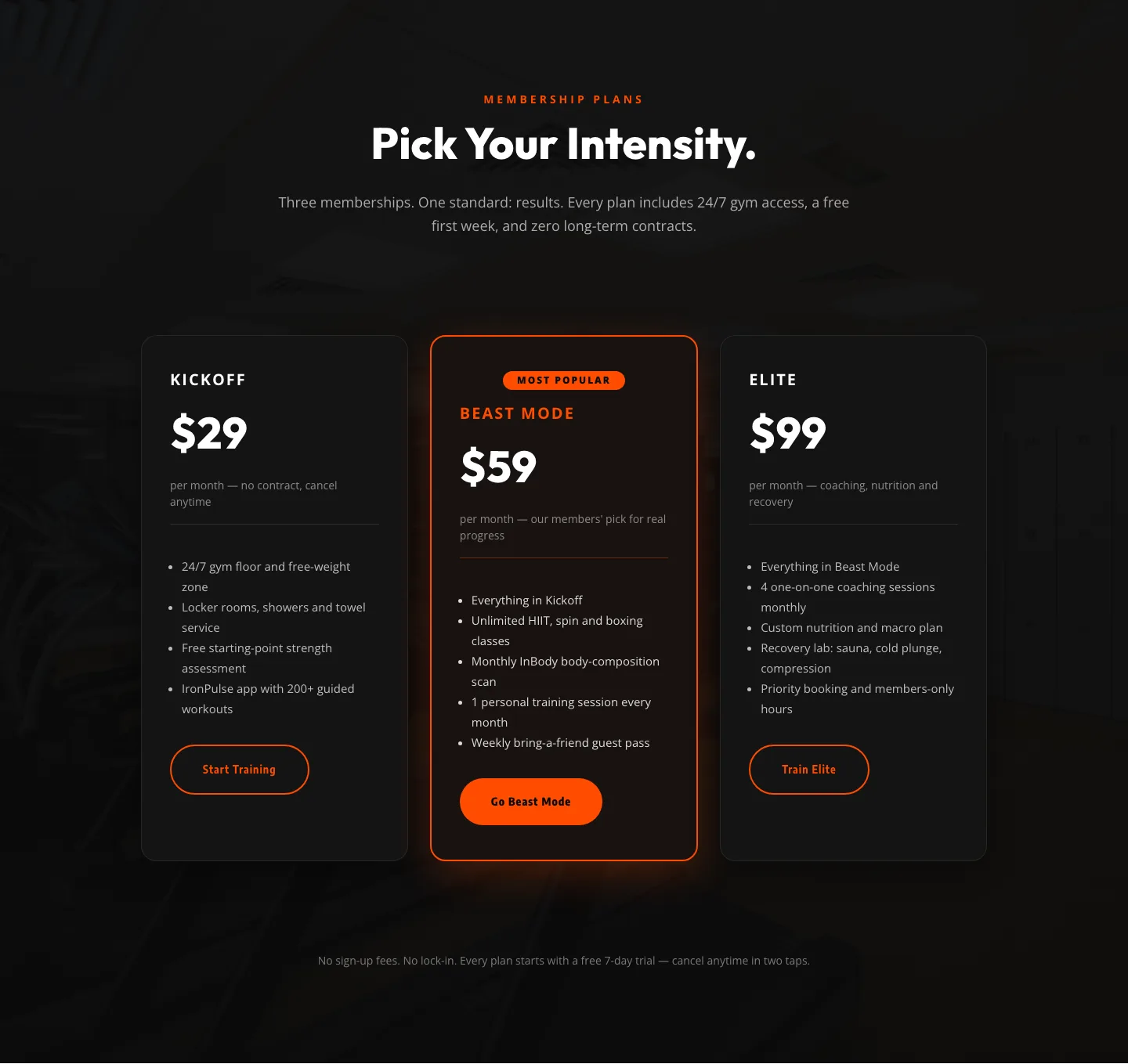
Bold Fitness Pricing Table: Dark Gym Membership Plans Divi 5 Layout
pricing · fitness · bold

Bold Agency Pricing Page: Blackline Studio Divi 5 Layout
pricing · agency · bold