
Minimal SaaS Pricing Section: 3-Tier Plan Cards with Featured Dark Tier | Divi 5 Layout
Clean 3-column Divi 5 pricing section for SaaS sites: Starter, Growth and Scale plan cards with a highlighted dark featured tier, feature lists, trial CTAs and a trust footnote. Fully responsive, minimal indigo design.
Rate this element
Download this section, free
- Divi 5 JSON, imports in seconds
- Commercial license included
- No account needed
Click to view the full page
Overview
The section opens on a soft off-white canvas (#F7F7FB) with a generous 120px top and bottom padding on desktop, tightening to 80px on tablet. That vertical breathing room is the whole point: pricing sections crash and burn when they feel cramped, so the layout leans hard on whitespace. A centered header block sits above the cards, capped at 720px so the intro copy never spans awkwardly wide on large monitors: a small indigo Pricing eyebrow in uppercase (13px, 3px tracking, #4F46E5), a 52px display heading in near-black #0F1222 with tight -1px tracking, and an 18px muted-slate subhead at 1.7em line-height. On phones the heading drops to 34px so it never overwhelms the viewport.
Below sits a three-column row (1_3 / 1_3 / 1_3) clamped to 1140px with a 28px flex gap. The two outer cards (Starter and Scale) are white with a 1px #ECECF3 hairline border, 16px rounded corners, 40px/32px padding, and a soft 12px/36px shadow at 6% opacity. The middle Growth card is the anchor: deep #0F1222 background, indigo #4F46E5 border, translated -10px on the Y axis, and wrapped in a 24px/60px indigo glow at 35% opacity. A tiny Most popular badge in lavender #A5B4FC sits above the tier label. Each card follows the same rhythm: tier label, huge 48px price at 800 weight, billing cadence, one-line description, hairline divider, feature list, CTA button. Outer cards use a ghost indigo button (Start free trial, Talk to sales) that fills solid on hover; the featured card ships a solid indigo button reversed for contrast.
A closing 720px reassurance row 56px below the cards holds a muted 14px paragraph: the unlimited read-only seats, EU/US GDPR hosting, sub-day support line that unblocks buyers on the fence. On phones the whole row switches to flexDirection column, so cards stack Starter → Growth → Scale with the dark card sitting proud in the middle of the stack; the -10px lift still reads as emphasis rather than misalignment, and touch targets stay comfortable at the same 40px/32px padding.
What’s inside
- Full pricing section built on a 1_3/1_3/1_3 row capped at 1140px with a 28px flex gap and stretch-aligned columns
- Centered 720px header block: uppercase indigo *Pricing* eyebrow, 52px display heading, and 18px subhead
- Two outer plan cards (Starter $19, Scale $119): white background, 16px radius, hairline #ECECF3 border, 6% drop shadow
- Featured Growth card ($49) with dark #0F1222 background, indigo glow at 35% opacity, -10px Y translate, and *Most popular* badge
- Divi 5 Heading modules power the 48px prices; Divi 5 Text modules handle every tier label, cadence line, description, and feature `<ul>`
- Divi 5 Divider modules split the description block from the feature list inside each card
- Three Divi 5 Button modules (two ghost, one solid) with hover fills wired for indigo/white swaps
- Bottom reassurance row (720px max, 56px above the closing padding) with a muted 14px small-print line about seats, hosting, and support
Who it’s for
Built for early- and mid-stage SaaS products that need a credible pricing page without sales-team baggage or a spreadsheet-style comparison chart. It suits analytics tools, developer platforms, project-management apps, marketing SaaS, AI wrappers, and any subscription product with three natural tiers (starter / team / scale-or-enterprise). The dark middle card does most of the persuasion work, so it's especially useful when you want to steer people toward a specific plan without hiding the others. Also works well for agencies, freelance retainers, and productized services that price in fixed packages: anywhere three side-by-side options need to feel calm, honest, and clickable rather than pushy.
Customization tips
Recolor via the Divi color presets: swap #4F46E5 for your brand accent on the eyebrow, badge, ghost button borders, featured-card border, and the indigo glow around the Growth card, then update #0F1222 on the dark card and headings to match. Keep the off-white section background (#F7F7FB) or shift to pure white, cards still separate cleanly against either. Prices sit in Heading modules, so any currency prefix and figure work, but hold each to 3–4 characters ($19, $1,299) or the 48px display size crowds the tier label. Feature bullets are a plain <ul> inside a Text module, keep each item to roughly 30–40 characters so nothing wraps to a third line on 320px viewports. If you need a fourth tier, duplicate an outer column and switch the row structure to 1_4/1_4/1_4/1_4; the 28px gap and 1140px max width still hold. No images are used, so aspect ratios don't apply: if you add a logo strip below, cap it at the same 720px reassurance width for visual consistency.
How to install this layout
- Download the layout JSON file from this page.
- Open the target page in the Divi 5 builder.
- Open the portability panel (up/down arrows icon) and choose the Import tab.
- Upload the JSON. Tick “replace existing content” only for full-page imports.
- Check the page at desktop and mobile widths, then swap in your copy and images.
Full walkthrough with troubleshooting: How to Import a Divi 5 Layout.
Questions about Minimal SaaS Pricing Section: 3-Tier Plan Cards with Featured Dark Tier | Divi 5 Layout
How do the three cards behave on mobile?
The row switches to `flexDirection: column` on phones, so Starter, Growth, then Scale stack vertically in that order. The Growth card keeps its -10px lift and indigo glow, and each card's 40px/32px padding stays intact so touch targets remain comfortable.
What Divi 5 modules make up the section?
Only native modules: Section, Row, Column, Heading (for the H2 and the $19 / $49 / $119 prices), Text (for the eyebrow, tier labels, cadence line, descriptions, and the `<ul>` feature lists), Divider, and Button. No third-party modules or custom code required.
How do I change which plan is highlighted?
Move the dark background (#0F1222), indigo border, the -10px Y translate, the indigo glow box-shadow, and the *Most popular* badge from the middle column onto whichever column you want featured. The card being demoted reverts to the plain white/hairline treatment used by Starter and Scale.
What should I edit first?
The tier labels, prices, billing cadence line (*per user / month, billed yearly*), one-line descriptions, and the feature `<ul>` bullets. Those five text fields are where every real edit lives, everything else is styling you can leave alone.
Are the buttons wired with hover states?
Yes. The two ghost buttons (Starter and Scale) fill solid indigo with white text on hover; the featured Growth button shifts from #4F46E5 to a lighter #6366F1 on hover. If you rebrand, change both the base and hover colors together so the interaction still reads.
Which Divi version does this layout need?
Divi 5. The layout is generated natively for Divi 5 and validated against its real module structure before publication, so it imports clean into the current builder.
Can I use this layout on client websites?
Yes. Every download includes a commercial license covering unlimited sites you own or build for clients. Only reselling or redistributing the layout file itself is prohibited.
More pricing tables
Browse all pricing tables
Playful Agency Pricing Section: Flat-Rate Divi 5 Layout
pricing · agency · playful
Elegant Coaching Pricing Section: 3-Tier Divi 5 Layout
pricing · coaching · elegant
Bold Agency Pricing Section: Dark 3-Tier Divi 5 Layout
pricing · agency · bold
Bold Fitness Pricing Table: Dark Gym Membership Plans Divi 5 Layout
pricing · fitness · bold
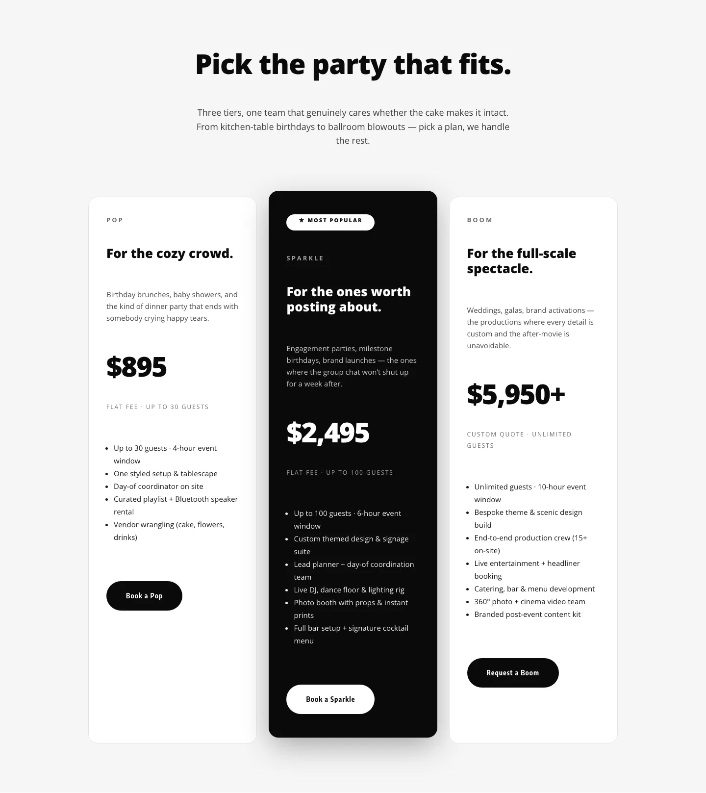
Playful Three-Tier Event Pricing Section for Divi 5
pricing · events · playful

Bold Agency Pricing Page: Blackline Studio Divi 5 Layout
pricing · agency · bold