
Playful Agency Pricing Section: Flat-Rate Divi 5 Layout
A playful, single-plan pricing section for creative agencies. Bold green palette, one flat monthly rate, perks list, and a friendly CTA. Drop-in Divi 5 JSON.
Rate this element
Download this section, free
- Divi 5 JSON, imports in seconds
- Commercial license included
- No account needed
Click to view the full page
Overview
This is a single pricing section built as two stacked rows on a soft mint background (#f0fdf4) with 96px of top-and-bottom breathing room and 24px of side padding: enough air that the offer never feels crowded, even on ultra-wide displays.
The first row narrows to 720px and centers a green tracked eyebrow ("★ HOW WE CHARGE"), a heavyweight 52px display heading in deep forest (#064e3b), and a 19px supporting paragraph. Everything is center-aligned so the eye slides straight down to the second row, which narrows further to 640px and holds the actual offer card. The card itself is white, wrapped in a 2px bright-green border with 28px rounded corners and a soft green preset3 drop shadow (28px offset, 60px blur, rgba(22,163,74,0.28)). The whole thing reads like a sticker floating on the page.
Inside the card, a Pexels lifestyle image with 20px rounded corners anchors the top. Below it sit a smaller uppercase eyebrow, a 44px "The Full Send" headline, an oversized 72px price treatment ($4,950 / month) built with inline HTML inside a Text module, a seven-item feature list with hand-styled green ✓ marks, and a full-width green CTA button (Start the partnership →) that reuses the border color. A smaller text link ("Book a 20-min vibes check") sits underneath as a lower-commitment secondary path.
The color story reads mint stage → forest headline → jade accent → white card, and every green in the section comes from the same three shades. Because both rows use max-widths, centered text, and a flex-column card layout, mobile behavior is graceful without any custom breakpoints: the intro and card stack naturally, the section's 24px horizontal padding keeps the card off the screen edge, and the raw-HTML price line reflows as ordinary text rather than a fragile grid.
What’s inside
- Two-row layout: a 720px intro block sitting above a 640px offer card, both centered on a mint (`#f0fdf4`) section with 96px vertical padding
- White card wrapped in a 2px green border, 28px rounded corners, and a soft `preset3` green shadow that gives it a floating-sticker feel
- Pexels lifestyle image at the top of the card with matching 20px rounded corners and 28px bottom margin
- Two uppercase tracked eyebrows (3px letter-spacing, `#16a34a`) sitting above the section heading and the card heading
- Oversized 72px price treatment (`$4,950 / month`) built with inline HTML inside a Text module so you can edit it in one place
- Seven-item feature list with hand-styled green ✓ checkmarks, tuned line-height, and playful agency-voice copy
- Full-width green CTA button plus a smaller secondary text link ("Book a 20-min vibes check") for hesitant visitors
- Built with only native Divi 5 Section, Row, Column, Text, Heading, Image, and Button modules. No third-party plugins
Who it’s for
This lands most naturally for creative and design agencies selling a productized, flat-rate service: the "one plan, cancel anytime" subscription model made popular by studios like DesignJoy. It works equally well for freelance collectives, brand studios, motion shops, no-code build teams, and small dev pods that want to skip tier fatigue and put a single number in front of prospects. The playful copy tone ("bring on the chaos," "vibes check," "yell at us live") signals a founder-led, personality-driven shop rather than a corporate consultancy, so it fits best when the surrounding brand voice is already loose. If your offer has multiple tiers, add-ons, or an enterprise sales motion, this layout will fight you. Reach for a comparison table instead.
Customization tips
Every green in the section comes from one of three shades: #f0fdf4 (background), #16a34a (accent, border, shadow, CTA), and #064e3b / #166534 (headings and body). Swap the accent to your brand color once and the eyebrow, border, shadow, checkmarks, price, and button all fall in line. Keep the main heading under about 32 characters so it stays on one or two lines at 52px, and cap the subhead around 140–160 characters. The seven feature bullets are the sweet spot, adding more will push the card taller than a laptop viewport. Replace the Pexels image with something landscape around 940×650 (roughly 3:2); the 20px radius forgives most compositions, but center your subject. The price line is inline HTML inside a Text module, so open that block and edit the $4,950 and / month spans directly. Keep them together so the line doesn't break awkwardly on mobile.
How to install this layout
- Download the layout JSON file from this page.
- Open the target page in the Divi 5 builder.
- Open the portability panel (up/down arrows icon) and choose the Import tab.
- Upload the JSON. Tick “replace existing content” only for full-page imports.
- Check the page at desktop and mobile widths, then swap in your copy and images.
Full walkthrough with troubleshooting: How to Import a Divi 5 Layout.
Questions about Playful Agency Pricing Section: Flat-Rate Divi 5 Layout
How does the pricing card behave on mobile?
The card row is capped at 640px and sits inside a section with 24px horizontal padding, so on phones it fills the screen with tidy 24px gutters. The card is a flex column with center alignment, so the image, price, feature list, and button stay stacked in order. Nothing floats or reflows into columns.
What should I edit first when I drop this into my site?
The price line. It's inline HTML inside a single Text module (a 72px price span plus a smaller cadence span) so open that block and swap `$4,950` and `/ month` before touching anything else. Then rewrite the seven feature bullets and the CTA button label to match your offer.
Which Divi 5 modules is this actually built from?
Just Section, Row, Column, and then Text, Heading, Image, and Button modules inside. No blurbs, no code modules, no third-party plugins. If you're comfortable editing Divi text and heading blocks, you can rewrite the whole section in about fifteen minutes.
Can I turn this into a two- or three-plan comparison?
Yes, but it means rebuilding the card row. The current row uses a single `4_4` column capped at 640px. Duplicate the column, remove the max-width on the row, switch the row structure to `1_3 1_3 1_3`, and trim the 40px side padding inside each card so three of them fit comfortably.
Is the image required?
No. It sits at the top of the card as a standalone Image module with a 28px bottom margin. Delete it and the small eyebrow slides up to become the first thing in the card. If you keep it, aim for a landscape shot around 940×650 with the subject centered. The 20px radius trims the edges.
Which Divi version does this layout need?
Divi 5. The layout is generated natively for Divi 5 and validated against its real module structure before publication, so it imports clean into the current builder.
Can I use this layout on client websites?
Yes. Every download includes a commercial license covering unlimited sites you own or build for clients. Only reselling or redistributing the layout file itself is prohibited.
More pricing tables
Browse all pricing tables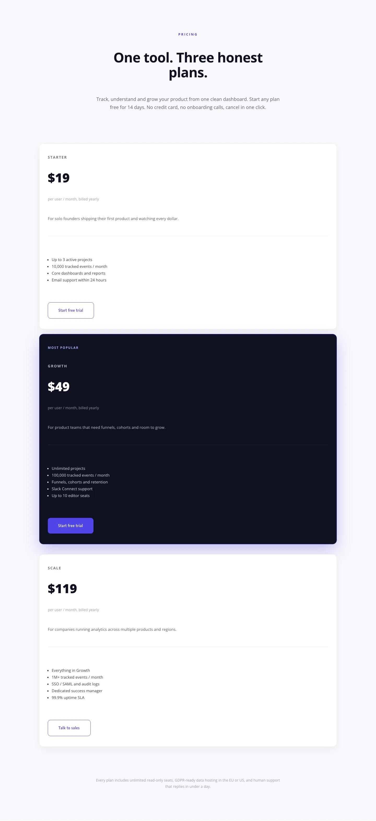
Minimal SaaS Pricing Section: 3-Tier Plan Cards with Featured Dark Tier | Divi 5 Layout
pricing · saas · minimal
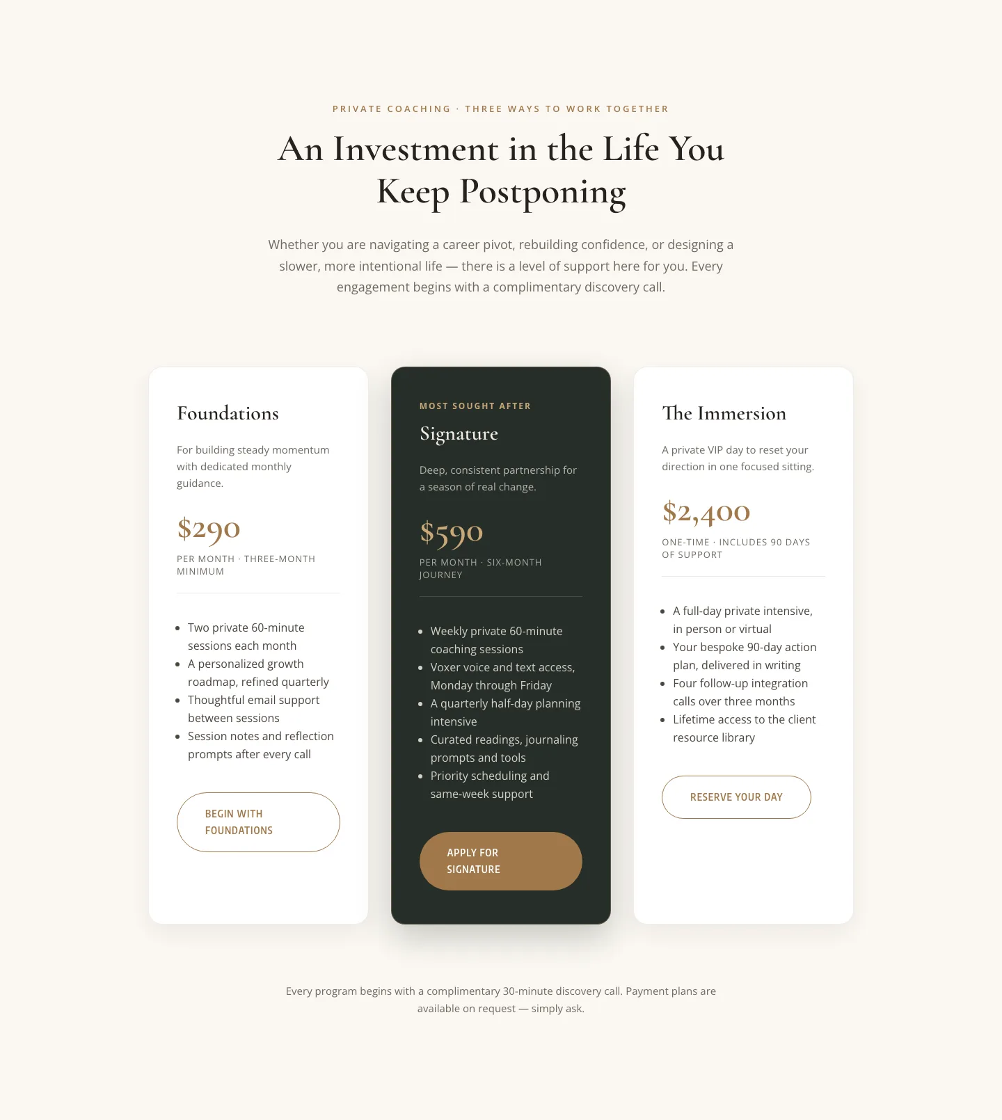
Elegant Coaching Pricing Section: 3-Tier Divi 5 Layout
pricing · coaching · elegant
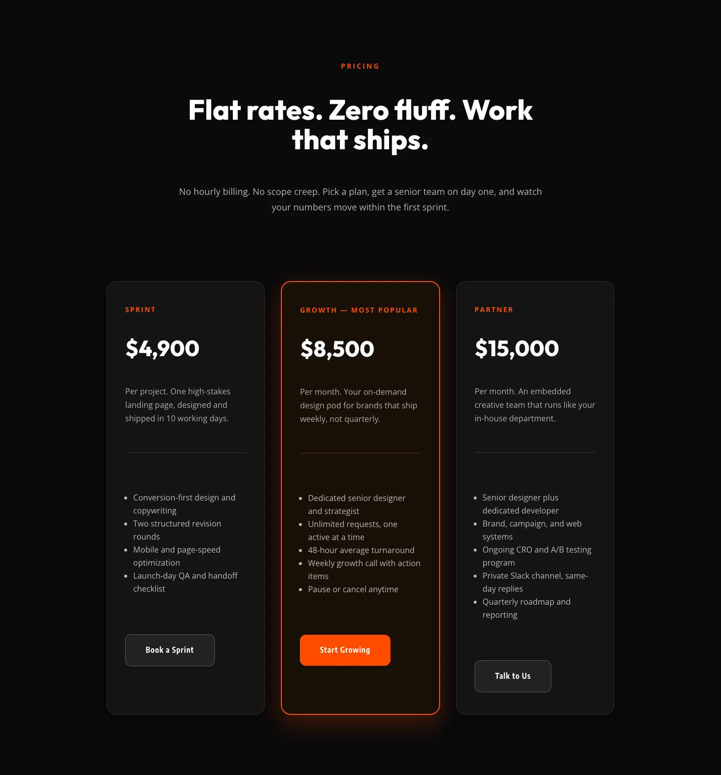
Bold Agency Pricing Section: Dark 3-Tier Divi 5 Layout
pricing · agency · bold
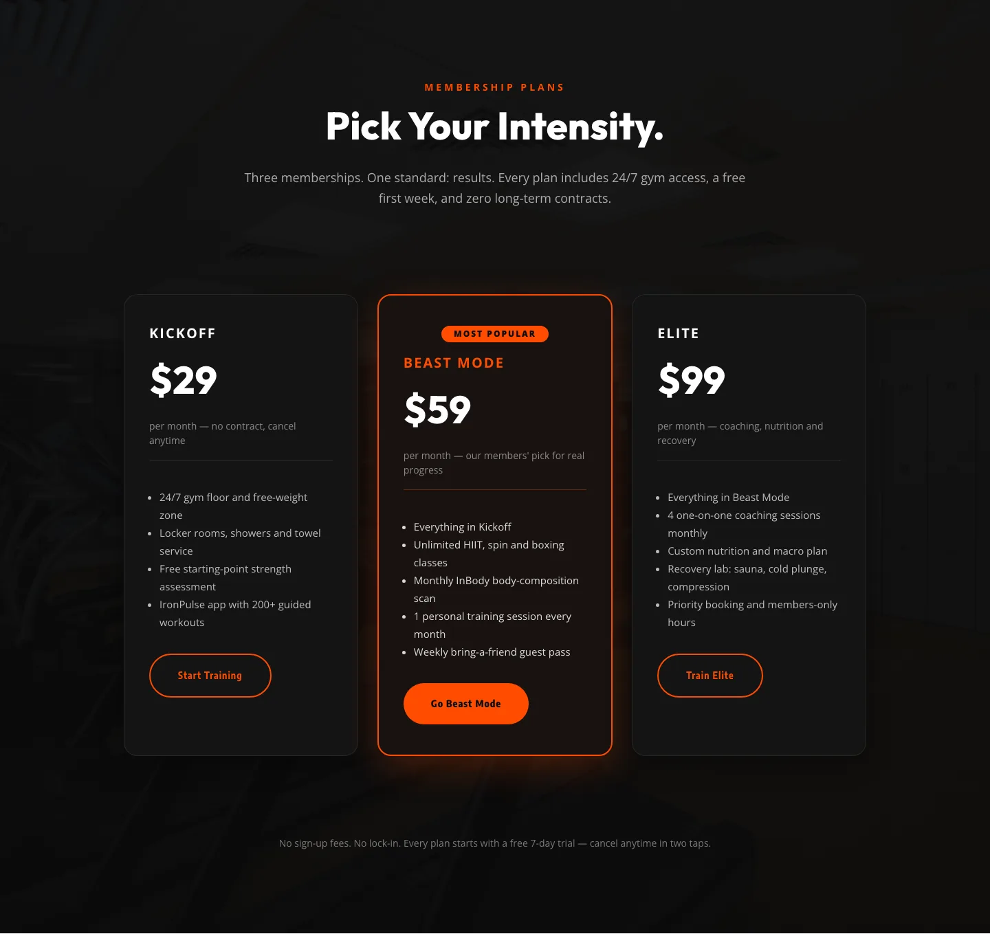
Bold Fitness Pricing Table: Dark Gym Membership Plans Divi 5 Layout
pricing · fitness · bold
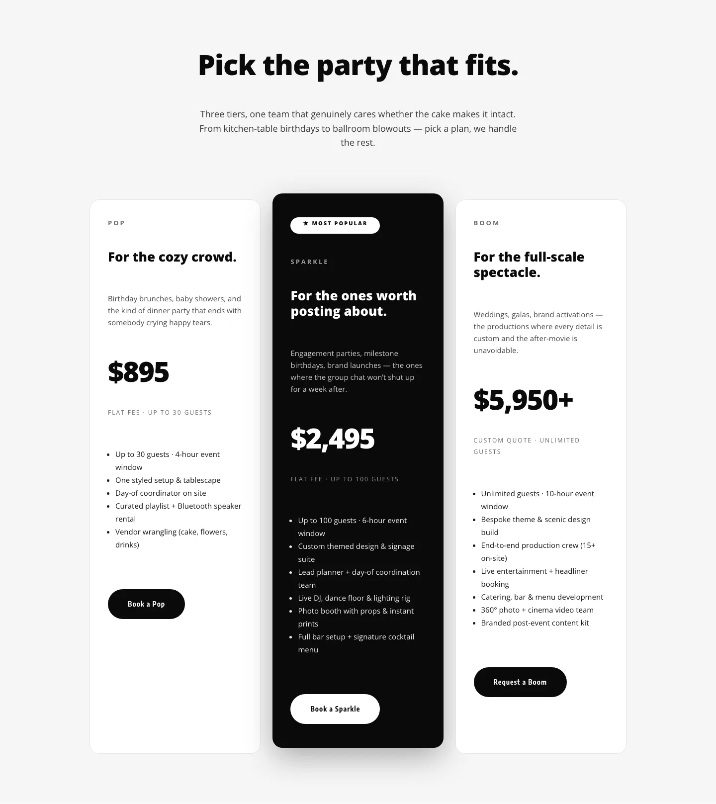
Playful Three-Tier Event Pricing Section for Divi 5
pricing · events · playful

Bold Agency Pricing Page: Blackline Studio Divi 5 Layout
pricing · agency · bold