
Bold Portfolio FAQ Section: Free Divi 5 Layout
Free Divi 5 FAQ section for portfolio studios. Bold dark-green design with two-column Q&A grid covering scope, timeline, pricing, and ownership. Download the JSON.
Rate this element
Download this section, free
- Divi 5 JSON, imports in seconds
- Commercial license included
- No account needed
Click to view the full page
Overview
The section drops onto a deep forest ground (#0a2218) that lets the emerald accent (#10b981) and mint body copy (#a7f3d0) do the heavy lifting, a palette that reads as confident and studio-grade without a single stock photo. The intro block is fully centered inside an 820px cap: a tight uppercase eyebrow ("FAQ" at 13px, 5px letter-spacing, emerald), an oversized H2 in Outfit 800 at 68/72 that steps down to 48/54 on tablet and 38/44 on phone, and a 640px-wide lead paragraph in mint. Vertical rhythm is deliberate (18px, then 22px, then a 40px shoulder into the Q&A grid) so the eye settles before it starts scanning questions.
The Q&A itself is a 1_2 / 1_2 row holding eight questions, four per column, each one built from three native Divi 5 modules: a 26px emerald FontAwesome question-mark icon (f128), a 23px white H3 in Outfit 700, and a 16px mint body paragraph at 1.7 line-height. Every Q&A block is separated from the next by a consistent 40px bottom margin, and the last card in each column drops that margin to zero so both columns land on the same baseline. Section padding tapers cleanly across breakpoints (110px → 80px → 64px), and on phone the columns switch to a single stack via flexDirection: column, no cramped side-by-side reading, no orphan lines. Because everything is typography and icons (zero images) the section stays fast, easy to translate, and simple to recolor at the module level.
What’s inside
- Two-column Q&A grid holding eight questions total (four per column): no accordion, everything scannable at a glance
- Native Divi 5 Heading, Text, and Icon modules only. No third-party plugins or shortcodes
- FontAwesome question-mark glyph (`f128`) at 26px in emerald anchoring every question card
- Centered intro trio: uppercase 13px eyebrow, oversized H2 title, and a 640px-capped mint lead paragraph
- Responsive H2 typography stepping 68px desktop → 48px tablet → 38px phone with matching line-heights
- Deep-green section (`#0a2218`) with emerald + mint accent system, set entirely in Outfit
- Columns stack cleanly on phone via `flexDirection: column`; section padding tapers 110/80/64px
- No image assets required: entirely typography and one repeated icon, so it stays light and fast
Who it’s for
Design studios, creative directors, freelance brand and web designers, photographers, illustrators, and small creative agencies who need to answer scope, timeline, and pricing questions before a lead ever hits the contact form. The sample copy is written for service work with real deliverables (process, revisions, ownership, retainers) so it also lands cleanly for editorial content shops, animation studios, product-design consultancies, and boutique dev+design teams. If your portfolio positioning leans confident and craft-forward rather than corporate, this palette and rhythm will feel native. Wedding photographers, tattoo studios, architects, and interior stylists working in a dark-luxe aesthetic can drop it in without rebuilding hierarchy.
Customization tips
The palette lives in four values: swap #0a2218 for your section background, #10b981 for the eyebrow and icon accent, #a7f3d0 for body copy, and #FFFFFF for the H3 questions. Every colored element is set at the module level rather than baked into a global preset, so recoloring the whole section is a ten-minute pass. Keep questions to a single line (roughly 50–60 characters) so they don't wrap awkwardly on tablet; keep answers to two or three sentences (150–220 characters) so both columns end at similar heights. To add a ninth question, duplicate the icon + heading + text triplet inside either column and reset the last card's bottom margin to 0px to preserve the flush baseline. To swap the question-mark glyph for a plus, star, or chevron, edit the Icon module in place. No image assets need to be sourced. Outfit is the only typeface in play; changing it in one Heading and one Text module ripples across the whole section.
How to install this layout
- Download the layout JSON file from this page.
- Open the target page in the Divi 5 builder.
- Open the portability panel (up/down arrows icon) and choose the Import tab.
- Upload the JSON. Tick “replace existing content” only for full-page imports.
- Check the page at desktop and mobile widths, then swap in your copy and images.
Full walkthrough with troubleshooting: How to Import a Divi 5 Layout.
Questions about Bold Portfolio FAQ Section: Free Divi 5 Layout
How does the two-column layout behave on mobile?
The row's phone-level `flexDirection` is set to `column`, so under ~767px both columns collapse into a single vertical stack. Questions read top-to-bottom without any side-by-side compression. Section padding also tapers from 110px down to 64px on phone so the block doesn't feel bloated on smaller screens.
Which Divi 5 modules is this built from?
Three: Heading (used for the H6 eyebrow and the H2 title), Text (used for the lead paragraph and for each Q&A card, the H3 question and body paragraph live inside the same Text module using headingFont + bodyFont overrides), and Icon (the repeated FontAwesome question mark). No accordion module, no toggle, no third-party dependency.
What should I edit first?
Rewrite the intro trio (the "FAQ" eyebrow, the "Questions, answered." H2, and the mint lead paragraph) so the section sounds like your studio. Then work through the eight Q&A blocks in order. The sample copy is scoped to a design studio (projects, timeline, revisions, ownership, retainers) and is meant as a scaffold you overwrite question by question.
Can I add or remove questions?
Yes. Each Q&A is a self-contained icon + heading + text triplet inside one column. Duplicate the triplet to add a question, delete it to remove one. Keep four per column for symmetry, or run three-and-five and just reset whichever card lands last in each column to `margin-bottom: 0` so the baselines still align.
Are any images or stock photos required?
None. The section is entirely typography plus one FontAwesome icon repeated eight times, so there's nothing to source, license, or optimize. That also keeps the download tiny, Core Web Vitals untouched, and translation into other languages painless. You only ever edit text.
Which Divi version does this layout need?
Divi 5. The layout is generated natively for Divi 5 and validated against its real module structure before publication, so it imports clean into the current builder.
Can I use this layout on client websites?
Yes. Every download includes a commercial license covering unlimited sites you own or build for clients. Only reselling or redistributing the layout file itself is prohibited.
More faq sections
Browse all faq sections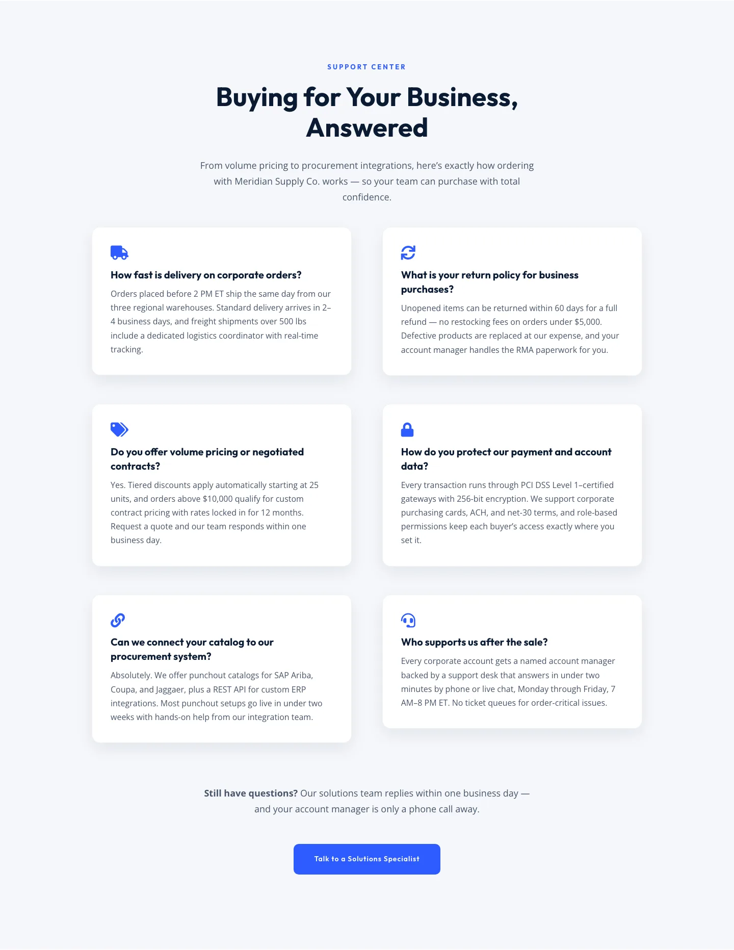
Corporate Ecommerce FAQ Section: Divi 5 Layout
faq · ecommerce · corporate
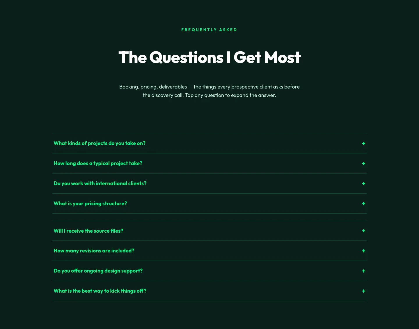
Bold Portfolio FAQ Section: Divi 5 Layout
faq · portfolio · bold
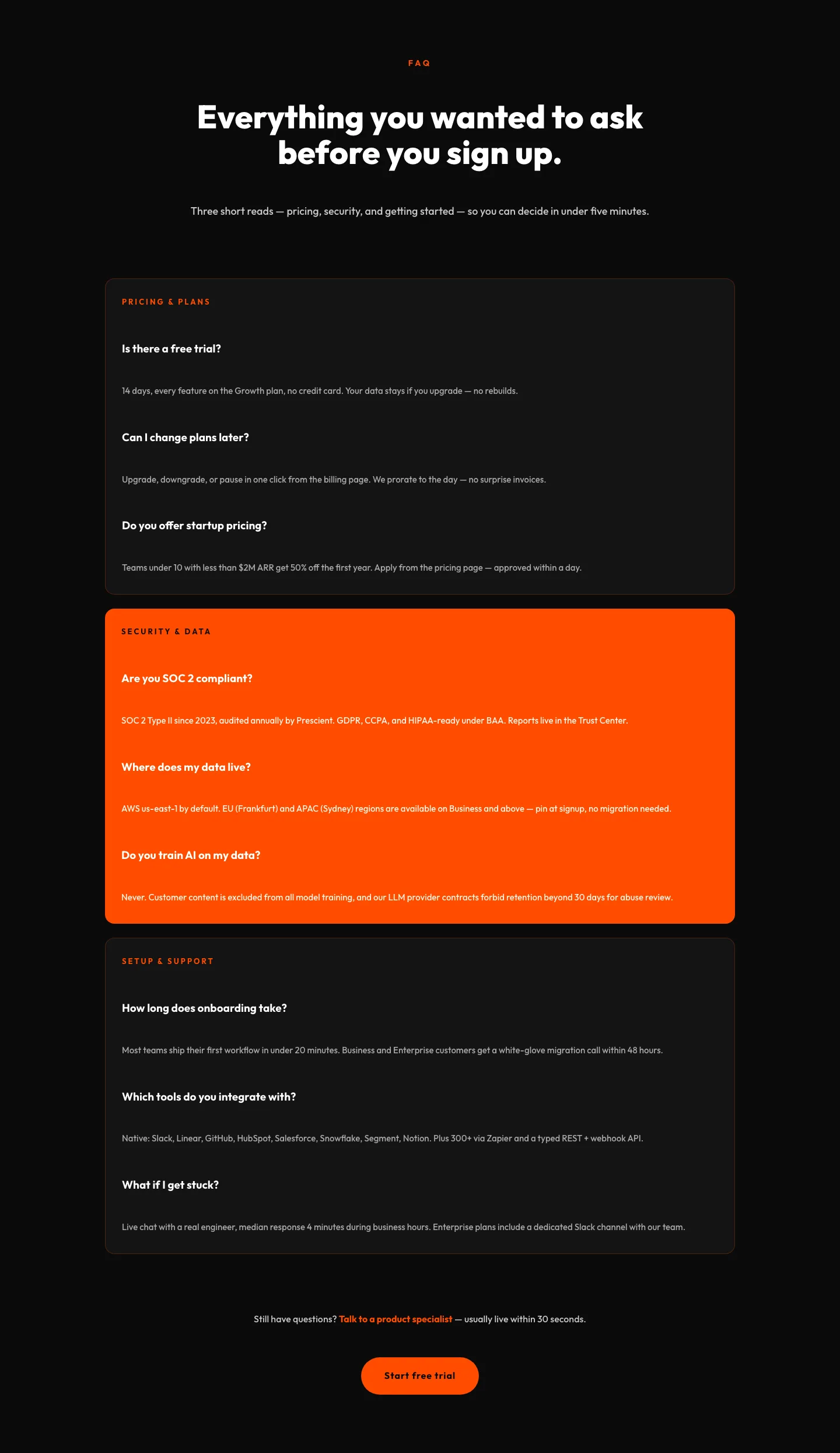
Bold SaaS FAQ Section: Divi 5 Layout
faq · saas · bold
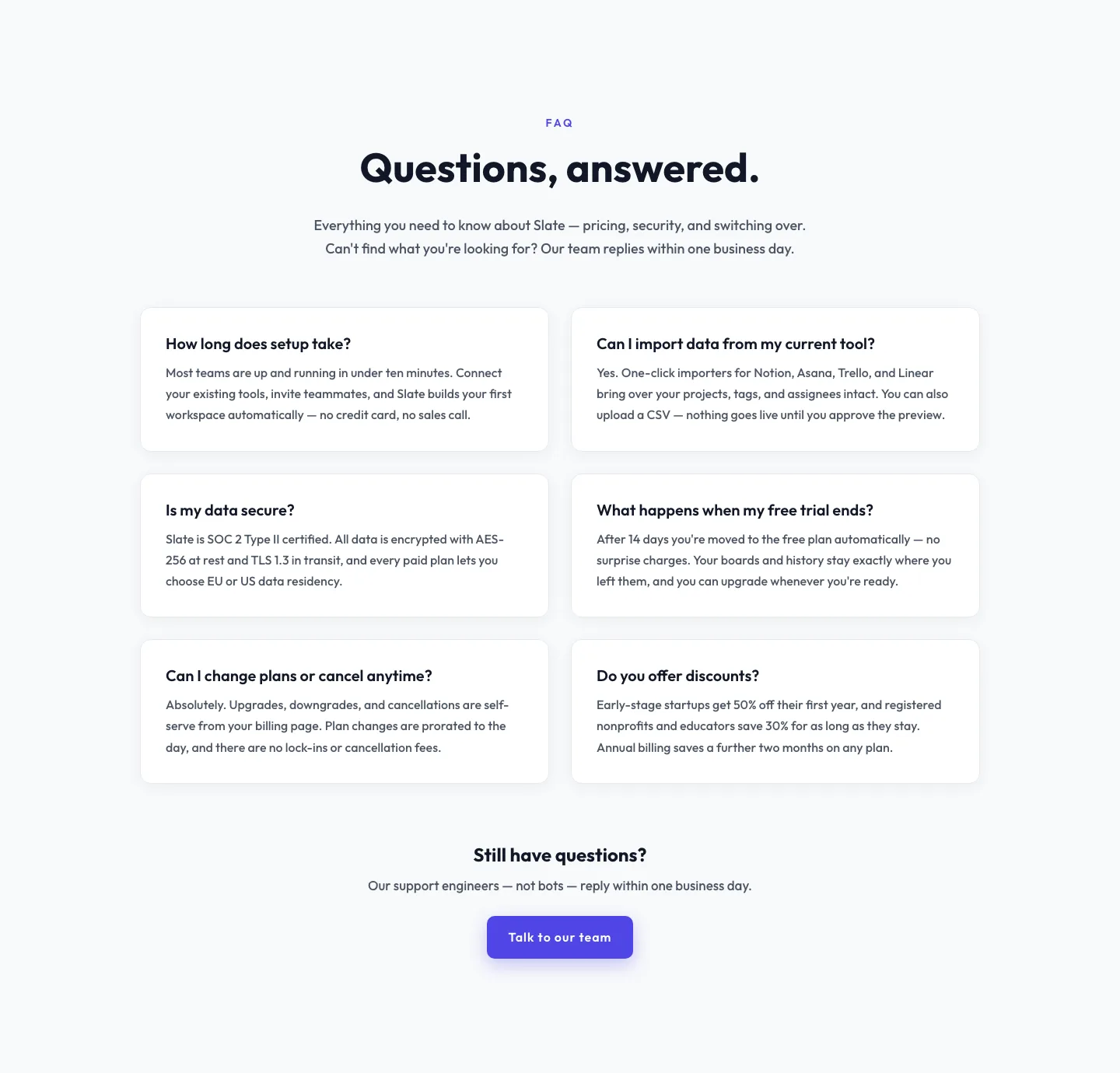
Minimal SaaS FAQ Section: Two-Column Card Layout for Divi 5
faq · saas · minimal
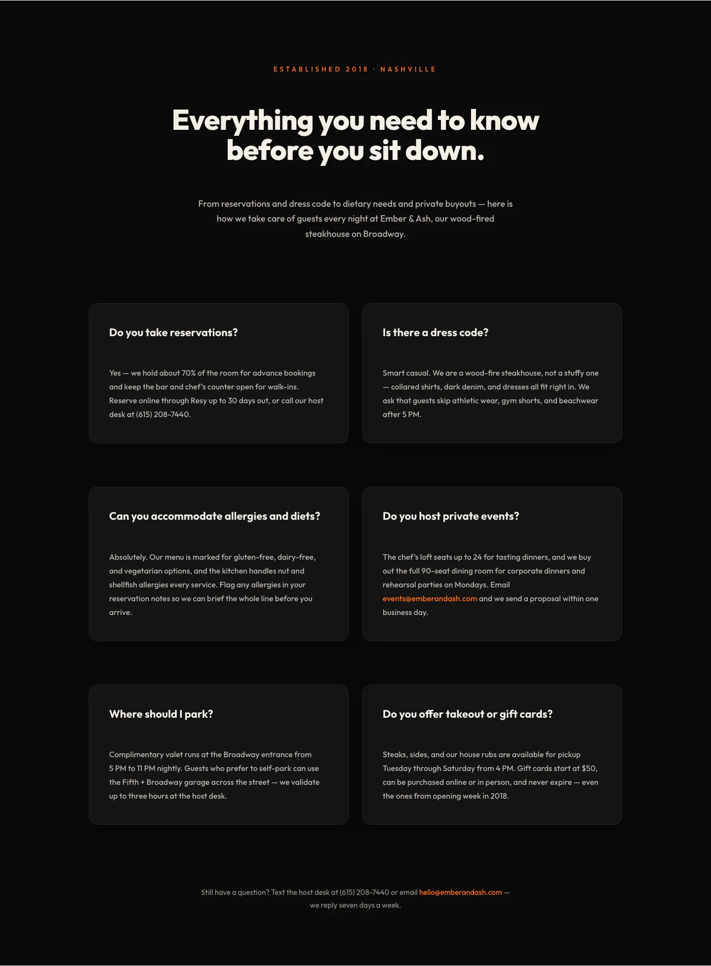
Bold Restaurant FAQ Layout: Wood-Fired Steakhouse Guest Questions | Divi 5
faq · restaurant · bold
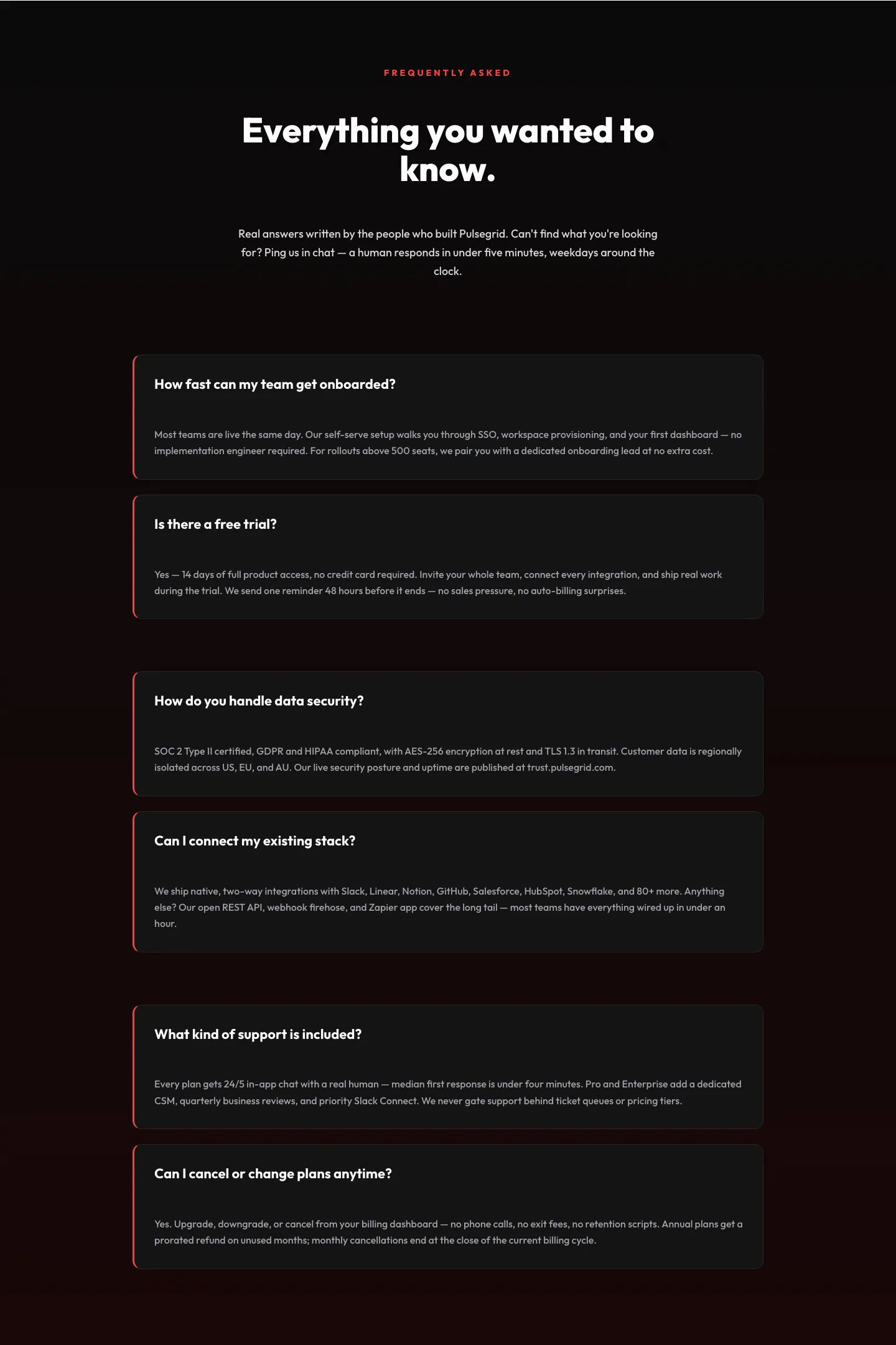
Bold SaaS FAQ Section: Two-Column Accordion Divi 5 Layout
faq · saas · bold