
Commercial Real Estate Advisory Landing Page: Divi 5 Layout
A corporate Divi 5 full landing page for commercial real estate advisory and brokerage. Navy-and-gold design with hero, stats, services, process, testimonials, pricing tiers, FAQ, and CTA. Import-ready JSON.
Rate this element
Download this section, free
- Divi 5 JSON, imports in seconds
- Commercial license included
- No account needed
Click to view the full page
Overview
Meridian Cornerstone is a seven-section corporate landing page built around a deep navy (#0f2a43) and antique-gold (#c9a24b) palette that reads as institutional without feeling stuffy. The hero uses a balanced 1/2 + 1/2 row: a gold eyebrow, a 56px white headline on 1.05 line-height, a 19px supporting paragraph, and paired primary/ghost buttons on the left, with a rounded, heavily shadowed portfolio image on the right. On phone the row collapses to a single column and the headline steps down to 36px so nothing overflows.
Below the fold, a white stats strip runs four Number Counter modules (12M sq ft, 40 markets, 98% retention, 27 years) at 56px in a flex-wrap row that keeps the numbers legible on tablet. The "Why Meridian" grid is four 1/4 white cards on a #f4f6f9 canvas, each with a gold Font Awesome icon, 21px h3, and a hover box-shadow lift from preset2 to a deeper preset2. A subtle interaction that signals premium without animation gimmicks.
The rest of the page walks a buyer from interest to booking: a numbered 01/02/03 process row, a three-up Testimonial row on the same soft-grey canvas, a three-tier pricing block where the middle "Professional" card is elevated with a gold border, translateY, and a gold shadow, six border-separated FAQ entries in an 860px reading column, and a closing 46px CTA on a gradient-overlaid Pexels photo. Section padding of 100–120px desktop drops to 64px on phone so the page keeps rhythm on small screens.
What’s inside
- Split hero row (1/2 + 1/2) with gold eyebrow, 56px headline, supporting paragraph, and paired solid/ghost buttons over a rounded shadowed image
- Four-metric stats strip using native Number Counter modules with a flex-wrap row so counters reflow cleanly at tablet widths
- "Why Meridian" four-card feature grid on a #f4f6f9 canvas with Font Awesome icons, h3 titles, and a preset2 hover box-shadow lift
- Numbered 01/02/03 process row rendered as three 1/3 columns with 64px gold numerals and short h3 + paragraph blocks
- Three-up testimonial row using native Divi Testimonial modules with portrait, name, job title, and rounded white cards
- Three-tier pricing block where the middle card is elevated via translateY(-16px), a 2px gold border, and a gold-tinted preset3 shadow
- Six-item FAQ stack in an 860px max-width column, each entry separated by a 1px bottom border for a clean accordion-style read
- Closing CTA section with a Pexels background image, dark navy gradient overlay, centered 46px headline, and a gold primary button
Who it’s for
Built for commercial real estate advisory firms, brokerages, and investment sales teams that need to look institutional on first impression: the kind of firm pitching family offices, REITs, and CFOs rather than first-time homebuyers. The structure (stats, process, pricing tiers, testimonials, FAQ) also fits adjacent professional-services businesses that sell high-consideration engagements: boutique wealth managers, private equity placement agents, M&A advisors, corporate law firms, commercial insurance brokers, and asset management consultancies. Anyone who needs to communicate rigor, track record, and tiered engagement models on a single scrollable page will get more mileage out of this template than a generic "services" layout.
Customization tips
The whole palette hinges on two swatches: navy #0f2a43 (hero, CTA, dark cards) and gold #c9a24b (accents, primary buttons, elevated card border). Swap those globally and the page rebrands cleanly: try forest/brass for law, charcoal/copper for M&A, or midnight/silver for wealth management. #f4f6f9 is the neutral canvas between dark sections; keep it desaturated so the alternating rhythm still reads. Hero headline works best at 6–9 words; the supporting paragraph is comfortable up to about 220 characters before the right-side image starts to feel short. Stat titles should stay under 30 characters or they wrap awkwardly under the 56px numeral. Feature card body copy holds ~180 characters cleanly. Pricing bullets look tightest at 4–5 items per tier. Hero and CTA images want a landscape 940×650 aspect (roughly 3:2), anything portrait will letterbox inside the 16px rounded corners.
How to install this layout
- Download the layout JSON file from this page.
- Open the target page in the Divi 5 builder.
- Open the portability panel (up/down arrows icon) and choose the Import tab.
- Upload the JSON. Tick “replace existing content” only for full-page imports.
- Check the page at desktop and mobile widths, then swap in your copy and images.
Full walkthrough with troubleshooting: How to Import a Divi 5 Layout.
Questions about Commercial Real Estate Advisory Landing Page: Divi 5 Layout
How does the layout behave on mobile?
Every row has a phone-level `flexDirection: column` override, so the hero split, four-card feature grid, three-step process, testimonials, and pricing tiers all stack vertically. Hero and section headings step down (56px → 36px, 40px → 30px, 46px → 32px) and hero/section padding drops from 100–120px to 64px so the page keeps its rhythm without overwhelming small screens.
Which Divi 5 modules are used?
Native modules only: Heading, Text, Button, Image, Icon, Number Counter, and Testimonial. No third-party plugins, no custom code. The pricing tiers and feature cards are built from styled columns (background, padding, radius, box-shadow) rather than a paid pricing-table add-on, so you can restyle them with preset changes.
Where do the images come from and can I replace them?
The hero photo and CTA background are Pexels URLs (`images.pexels.com/...`). Swap them for your own by editing the Image module `src` in the hero and the Section background `image.url` on the closing CTA. The gradient overlay on the CTA (navy 0.93 → 0.88) is what keeps text legible, keep it enabled when you change the photo.
What should I edit first to make it my own?
Start with the hero eyebrow, headline, and supporting paragraph, then update the four Number Counter values and their titles. Those numbers carry the credibility story. Next, rewrite the four "Why" cards, then the three pricing tiers (labels, prices, bullet lists). Testimonials, FAQ answers, and the closing CTA copy can come last.
How do I remove or rearrange the pricing tiers?
Each tier is a 1/3 column inside the pricing row. Delete a column to drop to two tiers (the row will rebalance), or duplicate the middle "Professional" column and adjust the `translate` transform to move the emphasized card. To flatten the highlight, remove the `translate.y = -16px`, drop the 2px gold border, and switch the box shadow from preset3 back to preset2.
Can I turn the FAQ list into a real accordion?
Yes. Each Q&A is currently a Text module with an h4 and paragraph, separated by a 1px bottom border. To convert, replace each Text module with a Divi Toggle module (or wrap them in an Accordion) and paste the question into the title and the paragraph into the content. The 860px max-width column and section padding stay the same.
Which Divi version does this layout need?
Divi 5. The layout is generated natively for Divi 5 and validated against its real module structure before publication, so it imports clean into the current builder.
Can I use this layout on client websites?
Yes. Every download includes a commercial license covering unlimited sites you own or build for clients. Only reselling or redistributing the layout file itself is prohibited.
More full landing pages
Browse all full landing pages
Brightwell Family Dental: Minimal Medical Landing Page for Divi 5
full_landing · medical · minimal

Aurelia Smile Studio: Bold Medical Landing Page for Divi 5
full_landing · medical · bold

Caldwell & Pierce: Corporate Legal Landing Page for Divi 5
full_landing · legal · corporate
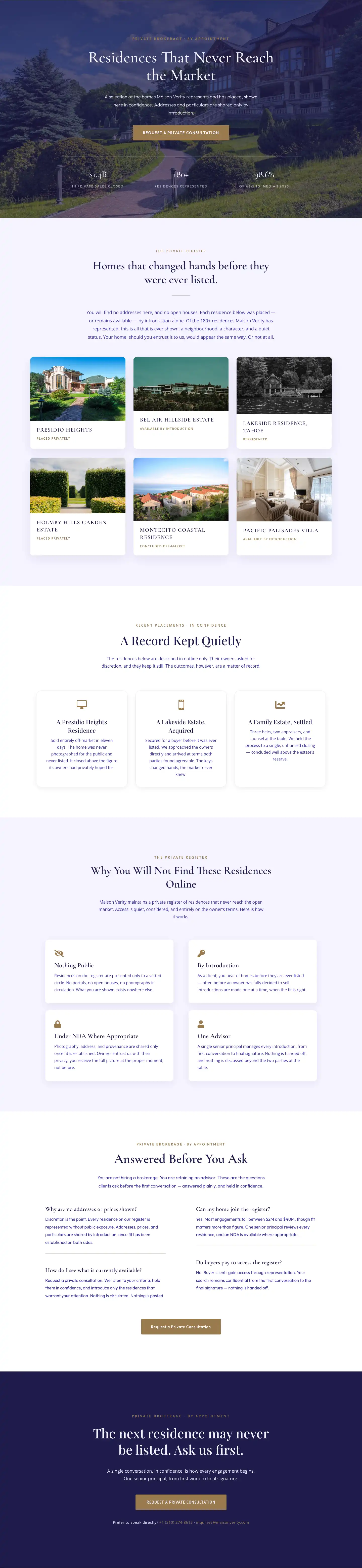
Maison Verity: Elegant Real Estate Residences Page for Divi 5
full_landing · real_estate · elegant
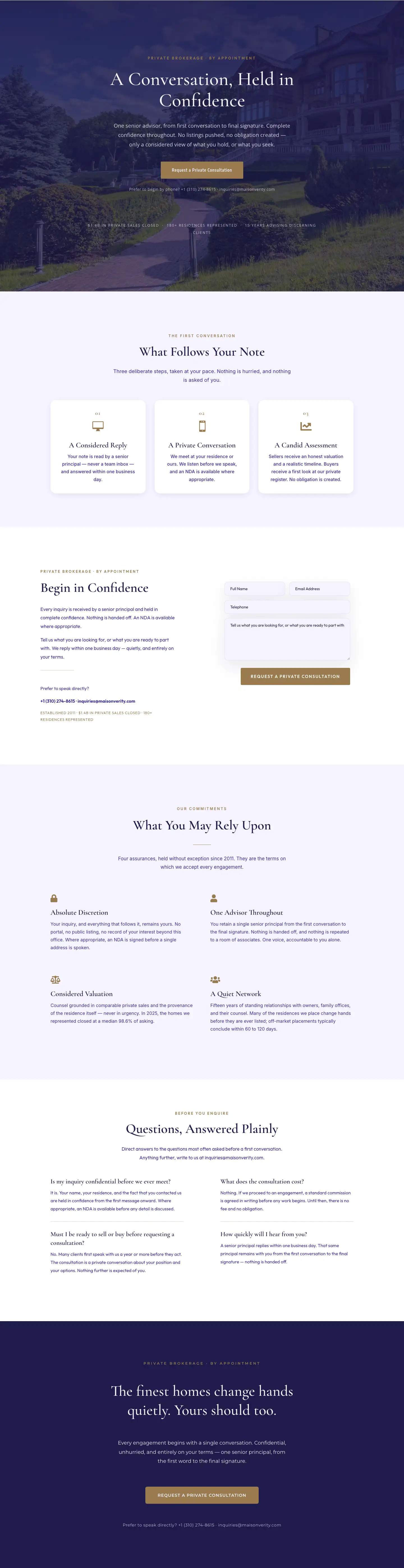
Maison Verity: Elegant Real Estate Private Consultation Page for Divi 5
full_landing · real_estate · elegant
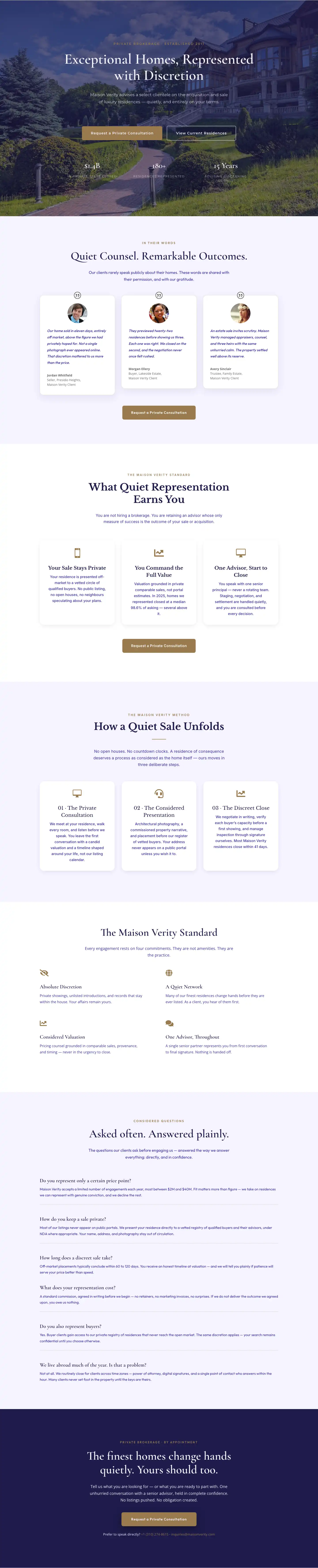
Elegant Luxury Real Estate Landing Page: Divi 5 Layout
full_landing · real_estate · elegant