
Elegant Coaching Services Cards: Divi 5 Layout
A refined three-card services section for executive and leadership coaches. Cormorant Garamond headings, warm cream background, gold accents, and hover-lift cards.
Rate this element
Download this section, free
- Divi 5 JSON, imports in seconds
- Commercial license included
- No account needed
Click to view the full page
Overview
The section opens with a centered 48px Cormorant Garamond headline in deep charcoal (#1a2a2e) sitting on a warm cream field (#f7f3ee), balanced by an Inter subhead capped at 640px so the intro reads like a printed page rather than a full-width banner. Beneath it, three equal 1/3 columns present the coaching offers as raised white cards: 20px radius, generous 40px/36px inner padding, and a soft preset3 shadow (rgba(26,42,46,0.12)) that lifts them off the cream without shouting.
Each card follows the same vertical rhythm: a 44px brass Divi Icon (#b38a5a), a 26px Cormorant Garamond h3, a 16px Inter body paragraph in a muted slate (#4a5556), and a 15px semi-bold text link in the same brass with a darker hover state (#8f6a3f). An 18px row-gap keeps the stack breathable, and a hover transform slides the whole card up 6px so it responds to intent without animation clutter. Stretch alignment on the row means uneven copy lengths never leave one card looking cropped next to its neighbours.
Section spacing is deliberately editorial (110px top and bottom on desktop, 72px on phone) and the layout resolves gracefully on smaller screens: the three-up grid wraps on tablet and stacks into a single column on phone, where the headline steps down from 48px to 34px so it stays comfortable to read. The palette does most of the work: cream, white, and brass reads as unhurried and considered, which is exactly what a coaching audience is looking for when they land on a services page.
What’s inside
- Three equal 1/3 white cards laid out with a 32px column gap and stretch alignment so uneven card copy stays balanced
- Centered intro with a 48px Cormorant Garamond h2 and an Inter subhead capped at 640px for readable line lengths
- Divi Icon module (44px, brass #b38a5a) at the top of every card. Swap the unicode in the icon picker to change it
- Cormorant Garamond h3 titles paired with Inter body copy and a semi-bold in-card text link with a defined hover colour
- Raised card treatment on cream: 20px border-radius, preset3 box-shadow, 40px vertical / 36px horizontal inner padding
- Subtle hover interaction: each card translates up 6px on hover, no fade, no overlay, no image swap
- Editorial section spacing: 110px vertical padding desktop, 72px phone, with wrap → single-column flex behaviour across breakpoints
- Built from stock Divi 5 modules only (Section, Row, Column, Heading, Text, Icon) no blurbs, plugins, or child themes
Who it’s for
Written for executive coaches, leadership consultants, and boutique advisors selling a small number of premium engagements rather than high-volume programs. The three-card structure suits practices with a clear tier ladder: a short intensive, a longer partnership, and a group or team format. The muted cream-and-brass palette and serif headline read as considered rather than corporate, which lands well for therapists, mindfulness teachers, family-office advisors, and boutique law or finance practices too. It also works for wellness studios, private guides, and hospitality operators presenting a set of curated services. If your buyer is time-poor and quality-signal-sensitive, this section speaks their language without hard-selling.
Customization tips
Swap the accent colour first: the brass (#b38a5a for icons and links, #8f6a3f for the link hover) drives most of the mood, so pushing it toward forest, indigo, or terracotta changes the whole feel while the neutrals stay intact. Card titles read best at 3–5 words; body copy holds up to about 45–55 words per card before the row-gap starts to feel tight. Icons come from Divi's built-in set, so pick a unicode from the icon picker rather than importing SVGs. Fonts are Cormorant Garamond and Inter (both free on Google) but a Playfair Display / Manrope pair drops in cleanly if those are already on your site. If you need a fourth offer, either duplicate a column and let the row wrap to 2+2, or switch to a 1_4 quad; the stretch alignment will keep card heights matched. Reduce section padding to 80px/56px on tighter templates. No photography is used, so there's nothing to crop.
How to install this layout
- Download the layout JSON file from this page.
- Open the target page in the Divi 5 builder.
- Open the portability panel (up/down arrows icon) and choose the Import tab.
- Upload the JSON. Tick “replace existing content” only for full-page imports.
- Check the page at desktop and mobile widths, then swap in your copy and images.
Full walkthrough with troubleshooting: How to Import a Divi 5 Layout.
Questions about Elegant Coaching Services Cards: Divi 5 Layout
How does the three-card row behave on tablet and phone?
On tablet the row uses flex-wrap so cards drop to a 2+1 arrangement, and on phone the flex direction switches to column and each card takes full width. The intro headline also steps down from 48px to 34px on phone so it stays comfortable to read.
Which Divi 5 modules make up this section?
Just the built-in ones: Section, Row, Column, Heading, Text, and Icon. There are no Blurb modules, no third-party libraries, and no custom code. You can edit every element with the standard Divi 5 UI.
Where does the brass accent colour live so I can rebrand quickly?
Two places per card: the Icon module colour (#b38a5a) and the in-card text link colour with its hover state (#8f6a3f). Update those on each of the three columns and the whole section retunes to your palette.
What should I edit first after importing?
The three h3 titles (Clarity Intensive / Six-Month Partnership / Leadership Team Retreats), the body paragraphs beneath them, and the link destinations. Then swap the section headline and subhead. The visual system doesn't need touching for the section to work.
Do I need to source any imagery?
No, this section uses zero photos or background images. The visual weight comes entirely from typography, the cream/white/brass palette, spacing, and Divi icons, so there is nothing to license or crop before you can publish.
Which Divi version does this layout need?
Divi 5. The layout is generated natively for Divi 5 and validated against its real module structure before publication, so it imports clean into the current builder.
Can I use this layout on client websites?
Yes. Every download includes a commercial license covering unlimited sites you own or build for clients. Only reselling or redistributing the layout file itself is prohibited.
More cards
Browse all cards
Minimal SaaS Features Cards Layout for Divi 5
cards · saas · minimal

Minimal SaaS 3-Up Feature Cards Layout for Divi 5
cards · saas · minimal

Minimal SaaS Feature Cards Layout: 4-Column Divi 5 Section
cards · saas · minimal

Minimal SaaS Feature Cards Layout for Divi 5
cards · saas · minimal

Elegant Coaching Cards Layout for Divi 5: Four-Pillar Framework
cards · coaching · elegant
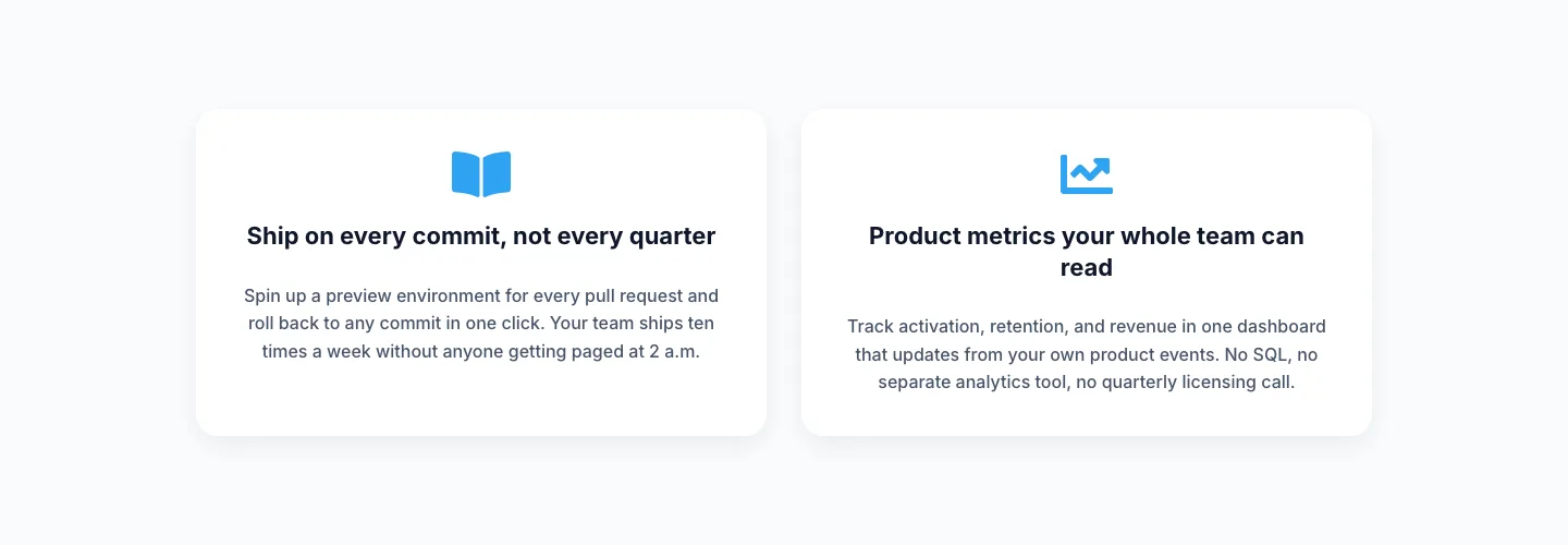
Minimal SaaS Two-Column Feature Cards
cards · saas · minimal