
Flare SaaS Churn Prediction Landing Page: Bold Divi 5 Layout
Bold, conversion-focused Divi 5 landing page for SaaS churn prediction and revenue retention products. Hero, stats, features, how-it-works, testimonials, pricing, FAQ, CTA.
Rate this element
Download this section, free
- Divi 5 JSON, imports in seconds
- Commercial license included
- No account needed
Click to view the full page
Overview
Flare opens on a deep, near-black hero (#0F0A0A) with 120px of top padding to let the message breathe. A red eyebrow (#FF4D3D, 13px, 3px letter-spacing) labels the category, then a 64px Outfit 800 headline in white anchors the fold. Dropping to 44px on tablet and 36px on phone so the line never breaks awkwardly. A 20px supporting paragraph is capped at 680px so it stays legible next to that huge headline, and the CTA row pairs a solid red primary button (#E11D2E) with a translucent outline secondary. The fold closes with a landscape product image inset in a 1000px frame, 16px radius, and a red-glow box-shadow (rgba(225,29,46,0.35) at 80px blur) that ties the imagery back to the palette.
Below the fold, a soft-pink strip (#FFF1F2) hosts a four-metric KPI row ($47M, 312, 94%, 18 days) with 52px red numerals stacked above tiny dark labels for instant credibility. The white feature section then repeats a four-tile grid on pink cards, each anchored by a 36px FontAwesome icon in the brand red (bolt, cogs, line-chart, plug), followed by a 20px heading and a 15px body cap. The 'How it works' block trades that for a three-card layout on pale pink (#FFE4E6) with oversized 64px red step numerals inside white 18px-radius containers, and testimonials keep the same three-up rhythm with 64px circular avatars and a red role byline for scannability.
Pricing sits on the pink wash again and uses a three-tier grid where the middle 'Growth' tier lifts off the page (dark #0F0A0A background, red border, and a soft red drop-shadow) while Starter and Enterprise stay on light outlined cards to make the recommendation obvious. The stacked FAQ lives in an 820px column with left-aligned questions divided by thin red hairlines, and the layout closes on a red gradient CTA (135° #7A0F1A → #E11D2E) with a 56px white headline that collapses to 34px on phones. Every row flips to a single column on phone via flexDirection: column, so buttons, cards, avatars and pricing tiers all stack cleanly without horizontal scroll.
What’s inside
- Dark #0F0A0A hero with an Outfit 800 headline, dual-CTA row (solid red + translucent outline) and a framed product image with a red-glow box-shadow
- Four-column KPI strip on #FFF1F2 with 52px red numerals over 14px dark labels for financial and adoption metrics
- Four-tile feature grid on pink cards with 36px FontAwesome icons (bolt, cogs, line-chart, plug) and centered heading + body copy
- Three-step 'How it works' row using oversized 64px red step numerals inside white 18px-radius cards
- Three-column testimonial section with 64px circular avatars, centered quote body, name heading and a red uppercase role byline
- Three-tier pricing block with an elevated dark middle tier (red border + red drop-shadow) and a 'MOST POPULAR' ribbon heading
- Six-question stacked FAQ inside an 820px column with divi dividers between each Q/A pair
- Red-gradient closing CTA (135° #7A0F1A → #E11D2E) with a 56px white headline and a single primary button
Who it’s for
Purpose-built for SaaS teams selling a considered B2B product: retention platforms, revenue intelligence, CS automation, product analytics, or any tool whose pitch needs both bold conviction and technical proof. The KPI strip is calibrated for outcome numbers (saved ARR, seat counts, accuracy, time-to-value), and the pricing block is shaped for classic Starter / Growth / Enterprise tiering, so it slots straight into a self-serve or PLG motion. It's equally usable for FinTech, HRTech and DevTools sites that want a high-contrast, action-forward tone rather than a soft pastel one. Skip it if your brand voice is quiet or your product is best sold in a longer, narrative-driven format.
Customization tips
The palette lives in four swatches: near-black (#0F0A0A), primary red (#E11D2E), accent red (#FF4D3D), and the two pink washes (#FFF1F2, #FFE4E6). Recolor with the Divi 5 preset system so every heading, icon, button, ribbon and gradient stop swaps together. One preset edit is enough to move the whole design toward navy/blue or emerald/forest. Keep the hero eyebrow ≤ 4 words, the H1 to 5–8 words (so the 64px line breaks intentionally), and the supporting paragraph under about 220 characters to respect the 680px cap. The hero image is a landscape asset (roughly 3:2, ideally 1600×1100 or larger). Export at that ratio to preserve the framing and the red-glow shadow. Testimonial avatars are square (swap the pravatar placeholders for real 320×320 headshots) and pricing feature bullets read best at 5–6 short lines per tier. The gradient CTA can be replaced with a solid color if you want a quieter close.
How to install this layout
- Download the layout JSON file from this page.
- Open the target page in the Divi 5 builder.
- Open the portability panel (up/down arrows icon) and choose the Import tab.
- Upload the JSON. Tick “replace existing content” only for full-page imports.
- Check the page at desktop and mobile widths, then swap in your copy and images.
Full walkthrough with troubleshooting: How to Import a Divi 5 Layout.
Questions about Flare SaaS Churn Prediction Landing Page: Bold Divi 5 Layout
Is every module in this layout a native Divi 5 module?
Yes: the hero, stats, feature grid, step cards, testimonials, pricing tiers, FAQ and closing CTA are all built with core Divi 5 modules (Section, Row, Column, Heading, Text, Image, Icon, Button, Divider). No custom code, no third-party add-ons, no shortcodes to maintain.
How does it behave on tablet and phone?
Every row is set to stack (flexDirection: column) on phone, and the hero, features, 'How it works,' testimonials and pricing tiers all break cleanly into single-column stacks. Headline sizes cascade down (64px → 44px → 36px in the hero, 44px → 30px in section H2s, and 56px → 34px in the closing CTA) so nothing overflows on a 375px viewport.
What images does the layout use?
A single landscape Pexels photo anchors the hero (swap with your product screenshot or dashboard render at ~3:2) and three round pravatar placeholders sit in the testimonials (swap with real 320×320 headshots). The four-tile feature grid uses FontAwesome icons, so no image assets are required there.
What should I edit first after import?
Replace the hero image, the four KPI numbers and their labels (they're the credibility hook), the three testimonial quotes/names/roles, and the pricing tier amounts and feature lists. The FAQ answers are written for a churn-prediction tool, rewrite those to match your own product's real questions.
Can I remove or reorder sections without breaking the design?
Yes. Each section is self-contained with its own background color and padding, so you can drop the stats strip, the 'How it works' row, or the testimonials without leaving visual gaps. If you cut the middle-tier highlight in pricing, the two remaining cards still align because the row uses a stretch layout.
Which Divi version does this layout need?
Divi 5. The layout is generated natively for Divi 5 and validated against its real module structure before publication, so it imports clean into the current builder.
Can I use this layout on client websites?
Yes. Every download includes a commercial license covering unlimited sites you own or build for clients. Only reselling or redistributing the layout file itself is prohibited.
Included in these packs

More full landing pages
Browse all full landing pages
Brightwell Family Dental: Minimal Medical Landing Page for Divi 5
full_landing · medical · minimal

Aurelia Smile Studio: Bold Medical Landing Page for Divi 5
full_landing · medical · bold

Caldwell & Pierce: Corporate Legal Landing Page for Divi 5
full_landing · legal · corporate
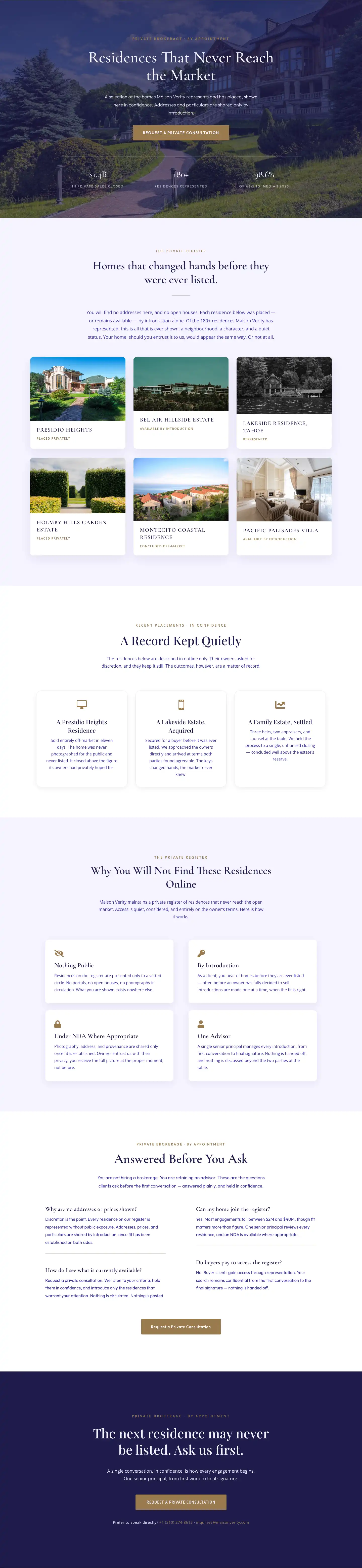
Maison Verity: Elegant Real Estate Residences Page for Divi 5
full_landing · real_estate · elegant
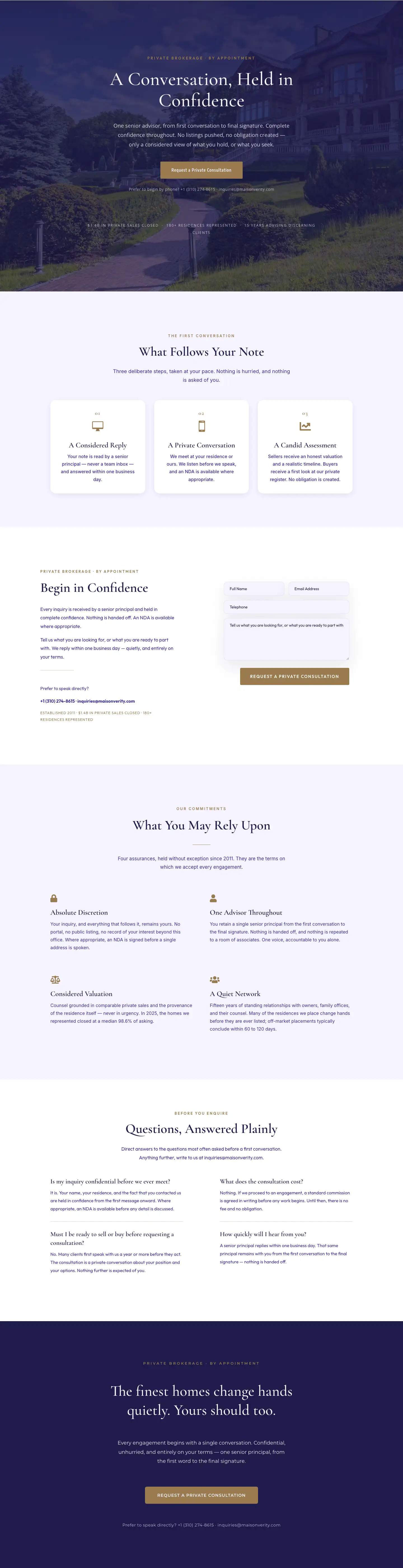
Maison Verity: Elegant Real Estate Private Consultation Page for Divi 5
full_landing · real_estate · elegant
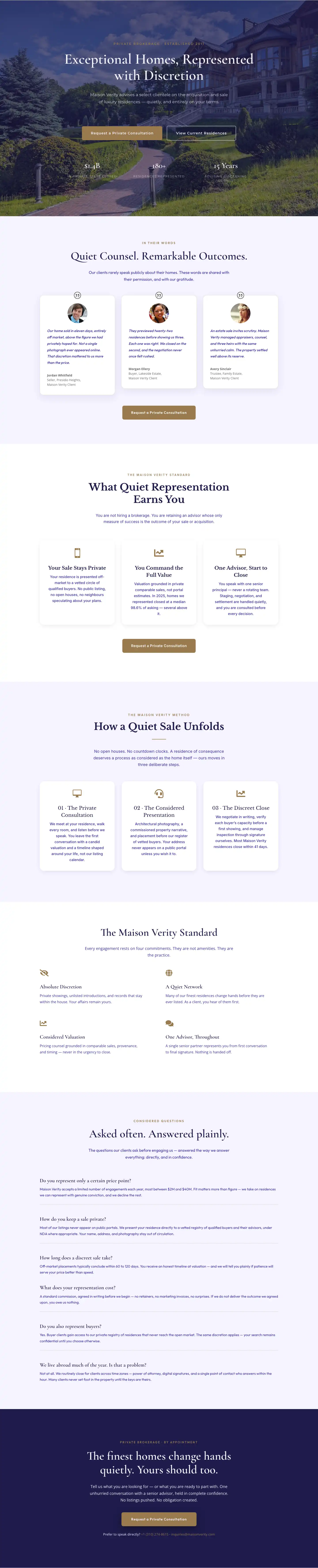
Elegant Luxury Real Estate Landing Page: Divi 5 Layout
full_landing · real_estate · elegant