
Larkspur Home Co. — Minimal Real_estate About Page for Divi 5
Clean, conversion-focused real estate landing page for Divi 5. Features a split hero, values cards, client testimonials, and a dark CTA section. Minimal style with sage green and forest tones.
Rate this element
Download this section, free
- Divi 5 JSON, imports in seconds
- Commercial license included
- No account needed
Click to view the full page
Overview
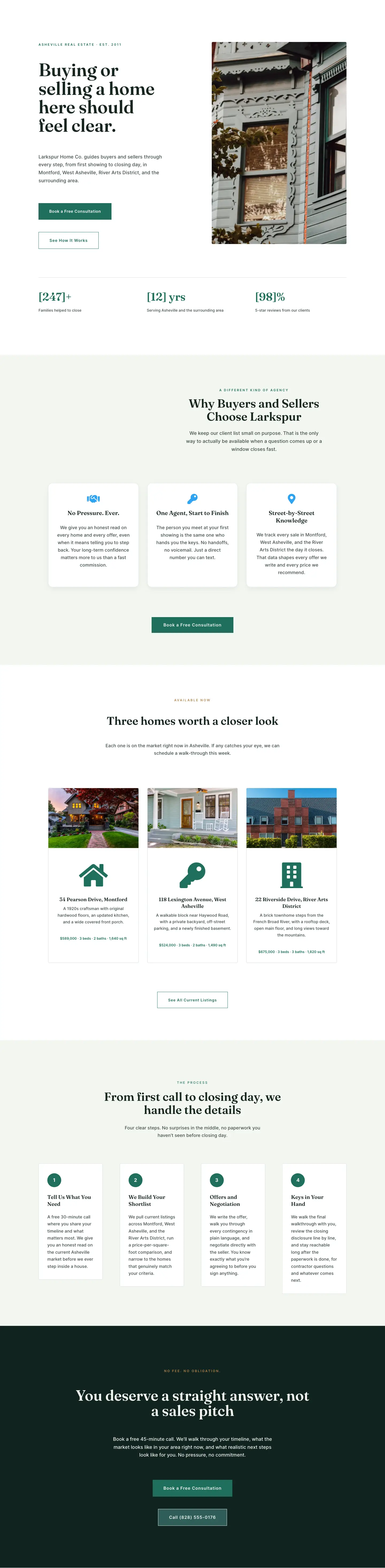
Larkspur Home Co. is structured as four clearly differentiated sections, each carrying a distinct visual weight so the page reads as a full brand story rather than a stack of independent blocks. The hero pairs a left-column text group with a right-column property image inside a 1296px-max-width row. The headline is set in Fraunces at 64px with a 1.02 line-height — tight enough to feel authoritative, open enough to stay readable at that size. Below it, an Inter 18px body paragraph and a dual-button group (a filled forest-green primary and a matching ghost variant) give visitors two momentum options without cluttering the column. A single social-proof line in Inter 13px — three stats separated by mid-dots — sits below the buttons at low visual weight, letting the numbers register without competing with the CTA. Section padding on the hero is 130px vertically on desktop, stepping down to 80px on tablet and 48px on phone; every other section follows a comparable step-down rhythm so the layout never feels cramped on small screens.
The principles section introduces the page's card pattern: three white columns on the shared #F3F6F1 sage-tinted ground, each bordered at 1px in rgba(31,111,92,0.15) — a near-invisible ghost of the brand green that implies structure without adding visual noise. Cards carry 36px of internal padding, a left-aligned FontAwesome icon at 28px in #1F6F5C, and a Fraunces h3 at 22px above an Inter body paragraph at 17px. The amber eyebrow label (#B8844A) heading this section is a deliberate palette decision: it keeps the primary green (#1F6F5C) reserved for interactive elements and icons, while the amber reads as a navigational marker that signals a shift in register from the hero's direct CTA tone to the brand's values layer.
The testimonials section repeats the centered header pattern — eyebrow, Fraunces h2, constrained subtext — then drops into a three-column Divi Testimonial grid. These cards are white with a 1px #D0DDD6 border and no corner radius, a deliberate departure from the 4px-radius principles cards that prevents the page from feeling templated. A centered CTA button row closes the section so readers who have reached the social proof can convert without scrolling back to the hero.
The closing section inverts the palette to #10231F near-black, reversing all type to #F3F6F1. The Fraunces headline lands at 62px, dropping to 44px on tablet and 34px on phone; the body paragraph is constrained to a 600px max-width and centered, keeping it from stretching uncomfortably on wide screens. A forest-green CTA button and a muted contact line — phone, email, and hours in Inter 14px at 55% opacity — complete the section. On mobile the padding compresses to 64px and every element remains visible; nothing is hidden or collapsed at any breakpoint.
What’s inside
- Two-column hero with Fraunces 64px heading (scales to 36px on mobile), dual-button CTA group (filled + ghost), and a three-stat social-proof line
- Three principles cards in a white-on-sage grid, each with a left-aligned FontAwesome icon (28px, #1F6F5C), Fraunces h3, and Inter body copy
- Three-column Divi Testimonial module grid with portrait image, author name, job title, and quote per client story
- Centered mid-page CTA button anchoring the testimonials section for a second conversion point before the closing section
- Inverted dark closing section (#10231F) with centered Fraunces headline, constrained body copy, primary CTA button, and a muted phone/email/hours contact line
- Responsive padding steps on every section (130/80/48px hero, 120/80/60px or 120/80/64px elsewhere) with no hidden elements at any breakpoint
- Responsive font scaling on all headings: 64→48→36px hero, 44→36→30px principles, 48→38→32px testimonials, 62→44→34px closing CTA
Who it’s for
This layout is built for independent real estate agents and small brokerages that lead with community knowledge and transparency rather than volume metrics. It suits boutique agencies with a values-first or relationship-first positioning — the three-principle card grid and testimonials section are structured to earn trust before asking for a commitment. Relocation-focused agents and buyer's agents working with out-of-state clients will find the closing section particularly useful; its plain-language copy and visible contact details are already calibrated to lower the barrier for a first call. It also adapts well to mortgage brokers, property managers, and real estate attorneys who need a credible, conversion-focused about or landing page.
Customization tips
The Fraunces and Inter pairing can be swapped at the theme level — any humanist serif holds the headline role and any geometric sans works in the body role. The palette has four active values to replace: #1F6F5C (forest green, used for CTAs, icons, and borders) and #10231F (the closing section background) are the primary and dark tones; #B8844A (amber eyebrow labels in sections two and four) and #14261F (headline dark) handle secondary and text roles. Keep hero body copy under 50 words to preserve the left-column rhythm. The social-proof stat line is designed for exactly three short data points — a fourth will wrap to two lines on mobile. Hero image should be at least 800px wide and close to a 4:3 or 3:2 landscape ratio; it fills a 50% column inside a 1296px row. Testimonial quotes work best under 80 words each so all three columns stay even in height on desktop.
How to install this layout
- Download the layout JSON file from this page.
- Open the target page in the Divi 5 builder.
- Open the portability panel (up/down arrows icon) and choose the Import tab.
- Upload the JSON. Tick “replace existing content” only for full-page imports.
- Check the page at desktop and mobile widths, then swap in your copy and images.
Full walkthrough with troubleshooting: How to Import a Divi 5 Layout.
Questions about Larkspur Home Co. — Minimal Real_estate About Page for Divi 5
How does the two-column hero stack on mobile?
The row's flex direction switches to column on phone, so the text block — eyebrow, headline, body, buttons, and stats — appears first and the property image follows below it. Section padding steps down to 48px vertically, keeping the layout open without excess whitespace.
Which Divi 5 modules does this layout use?
Text, Heading, Button, Image, Icon, and Testimonial — all native Divi 5 modules. No third-party plugins or extensions are required beyond Divi itself.
The principles cards have a border. Does the card structure collapse properly on mobile?
Yes. Each card column switches to full-width (24/24) on phone. The border is set at the column decoration level and scales independently; internal padding reduces from 36px to 28px/24px on smaller screens.
What image dimensions work best in the hero?
The placeholder is a landscape Pexels exterior at roughly 940×650. Any image at a similar 3:2 or 4:3 ratio performs well. The column constrains the display width to roughly half of the 1296px row, so plan for a source image at least 700px wide at 2x for retina displays.
What should I edit first after importing?
Start with the three social-proof stats below the hero buttons, the testimonial author names and quotes (all in [bracket] placeholder format), and the contact details in the closing section (phone number, email address, and hours). All heading and principles copy is final or near-final and can be used as-is or lightly adapted.
Can the dark closing section use a different background color?
Yes. The #10231F value is set on the section's background decoration. Swap it to any brand color; if you lighten it significantly, also update the heading and body text colors from #F3F6F1 to #14261F and the muted contact line from rgba(243,246,241,0.55) to a darker equivalent.
Which Divi version does this layout need?
Divi 5. The layout is generated natively for Divi 5 and validated against its real module structure before publication, so it imports clean into the current builder.
Can I use this layout on client websites?
Yes. Every download includes a commercial license covering unlimited sites you own or build for clients. Only reselling or redistributing the layout file itself is prohibited.
Included in these packs
More full landing pages
Browse all full landing pages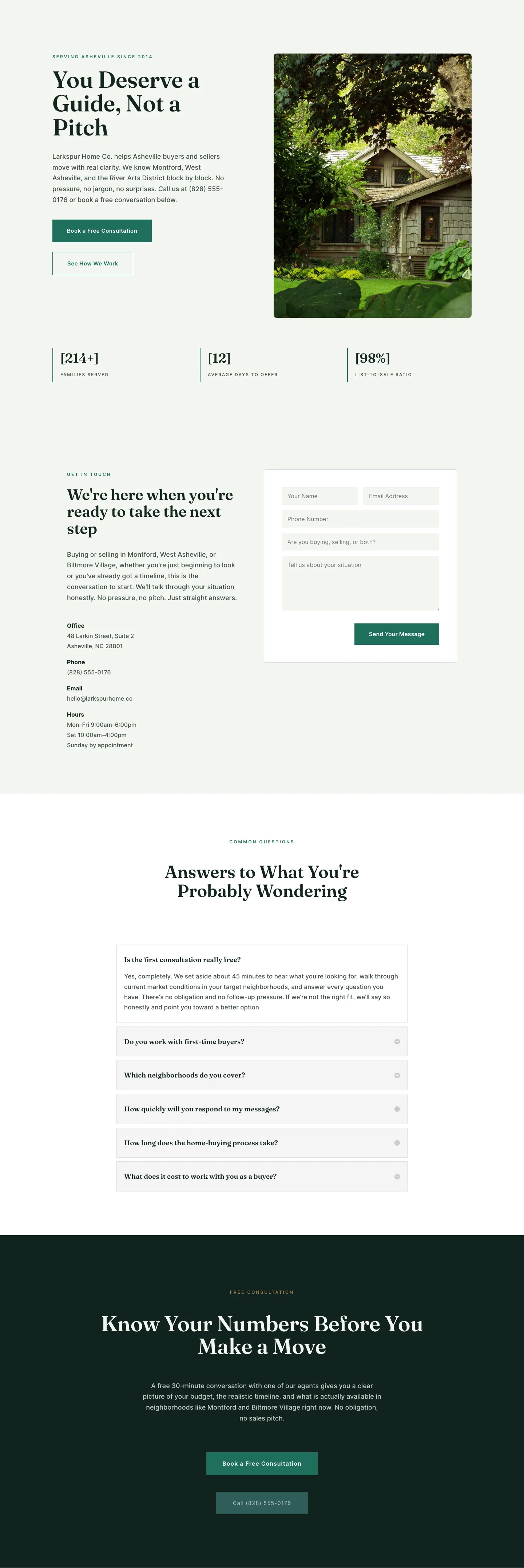
Larkspur Home Co. — Minimal Real_estate Contact Page for Divi 5
full_landing · real_estate · minimal
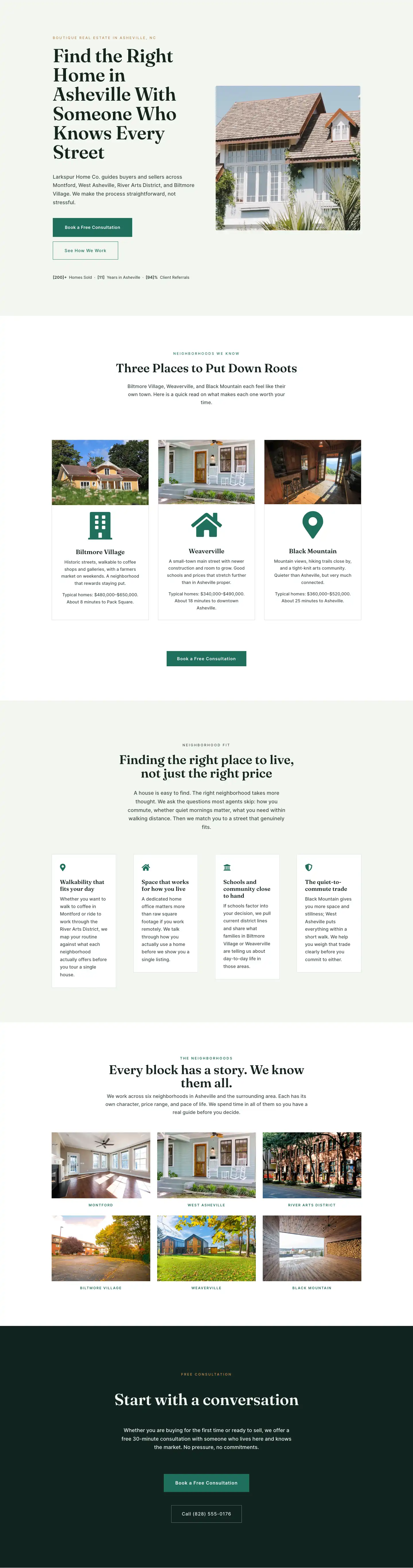
Larkspur Home Co. — Minimal Real_estate Neighborhoods Page for Divi 5
full_landing · real_estate · minimal
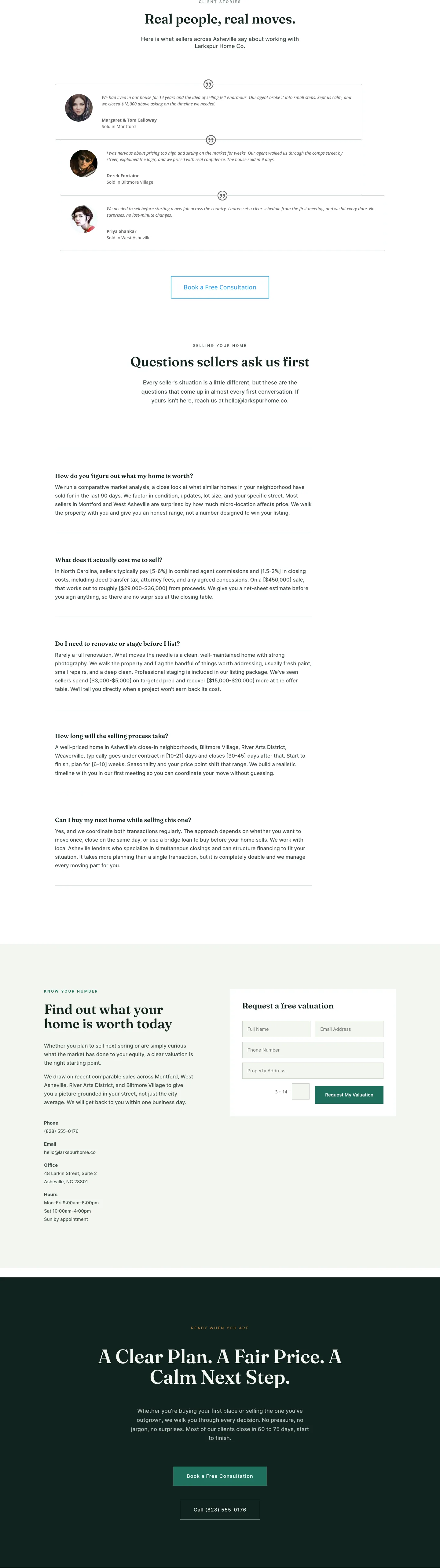
Larkspur Home Co. — Minimal Real_estate Sell Your Home Page for Divi 5
full_landing · real_estate · minimal

Larkspur Home Co. — Minimal Real_estate Property Page for Divi 5
full_landing · real_estate · minimal
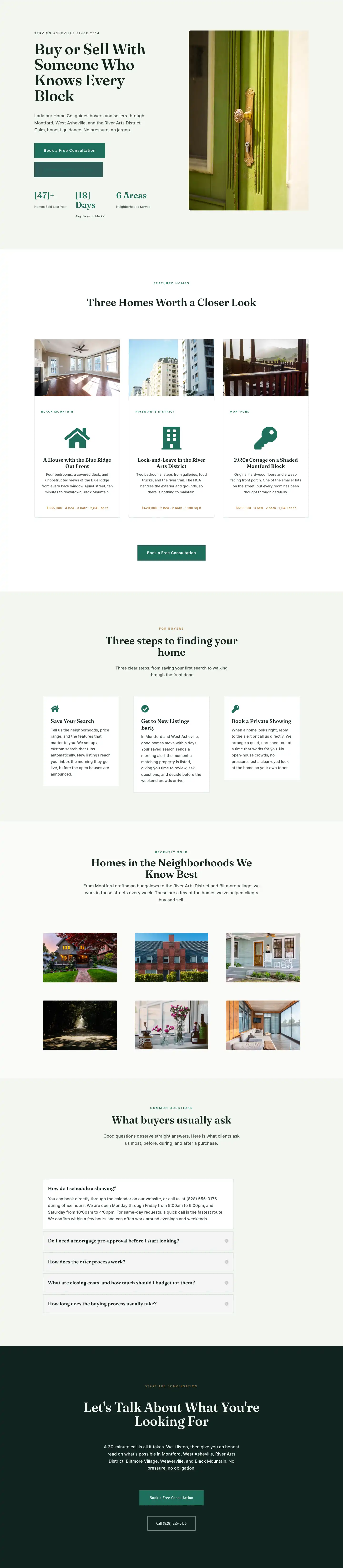
Larkspur Home Co. — Minimal Real_estate Listings Page for Divi 5
full_landing · real_estate · minimal
Larkspur Home Co. — Minimal Real_estate Home Page for Divi 5
full_landing · real_estate · minimal