
Playful Three-Tier Event Pricing Section for Divi 5
A playful Divi 5 pricing layout with three tiers for event planners: flat-fee packages, highlighted middle plan, and pill-shaped CTAs. Free JSON download.
Rate this element
Download this section, free
- Divi 5 JSON, imports in seconds
- Commercial license included
- No account needed
Click to view the full page
Overview
This is a three-tier pricing section built around a single-color contrast trick: two light cards flanking a jet-black featured card that's nudged up 12px and wrapped in a soft, wide shadow. The whole block sits on a warm off-white background (#f5f5f5) with generous 100px top/bottom padding, so the cards read as objects on a page rather than stripes across it. Above the tiers, a centered 56px display heading ("Pick the party that fits.") pairs with a 640px-capped intro paragraph. The hierarchy funnels the eye straight to the cards without a fight.
Each card follows the same rhythm: a small tracked-out eyebrow label (POP · SPARKLE · BOOM), a 26px tier name, a short use-case paragraph, then a 56px price locked to the baseline, a tiny caps line describing what the fee covers, a five-to-seven-item feature list at 15px/1.9em, and a fully rounded pill button at the bottom. Cards use 40–48px inner padding, 20px corner radii, and a stretched flex row with 24px gaps and align-items: stretch so all three heights match regardless of list length.
The playful energy comes from the copy voice and the button pills (999px radius), not from decoration: no gradients, no illustrations, no icons. That keeps the section drop-in friendly. On mobile the three-column row stacks vertically, the middle card's -12px translate keeps it visually prominent without breaking the flow, and the max-width caps on headings and intro text prevent line-length blowout on tablets.
What’s inside
- Three matched-height pricing cards in a 1/3 · 1/3 · 1/3 row with 24px gaps and stretched alignment
- A featured middle card in solid black (#0a0a0a) with a preset3 box shadow and a -12px Y-translate to lift it above the neighbors
- A white "★ MOST POPULAR" pill badge above the featured tier (180px max-width, fully rounded)
- Consistent card anatomy: eyebrow label, tier name, use-case paragraph, 56px price, fee/guest caps line, feature ul, pill CTA
- Rounded pill buttons (999px radius) with inverted color pairs: black-on-white for outer cards, white-on-black for the featured card
- Centered intro row with a 56px display heading capped at 640px and a supporting paragraph above the tiers
- Real bulleted feature lists (5–7 items each) rendered at 15px with 1.9em line-height for scannability
- A neutral three-color palette (#f5f5f5 section, #ffffff cards, #0a0a0a featured card and type) with no imagery required
Who it’s for
Built for event and hospitality brands that sell tiered packages: event planners, wedding coordinators, party stylists, catering companies, corporate event producers, and venue operators pricing packages by guest count or scope. The tone ("Pop / Sparkle / Boom," "the group chat won't shut up for a week") suits playful, personality-forward studios more than white-glove luxury shops: think birthday and milestone specialists, mobile bar services, brand-activation agencies, or photo-booth and entertainment rentals. It also drops cleanly into adjacent service businesses that price in three tiers with a flat fee up top and a custom-quote tier at the ceiling: bakeries with cake packages, florists, DJs, engagement photographers, or micro-wedding venues. Anywhere the buyer is choosing by scope-of-day, not by feature checkbox.
Customization tips
Recolor at the section level: swap #f5f5f5 for your brand's neutral, then change the featured card's #0a0a0a to a saturated accent (deep plum, forest, cobalt). The white type inside will still hit AA contrast. Keep the two outer cards white so the middle one stays the visual anchor. Tier names work best at 3–7 characters (POP, SPARKLE, BOOM) so the 3px letter-spacing doesn't wrap; use-case paragraphs comfortably hold 15–25 words. Feature lists are tuned for 5–7 bullets around 6–10 words each: longer bullets will push the featured card taller than the flankers, which the stretched row handles but the eye notices. Prices work in any format the price heading fits ("$895," "$2,495," "$5,950+," or "From €1,200"). The pill buttons are a strong signature: if you swap them for square corners, also drop the -12px translate on the middle card so the whole section feels consistent.
How to install this layout
- Download the layout JSON file from this page.
- Open the target page in the Divi 5 builder.
- Open the portability panel (up/down arrows icon) and choose the Import tab.
- Upload the JSON. Tick “replace existing content” only for full-page imports.
- Check the page at desktop and mobile widths, then swap in your copy and images.
Full walkthrough with troubleshooting: How to Import a Divi 5 Layout.
Questions about Playful Three-Tier Event Pricing Section for Divi 5
How does the featured middle card behave on mobile?
The row stacks vertically on phones, so the -12px lift becomes a small vertical offset from the card above it rather than a horizontal pop-out. The black background, shadow, and "MOST POPULAR" badge still do the visual work of marking it as the recommended tier.
Are the feature lists icons or text bullets?
They're standard HTML `<ul>` lists inside a Divi Text module: no icon list module, no SVGs. That keeps them fast to edit (paste from a doc, done) and it means the bullet style follows whatever your theme's list CSS is set to.
What's the first thing I should edit after import?
The three tier names and the price headings, those are the anchors buyers scan. Then the eyebrow labels (POP / SPARKLE / BOOM) and button text so the personality matches yours. Feature lists and use-case paragraphs come last because they'll change most often as you refine offers.
Does it need any images or icons to look complete?
No. The design is intentionally type-and-shape only: no photos, no icons, no dividers. That's why it renders cleanly on any background and drops into a page without asking you to source assets.
Can I add a fourth tier or drop to two?
Two is easy, delete a column and Divi's row will rebalance to 1/2 · 1/2. Four is tighter: on desktop the cards get narrow at 1/4 each, so consider switching to a 2×2 grid on tablet and stacking on mobile. Either way, keep the featured-card treatment on only one tier.
Will the three cards stay the same height if my feature lists are different lengths?
Yes: the row uses `align-items: stretch` with `flex-wrap: nowrap` on desktop, so all three columns match the tallest card. Big length gaps (say, 3 bullets vs. 9) will leave visible whitespace in the shorter cards, so try to keep list lengths within two items of each other.
Which Divi version does this layout need?
Divi 5. The layout is generated natively for Divi 5 and validated against its real module structure before publication, so it imports clean into the current builder.
Can I use this layout on client websites?
Yes. Every download includes a commercial license covering unlimited sites you own or build for clients. Only reselling or redistributing the layout file itself is prohibited.
More pricing tables
Browse all pricing tables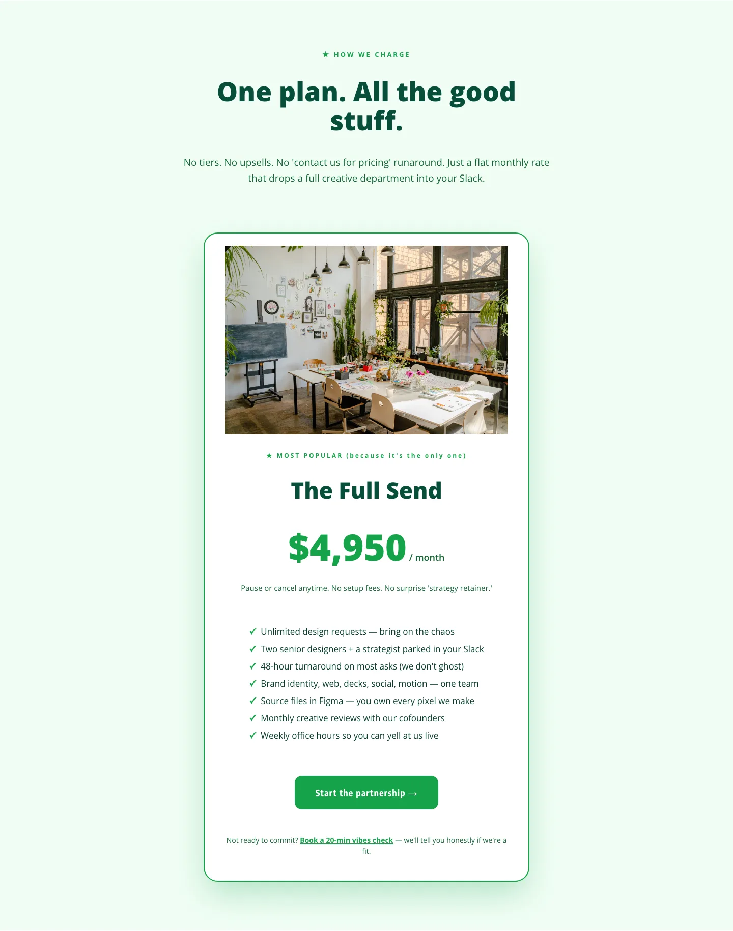
Playful Agency Pricing Section: Flat-Rate Divi 5 Layout
pricing · agency · playful
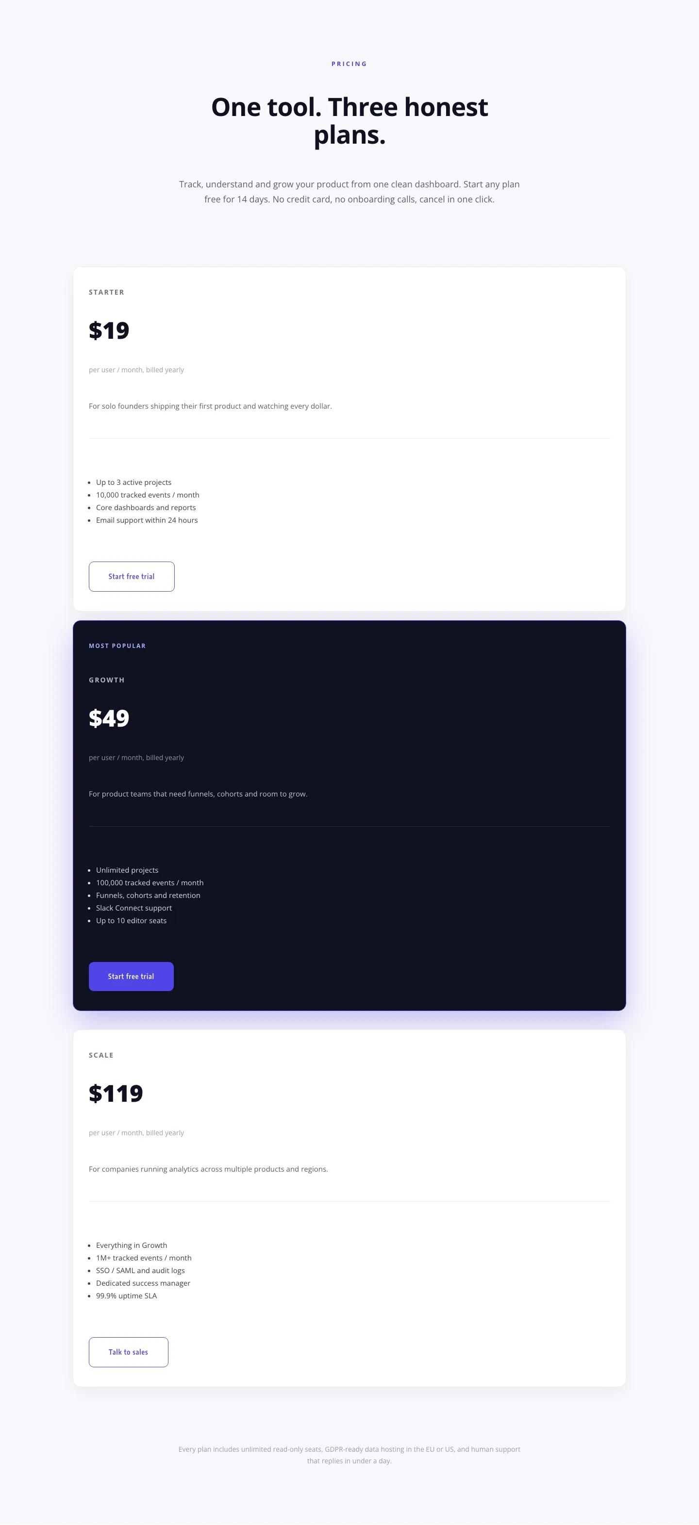
Minimal SaaS Pricing Section: 3-Tier Plan Cards with Featured Dark Tier | Divi 5 Layout
pricing · saas · minimal
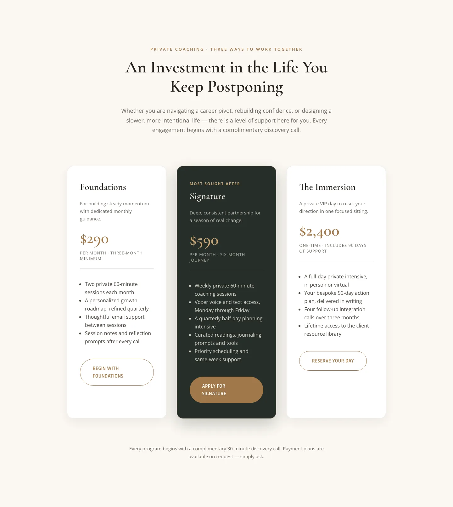
Elegant Coaching Pricing Section: 3-Tier Divi 5 Layout
pricing · coaching · elegant
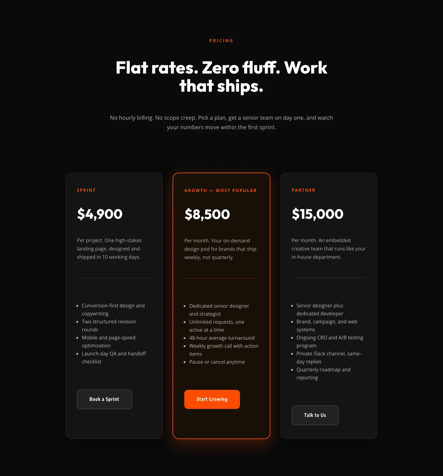
Bold Agency Pricing Section: Dark 3-Tier Divi 5 Layout
pricing · agency · bold
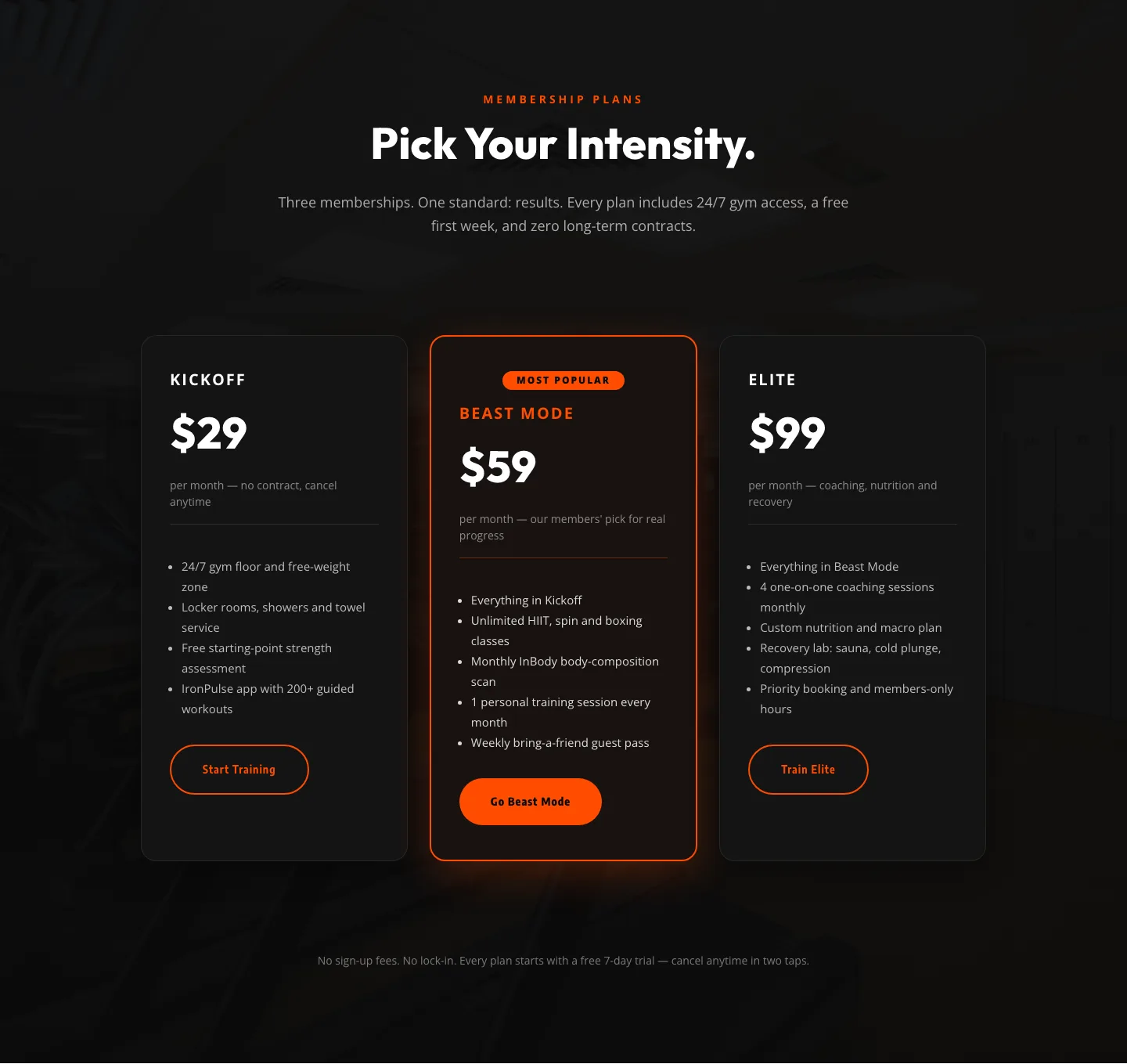
Bold Fitness Pricing Table: Dark Gym Membership Plans Divi 5 Layout
pricing · fitness · bold

Bold Agency Pricing Page: Blackline Studio Divi 5 Layout
pricing · agency · bold