
Bold Blue Restaurant Features Section: 4 Icon Columns | Divi 5
Bold, wood-fired steakhouse features section for Divi 5. Deep navy background, cobalt blue icons, Playfair Display headings, and 4 icon-led feature cards with hover lift.
Rate this element
Download this section, free
- Divi 5 JSON, imports in seconds
- Commercial license included
- No account needed
Click to view the full page
Overview
The layout opens with a centered intro block: a small uppercase eyebrow in accent blue ("Wood-Fired Since 2011"), a 54px Playfair Display H2, and a 19px lede capped at 640px so the line length stays readable. Below it sits the main event: a four-column feature grid on a 1240px max-width row with a 28px column and row gap, each column rendered as a rounded card (18px radius) on #12294f with a 1px hairline border in translucent blue and a soft layered shadow.
Every card follows the same rhythm: a 38px FontAwesome icon in the accent blue (#4c9eeb), a 22px Playfair heading, then a 15.5px body paragraph in muted slate blue (#a9bcd8). Padding is 40px top / 36px bottom / 30px sides, so the icon → heading → copy hierarchy breathes without wasting vertical space. On hover, cards lift 6px and the shadow deepens, and the whole grid fades in from the top at 700ms: subtle motion that signals the cards as tappable if you decide to wire them to menu, reservations, sommelier bio, or hours pages.
The palette is deliberately restaurant-editorial: deep navy section (#0b1e3f), slightly lighter card fill (#12294f), and a single luminous blue accent carrying the icons, eyebrow, and hover cues. Playfair Display handles both display and card headings; body text stays in the theme sans-serif. Responsive behavior collapses the 4-up grid to 2-up on tablet (each card at 12/24 flex) and stacks to a single column on phone, and section padding steps down from 110/120px vertical on desktop to 72/80px on phone so the block balances against whatever hero or gallery sits above it.
What’s inside
- Full-width dark section (#0b1e3f) with 110/120px vertical padding on desktop that scales to 90/100px tablet and 72/80px phone
- Centered intro row with a blue uppercase eyebrow, 54px Playfair Display H2, and a 19px lede paragraph capped at 640px
- Four-up feature grid on a 1240px max-width row with a 28px column and row gap
- Four rounded card columns (#12294f fill, 18px radius, 1px translucent-blue border, layered navy shadow)
- Per-card FontAwesome icon (38px, accent #4c9eeb) above a 22px Playfair heading and a 15.5px slate-blue body paragraph
- Hover interaction that lifts each card 6px and deepens the shadow, plus a 700ms fade-in-top entrance animation
- Native Divi 5 Section / Row / Column / Text / Heading / Icon modules, no third-party dependencies or custom code
- Responsive breakpoints: 4 columns desktop, 2 columns tablet (12/24 flex), single-column stack on phone
Who it’s for
The section reads as a chophouse or wine-forward restaurant page, but the framework is neutral enough to work for any hospitality brand that wants to lead with credibility markers instead of a photo carousel. Steakhouses, oyster bars, hotel dining rooms, and neighborhood bistros can lift it as-is. It also translates cleanly to wine bars, cocktail lounges, or private clubs where the story is program depth: cellar size, tasting menus, chef pedigree, late-night hours. Outside food and drink, the same structure serves boutique hotels, spas, or event venues that need to communicate four differentiators quickly. If you're rebuilding an aging Divi 4 restaurant site and want a bolder, more modern proof-points block sitting above the reservation CTA, this drops in without disrupting the surrounding sections.
Customization tips
The palette is preset-driven: swap the section background, card background, and accent blue in three color values and the whole grid re-skins. For a warmer chophouse look, try charcoal (#1a1a1a) with an espresso card fill and copper accent; for a coastal seafood brand, teal on sand with a brass accent. Keep the accent a single hue so icons, eyebrow, and hover cues stay unified. Heading copy runs best at 3–6 words so the 22px Playfair line doesn't wrap awkwardly on tablet; body paragraphs land cleanly at 25–40 words. Icons come from FontAwesome via the Divi Icon module, pick glyphs that read at 38px (avoid thin-line sets that disappear on dark cards). No images are used, so you don't need to source photography, but if you replace one icon with a small image, keep it square (1:1) around 120px to preserve the row rhythm. Horizontal padding is set in vw, so it scales gracefully; only touch the vertical values if you're dropping this into a very short page.
How to install this layout
- Download the layout JSON file from this page.
- Open the target page in the Divi 5 builder.
- Open the portability panel (up/down arrows icon) and choose the Import tab.
- Upload the JSON. Tick “replace existing content” only for full-page imports.
- Check the page at desktop and mobile widths, then swap in your copy and images.
Full walkthrough with troubleshooting: How to Import a Divi 5 Layout.
Questions about Bold Blue Restaurant Features Section: 4 Icon Columns | Divi 5
How does the four-column grid behave on tablet and phone?
On tablet the row wraps to two columns (each card takes a 12/24 flex), and on phone it stacks to a single full-width column. Section padding also steps down (110px top on desktop, 90px on tablet, 72px on phone) so the block stays proportional at every breakpoint.
Which Divi 5 modules is this built from?
Native modules only: a Section, two Rows (the centered intro and the four-up grid), Columns, plus Text, Heading, and Icon modules. There are no third-party plugins, custom blocks, or code modules. Every setting is editable in the visual builder.
Are the icons images or a font?
They're FontAwesome glyphs placed through the Divi Icon module (steak, shrimp, wine glass, and clock in the default copy). You can swap any of them from the icon picker and they'll inherit the 38px size and #4c9eeb accent color unless you override them per card.
What should I edit first after importing?
Start with the H2 and eyebrow at the top, those carry the brand voice. Then rewrite the four card headings (each is one concrete differentiator) and their body paragraphs at roughly 25–40 words each. Colors and spacing are worth leaving alone until you've decided how the rest of the page is themed.
Can I add a fifth or sixth card?
Yes. The row already uses flex-wrap, so duplicating a column will push a fifth card onto a second line. For a clean six-up, change each column's desktop flex to 8/24 and you'll get a 3+3 grid; the card padding, radius, hover, and animation carry over automatically.
Which Divi version does this layout need?
Divi 5. The layout is generated natively for Divi 5 and validated against its real module structure before publication, so it imports clean into the current builder.
Can I use this layout on client websites?
Yes. Every download includes a commercial license covering unlimited sites you own or build for clients. Only reselling or redistributing the layout file itself is prohibited.
More feature grids
Browse all feature grids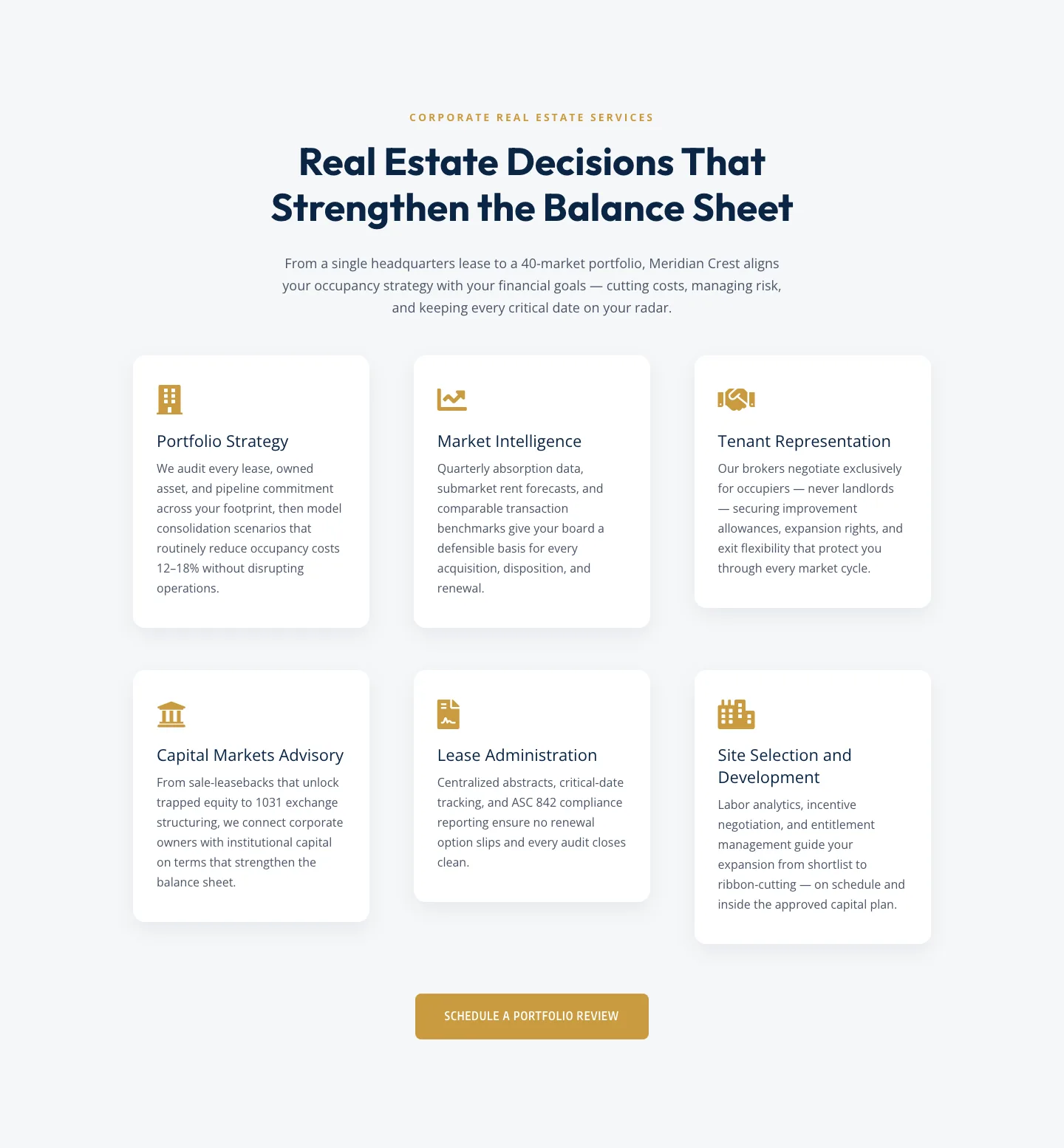
Corporate Real Estate Features Section: Six-Pillar Service Grid for Divi 5
features · real_estate · corporate
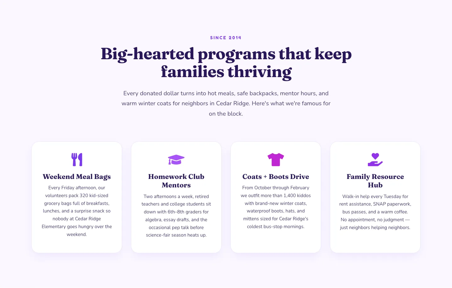
Playful Nonprofit Features Section: Four-Column Icon Cards for Divi 5
features · nonprofit · playful
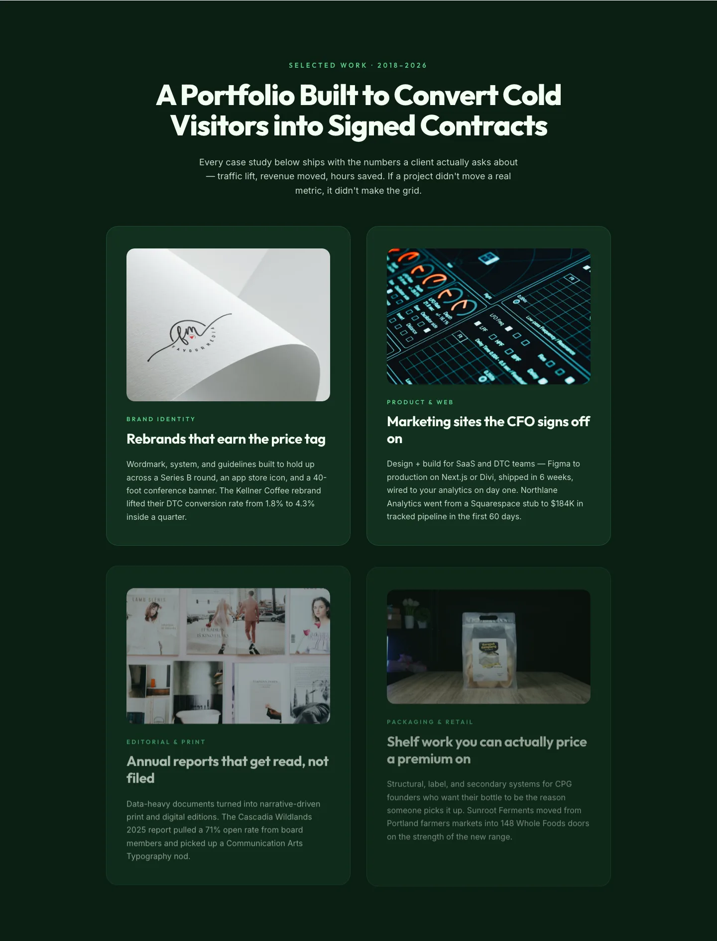
Bold Portfolio Features Grid: Divi 5 Case Study Layout
features · portfolio · bold
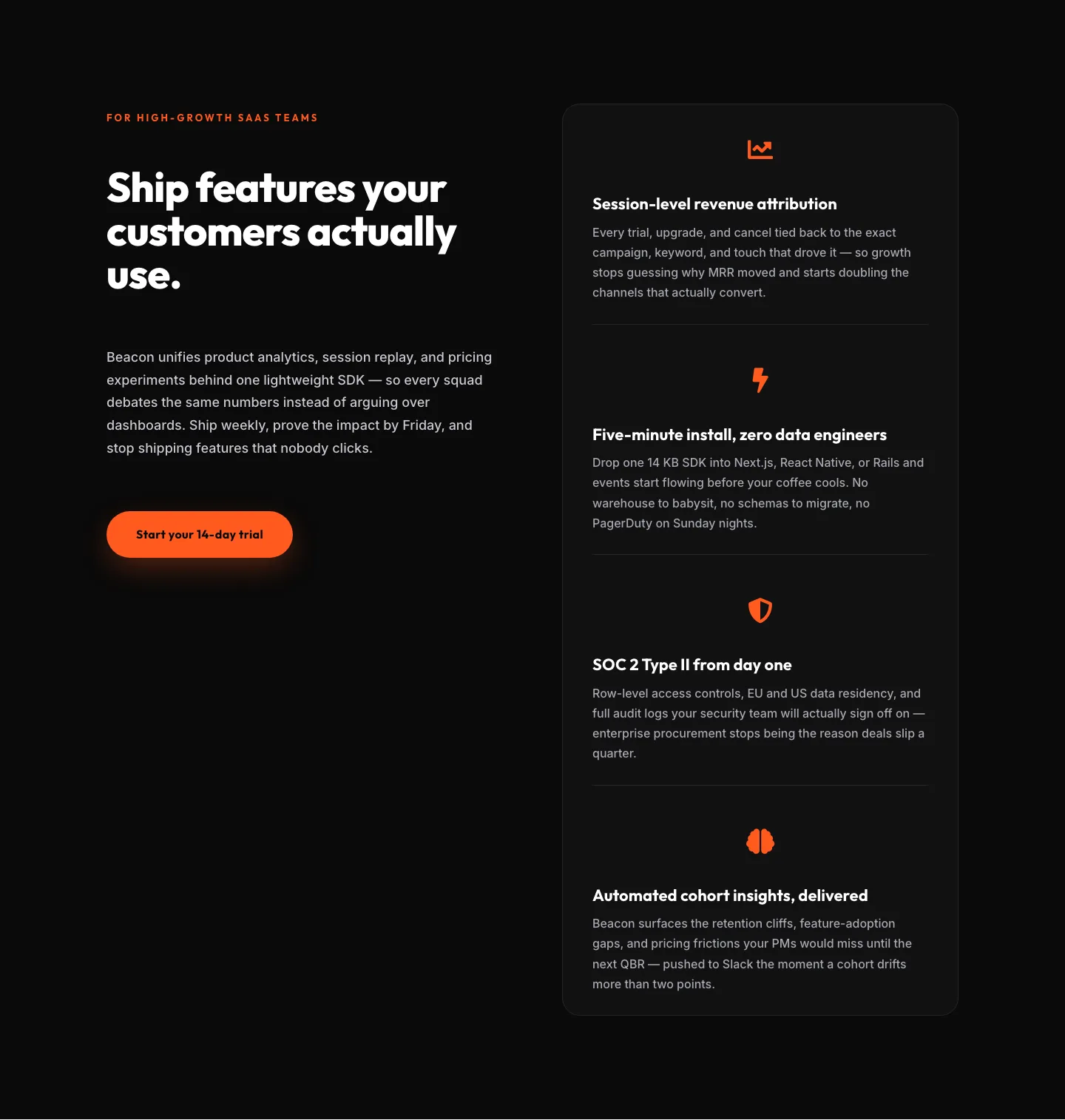
SaaS Features Section: Ship Features Customers Actually Use | Divi 5 Bold Layout
features · saas · bold
SaaS Features Section: Minimal Divi 5 Layout for Product Teams
features · saas · minimal
Bold Agency Features Section: Divi 5 Services Grid Layout
features · agency · bold