
Bold Ecommerce Features Section for DTC Storefronts
A bold, dark Divi 5 features section for ecommerce brands: showcase edge-fast PDPs, one-tap checkout, real-time inventory, duties, cohort reports & fraud shield.
Rate this element
Download this section, free
- Divi 5 JSON, imports in seconds
- Commercial license included
- No account needed
Click to view the full page
Overview
This features section leans into the aesthetic DTC brands actually ship with: near-black canvas (#0f0f13), a single searing orange accent (#ff5a1f), and a typographic hierarchy built on Outfit at 800 weight. The header row is capped at 820px so the eyebrow (uppercase, letter-spaced 3px, orange) and the 64px display headline sit in a tight, magazine-style column above a muted grey subhead. Vertical rhythm is generous: 120px section padding on desktop dropping to 80px on phone, plus 6vw / 5vw side gutters that keep the cards from ever kissing the viewport edge.
Below the header, six benefit cards live in two 1/3 + 1/3 + 1/3 rows with a 28px gap between them and a 28px gap between rows. Each card carries the same construction (20px rounded corners, 44px internal padding, a 1px rgba(255,255,255,0.08) hairline border, and a 20px×40px soft drop shadow) so the eye reads the grid as one system. The middle card in the first row breaks the pattern with a solid #ff5a1f fill and inverted dark text: a deliberate focal point that pulls attention to the checkout benefit before the reader scrolls to the second row.
Inside every card the pattern is consistent: a 36px left-aligned Font Awesome glyph (bolt, boxes, warehouse, globe, chart, shield), then a 24px H3 in Outfit, then a 16px body paragraph with 1.7em line-height for comfortable reading. On phone the row flips to flexDirection: column and each card expands to full width, stacking into a single scrollable column while padding relaxes to 80px top/bottom. So the density that works on a 27-inch monitor stays legible on a 375px screen.
What’s inside
- Full-width dark section (`#0f0f13`) with 120px desktop / 80px phone vertical padding and 6vw / 5vw fluid side gutters
- Centered intro block capped at 820px: orange uppercase eyebrow, 64px Outfit-800 H2 (scales to 44px tablet, 36px phone), and muted `#a8a8b3` subhead
- Six-card benefit grid built as two 1/3 + 1/3 + 1/3 rows with 28px column and row gap, flex-wrap enabled
- One accent card (`#ff5a1f` fill, dark text) placed mid-row to anchor the eye on the primary conversion benefit
- Uniform card styling: 20px radius, 44px padding, `rgba(255,255,255,0.08)` hairline border, and a soft 20px×40px shadow
- Six Font Awesome icons (bolt, boxes-stacked, warehouse, globe, chart-simple, shield) at 36px, left-aligned above each headline
- Native Divi 5 modules only (section, row, column, icon, heading, text) no third-party plugins required
- Mobile behavior: rows collapse to `flexDirection: column` so every card takes full width and stacks in reading order
Who it’s for
This section was built for direct-to-consumer ecommerce brands and the platforms that serve them: Shopify-adjacent SaaS, headless commerce tools, 3PL and fulfillment startups, subscription box operators, and independent apparel, beauty, or CPG storefronts that need to explain multiple product benefits at once. The bold dark palette and orange accent suit brands that already lean modern and confident (streetwear, performance, tech-forward home goods) rather than heritage or luxury. It's equally at home on a marketing site's homepage, a "why us" page, or a pricing-tier comparison where you need to justify a premium plan. If your value prop is a stack of concrete platform capabilities (speed, checkout, inventory, tax, analytics, fraud), this grid gives each one equal air.
Customization tips
Swap the palette at preset level: change section background from #0f0f13 to your dark brand tone, then update the accent card fill and the icon color (currently #ff5a1f in five places) to your primary. The five dark cards use #191922 with an 8% white border, bump both together to keep contrast intact. Keep the H2 to 6–10 words so it stays on two lines at 64px; the subhead reads best at 15–25 words. Each card headline works best at 3–6 words, and body copy holds up cleanly to about 200 characters before the card grows taller than its neighbors and breaks the grid's even baseline. Icons are Font Awesome: swap the unicode value on any icon module to change the glyph, and keep the 36px size for balance with the 24px H3. If you need eight benefits instead of six, duplicate a card and add a third row; the flex-wrap on the row will handle it without any layout math.
How to install this layout
- Download the layout JSON file from this page.
- Open the target page in the Divi 5 builder.
- Open the portability panel (up/down arrows icon) and choose the Import tab.
- Upload the JSON. Tick “replace existing content” only for full-page imports.
- Check the page at desktop and mobile widths, then swap in your copy and images.
Full walkthrough with troubleshooting: How to Import a Divi 5 Layout.
Questions about Bold Ecommerce Features Section for DTC Storefronts
Is the layout fully responsive?
Yes. The intro column is capped at 820px, the card rows use `flexWrap: wrap` on desktop, and both rows switch to `flexDirection: column` on phone so every card becomes full-width. The H2 scales from 64px desktop to 44px tablet to 36px phone, and section padding drops from 120px to 80px vertical on mobile.
Which Divi 5 modules does this section use?
Six module types only, all native to Divi 5.8: section, row, column, icon (Font Awesome), heading, and text. No blurb module, no third-party plugin, no custom code. Just the standard builder primitives arranged in a grid.
Are the icons images or a font?
They're Font Awesome glyphs rendered by Divi's icon module (`bolt`, `boxes-stacked`, `warehouse`, `globe`, `chart-simple`, `shield`). Swap the unicode value inside any icon module to change the glyph, no image asset needed.
What should I edit first after importing?
Start with the intro block: the eyebrow, the H2, and the subhead. That's where the section's voice lives. Then rewrite the six card headlines to your actual product benefits and shorten the body copy to under ~200 characters per card so the grid stays evenly aligned. Finally swap the accent color (`#ff5a1f`) to your brand primary in the icon fills and the middle card background.
Why is one card orange and the others dark?
The orange card is a deliberate focal point: it uses the accent color to draw the eye to whichever benefit you want to emphasize first (in the source, it's checkout). Move the accent styling to a different column if a different benefit is your primary conversion driver, or remove it entirely for a uniform six-card grid.
Can I add more than six cards?
Yes. The row uses `flexWrap: wrap` with a 28px gap, so duplicating a column and adding a third row (or a fourth) keeps the alignment intact. Just keep column widths at 1/3 so the grid math doesn't shift.
Which Divi version does this layout need?
Divi 5. The layout is generated natively for Divi 5 and validated against its real module structure before publication, so it imports clean into the current builder.
Can I use this layout on client websites?
Yes. Every download includes a commercial license covering unlimited sites you own or build for clients. Only reselling or redistributing the layout file itself is prohibited.
More feature grids
Browse all feature grids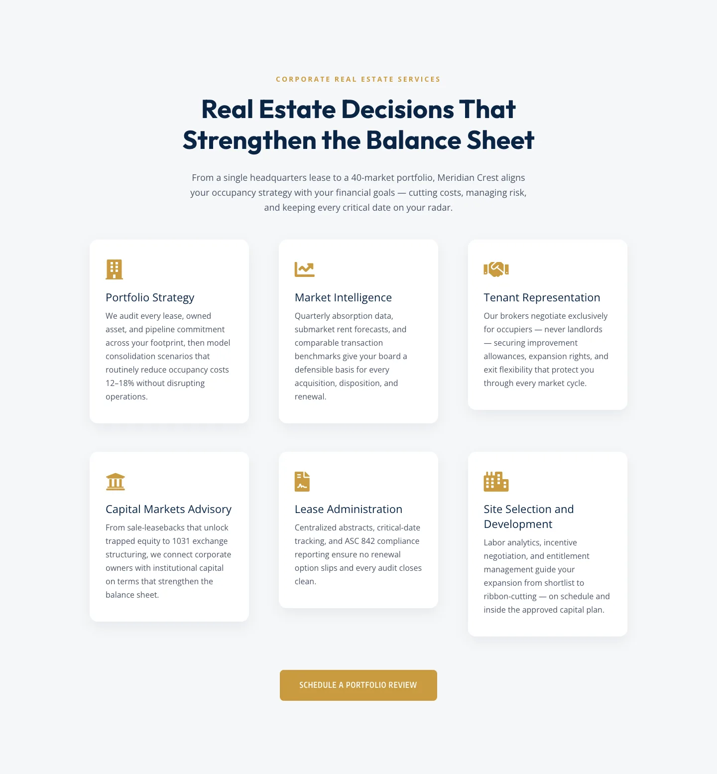
Corporate Real Estate Features Section: Six-Pillar Service Grid for Divi 5
features · real_estate · corporate
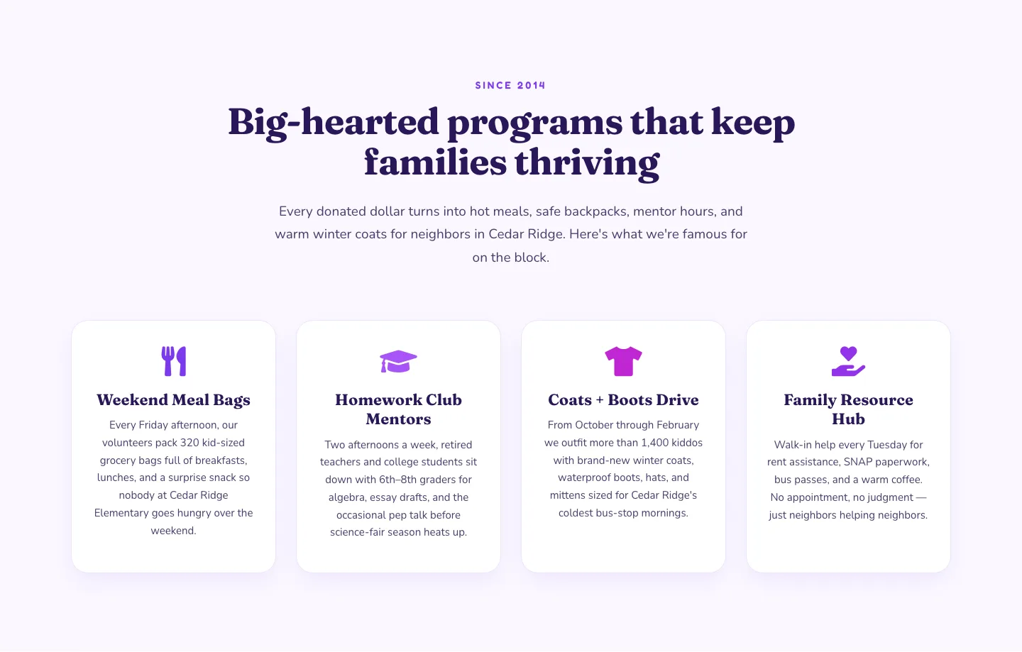
Playful Nonprofit Features Section: Four-Column Icon Cards for Divi 5
features · nonprofit · playful
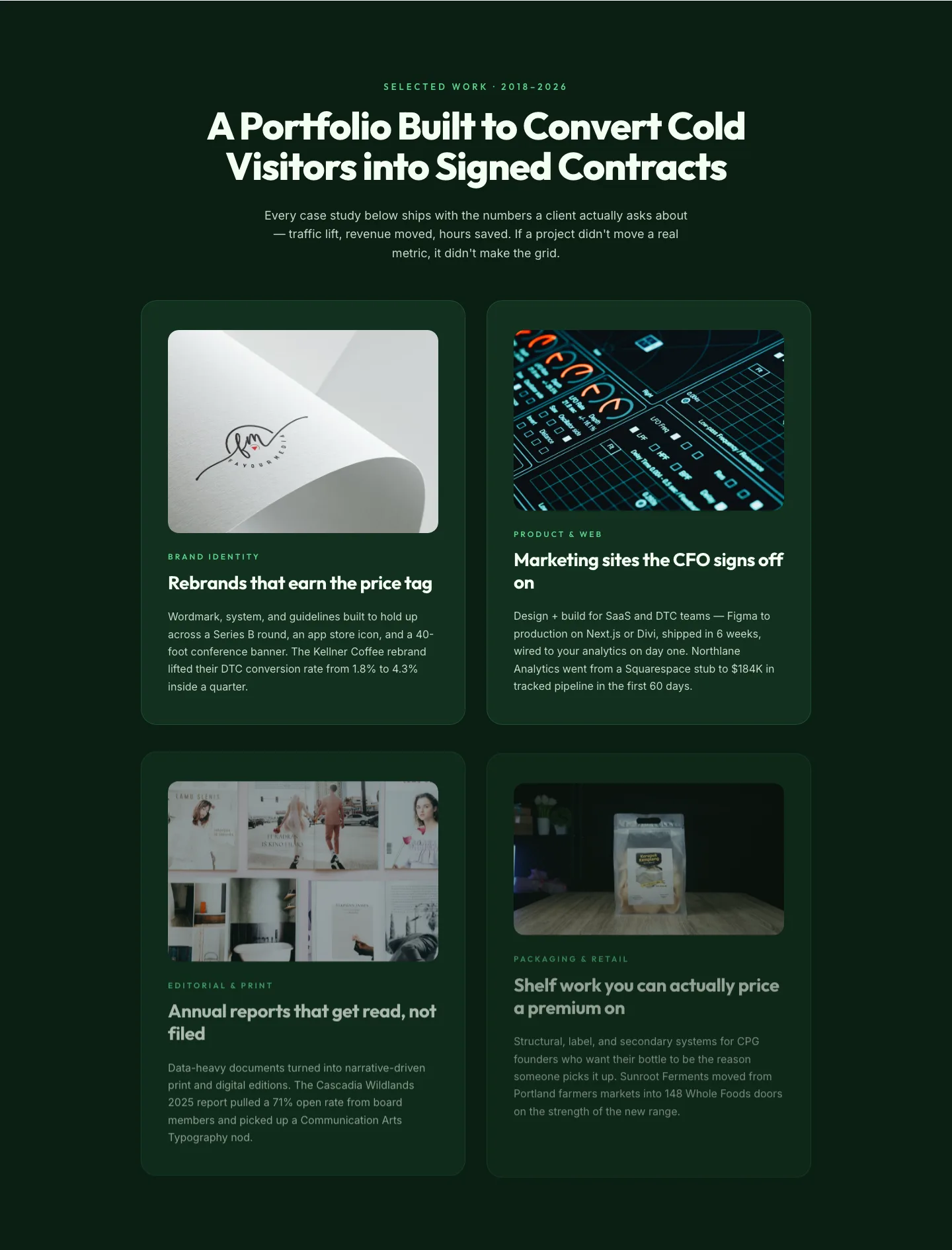
Bold Portfolio Features Grid: Divi 5 Case Study Layout
features · portfolio · bold
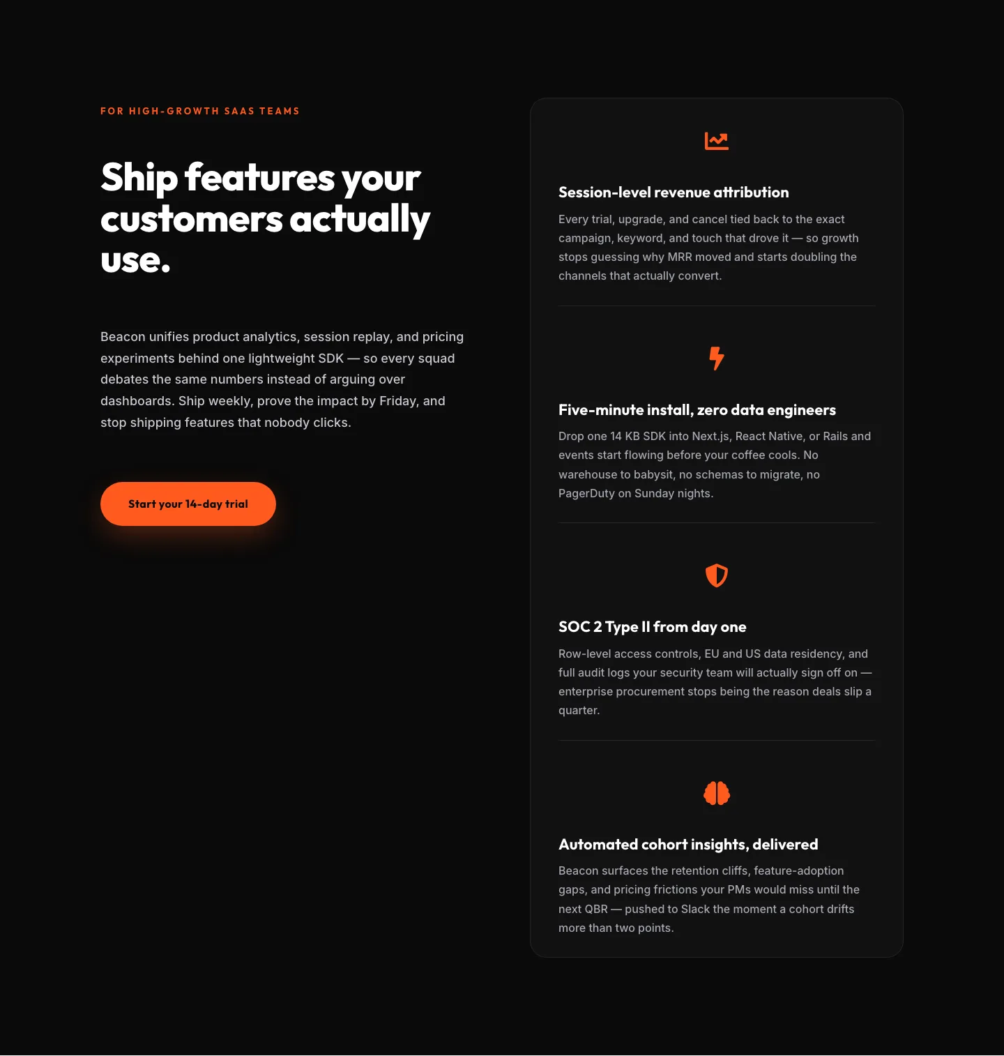
SaaS Features Section: Ship Features Customers Actually Use | Divi 5 Bold Layout
features · saas · bold
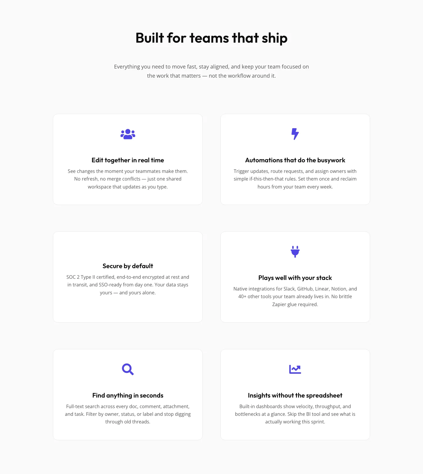
SaaS Features Section: Minimal Divi 5 Layout for Product Teams
features · saas · minimal
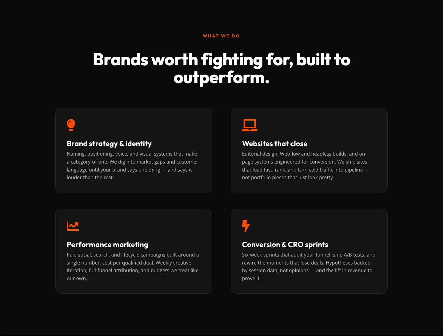
Bold Agency Features Section: Divi 5 Services Grid Layout
features · agency · bold