
Bold Fitness Features Section: Dark Gym Layout for Divi 5
High-impact Divi 5 features section for gyms and fitness studios: dark charcoal cards, blazing orange icons, six benefit blocks, and a trial CTA. Fully responsive and validator-approved.
Rate this element
Download this section, free
- Divi 5 JSON, imports in seconds
- Commercial license included
- No account needed
Click to view the full page
Overview
A single hard-hitting features section built for gyms, coaches, and fitness brands that want the site to feel like the training floor: dark, confident, and heavy on the accent. The section sits on a near-black #0A0A0A background with generous 120px vertical padding (72px on phones), giving the content a stadium-style stage instead of the cramped stat blocks you usually see in fitness templates.
The hierarchy is deliberately vertical. An orange eyebrow (Why Forge Strength Co., 14px Outfit, 4px letter-spacing, uppercase) fires the section, followed by a bold 56px H2 headline in Outfit 800, a muted 18px supporting paragraph capped at 640px wide, and then the grid. On tablet the headline drops to 42px and on phone it steps down to 34px, so nothing shouts off-screen at 375px.
Below the intro, six identical feature cards sit in two rows of 1_3 / 1_3 / 1_3 columns. Each card uses a #161616 charcoal fill, an 18px radius, a 1px rgba(255,255,255,0.08) hairline border, and a deep drop shadow (14px 46px rgba(0,0,0,0.55)) that lifts them off the black. On hover the border turns orange (the same #FF4D00 used for the eyebrow, the 36px Font Awesome icons, and the CTA) which is the single accent doing all the work on this palette.
Inside each card the pattern repeats cleanly: left-aligned icon, 22px white H3, 16px body text at rgba(255,255,255,0.6) with a roomy 1.7em line-height. A centered pill-shaped CTA button (Start Your 7-Day Trial, uppercase Outfit, 100px radius, 18px × 40px padding) closes the section. On phones the whole row switches to flexDirection: column and every card stretches to full width, so no card gets orphaned on a narrow viewport.
What’s inside
- Full-bleed dark section (`#0A0A0A`) with 120px / 72px vertical padding for desktop and phone
- Centered intro block: orange Outfit eyebrow, 56px H2 (steps to 42px tablet / 34px phone), 640px-wide supporting paragraph
- Two rows of three feature cards (`1_3, 1_3, 1_3`) that stack to full-width columns on phone
- Six pre-styled cards on `#161616` with 18px radius, hairline border, drop shadow, and orange hover border
- Native Divi 5 Icon modules (36px Font Awesome, orange). No external icon plugin required
- Text modules with proper H3 (22px white) + body (16px, 1.7em line-height) type scale baked in
- Centered pill CTA (100px radius, uppercase Outfit) with hover color already wired
- Outfit typography set across eyebrow, headline, and CTA. One font family to swap
Who it’s for
Built for gyms, CrossFit boxes, strength-and-conditioning studios, personal trainers, boot camps, and HIIT franchises that want a features section as intense as the training. The dark palette and orange accent also translate cleanly to combat-sports gyms, MMA schools, powerlifting clubs, and hybrid athlete brands. Beyond fitness, the same layout suits any bold-tone service business that leans on six-benefit storytelling: supplement and apparel brands, automotive tuners, motorcycle shops, tattoo studios, e-sports orgs, and streetwear labels can drop it in without fighting the aesthetic. It is less at home on soft, pastel, or medical-wellness sites; if your brand is closer to yoga-studio than iron-plate, the neighboring lighter fitness sections in the library will feel more natural.
Customization tips
Recolor from the section preset first: swap #FF4D00 for your brand accent across the eyebrow text, the six icon colors, the button background, and the card hover border. Those four spots are the whole personality. If your brand is lighter, flip the section background to #F5F5F5, cards to #FFFFFF, headings to #0A0A0A, and body text to rgba(0,0,0,0.6) to keep the same contrast rhythm. Copy limits: keep card H3 titles to 3–5 words so they hold one line at 22px, and body copy to roughly 22–28 words so the six cards stay visually even. The headline reads best at 5–8 words. Icons live in the Divi 5 Icon module, pick from the Font Awesome library rather than uploading SVGs so the color and 36px sizing carry over. If you want photography instead of icons, replace each Icon module with an Image module using a 1:1 crop (600×600 minimum) and keep the same top margin so the card grid stays aligned.
How to install this layout
- Download the layout JSON file from this page.
- Open the target page in the Divi 5 builder.
- Open the portability panel (up/down arrows icon) and choose the Import tab.
- Upload the JSON. Tick “replace existing content” only for full-page imports.
- Check the page at desktop and mobile widths, then swap in your copy and images.
Full walkthrough with troubleshooting: How to Import a Divi 5 Layout.
Questions about Bold Fitness Features Section: Dark Gym Layout for Divi 5
How many feature cards ship in this section?
Six: arranged as two rows of three on desktop and tablet, stacking to a single column on phone. You can delete a card and rebalance the row structure to `1_2, 1_2` for four features, or duplicate the row for nine.
Does it stay readable on mobile?
Yes. The phone breakpoint drops the headline to 34px, reduces the section padding to 72px top and bottom, sets each row to `flexDirection: column`, and stretches every card to full width (`flexType: 24_24`) with 32px / 24px inner padding.
Which Divi 5 modules does it use?
Native ones only: Section, Row, Column, Text, Heading, Icon, and Button. No third-party plugins, no custom CSS classes, no shortcodes. It imports cleanly into any Divi 5 site.
Can I use images inside the cards instead of icons?
Yes. Replace each Icon module with an Image module. Use square crops (1:1, minimum 600×600) so the cards stay visually balanced across the two rows, and keep the 8px bottom margin so the H3 doesn't collide with the image edge.
What should I edit first after importing?
Update the eyebrow (`Why Forge Strength Co.`), the H2, and the supporting paragraph. Those three lines set the whole tone. Then rewrite each card's H3 and body copy, and finally change the button text and destination URL on the CTA at the bottom.
Where is the accent color used, so I can rebrand it in one pass?
The orange `#FF4D00` appears in five places: the eyebrow text, all six card icons, the card hover border, the CTA button background, and the button hover shade (`#D93F00`). Change those five and the whole section retunes to your brand.
Which Divi version does this layout need?
Divi 5. The layout is generated natively for Divi 5 and validated against its real module structure before publication, so it imports clean into the current builder.
Can I use this layout on client websites?
Yes. Every download includes a commercial license covering unlimited sites you own or build for clients. Only reselling or redistributing the layout file itself is prohibited.
More feature grids
Browse all feature grids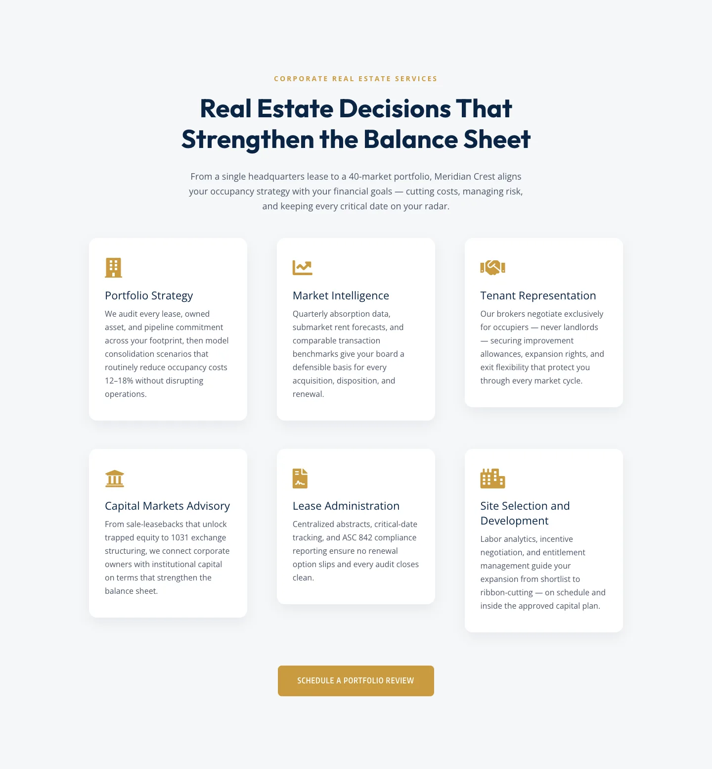
Corporate Real Estate Features Section: Six-Pillar Service Grid for Divi 5
features · real_estate · corporate
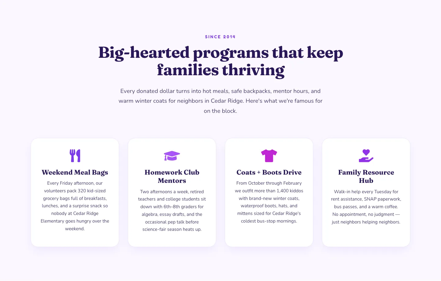
Playful Nonprofit Features Section: Four-Column Icon Cards for Divi 5
features · nonprofit · playful
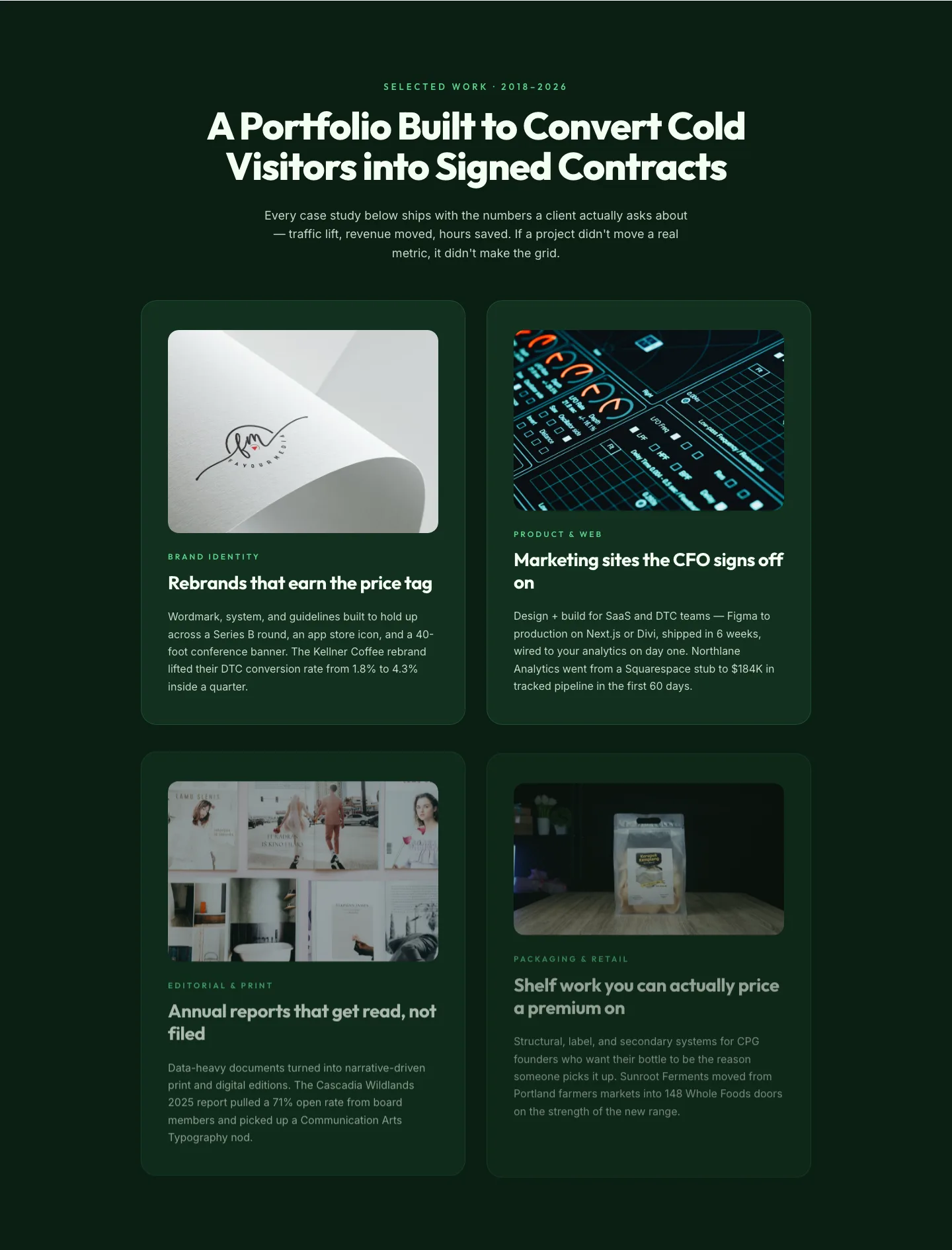
Bold Portfolio Features Grid: Divi 5 Case Study Layout
features · portfolio · bold
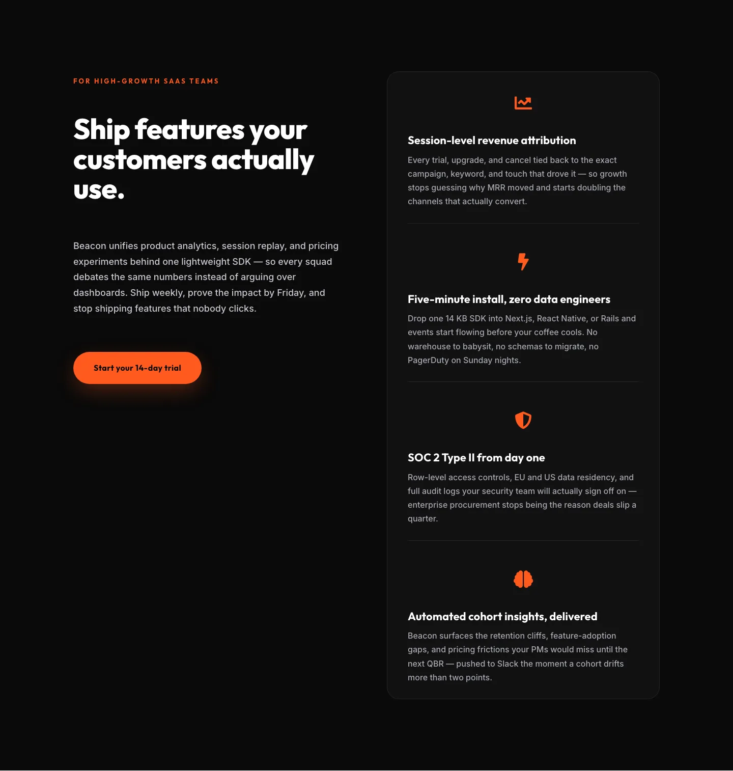
SaaS Features Section: Ship Features Customers Actually Use | Divi 5 Bold Layout
features · saas · bold
SaaS Features Section: Minimal Divi 5 Layout for Product Teams
features · saas · minimal
Bold Agency Features Section: Divi 5 Services Grid Layout
features · agency · bold