
Bold Monochrome Ecommerce Features Section: Northkit Promise | Divi 5
A bold, dark-monochrome Divi 5 features section for ecommerce brands. Three-column promise grid with icons: free shipping, 60-day returns, small-batch drops.
Rate this element
Download this section, free
- Divi 5 JSON, imports in seconds
- Commercial license included
- No account needed
Click to view the full page
Overview
The section opens on a near-black canvas (#0a0a0a) with 120px of vertical breathing room, so the trust promises sit inside a deliberate frame rather than jammed between other blocks. A tight two-line intro leads with a 13px uppercase eyebrow at 4px letter-spacing ("The Northkit Promise"), then an Outfit 700 headline drops to 56px with -1px tracking and a snug 1.06em line-height for that oversized-typography editorial feel. The supporting paragraph underneath is capped at 640px so it stays scannable while the H2 stretches to 820px for balance.
Below sits a three-up card row (1_3 × 3) with 24px column and row gaps. Each card is a self-contained dark tile: a #141414 fill, a 1px rgba(255,255,255,0.08) hairline, 20px corner radius, 44px/36px internal padding, and a preset drop-shadow that deepens on hover. From 20px/48px blur to 32px/64px. Inside each card, a 40px left-aligned Font Awesome icon anchors the top (truck, arrows-rotate, bolt), followed by a 24px Outfit heading and a 16px body paragraph at 72% white with 1.65em line-height. The monochrome palette leans on opacity, not accent color: pure white for headings, 72% white for body, 55% white for the eyebrow.
Responsive behavior is baked in module-by-module: section padding steps from 120px → 88px → 64px across desktop, tablet, and phone, and the H2 shrinks 56 → 40 → 32px so the intro never overwhelms a small screen. The card row flips to a single vertical column on phone with the same 24px gap preserved, so each promise stays fully legible without any custom breakpoint work.
What’s inside
- One Divi 5 Section with two Rows: a centered intro (Text eyebrow + H2 Heading + Text paragraph) followed by a three-column promise row
- Three identical card columns styled with native Divi Column background, border, radius, and box-shadow settings. No custom CSS required
- Font Awesome Icon modules at 40px in pure white (fa-truck for shipping, fa-arrows-rotate for returns, fa-bolt for small-batch scarcity)
- Native Heading modules: H2 in Outfit 700 at 56/40/32px for the intro, H3 in Outfit 700 at 24px on every card
- Text modules for body copy set to 16px with 1.65em line-height and 72% white, tuned for readability on the near-black surface
- Hover-state lift built with Divi's preset3 box-shadow: cards deepen from 0/20/48 to 0/32/64 on pointer hover, no code
- Full responsiveness: three cards across on desktop and tablet, single-column stack on phone, with vertical section padding scaling per breakpoint
Who it’s for
This drops naturally into any DTC or Shopify-migrated store selling premium apparel, footwear, small-batch home goods, skincare, or grooming. Anywhere the brand voice runs bolder than a typical big-box e-com template. It's especially strong under the product-page fold, above the footer on a category page, or as a standalone landing section for a drop announcement. Direct-to-consumer brands leaning into limited-run scarcity, subscription boxes, and cosmetics indies will get the most mileage from the "small-batch" third card. Because the layout is monochrome, it also slots cleanly into a menswear, sneaker, streetwear, or design-forward interiors catalog without fighting for attention against product photography.
Customization tips
Swap the section background to a brand color or a deep gradient via Section → Background, the 72%/55% white overlays will still read against any dark hue. To flip the whole section light, change #0a0a0a to a warm off-white and every text color from white to a near-black in a single find/replace on the JSON before importing.
Keep each card headline under 32 characters (about four words) so the H3 stays on two lines and the three cards remain visually balanced; body copy sits comfortably between 22–40 words per card. If you swap the Font Awesome glyphs, keep them in the same solid (900) weight and 40px size so they match visually. Prefer photos over icons? Replace the Icon module with a small Image module (96×96px square works best) and preserve the 24px margin below it. The card row is a 1_3 × 3 structure, so deleting one column and switching the remaining two to 1_2 gives you a clean two-promise variant.
How to install this layout
- Download the layout JSON file from this page.
- Open the target page in the Divi 5 builder.
- Open the portability panel (up/down arrows icon) and choose the Import tab.
- Upload the JSON. Tick “replace existing content” only for full-page imports.
- Check the page at desktop and mobile widths, then swap in your copy and images.
Full walkthrough with troubleshooting: How to Import a Divi 5 Layout.
Questions about Bold Monochrome Ecommerce Features Section: Northkit Promise | Divi 5
How does the three-column row behave on phone?
The three cards collapse to a single vertical stack on phone. The 24px gap is preserved, and section padding eases from 120px down to 64px so the promises never feel crushed against the edges of the section.
Which Divi 5 modules does the layout actually use?
Only built-ins: one Section, two Rows, four Columns, a Text module for the eyebrow, a Heading for the H2, a Text for the intro paragraph, and three Icon + Heading + Text stacks. One per card. No Code modules and no custom CSS.
Do I need to source images before I can use this section?
No. The layout is icon-driven, three Font Awesome glyphs at 40px in pure white handle the visual anchors. That means zero image prep before you ship it, which is why it works as a fast drop-in on a new product or category page.
What should I edit first after importing?
The three card headings and body paragraphs. That's the promise itself. Rewrite them to match your real shipping window, return policy, and stock model. Then update the eyebrow ("The Northkit Promise") and the H2 to match your brand voice. Palette changes are optional.
Does the hover-lift shadow work on touch devices?
The deeper box-shadow only triggers on desktop pointer hover. On phones and tablets the cards sit in the default 0px/20px/48px shadow, which is already deep enough to feel elevated against the near-black section. Nothing looks broken on touch.
Which Divi version does this layout need?
Divi 5. The layout is generated natively for Divi 5 and validated against its real module structure before publication, so it imports clean into the current builder.
Can I use this layout on client websites?
Yes. Every download includes a commercial license covering unlimited sites you own or build for clients. Only reselling or redistributing the layout file itself is prohibited.
More feature grids
Browse all feature grids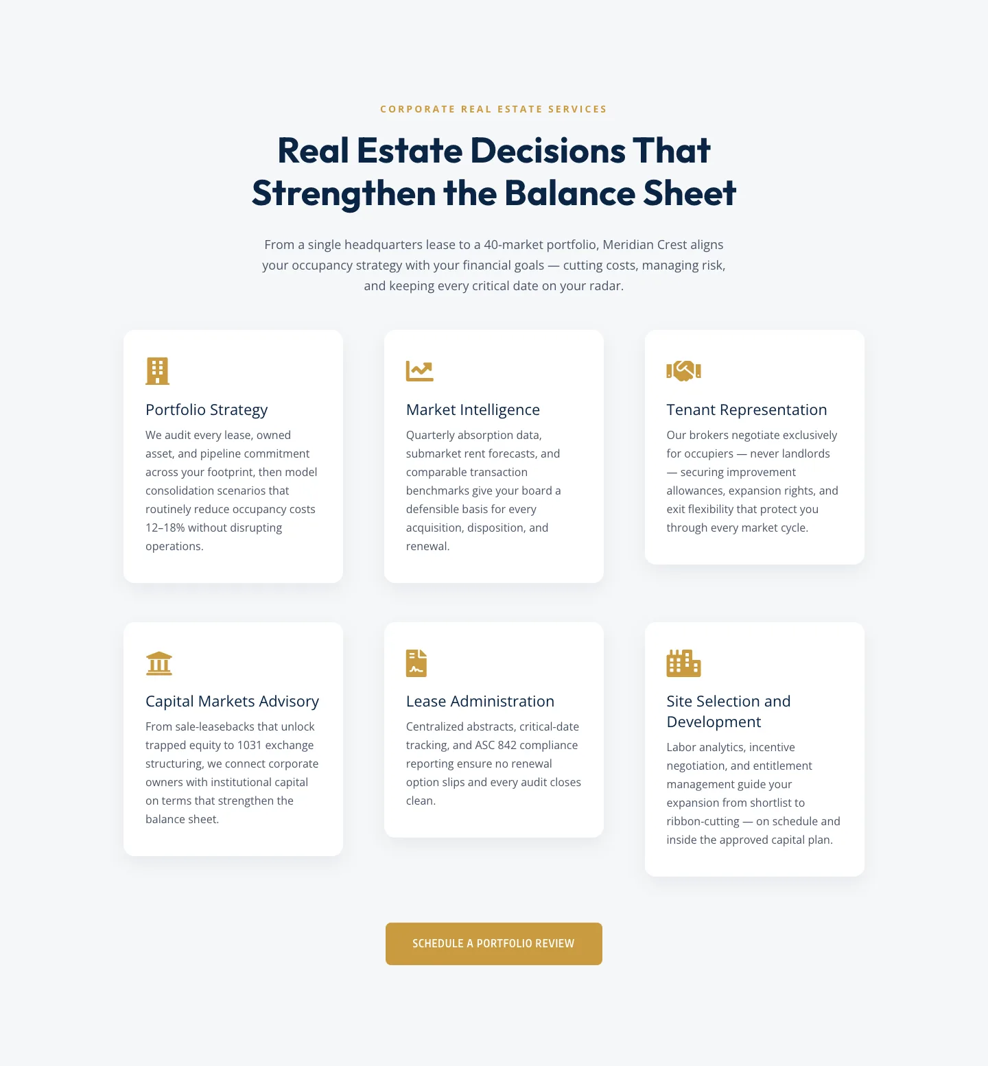
Corporate Real Estate Features Section: Six-Pillar Service Grid for Divi 5
features · real_estate · corporate
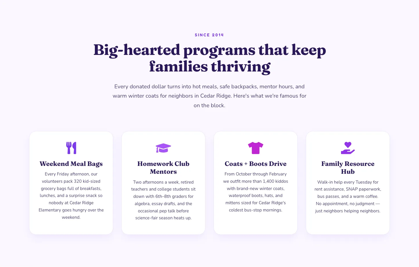
Playful Nonprofit Features Section: Four-Column Icon Cards for Divi 5
features · nonprofit · playful
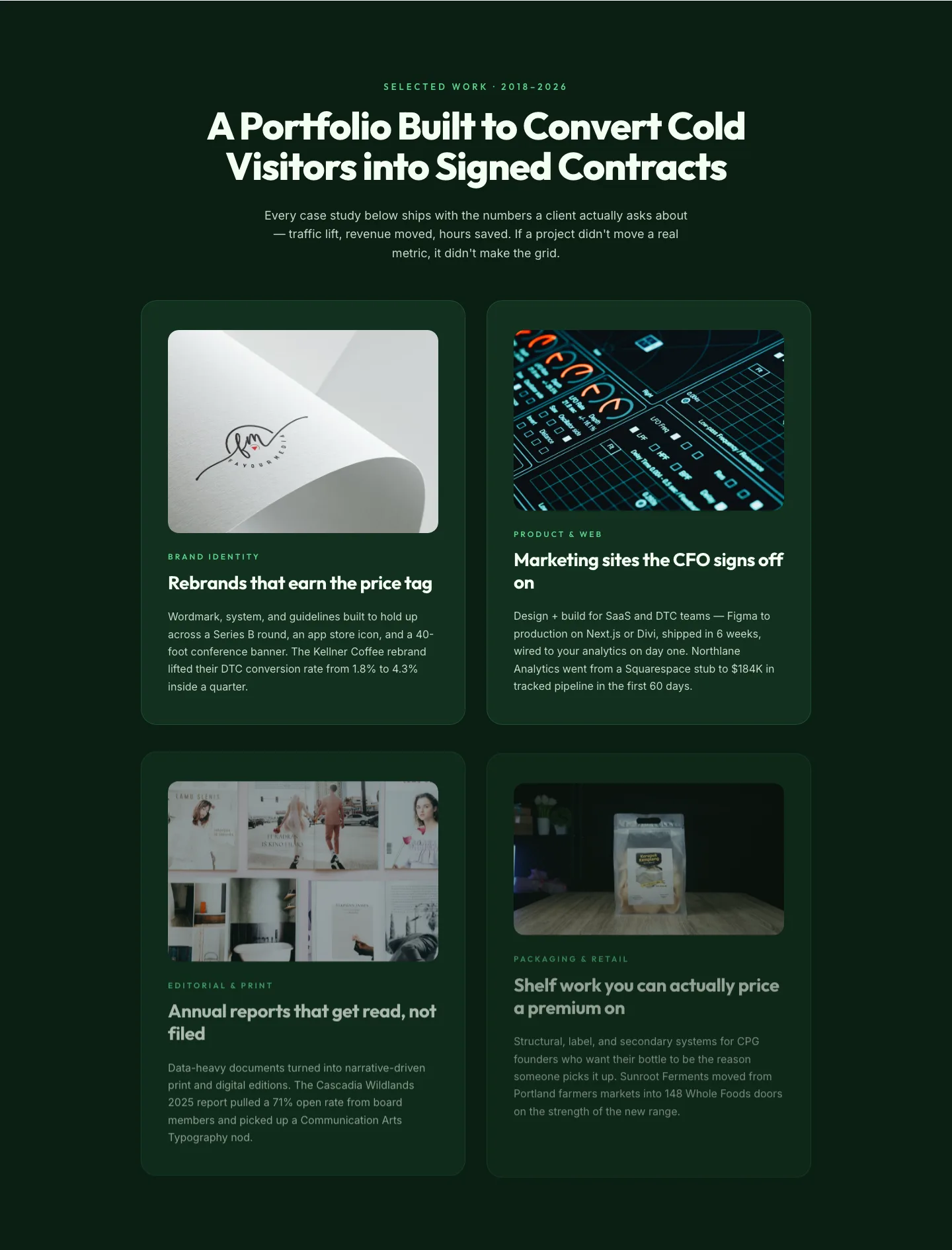
Bold Portfolio Features Grid: Divi 5 Case Study Layout
features · portfolio · bold
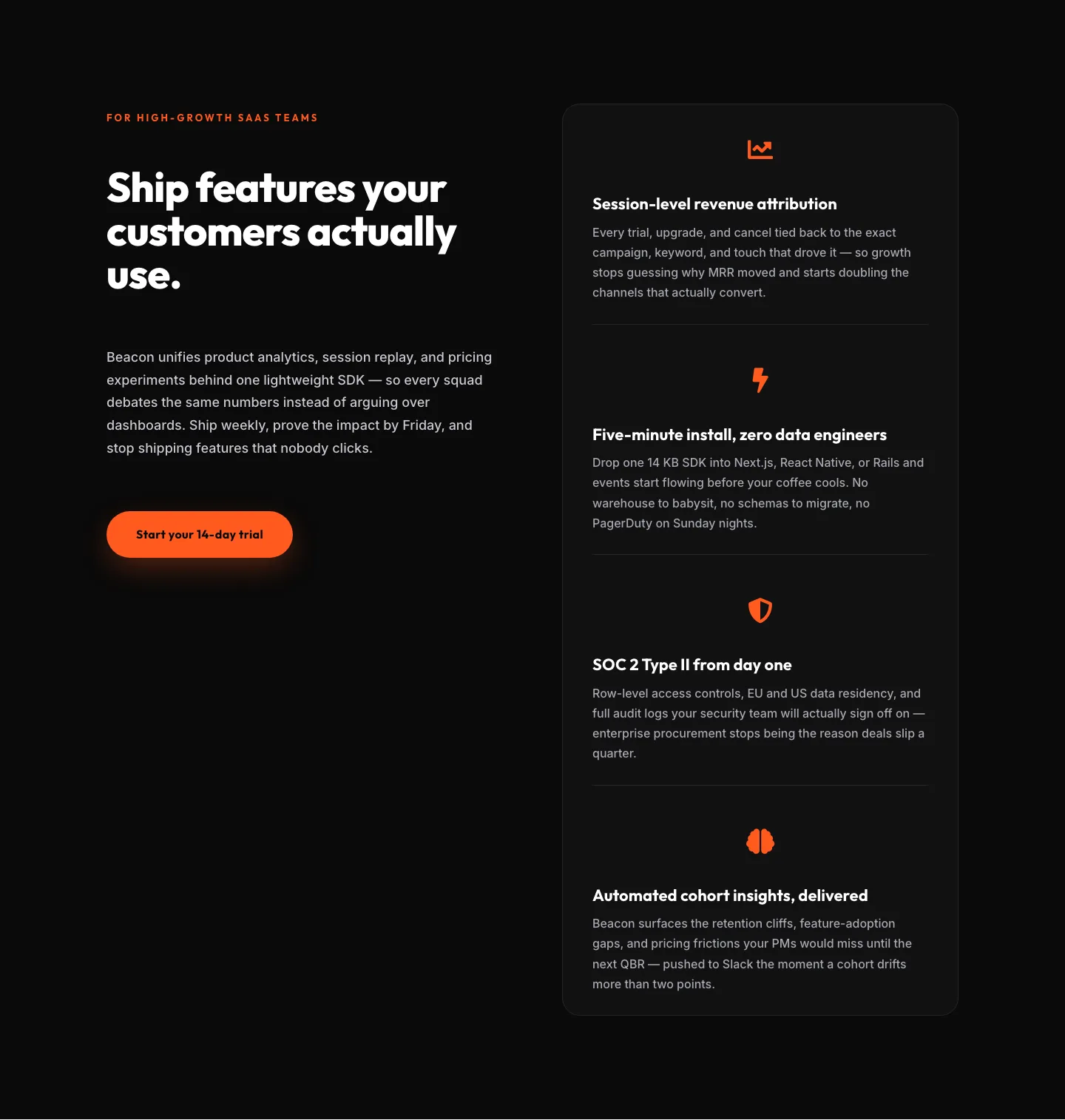
SaaS Features Section: Ship Features Customers Actually Use | Divi 5 Bold Layout
features · saas · bold
SaaS Features Section: Minimal Divi 5 Layout for Product Teams
features · saas · minimal
Bold Agency Features Section: Divi 5 Services Grid Layout
features · agency · bold