
Bold Red SaaS Hero Section for Divi 5: Ship Faster CTA
High-impact dark SaaS hero layout for Divi 5 with bold red CTA, trial button, trust badges, and product image. Drop-in JSON for conversion-focused launches.
Rate this element
Download this section, free
- Divi 5 JSON, imports in seconds
- Commercial license included
- No account needed
Click to view the full page
Overview
The layout runs on a 1240px two-column split (1/2 + 1/2) sat inside a deep #0b0b0d section: near-black rather than pure black, which softens the red without diluting it. The left column stacks a rounded eyebrow badge ("New · Incident-free deploys for SaaS teams"), an 800-weight display heading with -1.5px tracking that lands at 64px, a 19px muted-grey subhead capped at 540px so the line length stays comfortable, a two-button row with a solid red primary and a ghosted secondary, and a subtle trust bar with red check marks. The right column is a single framed image with a 20px radius, a hairline white border and a red glow shadow that bleeds off the container.
The palette is disciplined: one signature red (#dc2626) drives the primary button, the badge tint (rgba(220,38,38,0.12) inside a rgba(239,68,68,0.35) border), the ✓ marks (#f87171) and the image's soft glow. So every red pixel is doing conversion work. Everything else stays neutral: white heading, #d1d5db body copy, #9ca3af trust bar, all set in Inter. Spacing is generous (140px top/bottom on desktop, 6vw horizontal padding, 64px between columns) because a hero this loud needs air around it to read.
Mobile is choreographed, not compressed. The main row flips flex-direction to column on tablet (32px column gap, 40px row gap), the two-button row goes vertical on phones so both CTAs sit full-width, the headline steps down 64 → 48 → 38px, the body drops from 19px to 17px, and section padding compresses from 140 → 96 → 72px so the framed product image still lands near the fold on a phone. The Pexels image has a soft slide-in from the right (700ms, intensity 2) as a first-load flourish that never repeats.
What’s inside
- Two-column hero row (1/2 + 1/2) capped at 1240px, flex-aligned center with a 64px column gap on desktop
- Eyebrow badge Text module: rounded 999px pill with a tinted red background and hairline red border, uppercase 13px Inter
- Display Heading module: 64px / 48px / 38px responsive scale, 800 weight, -1.5px letter-spacing
- Subhead Text module capped at 540px so the line length stays under ~65 characters
- Nested button row: solid red primary (#dc2626 → #b91c1c hover) with a preset red glow, plus a ghost secondary (rgba white fill, 1px white border)
- Trust bar Text with three inline check items styled in #f87171 red on a neutral grey base
- Image module: 20px rounded, hairline white border, red glow shadow (preset3), and a 700ms slide-from-right entrance
- Section padding tuned per breakpoint (140/96/72) and full flex-direction switch at tablet
Who it’s for
This hero is engineered for developer tools, DevOps, deploy platforms, observability, monitoring, incident-response and modern B2B SaaS marketing sites. Anything where you'd normally lead with "ship faster / break nothing" energy. The red-on-black scheme signals urgency and confidence, so it also works well for security tools, uptime dashboards, feature-flag platforms and cybersecurity products that live inside a dark, opinionated brand system. The 540px-capped subhead and dual-CTA pattern (primary trial + secondary demo) map cleanly onto the standard product-led-growth playbook, so growth teams can drop in real trial and demo URLs and ship. Less obvious but valid fits: fintech dashboards, crypto infra, gaming platforms, and any brand that wants a high-contrast statement hero without going pastel or gradient.
Customization tips
Palette: to reskin, swap #dc2626 in the primary button background, the badge background tint (rgba 220,38,38,0.12), the badge border, the image shadow color, and the ✓ characters inside the trust-bar Text. Those five spots carry the entire red identity. For a cooler brand, pick a single hue and adjust the rgba variants proportionally. The heading is comfortable up to about 7 words; go longer and the -1.5px tracking starts breaking awkwardly at the 48px tablet size. Keep the subhead under ~40 words so it stays inside its 540px cap and doesn't push the buttons below the fold. Button copy caps at roughly 26 characters before the button row wraps on desktop. Replace the Pexels URL in the Image module with your own product screenshot at a 4:3 ratio (~1200×900) so the 20px radius and red glow shadow keep their intended proportions. Rewrite the three trust-bar items ("No credit card", "SOC 2", "2,400+ teams") to your real proof points before shipping. They're placeholders.
How to install this layout
- Download the layout JSON file from this page.
- Open the target page in the Divi 5 builder.
- Open the portability panel (up/down arrows icon) and choose the Import tab.
- Upload the JSON. Tick “replace existing content” only for full-page imports.
- Check the page at desktop and mobile widths, then swap in your copy and images.
Full walkthrough with troubleshooting: How to Import a Divi 5 Layout.
Questions about Bold Red SaaS Hero Section for Divi 5: Ship Faster CTA
How does this hero behave on mobile?
The main row flips to a vertical stack on tablet and below, the heading scales 64 → 48 → 38px, the two buttons stack full-width on phones, and section padding compresses from 140px to 72px so the product image still lands near the fold.
Which Divi 5 modules is it built from?
One Section, two Rows (the main 1/2 + 1/2 split plus a nested row for the buttons), three Columns, three Text modules (badge, subhead, trust bar), one Heading, two Buttons and one Image: all native Divi 5 modules, no third-party dependencies.
Can I replace the product screenshot on the right?
Yes, open the Image module and swap the source URL. A 4:3 asset around 1200×900 keeps the 20px rounded frame and the red glow shadow looking correct; noticeably taller or wider images will change the balance of the split.
What should I edit first when I import it?
In order: the badge label, the headline, the subhead, the primary and secondary button text and links, the image, then the three trust-bar items. Spacing, palette and the entrance animation can stay untouched on a first pass.
Is the slide-in animation on the image optional?
Yes. It's a preset on the Image module (slide from right, 700ms, intensity 2). Open the module's Animation tab and set the style to "none" if you'd rather the image render instantly with no motion.
Which Divi version does this layout need?
Divi 5. The layout is generated natively for Divi 5 and validated against its real module structure before publication, so it imports clean into the current builder.
Can I use this layout on client websites?
Yes. Every download includes a commercial license covering unlimited sites you own or build for clients. Only reselling or redistributing the layout file itself is prohibited.
More hero sections
Browse all hero sections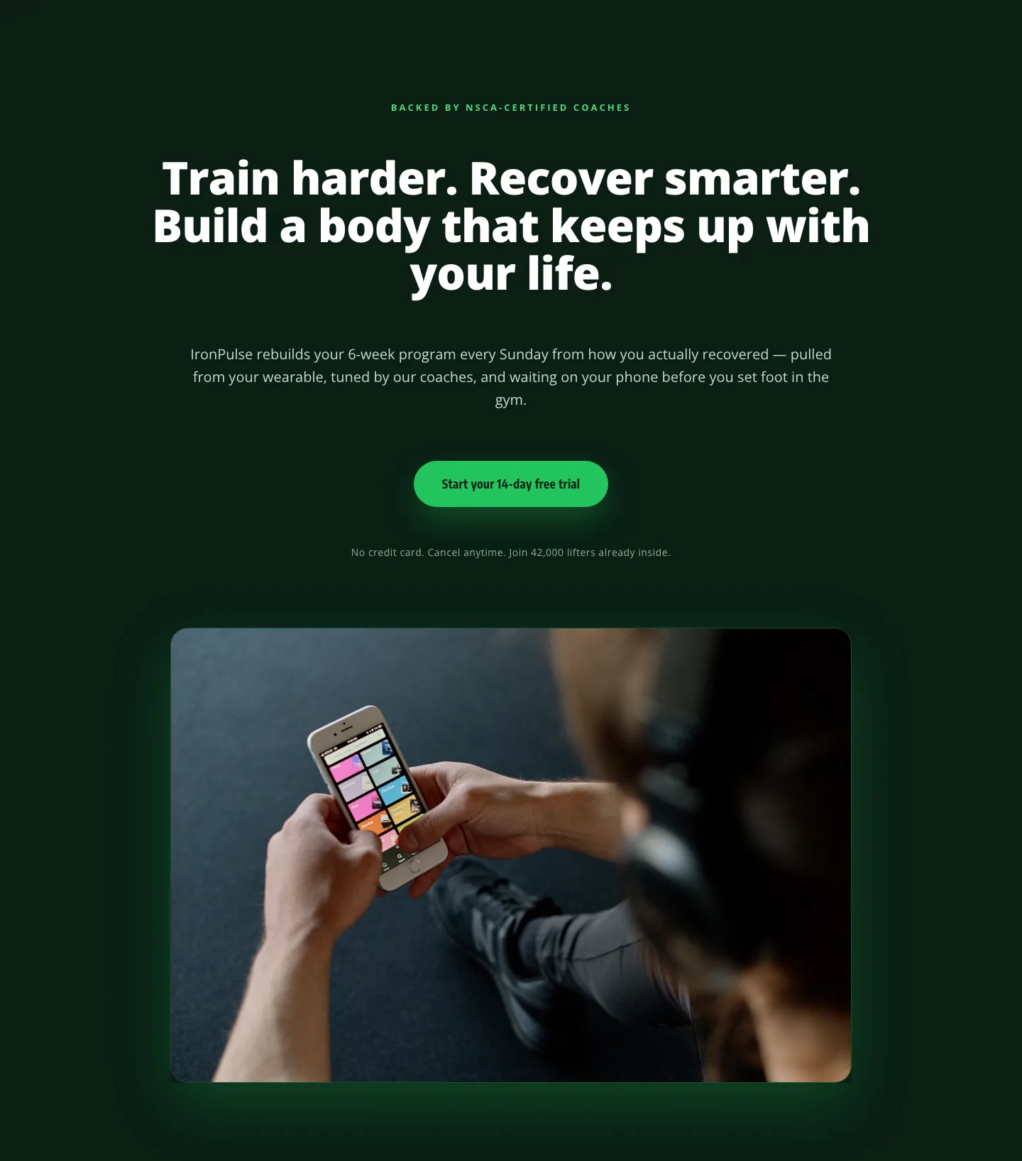
Bold Fitness App Hero Layout for Divi 5: IronPulse Adaptive Training
hero · fitness · bold
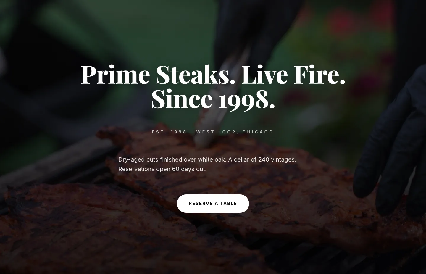
Prime Steaks Hero Section: Bold Monochrome Restaurant Layout for Divi 5
hero · restaurant · bold
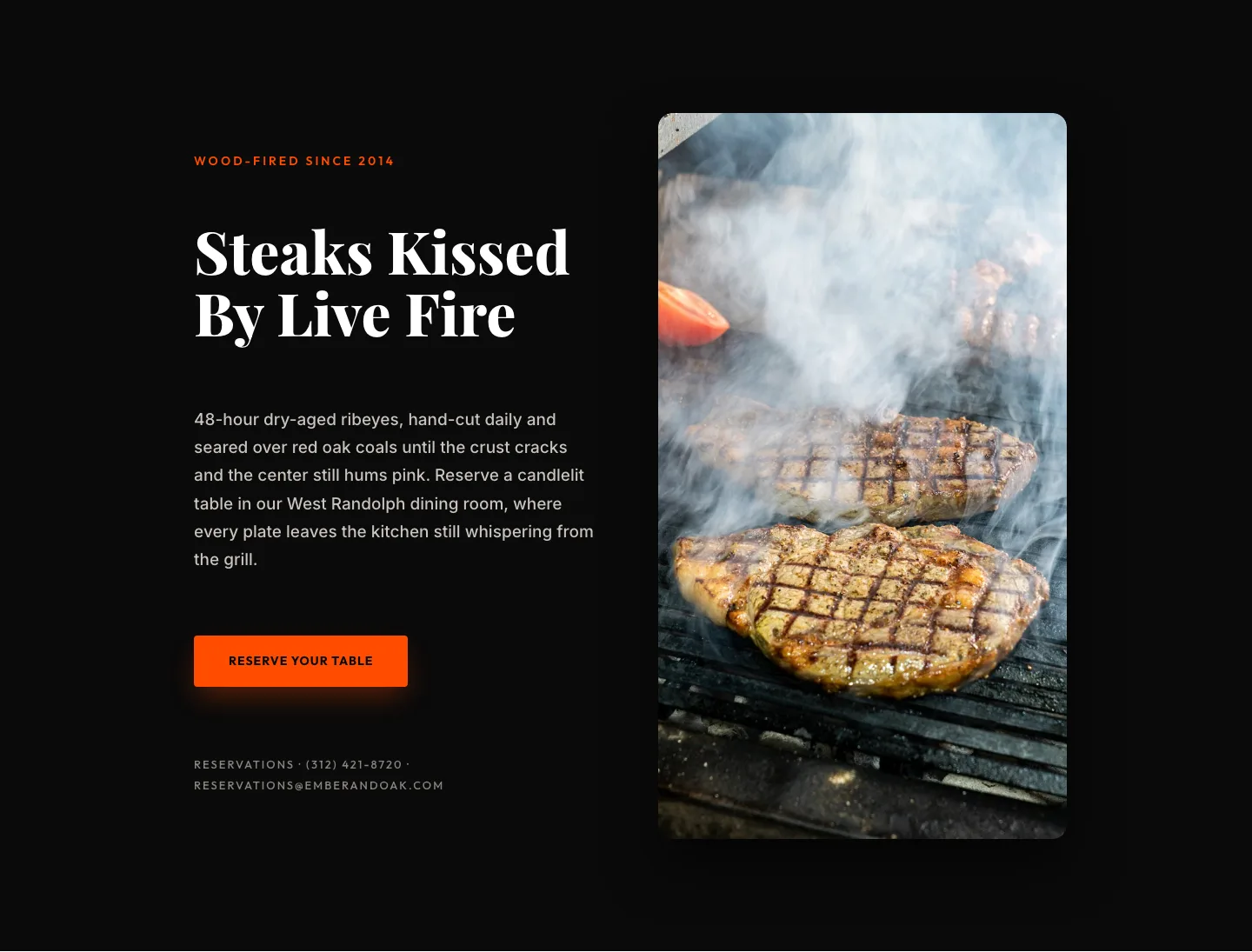
Wood-Fired Steakhouse Hero Layout for Divi 5: Bold Restaurant Template
hero · restaurant · bold
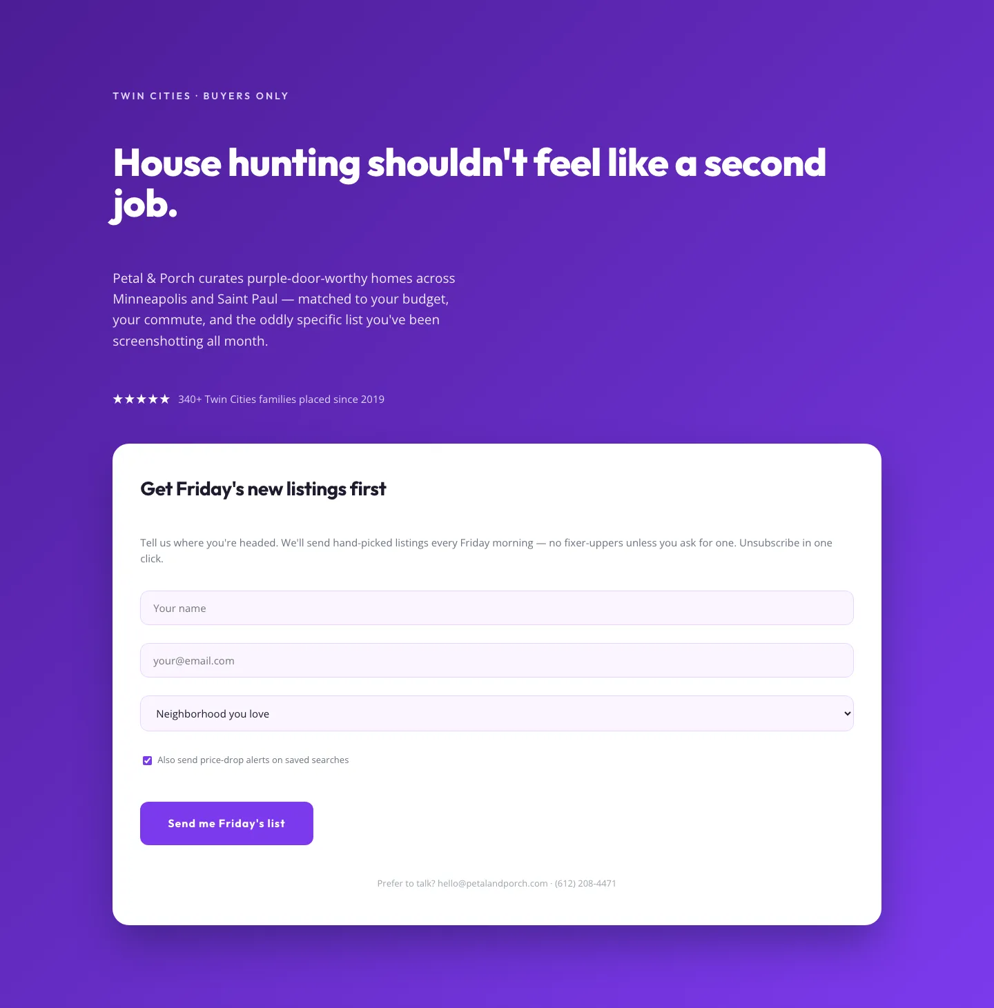
Playful Real Estate Hero with Weekly Listings Signup: Divi 5 Layout
hero · real_estate · playful
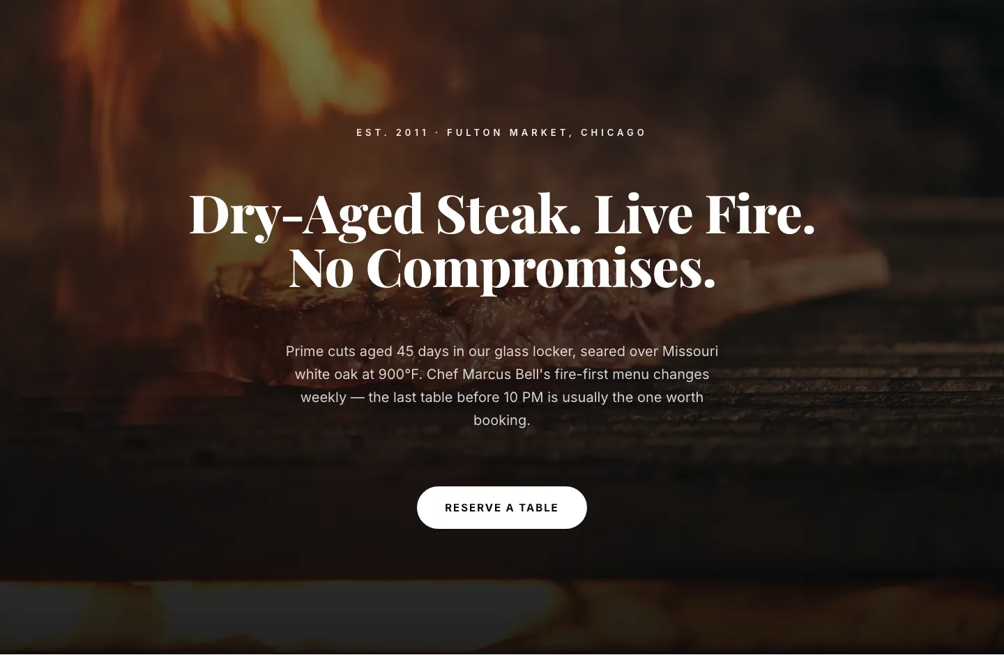
Bold Steakhouse Hero Layout for Divi 5: Fire & Dry-Aged
hero · restaurant · bold
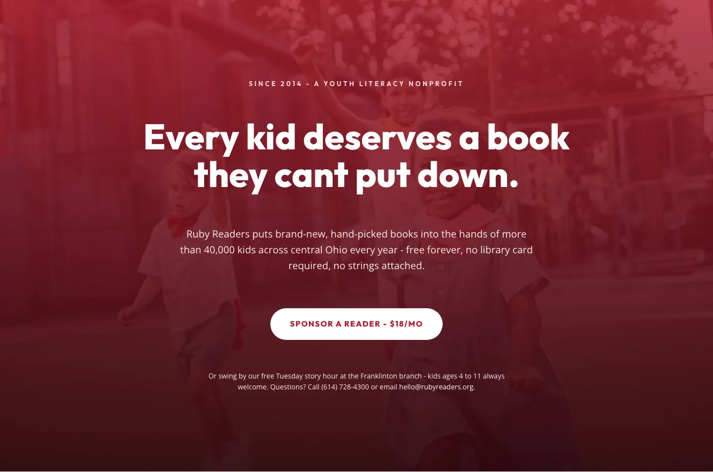
Ruby Readers Nonprofit Hero: Playful Divi 5 Layout
hero · nonprofit · playful