
Bold SaaS Hero Layout for CI/CD & Engineering Tools: Divi 5
High-contrast dark hero section for SaaS and DevOps brands. Bold red CTA, oversized headline, trust line, and image card. Built for Divi 5 conversion landing pages.
Rate this element
Download this section, free
- Divi 5 JSON, imports in seconds
- Commercial license included
- No account needed
Click to view the full page
Overview
A hero built for engineering-tools SaaS: two columns on desktop (roughly 60/40), copy on the left, a bordered product/team image on the right, everything sitting on a near-black #0A0A0A background with a single red accent (#DC2626) doing the heavy lifting. The row uses a 56px gap and centers vertically, so the headline block and the image feel balanced instead of top-aligned.
The hierarchy is aggressive on purpose. A short uppercase eyebrow (14px, 3px letter-spacing, red) labels the audience, then a 68px/800-weight headline with -2px tracking and a tight 1.05em line-height dominates the fold. Body copy sits at a comfortable 20px with 1.65em line-height in warm grey (#D4D4D4), followed by a solid red CTA (10px radius, generous 18px/32px padding, darker #991B1B hover) and one line of muted micro-copy (#737373, 14px) for trust signals. The section breathes: 120px top/bottom padding on desktop, dropping to 80px on tablet and 60px on phone.
On the right, the image sits inside a 20px rounded frame with a 2px red border and a large soft red glow (0 30px 80px rgba(220,38,38,0.35)), which is what makes the whole thing feel bold rather than corporate. On phone, the row switches to flex-direction: column with a 40px row gap so the copy stacks cleanly above the image; the headline scales down to 38px and body text to 17px so nothing overflows a 375px viewport.
What’s inside
- Two-column 60/40 hero row (3_5 / 2_5) with a 56px column gap and vertical centering
- Uppercase red eyebrow heading with 3px letter-spacing for a category / audience label
- Oversized 68px display headline with responsive downshifts to 48px on tablet and 38px on phone
- Body paragraph module sized for readability at 20px / 1.65 line-height
- Solid red CTA button with a darker hover state, 10px corners, and hefty click-target padding
- Muted 14px micro-copy row for trust signals (no credit card, setup time, logos-in-text)
- Right-column image module framed with a 20px radius, 2px red border, and a soft red glow shadow
- Three-tier responsive padding (120 / 80 / 60px) and a phone-only stack that swaps to a single column with a 40px row gap
Who it’s for
Purpose-built for developer-tools and infrastructure SaaS: CI/CD platforms, deploy tooling, observability, feature-flag services, on-call and incident-response apps, security scanners, cloud cost tools, internal developer platforms, and API/edge products. The tone ("Ship 10x faster. Break 10x less.") and the trust-signal line about engineering teams make it a natural fit for anything sold to CTOs, platform teams, and senior engineers. It also works for adjacent B2B SaaS with a bold, opinionated brand: analytics, data-ops, DevSecOps, MLOps, or any tool where credibility and speed claims matter more than a soft, friendly look.
Customization tips
The whole design is driven by one accent color, #DC2626. Swap it in four places (eyebrow text, button background + hover, image border, image glow shadow) and the section retakes any brand palette in a few minutes. Keep the headline to 5–7 words: at 68px with -2px letter-spacing it wraps to two lines gracefully but breaks awkwardly beyond three. The eyebrow works best at 3–5 words. Body copy comfortably holds 2–3 sentences (roughly 220–280 characters) before the CTA gets pushed below the fold on a laptop. For the image, upload something close to square (the source is declared 1200×1200) so the 20px rounded frame and red border read evenly; product screenshots, dashboard captures, or team shots all work. Avoid busy full-bleed photography that fights the red glow. If you drop the image entirely, widen the left column to 5_5 and the copy re-flows without touching any other setting.
How to install this layout
- Download the layout JSON file from this page.
- Open the target page in the Divi 5 builder.
- Open the portability panel (up/down arrows icon) and choose the Import tab.
- Upload the JSON. Tick “replace existing content” only for full-page imports.
- Check the page at desktop and mobile widths, then swap in your copy and images.
Full walkthrough with troubleshooting: How to Import a Divi 5 Layout.
Questions about Bold SaaS Hero Layout for CI/CD & Engineering Tools: Divi 5
How does the hero behave on mobile?
The row switches to a single stacked column with a 40px row gap: copy first, image second. The headline scales from 68px down to 38px, body text from 20px to 17px, and section padding drops to 60px top/bottom so nothing feels cramped on a 375px viewport.
What modules does this actually use?
Four native Divi 5 modules: two Heading modules (eyebrow + display headline), a Text module for the body paragraph, a Button module for the CTA, a second Text module for the trust-signal line, and one Image module in the right column. No third-party add-ons, no code modules.
What image should I put in the right column?
Something close to square works best, the source image is declared 1200×1200 and lives in a 20px rounded frame with a 2px red border. A product screenshot, dashboard shot, or a dark-toned team/office photo all sit well against the black background and the red glow shadow.
What should I edit first after importing?
Three things, in order: the accent color (`#DC2626` appears on the eyebrow, button, image border, and glow, do a project-wide swap if you're rebranding), the headline copy (keep it to 5–7 words so the 68px display size still wraps to two lines), and the image. Everything else (padding, hierarchy, hover states) is already tuned.
Will the big 68px headline break on smaller laptops?
No. It's capped by the 3_5 column width (roughly 60% of the row) and uses a tight 1.05em line-height with `-2px` letter-spacing, so long words don't overflow. On tablet it steps down to 48px automatically, then to 38px on phone.
Which Divi version does this layout need?
Divi 5. The layout is generated natively for Divi 5 and validated against its real module structure before publication, so it imports clean into the current builder.
Can I use this layout on client websites?
Yes. Every download includes a commercial license covering unlimited sites you own or build for clients. Only reselling or redistributing the layout file itself is prohibited.
More hero sections
Browse all hero sections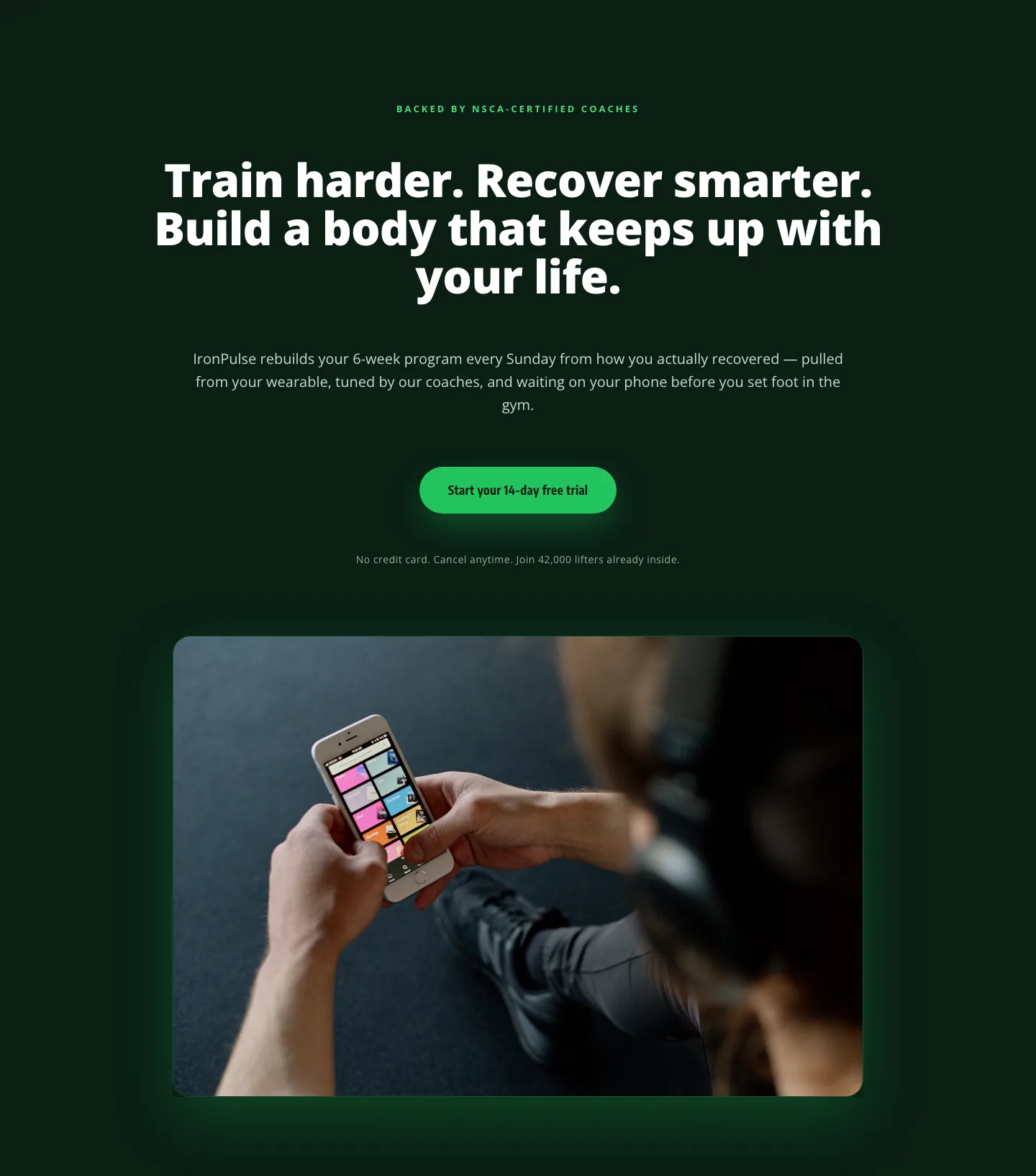
Bold Fitness App Hero Layout for Divi 5: IronPulse Adaptive Training
hero · fitness · bold
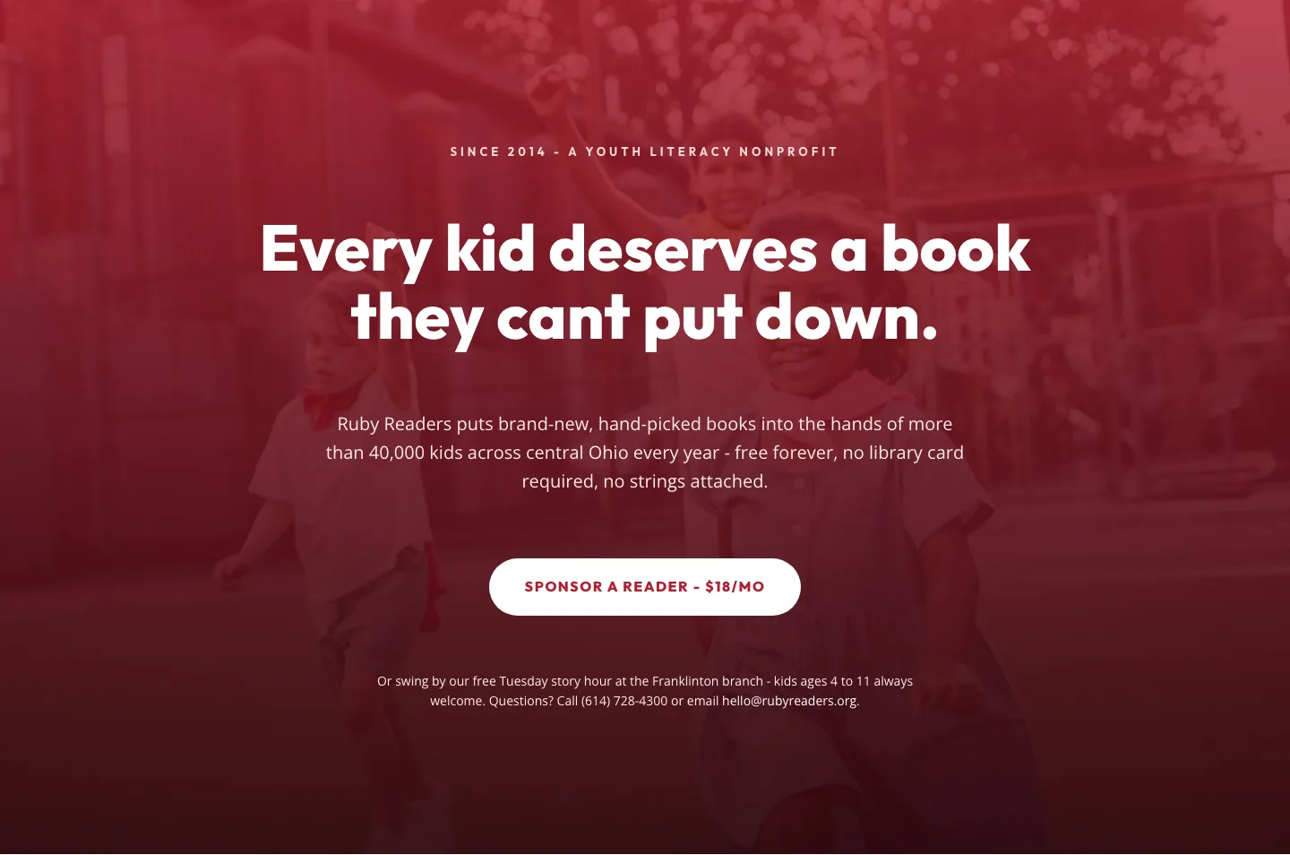
Ruby Readers Nonprofit Hero: Playful Divi 5 Layout
hero · nonprofit · playful
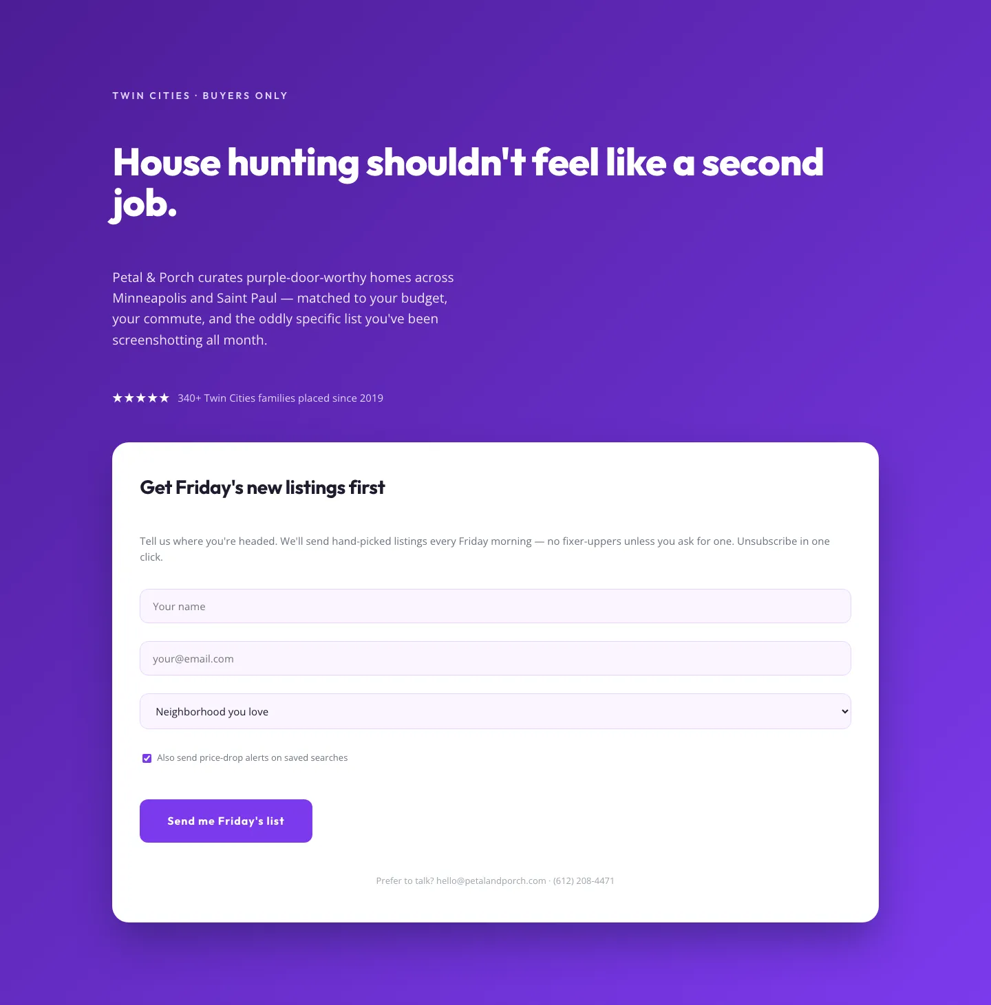
Playful Real Estate Hero with Weekly Listings Signup: Divi 5 Layout
hero · real_estate · playful
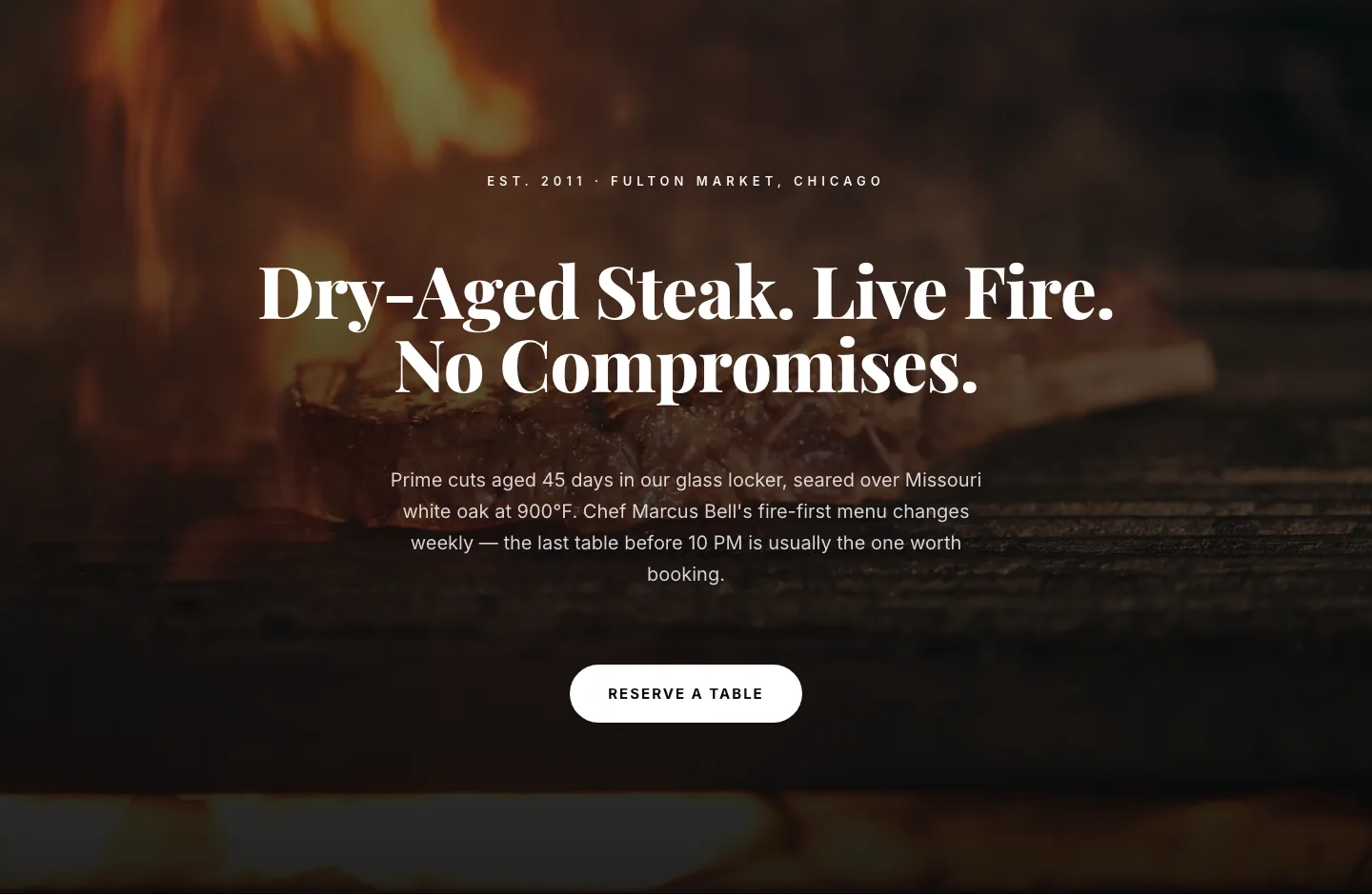
Bold Steakhouse Hero Layout for Divi 5: Fire & Dry-Aged
hero · restaurant · bold
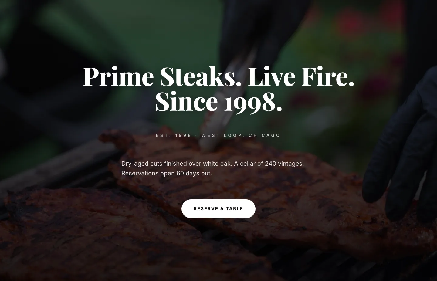
Prime Steaks Hero Section: Bold Monochrome Restaurant Layout for Divi 5
hero · restaurant · bold
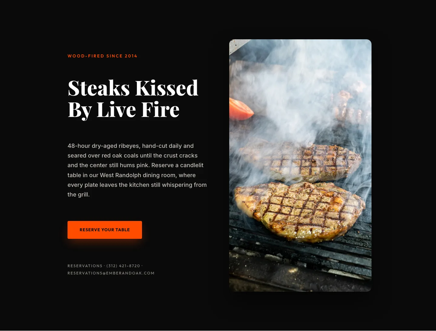
Wood-Fired Steakhouse Hero Layout for Divi 5: Bold Restaurant Template
hero · restaurant · bold