
Bold SaaS Hero Section: Red Gradient Helpdesk Template for Divi 5
High-impact Divi 5 hero section for SaaS products. Bold red gradient, oversized headline, trial CTA, and trust microcopy. Drop-in ready for landing pages.
Rate this element
Download this section, free
- Divi 5 JSON, imports in seconds
- Commercial license included
- No account needed
Click to view the full page
Overview
The layout is a single full-bleed section with a 3/5 + 2/5 asymmetric two-column row. On the left, an 800-weight Inter headline at 4.4vw pulls the eye first ("Shipping Customer Tickets in 4 Minutes Flat"), followed by a red uppercase subtitle at 22px with 3px letter-spacing, a 19px body paragraph capped at a 560px max-width, a solid red CTA button, and a small trust-signal line underneath. The right column carries a single product screenshot with a 16px border-radius, a 1px translucent-red border, and a large dark-red glow shadow that anchors the corner without needing a card frame.
Palette is intentionally narrow. The background is a 135° gradient from near-black #0a0a0a to a bruised #1a0606, so the red family (accent #ef4444 for the subtitle, #dc2626 for the button (hovering to #b91c1c), and a 35%-opacity red glow around the image) reads as the only real color on the section. Type is set in one family (Inter) across three weights and four sizes, which keeps hierarchy legible without visual noise. Section padding uses viewport-relative 7vw top and bottom so the hero breathes on wide monitors, while column-level 20px padding keeps the copy from touching the row edges. A 48px column gap plus 32px row gap defines the desktop rhythm, and the flex row wraps for anything narrower.
On phone breakpoints the section pads collapse to 60px vertical, the H1 drops from 4.4vw to a fixed 40px so it doesn't overwhelm small screens, and the flex row wraps so the copy sits above a full-width product image. The image ships with an 800ms slide-in from the right at desktop and a preset3 box shadow that keeps it distinct against the near-black background. The whole hero is a five-module stack of pure native Divi 5 blocks: no code module, no third-party dependency, nothing to break on update.
What’s inside
- Two-column asymmetric row (3/5 copy, 2/5 image) built as a flex row that wraps to a stacked single column on smaller viewports
- Dark 135° gradient background (#0a0a0a → #1a0606) that lets a single red accent carry the entire visual system
- Inter type stack across three weights (600, 700, 800) with a mobile-specific 40px H1 override so the headline never blows out on phones
- Uppercase red subtitle at 22px with 3px letter-spacing sitting under the H1 as a product/category tag
- Solid red CTA button (#dc2626 → #b91c1c on hover), 8px radius, 18/32px padding, sized to the headline column
- Product-image slot with 16px rounded corners, 1px translucent-red border, and a preset3 dark-red glow shadow
- 800ms slide-from-right entrance animation on the image for a subtle on-load motion cue
- Optional trust-signal microtext slot under the CTA at 14px zinc-400 for compliance, integrations, or reassurance copy
Who it’s for
This hero is built for SaaS founders and marketing teams who want a landing-page opener that reads as confident and product-forward without leaning on a stock illustration. It fits AI-powered tools, helpdesk and support platforms, dev tools, sales enablement, workflow automation, DevOps, and any B2B category where the buyer response you want is "how fast can I try this?" The dark red palette skews serious rather than playful, so it works better for infrastructure, ops, security, and enterprise-adjacent products than for consumer or lifestyle apps. Agencies building product-launch pages for founder clients can drop this in as the top-of-page module and let the rest of the page carry the softer, more explanatory sections beneath.
Customization tips
Swap the H1 for your own value proposition: the 4.4vw sizing scales gracefully between 42 and 88 characters, so aim for one line at desktop. The uppercase subtitle works up to about 60 characters before wrapping distractingly; keep it as a brand or category tag. Body copy has a 560px max-width and comfortably fits 2–4 sentences at 19px. To restyle the palette, replace the two background gradient stops and update the four red values (#ef4444 subtitle, #dc2626 button, #b91c1c hover, rgba(220,38,38,0.35) glow): the layout has no other colored surfaces, so a single hue swap re-themes the whole section. The product-image slot is 940×650, roughly 3:2; use a real product screenshot rather than stock photography for the highest conversion. If you don't need the trust-signal microtext, delete that second Text module. The button's 20px bottom margin already gives the row enough breathing room.
How to install this layout
- Download the layout JSON file from this page.
- Open the target page in the Divi 5 builder.
- Open the portability panel (up/down arrows icon) and choose the Import tab.
- Upload the JSON. Tick “replace existing content” only for full-page imports.
- Check the page at desktop and mobile widths, then swap in your copy and images.
Full walkthrough with troubleshooting: How to Import a Divi 5 Layout.
Questions about Bold SaaS Hero Section: Red Gradient Helpdesk Template for Divi 5
How does the two-column layout behave on tablet and phone?
The row is a flex container with wrap enabled, so the copy column stacks above the image once the viewport is too narrow to hold the 3/5 + 2/5 split. Section padding also drops from 7vw to a fixed 60px at the phone breakpoint, and the H1 shrinks from 4.4vw to 40px so it never overflows.
Which Divi 5 modules are used?
Just the essentials: one Section, one Row with two Columns, two Heading modules (H1 plus the red subtitle), two Text modules (body paragraph and trust microtext), a Button, and an Image. No code module, no third-party blocks.
What image dimensions should I use in the right column?
The included placeholder is 940×650, roughly 3:2. Anything in that ratio will look correct with the 16px rounded corners and the 1px translucent-red border. A product UI screenshot works best, the dark-red glow shadow was tuned assuming the subject is mostly light or mid-tone against the near-black background.
What should I edit first?
The H1, then the red subtitle (usually your product name), then the body paragraph, then the button label, then the image. The trust-signal microtext is optional: if you don't have a compliance line or integration list, delete that Text module rather than leaving generic filler.
Can I turn off the slide-in animation on the image?
Yes. Open the Image module, go to Advanced → Animation, and set the style to None. The animation is a one-time 800ms slide from the right on page load, so removing it won't shift any spacing or affect the layout at rest.
Which Divi version does this layout need?
Divi 5. The layout is generated natively for Divi 5 and validated against its real module structure before publication, so it imports clean into the current builder.
Can I use this layout on client websites?
Yes. Every download includes a commercial license covering unlimited sites you own or build for clients. Only reselling or redistributing the layout file itself is prohibited.
More hero sections
Browse all hero sections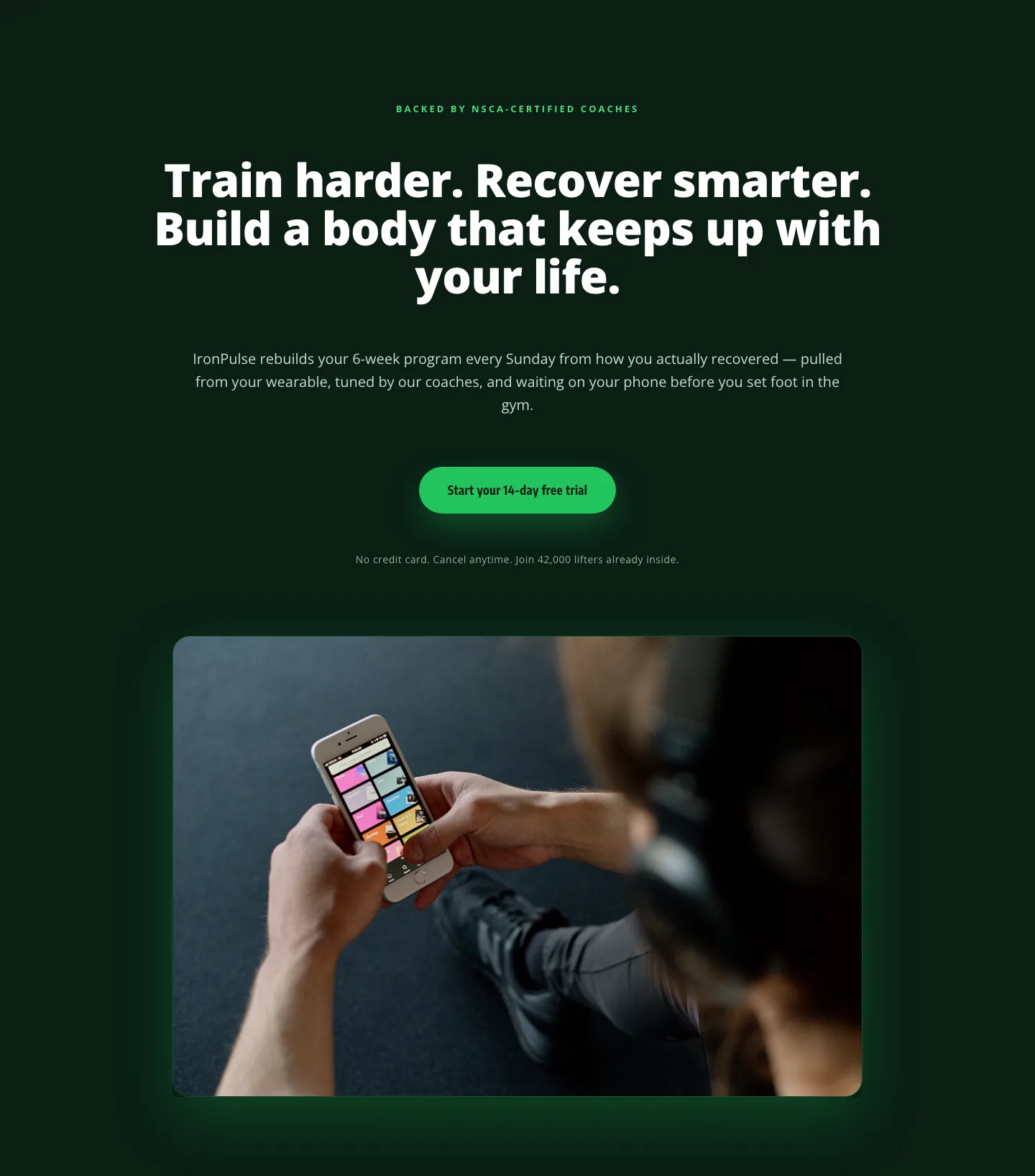
Bold Fitness App Hero Layout for Divi 5: IronPulse Adaptive Training
hero · fitness · bold
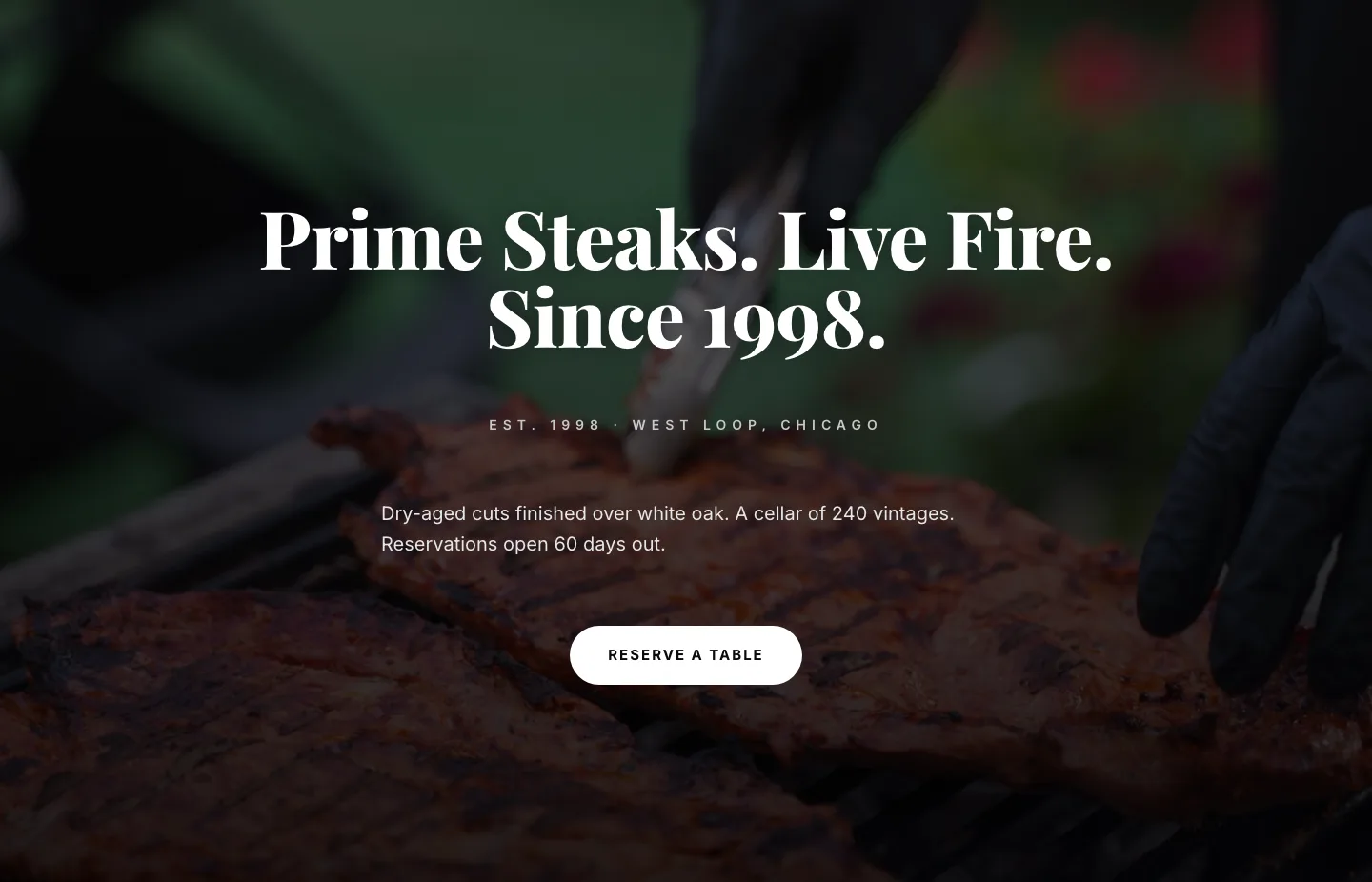
Prime Steaks Hero Section: Bold Monochrome Restaurant Layout for Divi 5
hero · restaurant · bold
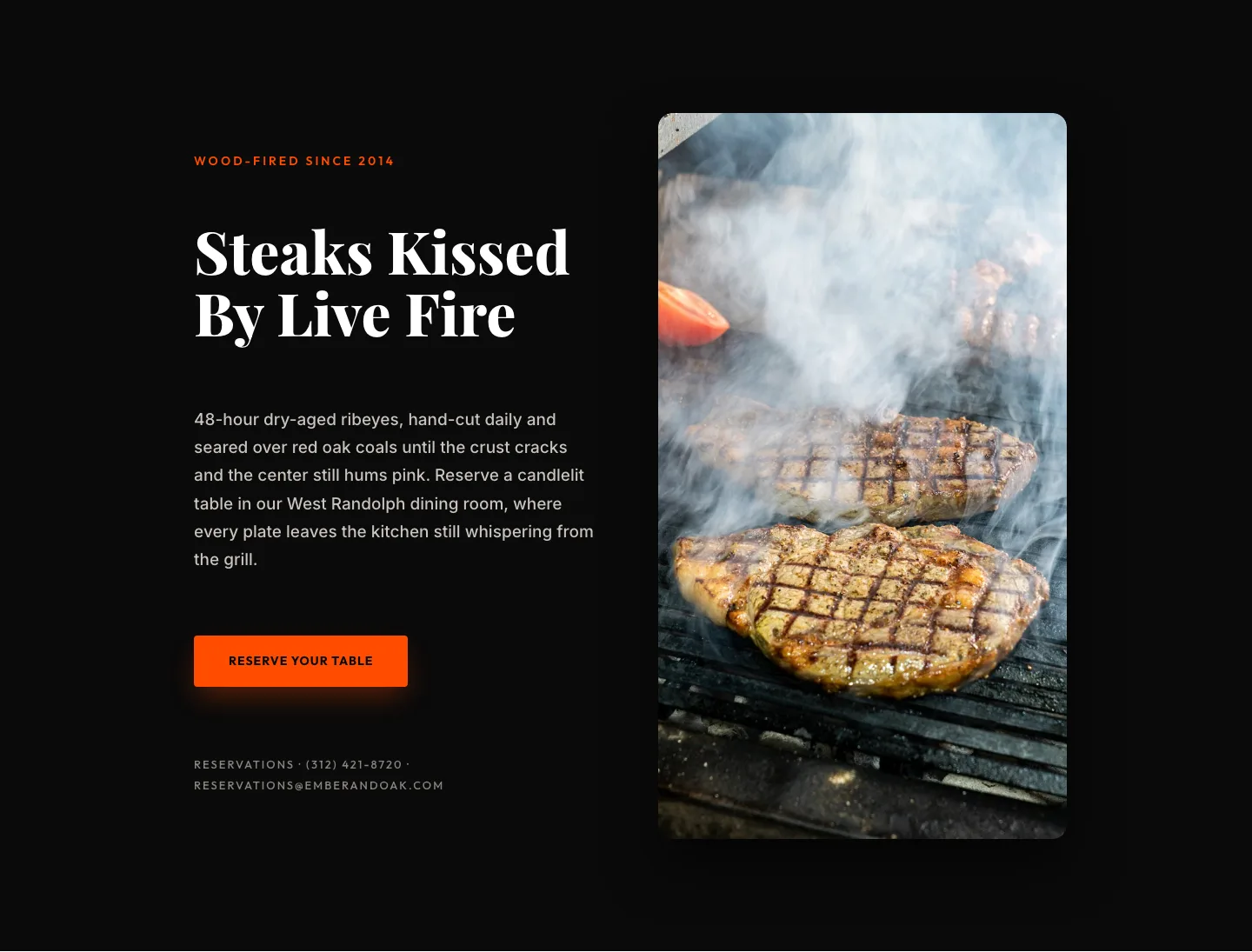
Wood-Fired Steakhouse Hero Layout for Divi 5: Bold Restaurant Template
hero · restaurant · bold
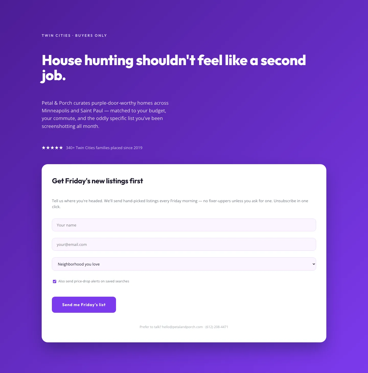
Playful Real Estate Hero with Weekly Listings Signup: Divi 5 Layout
hero · real_estate · playful
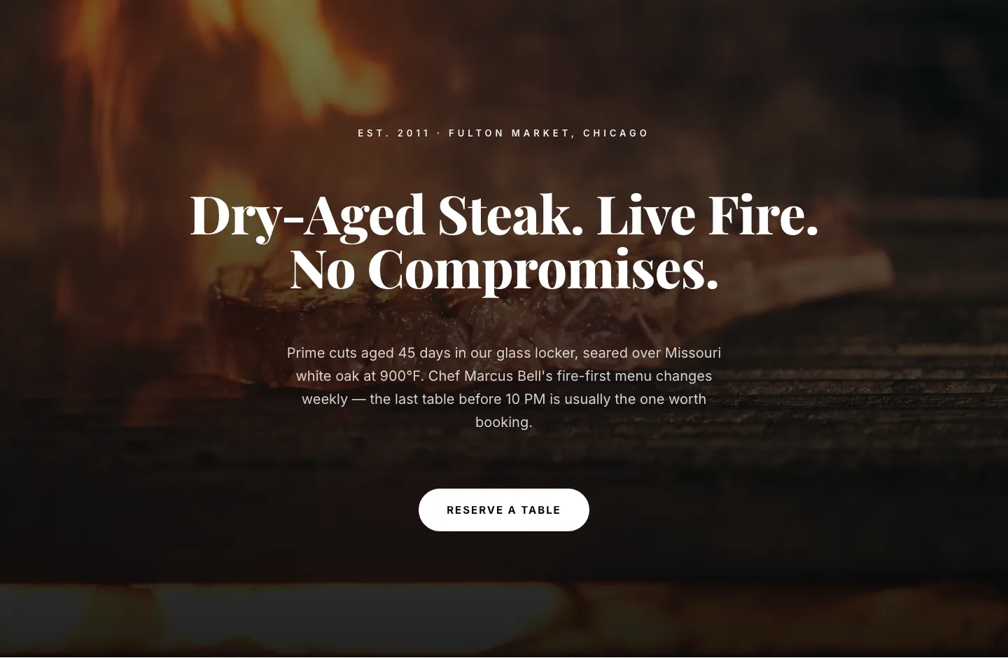
Bold Steakhouse Hero Layout for Divi 5: Fire & Dry-Aged
hero · restaurant · bold
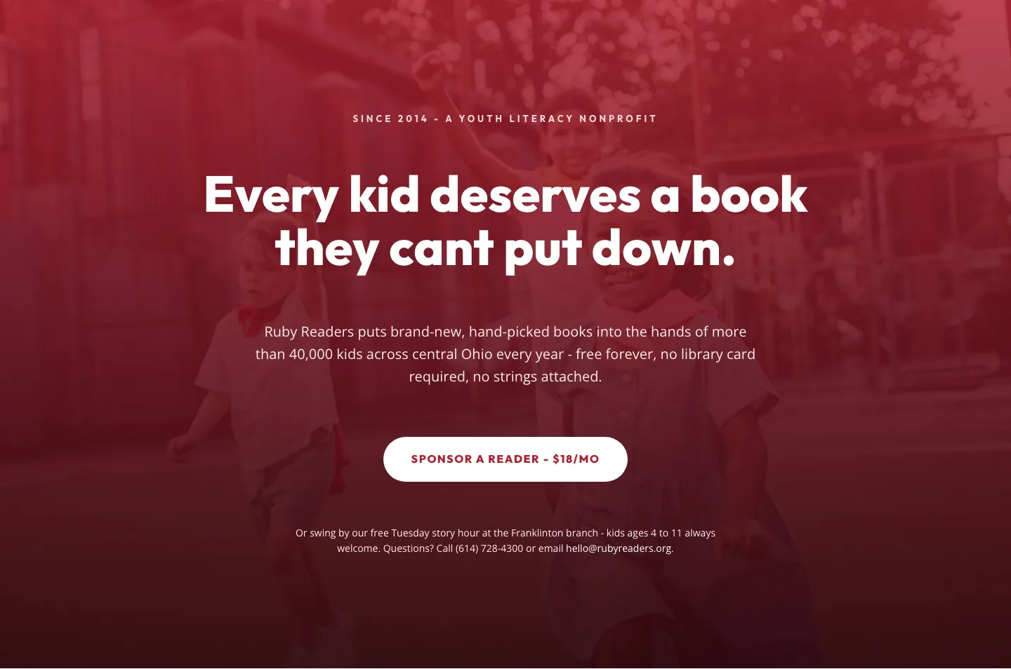
Ruby Readers Nonprofit Hero: Playful Divi 5 Layout
hero · nonprofit · playful