
Bold SaaS Pricing Section: Three-Tier Dark Layout for Divi 5
High-contrast Divi 5 pricing section for SaaS products. Three tiers with a highlighted plan, feature lists, and trial CTAs on a bold dark background.
Rate this element
Download this section, free
- Divi 5 JSON, imports in seconds
- Commercial license included
- No account needed
Click to view the full page
Overview
The section opens with a tight, 820px‑wide intro block (an orange "For SaaS teams" eyebrow at 13px/letter‑spacing 3px, an 800‑weight 56px headline reading "Pricing that scales with your product," and a soft 65%‑white subhead) all center‑aligned so the eye funnels straight down into the plan grid. Because the intro column is capped narrower than the 1200px pricing row below it, the cards visually dominate while the copy above stays comfortably legible.
The three plans sit in a 1_3, 1_3, 1_3 row with a 24px column gap and align-items: stretch, so the cards match height regardless of feature‑list length. Starter and Scale share the same shell (#141414 fill, a 1px hairline border at 8% white, 24px radius, and a deep preset3 drop shadow) and use ghost buttons on 8%‑white backgrounds. The middle Growth card breaks the pattern deliberately: a warm #1a1108 fill, a 2px #ff4d00 border, and a wide orange glow shadow (rgba(255,77,0,0.28)) push it forward, and it's the only card with a solid orange CTA and a small "Most popular" pill above its plan name.
Every plan follows the same internal hierarchy: uppercase label, 56px price, "per month, billed annually" caption, one‑sentence audience line, a feature <ul> set to 2em line‑height for scannability, then the CTA. Section padding is 120px vertical and 6vw horizontal, giving the whole block breathing room without touching the viewport edges on wide screens. On phone, the pricing row flips to flexDirection: column, so the three cards stack full‑width in Starter → Growth → Scale order while every internal spacing rule stays intact.
What’s inside
- Three‑column pricing grid built with a native Divi Row using `1_3, 1_3, 1_3` structure and 24px column/row gaps
- Centered intro block (eyebrow + H1 headline + supporting paragraph) capped at 820px so the plan cards visually lead
- Featured middle card with 2px `#ff4d00` border, warm `#1a1108` fill, orange glow box‑shadow, and its own "Most popular" label
- Two ghost CTA buttons ("Start free 14‑day trial", "Talk to sales") and one solid orange CTA. All standard Divi Button modules with rounded 12px radius
- Per‑plan feature list rendered as a `<ul>` inside a Divi Text module at 2em line‑height for scannable rows
- Consistent card hierarchy: uppercase label → $price → billing caption → one‑line audience blurb → feature list → CTA
- Only three module types across the whole section (Text, Heading, and Button) inside Section/Row/Column, so nothing external to install
- Mobile behavior baked in: the pricing row flips to `flexDirection: column` on phone and each card stretches to full width
Who it’s for
Built specifically for SaaS products that sell on a three‑tier plan structure: analytics platforms, dev tools, monitoring services, PLG apps, API products, and B2B dashboards. It handles the classic "Starter / Growth (featured) / Scale" shape without modification, and the copy hooks (event quotas, retention windows, SSO, SOC 2, dedicated CSM) already read like a real SaaS pricing page rather than a template. It also works cleanly for infrastructure/agency retainers with three service tiers, or for a membership site where you want one clearly recommended plan. If you sell more than three tiers, a single flat plan, or usage‑based pricing without discrete plans, another layout will fit better.
Customization tips
The orange #ff4d00 accent appears in five places: the intro eyebrow, the "Most popular" tag, the featured card's 2px border, its box‑shadow tint, and the Growth CTA background. Swap all five together: easiest via Divi Global Colors before importing, or a search/replace in the JSON. The dark palette is three tokens: #0a0a0a section, #141414 outer cards, #1a1108 featured card; keep the featured slightly warmer than the neighbours so it still reads as "chosen" without the orange border. Feature lists sit best at 5–6 items each; go past 7 and the shorter cards leave visible whitespace above the CTA because columns stretch to equal height. Prices are 56px/800‑weight: 2–4 characters look ideal ($29, $249), longer strings like $1,299 still fit but tighten the vertical rhythm. Plan descriptions are one sentence, roughly 12–18 words. There are no image modules, so no aspect ratios or Pexels swaps to worry about. This is pure type and CSS.
How to install this layout
- Download the layout JSON file from this page.
- Open the target page in the Divi 5 builder.
- Open the portability panel (up/down arrows icon) and choose the Import tab.
- Upload the JSON. Tick “replace existing content” only for full-page imports.
- Check the page at desktop and mobile widths, then swap in your copy and images.
Full walkthrough with troubleshooting: How to Import a Divi 5 Layout.
Questions about Bold SaaS Pricing Section: Three-Tier Dark Layout for Divi 5
Does the featured Growth card still stand out on mobile?
Yes. On phone the row switches to `flexDirection: column` and the cards stack vertically. The Growth card keeps its 2px `#ff4d00` border, warm `#1a1108` fill, orange glow shadow, and solid orange CTA, so it still reads as the recommended plan even without side‑by‑side comparison.
How many feature bullets can I put in each plan?
Five to six per card is the sweet spot: the current cards ship with 5, 6, and 6. Columns are set to `align-items: stretch` so heights match, which means adding a lot more items to one card leaves visible empty space above the CTAs on the shorter ones.
What Divi modules does this use, anything third‑party?
Nothing third‑party. It's built entirely with Divi 5's Section, Row, and Column plus Text, Heading, and Button modules. No pricing‑table plugin, no shortcodes, no external CSS. Everything is styled through the standard module design controls.
There are no images. What should I edit first?
Correct, this is pure type. Start with the eyebrow ("For SaaS teams"), the H1, and each plan's label, price, one‑line description, and the feature `<ul>`. Then decide which card carries the "Most popular" tag, you can move the featured styling to any of the three columns.
Can I change the orange accent to my brand color?
Yes, but change it in all five places at once: the intro eyebrow color, the "Most popular" pill color, the Growth card's 2px border, the orange box‑shadow tint, and the solid CTA background. The cleanest path is registering it as a Divi Global Color first, then reassigning those five swatches.
What if I only need two plans instead of three?
Delete one of the outer columns and change the Row's column structure from `1_3, 1_3, 1_3` to `1_2, 1_2`. Keep the featured card in the primary slot and the 1200px row max‑width: the 24px gap, stretch alignment, and phone stack behavior all carry over unchanged.
Which Divi version does this layout need?
Divi 5. The layout is generated natively for Divi 5 and validated against its real module structure before publication, so it imports clean into the current builder.
Can I use this layout on client websites?
Yes. Every download includes a commercial license covering unlimited sites you own or build for clients. Only reselling or redistributing the layout file itself is prohibited.
More pricing tables
Browse all pricing tables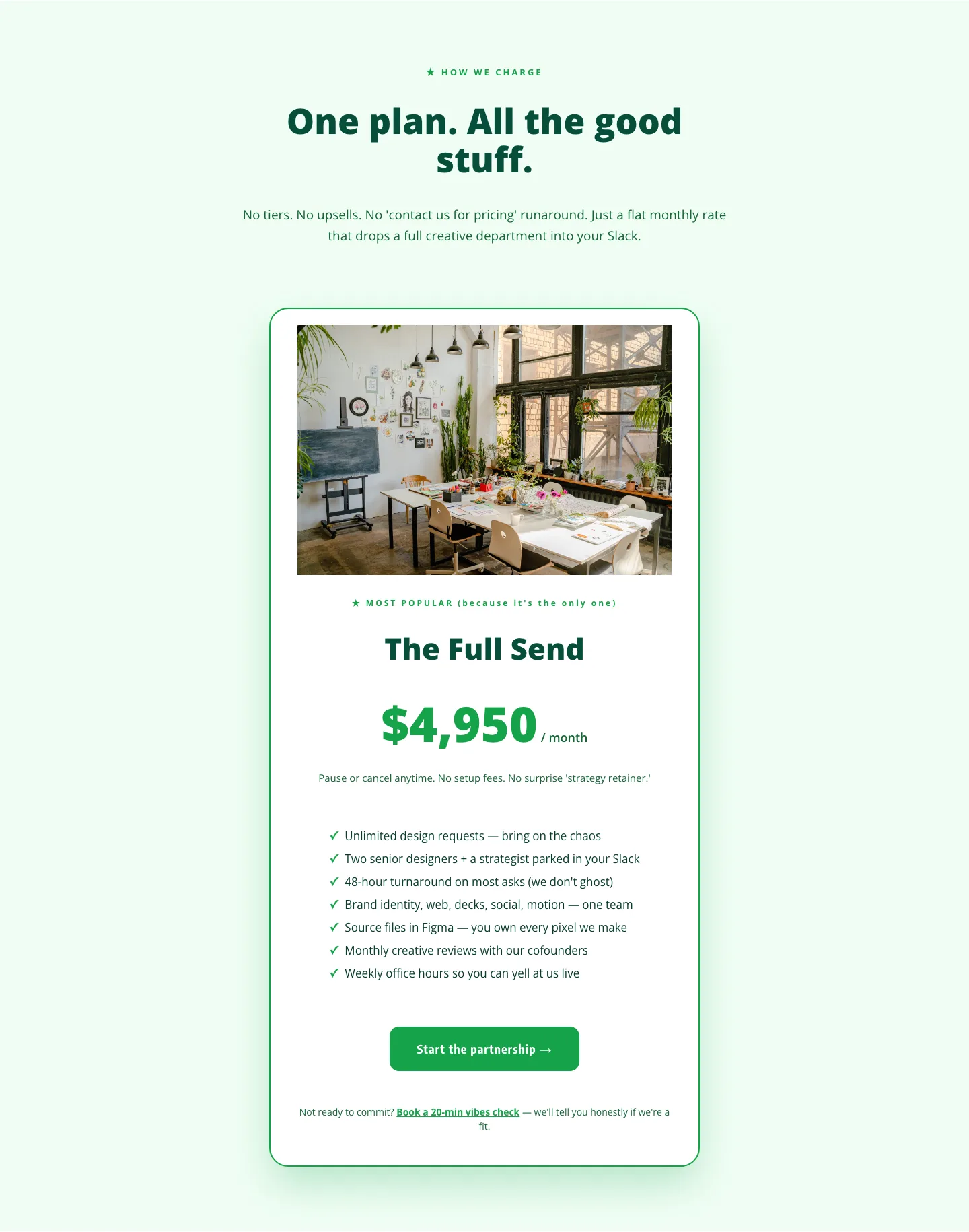
Playful Agency Pricing Section: Flat-Rate Divi 5 Layout
pricing · agency · playful
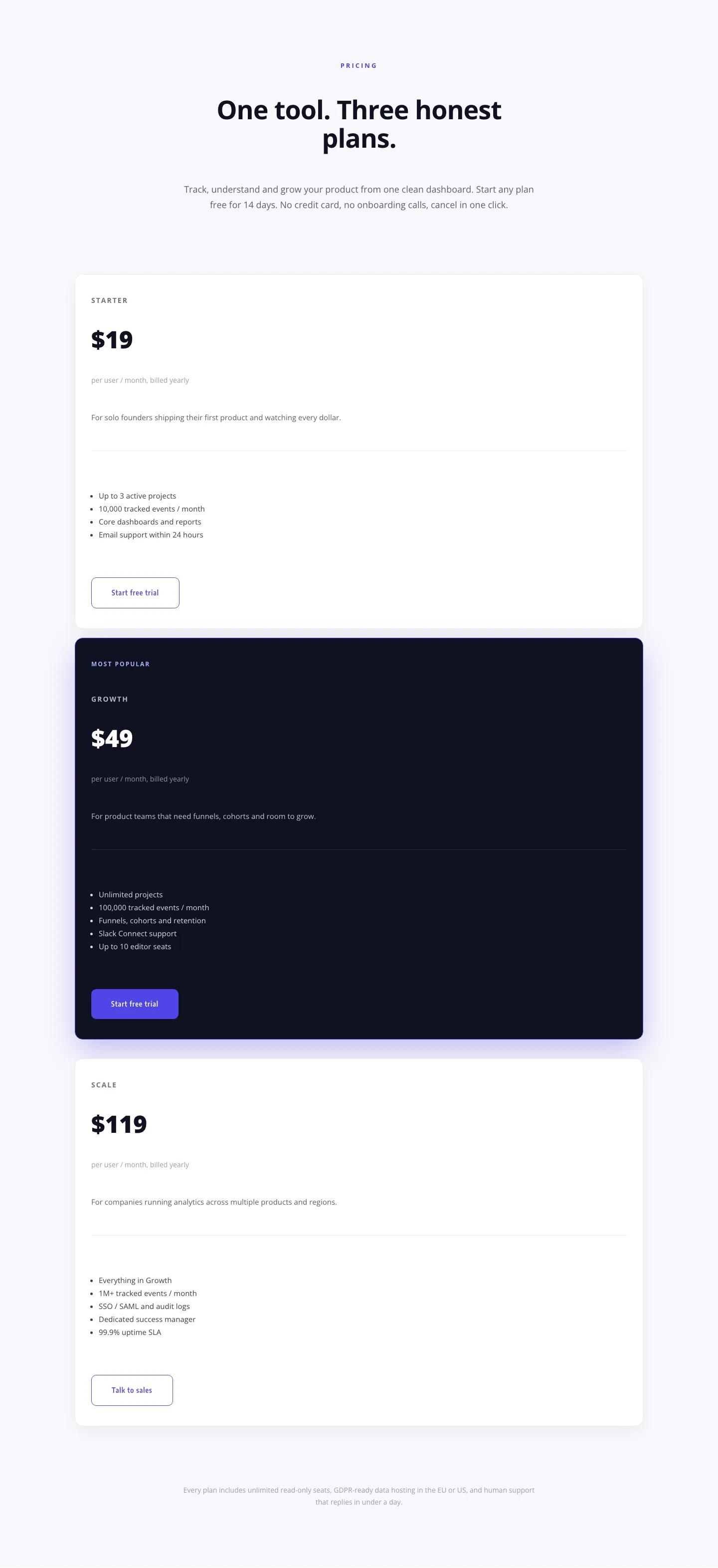
Minimal SaaS Pricing Section: 3-Tier Plan Cards with Featured Dark Tier | Divi 5 Layout
pricing · saas · minimal
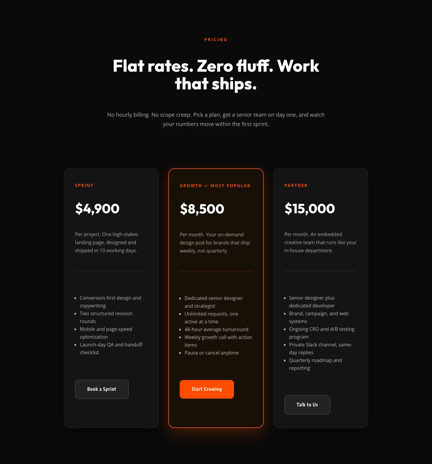
Bold Agency Pricing Section: Dark 3-Tier Divi 5 Layout
pricing · agency · bold
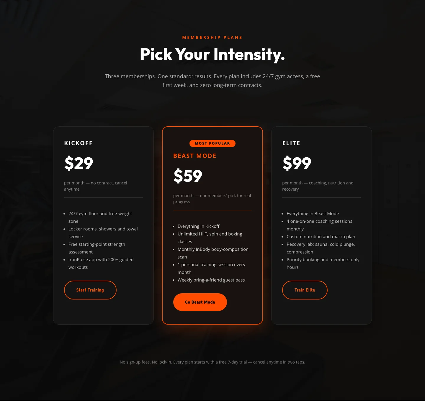
Bold Fitness Pricing Table: Dark Gym Membership Plans Divi 5 Layout
pricing · fitness · bold
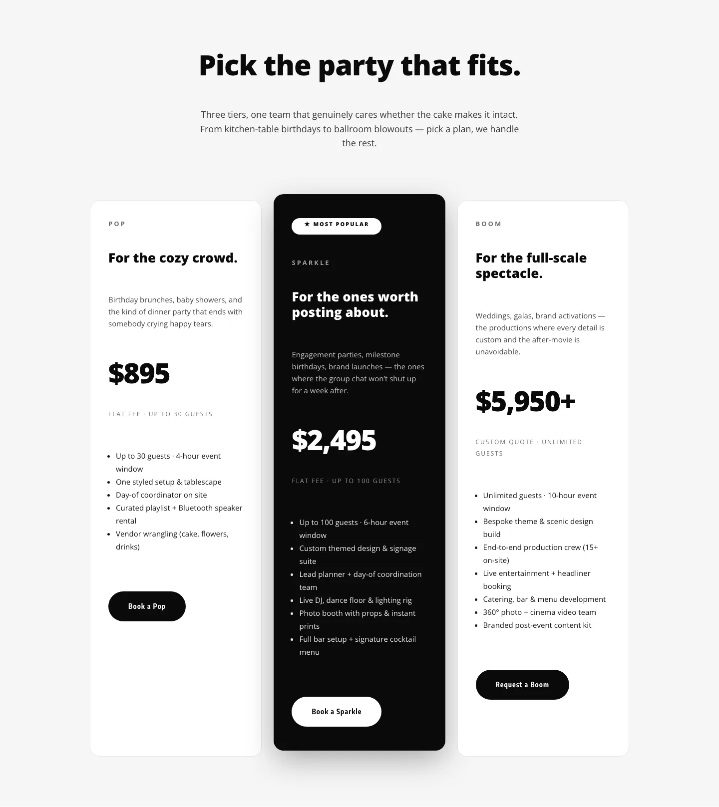
Playful Three-Tier Event Pricing Section for Divi 5
pricing · events · playful
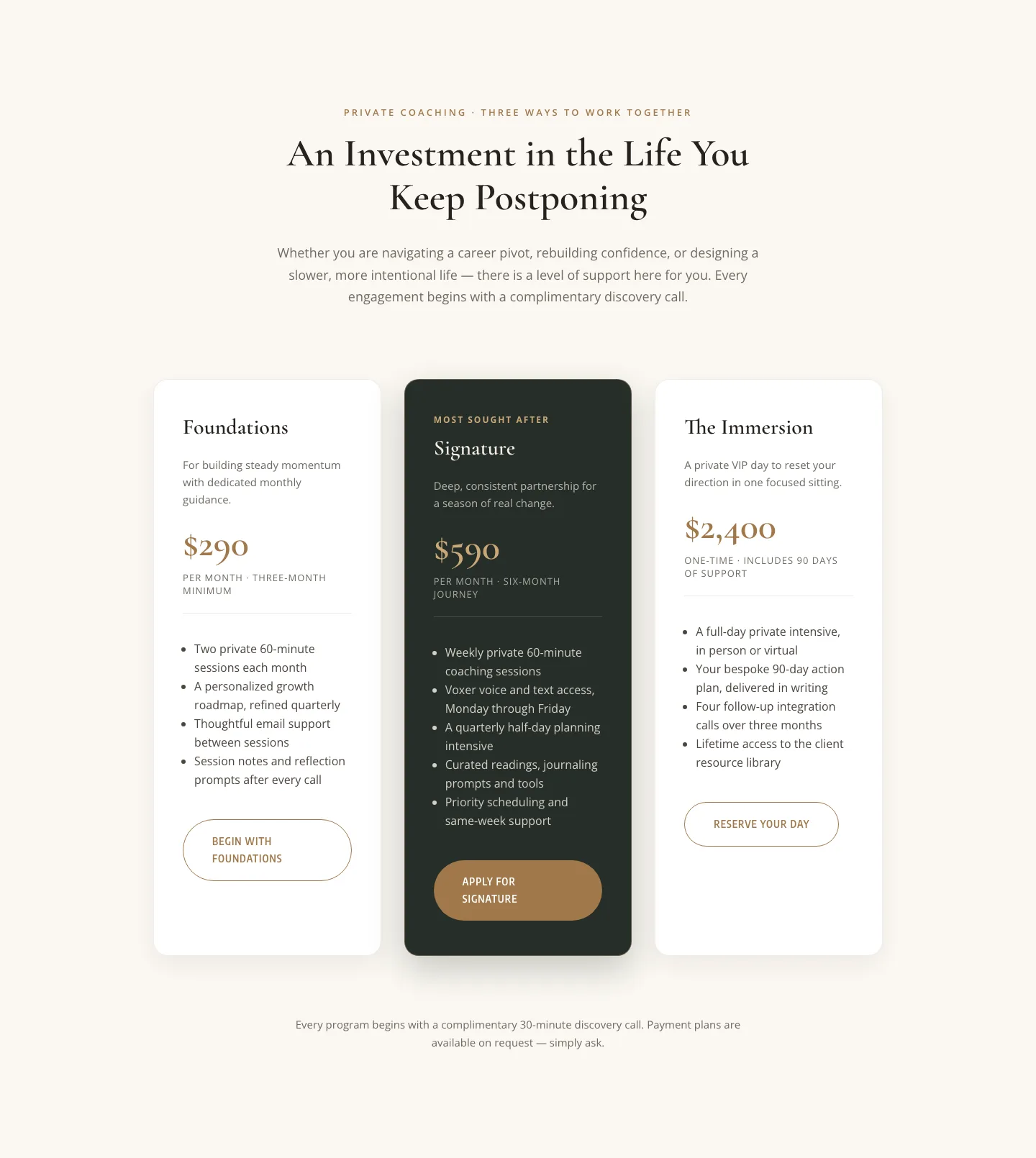
Elegant Coaching Pricing Section: 3-Tier Divi 5 Layout
pricing · coaching · elegant