
Bureau of Bad Ideas — Bold Creative_agency The Bureau Page for Divi 5
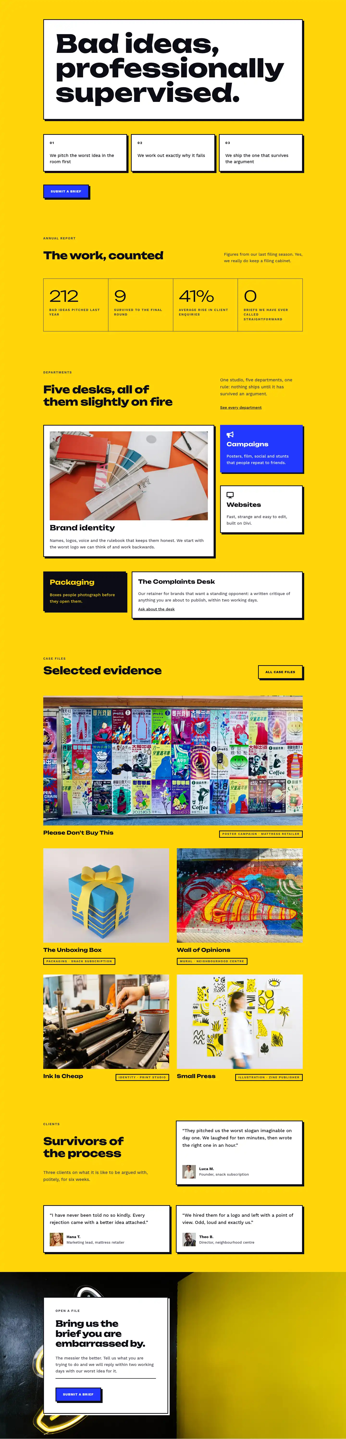
Meet the Bureau of Bad Ideas: a Chicago creative agency built on productive disagreement, honest critique, and ten years of work that refuses to be forgettable.
Rate this element
Download this section, free
- Divi 5 JSON, imports in seconds
- Commercial license included
- No account needed
This page ships inside Bureau of Bad Ideas: Creative Agency Theme (6 Pages), 6 coherent pages that share one brand.
Click to view the full page
Overview
The layout opens on an electric yellow (#ffd60a) section built around a deliberate visual collision. The left half is a full-bleed studio photograph locked to a 4:5 portrait ratio. The right half is a white card that overlaps the image by 128px using a negative left margin, a 3px solid dark (#0c0c14) border, and a hard 6px/6px box-shadow with no blur. This offset reads as physical and tactile rather than decorative, giving the hero the weight of a printed broadsheet pasted on a wall. Inside the card, an h1 set in Unbounded Extra Bold at 52px with -1px letter-spacing and textWrap: balance handles the headline, while a Work Sans paragraph and a blue (#2438ff) CTA button with the same border-and-shadow treatment close the composition. On phones the negative margin resets to zero, the card drops below the image, and the two columns stack cleanly without intervention.
The agency history section layers a workspace photo under a 70% opacity dark gradient, producing a near-black canvas that retains just enough photographic texture. Each of the four milestone cards (2016, 2019, 2022, 2025) is marked by a 4px white top border, a large year figure in Unbounded at 48px, an h3 milestone title, and a short Work Sans description. The grid reflows from four columns on desktop to two on tablet and one on phone, with row gaps tightening at each breakpoint.
Sections three and four handle the people. A four-column portrait grid pairs square 1:1 crops with Unbounded 20px names and 13px uppercase Work Sans role labels, each card anchored by a 4px dark top border. The following founder spotlight gives the co-founder a structurally distinctive portrait shape: 999px top-corner radii producing a pill arch at the top, 32px radii at the bottom. Three editorial paragraphs set in Unbounded at 22px and an italic signature line close the column, pushing this section well past a standard bio into a genuine manifesto.
The layout finishes with two heavily typographic sections on dark and photo backgrounds. A four-rule manifesto sequences numbered rows separated by 4px yellow horizontal dividers, each row holding a fixed 64px number label, a rule title at 34px, and a description constrained to 360px max-width. The final CTA places a white card (520px max-width, 3px border, white hard shadow) over a Pexels photo background, containing an open-house invitation and a blue button styled identically to the hero's, ensuring every section reads as part of one coherent visual system rather than assembled from separate templates.
What’s inside
- Split hero with overlapping white card: 128px negative left margin on desktop, 3px solid border, and hard 6px/6px box-shadow, all built with native Divi 5 group and spacing controls
- Responsive h1 in Unbounded Extra Bold (52px desktop / 40px tablet / 32px phone) with `textWrap: balance` and a -1px letter-spacing that prevents awkward rag on short viewports
- Four-milestone timeline grid: 4 columns desktop / 2 tablet / 1 phone, each card marked by a 4px white top border and a large year figure at 48px
- Four-person portrait grid with 1:1 square image crops, 4px dark top-border name cards, Unbounded names, and uppercase Work Sans role labels (6/24 desktop, 12/24 tablet, 24/24 phone)
- Co-founder spotlight with pill-arch portrait shape (999px top-corner radius, 32px bottom), paired with three 22px Unbounded editorial paragraphs and an italic signed closing
- Four-rule manifesto on dark (#0c0c14) background with 4px yellow horizontal dividers between numbered rows and rule titles at 34px
- Consistent CTA button treatment: blue (#2438ff) fill, 3px dark border, hard 6px/6px shadow, and -4px Y translate on hover, used identically in both the hero and the closing section
Who it’s for
This layout fits independent creative agencies, brand consultancies, and design studios that position their point of view as the product. It also works well for strategy firms, copywriting studios, and any small professional service where personality builds trust faster than a credentials list. The founder's letter section, milestone timeline, and house rules structure give studios building their first proper web presence a content architecture that goes beyond a generic team page, making it equally useful for a rebrand as for a launch.
Customization tips
The three core colors (yellow #ffd60a, dark #0c0c14, blue #2438ff) can be changed by updating your Divi 5 global preset values. Because borders and shadows throughout the layout reference #0c0c14 explicitly in individual module settings rather than a preset, search for that value in the Divi visual builder after changing the dark tone and replace it consistently. The hero h1 uses textWrap: balance, which handles headlines up to roughly 60 characters gracefully across two lines; longer headlines may need a one-step size reduction at the tablet breakpoint. Team portrait images should be square crops at a minimum of 800x800px to avoid upscaling in the 1:1 grid. The hero and timeline photos should be at least 1200px wide to fill the 4:5 portrait module cleanly. The co-founder portrait uses a pill-top shape, so a vertical head-and-shoulders crop works best here; a landscape crop will clip at the top. Milestone years, team names, and rule titles are standard Divi text and heading modules, so copy swaps take seconds in the visual builder.
How to install this layout
- Download the layout JSON file from this page.
- Open the target page in the Divi 5 builder.
- Open the portability panel (up/down arrows icon) and choose the Import tab.
- Upload the JSON. Tick “replace existing content” only for full-page imports.
- Check the page at desktop and mobile widths, then swap in your copy and images.
Full walkthrough with troubleshooting: How to Import a Divi 5 Layout.
Questions about Bureau of Bad Ideas — Bold Creative_agency The Bureau Page for Divi 5
How does the white card overlap the hero photo without custom CSS?
The overlap is built entirely in the Divi 5 group module's spacing settings: a negative left margin of -128px on desktop and -96px on tablet. On phones the value resets to 0px and the card stacks below the image. No custom CSS or JavaScript is involved.
The history section looks nearly black, but the layout JSON sets the background to yellow. What is happening?
That section uses a three-layer background: the yellow color, a Pexels workspace photo on top of it, and a gradient overlay set to rgba(12,12,20,0.7) on both gradient stops. The 70% opacity dark wash covers the yellow and most of the photo. To let more color or image detail through, reduce the gradient opacity values in the Divi section background settings.
Can I add a fifth or sixth team member to the portrait grid?
Yes. The grid is a standard Divi row with four 1/4-width columns. Duplicate a column in the visual builder and the row reflows automatically. Each column is set to 12/24 on tablet, so adding an even number of extra members produces the cleanest two-column wrap at that breakpoint.
What image dimensions work best for the co-founder portrait?
The module is locked to a 4:5 ratio. The border radius applies a pill arch to the top two corners (999px) and rounded corners to the bottom (32px), so a head-and-shoulders crop with the subject centered works best. Aim for at least 800x1000px to avoid upscaling.
Are the hover effects on the buttons CSS animations or Divi's built-in transform?
Both CTA buttons use Divi 5's native transform property set to translate Y: -4px on hover. The border color and background stay fixed on hover; only the vertical lift changes. No custom CSS is needed.
What is the simplest thing to edit first when adapting this layout?
Start with the h4 eyebrow labels and the h1 in the hero, then the milestone years and their titles in the history section. Those six or seven text fields set the agency's voice across the whole page. The visual system, spacing, and type scale are already locked in and will carry any copy you write into them.
Which Divi version does this layout need?
Divi 5. The layout is generated natively for Divi 5 and validated against its real module structure before publication, so it imports clean into the current builder.
Can I use this layout on client websites?
Yes. Every download includes a commercial license covering unlimited sites you own or build for clients. Only reselling or redistributing the layout file itself is prohibited.
Included in these packs
More full landing pages
Browse all full landing pages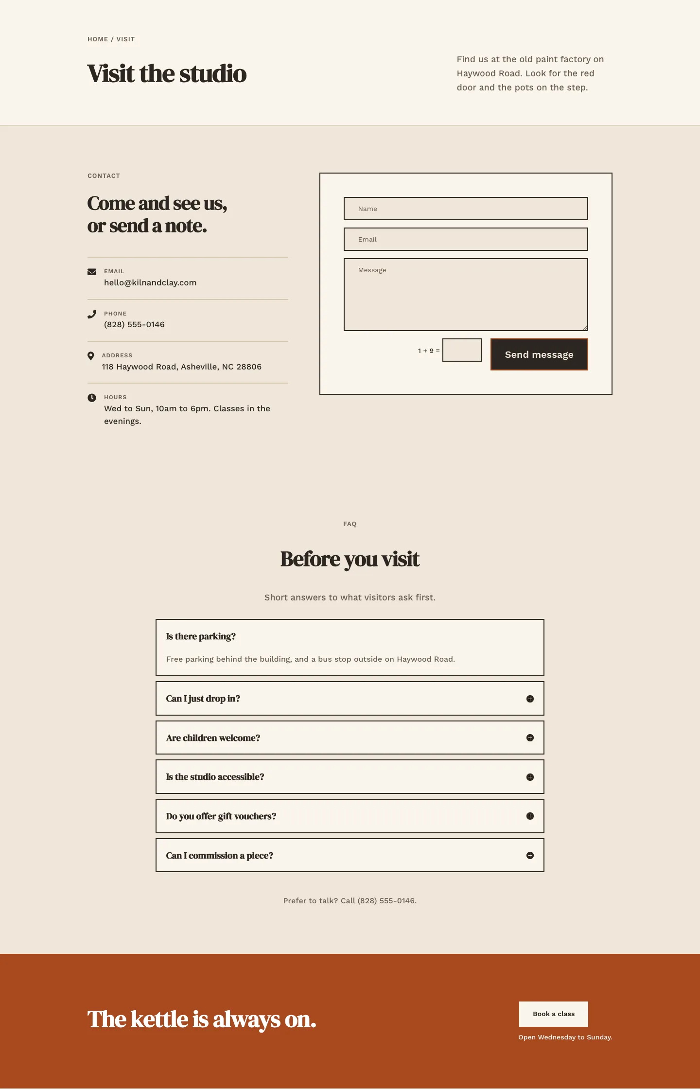
Kiln & Clay — Minimal Pottery_studio Visit Page for Divi 5
full_landing · pottery_studio · minimal
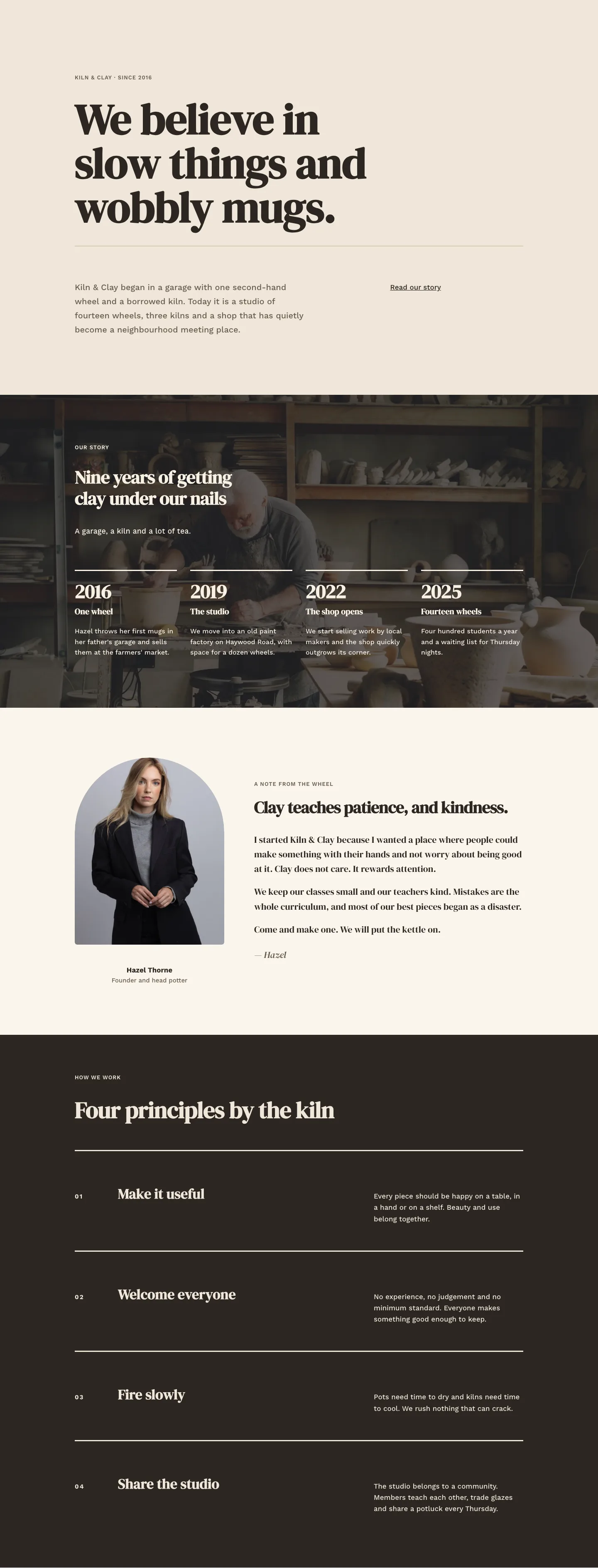
Kiln & Clay — Minimal Pottery_studio Our Story Page for Divi 5
full_landing · pottery_studio · minimal
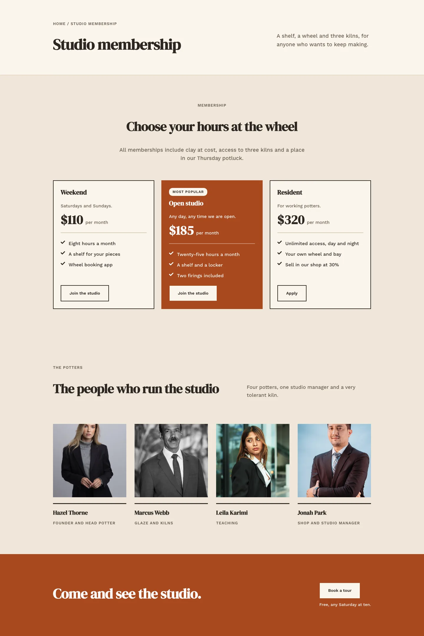
Kiln & Clay — Minimal Pottery_studio Studio Membership Page for Divi 5
full_landing · pottery_studio · minimal
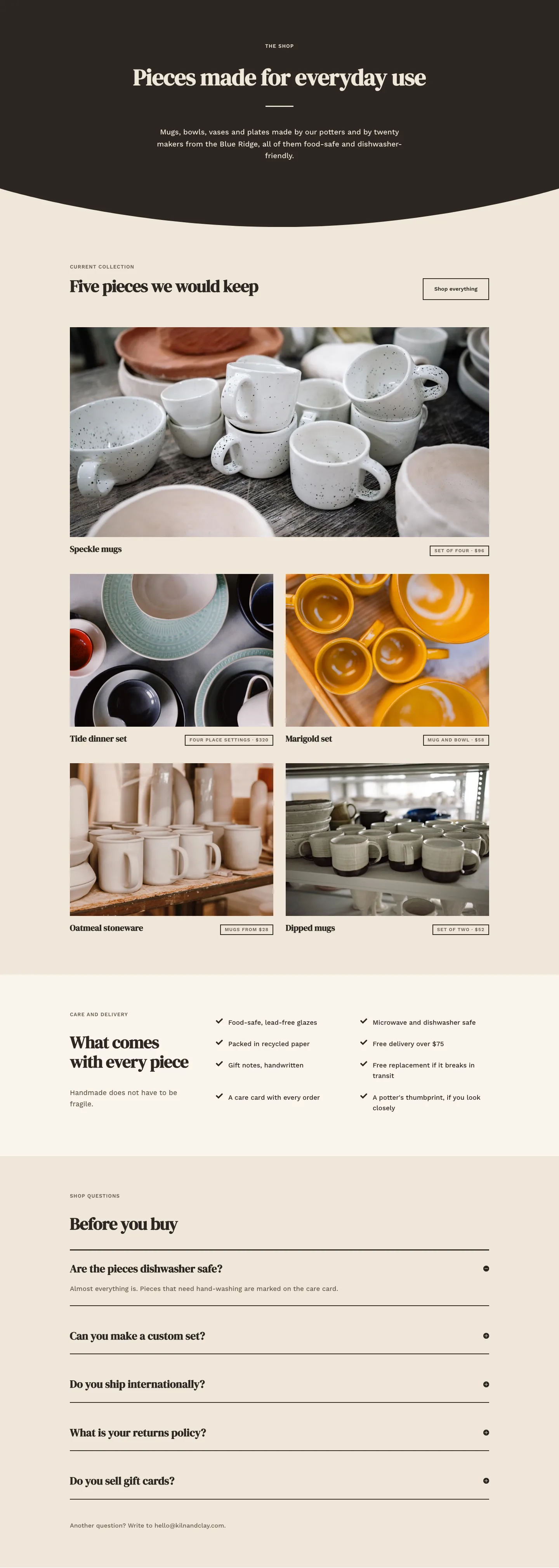
Kiln & Clay — Minimal Pottery_studio The Shop Page for Divi 5
full_landing · pottery_studio · minimal
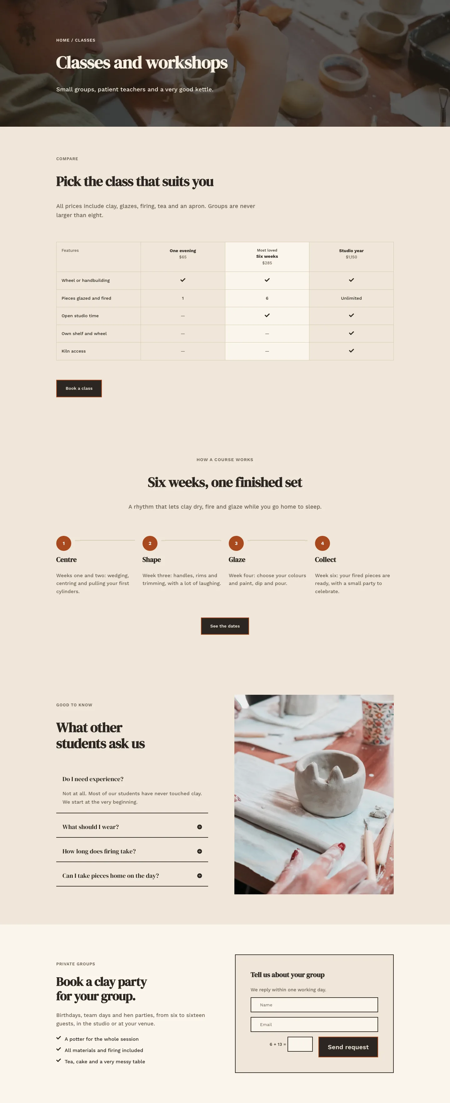
Kiln & Clay — Minimal Pottery_studio Classes Page for Divi 5
full_landing · pottery_studio · minimal
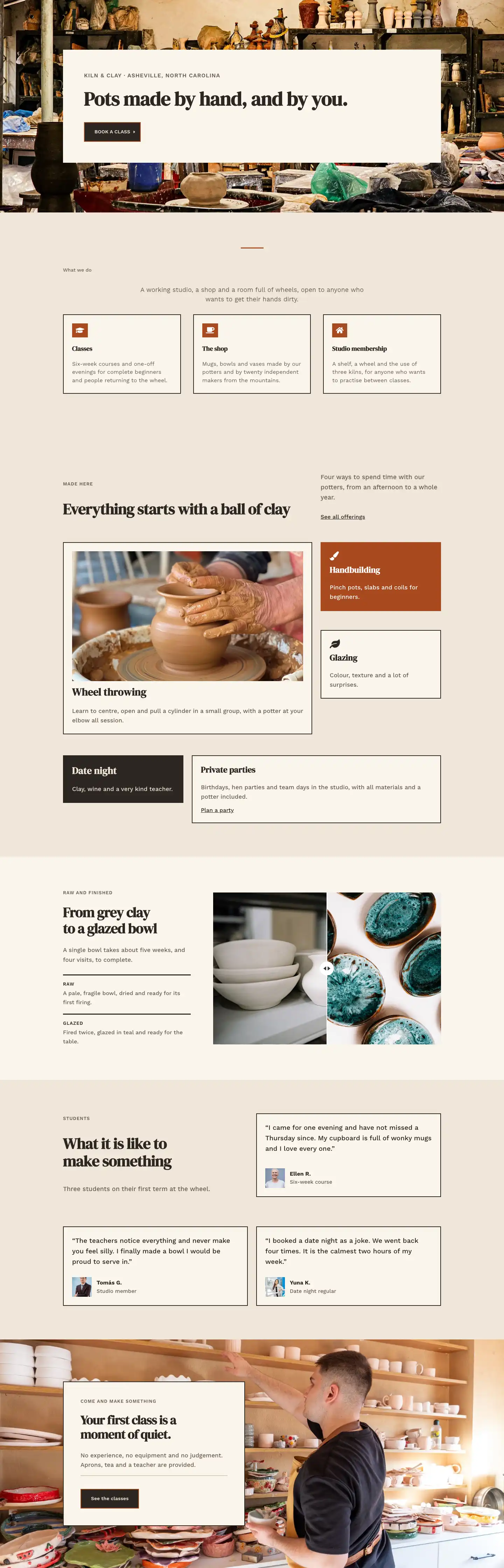
Kiln & Clay — Minimal Pottery_studio Home Page for Divi 5
full_landing · pottery_studio · minimal