
Kiln & Clay — Minimal Pottery_studio Our Story Page for Divi 5
A clean, story-driven about page for a pottery studio. Features a bold headline section, founder portrait, timeline history, and guiding principles — all in a warm minimal palette.
Rate this element
Download this section, free
- Divi 5 JSON, imports in seconds
- Commercial license included
- No account needed
This page ships inside Kiln & Clay: Pottery Studio Theme (6 Pages), 6 coherent pages that share one brand.
Click to view the full page
Overview
The page opens on a warm sand section (#efe6d8) with 180px of top padding on desktop, giving the headline room to settle before any other content arrives. The H1 — set in DM Serif Display at 104px with -1px letter-spacing and textWrap: balance — scales to 72px on tablet and 44px on phone using Divi 5's per-breakpoint font controls, so the line breaks stay intentional at every viewport. Below a 2px horizontal rule in #d6c7b0, the intro copy sits in an asymmetric two-column row split 16/24 and 8/24 in flex units: the wider column carries the origin paragraph in Work Sans 20px at 1.7em line-height, and the narrower column holds a single underlined call-to-action link. The asymmetry is a deliberate hierarchy choice — the copy carries the weight, the link stays unobtrusive.
The second section covers a full-bleed photograph with a uniform 70% dark-brown gradient overlay (rgba(36,29,23,0.7) at both stops), which means any moody studio or workshop shot will read with the same contrast against the cream type. The section headline scales from 44px desktop to 30px phone. Below a short subhead, a four-column milestone grid uses Divi 5's native group layout with display: grid and gridColumnCount: 4, reflows to two columns on tablet and one column on phone. Each milestone card opens with a 3px top border in #f7f0e3, then a large DM Serif Display year number at 48px, a brief H3 title, and a one-sentence description in Work Sans 16px. The 32px column gap and 40px row gap keep the grid airy while the shared top-border detail ties all four cards into a single visual system.
The third section switches to #faf5ec, a slightly warmer off-white, and introduces the founder in a two-column layout proportioned 9/24 vs 15/24. The portrait uses a 4:5 aspect ratio with 999px top radii and a 32px bottom-right radius, producing a pill-top silhouette with a single grounded corner. A 72px column gap and alignItems: center keep the image and text optically balanced regardless of copy length. The text side opens with a 13px uppercase Work Sans label, then an H2 at 40px, followed by three body paragraphs set in DM Serif Display 22px at 1.6em line-height. That typeface choice is intentional: using the display face for body copy turns the founder letter into an editorial statement rather than a supporting footnote. An italic signature line closes the quote at the same size, in #6a5d51.
The final section fills the full width in #2b2622 (near-black espresso) and presents four studio principles in a numbered-divider format. Each row uses a fixed 64px number column in Work Sans with 2px letter-spacing, a flex-grow heading column in DM Serif Display 34px, and a max-360px description column in Work Sans 17px. Three-pixel horizontal rules in #efe6d8 separate each row and echo the 2px divider weight used in the hero section, threading the same graphic language across all four backgrounds. On phone the three-part row collapses to a stacked column for each principle, maintaining reading order without any custom CSS.
What’s inside
- H1 headline in DM Serif Display at 104px / 72px / 44px across three breakpoints, with -1px letter-spacing and `textWrap: balance` built in
- Asymmetric intro row (16/24 + 8/24 flex columns) splitting origin body copy from a single underlined CTA link
- Full-bleed photo section with a 70% uniform dark overlay and a four-column milestone grid (4 → 2 → 1 columns) using native Divi 5 group grid layout
- Milestone cards with 3px top-border detail, 48px DM Serif Display year numbers, H3 titles, and Work Sans 16px descriptions
- Founder portrait module with 4:5 aspect ratio, pill-top corners (999px radius), and a 32px bottom-right radius — no custom CSS required
- Founder letter in DM Serif Display 22px across three body paragraphs plus an italic signature line, inside a 9/24 vs 15/24 two-column layout
- Four-principle numbered list using a three-part horizontal layout (fixed number column, flex-grow heading, max-360px description) divided by 3px horizontal rules
- Four background sections — warm sand, dark photo overlay, light cream, near-black espresso — all colour-controlled at the module level
Who it’s for
Pottery studios, ceramics teachers, and craft workshops are the obvious fit, but the structure travels well. Any handmade-goods brand — a glassblowing studio, a weaving collective, a small candle maker, a woodworking shop — that needs a timeline section, a named founder, and a values statement will find the four-section sequence directly usable. Freelance designers building sites for artisan clients will appreciate the numbered-principles section as a standalone component: it works equally well for a bakery's ethos page or a photography studio's process page without any structural changes.
Customization tips
The palette is set at the module level across four values: warm sand #efe6d8, light cream #faf5ec, near-black #2b2622, and clay brown #6a5d51. Updating all four in Divi 5's global presets before importing is the fastest route; a targeted find-and-replace in the JSON file before import also works cleanly.
The H1 uses textWrap: balance at 104px, which handles up to roughly 55 characters before a line break looks unintentional. Keep your headline under that count for the best result.
The milestone grid expects four cards to fill the four-column desktop layout evenly. Removing a card is awkward; if you need fewer milestones, swap in a different number and update gridColumnCount to match. Adding a fifth works the same way.
The founder portrait is sized at a 4:5 ratio and displayed at up to roughly 360px wide. Supply a source image at least 800×1000px to stay sharp on retina screens. A vertical crop of a person, a detail shot, or a close-up of hands at a wheel all work well at that proportion.
How to install this layout
- Download the layout JSON file from this page.
- Open the target page in the Divi 5 builder.
- Open the portability panel (up/down arrows icon) and choose the Import tab.
- Upload the JSON. Tick “replace existing content” only for full-page imports.
- Check the page at desktop and mobile widths, then swap in your copy and images.
Full walkthrough with troubleshooting: How to Import a Divi 5 Layout.
Questions about Kiln & Clay — Minimal Pottery_studio Our Story Page for Divi 5
How does the milestone grid respond on smaller screens?
The grid is built with Divi 5's native group layout using `display: grid`. The column count is set to 4 on desktop, 2 on tablet, and 1 on phone via the responsive layout controls. Row gap reduces from 40px to 32px on phone. No custom CSS is involved.
What modules make up the founder portrait section?
A single divi/image module with a custom border-radius (999px top-left and top-right, 32px bottom-right, default bottom-left) and a 4:5 aspect ratio. Below it, two divi/text modules handle the founder name and title. The letter itself is three divi/text modules plus a fourth italic signature, all inside a divi/column with a 16px row gap.
Does the photo background in section two require a specific image size or ratio?
No fixed ratio is required. The background is set to `size: cover` centered, so it crops to fill whatever the section height becomes based on content. Any landscape image at 1920px wide or wider works well. The 70% dark overlay is applied as a gradient over the image, so text contrast holds across light and dark source photos alike.
What should I edit first after importing the layout?
Start with the H1 in section one and the four milestone entries (year, title, and description) in section two — those carry the most brand-specific content. Next, swap the founder photo and update the three letter paragraphs and the signature in section three. Update section four's principle headings and descriptions last, since those rarely need structural changes.
Can the principles section be used independently on another page?
Yes. Each section is a self-contained divi/section block with its own background colour, padding, and typography. Copy the fourth section block into any other page and it brings its layout, colours, and type settings with it without affecting the rest of the page.
The founder letter uses DM Serif Display for body text — is that intentional?
Yes. The editorial choice to use the display typeface at 22px for the letter paragraphs is a deliberate design decision: it signals that the founder quote is a considered statement, not a supporting caption. If you prefer a lighter body weight for that section, switch those three text modules to Work Sans 20px and the visual tone shifts from editorial to conversational.
Which Divi version does this layout need?
Divi 5. The layout is generated natively for Divi 5 and validated against its real module structure before publication, so it imports clean into the current builder.
Can I use this layout on client websites?
Yes. Every download includes a commercial license covering unlimited sites you own or build for clients. Only reselling or redistributing the layout file itself is prohibited.
Included in these packs
More full landing pages
Browse all full landing pages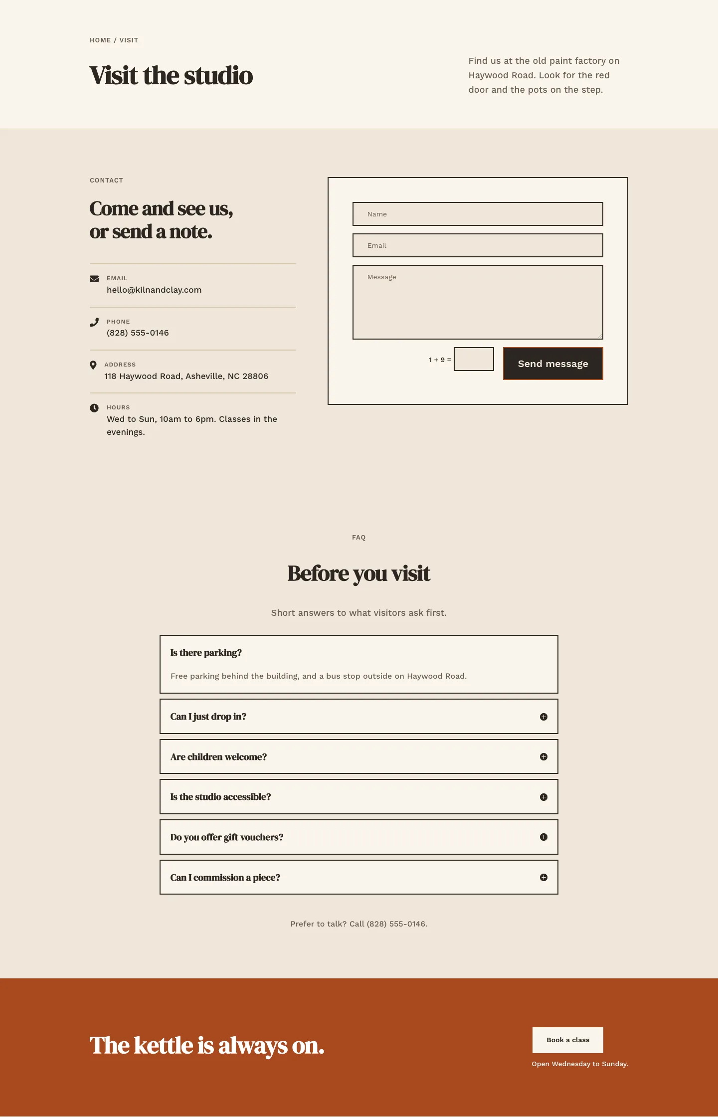
Kiln & Clay — Minimal Pottery_studio Visit Page for Divi 5
full_landing · pottery_studio · minimal
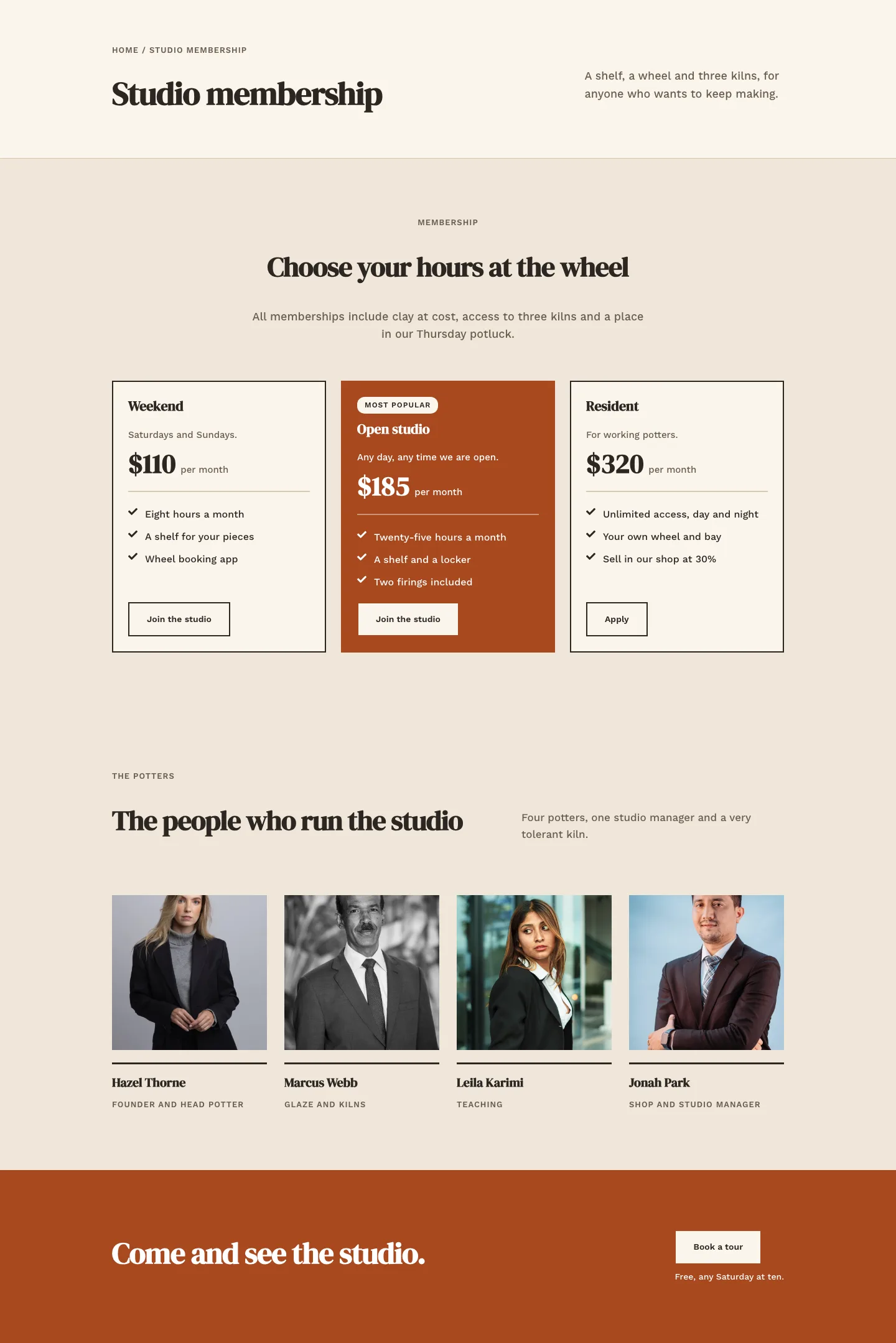
Kiln & Clay — Minimal Pottery_studio Studio Membership Page for Divi 5
full_landing · pottery_studio · minimal
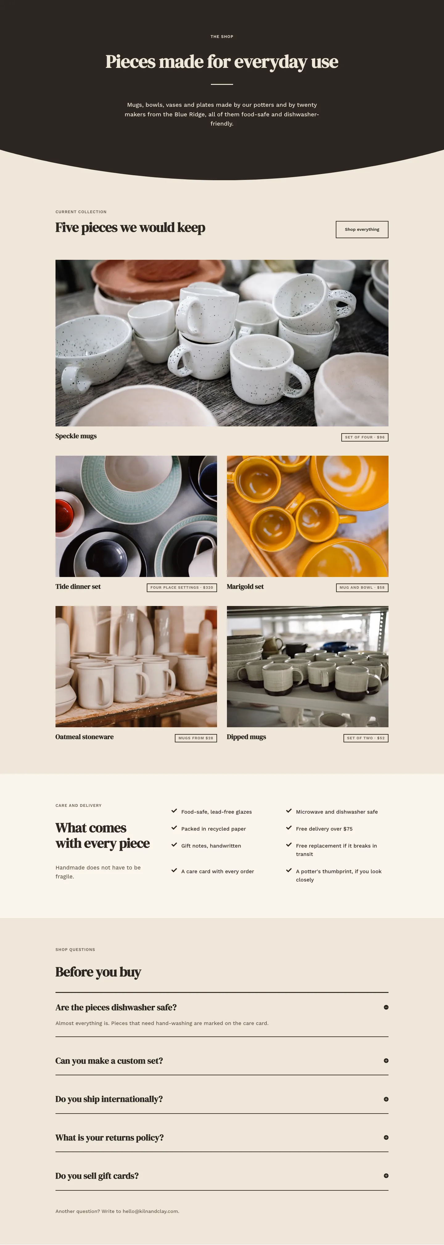
Kiln & Clay — Minimal Pottery_studio The Shop Page for Divi 5
full_landing · pottery_studio · minimal
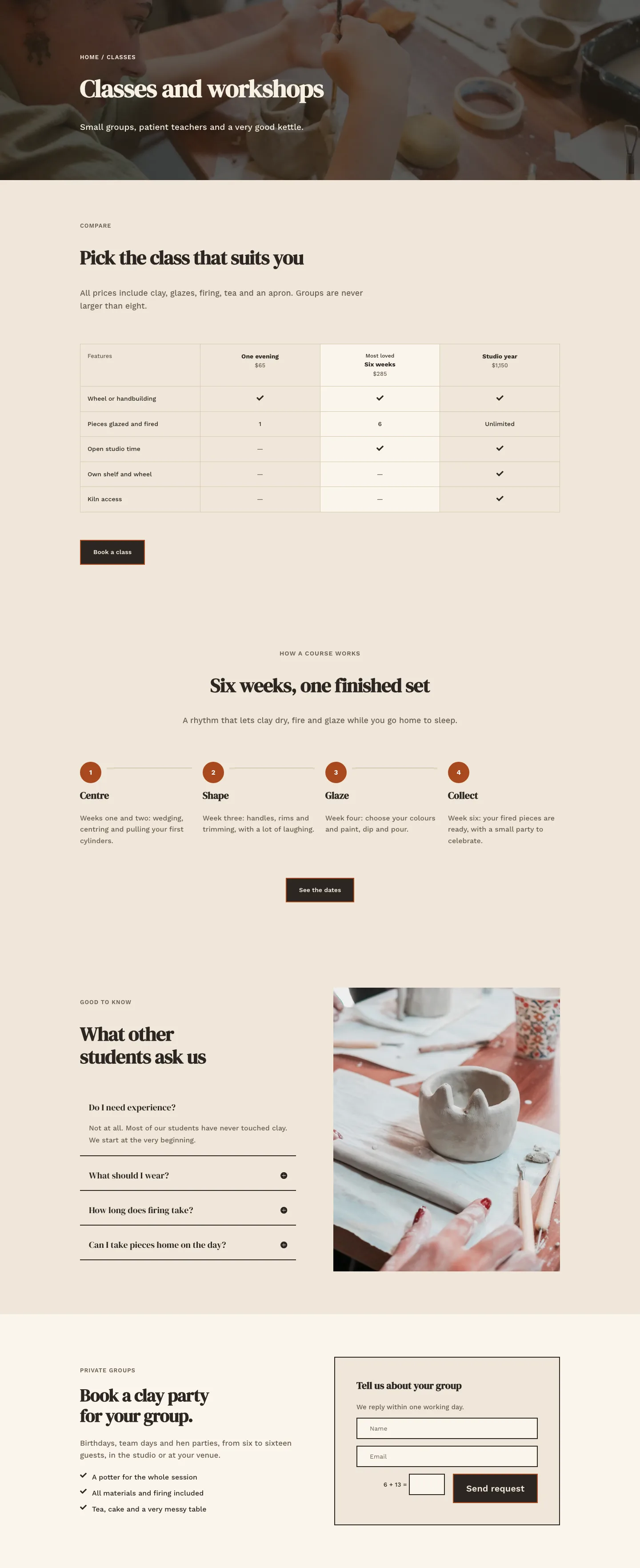
Kiln & Clay — Minimal Pottery_studio Classes Page for Divi 5
full_landing · pottery_studio · minimal
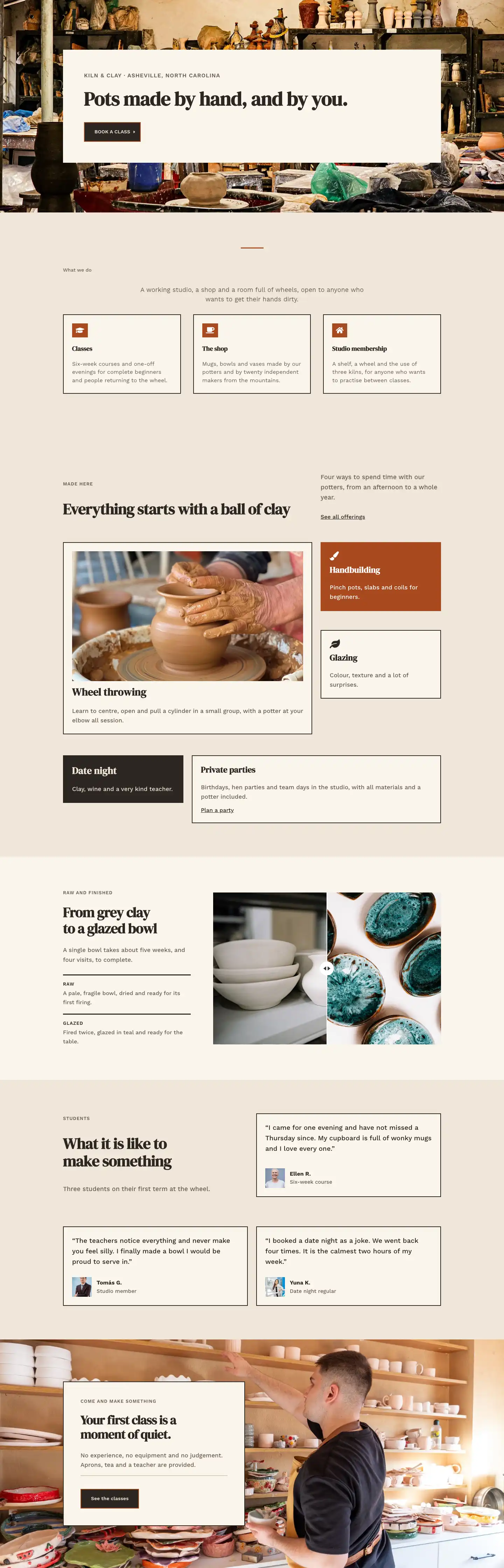
Kiln & Clay — Minimal Pottery_studio Home Page for Divi 5
full_landing · pottery_studio · minimal
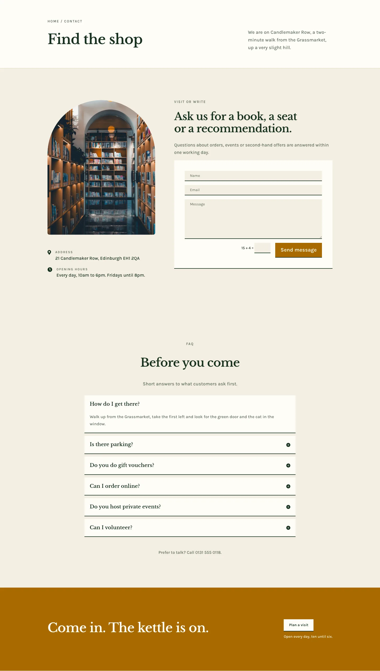
Folio & Fable — Elegant Bookshop Contact Page for Divi 5
full_landing · bookshop · elegant