
Bureau of Bad Ideas — Bold Creative_agency Home Page for Divi 5
A sharp, typographic homepage for a creative agency that pitches the worst idea first. Built with Divi 5, featuring stats, service departments, case studies, and a contact CTA in a bold yellow and navy design system.
Rate this element
Download this section, free
- Divi 5 JSON, imports in seconds
- Commercial license included
- No account needed
This page ships inside Bureau of Bad Ideas: Creative Agency Theme (6 Pages), 6 coherent pages that share one brand.
Click to view the full page
Overview
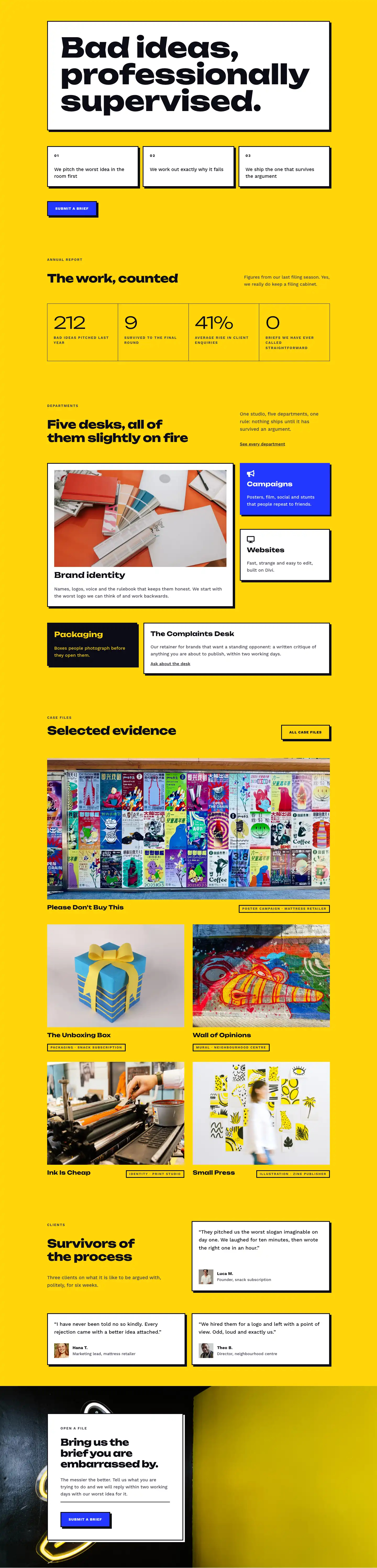
The layout opens on a full-bleed electric-yellow section (#ffd60a) that signals the brand's personality before a word is read. A white-background group framed by a 3-pixel #0c0c14 border and a hard-offset box shadow (6px right, 6px down, zero blur, no spread) holds the H1 "Bad ideas, professionally supervised." set in Unbounded weight 800 at 104px on desktop, scaling to 68px on tablet and 40px on phone via explicit breakpoint values baked into the layout. The 0.98em line height compresses the headline vertically, making it feel deliberate rather than accidental. Below it, three numbered process cards sit in a 3-column CSS grid with 16px gaps, collapsing to a single stack on mobile. Every card shares the same neo-brutalist system: white fill, 3px solid border, flat drop shadow, and a -4px Y-axis hover translate that makes the page feel tactile without any custom JavaScript.
The second section introduces an asymmetric two-column layout (16/24-width left, 8/24 right on desktop) for section subheadings, a pattern that repeats consistently across every subsequent section and gives the page a clear horizontal rhythm. The stats block uses a dark #0c0c14 container as a 1px-gap grid frame, with four yellow cells in a 4-column grid on desktop and a 2-column grid on tablet and phone. Each cell holds an Unbounded numeral at weight 300 and 64px (intentionally thin, contrasting the bold heading system) alongside a Work Sans uppercase label at 13px with 2px letter-spacing. The four figures (212 bad ideas pitched, 9 survived, 41% enquiry rise, 0 briefs called straightforward) carry the brand voice directly into the data display.
The departments section uses the same asymmetric header row followed by two rows of service cards in a two-column structure with 24px column gaps. Cards alternate between white, electric blue (#2438ff), and near-black (#0c0c14) fills, rotating the palette without introducing new colors. The Brand Identity card carries a 16:9 cover image; the Campaigns card uses a Font Awesome bullhorn icon on a blue fill with white text; the Packaging card inverts to near-black with yellow typography. The portfolio case-file grid follows: a 2:1 featured image spanning both columns, then four 4:3 thumbnails in a 2-column grid, each labeled with a bordered category-tag pill.
The testimonials section pairs a left-side context column with right-side white cards, each holding a quote at 19px and a 56px square portrait alongside name and role. The page closes on a CTA section that layers a full-cover photograph behind the yellow section background, with a left-aligned white contact card (max-width 520px, 48px padding) floating over it. A horizontal divider module sits between the body copy and the electric-blue submit button, creating a structural break inside the card. The same border, shadow, and button treatment from the hero closes the loop, giving the layout a strong bookend structure.
What’s inside
- Full-page neo-brutalist hero with Unbounded H1 at 104px/68px/40px across breakpoints, inside a white card with 3px solid border and 6px flat box shadow, zero border radius throughout
- Three-card process grid using native divi/group CSS grid (3 columns desktop, 1 column phone) with Work Sans numbered labels and a -4px Y hover lift on every card
- Four-cell stats display inside a dark #0c0c14 grid frame with 1px dividers, Unbounded weight-300 numerals at 64px stepping to 56px/40px, 4-column grid collapsing to 2-column on tablet and phone
- Five department cards across two asymmetric rows, mixing white, electric-blue, and near-black fills, with Font Awesome icons (bullhorn on Campaigns, desktop monitor on Websites) at 26px
- Portfolio case-file grid: one full-width 2:1 featured image spanning both columns plus four 4:3 project thumbnails, each labeled with a title heading and a bordered category-tag pill
- Three testimonials in a mixed-layout (one right-column card plus a two-column second row), each with a 56px square portrait, quote text at 19px/1.6em, and name-and-role attribution
- Background-image CTA section with a constrained white contact card (max-width 520px), native divi/divider module, and electric-blue submit button with flat 6px drop shadow
- Responsive padding steps on every section: 80px desktop, 56px tablet, 36px phone; all grids and flex layouts defined at each breakpoint in the layout JSON
Who it’s for
This layout suits creative studios, branding agencies, campaign shops, packaging designers, and multidisciplinary consultancies that lead with a distinct point of view rather than a polished portfolio grid. The five named service departments, numbered process cards, and stats-as-personality approach work well for shops with identifiable service lines and a voice strong enough to carry deadpan copy. It also fits freelance designers building Divi sites for agency clients who want to stand apart from the generic creative-agency template, or studio owners who want a starting point with genuine structural confidence and a complete homepage section set they can adapt in an afternoon.
Customization tips
The three-color system (#ffd60a yellow, #0c0c14 near-black, #2438ff electric blue, #ffffff white) maps cleanly to global presets. Replacing the yellow with a cooler neutral (stone, warm grey, dusty rose) or a brand color shifts the mood completely. Update section backgrounds, stat cell fills, and the CTA section background-color together so nothing is missed. The electric blue on the button and Campaigns card can swap to any accent without touching the layout structure.
Unbounded drives the display personality. Swapping it for Syne, Space Grotesk, or DM Serif Display changes the register while keeping the weight-contrast system (800 for headings, 300 for stat numerals) intact. Work Sans on body copy pairs well with most sans-serif replacements.
The three hero process cards fit 1 to 2 lines of body text comfortably at 18px; beyond three lines the cards become uneven on mobile. Portfolio images expect 16:9 for the featured slot and 4:3 for the grid thumbnails, sourced at 1600px wide. Testimonial portraits render at 56px, so any square crop works, but high-contrast headshots hold up best at that size. The CTA card's max-width is 520px; widening to 600px is fine, but going full-width breaks the floating-card effect over the background image.
How to install this layout
- Download the layout JSON file from this page.
- Open the target page in the Divi 5 builder.
- Open the portability panel (up/down arrows icon) and choose the Import tab.
- Upload the JSON. Tick “replace existing content” only for full-page imports.
- Check the page at desktop and mobile widths, then swap in your copy and images.
Full walkthrough with troubleshooting: How to Import a Divi 5 Layout.
Questions about Bureau of Bad Ideas — Bold Creative_agency Home Page for Divi 5
The hero H1 is 104px on desktop. Will it overflow on mid-size screens?
Three explicit font-size breakpoints are defined in the layout: 104px desktop, 68px tablet, 40px phone. The 0.98em line height keeps the block compact, and the enclosing group padding also steps down per breakpoint (48px, 36px, 24px). Headlines up to roughly 45 characters sit cleanly at all sizes without overflow.
How does the four-cell stats grid reflow on smaller screens?
The outer container uses a CSS grid with gridColumnCount defined at three breakpoints: 4 columns on desktop, 2 on tablet, 2 on phone. The 1px dividers between cells are produced by the dark #0c0c14 wrapper background rather than CSS gap, so they stay consistent at every size. The Unbounded numeral steps from 64px to 56px to 40px at the same breakpoints.
Which Font Awesome icons are used, and do they need FA loaded separately?
The Campaigns card uses  (bullhorn, FA solid) and the Websites card uses  (desktop monitor, FA solid), both at 26px. Divi 5's divi/icon module references FA characters directly, but Font Awesome must be enqueued by your theme or Divi settings. If icons appear as empty boxes, enable Font Awesome in Divi's performance options or your child theme.
What image dimensions should I use when replacing the portfolio thumbnails?
The featured case file uses a 2:1 aspect ratio, so source replacements at 1600x800px minimum. The four supporting thumbnails use 4:3; 1200x900px works well. All images use objectFit cover with zero border radius, so keep critical composition away from the edges and match the flat-corner system throughout.
Can I add a sixth service department without restructuring the section?
The departments section uses two separate row modules rather than a single auto-filling grid, so adding a sixth service means adding a new row. The existing second row has a narrow (8/24) and a wide (16/24) column. The simplest approach is to duplicate one of the existing column pairs or add a full-width card. Department cards are self-contained divi/group modules, so copying and editing one takes under a minute.
How do I replace the background photograph in the CTA section?
The background image is set on the section's decoration.background property alongside the #ffd60a yellow color fill. In Divi 5, open the section settings, go to the Background tab, and swap the image URL. The yellow acts as a fallback if the image fails to load. Use a landscape photograph at 1920px wide or wider with the focal point centered, since the image is set to cover and center.
Which Divi version does this layout need?
Divi 5. The layout is generated natively for Divi 5 and validated against its real module structure before publication, so it imports clean into the current builder.
Can I use this layout on client websites?
Yes. Every download includes a commercial license covering unlimited sites you own or build for clients. Only reselling or redistributing the layout file itself is prohibited.
Included in these packs
More full landing pages
Browse all full landing pages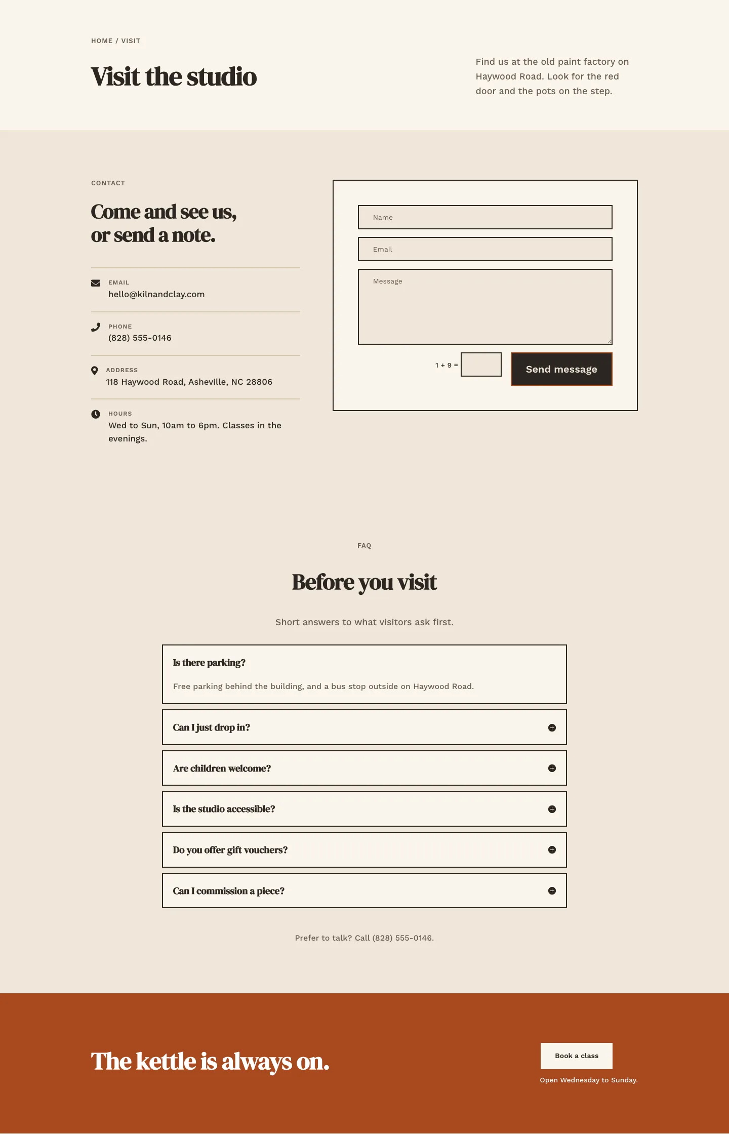
Kiln & Clay — Minimal Pottery_studio Visit Page for Divi 5
full_landing · pottery_studio · minimal
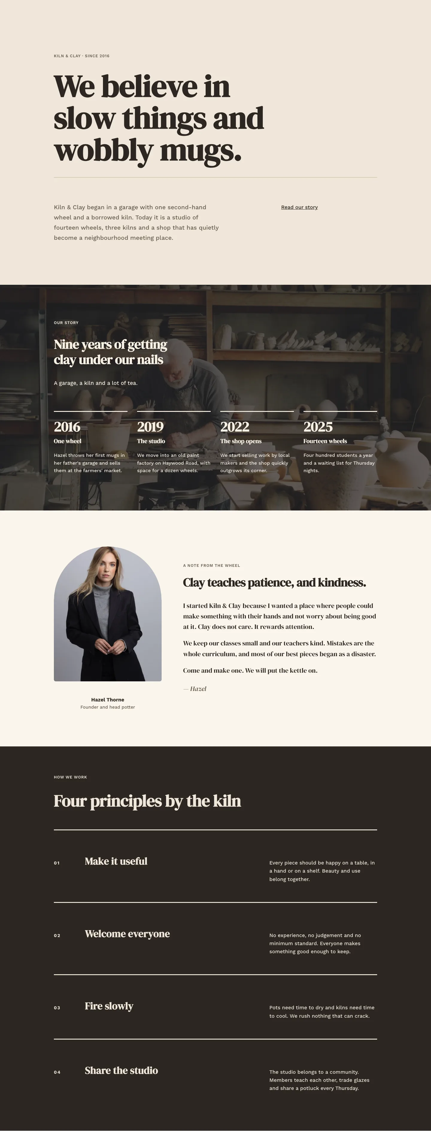
Kiln & Clay — Minimal Pottery_studio Our Story Page for Divi 5
full_landing · pottery_studio · minimal
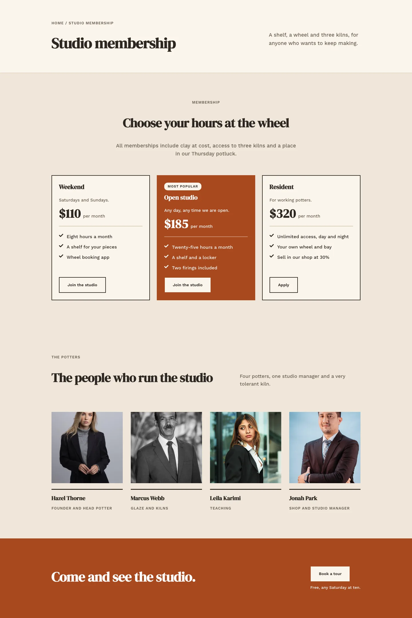
Kiln & Clay — Minimal Pottery_studio Studio Membership Page for Divi 5
full_landing · pottery_studio · minimal
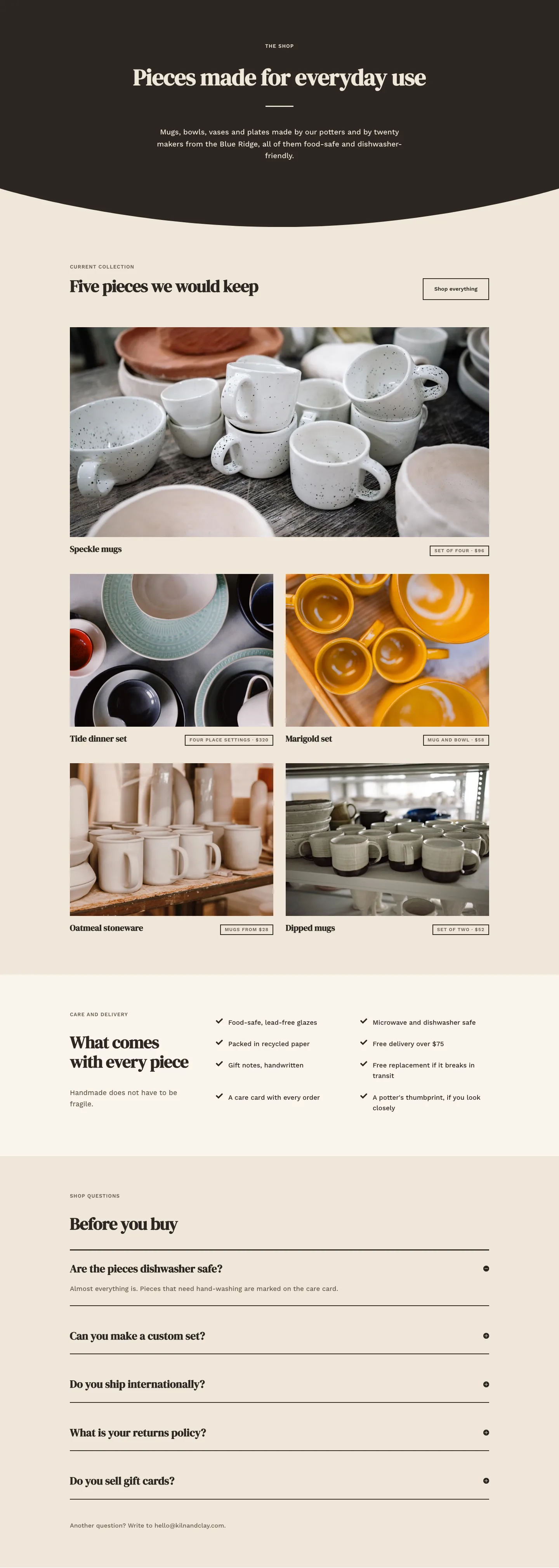
Kiln & Clay — Minimal Pottery_studio The Shop Page for Divi 5
full_landing · pottery_studio · minimal
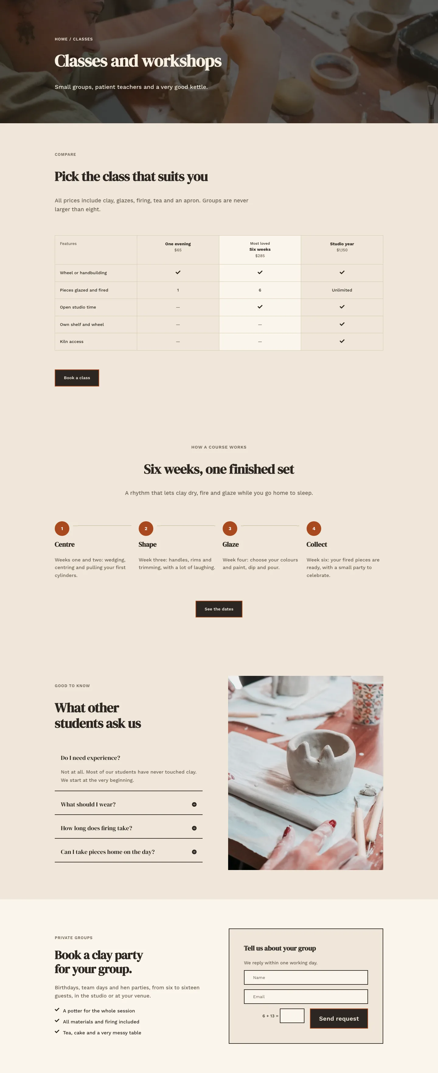
Kiln & Clay — Minimal Pottery_studio Classes Page for Divi 5
full_landing · pottery_studio · minimal
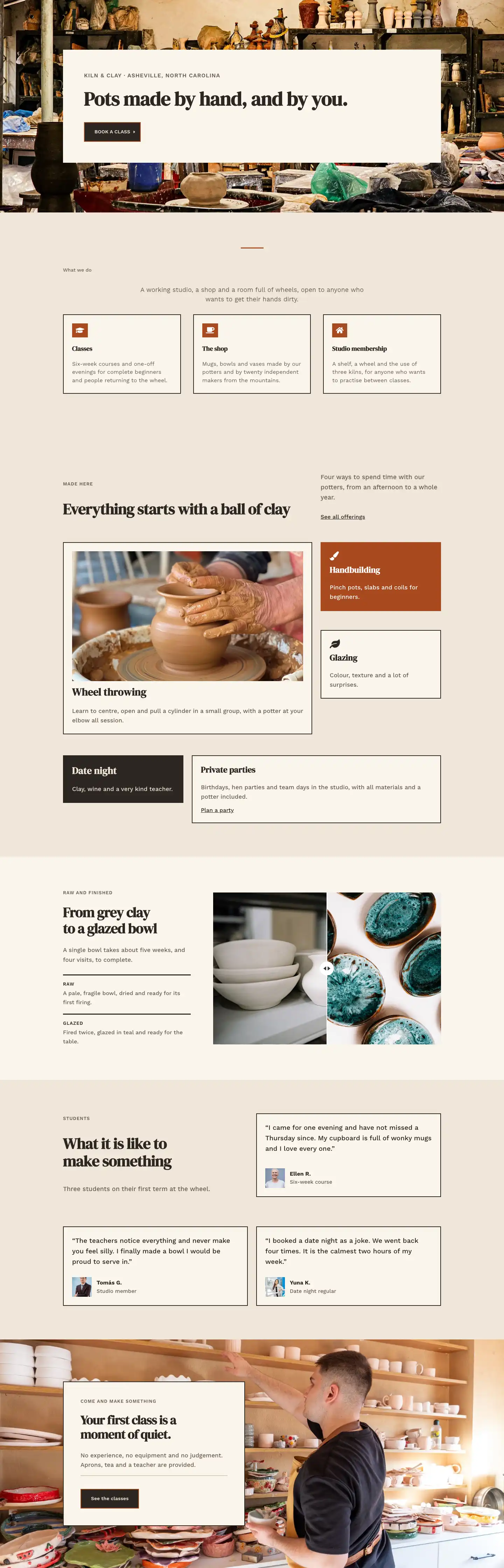
Kiln & Clay — Minimal Pottery_studio Home Page for Divi 5
full_landing · pottery_studio · minimal