
Corporate Real Estate Features Section: Six-Pillar Service Grid for Divi 5
Polished six-card features section for corporate real estate firms. Navy-and-gold service grid covering portfolio strategy, tenant rep, and capital markets. Ready-to-import Divi 5 JSON.
Rate this element
Download this section, free
- Divi 5 JSON, imports in seconds
- Commercial license included
- No account needed
Click to view the full page
Overview
Built as a self-contained features section, this layout leads with a centered eyebrow, an Outfit 52px h2 in deep navy (#0B2545) capped at 820px, and a 700px intro paragraph. A tight editorial header that survives being dropped into almost any corporate page. Below it sits a 3×2 card grid: two rows of three equal columns, each column holding a Font Awesome icon, an h3 pillar name, and a two-to-three-line description. The six pillars (Portfolio Strategy, Market Intelligence, Tenant Representation, Capital Markets Advisory, Lease Administration, and Site Selection and Development) are the whole point, so the cards do the visual work: white fill, 16px radius, and a soft navy-tinted box shadow that deepens on hover to signal interactivity without adding clutter.
The palette is deliberately restrained. A light neutral canvas (#F6F7F9) pushes the white cards forward, navy handles hierarchy on headings, slate (#4A5568) carries the body copy at a comfortable 16px/27px, and a single gold accent (#C99B3F) ties the eyebrow, all six icons, and the closing CTA together. That accent is the only warm color in the section, which is why it reads as premium rather than decorative. Spacing is generous but disciplined (120px section padding on desktop, 40px inside each card, 30px gutters between rows) giving executive audiences room to scan.
On tablet the section relaxes to 80px vertical padding and the cards stack with a 24px bottom margin between them; the h2 drops to 38px/46px. On phone, padding collapses to 60px, the h2 becomes 32px/40px, and both rows switch to a single-column flex layout so each pillar gets full width. The row closes with a centered, uppercase gold button ("Schedule a Portfolio Review") as the single conversion action, aligned by a flex column so it stays optically anchored on every breakpoint.
What’s inside
- Full Divi 5 section with a centered eyebrow + h2 + intro paragraph header block, max-widths pre-set (820px headline, 700px lead) to keep line lengths readable
- Six identical service-pillar cards arranged in a 3×2 grid (two 1/3 + 1/3 + 1/3 rows): pre-filled with portfolio, market intelligence, tenant rep, capital markets, lease admin, and site selection copy
- Each card ships with a Font Awesome icon module (40px, gold), an h3 heading (22px navy), and a body Text module tuned to 16px/27px
- Soft shadow preset on every card (0 10px 30px navy-tint) with a deeper hover state (0 20px 50px) so the grid feels interactive without needing extra code
- Single closing CTA (a full Divi 5 Button module with uppercase label, 8px radius, gold background and dark-gold hover) centered via a flex column
- Responsive rules baked into every module: desktop → tablet stacks with 24px card gaps → phone switches rows to column flex for a clean single-file scroll
- Only native Divi 5 modules used (Section, Row, Column, Text, Heading, Icon, Button): no shortcodes, third-party plugins, or custom CSS required
Who it’s for
This section is written for firms whose audience sits on the occupier side of commercial real estate: tenant-rep brokerages, corporate real estate advisories, capital markets boutiques, lease administration providers, and site-selection consultants pitching to CFOs, heads of workplace, and boards. The copy leans institutional (sale-leasebacks, ASC 842, submarket rent forecasts, entitlement management) so it also drops cleanly onto pages for facilities and portfolio management SaaS, workplace strategy consultancies, and industrial or logistics developers courting national tenants. If your buyer is a Fortune 1000 real estate committee rather than a homeowner, the tone and pillar structure will feel native. It's less suited to residential agents or single-property listings without significant rewriting.
Customization tips
Swap the palette at the preset level: change the accent gold (#C99B3F) once and the eyebrow, all six icons, and the CTA update together, pair it with a green, oxblood, or muted blue for a different firm identity. Keep pillar headings to two or three words and card body copy to roughly 25–35 words so cards stay the same height across the grid. If you only need four services, delete one row and one card in the other; if you need eight, duplicate a card twice. The 1/3 + 1/3 + 1/3 structure absorbs it without breaking. To swap icons, open each Icon module and pick a Font Awesome glyph that matches your service; keep them at 40px and left-aligned for consistency. There are no images to size, but if you add a background photo to the section, drop the section background color to rgba(11,37,69,0.85) overlay so the white cards still read. Edit the CTA text and destination first. It's the only conversion path in the block.
How to install this layout
- Download the layout JSON file from this page.
- Open the target page in the Divi 5 builder.
- Open the portability panel (up/down arrows icon) and choose the Import tab.
- Upload the JSON. Tick “replace existing content” only for full-page imports.
- Check the page at desktop and mobile widths, then swap in your copy and images.
Full walkthrough with troubleshooting: How to Import a Divi 5 Layout.
Questions about Corporate Real Estate Features Section: Six-Pillar Service Grid for Divi 5
How does the six-card grid behave on mobile?
On tablet the three-across rows keep their structure but each card picks up a 24px bottom margin so they breathe. On phone, both rows switch to a single-column flex layout, the h2 shrinks to 32px/40px, and section padding drops from 120px to 60px. Buyers scroll pillar-by-pillar instead of pinching to read.
What modules make up each service card?
Every card is a Column with three stacked modules: a Divi 5 Icon module (40px, gold, left-aligned), a Text module containing the h3 pillar name at 22px navy, and a second Text module for the description at 16px/27px slate. No Blurb module, that keeps the icon color and size independently editable.
There's no imagery, is that intentional?
Yes. The section relies on typography, whitespace, and the gold icon-plus-accent rhythm rather than stock photography, which is usually the right call for corporate service pages. If you want to add a subtle backdrop, apply a section background image at low opacity or a single hero image above the section rather than adding photos inside the cards.
What should I edit first?
Three things in order: the eyebrow and h2 to match your firm's positioning, the six h3 pillar names and their descriptions to reflect your actual services, and the CTA button text plus link. The palette (navy, gold, slate on light gray) works for most institutional brands, so you can leave colors for a second pass.
Can I extend this into a full services page?
Easily. The header row (eyebrow + h2 + lead) can be reused above other sections, and the card row is a repeatable pattern: duplicate it for a second grid covering sub-services, or follow it with a testimonial or case-study section. The 120/80/60px section padding matches most Divi 5 layouts, so vertical rhythm stays consistent.
Which Divi version does this layout need?
Divi 5. The layout is generated natively for Divi 5 and validated against its real module structure before publication, so it imports clean into the current builder.
Can I use this layout on client websites?
Yes. Every download includes a commercial license covering unlimited sites you own or build for clients. Only reselling or redistributing the layout file itself is prohibited.
More feature grids
Browse all feature grids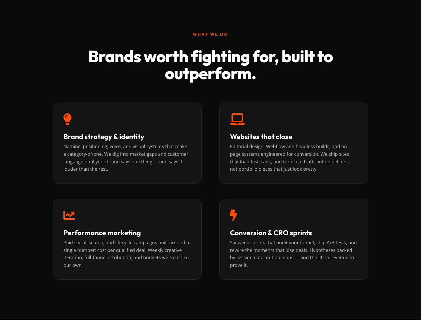
Bold Agency Features Section: Divi 5 Services Grid Layout
features · agency · bold
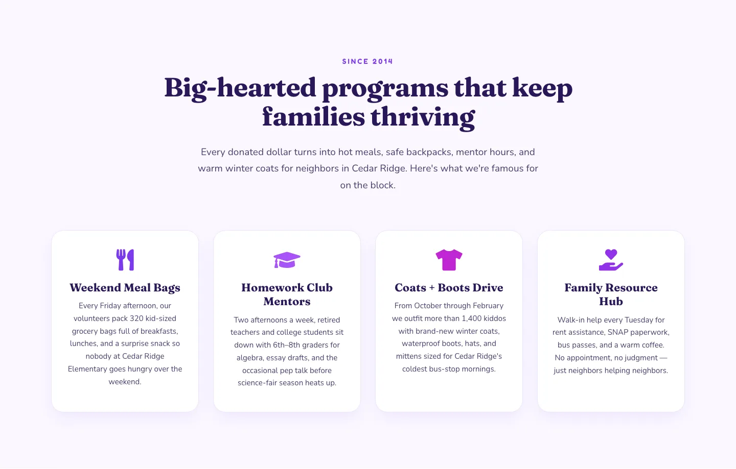
Playful Nonprofit Features Section: Four-Column Icon Cards for Divi 5
features · nonprofit · playful
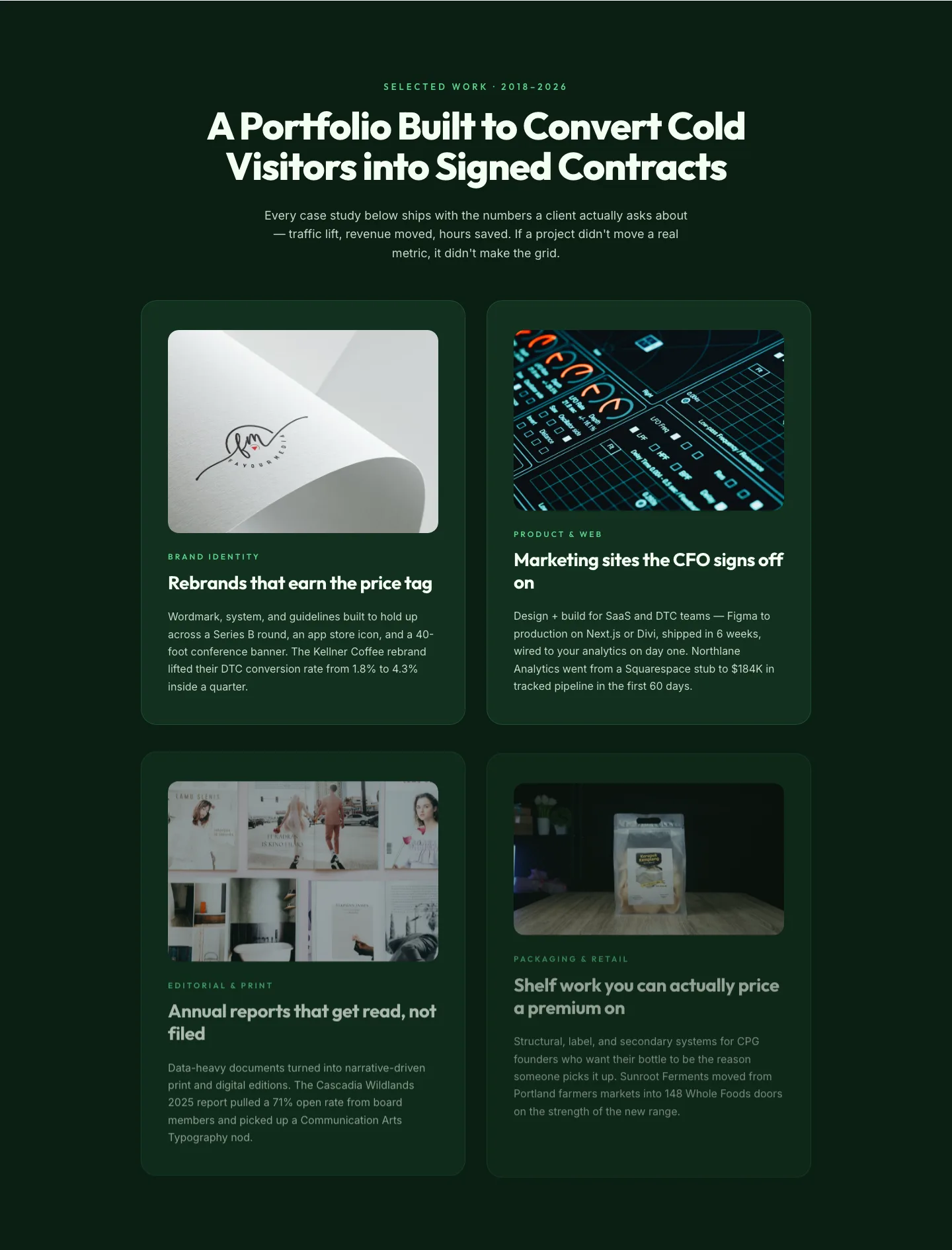
Bold Portfolio Features Grid: Divi 5 Case Study Layout
features · portfolio · bold
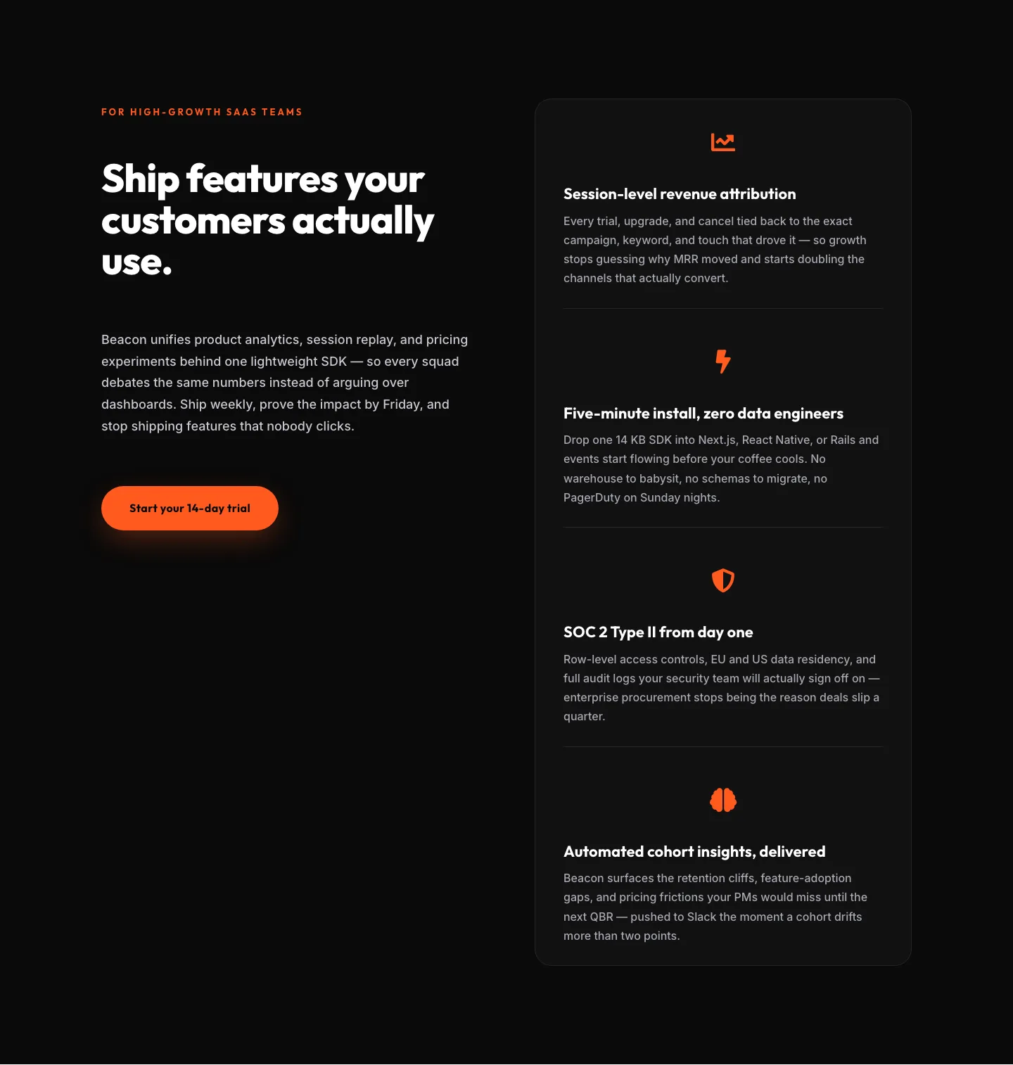
SaaS Features Section: Ship Features Customers Actually Use | Divi 5 Bold Layout
features · saas · bold
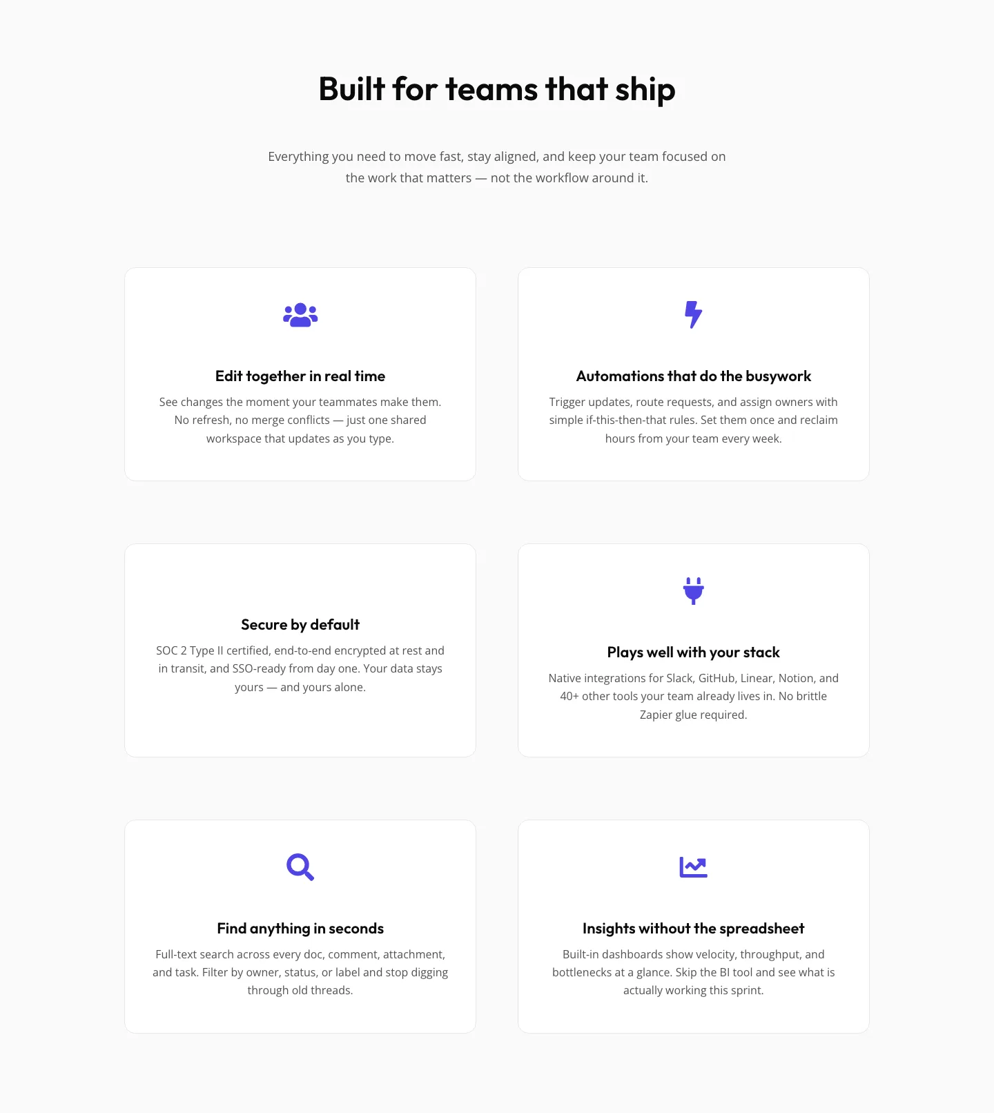
SaaS Features Section: Minimal Divi 5 Layout for Product Teams
features · saas · minimal
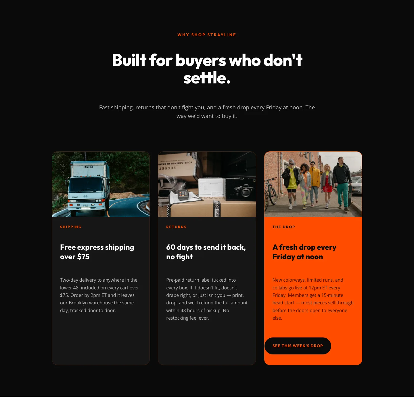
Bold Ecommerce Features Section: Free Shipping, Returns & Weekly Drops
features · ecommerce · bold