
Elegant Coaching Features Section: Signature Experience Cards for Divi 5
A refined Divi 5 features section for coaching sites: serif headlines, six gold-accented service cards on warm cream, hover shadows, and a discovery-call CTA. Fully responsive.
Rate this element
Download this section, free
- Divi 5 JSON, imports in seconds
- Commercial license included
- No account needed
Click to view the full page
Overview
This features section carries the quiet, boutique-hotel feel of a high-touch coaching practice: a warm ivory canvas (#FAF7F2) framing six white feature cards laid out as two 1/3, 1/3, 1/3 rows. The eyebrow line "The Signature Experience" is set in a small uppercase Outfit with 4px letter-spacing and a muted brass tone (#9A7B4F), sitting above a serif Cormorant Garamond H2 at 54px that caps at 820px wide and centers itself, so the headline never sprawls on wide monitors. A supporting Outfit paragraph clamps to 640px with generous 1.7em line-height, giving the intro block real breathing room before the grid begins.
Each card carries the same rhythm: a 34px brass FontAwesome icon top-left, a Cormorant Garamond H3 at 26px, then a short Outfit body paragraph. Cards use 40px top/bottom and 32px side padding, an 18px synced border-radius, a hairline 1px border in rgba(154,123,79,0.16), and a soft preset1 shadow (0/12/32, rgba(43,38,32,0.06)) that deepens on hover to 0/22/52 at 14% opacity. A subtle lift rather than a bounce. The palette stays strict: brass accents, near-black #2B2620 headings, warm #6B6259 body copy.
Spacing is deliberately calm: the section pads 120px top and bottom on desktop and eases to 72px on phone, and the two card rows are separated by 32px of top padding on the second row plus 24px bottom margin on every column. At the phone breakpoint every row flips to flex-direction column, so the 1/3 columns stack full-width (24_24) in a single readable rail. The section closes with a centered pill button ("Book a Complimentary Discovery Call") in brass with a 50px radius and a darker #7E6238 hover state, giving the whole block a clear terminal action.
What’s inside
- Ivory (#FAF7F2) Divi Section with 120px / 72px vertical padding (desktop / phone) for a calm, editorial rhythm
- Centered intro block: uppercase Outfit eyebrow, Cormorant Garamond H2 (54px desktop, 40px tablet, 34px phone), and a max-640px Outfit lede
- Two 1_3, 1_3, 1_3 rows delivering six identical feature cards built from native Divi Icon and Text modules
- Cards styled with #FFFFFF backgrounds, 18px synced border-radius, hairline brass border, and a soft preset1 shadow that lifts on hover
- 34px FontAwesome icons in brass (#9A7B4F) (coffee cup, map, comment, lightbulb, calendar, lock) placeholder-swappable per card
- Cormorant Garamond H3 headings at 26px paired with Outfit body copy at 16px / 1.7em for premium serif-plus-sans hierarchy
- Phone-safe stacking: every row switches to flex-direction column so 1_3 columns become full-width (24_24) tiles
- Centered pill CTA (Outfit 16px, 50px radius, 36px horizontal padding, brass → #7E6238 hover) closes the block with one clear action
Who it’s for
Written for premium 1:1 service providers who sell an experience as much as an outcome, executive and life coaches, leadership consultants, therapists and psychotherapists in private practice, wellness and longevity concierges, functional-medicine and integrative-health clinicians, and boutique advisors (financial, family-office, private banking). The tone and typography also work for luxury travel planners, private chefs, holistic fertility or postpartum coaches, high-end interior designers, and creative directors offering signature engagements. If your pricing is discovery-call driven, your clients expect discretion, and the offer is a defined program rather than a per-hour service, this six-tile grid gives you a calm, credible way to explain what's included without slipping into feature-list clichés.
Customization tips
Start with the palette: swap the brass #9A7B4F everywhere it appears (icons, eyebrow, button background, hover #7E6238, and the rgba(154,123,79,0.16) border) via Find & Replace to reskin the whole section to sage, navy, or charcoal in about a minute. Keep H3 titles to 3–5 words and body copy to 22–35 words per card so the six tiles stay the same height on desktop, the design assumes visual parity. To use images instead of icons, replace each Divi Icon module with a Divi Image module sized to a 1:1 or 4:3 crop (around 320×320 or 480×360) so cards don't drift in height. If you only have five services, delete one column and change the row's columnStructure from 1_3,1_3,1_3 to 1_2,1_2 in the second row. The centered CTA hits Calendly or a contact form well; keep the label under about 34 characters so it stays on one line on mobile.
How to install this layout
- Download the layout JSON file from this page.
- Open the target page in the Divi 5 builder.
- Open the portability panel (up/down arrows icon) and choose the Import tab.
- Upload the JSON. Tick “replace existing content” only for full-page imports.
- Check the page at desktop and mobile widths, then swap in your copy and images.
Full walkthrough with troubleshooting: How to Import a Divi 5 Layout.
Questions about Elegant Coaching Features Section: Signature Experience Cards for Divi 5
How does the grid behave on tablet and phone?
On desktop and tablet the six cards sit in two rows of three (1_3, 1_3, 1_3). At the phone breakpoint each row switches to flex-direction column and every 1_3 column becomes full-width (24_24), so the cards stack into a single readable column with the 24px bottom margin preserved between them.
Which Divi 5 modules does this section actually use?
Only four native modules: Section, Row, Column, Text, Heading, Icon, and Button. The card backgrounds, radius, borders, hover shadow, and spacing are all handled through native Column and module decoration settings: no third-party plugins, no custom CSS, no code modules.
Can I change the six icons to my own set?
Yes. Each icon is a Divi Icon module set to FontAwesome (weight 900). Open the module, pick a different FontAwesome glyph, and keep the size at 34px and the color at #9A7B4F (or your brand accent) so the six cards stay visually consistent.
What should I edit first when I drop this into my site?
Swap the eyebrow "The Signature Experience," the H2 headline, and the intro paragraph in the top row, then rewrite each card's H3 title and short paragraph. Finally, change the button label and link the CTA to your discovery-call scheduler.
Do the cards animate on hover?
Yes, a subtle box-shadow lift. The default preset1 shadow is 0/12/32 at rgba(43,38,32,0.06) and shifts on hover to 0/22/52 at rgba(43,38,32,0.14). There's no transform, so the cards don't jump; they just feel a touch more elevated when the cursor is over them.
What happens if my copy lengths are uneven across cards?
Because each card is a Divi Column with fixed padding (40px top/bottom, 32px sides), taller copy pushes the card taller and the row equalizes on desktop. Keep body copy within 22–35 words per card to avoid one card towering over its neighbors.
Which Divi version does this layout need?
Divi 5. The layout is generated natively for Divi 5 and validated against its real module structure before publication, so it imports clean into the current builder.
Can I use this layout on client websites?
Yes. Every download includes a commercial license covering unlimited sites you own or build for clients. Only reselling or redistributing the layout file itself is prohibited.
More feature grids
Browse all feature grids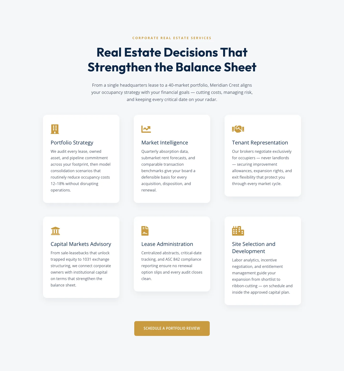
Corporate Real Estate Features Section: Six-Pillar Service Grid for Divi 5
features · real_estate · corporate
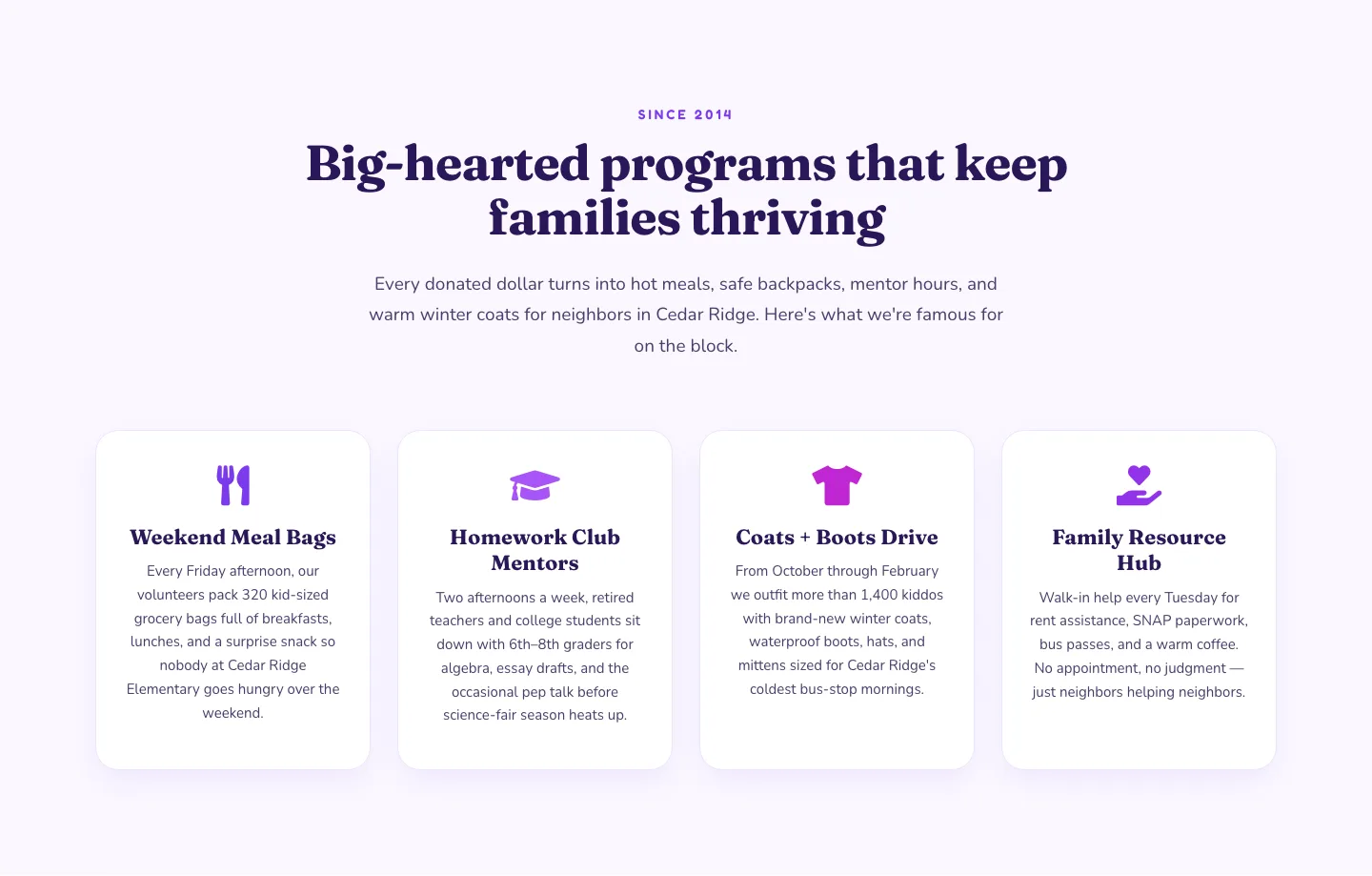
Playful Nonprofit Features Section: Four-Column Icon Cards for Divi 5
features · nonprofit · playful
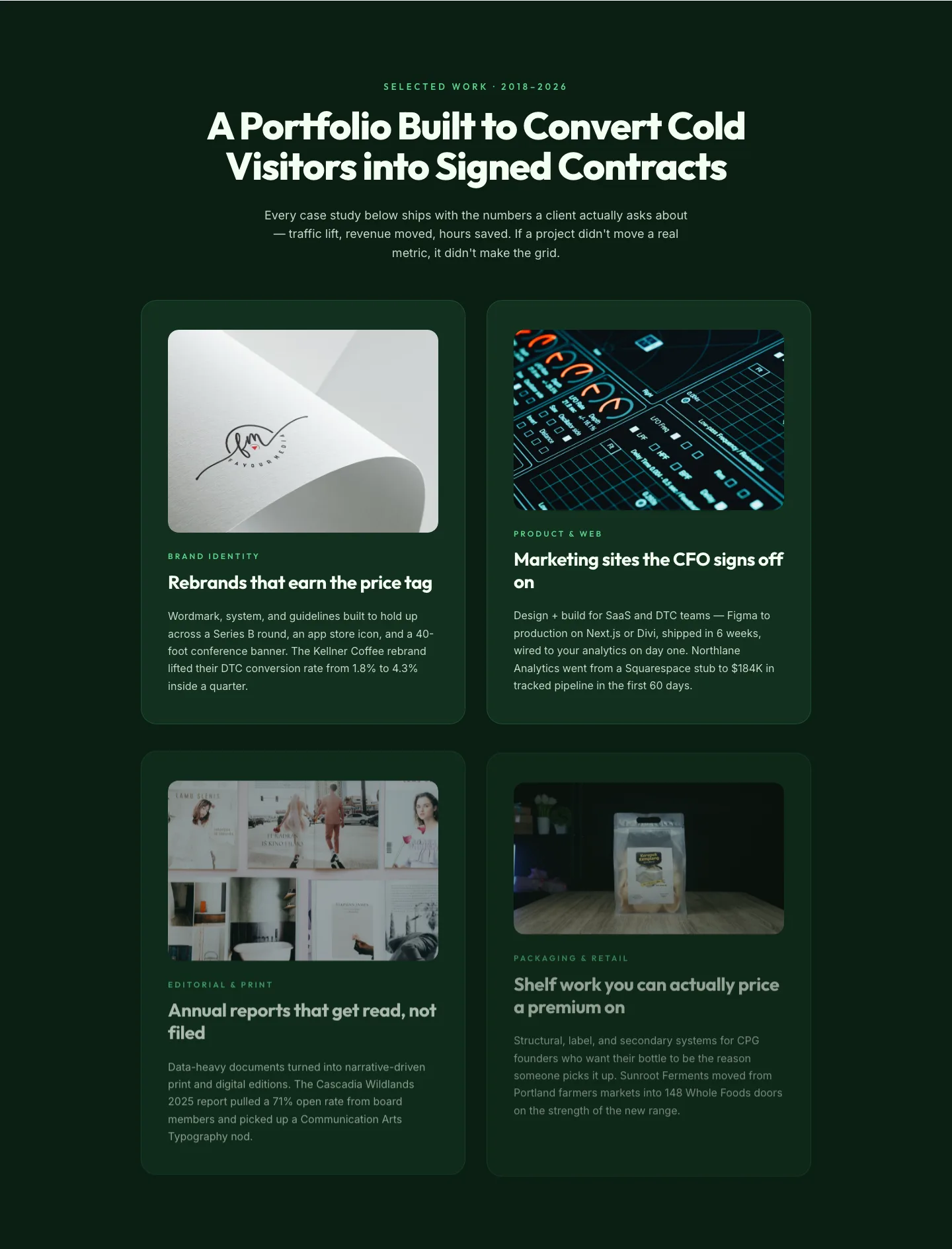
Bold Portfolio Features Grid: Divi 5 Case Study Layout
features · portfolio · bold
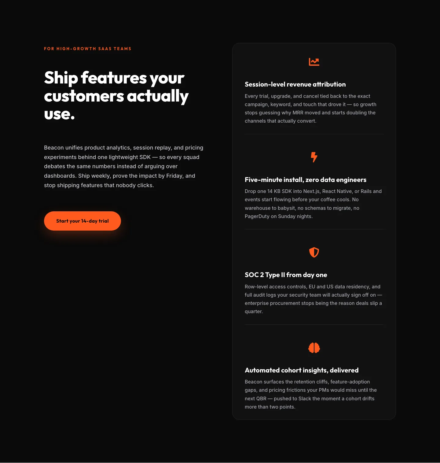
SaaS Features Section: Ship Features Customers Actually Use | Divi 5 Bold Layout
features · saas · bold
SaaS Features Section: Minimal Divi 5 Layout for Product Teams
features · saas · minimal
Bold Agency Features Section: Divi 5 Services Grid Layout
features · agency · bold