
Elegant Coaching Programs Cards Section for Divi 5
A refined four-card coaching programs section for Divi 5. Cormorant Garamond headings, warm cream background, and soft hover lift. Ideal for premium coaches and mentors.
Variations
Rate this element
Download this section, free
- Divi 5 JSON, imports in seconds
- Commercial license included
- No account needed
Click to view the full page
Overview
The section opens with a centered intro row, a Cormorant Garamond heading at 48px sitting above a single line of Inter body copy capped at 680px so the paragraph never spans the full frame. Below it, four service cards arrange themselves as a 2×2 grid at desktop widths, with 32px column and row gaps letting the warm #FAF7F2 background breathe between tiles. Every card is a white Blurb module with a 20px corner radius, 36px of padding on all four sides, and a soft preset shadow that deepens and lifts by −6px on hover, so the tiles feel tactile without shouting.
Typography carries the elegance. Titles are set in Cormorant Garamond at 26px in a warm 500 weight, paired with Inter at 16px and a 1.7em line-height for body copy. A classic serif/sans contrast that reads calmly at any width. Each card leads with a left-aligned 36px icon rendered in a single warm bronze (#A77D5C), the only accent hue in the palette, which keeps the visual rhythm quiet and disciplined. Body copy sits at #5A5A5A rather than pure black, so it stays soft against the cream backdrop, and the intro copy is centered while the card interiors stay left-aligned so the eye lands on titles first.
On phone widths, both rows switch to flexDirection: column and each card takes the full 24/24 flex track, stacking vertically in the order they appear. The section keeps 110px top and bottom padding with 24px side padding on every breakpoint, so the layout keeps its editorial spacing on small screens instead of crushing against the viewport edges.
What’s inside
- Four Blurb service cards arranged 2×2 at desktop, stacked single-column on phone via `flexDirection: column`
- Cormorant Garamond serif headings (48px intro / 26px card titles) paired with Inter body copy for a boutique editorial voice
- Warm cream section background (#FAF7F2) with pure white cards and a single bronze accent (#A77D5C): a three-colour palette, no clutter
- Left-aligned 36px icons on every card, mixing Font Awesome (tag, chart-line) and native Divi glyphs so you can swap either way
- Hover interaction on each card: −6px translate plus a deeper preset3 shadow (16px blur, −6px spread), no plugin, all built-in
- Centered intro row with the paragraph capped at 680px so the header sits balanced above the grid instead of stretching edge-to-edge
- 20px card radius with 32px column and row gaps and `flexWrap: wrap`, add a fifth or sixth card and it re-flows without CSS
- 110px vertical section padding preserved across breakpoints for the same editorial rhythm on mobile
Who it’s for
Life coaches, executive coaches, and mentors who sell tiered service packages (a single session, a longer engagement, a small mastermind, a retreat) will find the four-card grid maps directly onto their offer ladder. The muted cream-and-bronze palette and Cormorant Garamond headings lean quiet-luxury, so it also fits therapists, wellness practitioners, financial advisors, boutique consultancies, and high-touch service brands whose clients pay for calm authority rather than marketing volume. It works equally well as a services grid for interior designers, brand strategists, or private chefs. Any professional who wants to present three to four programs on one page without a hard sell will get the structure they need without stripping personality out of it.
Customization tips
Swap #A77D5C for your brand accent inside each Blurb's icon color field: the palette only uses one warm hue, so one change repaints all four cards. If your look is cooler, drop the section background from #FAF7F2 to a soft grey or off-white in the section's Design tab; card whites can stay as-is. Titles read best at three to five words ("Clarity Sessions", "Private Retreats"). Anything longer wraps into three lines and breaks the grid's rhythm. Body copy is comfortable at roughly 25–40 words per card; past that the tiles grow uneven in height. There are no images to prepare (icons are vector) but if you replace an icon with a small photo, use a square 1:1 crop at around 400×400 so it sits correctly inside the 36px alignment slot. Duplicate a column to add a fifth or sixth service; the row's flexWrap is already wrap, so it will fall to a new line without extra CSS.
How to install this layout
- Download the layout JSON file from this page.
- Open the target page in the Divi 5 builder.
- Open the portability panel (up/down arrows icon) and choose the Import tab.
- Upload the JSON. Tick “replace existing content” only for full-page imports.
- Check the page at desktop and mobile widths, then swap in your copy and images.
Full walkthrough with troubleshooting: How to Import a Divi 5 Layout.
Questions about Elegant Coaching Programs Cards Section for Divi 5
Is this a full page or just a section?
Just the section, a single "Ways We Work Together" cards block. Import it into any Divi 5 page and it slots in above or below whatever else you have on that page.
What if I only have three programs to show, not four?
Delete one column from the second row. The remaining card will sit at half-width on desktop; if you want it centered, either remove the second row entirely and add a third card to the top row, or set the surviving column's flex alignment to center.
Can I change the icons?
Yes, each card uses a Blurb module with the icon slot enabled. Two cards use Font Awesome glyphs (tag, chart-line) and two use native Divi icons; you can swap between either set from the icon picker without touching CSS.
How do I turn each card into a clickable link to a booking or program page?
Open the Blurb, add your URL to its link field, and set the whole module to link so the entire card becomes tappable. The hover lift already telegraphs that the tile is interactive.
Does it hold up in a dark theme?
It's designed light, pure white cards on a warm cream base. For a dark variant, flip the section background to a deep neutral and change the card background plus text colors to their inverses; the icon accent and layout structure can stay the same.
What should I edit first?
The four card titles and body copy. They're written for a female-founder coaching voice and will read as someone else's brand if left as-is. Swap the copy, then change the bronze accent to your brand hue, then link each card to its program page.
Which Divi version does this layout need?
Divi 5. The layout is generated natively for Divi 5 and validated against its real module structure before publication, so it imports clean into the current builder.
Can I use this layout on client websites?
Yes. Every download includes a commercial license covering unlimited sites you own or build for clients. Only reselling or redistributing the layout file itself is prohibited.
More cards
Browse all cards
Elegant Coaching Services Cards: Divi 5 Layout
cards · coaching · elegant
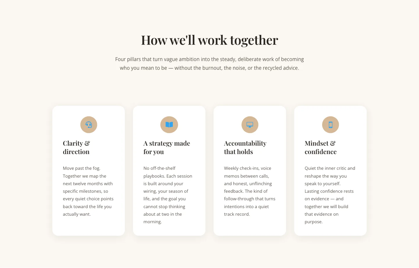
Elegant Coaching Cards Layout for Divi 5: Four-Pillar Framework
cards · coaching · elegant

Minimal SaaS Feature Cards Layout: 4-Column Divi 5 Section
cards · saas · minimal

Minimal SaaS Feature Cards Layout for Divi 5
cards · saas · minimal

Minimal SaaS Features Cards Layout for Divi 5
cards · saas · minimal

Minimal SaaS 3-Up Feature Cards Layout for Divi 5
cards · saas · minimal