
Elegant Coaching Cards Layout for Divi 5
A refined two-card Divi 5 section for coaches: warm cream palette, Cormorant Garamond headings, and quietly persuasive copy about clarity and momentum.
Variations
Rate this element
Download this section, free
- Divi 5 JSON, imports in seconds
- Commercial license included
- No account needed
Click to view the full page
Overview
This is a two-card explainer section built for the moment on a coaching page where a visitor is deciding whether the process actually fits how they think. The section sits on a warm cream background (#f7f3ed) with generous 110px vertical padding, giving the cards space to breathe rather than compete with the rest of the page. Above them, a centered eyebrow (a small uppercase Outfit line in warm bronze (#8b6f47) with 3px letter-spacing) introduces a Cormorant Garamond serif H2 at 42px in deep forest green (#1a2e2c). The header row is capped at 720px so the sentence keeps a considered, editorial rhythm instead of stretching across the viewport.
Below the intro, two equal 1_2 columns hold matching white cards with 20px rounded corners, 36px of internal padding on every side, and an 18px row gap between icon, heading, and paragraph. Each card opens with a circular icon badge (one in a soft peach (#f2e6d9) using a Divi glyph, the other in muted sage (#dde6e2) using a Font Awesome icon) so the two "steps" feel visually paired but not identical. Hierarchy inside the card is disciplined: a 26px serif H3, then a short paragraph in 16px Outfit at 1.7em line-height in a softened text tone (#4a5754) that reads long-form without looking dense.
Interaction is quiet but present. On hover, each card lifts 6px and its preset3 box-shadow deepens (from rgba(26,46,44,0.12) to 0.22), signaling that the cards are the interactive unit even though nothing is clickable yet. On tablet and phone the row wraps, and on phone the columns switch to a stacked column direction so each card gets full width with its padding intact. No cramped side-by-side on small screens.
What’s inside
- Centered header row with uppercase Outfit eyebrow, 42px Cormorant Garamond H2, and a 720px max-width so the intro reads editorial rather than wide
- Two-column card row using an equal 1_2, 1_2 structure with a 32px column gap and stretch alignment so both cards match height
- White cards with 20px rounded corners, 36px inner padding on all sides, and an 18px row gap between icon, headline and body copy
- Circular icon badges in two accent colors (peach `#f2e6d9` with a Divi glyph, sage `#dde6e2` with a Font Awesome icon) for visual pairing without repetition
- Hover state: cards translate up 6px and swap to a deeper `preset3` shadow, giving the section a quiet interactive feel
- Warm cream section background (`#f7f3ed`), forest-green headings (`#1a2e2c`), muted body text (`#4a5754`). A considered coaching palette
- Responsive behavior baked in: the row wraps on tablet and switches to `flexDirection: column` on phone so cards stack cleanly full-width
Who it’s for
This section is designed for practices that sell thoughtful, considered work rather than urgency: life, career, executive, mindset and relationship coaches who need to explain a process without turning it into a sales pitch. The two-card structure fits any "how it works" narrative that breaks cleanly into two beats: a clarifying phase and a compounding one. It transfers naturally to therapists, wellness and somatic practitioners, creative mentors, and boutique consultants where tone matters as much as outcomes. Studios, retreats and holistic health brands can also drop it in as a "what to expect" moment. If your brand voice leans warm, quiet and editorial (cream palettes, serif headlines, small-caps eyebrows), this is the kind of block you can trust to hold the middle of a page.
Customization tips
Palette changes are the highest-leverage edit. Swap the section background (#f7f3ed) for any warm neutral, then keep the cards white or lift them to a paler off-white so the shadow still reads. The two icon-badge fills (#f2e6d9 peach and #dde6e2 sage) are the accent recipe, change them together and the section takes on a new mood without touching type. Aim for around 6–9 words in each H3 and 35–50 words in each card paragraph; the hover-lift starts to feel awkward if one card is visibly taller than the other, so keep copy roughly balanced. Icons are set at 22px inside 18px-padded circular badges: swap them for anything from the Divi or Font Awesome sets, but stay with simple line or solid glyphs so the pair reads as a set. No images are used, so there is nothing to source. If you need a third card, duplicate a column and reduce the column gap to 24px so the row still breathes.
How to install this layout
- Download the layout JSON file from this page.
- Open the target page in the Divi 5 builder.
- Open the portability panel (up/down arrows icon) and choose the Import tab.
- Upload the JSON. Tick “replace existing content” only for full-page imports.
- Check the page at desktop and mobile widths, then swap in your copy and images.
Full walkthrough with troubleshooting: How to Import a Divi 5 Layout.
Questions about Elegant Coaching Cards Layout for Divi 5
How many cards does this section include, and can I add more?
Two equal-width cards in a 1_2, 1_2 row. You can duplicate a column to add a third, but you'll want to reduce the 32px column gap slightly and re-check the balance. Three cards read best when the copy in each is similar in length.
How does the section behave on mobile?
The row is set to wrap on tablet and to switch to a stacked column direction on phone, so each card takes the full width with its 36px internal padding intact. The rounded corners, icon badge and typography scale down cleanly without extra tweaks.
What Divi 5 modules is it actually built from?
Native Divi 5 only: Section, Row, Column, two Text modules for the eyebrow and H2 header, and inside each card an Icon module plus two Text modules (H3 and paragraph). No third-party modules or code modules are used.
Is the hover lift on the cards easy to remove?
Yes. The lift is a transform translate (Y: -6px) plus a swap to a deeper `preset3` shadow, both live on the column's hover state. Clear those two hover values in the Divi 5 editor and the cards become static without breaking the layout.
What should I edit first after importing?
Start with the eyebrow line and the H2 sentence, they set the whole tone. Then rewrite each card's H3 and paragraph to match your two-step narrative, and finally swap the two icons to match your process language.
Are the fonts included, and can I swap them?
The section uses Cormorant Garamond for headings and Outfit for body copy, both Google Fonts that Divi 5 loads automatically. Swap them from the module type panels, any serif/sans pair with similar weights (500–600 for headings) will preserve the editorial feel.
Which Divi version does this layout need?
Divi 5. The layout is generated natively for Divi 5 and validated against its real module structure before publication, so it imports clean into the current builder.
Can I use this layout on client websites?
Yes. Every download includes a commercial license covering unlimited sites you own or build for clients. Only reselling or redistributing the layout file itself is prohibited.
More cards
Browse all cards
Elegant Coaching Services Cards: Divi 5 Layout
cards · coaching · elegant
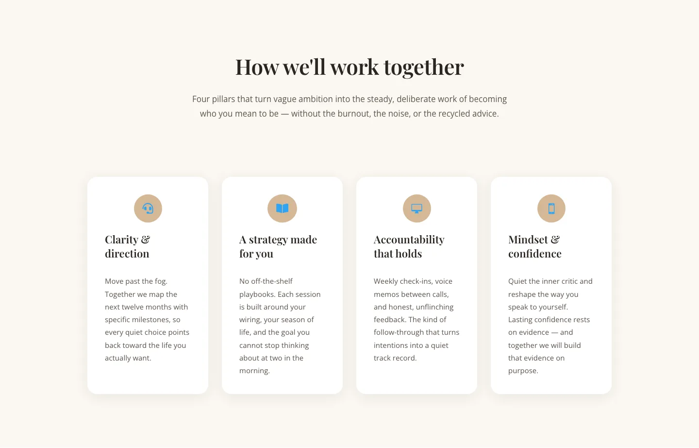
Elegant Coaching Cards Layout for Divi 5: Four-Pillar Framework
cards · coaching · elegant

Minimal SaaS Feature Cards Layout: 4-Column Divi 5 Section
cards · saas · minimal

Minimal SaaS Feature Cards Layout for Divi 5
cards · saas · minimal

Minimal SaaS Features Cards Layout for Divi 5
cards · saas · minimal

Minimal SaaS 3-Up Feature Cards Layout for Divi 5
cards · saas · minimal