
Elegant Coaching Cards Layout: How We Work Together
Refined Divi 5 cards section for coaches, with four pillar cards, soft shadows, and Cormorant Garamond headings on a warm cream backdrop.
Variations
Rate this element
Download this section, free
- Divi 5 JSON, imports in seconds
- Commercial license included
- No account needed
Click to view the full page
Overview
The section opens with a centered header block: a gold uppercase eyebrow ("THE ENGAGEMENT", 13px, 4px letter-spacing, #C8A56B), a Cormorant Garamond H2 at 48px, and an intro paragraph capped at 620px so the lead never fights the cards below for attention. All of this sits on a warm cream canvas (#F5F2EC) with 110px of vertical breathing room top and bottom.
Below the header is a 2x2 grid of white pillar cards. Each card is a tight three-part stack: a circular icon module (28px glyph inside 22px padding, sitting on a coloured disc), a Cormorant Garamond heading at 26px, and Inter body copy at 16px with 1.7em leading. All centred. Row gap inside the card is 20px, so the icon, title and paragraph read as one composed unit rather than three separate modules. The four icon discs use distinct accents (deep teal #2F5D58, gold #C8A56B, charcoal #1F2937, warm brown #8B5E3C) enough visual rhythm to differentiate the pillars without breaking the muted palette.
Cards use 20px rounded corners and a soft preset3 shadow (12px vertical, 36px blur, -10px spread, rgba(31,41,55,0.12)). On hover they translate up 6px and the shadow deepens to 24px/48px at 0.22 opacity, a quiet interaction that signals "these are the choices" without shouting. Column and row gaps are 32px, with 60px separating the header from the first row and 32px between the two card rows.
Responsive behaviour is handled in the row itself. Tablet keeps the two-column grid but sets flexWrap so cards can breathe if content grows. Phone flips flexDirection to column, so each card takes the full width and reads as a scrollable stack. The display heading steps down 48px → 36px → 32px so Cormorant stays elegant, not oversized, on a phone.
What’s inside
- Centered header row with a gold uppercase eyebrow, a Cormorant Garamond H2, and an intro paragraph max-width 620px
- Four pillar cards laid out as a 2x2 grid on desktop with 32px column and row gaps and stretched alignment
- Each card built from three native Divi 5 modules: Icon, Heading, Text. No third-party dependencies
- Circular icon module (28px glyph, 22px padding, 50% radius) with four distinct accent backgrounds: teal #2F5D58, gold #C8A56B, charcoal #1F2937, brown #8B5E3C
- White cards on cream #F5F2EC with 20px rounded corners and a preset3 drop shadow
- Hover interaction: cards lift 6px (translateY -6px) and the shadow deepens
- Type pairing already dialled in: Cormorant Garamond 500/600 for display, Inter for body at 1.65–1.7em leading
- Responsive rules baked in: tablet wraps, phone stacks the row to a single column, heading scales 48/36/32px
Who it’s for
Coaches, therapists, consultants and advisors who sell a structured engagement (a method, a framework, a set of pillars) and want that structure to be legible on the page before the first call. It fits life and executive coaches, wellness practitioners, financial planners, and boutique agencies presenting service pillars or a four-step process. The elegant serif-and-sans palette leans slightly premium, so it also works for high-ticket therapists, EFT/somatic practitioners, wedding planners, and mentorship programs where the buyer needs to feel calm (not sold to) before committing. If your offer is a one-off product or a live class, the framing ("how we work together") will feel forced; use the modules but rewrite the header.
Customization tips
The palette lives in four spots: section background (#F5F2EC), card background (#FFFFFF), icon disc colours (#2F5D58, #C8A56B, #1F2937, #8B5E3C), and body/heading text (#1F2937 and #4A4A4A). Change those six values across the section and the whole thing rebrands in under a minute. Copy limits: the H2 reads best at 20–34 characters ("How we work together" is 20). Card titles work at 2–3 words / 15–30 characters, anything longer starts to wrap and breaks the tidy card height. Card body copy stays balanced between 180 and 260 characters. There are no images, so no aspect ratios to manage. Just Font Awesome and Divi glyphs at 28px. If you want to keep the composed look, add a 3rd row rather than a 5th card in the second row: 4 or 6 pillars preserve the 2-column symmetry; 3 or 5 will look off-balance on desktop.
How to install this layout
- Download the layout JSON file from this page.
- Open the target page in the Divi 5 builder.
- Open the portability panel (up/down arrows icon) and choose the Import tab.
- Upload the JSON. Tick “replace existing content” only for full-page imports.
- Check the page at desktop and mobile widths, then swap in your copy and images.
Full walkthrough with troubleshooting: How to Import a Divi 5 Layout.
Questions about Elegant Coaching Cards Layout: How We Work Together
Is this section responsive out of the box?
Yes. On tablet the row keeps two columns but allows wrap so cards don't get squeezed. On phone the row switches to flexDirection column and each card spans the full width. The Cormorant heading also steps down from 48px on desktop to 36px on tablet and 32px on phone.
What Divi 5 modules does the layout actually use?
Only three: Text (for the eyebrow, intro paragraph and card descriptions), Heading (for the main H2 and each card title), and Icon (for the four circular icons). No blurb module, no third-party plugins. You can rebuild any part of it from the standard module list.
Are there any images or photos to swap?
No. The section is intentionally icon-only, which keeps it fast and easy to rebrand. Icons are pulled from Font Awesome (map-pin, weekly checkmark, terracotta target) and one Divi native glyph on the gold card. Swap them via the Icon module picker.
What should I edit first when I drop this in?
Rewrite the eyebrow ("THE ENGAGEMENT"), the H2 ("How we work together") and the four card titles to match your method. Everything else (colours, spacing, hover) is already tuned. Card body copy is where most people over-write; keep each description to 2–3 short sentences.
Can I change it from four cards to three or six?
Six works well: just duplicate a card in each row to make it a 2x3 grid, or add a third row of two. Three is trickier because the row is built as two columns; you'd need to switch the row structure to 1_3, 1_3, 1_3. Avoid five cards, one column will orphan and the composition falls apart.
Does the hover lift work on touch devices?
Not really: phones don't have a persistent hover state, so the 6px lift and deeper shadow only fire briefly on tap. That's fine: the cards are already visually complete without the interaction, and the hover is a desktop nicety, not the primary signal.
Which Divi version does this layout need?
Divi 5. The layout is generated natively for Divi 5 and validated against its real module structure before publication, so it imports clean into the current builder.
Can I use this layout on client websites?
Yes. Every download includes a commercial license covering unlimited sites you own or build for clients. Only reselling or redistributing the layout file itself is prohibited.
More cards
Browse all cards
Elegant Coaching Services Cards: Divi 5 Layout
cards · coaching · elegant
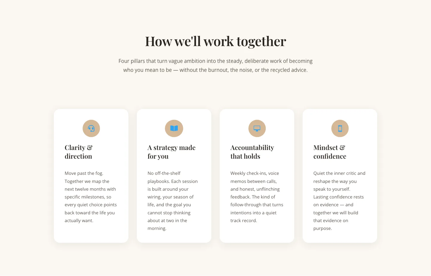
Elegant Coaching Cards Layout for Divi 5: Four-Pillar Framework
cards · coaching · elegant

Minimal SaaS Feature Cards Layout: 4-Column Divi 5 Section
cards · saas · minimal

Minimal SaaS Feature Cards Layout for Divi 5
cards · saas · minimal

Minimal SaaS Features Cards Layout for Divi 5
cards · saas · minimal

Minimal SaaS 3-Up Feature Cards Layout for Divi 5
cards · saas · minimal