
Elegant Coaching Three-Pillar Cards Layout for Divi 5
An elegant Divi 5 cards layout for coaches: three-pillar service cards in cream and deep green with serif headings, soft shadows, and refined hover lift.
Variations
Rate this element
Download this section, free
- Divi 5 JSON, imports in seconds
- Commercial license included
- No account needed
Click to view the full page
Overview
The section opens with a centered intro block: a copper eyebrow in Outfit uppercase, letter-spaced 3px, sitting above a large Cormorant Garamond h2 that steps from 48px on desktop down to 36px on tablet and 30px on phone. A supporting paragraph is capped at 680px so the line length stays comfortable regardless of container width. Underneath, three equal cards sit in a 1_3, 1_3, 1_3 row with a 32px column gap and stretch alignment, so their heights lock together on desktop without any manual matching.
Each card is a white surface with a 20px corner radius, 40px vertical padding, and a preset3 box shadow (12px offset, 32px blur, −6px spread) that deepens on hover as the whole card translates up by 6px: a small, considered movement rather than a flashy animation. Inside every card the same rhythm repeats: a 22px circular icon medallion, an h3 pillar name in Cormorant Garamond 600 at 26px, and a short paragraph in Outfit 16px with 1.7em line-height. The icon fills alternate (dark forest #2B3A36 for cards one and three, copper #A0784A for card two) so the eye finds a natural center without any extra "featured" plate treatment on the middle card.
The palette holds the whole thing together: a warm sand #F4EEE6 wash for the section, white cards for lift, two greens (#1F2A28 for headings, #2B3A36 for icon backs) for gravity, and a single copper accent (#A0784A) that ties the eyebrow, the middle icon, and the brand voice into one line. On tablet the row wraps with a 24px column gap and 24px row gap; on phone the flex direction switches to column and the section's padding relaxes to 64px vertical / 20px horizontal so the stacked cards breathe instead of crowding the edges.
What’s inside
- Cream-sand section background (#F4EEE6) with 96px desktop / 64px phone vertical padding for a calm, editorial rhythm
- Centered intro row: Outfit uppercase eyebrow, Cormorant Garamond h2 (48/36/30px across breakpoints), 680px-capped supporting paragraph
- Three equal columns (1_3, 1_3, 1_3) with 32px column gap and stretch alignment so card heights lock together on desktop
- White cards with 20px border radius and preset3 box shadow, plus a 6px upward translate and deeper shadow on hover
- Circular 22px-padded icon medallions using Divi and FontAwesome glyphs, alternating dark forest and copper fills
- Cormorant Garamond 600 26px pillar titles paired with Outfit 16px body at 1.7em line-height for editorial pacing
- Tablet reflow that wraps columns with 24px gaps; phone forces flex-direction column so cards stack full-width cleanly
Who it’s for
Built for coaching practices that lead with methodology: life, executive, leadership, business, health, or spiritual coaches who want the "how we work with you" moment on a home page or an about page. It also translates cleanly to therapists, consultants, holistic wellness studios, mindfulness teachers, and boutique advisory firms whose offer is really a three-step process. Because the palette leans warm-neutral and the type pairing is quiet-editorial, it sits comfortably next to premium service brands where clinical or startup-flavored card grids would feel wrong. Anywhere you'd say "our approach," "the practice," or "the three pillars," this section can carry the weight without leaning on photography.
Customization tips
Recolour the section from the Divi color presets: swap #A0784A for another accent (rose, terracotta, deep teal) and the copper carries through both the eyebrow and the middle icon. Keep the two forest greens (#1F2A28 for type, #2B3A36 for icon backs) if you want to preserve the calm, or push them lighter for a softer, coastal feel. Copy holds best when pillar titles stay at three or four words and card paragraphs land between 30 and 45 words: the row uses stretch alignment, so an unusually short middle card will pull the others taller than they need to be. Icons come from Divi's own set and FontAwesome; swap them from the icon picker without touching CSS. There are no photos in this section, so aspect ratios don't apply, but if you replace an icon with a small illustration, keep it under 60px so it still reads centered inside the circular medallion.
How to install this layout
- Download the layout JSON file from this page.
- Open the target page in the Divi 5 builder.
- Open the portability panel (up/down arrows icon) and choose the Import tab.
- Upload the JSON. Tick “replace existing content” only for full-page imports.
- Check the page at desktop and mobile widths, then swap in your copy and images.
Full walkthrough with troubleshooting: How to Import a Divi 5 Layout.
Questions about Elegant Coaching Three-Pillar Cards Layout for Divi 5
How does the three-column row behave on tablet and mobile?
On tablet the row wraps with a 24px column gap and a 24px row gap, so cards can drop below one another gracefully. On phone the flex direction switches to column, each card stacks full-width, and the section's padding softens to 64px vertical / 20px horizontal.
Which Divi modules is this section built from?
Native Divi 5 modules only: Section, Row, Column, Text (for the eyebrow, subhead, and card body), Heading (h2 for the intro and h3 for each pillar), and Icon. No third-party plugins or custom code.
Can I add a fourth pillar card?
Yes. Duplicate one card column and change the row's column structure to `1_4, 1_4, 1_4, 1_4`. Consider dropping the column gap from 32px to 24px so four cards still breathe on a standard 1080px content width.
What should I edit first after importing?
The three pillar titles and their paragraphs, then the middle icon's background color if your brand accent isn't copper. Everything else (spacing, radius, shadow, and hover lift) is tuned to hold up as-is.
Can I swap the icons for photos?
Not by editing the existing module: the medallion is a circular Divi Icon, not an Image. If you want a photo per pillar, delete the icon and drop an Image module in its place, then apply a 50% border-radius and match the ~90px diameter so the composition stays balanced.
Which Divi version does this layout need?
Divi 5. The layout is generated natively for Divi 5 and validated against its real module structure before publication, so it imports clean into the current builder.
Can I use this layout on client websites?
Yes. Every download includes a commercial license covering unlimited sites you own or build for clients. Only reselling or redistributing the layout file itself is prohibited.
More cards
Browse all cards
Elegant Coaching Services Cards: Divi 5 Layout
cards · coaching · elegant
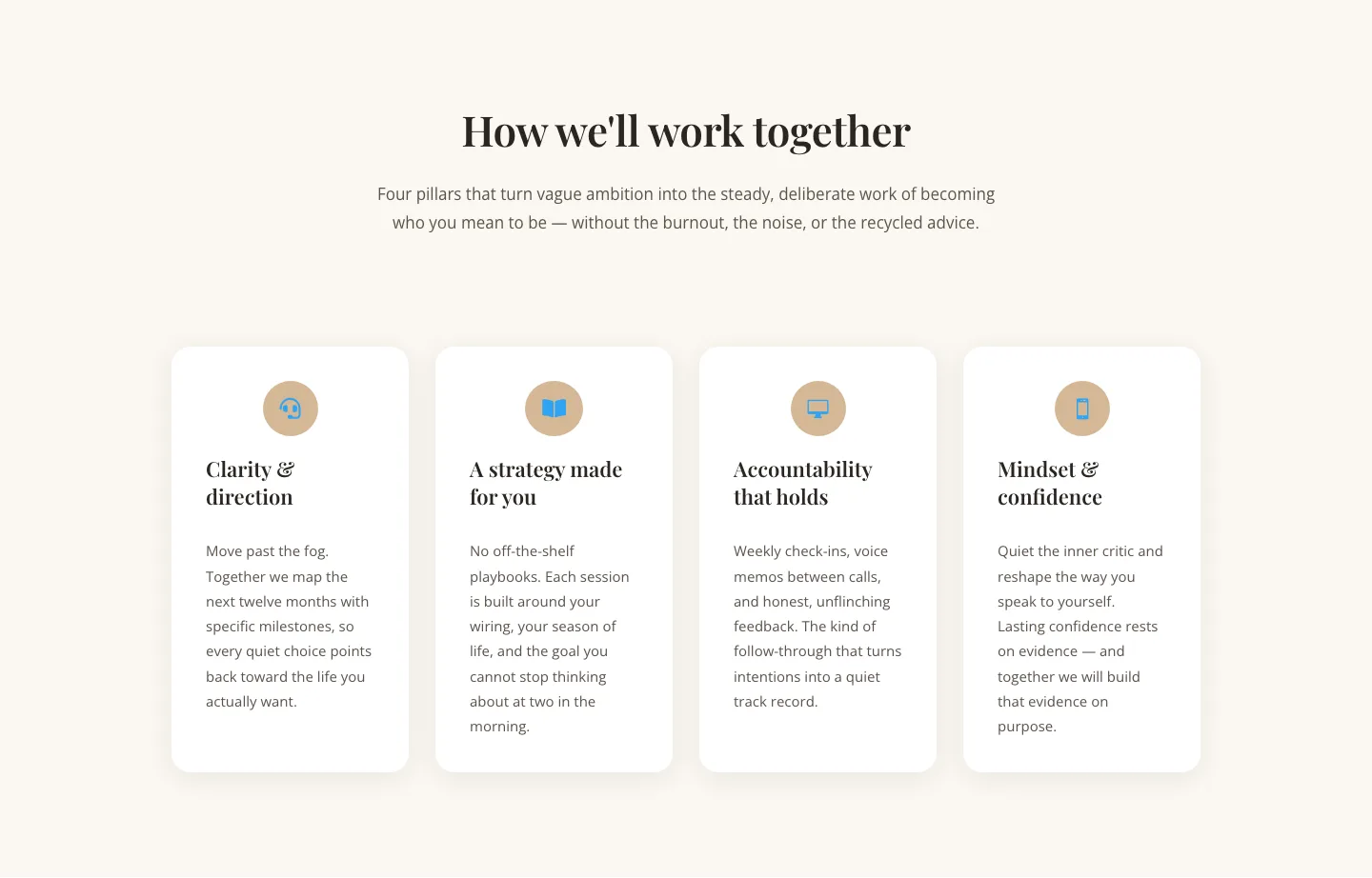
Elegant Coaching Cards Layout for Divi 5: Four-Pillar Framework
cards · coaching · elegant

Minimal SaaS Feature Cards Layout: 4-Column Divi 5 Section
cards · saas · minimal

Minimal SaaS Feature Cards Layout for Divi 5
cards · saas · minimal

Minimal SaaS Features Cards Layout for Divi 5
cards · saas · minimal

Minimal SaaS 3-Up Feature Cards Layout for Divi 5
cards · saas · minimal