
Ember & Oak Fall Drop Hero: Bold Ecommerce Divi 5 Layout
Bold Divi 5 ecommerce hero for streetwear and fashion drops. Warm cream backdrop, oversized product image, rounded pill CTA in signature orange, and small-batch storytelling copy.
Rate this element
Download this section, free
- Divi 5 JSON, imports in seconds
- Commercial license included
- No account needed
Click to view the full page
Overview
The section sits on a warm cream ground (#FFF7ED) with generous 140px vertical padding on desktop, dialing down to 90px on tablet and 70px on phone so the hero always breathes without eating the fold. Inside, an equal 1_2 / 1_2 row caps at 1240px and centers itself in the viewport, holding a 72px column gap that keeps the product photograph and the sales pitch as separate weights the eye can land on independently.
The left column carries a single tall product image with a 28px corner radius and a soft orange-tinted drop shadow (rgba(194,65,12,0.28), 70px blur) that lifts it off the cream field without shouting. A 700ms slide-in from the left plays on load: subtle motion, not a distraction. On phones the row flips to a stacked flex-column with a 36px row gap so the image reads first and the copy follows directly beneath, exactly the order a mobile shopper expects.
Typography does the hierarchy work in three deliberate steps. A 14px eyebrow in burnt orange (#C2410C) (uppercase, 700 weight, 3px letter-spacing) labels the drop. The 64px near-black headline (dropping to 48px on tablet and 38px on phone) uses -1.5px letter-spacing and a tight 1.05 line-height so it feels like printed campaign type rather than a website title. Body copy sits at 19px in zinc grey (#3F3F46) with 1.7 line-height, capped at a 520px max-width so the paragraph never stretches into an unread strip.
The button is the loudest element on the page by design: a fully-rounded pill (999px radius) in solid #FF6B1A with a heavy orange glow shadow, deepening to #C2410C on hover. It's the only saturated-orange fill in the composition, so it reads unambiguously as the single action to take.
What’s inside
- Two-column 1_2 / 1_2 row (product image + copy) that stacks to a single flex-column with a 36px row gap on phones
- Portrait product Image module with 28px rounded corners and a warm orange-tinted drop shadow (70px blur)
- Three stacked text blocks in the right column: uppercase eyebrow Heading, oversized H1 Heading, and a 520px-capped Text paragraph
- Pill-shaped Divi Button module (999px radius) in #FF6B1A with a glowing shadow and a darker #C2410C hover fill
- Responsive type scale on the headline: 64px desktop → 48px tablet → 38px phone, tuned per breakpoint
- Section-level responsive padding: 140px vertical desktop, 90px tablet, 70px phone. The hero always keeps proportion
- 700ms slide-in-from-left animation on the product image, applied at the module level
- Built entirely from native Divi 5 Section, Row, Column, Image, Heading, Text, and Button modules: no custom code, no third-party plugins
Who it’s for
This hero is built for direct-to-consumer ecommerce brands that lead with product and personality: apparel drops, small-batch goods, coffee roasters, streetwear labels, homeware makers, beauty brands with a clear point of view. The split image-and-copy layout gives one hero product the whole stage, which suits limited runs, seasonal drops, restocks, and launch pages far better than a busy carousel. The warm cream and burnt-orange palette leans autumn and craft, but re-tinting takes minutes for a spring, winter, or monochrome equivalent. If you sell a flagship product (or want one collection to feel like the anchor of the whole store), this layout carries that job cleanly on any Divi 5 theme.
Customization tips
Swap the palette at the Section preset level by editing the four brand colors in one pass: the cream background (#FFF7ED), the burnt-orange eyebrow (#C2410C), the bright-orange button and shadow (#FF6B1A), and the near-black headline (#111111). Keep the eyebrow short (three to five words work best given the 3px letter-spacing) and the headline under 70 characters so it survives the -1.5px tracking without wrapping awkwardly on tablet. Body copy sits inside a 520px max-width, so aim for 30–50 words. Replace the product photo with a tall portrait image (roughly 1200×1400, or any 4:5 to 6:7 ratio) so the 28px radius sits evenly on all four edges; a square or landscape crop will collapse the visual balance against the copy column on desktop. If the CTA loses contrast on a lighter palette, deepen the shadow color rather than the button fill. The rounded pill shape is what makes it read as the action.
How to install this layout
- Download the layout JSON file from this page.
- Open the target page in the Divi 5 builder.
- Open the portability panel (up/down arrows icon) and choose the Import tab.
- Upload the JSON. Tick “replace existing content” only for full-page imports.
- Check the page at desktop and mobile widths, then swap in your copy and images.
Full walkthrough with troubleshooting: How to Import a Divi 5 Layout.
Questions about Ember & Oak Fall Drop Hero: Bold Ecommerce Divi 5 Layout
How does this hero behave on phones?
The two-column row switches to a stacked flex-column with a 36px row gap. The product image lands first, then the eyebrow, headline, body copy, and button follow directly beneath. Section padding also drops from 140px to 70px vertical so the hero doesn't dominate a phone viewport.
What image proportion should the product photo use?
The reference image is 1200×1400 (portrait, roughly 6:7). Any portrait crop between 4:5 and 6:7 will hold the 28px rounded corners cleanly. Landscape or square photos leave the right column visually heavier than the left on desktop, so keep the replacement portrait-oriented.
Which Divi 5 modules are actually used?
Native Section, Row, Column, Image, two Heading modules (one for the uppercase eyebrow, one for the H1), a Text module for the paragraph, and a Button module. Nothing else: no third-party plugins, no custom code, no shortcodes.
How long can the headline run before it breaks the layout?
The desktop headline is 64px with -1.5px letter-spacing on a 1.05 line-height, so aim for two lines maximum. Roughly 55–70 characters. It scales down to 48px on tablet and 38px on phone, but a very long line will still wrap to three lines on narrower screens.
Can I remove the slide-in animation on the image?
Yes. Open the Image module, go to the Advanced tab, and clear the Animation setting. The rest of the layout uses no motion, so the section will settle into place instantly on load.
What should I edit first after importing?
Replace the Pexels product photo with your own portrait shot, then rewrite the eyebrow (drop name or campaign tag), the headline, and the paragraph. Point the button URL at the collection or product page, the palette and spacing rarely need touching to launch.
Which Divi version does this layout need?
Divi 5. The layout is generated natively for Divi 5 and validated against its real module structure before publication, so it imports clean into the current builder.
Can I use this layout on client websites?
Yes. Every download includes a commercial license covering unlimited sites you own or build for clients. Only reselling or redistributing the layout file itself is prohibited.
More hero sections
Browse all hero sections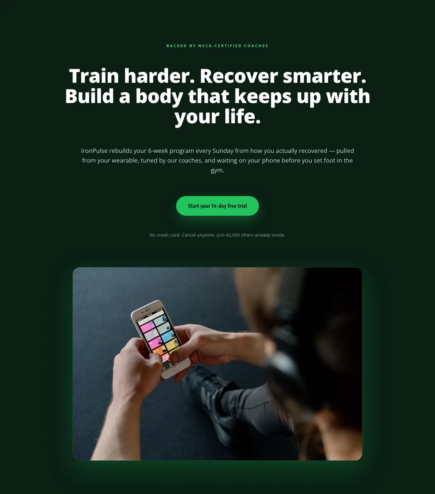
Bold Fitness App Hero Layout for Divi 5: IronPulse Adaptive Training
hero · fitness · bold
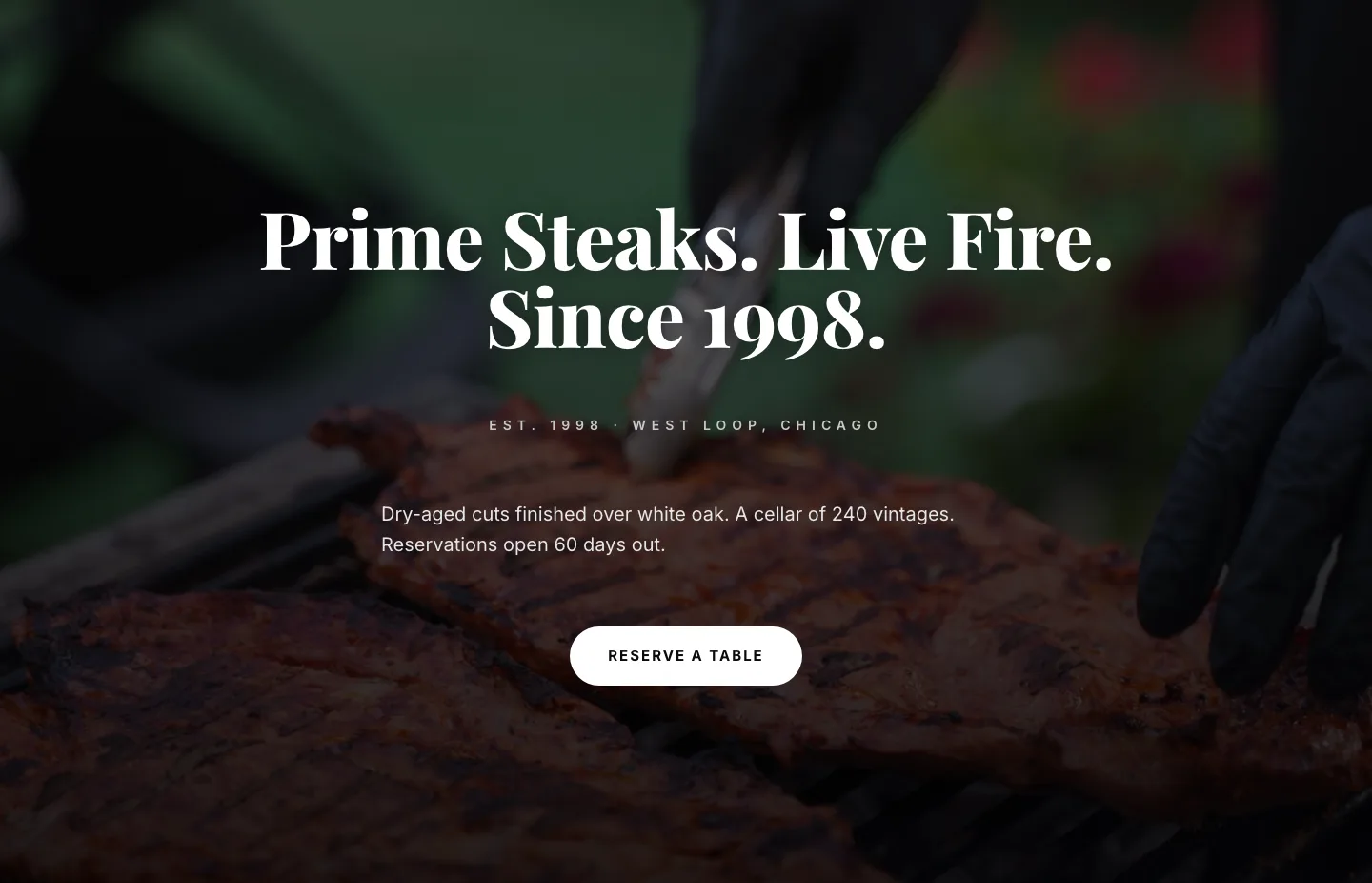
Prime Steaks Hero Section: Bold Monochrome Restaurant Layout for Divi 5
hero · restaurant · bold
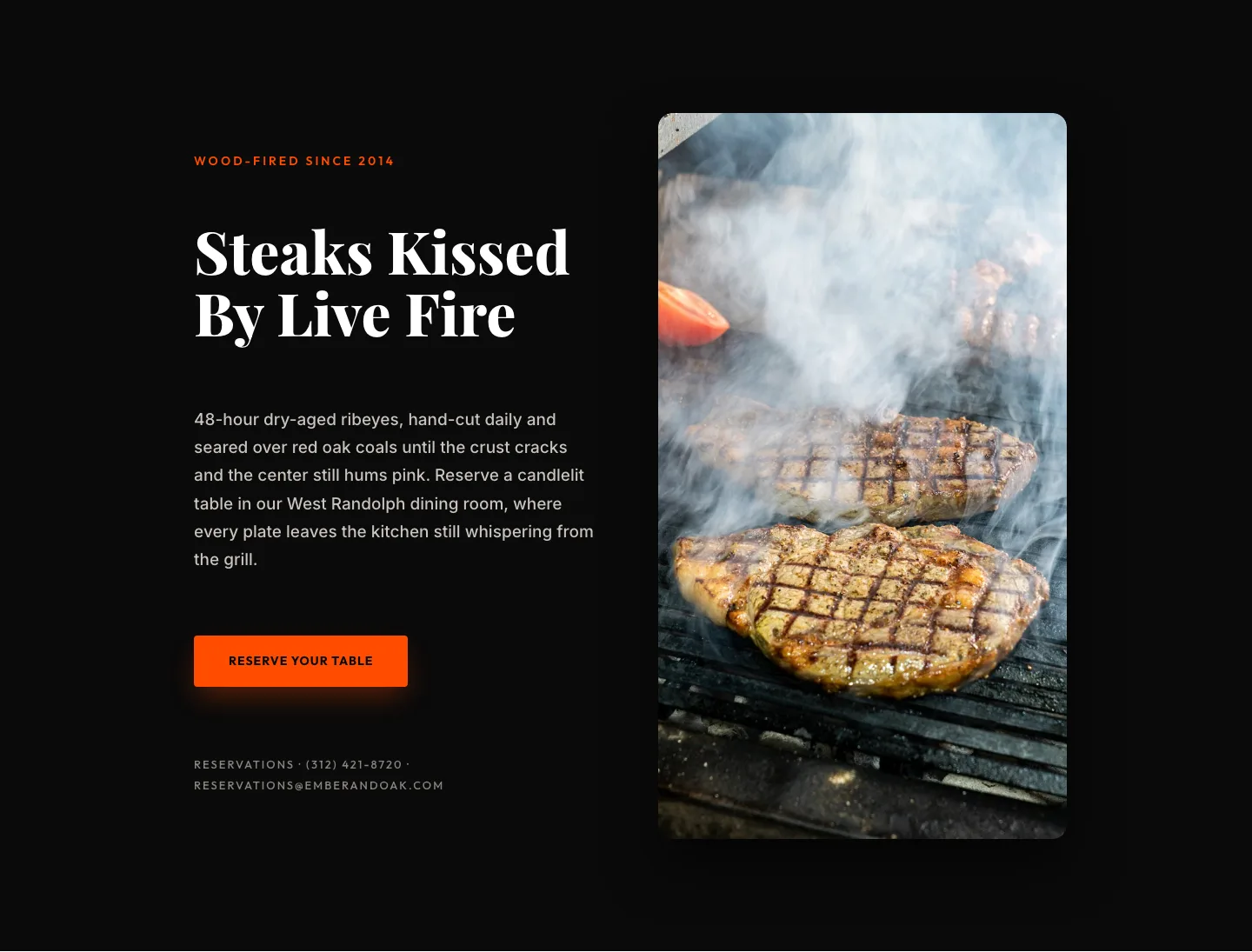
Wood-Fired Steakhouse Hero Layout for Divi 5: Bold Restaurant Template
hero · restaurant · bold
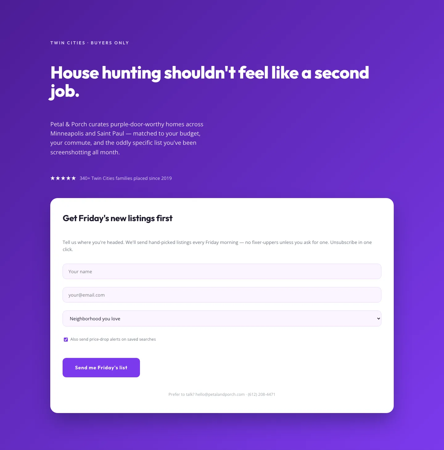
Playful Real Estate Hero with Weekly Listings Signup: Divi 5 Layout
hero · real_estate · playful
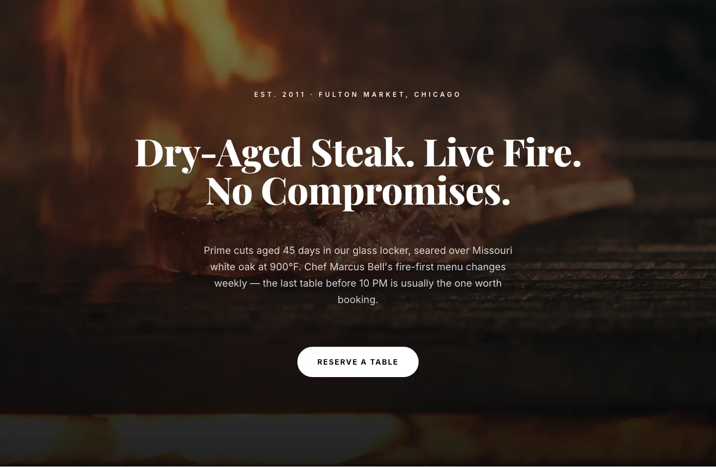
Bold Steakhouse Hero Layout for Divi 5: Fire & Dry-Aged
hero · restaurant · bold
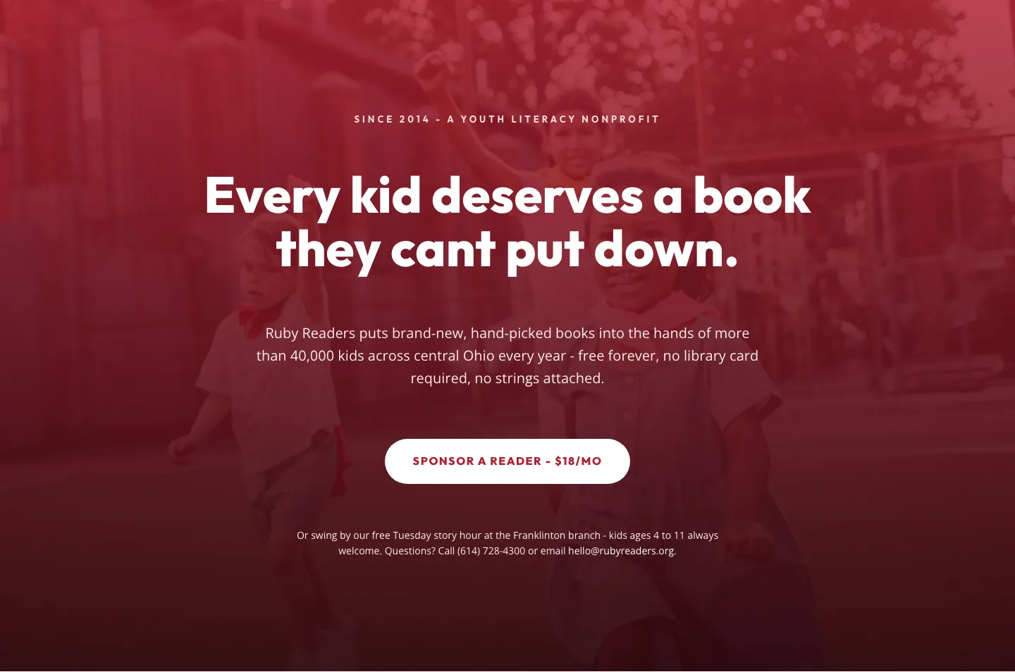
Ruby Readers Nonprofit Hero: Playful Divi 5 Layout
hero · nonprofit · playful