
Evermore Weddings — Elegant Wedding_planner About Page for Divi 5
Meet the Evermore Weddings team – five experienced planners dedicated to personal, calm and beautifully organised wedding days. Honest pricing, contingency planning and one dedicated planner from first call to last dance.
Rate this element
Download this section, free
- Divi 5 JSON, imports in seconds
- Commercial license included
- No account needed
This page ships inside Evermore: Wedding Planner Theme (6 Pages), 6 coherent pages that share one brand.
Click to view the full page
Overview
The layout opens with a full-width hero section on a warm linen background (#f6f1ec) and 180px of vertical padding, which gives the page a measured, editorial pace from the first scroll. A small Cormorant Garamond eyebrow in tracked-out slate introduces the brand, while the h1 headline runs at 104px on desktop and scales fluidly to 44px on mobile -- textWrap: balance keeps word wraps clean as the type reflows at every viewport width. A 2px dotted warm-beige divider separates the headline block from an asymmetric two-column strip below: the body paragraph sits in a wider 16/24 column in Lora at 20px with generous 1.7em line-height, and a minimal underlined link anchors the narrower 8/24 column to the right. On phones both columns go full-width and stack vertically with no manual override needed.
The team section stays on the linen background and presents four planners through a tightly controlled four-column grid. A split header row aligns the h2 heading to the bottom of the copy opposite it using alignItems: flex-end, which keeps the eye moving horizontally rather than jumping between heights. Each card places a square 1:1 portrait -- sharp corners, object-fit cover -- above a group with a 3px dotted top border, followed by the planner name in Cormorant Garamond h3 at 20px and a spaced-out role label below it. A 28px column gap and 40px row gap are defined directly on the row module, so spacing stays consistent even as the grid collapses to two columns on tablet and a single vertical stack on phone.
The white-background section isolates the founder in a deliberately asymmetric flex row. A 9/24 column holds a 4:5 portrait with pill-shaped top corners (999px radius) and softened 32px bottom corners, framing the image as a keepsake rather than a standard headshot. The wider 15/24 column carries an h4 eyebrow, an h2 quote at 40px, three body paragraphs in Cormorant Garamond at 22px with 1.6em line-height, and an italic signature -- the emotional core of the page. The deep navy section (#2f3a4a) that follows inverts the palette and builds a four-row promise list: each row holds a fixed 64px index label, a flex-grow heading column, and a description column capped at 360px max-width, all aligned to baseline so the numbers and headings share a common reading line, separated by 3px dotted cream dividers.
The page closes with a full-bleed wedding photograph as section background, over which a white card floats in a max-520px left-aligned group. The card is enclosed in a 2px dotted navy border with 24px corner radius and 48px internal padding, and its content moves from eyebrow through heading through body copy to a dotted divider and a pill-shaped ghost button. The button inverts on hover from transparent to navy fill, matching the section's inversion logic. All five sections carry explicit padding breakpoints for desktop, tablet, and phone, so no viewport requires a manual adjustment after import.
What’s inside
- Oversized h1 hero block (104px desktop / 44px mobile) in Cormorant Garamond with `textWrap: balance`, paired with an asymmetric 16/24 + 8/24 two-column intro strip and dotted warm-beige divider
- Responsive four-person team grid: square 1:1 portrait images with sharp corners and object-fit cover, collapsing from 4 columns on desktop to 2 on tablet and 1 on phone, each card topped with a 3px dotted accent border
- Founder spotlight section with a shaped 4:5 portrait (999px pill-top radius, 32px bottom radius) paired with a three-paragraph personal letter block and an italic Cormorant Garamond signature
- Numbered-promise list on a deep navy (#2f3a4a) background: four rows with dotted cream dividers, fixed 64px index labels, flex-grow heading columns, and 360px-capped description widths all aligned to a shared baseline
- Floating recruitment CTA card over a full-bleed Pexels background image: white fill, 2px dotted navy border, 24px corner radius, 48px padding, and a pill-shaped ghost button with navy hover fill
- Consistent dotted-motif system across all dividers, name-card top borders, promise-section dividers, CTA card border, and ghost button border for visual cohesion across all five sections
- Two-family typography system (Cormorant Garamond for all display and headings, Lora for body copy) with responsive size overrides pre-wired for every breakpoint
Who it’s for
This layout fits independent wedding planners and small boutique studios who lead with team personality rather than a portfolio-first pitch. It also suits elopement specialists, destination wedding coordinators, and event design firms who want prospective couples to feel they know the team before making an enquiry. Adjacent businesses in the wedding ecosystem -- florists, stylists, venue consultants -- will find the About page structure equally usable. Any service business built around a small, trusted group of people, where the team itself is the primary selling point, will find the hierarchy and tone a direct match.
Customization tips
The palette lives entirely in direct hex values on section backgrounds and text modules, so the most effective global edit is replacing the linen #f6f1ec and navy #2f3a4a pair with your brand primaries -- the dotted-border motif and typography system will hold regardless of the colors you choose. The team grid is built for exactly four members: to reduce to three, delete one column and change the row's flexColumnStructure value to equal-columns_3. All four team portrait images use a 1:1 aspect ratio with object-fit cover, so any square crop works -- shoot slightly loose around the face so the automatic crop does not clip the subject at the edges. The founder portrait in the spotlight section uses a 4:5 ratio; a vertical headshot at around 800x1000px is ideal. Body paragraphs in the founder letter run at 22px Cormorant Garamond with 1.6em line-height -- keep each paragraph under 60 words to preserve the airy rhythm. The four promise items are independent group modules and can be reordered, renamed, or reduced to three without affecting any surrounding structure.
How to install this layout
- Download the layout JSON file from this page.
- Open the target page in the Divi 5 builder.
- Open the portability panel (up/down arrows icon) and choose the Import tab.
- Upload the JSON. Tick “replace existing content” only for full-page imports.
- Check the page at desktop and mobile widths, then swap in your copy and images.
Full walkthrough with troubleshooting: How to Import a Divi 5 Layout.
Questions about Evermore Weddings — Elegant Wedding_planner About Page for Divi 5
How does the four-person team grid behave on smaller screens?
On tablet the grid switches to two columns (each column takes 12/24 of the row width). On phone all four columns stack into a single full-width column so portraits and name cards read in sequence with consistent vertical spacing.
What modules make up each numbered-promise row?
Each row is three nested divi/group modules inside a parent group: a fixed 64px-wide group holds the number, a flex-grow group holds the h3 heading, and a max-360px group holds the supporting text. The parent uses `alignItems: baseline` so all three elements sit on the same reading line regardless of text length.
What image ratio should I use for the founder portrait in the spotlight section?
The spotlight portrait is set to 4:5 with object-fit cover. A vertical headshot at 800x1000px or taller works well. The module uses 999px top-left and top-right border radii and 32px bottom radii, so a centered composition with some headroom above the face will look best after the pill-top crop is applied.
Can I change the dotted border style to solid lines throughout?
Yes. The dotted style appears independently on the hero divider, each name-card top border, the promise-section dividers, the CTA card border, and the ghost button border. Each is a separate decoration property on its own module, so you can update each one to solid without touching any other styling or layout structure.
How does the background work in the final CTA section?
The section uses a dual background: the base color is set to the linen `#f6f1ec` and a Pexels wedding photograph is layered over it at full cover size. To replace it, update the section background image URL in the Divi 5 background settings. Any scene with a light or softly blurred background will keep the floating white card legible without needing a color overlay on top.
Which Divi version does this layout need?
Divi 5. The layout is generated natively for Divi 5 and validated against its real module structure before publication, so it imports clean into the current builder.
Can I use this layout on client websites?
Yes. Every download includes a commercial license covering unlimited sites you own or build for clients. Only reselling or redistributing the layout file itself is prohibited.
Included in these packs
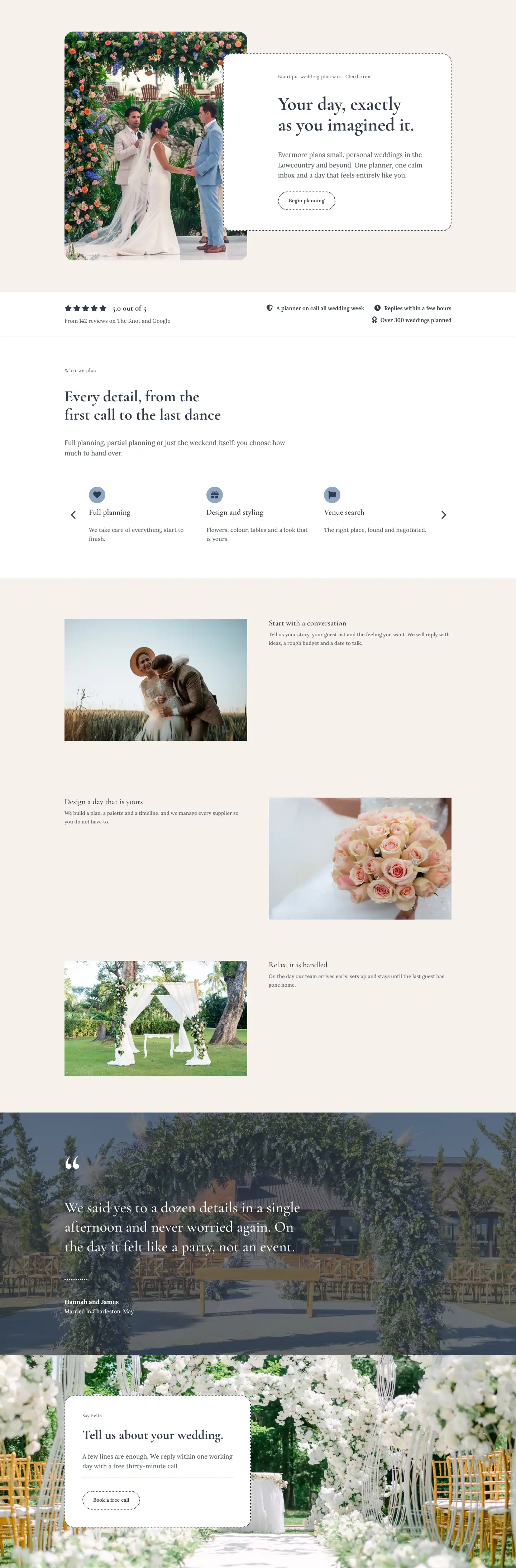
More full landing pages
Browse all full landing pages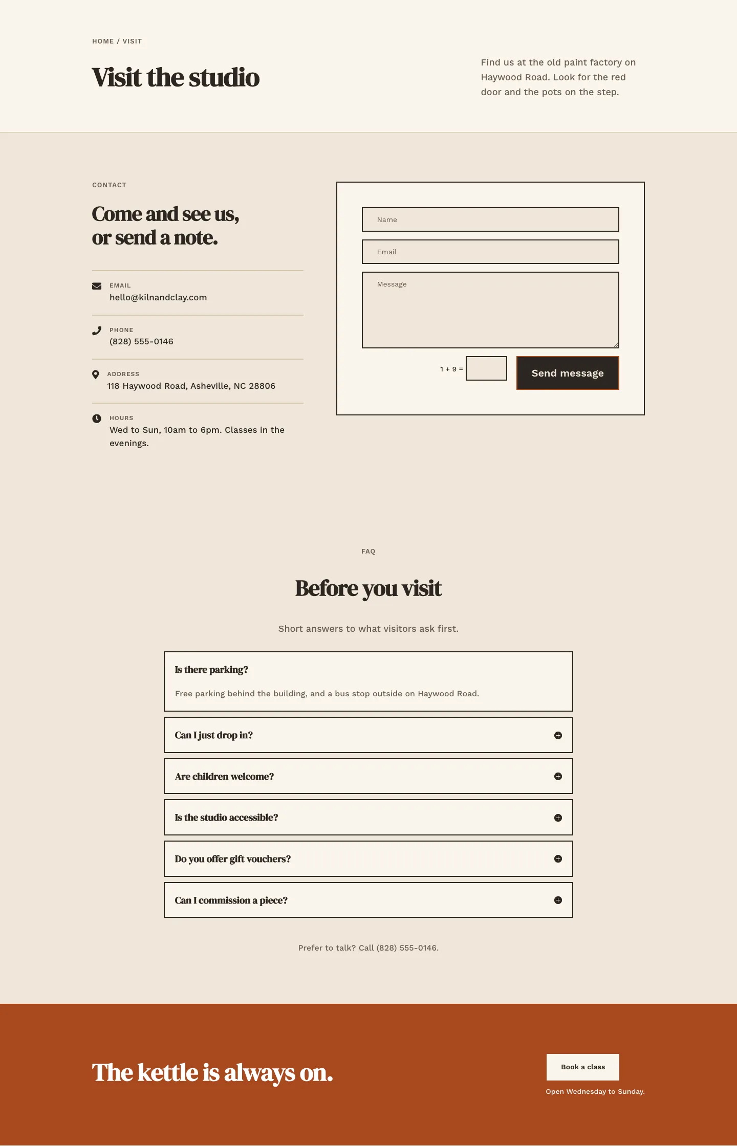
Kiln & Clay — Minimal Pottery_studio Visit Page for Divi 5
full_landing · pottery_studio · minimal
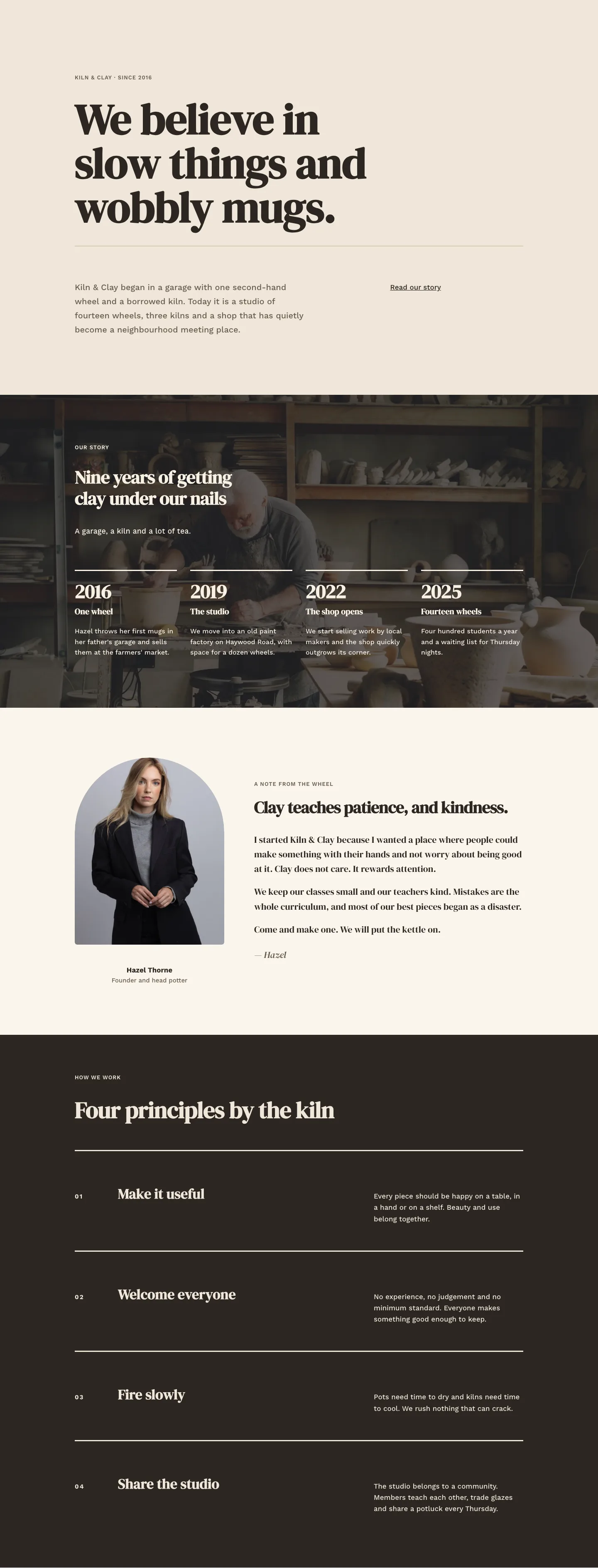
Kiln & Clay — Minimal Pottery_studio Our Story Page for Divi 5
full_landing · pottery_studio · minimal
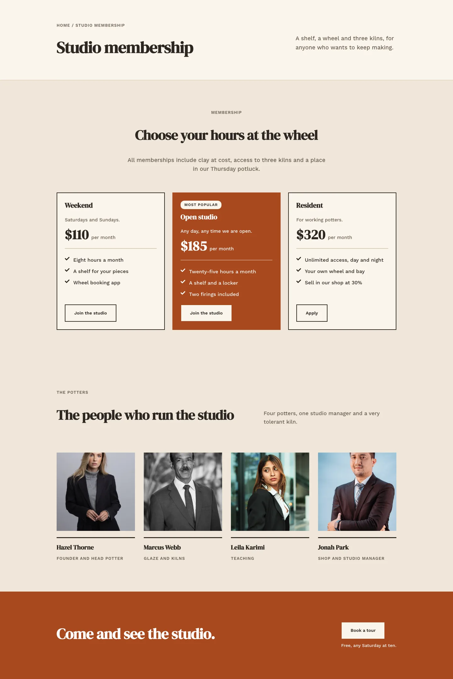
Kiln & Clay — Minimal Pottery_studio Studio Membership Page for Divi 5
full_landing · pottery_studio · minimal
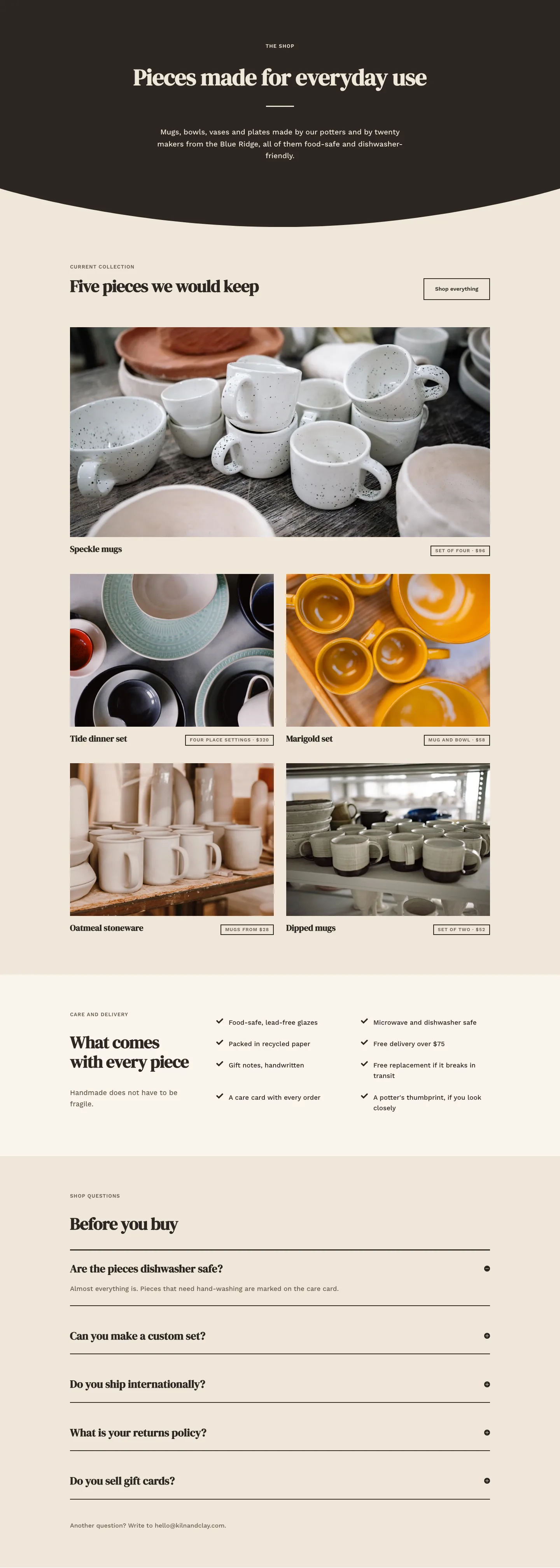
Kiln & Clay — Minimal Pottery_studio The Shop Page for Divi 5
full_landing · pottery_studio · minimal
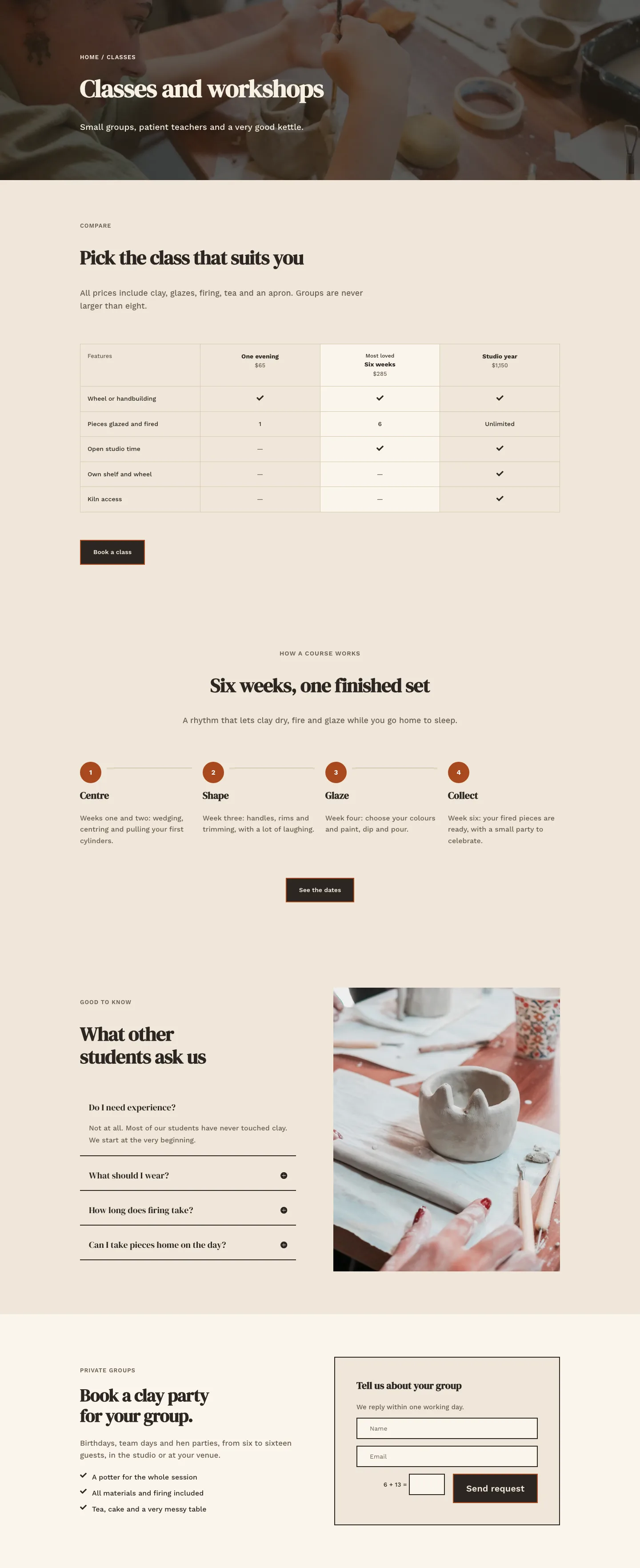
Kiln & Clay — Minimal Pottery_studio Classes Page for Divi 5
full_landing · pottery_studio · minimal
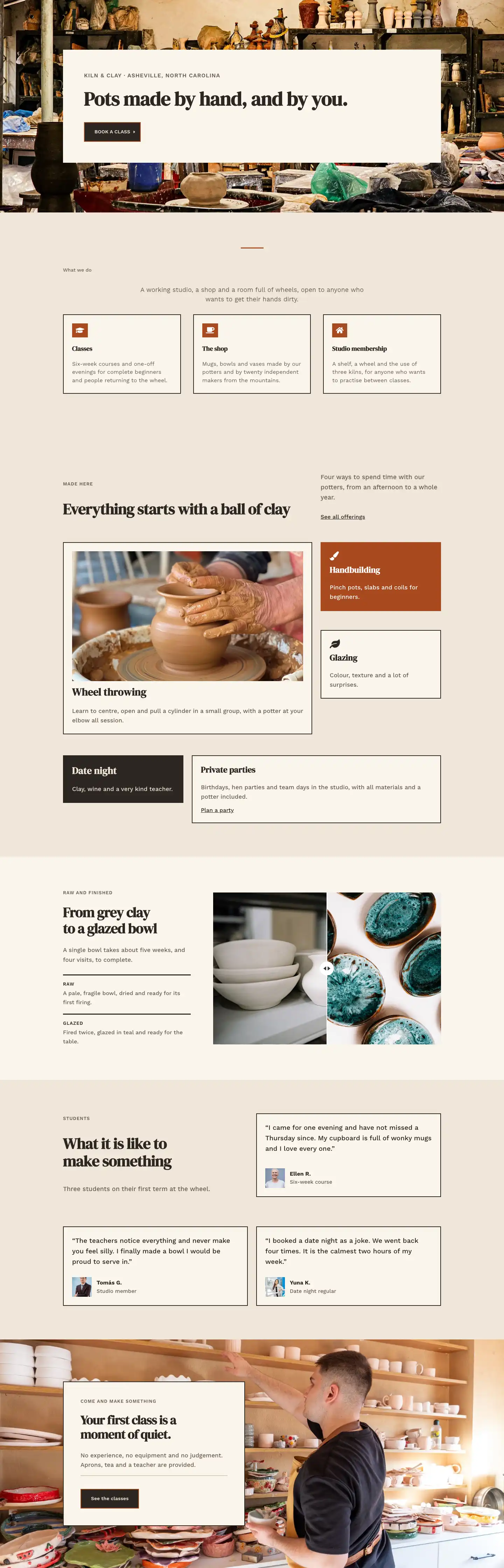
Kiln & Clay — Minimal Pottery_studio Home Page for Divi 5
full_landing · pottery_studio · minimal