
Playful Agency Features Section: Divi 5 Layout
A warm, playful three-card features section for a small creative agency. Highlights working style with bold Outfit type, coral-red accents, and lifted white cards on a blush background.
Rate this element
Download this section, free
- Divi 5 JSON, imports in seconds
- Commercial license included
- No account needed
Click to view the full page
Overview
This section leads with a compact centered intro: a red uppercase eyebrow ("How we work"), a big 56px H2 in Outfit 800 with a tight -1.2px tracking ("Big ideas, tiny egos, zero busywork"), and a one-line subhead capped at 680px so the reading rhythm stays short and confident. The whole block sits on a soft blush #FFF5F5 background with 120px of vertical breathing room on desktop, which drops to 88px on tablet and 72px on phone so the section doesn't eat the fold on small screens.
Below the intro, three equal-width cards (1_3 · 1_3 · 1_3) sit inside a 1240px flex row with a 32px gap. Each card is white on the blush field with a 24px radius, a hairline 1px red-tinted border (rgba(230,57,70,0.10)), and a soft red-tinted drop shadow that deepens on hover while the card lifts -6px on the Y axis. That's where the "playful" reads without turning into a novelty. Inside each card you get the same three-module recipe: a 44px FontAwesome icon in agency red (#E63946), an Outfit 700 H3 at 26px, and a 16px body paragraph with 1.7em line-height in a warm off-black (#4A2A2A) tuned for comfortable reading against white.
The headline steps down for smaller screens (56 → 42 → 34px), the row collapses to a single column on phone, and the card padding (48/36) does the visual work of separating each idea without extra dividers. Palette-wise, #E63946 carries the personality across the eyebrow, the icons, the border tint, and the shadow: one accent, applied consistently, doing most of the mood-setting.
What’s inside
- One Divi section, two rows: a centered intro row and a three-column card row inside a 1240px max-width container
- Red uppercase eyebrow (14px / 3px tracking) + 56px H2 in Outfit 800 with responsive step-downs to 42px (tablet) and 34px (phone)
- Three identical cards built from real native modules only (Icon + Heading + Text) no third-party dependencies
- Warm blush section background (#FFF5F5) with white cards, 24px rounded corners, thin #E63946-tinted border, and a soft red shadow
- Hover state on every card: lifts -6px on Y and grows the shadow blur from 44px to 64px, playful, not gimmicky
- 44px FontAwesome icons pre-loaded (lightbulb, heart, chart-pie). Swap the unicode value to change icons in place
- Placeholder copy already written in an agency voice ("Two-week sprints, real Fridays", "Kind red pens, sharp edits", "Numbers with a grin") so you can ship a demo before writing a word
- Fully responsive: section padding steps 120 → 88 → 72px, cards stack to a single column on phone, headline and body scale with it
Who it’s for
Built for small creative agencies, brand studios, dev shops, and boutique digital marketing teams that lead with personality. The ones that want to feel warm and confident instead of corporate. It slots naturally onto agency home pages as a "how we work" or "our process" band, and onto about pages as a values/principles trio. The playful-but-controlled palette also fits coaching brands, indie SaaS with a human tone, wellness studios, hospitality and food brands, and consultants who want a personality-forward alternative to the usual dark, techy feature grid. Because the cards carry icons (not photos), it works just as well for service businesses that don't have great imagery yet.
Customization tips
Start with the palette: change the section background (#FFF5F5) and the single accent (#E63946) that drives the eyebrow, icons, border tint, and shadow, and the whole personality moves with it. Swap the three FontAwesome icons by editing each Icon module's unicode value: keep them to a single family (all solid, all outline) so the row stays cohesive. Copy limits: aim for H3s under 30 characters (three words works best at 26px) and card body paragraphs of 25–40 words so the three cards visually match. No imagery is required, which keeps setup fast, but if you want to add a photo band above this section, use a 16:9 or 21:9 hero image for balance. Fonts default to Outfit; Space Grotesk or Fraunces both swap in cleanly if you want a sharper or more editorial feel. Duplicate a card for a fourth if you must, but drop card padding to 40/28 and the row gap to 24px so it still breathes.
How to install this layout
- Download the layout JSON file from this page.
- Open the target page in the Divi 5 builder.
- Open the portability panel (up/down arrows icon) and choose the Import tab.
- Upload the JSON. Tick “replace existing content” only for full-page imports.
- Check the page at desktop and mobile widths, then swap in your copy and images.
Full walkthrough with troubleshooting: How to Import a Divi 5 Layout.
Questions about Playful Agency Features Section: Divi 5 Layout
What modules is the layout actually built from?
Only three, all native Divi 5: Text (for the eyebrow, subhead, and card body copy), Heading (for the H2 and H3s), and Icon (for the three 44px FontAwesome glyphs). No Blurb module, no third-party add-ons. Which keeps editing predictable and the DOM light.
How does the three-column card row behave on mobile?
The row is a flex container that switches to `flexDirection: column` at the phone breakpoint, so the cards stack in order and each column flips to full width (24_24). Section padding also steps down from 120px to 72px so the section doesn't eat the fold on small screens.
Do I need to source images to use it?
No. Every visual on the section is either type, icon, or color: no photos, no illustrations. That's the fastest thing about this layout: you can ship a real-looking page with zero imagery sourcing, which is why it works well as an early build or a placeholder while a photo shoot is pending.
What should I edit first to make it mine?
The three H3s and their supporting paragraphs, those carry the whole message. After that, swap the icons if the meanings don't match your three ideas, then adjust the accent color if red isn't your brand. The layout is designed so those three changes alone rebrand the whole section.
Is the hover lift on the cards optional?
Yes. The hover state lives on the column module's Transform (translateY -6px) and Box Shadow presets. If you want the cards to stay perfectly still, remove the hover values on each column. The resting state remains fully styled and looks intentional on its own.
Can I turn this into a 4-up or 2-up card row?
Yes. Change the row's column structure from `1_3,1_3,1_3` to `1_4,1_4,1_4,1_4` or `1_2,1_2` and copy an existing column so the styling carries over. For 4-up, drop card padding to about 40/28 and the row gap to 24px so nothing feels cramped.
Which Divi version does this layout need?
Divi 5. The layout is generated natively for Divi 5 and validated against its real module structure before publication, so it imports clean into the current builder.
Can I use this layout on client websites?
Yes. Every download includes a commercial license covering unlimited sites you own or build for clients. Only reselling or redistributing the layout file itself is prohibited.
More feature grids
Browse all feature grids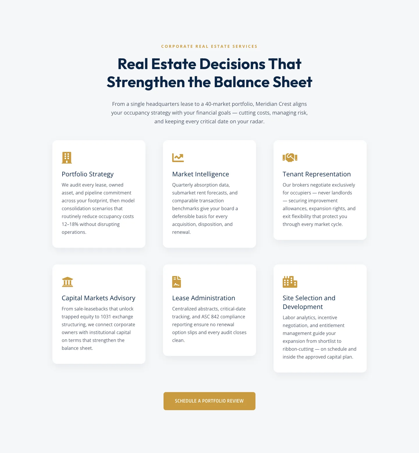
Corporate Real Estate Features Section: Six-Pillar Service Grid for Divi 5
features · real_estate · corporate
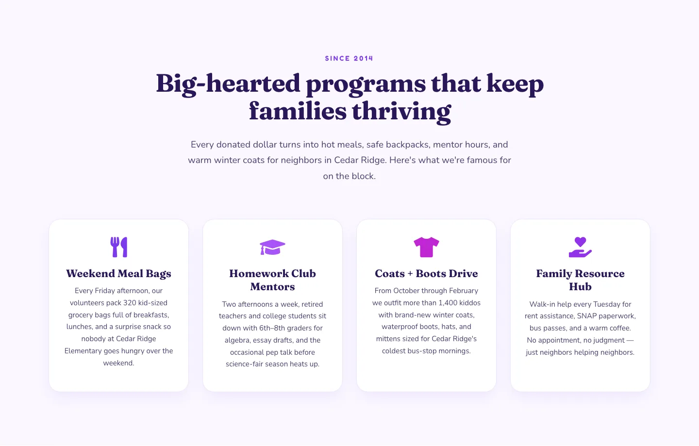
Playful Nonprofit Features Section: Four-Column Icon Cards for Divi 5
features · nonprofit · playful
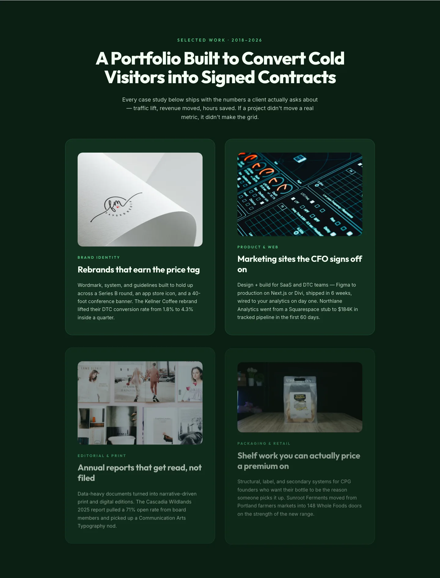
Bold Portfolio Features Grid: Divi 5 Case Study Layout
features · portfolio · bold
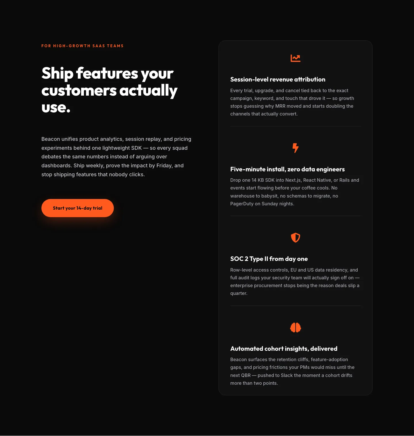
SaaS Features Section: Ship Features Customers Actually Use | Divi 5 Bold Layout
features · saas · bold
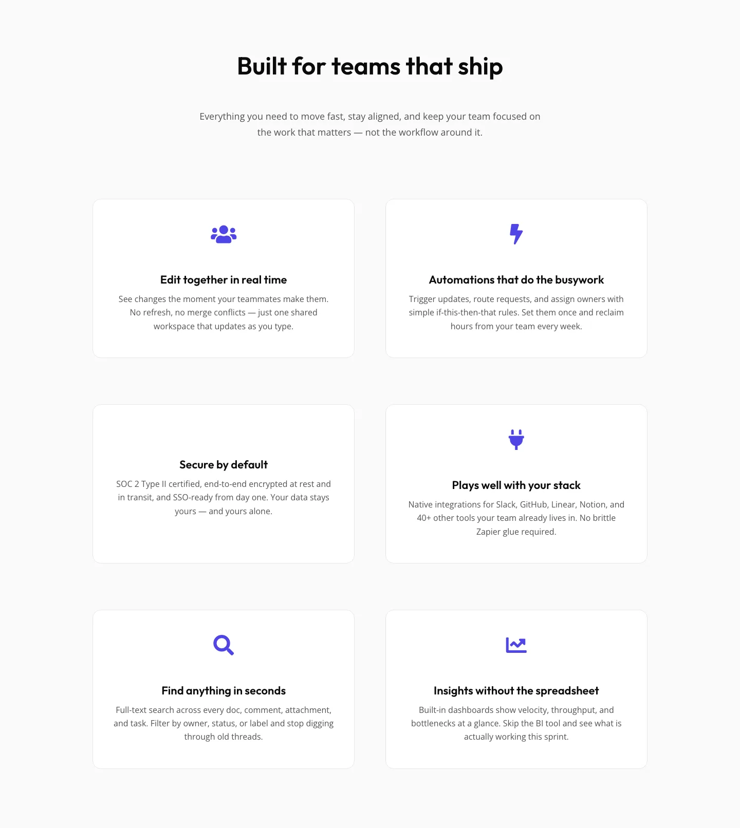
SaaS Features Section: Minimal Divi 5 Layout for Product Teams
features · saas · minimal
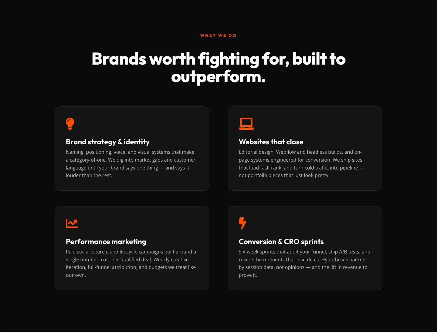
Bold Agency Features Section: Divi 5 Services Grid Layout
features · agency · bold