
Playful Agency Hero Section: Bright Image-Left Divi 5 Layout
A playful, image-left hero section for creative agencies and studios. Bold Poppins headline, rounded photo, gradient background, and a rounded CTA. Drop-in Divi 5 JSON.
Rate this element
Download this section, free
- Divi 5 JSON, imports in seconds
- Commercial license included
- No account needed
Click to view the full page
Overview
This hero is built as a single Divi 5 section wrapping a 50/50 row: a rounded, shadowed image on the left and a stacked copy block on the right. The section uses a soft 135° gradient from #e6f0ff to #f4f8ff, so the whole hero reads as a cool, pale blue canvas: enough color to feel intentional, quiet enough that photography and typography carry the design. Desktop padding runs a generous 120px top and bottom (80px on tablet, 64px on phone), giving the hero real breathing room even on small screens.
The hierarchy is deliberate: a deep-blue Poppins eyebrow (#1e40af, uppercase, 3px letter-spacing) sets the studio's category, followed by an 800-weight headline that scales from 64px on desktop down to 48px on tablet and 36px on phone with a tight 1.05em line height. The 19px body sits at a comfortable 1.7em leading and is capped at a 520px max-width for readability, then a pill-shaped primary button (#2563eb, 999px radius, soft blue shadow, subtle lift on hover) closes the block. A muted 14px trust line (social proof plus a mailto and phone number) anchors the bottom of the column.
On tablet and phone the row switches to a column-flex layout with a 40px row gap, so the image stacks above the copy without cramping. The image itself keeps a 28px border radius and a warm blue box shadow that gently deepens on hover, and the section's horizontal padding drops in step with each breakpoint (40 / 32 / 20px). It's a compact, honest hero (five modules total, no clutter) designed to open a studio, agency, or product site with personality rather than gimmicks.
What’s inside
- One Divi 5 section with a 135° two-stop gradient background (`#e6f0ff` → `#f4f8ff`) and responsive padding (120 / 80 / 64px).
- Balanced 1_2 + 1_2 row capped at 1200px, using flex alignment and a 64px column gap on desktop.
- Left-column Image module with 28px rounded corners, a colored box shadow, and a hover lift transform (400ms).
- Eyebrow Text module in uppercase Poppins with 3px tracking for the category tagline.
- Responsive Heading module scaling 64 → 48 → 36px with an 800 weight and tight -1px letter-spacing.
- Body Text module capped at 520px max-width so the paragraph never gets too wide to scan.
- Pill Button (999px radius) with layered blue shadow, hover color shift, and a translateY(-3px) micro-interaction.
- Muted footnote Text module with an inline mailto link and phone number for immediate contact.
Who it’s for
This hero fits creative agencies, brand and web studios, freelance design shops, and small product teams that want their homepage to feel warm and confident without going dark or moody. The playful copy and bright blue accents lean toward founder-facing services (branding, web design, illustration, motion, small SaaS marketing) but the structure is neutral enough for coaching, consulting, and boutique B2B firms too. It's also a good fit for a personal portfolio landing page where a single photo of the maker, studio, or workspace deserves equal weight with the headline. Skip it if your brand demands a full-bleed image hero or a dense multi-column value prop, this layout intentionally keeps things quiet and focused.
Customization tips
The palette lives on five hex values you can find-and-replace: the two gradient stops on the section, the eyebrow color #1e40af, the headline navy #0b1f4a, and the button background #2563eb (with #1e40af as its hover). Swap them for a warm palette (peach + terracotta) or a mono grayscale in about five minutes. Keep the headline to roughly 6–9 words so it holds its two-line rhythm at 64px; the eyebrow reads best at 3–6 words. Body copy should stay under about 40 words to respect the 520px column cap. For the image, use a 940×650 (roughly 3:2) photo (Pexels or your own) and keep faces or focal subjects off the far-right edge, since the image sits directly next to the copy column on desktop. If you want the button to feel calmer, drop the box shadow one preset step and remove the hover translate in the Transform panel.
How to install this layout
- Download the layout JSON file from this page.
- Open the target page in the Divi 5 builder.
- Open the portability panel (up/down arrows icon) and choose the Import tab.
- Upload the JSON. Tick “replace existing content” only for full-page imports.
- Check the page at desktop and mobile widths, then swap in your copy and images.
Full walkthrough with troubleshooting: How to Import a Divi 5 Layout.
Questions about Playful Agency Hero Section: Bright Image-Left Divi 5 Layout
How does this hero behave on mobile?
The row switches to a stacked flex column at tablet and phone breakpoints, so the image sits above the copy. Section padding drops from 120px to 80px on tablet and 64px on phone, the headline shrinks from 64px to 48px to 36px, and body text steps down from 19px to 17px on phone.
What Divi 5 modules are actually used?
Five native modules: one Image, one Heading, three Text modules (eyebrow, body, footnote), and one Button. Wrapped in a single Section and a two-column Row. No third-party plugins, no code modules.
What image size and aspect ratio should I use?
The included Pexels reference is 940×650, roughly a 3:2 landscape ratio. Anything between 3:2 and 4:3 will slot in cleanly. Export at around 1600px wide for retina sharpness and let the 28px border radius do the framing.
What should I edit first?
Replace the four copy blocks in the right column (eyebrow, headline, body paragraph, and the trust line (with your real email and phone)) then swap the Pexels image for your own. After that, retune the two gradient stops and the button color if you want to match your brand.
Can I flip the image to the right side?
Yes. Drag the columns to swap their order, or set `flex-direction: row-reverse` on the row's desktop Layout options. The stacked mobile behavior stays the same either way.
Which Divi version does this layout need?
Divi 5. The layout is generated natively for Divi 5 and validated against its real module structure before publication, so it imports clean into the current builder.
Can I use this layout on client websites?
Yes. Every download includes a commercial license covering unlimited sites you own or build for clients. Only reselling or redistributing the layout file itself is prohibited.
More hero sections
Browse all hero sections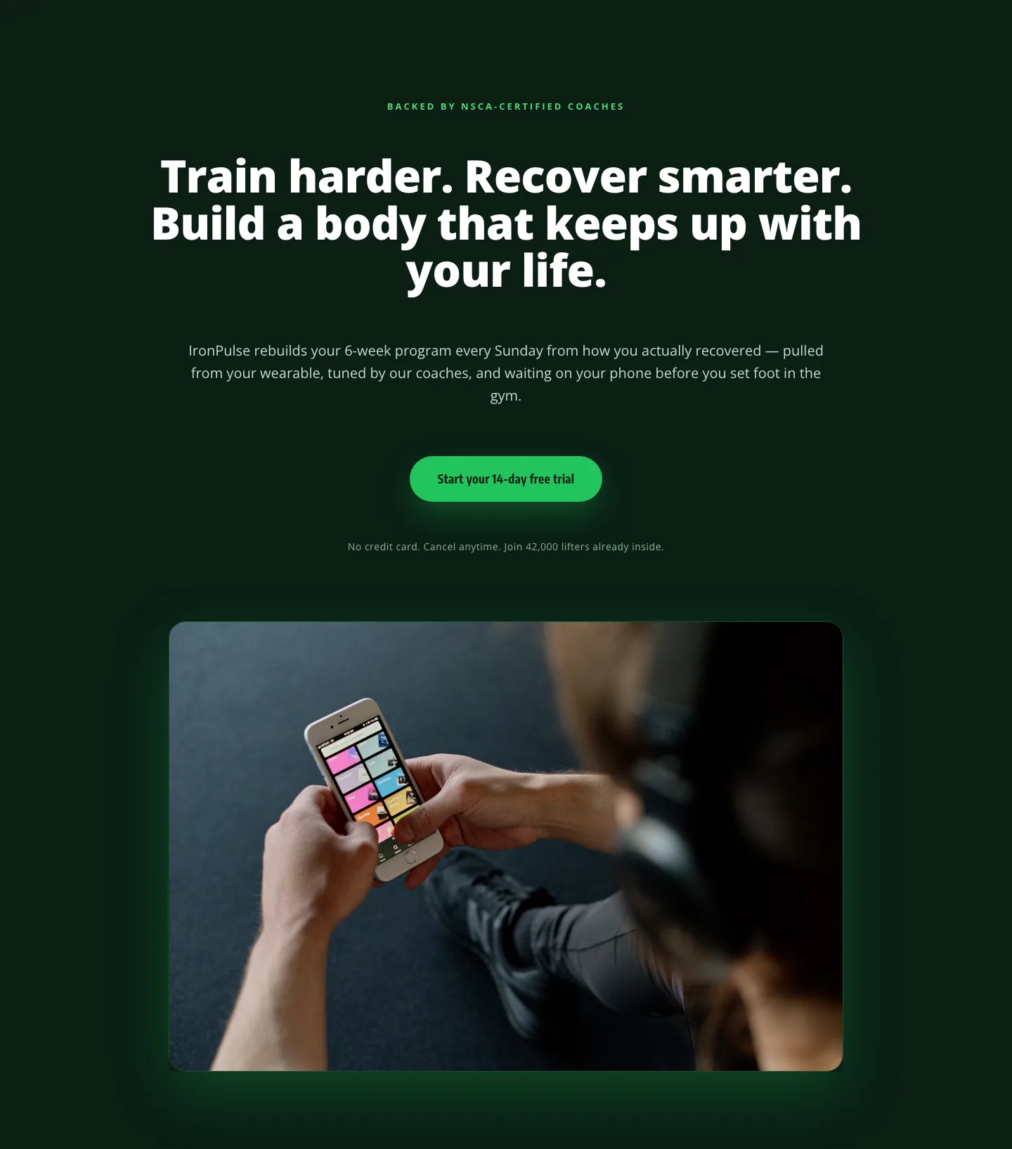
Bold Fitness App Hero Layout for Divi 5: IronPulse Adaptive Training
hero · fitness · bold
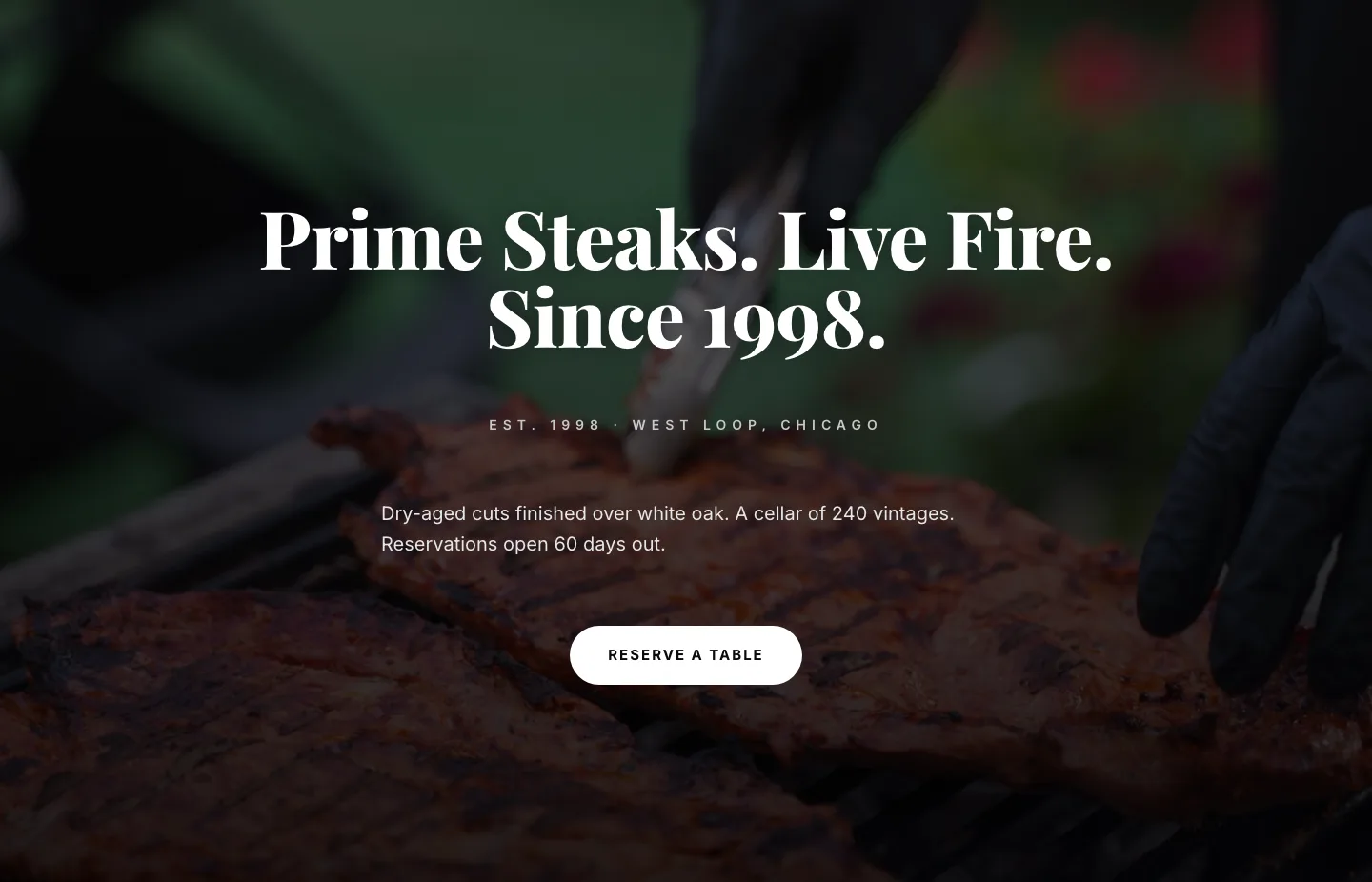
Prime Steaks Hero Section: Bold Monochrome Restaurant Layout for Divi 5
hero · restaurant · bold
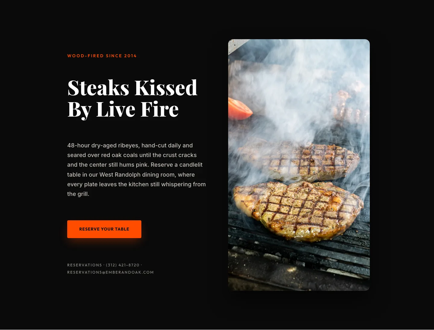
Wood-Fired Steakhouse Hero Layout for Divi 5: Bold Restaurant Template
hero · restaurant · bold
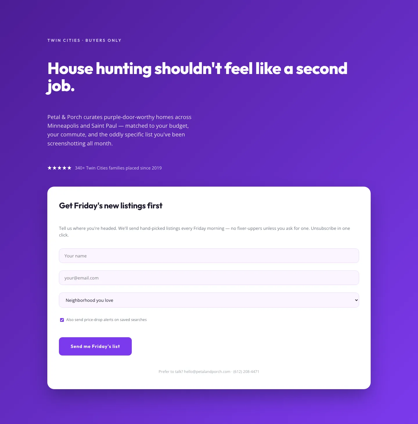
Playful Real Estate Hero with Weekly Listings Signup: Divi 5 Layout
hero · real_estate · playful
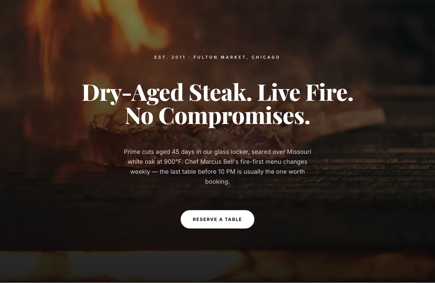
Bold Steakhouse Hero Layout for Divi 5: Fire & Dry-Aged
hero · restaurant · bold
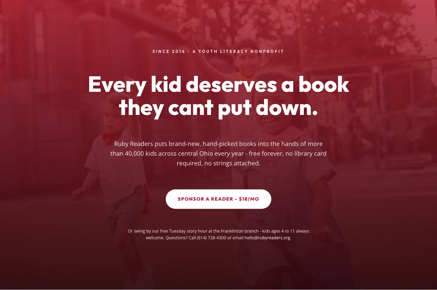
Ruby Readers Nonprofit Hero: Playful Divi 5 Layout
hero · nonprofit · playful