
Playful Real Estate Hero: Weekly Listing Drop Signup | Divi 5
A warm, playful Divi 5 hero for boutique real-estate agents: bold headline, three-point value stack, and a purple email-capture card for weekly listing drops.
Rate this element
Download this section, free
- Divi 5 JSON, imports in seconds
- Commercial license included
- No account needed
Click to view the full page
Overview
This hero splits into a two-column, vertically centered row inside a soft lavender section (#faf5ff) with generous 120px vertical padding on desktop that steps down to 88px on tablet and 64px on phone. So the layout breathes on wide screens without eating up mobile viewport height. The left column carries the message: a 13px uppercase violet eyebrow (#7c3aed, 3px letter-spacing) sits above a bold 62px display headline in deep indigo (#2e1065, weight 800, -1px tracking) that scales to 46px on tablet and 36px on phone. A 19px supporting paragraph in muted purple-grey (#4a3f6b) explains the pitch, followed by three checkmark bullet lines styled with a violet ✓ glyph and bold labels. A lightweight feature list that avoids needing a real icon module.
The right column is the conversion card: a white panel with a 28px border-radius, a hairline #ede9fe border, and a preset-3 shadow tinted rgba(76,29,149,0.18) for a lifted, playful feel. Inside, a violet pill-badge (✦ Free · Weekly · Unsubscribe anytime) sits above a 32px card headline, a supporting paragraph, a faux input row (a rounded lavender text block acting as the email field placeholder. You'll swap in a real form plugin), and a full-width violet CTA button with rounded 14px corners and a soft violet drop-shadow. A 13px trust line under the button holds a 4.9-star rating, a text-to-subscribe SMS shortcode and an email link.
On phone, the row switches to flex-direction: column, both columns go full width, and the card padding tightens to 36px/28px so the CTA still lands above the fold on common device heights.
What’s inside
- Two-column hero row (1_2 / 1_2) that stacks to a single column on phone via `flexDirection: column`
- Left column: uppercase eyebrow Heading, 62px display Heading, intro Text module, and three checkmark Text bullets, all native Divi modules, no icon library needed
- Right column conversion card built from a Column with 28px radius, `#ede9fe` border, preset-3 violet drop-shadow, and 56px inner padding
- Pill-shaped micro-badge, 32px card Heading, supporting Text, faux email-input Text block, purple CTA Button, and a trust-line Text with SMS shortcode and mailto link
- Purposeful responsive typography: 62/46/36px for the H1 and 32/26px for the card H2, tuned across desktop, tablet and phone breakpoints
- Section padding steps 120 → 88 → 64px vertically and 24 → 20 → 16px horizontally to stay comfortable on every device
- Playful violet palette locked into 5 tokens (`#faf5ff`, `#f5f3ff`, `#7c3aed`, `#2e1065`, `#4a3f6b`) so a global find-and-replace re-skins the whole hero
Who it’s for
Built for small residential real-estate brands that grow through a weekly listings newsletter rather than a full IDX search: indie brokers, buyer's agents, boutique brokerages, and neighborhood specialists who want a warm, human-feeling landing page instead of a corporate MLS clone. The playful violet palette and rounded card also work well for adjacent lead-magnet flows: a home-search concierge service, a relocation guide signup, a first-time-buyer coaching list, or a mortgage broker's rate-drop alert. Anywhere you're trading an email for a curated weekly drop (and want copy that sounds like a person, not a franchise), this hero fits without heavy rework.
Customization tips
Start with the palette: recolor by find-and-replacing #7c3aed (primary violet), #2e1065 (headline indigo), #faf5ff (section wash) and #ede9fe (card border) across the section. Six tokens cover ~95% of the look. Keep the H1 to about 6–9 words so the 62px desktop size doesn't wrap to four lines, and cap the eyebrow at 6 words to preserve the 3px letter-spacing rhythm. The three checkmark bullets look best at one short line each (max ~70 characters); longer than that, tighten copy before increasing font size. The card is form-agnostic: the lavender rounded Text block is a placeholder, so drop in a Bloom, Fluent Forms, Mailchimp or ConvertKit module in its place and reuse the same 14px radius and 18/20px padding. No hero image is needed, but if you add one, swap the right column's card for an Image module at roughly 4:5 portrait or 3:4 to keep the vertical rhythm.
How to install this layout
- Download the layout JSON file from this page.
- Open the target page in the Divi 5 builder.
- Open the portability panel (up/down arrows icon) and choose the Import tab.
- Upload the JSON. Tick “replace existing content” only for full-page imports.
- Check the page at desktop and mobile widths, then swap in your copy and images.
Full walkthrough with troubleshooting: How to Import a Divi 5 Layout.
Questions about Playful Real Estate Hero: Weekly Listing Drop Signup | Divi 5
How does the two-column layout behave on tablet and phone?
On desktop the row is a centered flex container with 64px column gap and 48px row gap, capped at 1240px. Tablet keeps the two columns side by side with slightly reduced padding. On phone the row switches to `flexDirection: column`, both columns become full width, and the card's inner padding drops to 36px top/bottom and 28px left/right.
Is there a real email input in the card, or do I need to add one?
The lavender rounded block under the card headline is a Text module styled to look like an input field. It's a visual placeholder, not a working form. Drop your form plugin of choice (Bloom, Fluent Forms, ConvertKit, Mailchimp) in its place and match the 14px border-radius so it sits naturally above the CTA button.
What Divi 5 modules are actually used?
Only four native module types: Section, Row, Column, Heading, Text and Button. The checkmarks in the bullet list are inline HTML glyphs inside Text modules, so there's no dependency on an icon library or third-party module.
What should I edit first after importing?
Rewrite the eyebrow, H1 and card headline for your city and offer, then swap the placeholder Text block for a real form. After that, replace the SMS shortcode and mailto link in the trust-line Text, and finally recolor the six violet/indigo tokens if you're skinning it to a brand.
Does the hero need a photo or background image?
No: the design is intentionally illustration-free and leans on typography, the flat lavender wash and the shadowed white card for depth. If you want a photo, replace the right-column card with an Image module or add a background image to the Section and lift the card contrast.
Will the CTA button stay above the fold on mobile?
On common phones (375–414px wide, ~700px viewport) the CTA lands just above or right at the fold thanks to the reduced 64px section padding, 36px card padding and shorter phone headline sizes (36px H1, 26px card H2). Trimming the intro paragraph by one sentence guarantees it.
Which Divi version does this layout need?
Divi 5. The layout is generated natively for Divi 5 and validated against its real module structure before publication, so it imports clean into the current builder.
Can I use this layout on client websites?
Yes. Every download includes a commercial license covering unlimited sites you own or build for clients. Only reselling or redistributing the layout file itself is prohibited.
More hero sections
Browse all hero sections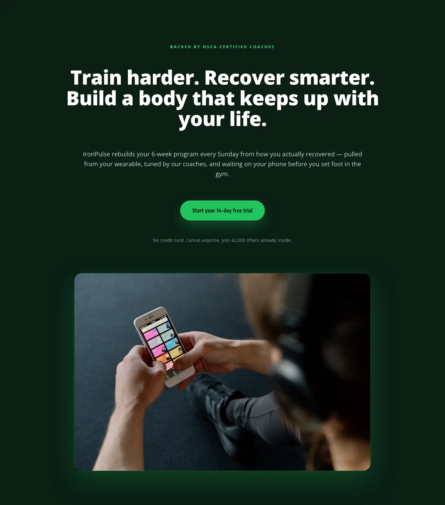
Bold Fitness App Hero Layout for Divi 5: IronPulse Adaptive Training
hero · fitness · bold
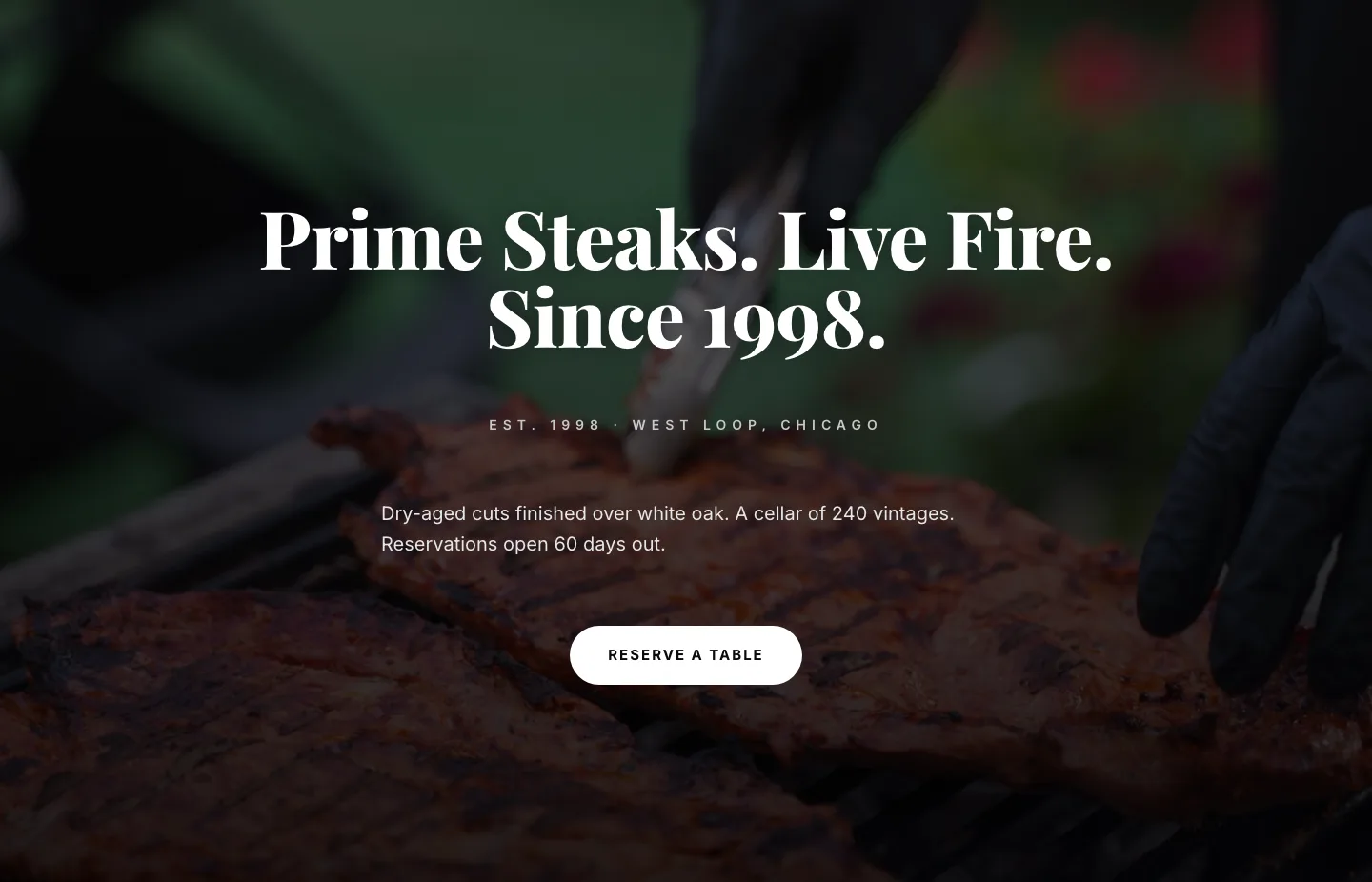
Prime Steaks Hero Section: Bold Monochrome Restaurant Layout for Divi 5
hero · restaurant · bold
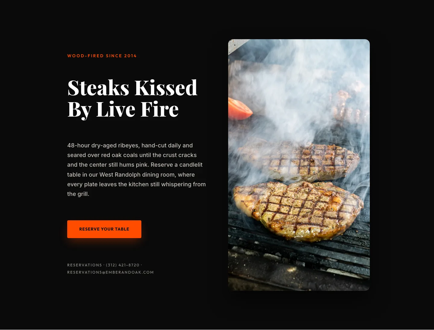
Wood-Fired Steakhouse Hero Layout for Divi 5: Bold Restaurant Template
hero · restaurant · bold
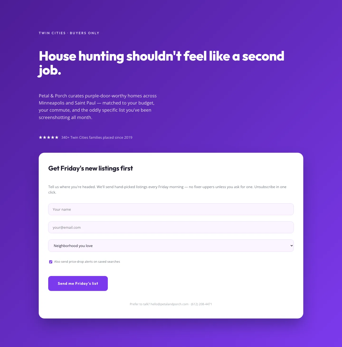
Playful Real Estate Hero with Weekly Listings Signup: Divi 5 Layout
hero · real_estate · playful
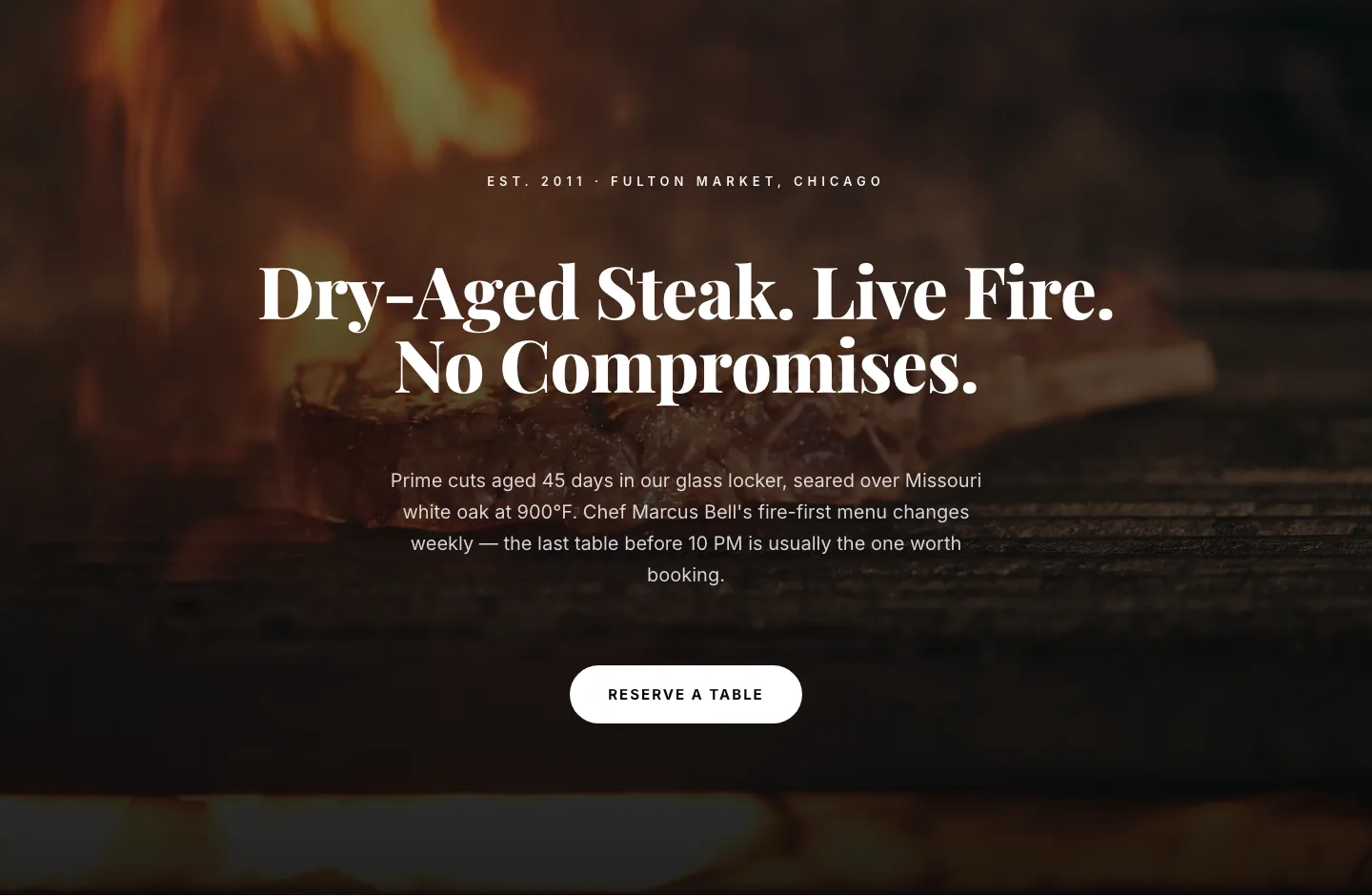
Bold Steakhouse Hero Layout for Divi 5: Fire & Dry-Aged
hero · restaurant · bold
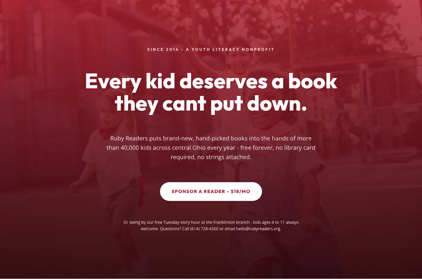
Ruby Readers Nonprofit Hero: Playful Divi 5 Layout
hero · nonprofit · playful