
Pulsegrid Bold SaaS Hero: Churn Prediction Landing Section
Bold dark-orange SaaS hero for churn prediction tools. Punchy headline, ARR-risk subhead, trial CTA, and product image. Divi 5 JSON, one-click import.
Rate this element
Download this section, free
- Divi 5 JSON, imports in seconds
- Commercial license included
- No account needed
Click to view the full page
Overview
A split-column hero built for one job: convince a SaaS operator that your product deserves 90 seconds of setup time. The section runs on a near-black #0a0a0a canvas with generous 10vw vertical padding, so the saturated #ff4d00 orange accent carries all the visual weight without ever fighting the type. On the left, the hierarchy stacks tight: a 13px uppercase eyebrow ("For SaaS teams from Seed to Series C") with 3px letter-spacing in that same orange, then a 60px headline in white at weight 800 with a slightly negative -1.5px tracking and a compressed 1.05 line-height, then a 20px body paragraph set at 72% white opacity so it stays readable without competing with the H1 above it.
The CTA anchors the lower half of the column. A solid orange button with a soft 36px orange glow shadow (preset3, offset 14px) sits above a 14px block of muted 50%-opacity micro-copy handling the objections every SaaS visitor asks up front: no credit card, setup time, integrations. On the right, a single image module gets a 16px border-radius, a hairline rgba(255,255,255,0.1) inner border, and an 80px orange glow that visually rhymes with the button so the two columns feel like one composition. The 1_2 / 1_2 row collapses to a single column on phone via flexDirection: column, the headline scales down from 60px to 36px with a looser 1.1 line-height, and the row padding drops from 30px right-gutter to zero so the copy still fits comfortably above the fold on a 6-inch screen.
What’s inside
- Two-column 1/2 + 1/2 row that cleanly stacks to a single column on phone (`flexDirection: column`)
- Eyebrow heading module styled at 13px, 3px letter-spacing, uppercase, accent-colored. Ready for a category or audience label
- Oversized 60px headline (weight 800, -1.5px tracking) with a dedicated 36px phone override so it never overflows
- Supporting body copy at 20px / 1.6 line-height at 72% white opacity for legible dark-mode reading
- Primary CTA button with rounded 10px corners and a `preset3` orange glow shadow (0px 14px 36px)
- Micro-trust line under the button for card-not-required, setup time, and integration mentions
- Right-column image module with 16px radius, subtle 1px white-alpha border, and a matching 80px orange glow (`preset4`)
- Section-level `10vw / 6vw` responsive padding that scales cleanly from wide desktop to narrow mobile
Who it’s for
Built specifically for B2B SaaS teams launching or relaunching a product landing page: churn prediction, revenue analytics, customer success platforms, product-analytics tools, PLG onboarding suites, and anything sold to CS or RevOps leaders. The bold-dark aesthetic and integration name-drops fit companies from seed-stage MVPs through Series C growth-stage brands. It also transposes cleanly to adjacent categories: developer tools, data platforms, cybersecurity dashboards, AI infrastructure products, and B2B fintech. If your buyer expects a modern dark-mode hero with a clear promise, a trial CTA, and a product screenshot on the right, this section slots in without structural surgery.
Customization tips
The palette is driven by two colors: swap #ff4d00 (eyebrow, button background, both glow shadows) for your brand accent and adjust the button hover color to a lighter tint of the same hue. If you move off the near-black #0a0a0a background, drop the shadow opacities (currently 0.35 and 0.28) or the glows will overpower a lighter canvas. Keep the headline under ~60 characters so the 60px desktop size doesn't wrap awkwardly, and cap the body paragraph around 220 characters. Beyond that the 20px setting gets visually heavy against the tight headline. The right-column image is set roughly 940×650, so a 3:2 landscape crop is safest; use a product screenshot, dashboard, or high-contrast lifestyle shot rather than a busy photo, since the border-radius plus glow assumes a clean subject. Change the button copy but keep it under ~28 characters so the padding stays balanced against the micro-trust line.
How to install this layout
- Download the layout JSON file from this page.
- Open the target page in the Divi 5 builder.
- Open the portability panel (up/down arrows icon) and choose the Import tab.
- Upload the JSON. Tick “replace existing content” only for full-page imports.
- Check the page at desktop and mobile widths, then swap in your copy and images.
Full walkthrough with troubleshooting: How to Import a Divi 5 Layout.
Questions about Pulsegrid Bold SaaS Hero: Churn Prediction Landing Section
What image size and ratio should I upload for the right column?
The layout ships with a Pexels placeholder at roughly 940×650 (a 3:2 landscape). Anything close to that ratio works; upload at 1600–1880px wide for retina crispness. A dashboard screenshot or product UI reads best because the 16px radius and 80px orange glow assume a fairly clean, high-contrast subject.
How does the two-column layout behave on mobile?
The row's phone breakpoint flips to `flexDirection: column`, so the left content column stacks above the image. The headline also drops from 60px to 36px with a 1.1 line-height, and the left column's 30px right-padding is removed, so the copy uses the full width without needing manual overrides.
Can I recolor the orange accent without breaking the design?
Yes: the accent appears in exactly three places: the eyebrow text color, the button background (plus hover), and the two shadow glow colors (button and image). Update all three to keep the composition tied together. If you move to a lighter accent, lower the shadow alpha from 0.35 / 0.28 or the glow will bloom.
Which modules is this section built from?
Native Divi 5 modules only: two Heading modules (eyebrow + H1), one Text module for the body paragraph, one Button module, a second Text module for the micro-trust line, and one Image module in the right column. All inside a single Section with one Row and two 1/2 columns.
What should I edit first when I drop this into my page?
Swap the H1 ("Spot churn 30 days before it hits your MRR."), then the body paragraph, then the button label and its destination link, then the right-column image. The eyebrow ("For SaaS teams from Seed to Series C") and the micro-trust line under the CTA are the last two strings, both are optional if your positioning is tighter.
Which Divi version does this layout need?
Divi 5. The layout is generated natively for Divi 5 and validated against its real module structure before publication, so it imports clean into the current builder.
Can I use this layout on client websites?
Yes. Every download includes a commercial license covering unlimited sites you own or build for clients. Only reselling or redistributing the layout file itself is prohibited.
More hero sections
Browse all hero sections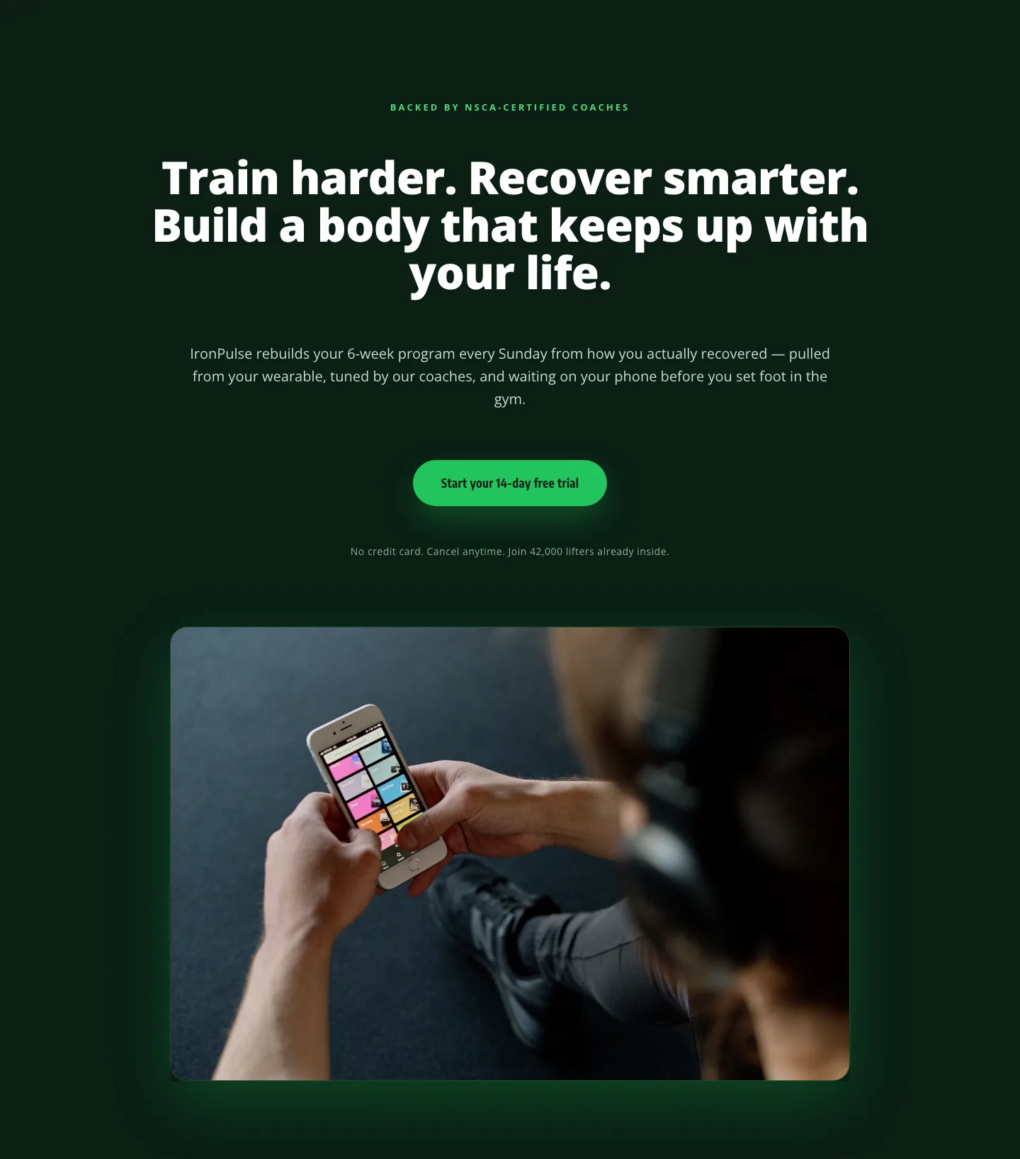
Bold Fitness App Hero Layout for Divi 5: IronPulse Adaptive Training
hero · fitness · bold
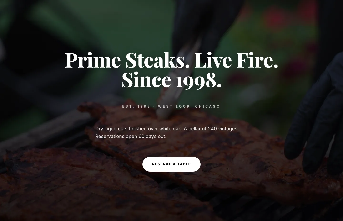
Prime Steaks Hero Section: Bold Monochrome Restaurant Layout for Divi 5
hero · restaurant · bold
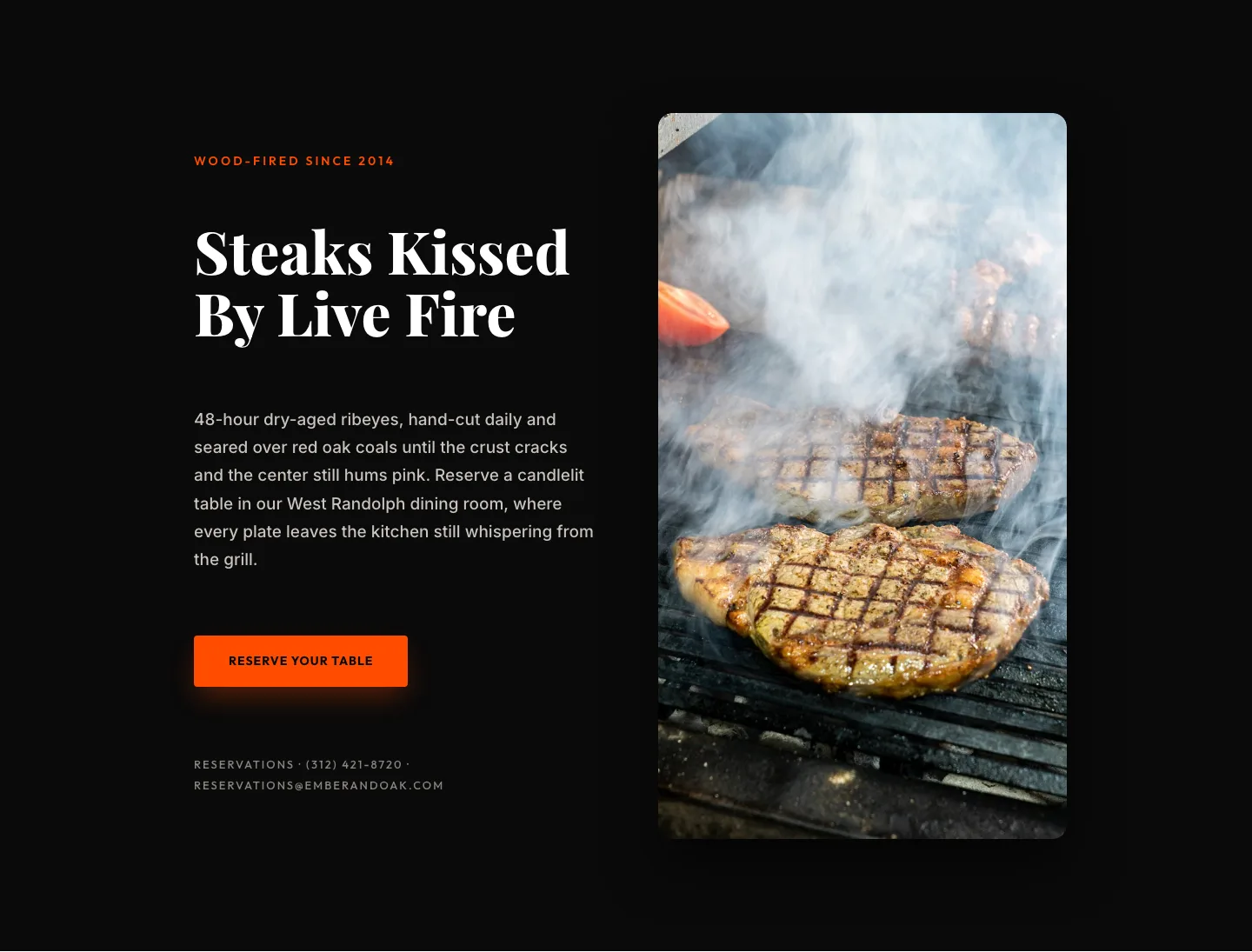
Wood-Fired Steakhouse Hero Layout for Divi 5: Bold Restaurant Template
hero · restaurant · bold
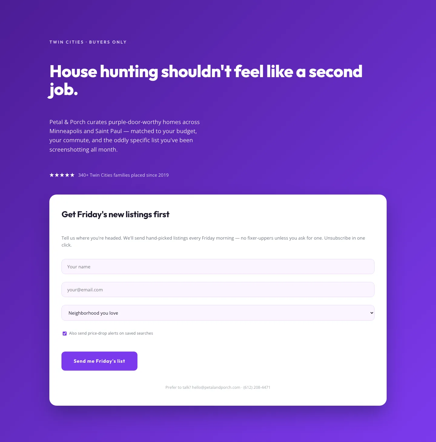
Playful Real Estate Hero with Weekly Listings Signup: Divi 5 Layout
hero · real_estate · playful
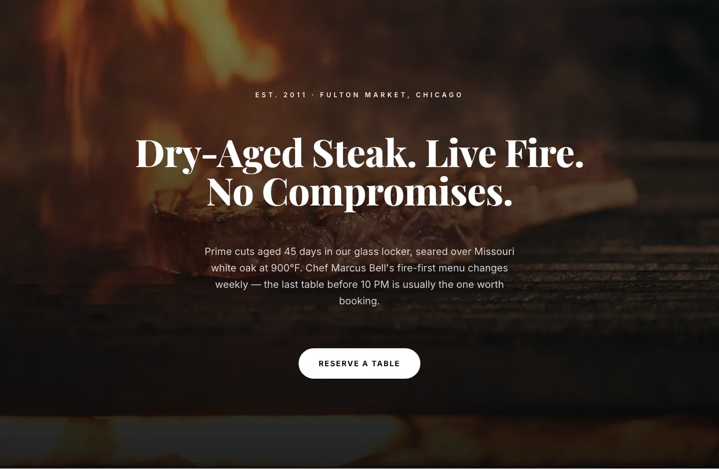
Bold Steakhouse Hero Layout for Divi 5: Fire & Dry-Aged
hero · restaurant · bold
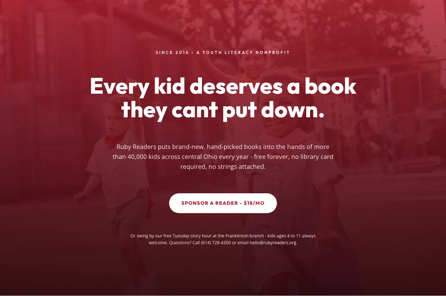
Ruby Readers Nonprofit Hero: Playful Divi 5 Layout
hero · nonprofit · playful