
Pulsegrid SaaS Hero: Bold Dark Product Analytics Landing Section | Divi 5
Bold dark SaaS hero layout for Divi 5 with red accent CTA, eyebrow tagline, social proof line, and product screenshot. Drop-in JSON for product analytics and developer tools.
Rate this element
Download this section, free
- Divi 5 JSON, imports in seconds
- Commercial license included
- No account needed
Click to view the full page
Overview
A two-column split hero built on a near-black #0a0a0a stage, with 110px top/bottom section padding on desktop that eases to 70px on tablet and 50px on phone so the composition never crowds the fold. The row uses a 3/5 + 2/5 column split with a 48px gap and vertical centering, which puts a wide typographic column on the left and a floating product image on the right. A hierarchy tuned for a bold SaaS pitch where the headline needs to lead and the visual proof follows.
Type is handled with Outfit throughout. A red #ef4444 uppercase eyebrow set at 13px with 3px letter-spacing acts as a category label above the H1 ("Ship customer insights 10x faster.") which sits at a hefty 60px/800 with a tight 1.05 line-height. Support copy uses light-gray #d4d4d4 at 19px with 1.65 line-height for comfortable long-line reading against dark bg, then a solid red #dc2626 CTA button with an 8px radius and hover to #b91c1c picks up the eyebrow accent. Under the button, a muted #737373 trust line references real SaaS logos to close the fold.
The image column carries the visual weight: an 18px-radius product photo framed by a 1px translucent-red border and a soft 80px-blur box-shadow tinted rgba(220,38,38,0.45) (the same red as the CTA) so the glow reads as brand light rather than decoration. On phone, the row's flex-direction flips to column, so the copy stacks above the image and the headline scales down to 36px, keeping the fold intact on narrow screens without any secondary treatment needed.
What’s inside
- Two-column split hero (3/5 text · 2/5 image) with a 48px gap and vertical centering, stacked column on phone
- Uppercase red eyebrow label (Outfit 13px, 3px letter-spacing) sitting above an 800-weight 60px H1 with a tight 1.05 line-height
- Responsive H1 scale baked in: 60px desktop → 44px tablet → 36px phone via the native Divi heading breakpoints
- Body copy tuned for dark backgrounds, `#d4d4d4` on `#0a0a0a` at 19px/1.65 for legible long-line reading
- Solid red CTA button (`#dc2626` → `#b91c1c` on hover) with an 8px radius and a muted trust line beneath
- Product image with an 18px radius, a 1px translucent-red border, and a red-tinted 80px-blur glow that matches the button color
- Section padding that steps down 110 → 70 → 50px across desktop, tablet, and phone so the fold breathes on every device
Who it’s for
Purpose-built for SaaS product landings (analytics tools, dev platforms, observability, developer tooling, AI apps, PLG onboarding funnels) where a bold single-message hero has to carry the pitch before anyone scrolls. The dark stage plus a saturated red accent reads confidently in the "serious infra" lane occupied by Linear, Vercel, Retool and similar brands, so it slots naturally into a modern product marketing site. It also works for pricing-page toppers, campaign landing pages, or feature-launch heroes that need a single strong CTA ("Start free trial") next to a product screenshot or dashboard shot. Not the right fit for softer categories like wellness, hospitality, or fashion. The palette and type scale skew technical and high-contrast.
Customization tips
First swap: replace the Pexels URL on the image module with your real product screenshot. It's set to 1100×900, so anything roughly 5:4 to 4:3 will hold the frame without letterboxing; a wider dashboard shot at 16:10 also works if you're comfortable with a shorter column. Keep the H1 to about six to eight words, anything longer breaks the 1.05 line-height rhythm. The eyebrow label is designed for one short phrase (aim for under ~55 characters so it stays on one line). To rebrand the accent, change three synced values: the eyebrow color #ef4444, the button background #dc2626/hover #b91c1c, and the image glow rgba(220,38,38,0.45). Pick a hue and reuse it in all three so the fold stays cohesive. If your palette isn't red, drop the border color on the image (rgba(239,68,68,0.35)) and glow to match. Body copy at 19px handles roughly two to three sentences before the column gets tall, trim if you add a second CTA.
How to install this layout
- Download the layout JSON file from this page.
- Open the target page in the Divi 5 builder.
- Open the portability panel (up/down arrows icon) and choose the Import tab.
- Upload the JSON. Tick “replace existing content” only for full-page imports.
- Check the page at desktop and mobile widths, then swap in your copy and images.
Full walkthrough with troubleshooting: How to Import a Divi 5 Layout.
Questions about Pulsegrid SaaS Hero: Bold Dark Product Analytics Landing Section | Divi 5
How does the split layout behave on mobile?
The row flips from a horizontal 3/5 · 2/5 split to a stacked column on phone: the headline block sits on top and the product image drops beneath it. Section padding steps down from 110px to 50px, and the H1 scales from 60px to 36px, so the fold stays clean without extra tweaks.
Which native Divi 5 modules are used?
Just four: two Heading modules (eyebrow + H1), one Text module for the paragraph, a Button module, and one Image module in the right column. Everything sits inside a single Section > Row with two Columns: no third-party plugins, no custom code.
What image size should I use for the product shot?
The image slot is set to 1100×900, so 5:4 ratios (dashboard crops, product UI screenshots) fit best. A little wider is fine, but avoid tall portraits. They'll dominate the column and push the headline off-center. The 18px radius and red-tinted glow are applied at the module level, so any image inherits them automatically.
What should I edit first after installing?
In order: the eyebrow label, the H1, the paragraph, the button text and destination URL, the trust line under the button, and finally the product image. Then, if you're rebranding away from red, update the three accent colors together (eyebrow, button, image glow) so the fold reads as one system.
Can I make the CTA a two-button group?
Yes, duplicate the Button module and drop it beside the existing one. You'll probably want to strip the background on the second button (transparent + a 1px border in the accent color) so it reads as a secondary action, and shorten the trust line beneath so the column doesn't get too tall.
Does it work on a light background?
It's designed for dark. Flipping the section background to white means retuning the body text (`#d4d4d4` becomes unreadable), the trust line, and softening the image glow: the red accent still works, but plan for a light-mode pass rather than a one-click swap.
Which Divi version does this layout need?
Divi 5. The layout is generated natively for Divi 5 and validated against its real module structure before publication, so it imports clean into the current builder.
Can I use this layout on client websites?
Yes. Every download includes a commercial license covering unlimited sites you own or build for clients. Only reselling or redistributing the layout file itself is prohibited.
More hero sections
Browse all hero sections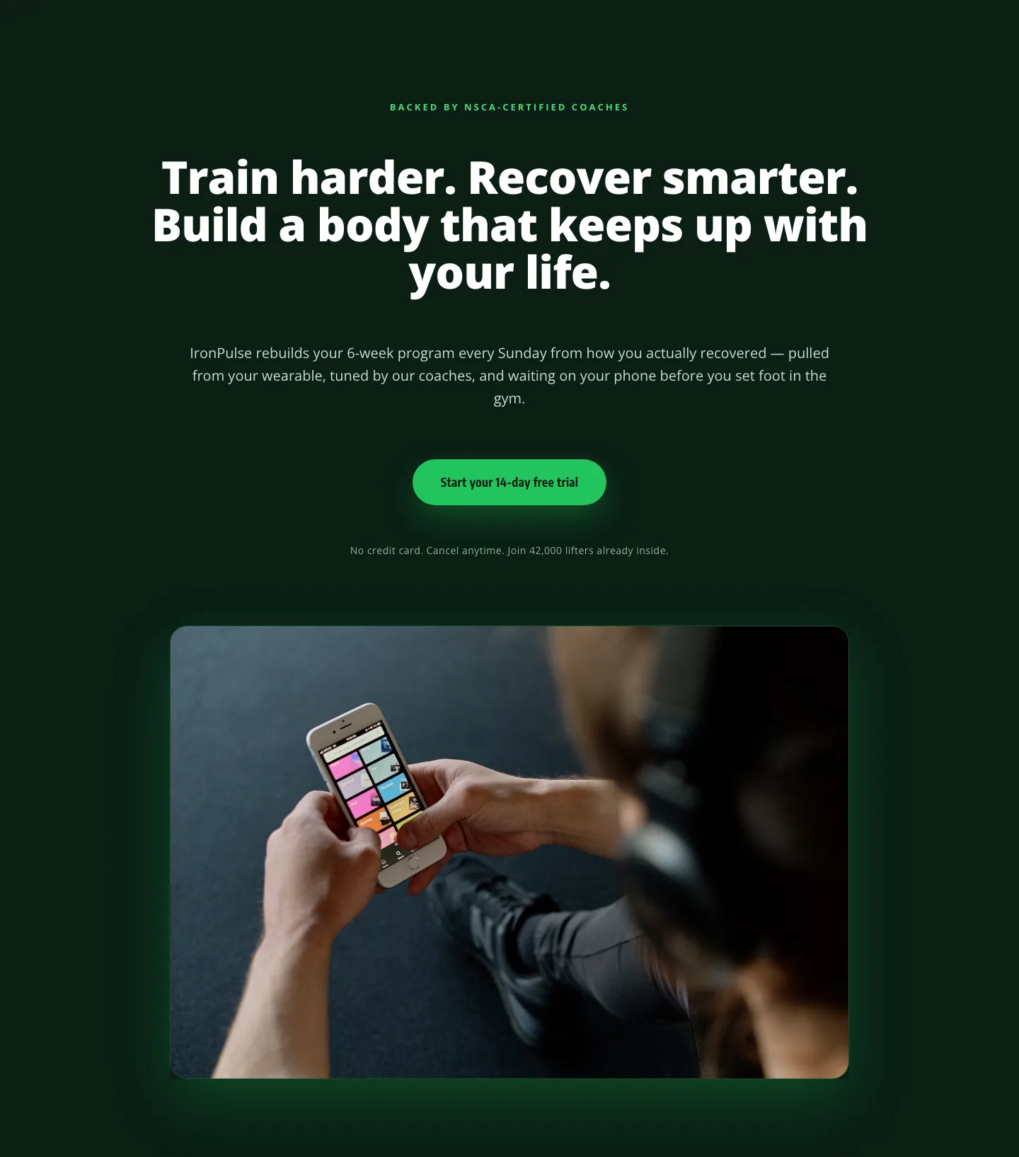
Bold Fitness App Hero Layout for Divi 5: IronPulse Adaptive Training
hero · fitness · bold
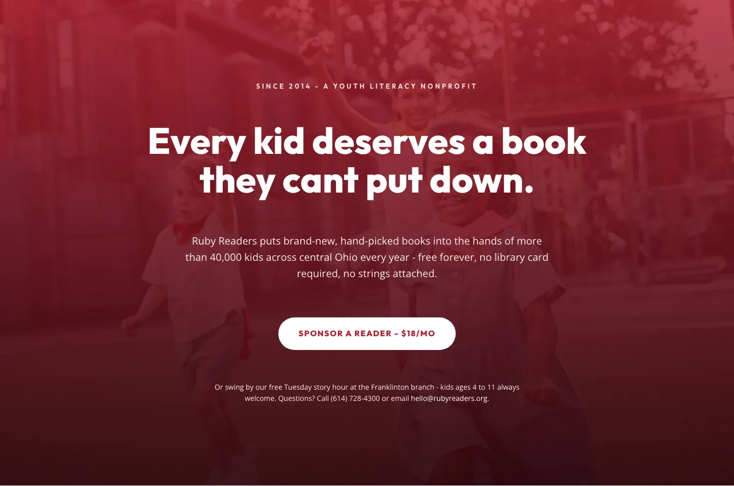
Ruby Readers Nonprofit Hero: Playful Divi 5 Layout
hero · nonprofit · playful
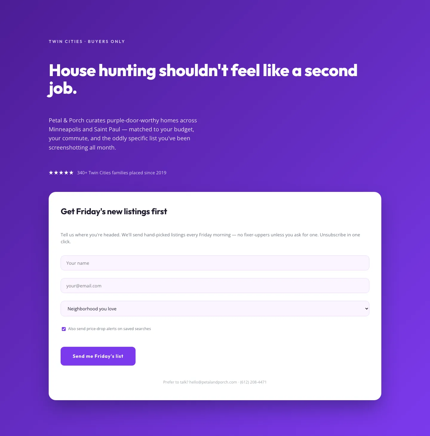
Playful Real Estate Hero with Weekly Listings Signup: Divi 5 Layout
hero · real_estate · playful
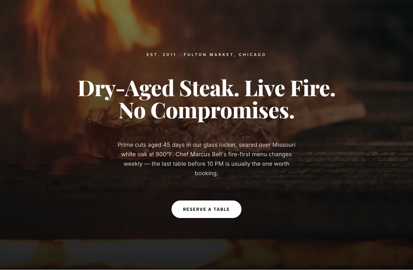
Bold Steakhouse Hero Layout for Divi 5: Fire & Dry-Aged
hero · restaurant · bold
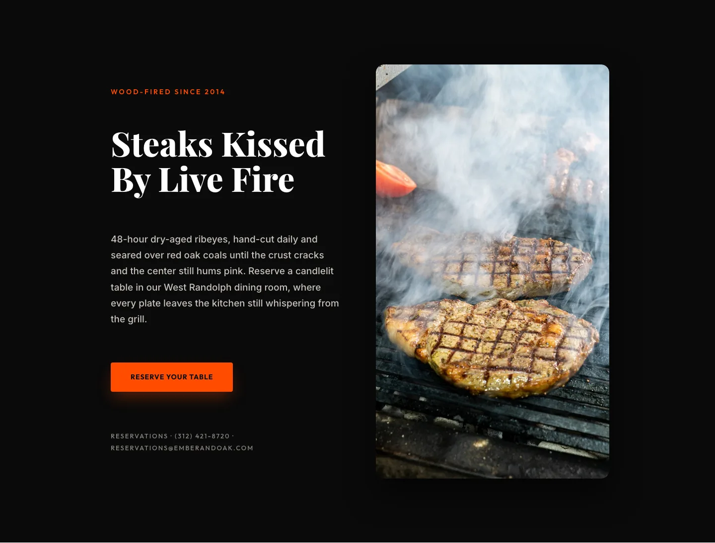
Wood-Fired Steakhouse Hero Layout for Divi 5: Bold Restaurant Template
hero · restaurant · bold
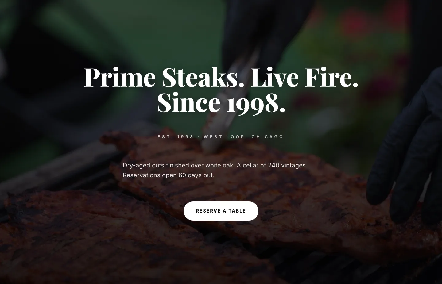
Prime Steaks Hero Section: Bold Monochrome Restaurant Layout for Divi 5
hero · restaurant · bold