
SaaS Features Section: Integrations, Automation & Live Dashboards
Minimal Divi 5 features layout for SaaS sites. Three-card grid highlighting native integrations, no-code workflows, and live revenue dashboards.
Variations
Rate this element
Download this section, free
- Divi 5 JSON, imports in seconds
- Commercial license included
- No account needed
Click to view the full page
Overview
The section opens with a centered intro block: a small indigo eyebrow ("WHY TEAMS SWITCH," 13px uppercase, 3px letter-spacing, #4F46E5) sits 12px above a 44px H2 (Inter 700, -0.02em tracking, #0F172A) and an 18px lead paragraph in slate (#475569) capped at 640px wide. The intro column itself maxes out at 720px and centers on the page, so headline and lede stay comfortably scannable on a wide desktop instead of stretching into a single flat line.
Below it, three equal 1/3 columns render soft-grey cards on a #F8FAFC fill with a 1px #E2E8F0 border, 16px radius, and 32px/28px inner padding. Each card is a 1/4 + 3/4 inner row: an indigo Font Awesome Icon module (28px, #4F46E5) on the left, an H3 (Inter 20px, 600, #0F172A) and a 15px body paragraph in slate on the right. The card row uses flex with a 24px column gap and 24px row gap, so nothing touches and the grid wraps predictably.
Section padding is fully responsive (100px top/bottom on desktop, 72px on tablet, 56px on phone) and the H2 steps 44 → 34 → 28px across the same breakpoints. Because the cards live in a flex-wrap row of equal 1/3 columns, they collapse to a clean single-column stack on narrow viewports without any custom CSS. The palette does the visual work: white section, slate copy, one indigo accent shared between the eyebrow and the three icons. Quiet enough to sit under a hero or above a pricing block without picking a fight.
What’s inside
- Full-width white section with responsive padding (100px desktop / 72px tablet / 56px phone) sized to sit between a hero and a CTA
- Centered intro block: eyebrow Text + H2 Heading + lead Text, capped at 720/640px so lines never over-run
- Three-column equal-width row (1_3 / 1_3 / 1_3) built with flex, 24px column gap, 24px row gap, and flex-wrap for automatic stacking
- Three grey-fill cards (#F8FAFC) with 1px #E2E8F0 border, 16px radius, and 32/28px inner padding
- Per-card 1_4 / 3_4 inner row pairing a 28px Font Awesome Icon module with an H3 + paragraph Text module
- Three ready-made icons pre-wired: share-alt (integrations), cogs (automation), line-chart (dashboards)
- Inter typeface stack with tight -0.02em H2 tracking and 1.6 / 1.65 body line-heights for editorial rhythm
- Single indigo accent (#4F46E5) on eyebrow and icons, one color change reskins the whole section
Who it’s for
Built for SaaS product pages that need to sell capability without turning the section into a spec sheet. It fits platforms, dashboards, workflow tools, developer APIs, CRMs, analytics products, and internal tools that want a scannable "why we're different" strip between a hero and a pricing block. It also works as a features anchor on a homepage, a "what's inside" band on a product-detail page, or a lightweight benefits row inside a longer landing page. If your three headline promises are integrations, automation, and reporting, the icons and copy slots line up out of the box. Swap the three icons and it becomes a general-purpose three-benefit grid for consulting sites, agency service pages, or any B2B product that wants a calm, text-forward feature block.
Customization tips
Start with the indigo accent: #4F46E5 appears on the eyebrow text and all three icons, so a single find-and-replace reskins the section to match your brand. Card fill (#F8FAFC), border (#E2E8F0), heading (#0F172A), and body copy (#475569) form the neutral base; keep the tonal gap between them when you swap palettes so the cards stay legible on white. For copy, hold H3 titles to 3–5 words so each fits on one line at 20px, and keep card paragraphs to roughly 25–35 words so the three columns stay visually balanced. Need a fourth or fifth benefit? Duplicate a column, flex-wrap will handle the layout and 1/3 columns will still stack cleanly on narrow screens. Icons are Font Awesome unicode values (fa-share-alt, fa-cogs, fa-line-chart shipped); swap the unicode on any Icon module to any FA glyph without touching the surrounding structure. No imagery ships with this section, so there are no aspect ratios or crops to plan for.
How to install this layout
- Download the layout JSON file from this page.
- Open the target page in the Divi 5 builder.
- Open the portability panel (up/down arrows icon) and choose the Import tab.
- Upload the JSON. Tick “replace existing content” only for full-page imports.
- Check the page at desktop and mobile widths, then swap in your copy and images.
Full walkthrough with troubleshooting: How to Import a Divi 5 Layout.
Questions about SaaS Features Section: Integrations, Automation & Live Dashboards
Is the three-column card row responsive?
Yes. The row uses flex-wrap with equal 1/3 columns and a 24px row gap, so cards fall into a single-column stack on tablet and phone widths without extra work. Section padding steps down 100 → 72 → 56 px and the H2 scales 44 → 34 → 28 px across the same breakpoints.
Which Divi 5 modules does this section use?
Only native ones: Section, Row, Column, Text, Heading, and Icon. No third-party modules and no custom CSS. The card visuals (grey fill, border, radius) come from column-level background and border settings baked into the JSON.
What icons ship with the layout, and can I change them?
The three cards use Font Awesome glyphs: share-alt for integrations, cogs for automation, and line-chart for dashboards, all at 28px in #4F46E5. Every Icon module has its unicode set directly, so you can swap to any FA icon by editing the unicode value in the module.
What should I edit first when I drop this into my site?
The eyebrow, H2, and lead paragraph in the top row. Those set the section's promise. Then rewrite the three H3s and supporting paragraphs to match your actual product benefits, and finally re-tint the indigo accent (#4F46E5) to your brand's primary color.
Does the section include any imagery?
No. It's fully text + icon based. That keeps the layout light and fast, makes translation easy, and means there are zero image assets to source, crop, or optimize before you publish.
Which Divi version does this layout need?
Divi 5. The layout is generated natively for Divi 5 and validated against its real module structure before publication, so it imports clean into the current builder.
Can I use this layout on client websites?
Yes. Every download includes a commercial license covering unlimited sites you own or build for clients. Only reselling or redistributing the layout file itself is prohibited.
More feature grids
Browse all feature grids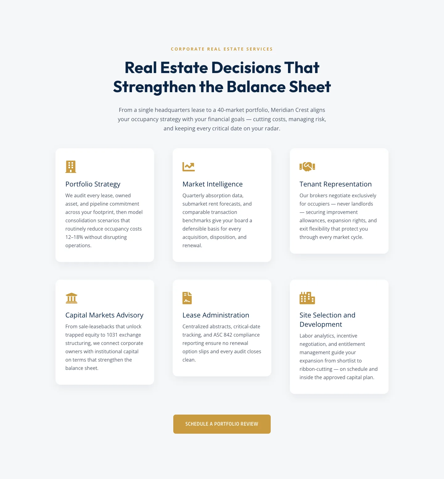
Corporate Real Estate Features Section: Six-Pillar Service Grid for Divi 5
features · real_estate · corporate
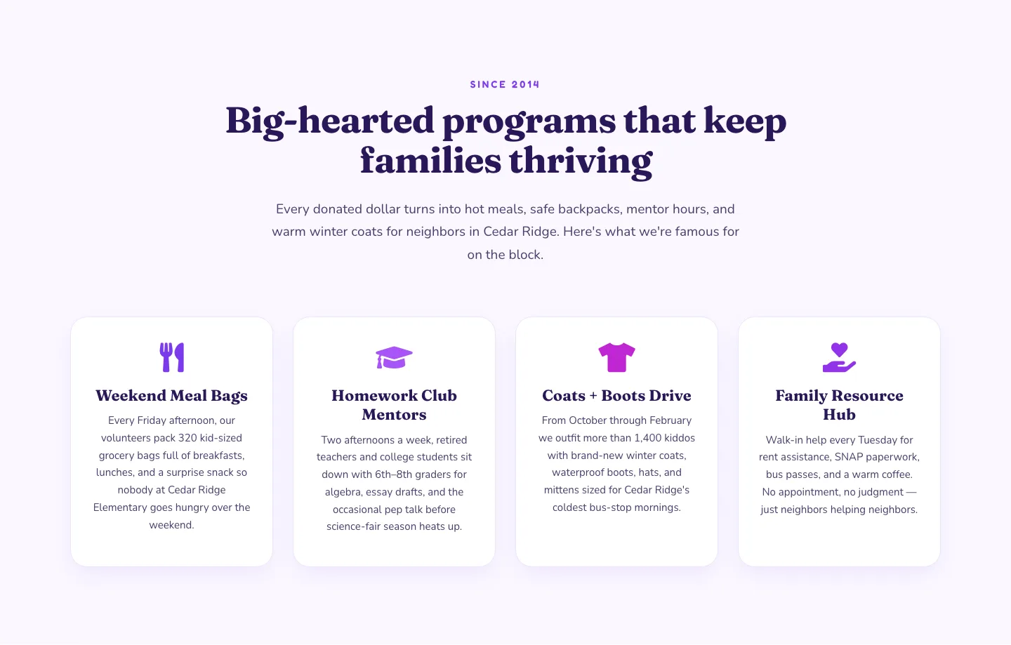
Playful Nonprofit Features Section: Four-Column Icon Cards for Divi 5
features · nonprofit · playful
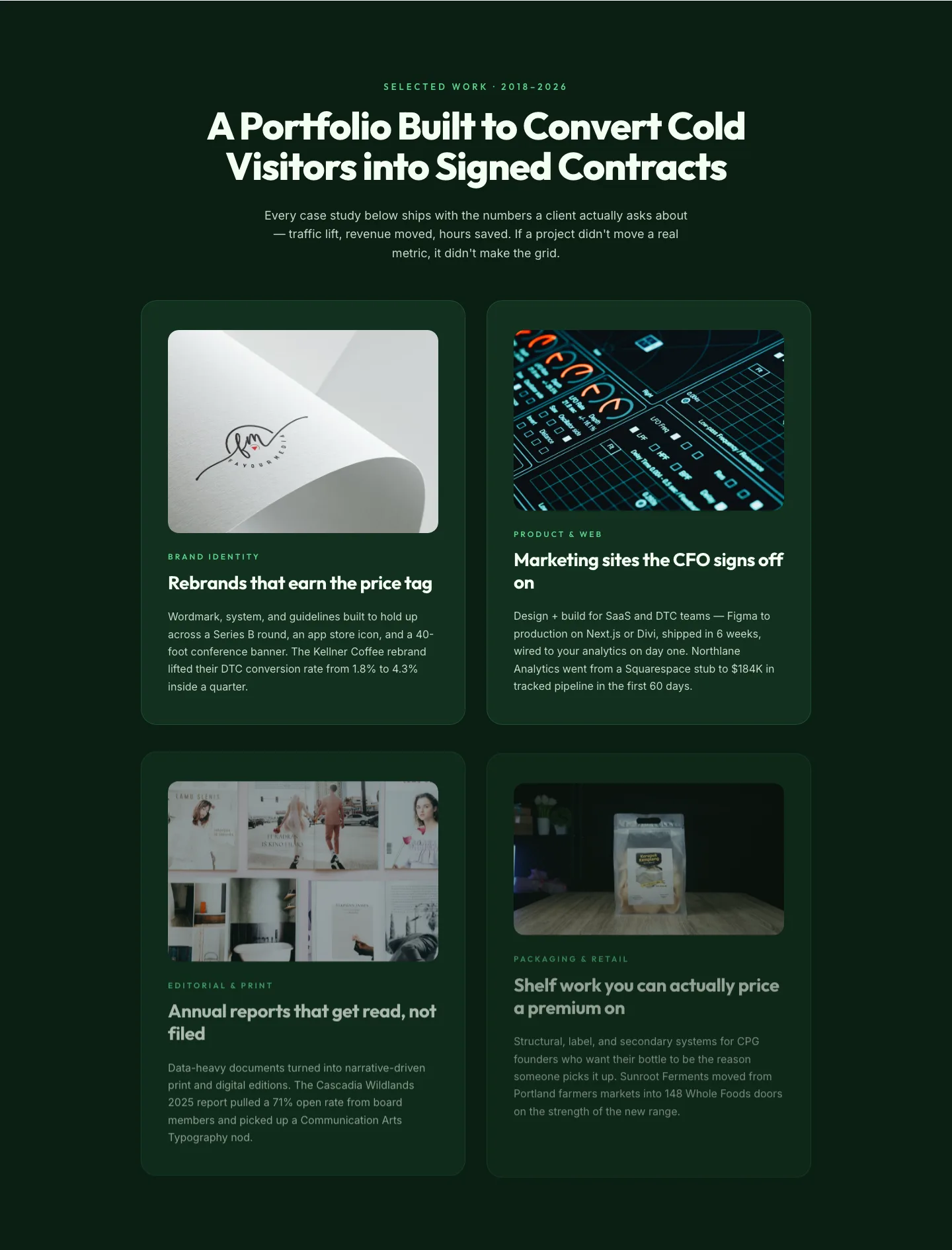
Bold Portfolio Features Grid: Divi 5 Case Study Layout
features · portfolio · bold
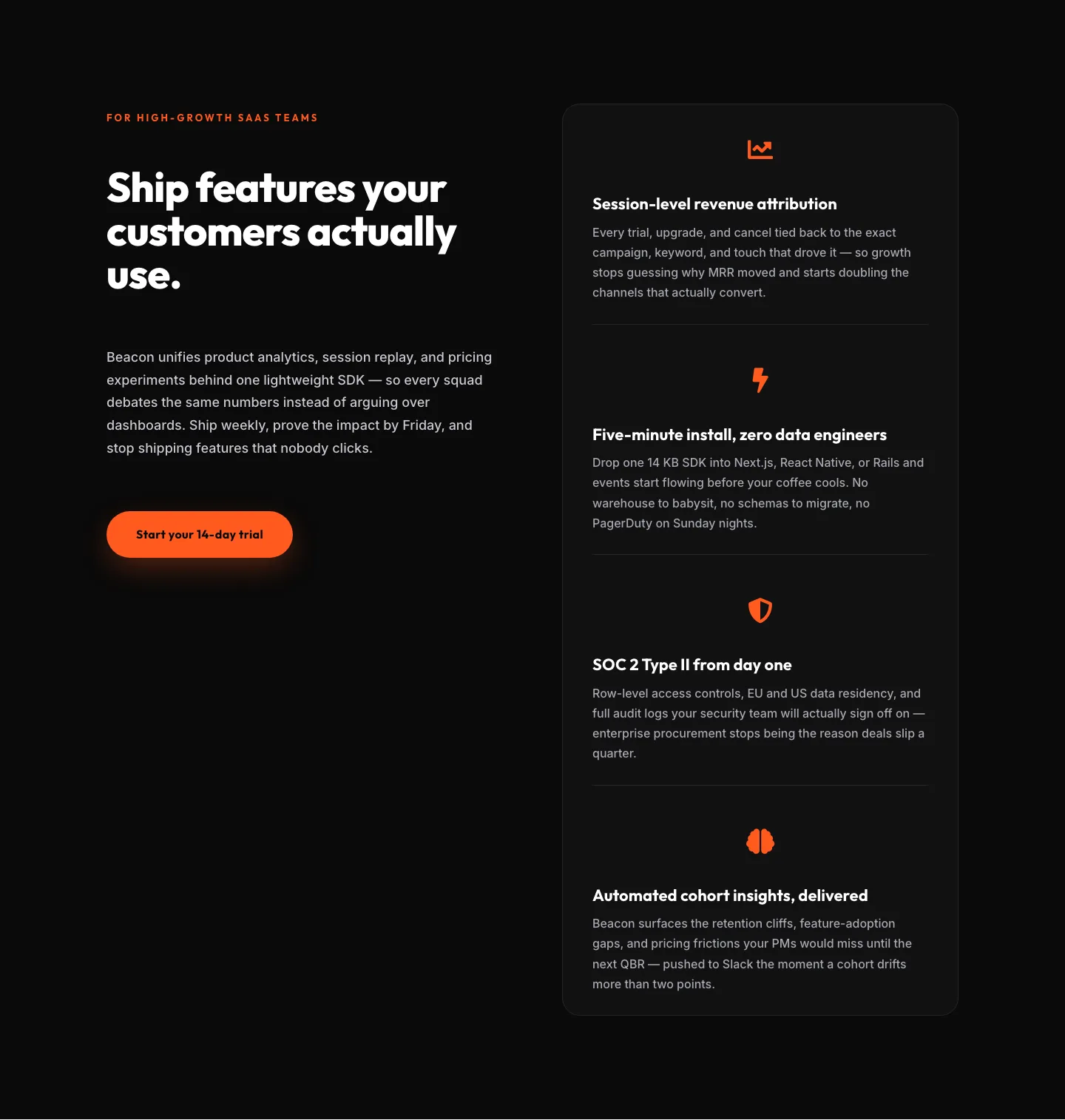
SaaS Features Section: Ship Features Customers Actually Use | Divi 5 Bold Layout
features · saas · bold
SaaS Features Section: Minimal Divi 5 Layout for Product Teams
features · saas · minimal
Bold Agency Features Section: Divi 5 Services Grid Layout
features · agency · bold