
Signalstack SaaS Hero Section: Bold Red Split-Image Divi 5 Layout
High-impact Divi 5 hero section for SaaS and DevOps brands. Split layout with bold red CTA, dark background, social proof, and trial signup. Plug-and-play JSON.
Rate this element
Download this section, free
- Divi 5 JSON, imports in seconds
- Commercial license included
- No account needed
Click to view the full page
Overview
This hero is built on a single Divi 5 section with a near-black #0B0B0F canvas and a tight 3/5 + 2/5 row split: copy on the left, product image on the right, capped at a 1200px max-width so the composition never sprawls on ultrawide displays. Vertical rhythm is deliberate: 140px top and bottom padding on desktop, tapering to 90px on tablet and 70px on phone, which keeps the hero feeling premium at every breakpoint without wasting screen height on small devices.
The left column runs a five-part hierarchy: red uppercase eyebrow (#FF3B4F, 13px, 3px letter-spacing) → 64px display headline in weight 800 with a -1.5px tracking pull → 19px body paragraph at 74% white for readable contrast → a saturated red CTA (#E11D2E) with a 14px radius and a soft red glow shadow → a 14px trust-strip line at 50% white. That hard step from tiny label to giant headline is what gives the layout its bold SaaS energy, and the headline is capped at 620px so line breaks stay controlled.
The right column centers a single image module with a 20px corner radius, a 1px translucent-red border, and a wide red drop-shadow (rgba(225,29,46,0.28)) that visually ties the panel to the button. On phone the row flips to flex-direction: column, so the image tucks below the copy and the headline scales down to 34px with a 1.1em line-height. No cramped side-by-side layout on small screens.
What’s inside
- Two-column 3/5 + 2/5 row (copy left, image right) that collapses to a single stacked column on phone
- Red uppercase eyebrow → 64px display headline → body → CTA → micro-trust line hierarchy, all built with native Divi 5 Heading, Text, and Button modules
- Bold red primary button (`#E11D2E` → `#B4141F` on hover) with a 14px radius and a preset-3 red glow box-shadow
- Product image module with 20px rounded corners, translucent red border, and a matching soft red drop-shadow
- Responsive typography baked in: 64px / 46px / 34px headline scale across desktop, tablet, phone
- 1200px max-width row, 56px column gap, and centered auto margins to keep the composition contained on wide screens
- Trust micro-copy slot under the CTA for compliance badges, guarantees, or short social proof
- Dark `#0B0B0F` background with 140/90/70px vertical padding at desktop/tablet/phone breakpoints
Who it’s for
Built for SaaS and dev-tools brands that want a confident, opinionated hero: infrastructure and observability products, DevOps and SRE tooling, security platforms, fintech APIs, and any B2B software where a bold red CTA needs to feel earned rather than shouty. The dark canvas and high-contrast typography also translate cleanly to AI startups, developer platforms, and product-led growth pages where a free-trial CTA is the primary conversion goal. Agencies pitching a modern SaaS brand refresh can drop it in as a starting frame: the split-image layout gives real estate to a product screenshot, dashboard, or hero photograph without forcing a full-bleed background image.
Customization tips
Start with the palette: the layout uses one accent (#E11D2E for the button, #FF3B4F for the eyebrow) plus a near-black background. Swap those two hex values in the Design tab and the whole section rebrands in under a minute. The button's box-shadow color is a translucent version of the same red, so update that to match. Keep the eyebrow to around 30 characters so the 3px letter-spacing doesn't wrap; the headline reads best at 6–9 words to preserve the 1.05em line-height, and the body paragraph is sized for roughly 30–45 words before it visually competes with the CTA. For the image slot, use a 4:3 asset (the source is 1200×900), product screenshots, dashboards, or editorial photography all work; anything portrait will fight the row's align-items: center and leave awkward gaps. If you replace the CTA copy, stay under 24 characters so the button doesn't wrap on phone.
How to install this layout
- Download the layout JSON file from this page.
- Open the target page in the Divi 5 builder.
- Open the portability panel (up/down arrows icon) and choose the Import tab.
- Upload the JSON. Tick “replace existing content” only for full-page imports.
- Check the page at desktop and mobile widths, then swap in your copy and images.
Full walkthrough with troubleshooting: How to Import a Divi 5 Layout.
Questions about Signalstack SaaS Hero Section: Bold Red Split-Image Divi 5 Layout
How does the split layout behave on mobile?
On phone the row switches to `flex-direction: column`, so the image drops below the copy block. The headline scales from 64px down to 34px with a tighter 1.1em line-height, and the section padding shrinks from 140px to 70px top and bottom: no horizontal scroll, no cramped side-by-side.
Which Divi 5 modules does it actually use?
Five native modules only: two Heading modules (eyebrow + H1), one Text module for the body paragraph, one Button module for the CTA, one Text module for the trust line, and one Image module in the right column. No third-party plugins, no custom code.
Can I replace the Pexels image with a product screenshot?
Yes. That's the intended use. The image module is set to a 4:3 frame (the placeholder is 1200×900), has a 20px corner radius, and a 1px translucent red border. Drop in a dashboard mock or product shot at similar proportions and the styling carries over automatically.
What should I edit first after importing?
Palette, then copy. Change the two reds (`#E11D2E` on the button, `#FF3B4F` on the eyebrow) and the button's shadow color to your brand accent, then rewrite the eyebrow, headline, body, CTA label, and trust line. The image is the last thing to swap because layout won't shift when you do it.
Is the red glow behind the button and image adjustable?
Both use Divi's preset-3 box-shadow with a translucent red color. Open the module's Design → Box Shadow panel and change the color to a translucent version of your accent: the blur, vertical offset, and hover state values will keep working.
Does the headline stay on one line at 64px?
The headline column is capped at 620px max-width, so the current copy wraps to two lines on desktop by design. If you write a shorter headline it will collapse to one line; a longer one will wrap to three, the 1.05em line-height is tuned for two- to three-line display headlines.
Which Divi version does this layout need?
Divi 5. The layout is generated natively for Divi 5 and validated against its real module structure before publication, so it imports clean into the current builder.
Can I use this layout on client websites?
Yes. Every download includes a commercial license covering unlimited sites you own or build for clients. Only reselling or redistributing the layout file itself is prohibited.
More hero sections
Browse all hero sections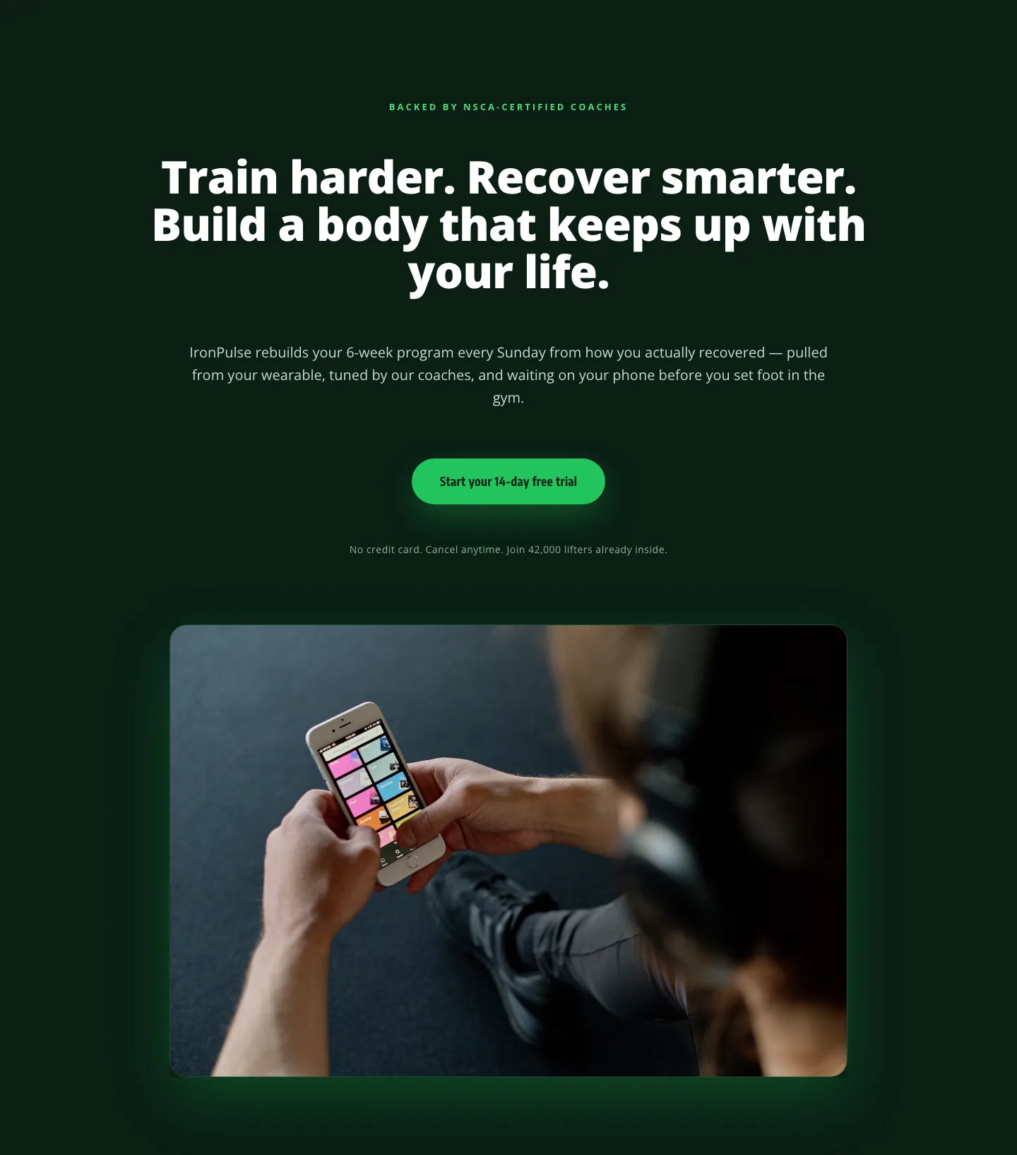
Bold Fitness App Hero Layout for Divi 5: IronPulse Adaptive Training
hero · fitness · bold
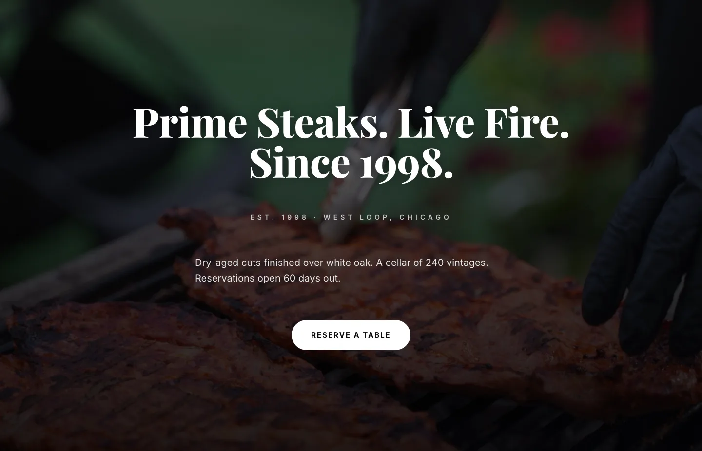
Prime Steaks Hero Section: Bold Monochrome Restaurant Layout for Divi 5
hero · restaurant · bold
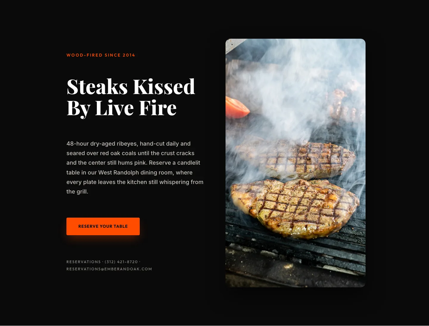
Wood-Fired Steakhouse Hero Layout for Divi 5: Bold Restaurant Template
hero · restaurant · bold
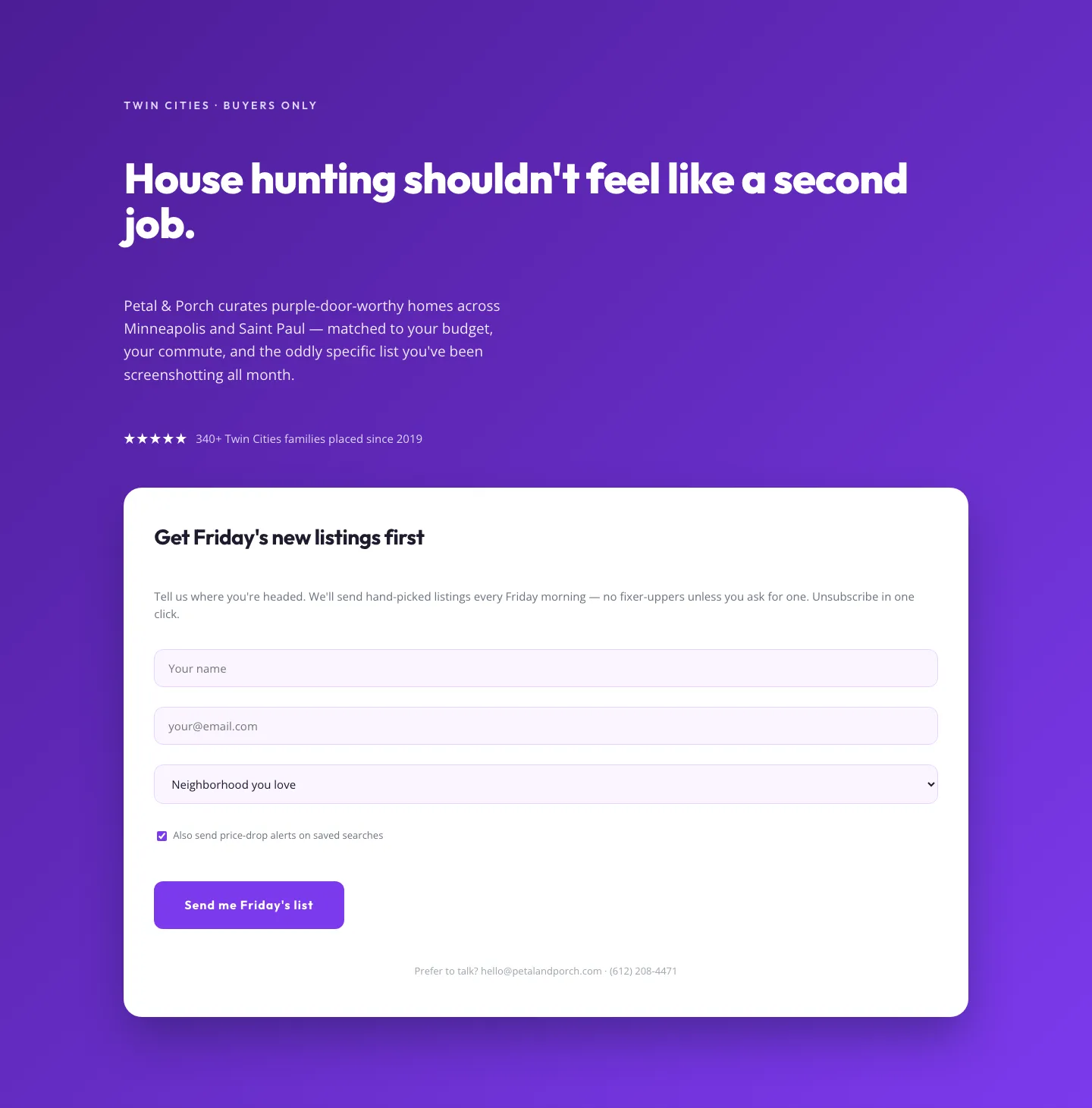
Playful Real Estate Hero with Weekly Listings Signup: Divi 5 Layout
hero · real_estate · playful
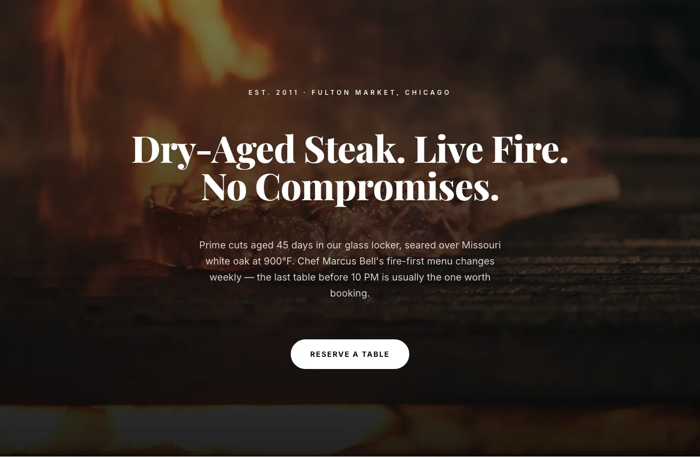
Bold Steakhouse Hero Layout for Divi 5: Fire & Dry-Aged
hero · restaurant · bold
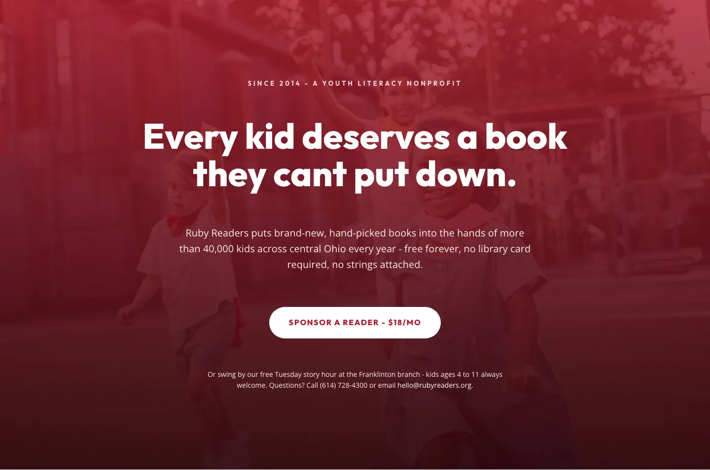
Ruby Readers Nonprofit Hero: Playful Divi 5 Layout
hero · nonprofit · playful