
The Lantern House — Elegant Boutique_hotel About Page for Divi 5
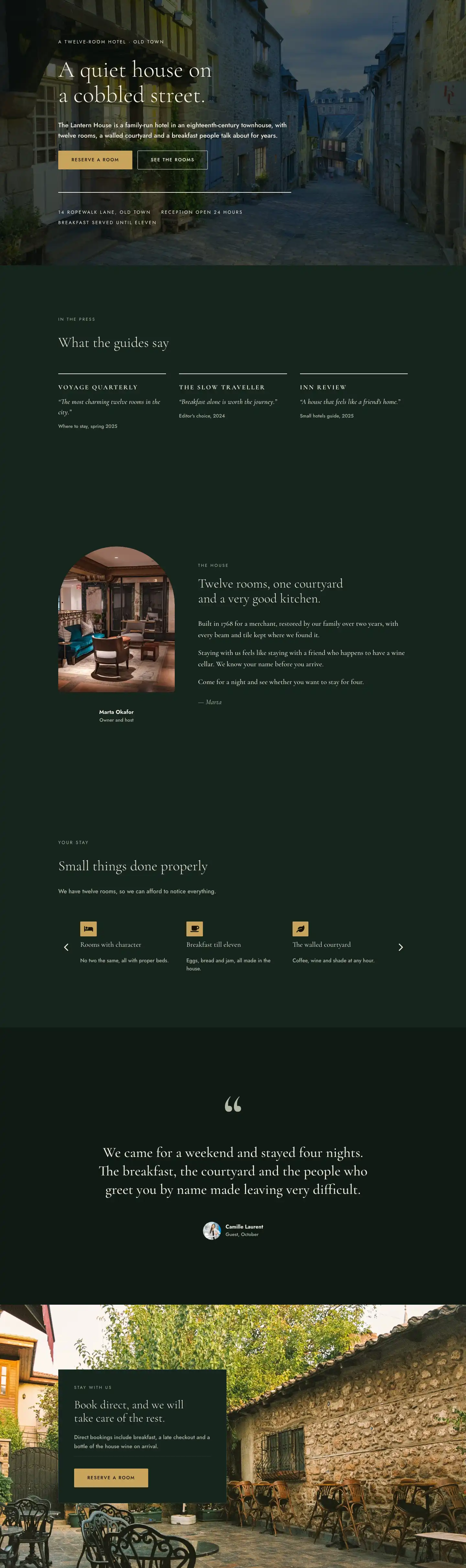
A full-page About layout for a family-run boutique hotel. Features a brand story timeline, team portraits, house philosophy, and a careers CTA — all in a deep forest green and warm ivory palette.
Rate this element
Download this section, free
- Divi 5 JSON, imports in seconds
- Commercial license included
- No account needed
This page ships inside The Lantern House: Boutique Hotel Theme (6 Pages), 6 coherent pages that share one brand.
Click to view the full page
Overview
The Lantern House About Page opens with a full-bleed hero section on deep forest green (#0f1a15) — a deliberate choice to signal heritage rather than luxury-chain polish. A spaced h4 eyebrow in muted sage (#b4b9a8) at 13px with 3px letter-spacing establishes the hotel's founding year before a 104px Cormorant Garamond h1 at light weight (300) drops the page's emotional thesis: A family, a house and a very long staircase. The headline scales to 72px on tablet and 44px on mobile, preserving the typographic impact at every breakpoint. A text-wrap: balance property ensures the long serif line never orphans awkwardly. A 1px divider in #2b3d33 closes the hero, and a tight two-column row below it introduces the hotel's voice in Jost at 20px with 1.7em line-height — generous enough to feel unhurried.
The second section overlays a full-width editorial photograph with a 68% dark-green gradient scrim on both edges, keeping the image atmospheric without competing with the text. Inside, a four-column CSS grid presents a chronological timeline — 1998, 2001, 2010, 2024 — each milestone card topped by a 2px #f8f3e6 border, a large Cormorant Garamond year figure at 48px bold, a serif h3 label, and a single-sentence Jost body. On tablet the grid reflows to two columns; on phone it collapses to one, with row-gap tightened to 32px. Nothing is hidden or stacked in ways that break reading order.
The third section switches to a four-column team grid on #0f1a15: each card pairs a 1:1 aspect-ratio cover-fit portrait image with a 2px top-border name group in Cormorant Garamond h3 and an uppercase Jost role label. The row allows flex-wrap on tablet (two columns per row) and stacks fully on phone. The header row above uses an asymmetric 14/24 + 10/24 flex split that aligns the section heading to the left body weight and the introductory text to a narrower supporting column — a layout decision that mirrors editorial magazine hierarchy.
A fourth section on parchment cream (#f2ede1) delivers a numbered principles accordion: four divider-separated rows, each with a fixed 64px number column, a flex-grow heading column in Cormorant Garamond at 34px, and a max-width-360px body column. The pattern collapses gracefully on phone. A closing CTA section uses a full-bleed background image (no gradient overlay this time, purely photographic) with a contained dark-green card (#16241d, 1px border #2b3d33) housing the recruitment pitch and a gold (#c9a45c) Jost button with 2px letter-spacing — the only warm-accent color in the entire layout, used with restraint.
What’s inside
- Five distinct sections with purpose-built layouts: serif hero, image-overlay timeline, team grid, numbered principles list, and full-bleed CTA card
- Four-column responsive timeline grid (CSS grid, collapses to 2-col tablet / 1-col phone) with top-border milestone cards using Cormorant Garamond year figures at 48px
- Team grid section with 1:1 aspect-ratio portrait images, flex-based 4-column desktop layout reflows to 2-column tablet and single-column phone
- Numbered principles rows: fixed 64px counter column, flex-grow heading, and constrained 360px body column separated by 2px solid dividers
- Asymmetric two-column header rows using Divi's flex column sizing (14/24 + 10/24, 16/24 + 8/24) for editorial weight contrast
- Dual-palette design: deep forest green dark sections (`#0f1a15`) and a cream light section (`#f2ede1`), with a single gold accent (`#c9a45c`) reserved for the CTA button
- Three image placements: a gradient-overlaid full-bleed story section, unadorned full-bleed CTA background, and individual square portrait images in the team section
- All responsive padding breakpoints explicitly set: desktop 160–200px vertical, tablet 112–144px, phone 72–88px
Who it’s for
This layout suits independent and family-run boutique hotels, guesthouses, and historic inns where the ownership story is the differentiator. It also fits wine estates with accommodation, rural retreats, design B&Bs, and heritage restaurants with rooms. The tone — earned rather than marketed, spare rather than lavish — works for any hospitality brand that competes on character over amenities. Web designers building for clients in the slow-travel or agritourism space will find the timeline and principles sections reusable across a wide range of property types without feeling generic.
Customization tips
The two-palette structure makes a full rebrand straightforward: swap #0f1a15 (dark sections) and #f2ede1 (light section) in Divi's global presets and both palettes update together. The gold button color #c9a45c is the only accent; changing it to a terracotta or deep teal shifts the mood considerably, so test it against the hero and CTA images first.
Timeline milestone copy works best at one short sentence per card — the 16px Jost body at 1.6em line-height has room for roughly 15–20 words before the card starts to feel dense. Portrait images should be square crops (1:1) at a minimum of 800px wide; the object-fit: cover setting handles off-ratio sources, but faces should be centered in frame. The principles section is built for exactly four rows but can be extended with additional divider + row groups. Keep h3 headings to three words or fewer for the numbered rows — anything longer breaks the visual alignment with the fixed counter column on mobile.
How to install this layout
- Download the layout JSON file from this page.
- Open the target page in the Divi 5 builder.
- Open the portability panel (up/down arrows icon) and choose the Import tab.
- Upload the JSON. Tick “replace existing content” only for full-page imports.
- Check the page at desktop and mobile widths, then swap in your copy and images.
Full walkthrough with troubleshooting: How to Import a Divi 5 Layout.
Questions about The Lantern House — Elegant Boutique_hotel About Page for Divi 5
How does the timeline section reflow on smaller screens?
The four-column CSS grid defined on the timeline group switches to two columns on tablet and a single column on phone, with row-gap reduced from 40px to 32px. Each milestone card retains its 2px top border and large year figure at all sizes.
What aspect ratio should the team portrait photos be?
The image modules are set to a 1:1 aspect ratio with `object-fit: cover`. Square crops work perfectly; portrait or landscape sources will be cropped to square automatically, so position the subject centrally when preparing images.
Can I remove the second full-bleed image section and keep only the light principles section?
Yes. The story (timeline) section and the principles section are independent Divi sections with no dependencies. Deleting the timeline section leaves the hero, team grid, principles, and CTA intact with no layout breakage.
What fonts does the layout use and do I need to install them?
Two Google Fonts are used: Cormorant Garamond (display headings) and Jost (labels, body, buttons). Both load via Divi's built-in Google Fonts integration — no manual installation needed.
The CTA section has no gradient over its background image — is that intentional?
Yes. Unlike the story section (which uses a 68% green overlay to keep text readable over a complex photograph), the CTA background image is set without a gradient. The dark-green card containing the text sits over the image as a panel, so legibility comes from the card's background rather than an overlay.
What is the first thing I should edit after importing?
Replace the eyebrow text in the hero ("The Lantern House · Since 1998") and the h1 tagline — these two lines set the entire page's voice. Then swap the four team portrait images for your own, as placeholder faces will undermine the personal tone the layout is designed to project.
Which Divi version does this layout need?
Divi 5. The layout is generated natively for Divi 5 and validated against its real module structure before publication, so it imports clean into the current builder.
Can I use this layout on client websites?
Yes. Every download includes a commercial license covering unlimited sites you own or build for clients. Only reselling or redistributing the layout file itself is prohibited.
Included in these packs
More full landing pages
Browse all full landing pages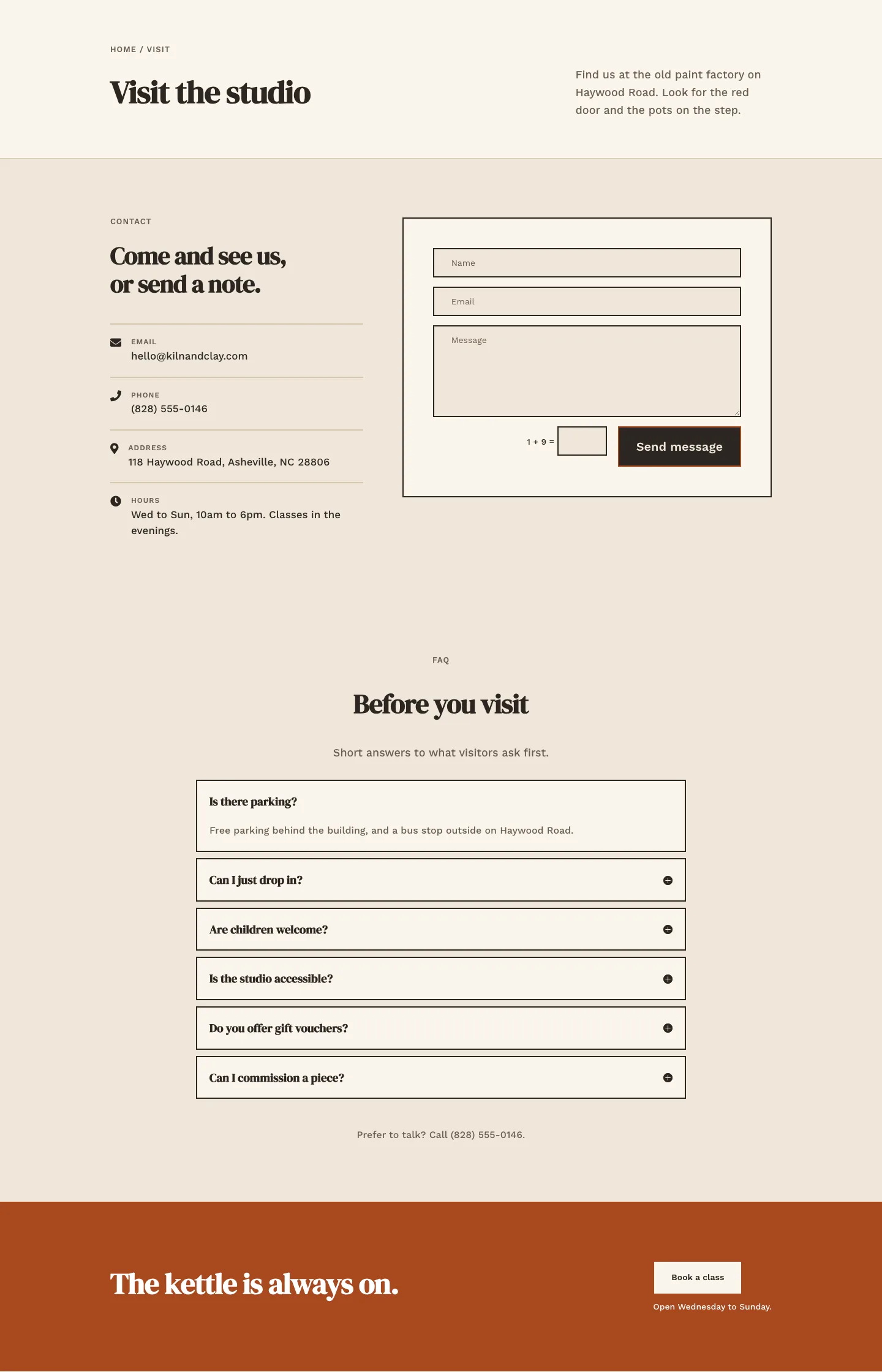
Kiln & Clay — Minimal Pottery_studio Visit Page for Divi 5
full_landing · pottery_studio · minimal
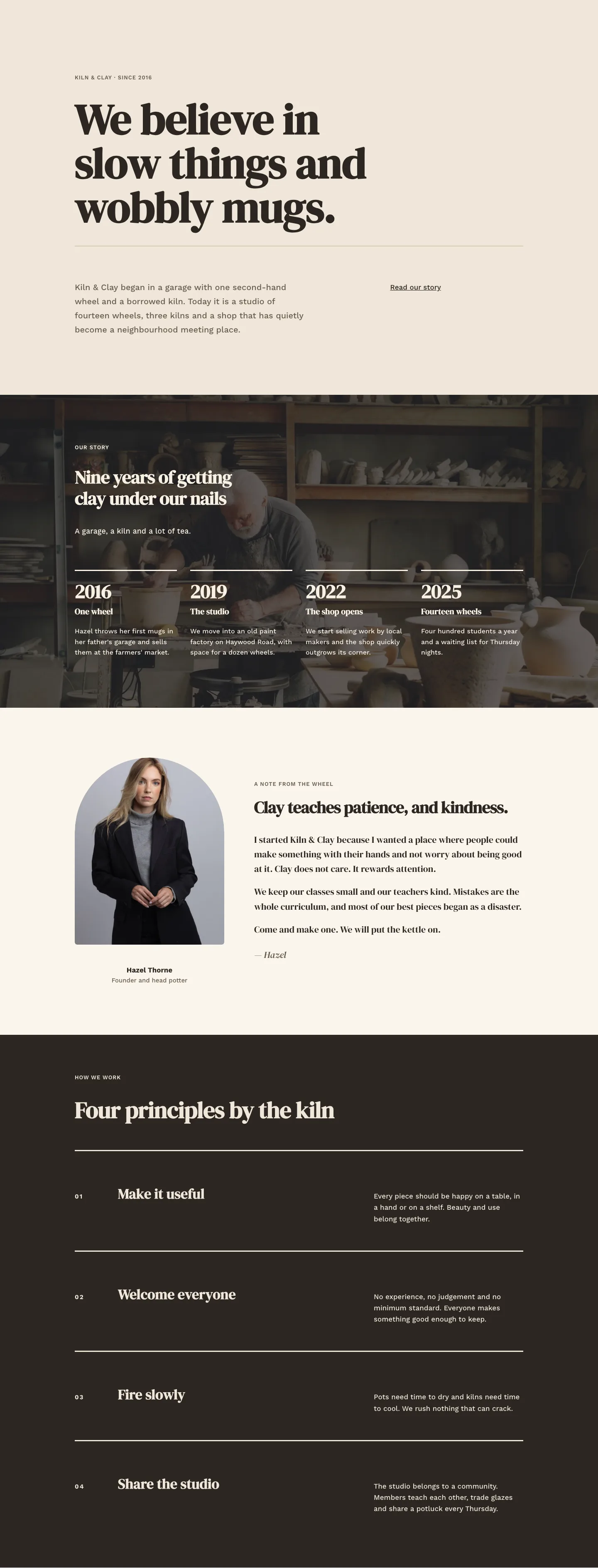
Kiln & Clay — Minimal Pottery_studio Our Story Page for Divi 5
full_landing · pottery_studio · minimal
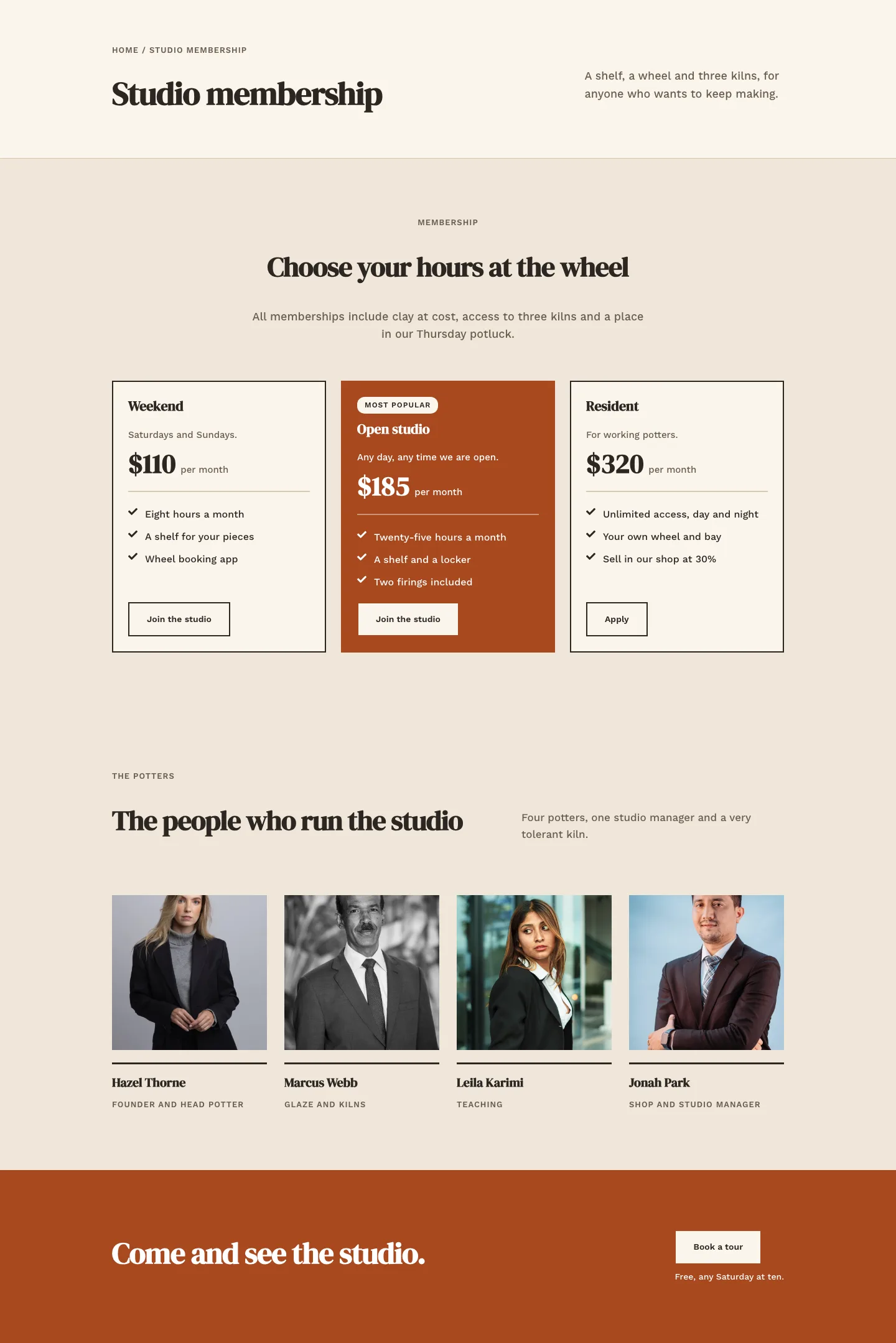
Kiln & Clay — Minimal Pottery_studio Studio Membership Page for Divi 5
full_landing · pottery_studio · minimal
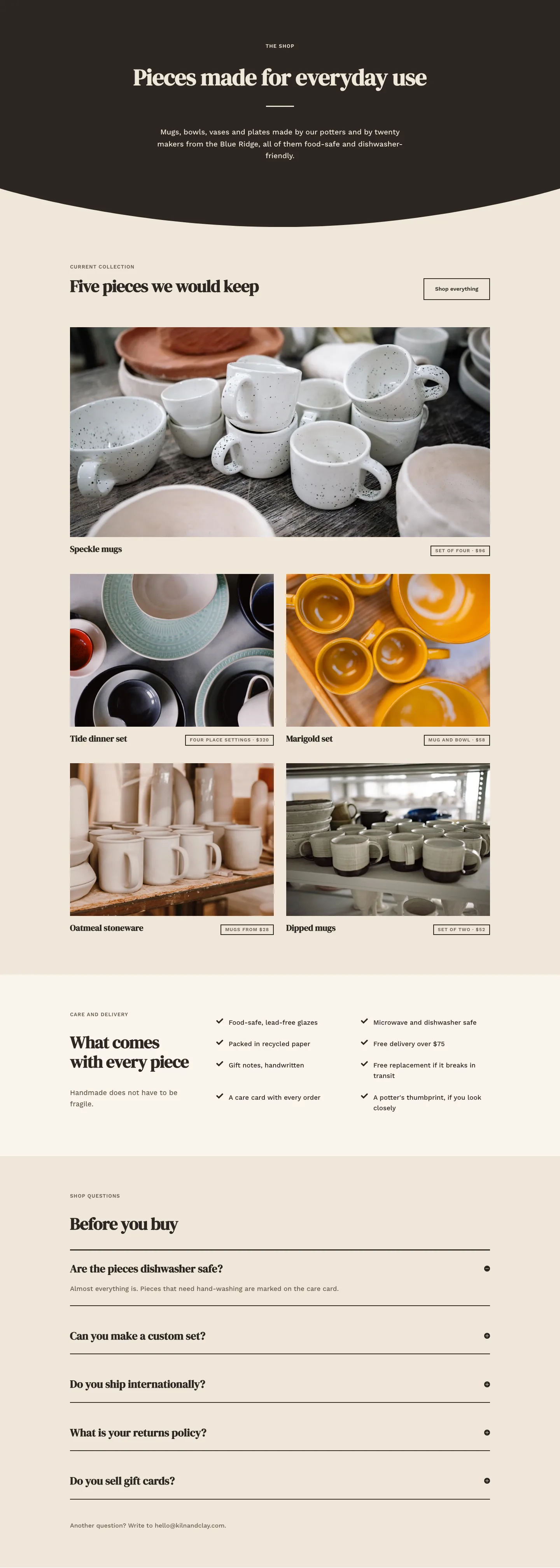
Kiln & Clay — Minimal Pottery_studio The Shop Page for Divi 5
full_landing · pottery_studio · minimal
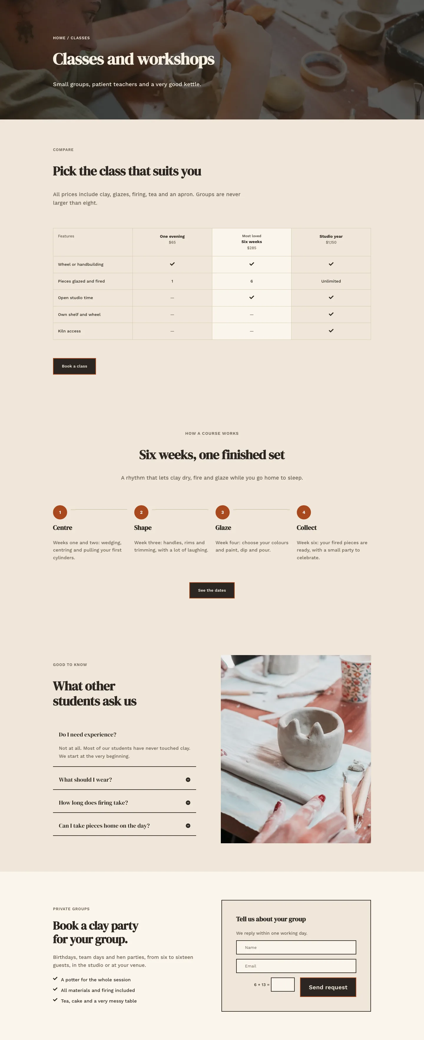
Kiln & Clay — Minimal Pottery_studio Classes Page for Divi 5
full_landing · pottery_studio · minimal
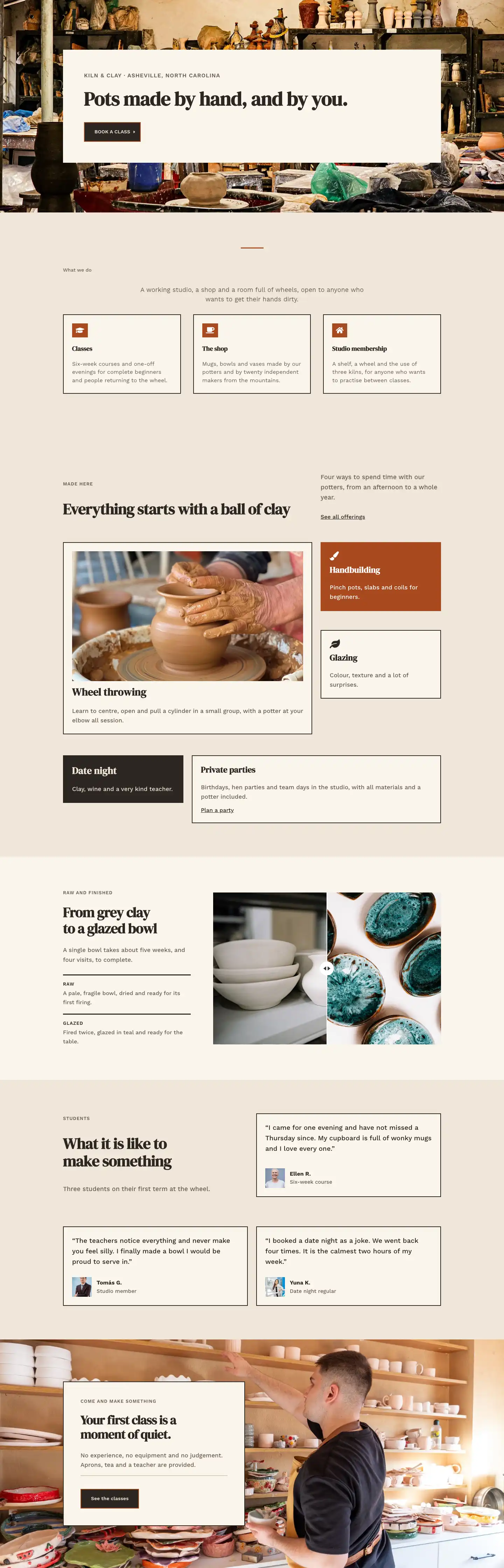
Kiln & Clay — Minimal Pottery_studio Home Page for Divi 5
full_landing · pottery_studio · minimal