
Bold Portfolio Features Section: 2x2 Discipline Grid for Divi 5
Navy-and-electric-blue 2x2 features grid for Divi 5 portfolios: bold typography, icon-led service cards, and editorial copy designed to sell creative work.
Rate this element
Download this section, free
- Divi 5 JSON, imports in seconds
- Commercial license included
- No account needed
Click to view the full page
Overview
Four discipline cards sit on a deep navy field (#0a1a3a) with 100px of vertical breathing room top and bottom, so the section reads like a chapter opener rather than a marketing block. A short blue eyebrow in uppercase Outfit ("What I Do", 14px, 4px letter-spacing) sits above a heavy 56px H2 in white, then a single 18px lead paragraph capped at 680px. A classic editorial hierarchy that funnels the eye down before the grid even begins.
The grid itself is a 2x2 of half-width columns, each rendered as a soft glass card: rgba(255,255,255,0.04) fill, a 1px border in rgba(96,165,250,0.25), and 20px corner radius. Inside each card, a 40px Font Awesome icon in the accent blue (#3b82f6) anchors the top-left, followed by a 24px Outfit H3 in white and a 16px body paragraph at 1.65 line-height in a cool blue-grey (#bcd0f0). The consistent 40px/36px padding and left-aligned typography give every card the same visual weight: nothing shouts, everything reads.
Color does the heavy lifting instead of decoration. The blue-on-navy palette pulls one accent from the eyebrow through the icons, so a reader immediately knows what to look at. On tablet the H2 drops to 40px and on phone to 34px, section padding relaxes from 100px to 60px, and the two 1/2 + 1/2 rows switch to a vertical flex-column stack so the four cards become a single scrollable column: no cropping, no horizontal scroll, no font-resize surprises.
What’s inside
- Full Divi 5 section with a centered eyebrow + H2 + lead intro row above a 2x2 discipline grid (two 1/2 + 1/2 rows)
- Four glass-style feature cards using column background rgba(255,255,255,0.04), 1px blue-tinted border, 20px radius, 40px/36px padding
- Native Divi 5 Icon module (40px, Font Awesome) in each card: paint-brush, wrench, cog, and camera icons pre-wired
- Native Divi 5 Heading + Text modules with Outfit 800/700 typography, 56px H2 and 24px H3 sizes preset
- Dark navy (#0a1a3a) background with #3b82f6 accent icons, white headings, and #bcd0f0 body copy. A single-palette system you can retheme in minutes
- Explicit responsive typography: 56/40/34px H2 across desktop/tablet/phone, plus 100/60px section padding
- Phone-optimized flexDirection column on both grid rows so cards stack cleanly with no overlap
Who it’s for
Built for design-led portfolio sites where the owner sells services rather than products: independent brand designers, art directors, motion designers, editorial web designers, illustrators, photographers, and small studios. It's a natural fit for a "What I Do" or "Services" section on a freelancer's homepage, and it holds up equally well on a boutique agency's capabilities page or an in-house creative director's personal site. The four-card format also works for consultants, coaches, and creative technologists who want to communicate a tight, curated set of offerings without a full services page. If your portfolio leans dark, editorial, or fashion-adjacent, the palette drops in with almost no tuning.
Customization tips
Start with copy: the H2 is capped at 820px and the lead paragraph at 680px, so keep the headline to about 8 words and the intro to two sentences to preserve the centered rhythm. Each card H3 is designed for a 2–4 word discipline name; body copy reads best at 30–55 words so the four cards stay visually balanced. To recolor, change the section background hex, then update the icon color, the border rgba, and the eyebrow color to a matching accent. Three swaps and the palette is yours. Swap the Font Awesome unicodes on each Icon module to match your actual disciplines (icons are set to 40px, left-aligned). There are no images in this section, so no aspect ratios to worry about; if you want to add photography, drop a 16:9 or 4:3 Image module above each H3 and shrink the icon to 28px.
How to install this layout
- Download the layout JSON file from this page.
- Open the target page in the Divi 5 builder.
- Open the portability panel (up/down arrows icon) and choose the Import tab.
- Upload the JSON. Tick “replace existing content” only for full-page imports.
- Check the page at desktop and mobile widths, then swap in your copy and images.
Full walkthrough with troubleshooting: How to Import a Divi 5 Layout.
Questions about Bold Portfolio Features Section: 2x2 Discipline Grid for Divi 5
Is the 2x2 grid actually two rows, or a single CSS grid?
It's two separate Divi rows, each with a 1/2 + 1/2 column structure. That's why they collapse cleanly to a single column on phone: the row's flexDirection switches to column at the phone breakpoint, so cards stack in reading order without needing a custom grid.
Does it use any custom code or third-party plugins?
No. It's 100% native Divi 5 modules: Section, Row, Column, Text, Heading, and Icon. Font Awesome is included with Divi, and Outfit is loaded through Divi's Google Fonts integration. Nothing to install.
How does it behave on mobile?
Section padding relaxes from 100px to 60px on phone, the H2 steps down from 56px to 40px on tablet and 34px on phone, and both card rows switch to a vertical column layout. Card padding stays at 40px/36px so touch targets remain comfortable.
What should I edit first when I drop this on my site?
Replace the four card headings and body paragraphs with your actual disciplines. That's what makes or breaks the section. Then swap the four Font Awesome icons to match, and rewrite the eyebrow ("What I Do") and H2 to your voice. Palette changes can wait until copy is locked.
Can I turn it into a 3-column or 4-column layout instead of 2x2?
Yes: the simplest path is to delete one row and rebuild it as a 1/3 + 1/3 + 1/3 or 1/4 + 1/4 + 1/4 row, then copy the card contents across. The card styling lives on the column, so duplicating a column carries the background, border, and padding with it.
Are the icons interactive or linked?
No, the icons are decorative Divi Icon modules with no href set. If you want each card to link to a services subpage, wrap each column's content or add a Button module below the paragraph; the layout has vertical room for it inside the 40px bottom padding.
Which Divi version does this layout need?
Divi 5. The layout is generated natively for Divi 5 and validated against its real module structure before publication, so it imports clean into the current builder.
Can I use this layout on client websites?
Yes. Every download includes a commercial license covering unlimited sites you own or build for clients. Only reselling or redistributing the layout file itself is prohibited.
More feature grids
Browse all feature grids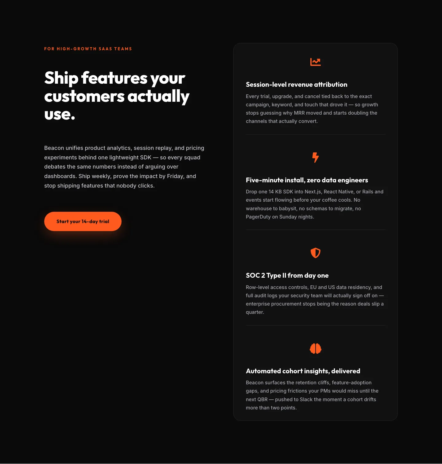
SaaS Features Section: Ship Features Customers Actually Use | Divi 5 Bold Layout
features · saas · bold
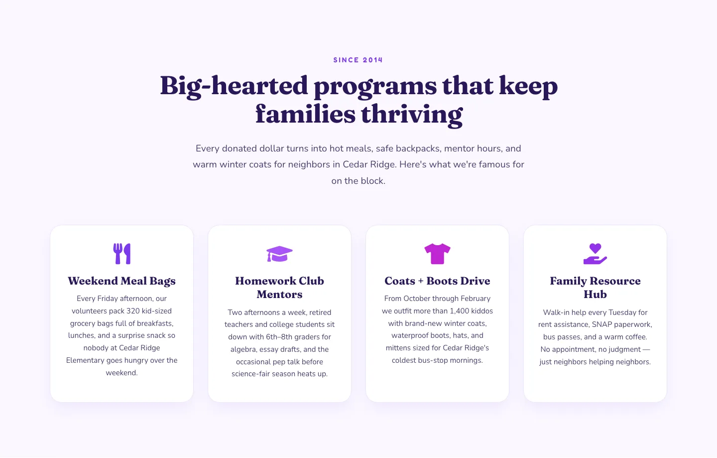
Playful Nonprofit Features Section: Four-Column Icon Cards for Divi 5
features · nonprofit · playful
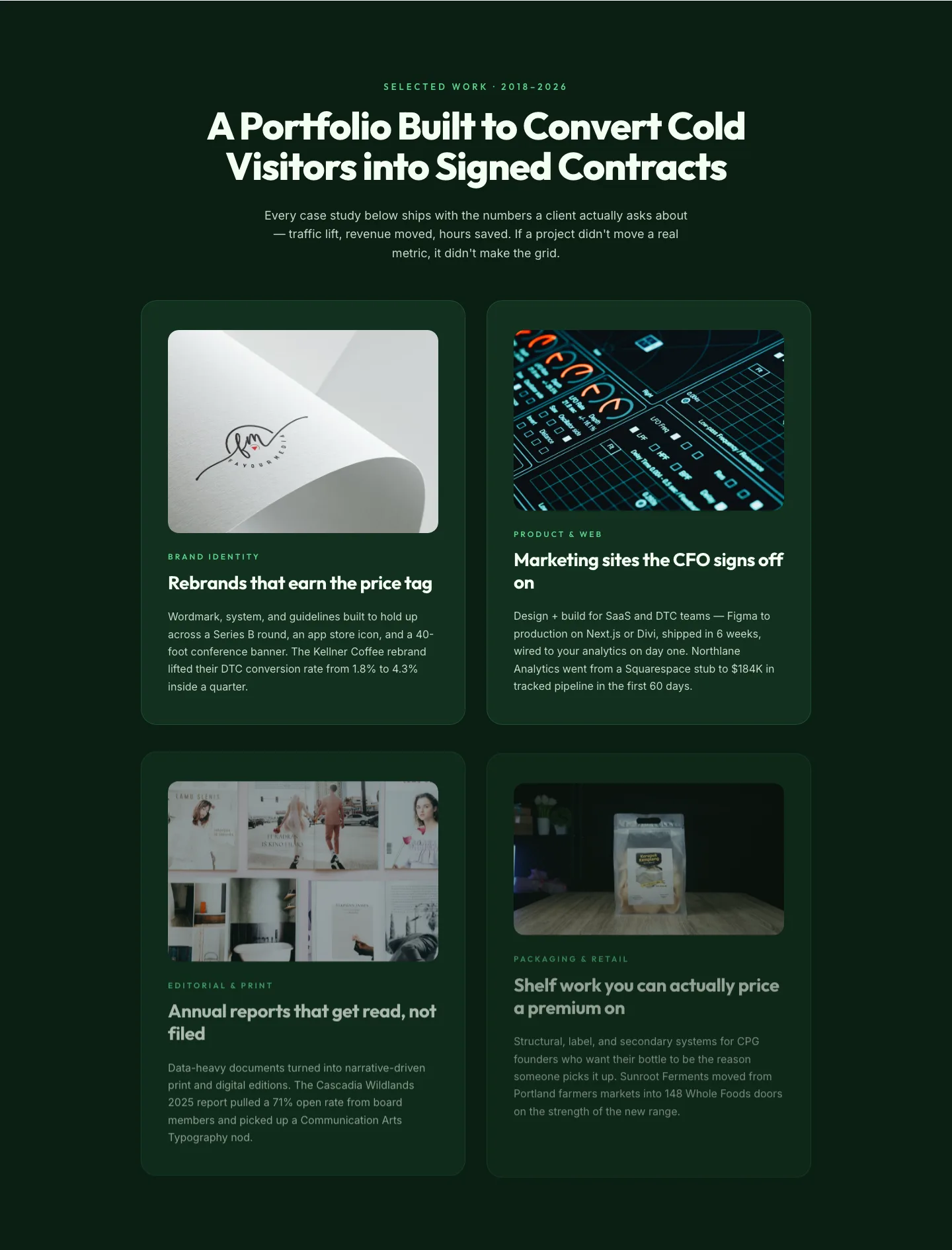
Bold Portfolio Features Grid: Divi 5 Case Study Layout
features · portfolio · bold
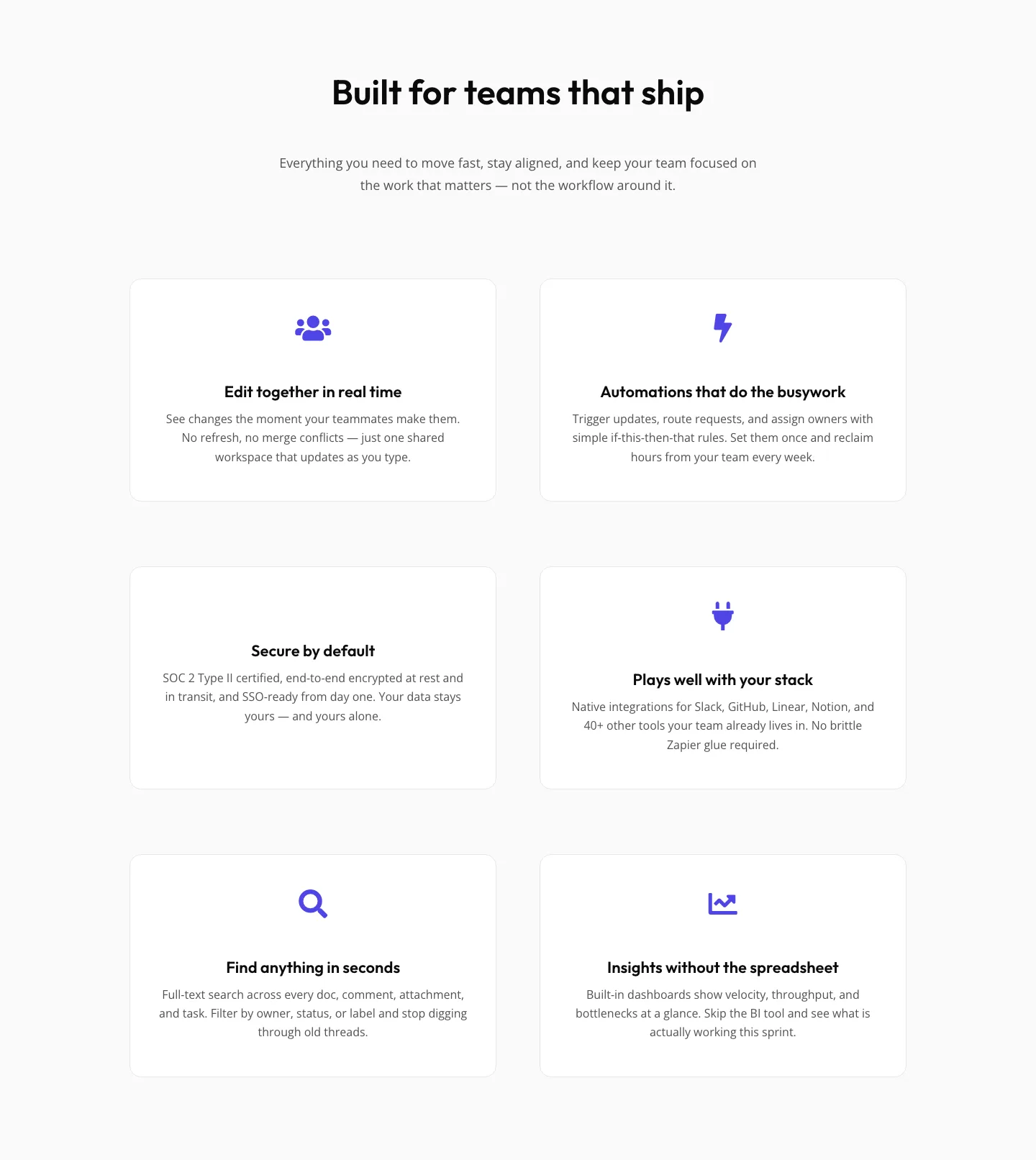
SaaS Features Section: Minimal Divi 5 Layout for Product Teams
features · saas · minimal
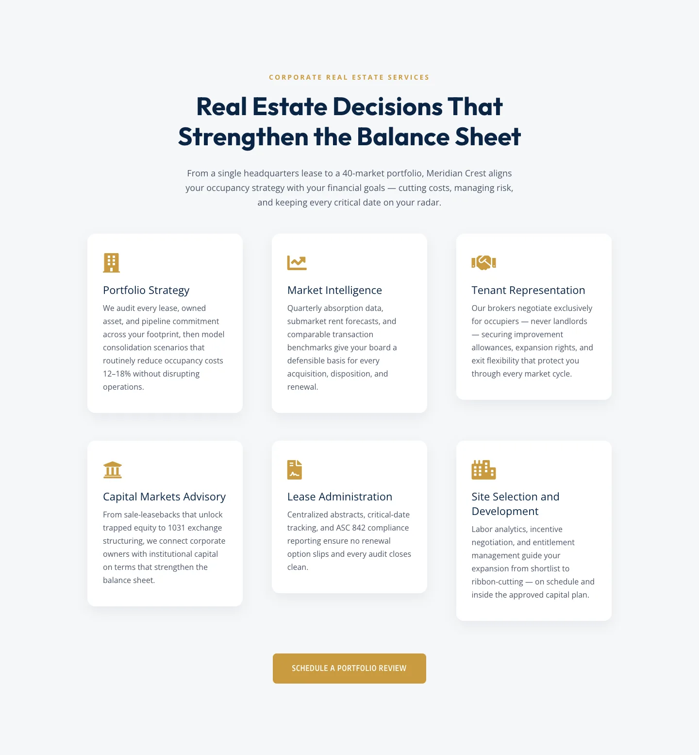
Corporate Real Estate Features Section: Six-Pillar Service Grid for Divi 5
features · real_estate · corporate
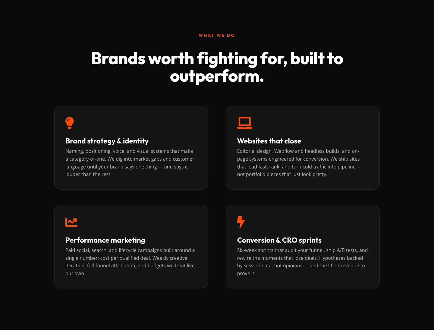
Bold Agency Features Section: Divi 5 Services Grid Layout
features · agency · bold