
Minimal SaaS Features Section: 4-Column Icon Grid for Divi 5
Clean minimal Divi 5 features layout for SaaS sites. Four-column icon grid highlighting SSO, audit logs, integrations, and permissions on a soft neutral background.
Variations
Rate this element
Download this section, free
- Divi 5 JSON, imports in seconds
- Commercial license included
- No account needed
Click to view the full page
Overview
This is a single features section built on a soft #fafafa canvas with 100px vertical padding on desktop (72px on tablet), so it sits cleanly between darker hero or CTA sections without competing for attention. The intro row is a centered stack: a small uppercase eyebrow in the accent indigo #5b6cff at 13px with 2px letter-spacing, an Inter H2 headline at 44px/1.15 in near-black #0a0a0a (capped at 760px wide), and a supporting paragraph at 18px in #555555 inside a tighter 680px column. The type ladder (13 → 44 → 18) gives the eye a clear entry point and keeps the copy scannable at desktop widths.
Below that, a 1_4, 1_4, 1_4, 1_4 row holds four white feature cards with 1px #ececec borders and 16px synced corner radii, each padded 36px top/bottom and 24px left/right. Every card follows the same three-part rhythm: a 36px FontAwesome icon in the accent indigo, centered, then an 18px Inter H3 in near-black with an 18px top margin, then a 14px/1.65 body paragraph in #555555. Because content, spacing, and color roles are identical across all four columns, the grid reads as a system rather than four separate blocks.
On tablet the section padding drops to 72px so the block breathes without eating the fold, and the H2 steps down to 34px, then 28px on phone: the four-column row naturally reflows to a stack on narrow viewports thanks to Divi's default column behavior, so each card gets full width and the icon-title-body rhythm stays intact.
What’s inside
- One Divi 5 Section with a light `#fafafa` background and 100px / 72px responsive vertical padding
- Intro Row with a centered Text eyebrow, Heading (H2, Inter 700, 44/34/28px), and a supporting Text paragraph capped at 680px
- Four-column feature Row using a 1_4, 1_4, 1_4, 1_4 column structure
- Four identical white feature cards with 1px `#ececec` borders, 16px radii, and 36/24px padding
- Four native Divi Icon modules (FontAwesome) sized 36px in accent indigo `#5b6cff`, center-aligned
- Four Text modules pairing an H3 title (18px Inter 600) with a 14px/1.65 body paragraph
- Consistent type ladder (13px eyebrow → 44px H2 → 18px lede → 18px H3 → 14px body) tuned for scannability
- Pre-written SaaS copy covering SSO, audit logs, integrations, and permissions. Ready to swap for your own
Who it’s for
Built for SaaS and B2B product teams that need a clean, credible way to show four core capabilities without turning the page into a spec sheet. It fits developer tools, workspace apps, security and compliance platforms, analytics dashboards, API companies, and internal tools where buyers scan for feature parity before requesting a demo. The neutral off-white canvas and indigo accent slot naturally between a dark hero and a pricing table, so it works equally well on a marketing home page, a product overview, or a solutions-by-role landing page. Agencies building startup sites will get a drop-in section they can restyle to any brand in minutes.
Customization tips
Swap the accent by changing #5b6cff in one place (the eyebrow color, the four icon colors, and any hover states you add should share it) then tweak the card background from #ffffff if you want a bolder canvas contrast. Keep H3 titles to 2–4 words and body copy to roughly 18–24 words per card; anything longer starts to break the four-column rhythm on 1024–1280px screens. The eyebrow works best at 2–4 words in all caps. If you only have three features, delete one column and let Divi rebalance to 1_3s; for six, duplicate the row and stack. Icons are native Divi Icon modules, so pick from the FontAwesome library rather than uploading SVGs to keep the crisp vector rendering. If you switch to a dark section background, invert card backgrounds to #0f0f14, borders to #1f2030, and titles to #ffffff. Leave body copy near #a0a0aa for legibility.
How to install this layout
- Download the layout JSON file from this page.
- Open the target page in the Divi 5 builder.
- Open the portability panel (up/down arrows icon) and choose the Import tab.
- Upload the JSON. Tick “replace existing content” only for full-page imports.
- Check the page at desktop and mobile widths, then swap in your copy and images.
Full walkthrough with troubleshooting: How to Import a Divi 5 Layout.
Questions about Minimal SaaS Features Section: 4-Column Icon Grid for Divi 5
How does the four-column grid behave on mobile?
Divi's default column stacking reflows the 1_4, 1_4, 1_4, 1_4 row into a single-column stack on phone widths, so each card takes full width. The H2 also steps down from 44px to 34px on tablet and 28px on phone via the built-in responsive font sizes.
Which Divi 5 modules does the section use?
Only four native modules: Section, Row, Column, Text (for the eyebrow, lede, and card body/title pairs), Heading (for the H2), and Icon. No third-party plugins, no Code modules, no custom CSS classes. Everything is editable through the visual builder.
Are the icons images or a font?
They're FontAwesome glyphs rendered by Divi's native Icon module (shield, building, plug, and lock in the shipped copy). Change any of them from the icon picker: no image uploads, no SVG handling, and they inherit the accent color you set on the module.
What should I edit first after importing?
Rewrite the eyebrow, H2, and lede in the top row so they match your product, then update the four card titles and bodies. Keep card titles to 2–4 words and bodies to about 18–24 words so the grid stays visually balanced across all four columns.
Can I add a CTA button under the grid?
Yes: drop a new full-width Row below the four-column row, add a Button module centered inside a 4_4 column, and match the 40px bottom padding rhythm used by the intro row so the spacing feels intentional.
Does the section include any images?
No. The layout is icon-driven by design, which is why it stays fast and easy to rebrand. If you want photography, replace an icon column's Icon module with an Image module (recommend 1:1 aspect, ~600×600px, WebP) and keep the card padding as-is.
Which Divi version does this layout need?
Divi 5. The layout is generated natively for Divi 5 and validated against its real module structure before publication, so it imports clean into the current builder.
Can I use this layout on client websites?
Yes. Every download includes a commercial license covering unlimited sites you own or build for clients. Only reselling or redistributing the layout file itself is prohibited.
More feature grids
Browse all feature grids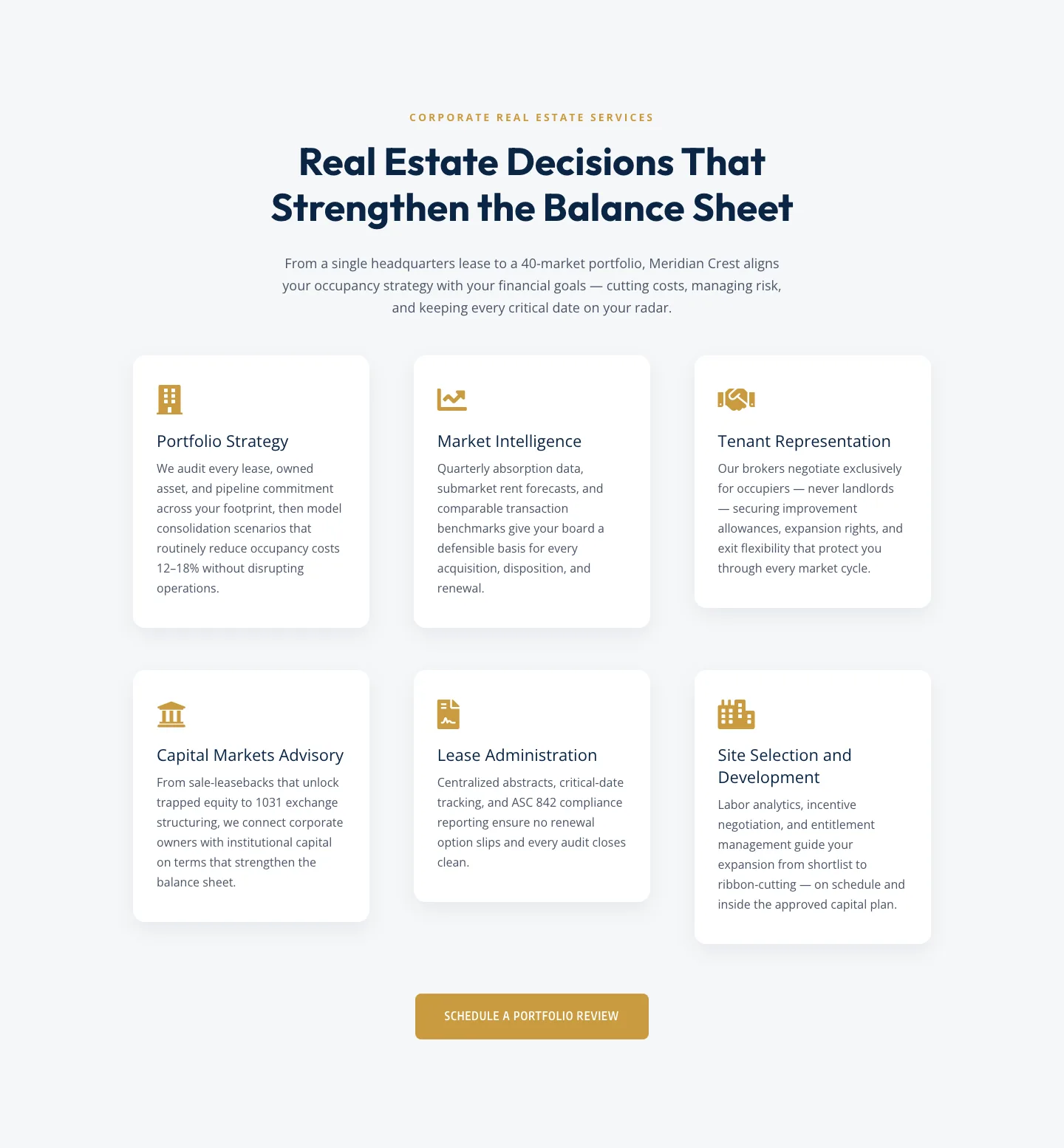
Corporate Real Estate Features Section: Six-Pillar Service Grid for Divi 5
features · real_estate · corporate
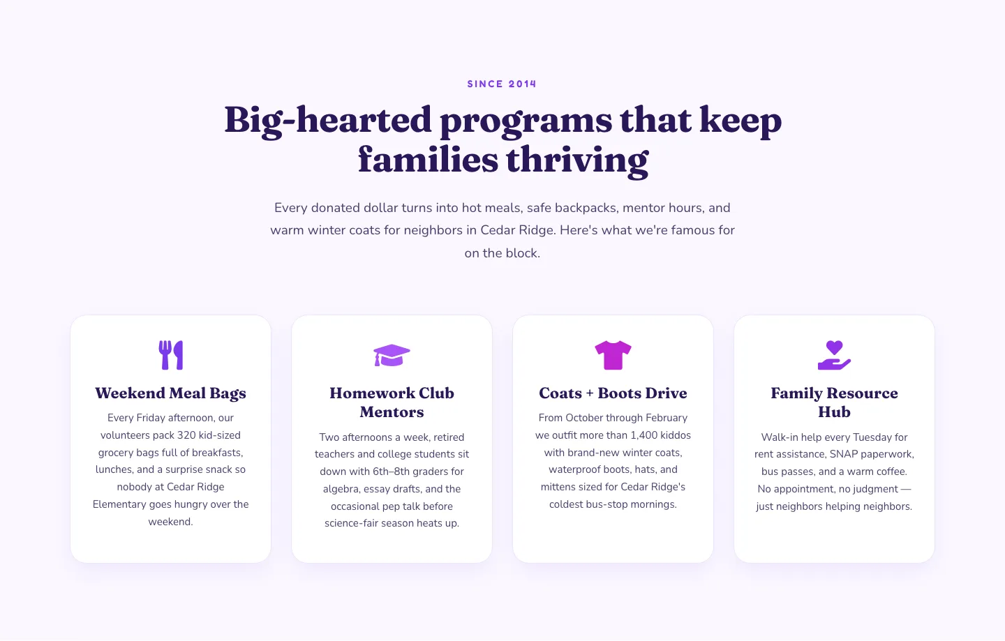
Playful Nonprofit Features Section: Four-Column Icon Cards for Divi 5
features · nonprofit · playful
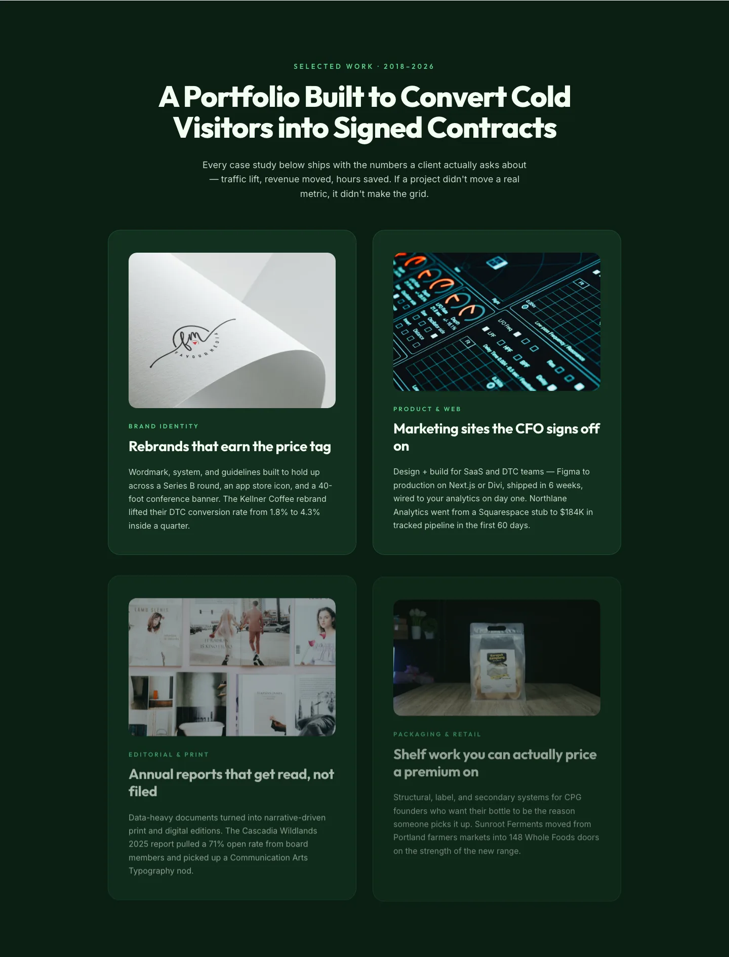
Bold Portfolio Features Grid: Divi 5 Case Study Layout
features · portfolio · bold
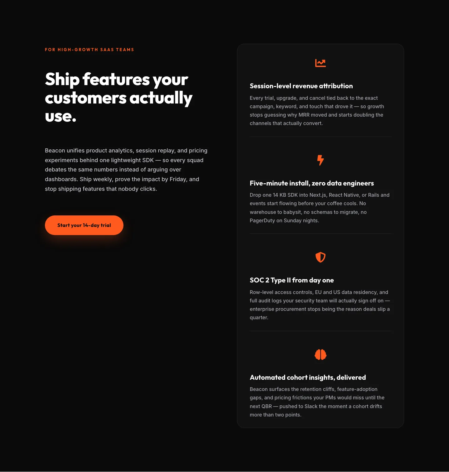
SaaS Features Section: Ship Features Customers Actually Use | Divi 5 Bold Layout
features · saas · bold
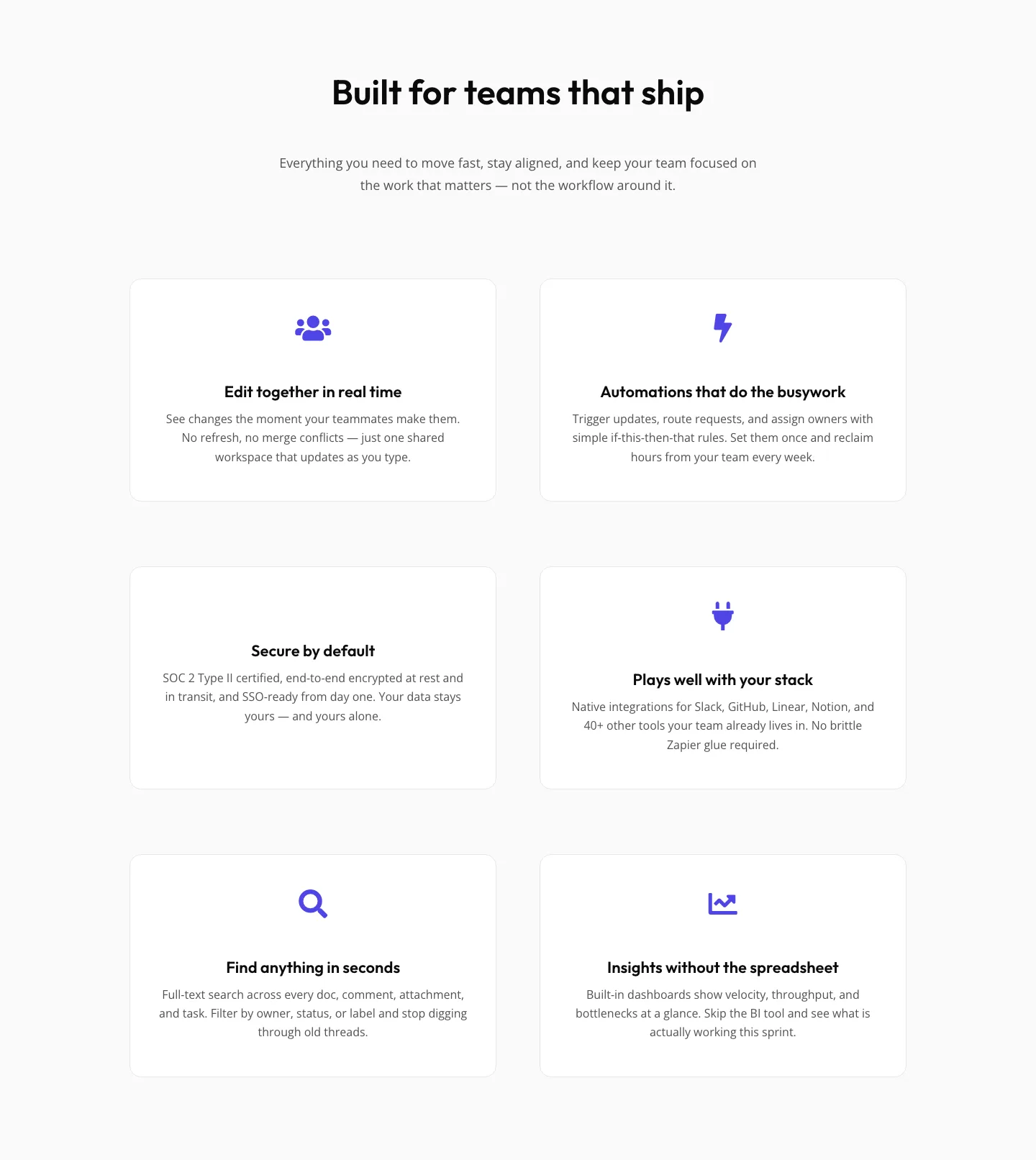
SaaS Features Section: Minimal Divi 5 Layout for Product Teams
features · saas · minimal
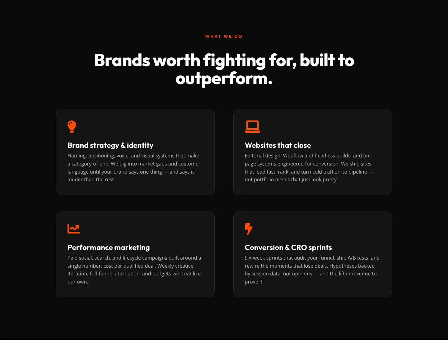
Bold Agency Features Section: Divi 5 Services Grid Layout
features · agency · bold