
SaaS Features Section: Minimal Divi 5 Layout for Product Teams
A clean, minimal Divi 5 features section for SaaS sites. Six icon cards covering collaboration, automation, security, integrations, search, and analytics.
Variations
Rate this element
Download this section, free
- Divi 5 JSON, imports in seconds
- Commercial license included
- No account needed
Click to view the full page
Overview
This features section leads with a centered eyebrow block: an H2 in Outfit 600 (48px desktop, dropping to 36px on tablet and 32px on phone) paired with an 18px supporting paragraph capped at a 680px max-width and centered with auto margins. The rhythm is deliberately calm: a soft #FAFAFA section background, 100px of top and bottom padding, and a slate-neutral body color (#525252) that lets the near-black headings (#0A0A0A) do the visual work. Nothing shouts, which is exactly what a SaaS features grid should do.
Below the intro sits a 3×2 grid built from three 1/2 + 1/2 Divi 5 rows, giving you six feature cards. Each card is its own column with a white background, a 1px #E5E7EB hairline border, a 16px corner radius, and 48px vertical / 40px horizontal padding. A card style that reads modern without feeling heavy. Inside every card, a 40px Font Awesome icon in indigo #4F46E5 (users, bolt, shield, plug, magnifying glass, chart) sits centered above a 22px H3 and a 16px body paragraph. All copy is center-aligned and the icon color is the section's only accent, which keeps six cards from turning into visual noise.
On tablet and phone, Divi 5's 1/2 columns collapse to full-width, so the grid restacks to a single column and the cards keep their generous 48/40 padding. Plenty of tap room and no cramped text. Heading sizes step down at each breakpoint via the built-in responsive font settings, so the hierarchy holds together on a 375px screen without any custom CSS.
What’s inside
- One Divi 5 section with a `#FAFAFA` background and 100px top/bottom padding: a real breathing-room container, not a squeezed strip
- Centered intro row: Outfit H2 (48/36/32px responsive) plus a max-width 680px paragraph in a neutral gray
- Three 1/2 + 1/2 rows composing a 3-column-wide × 2-row grid of six identical feature cards
- Every card uses white fill, a 1px `#E5E7EB` border, 16px rounded corners and 48px × 40px inner padding
- Six centered Font Awesome icons at 40px in indigo `#4F46E5`: users, bolt, shield, plug, search, and chart glyphs ready to swap
- Six 22px H3 titles + 16px body copy pre-written for SaaS features (collaboration, automation, security, integrations, search, analytics)
- Fully native Divi 5 modules only: section, row, column, heading, text, and icon. No third-party plugins or shortcodes
- Responsive typography baked in: heading sizes step down on tablet and phone via Divi 5's device settings
Who it’s for
This is aimed squarely at SaaS product pages: B2B tools, developer platforms, project-management apps, internal-comms products, and anywhere a founder needs to explain six benefits without a cluttered hero. The copy is already framed around team-productivity SaaS (collaboration, automations, SSO, integrations, search, dashboards), so it drops cleanly onto a homepage, a /features page, or a pricing page's supporting section. It also works well beyond pure SaaS: agencies pitching a productized service, fintech marketing sites, API companies, and internal design-system showcases can all use the same 6-tile grid by rewriting copy and swapping icons. Anywhere you'd normally reach for a Bento-style feature grid, this minimal card layout is a fair starting point.
Customization tips
Start with the indigo accent: the icon color #4F46E5 is the only chromatic decision in the section, so swapping it to your brand hue instantly rebrands all six cards at once. Keep body text under ~140 characters per card; the 22px H3 comfortably holds 3–5 words, and going longer breaks the grid's visual rhythm. If you want a darker mode, change the section background from #FAFAFA to a deep neutral, invert card fills to a near-black, and lift the border from #E5E7EB to something like #262626. Icons are Font Awesome 5 (solid weight), pick alternates from the same set to keep stroke weights consistent. To move from six features to four, delete the last row entirely; to go to eight, duplicate a row and edit the new pair. Card padding (48/40px) is where you can dial density up or down without touching typography.
How to install this layout
- Download the layout JSON file from this page.
- Open the target page in the Divi 5 builder.
- Open the portability panel (up/down arrows icon) and choose the Import tab.
- Upload the JSON. Tick “replace existing content” only for full-page imports.
- Check the page at desktop and mobile widths, then swap in your copy and images.
Full walkthrough with troubleshooting: How to Import a Divi 5 Layout.
Questions about SaaS Features Section: Minimal Divi 5 Layout for Product Teams
How many feature cards are included, and can I add or remove some?
You get six identical cards laid out across three 1/2 + 1/2 Divi 5 rows. To drop to four cards, delete the bottom row; to expand to eight, duplicate one of the rows and update the icon and copy in the two new cards.
How does the six-card grid behave on mobile?
Because it's built with Divi 5's native 1/2 columns, the grid collapses to a single stacked column on tablet and phone. Each card keeps its 48px vertical / 40px horizontal padding, so tap targets and readability stay comfortable at 375px.
Which Divi 5 modules does the layout actually use?
Only core Divi 5 modules: one Section, four Rows, thirteen Columns, one Heading, one intro Text module, and then six Icon + Text pairs inside the cards. No third-party plugins, shortcodes, or custom code.
Are the icons images, or something I can easily swap?
They're Font Awesome icons rendered by Divi 5's Icon module (users, bolt, shield, plug, magnifying glass, chart). Open any card's icon module and pick a new glyph from the same set to keep stroke weights consistent.
There are no images in this section, is that intentional?
Yes. This is a minimal, text-forward features grid where icons carry the visual weight instead of screenshots or photos. If you want product imagery, add an Image module inside a card above the icon or replace the icon entirely.
What should I edit first after importing?
Rewrite the H2 and intro paragraph to match your product, then work through the six cards top-to-bottom updating H3 titles and body copy. Finally, change the icon color `#4F46E5` to your brand accent to rebrand all six cards at once.
Which Divi version does this layout need?
Divi 5. The layout is generated natively for Divi 5 and validated against its real module structure before publication, so it imports clean into the current builder.
Can I use this layout on client websites?
Yes. Every download includes a commercial license covering unlimited sites you own or build for clients. Only reselling or redistributing the layout file itself is prohibited.
More feature grids
Browse all feature grids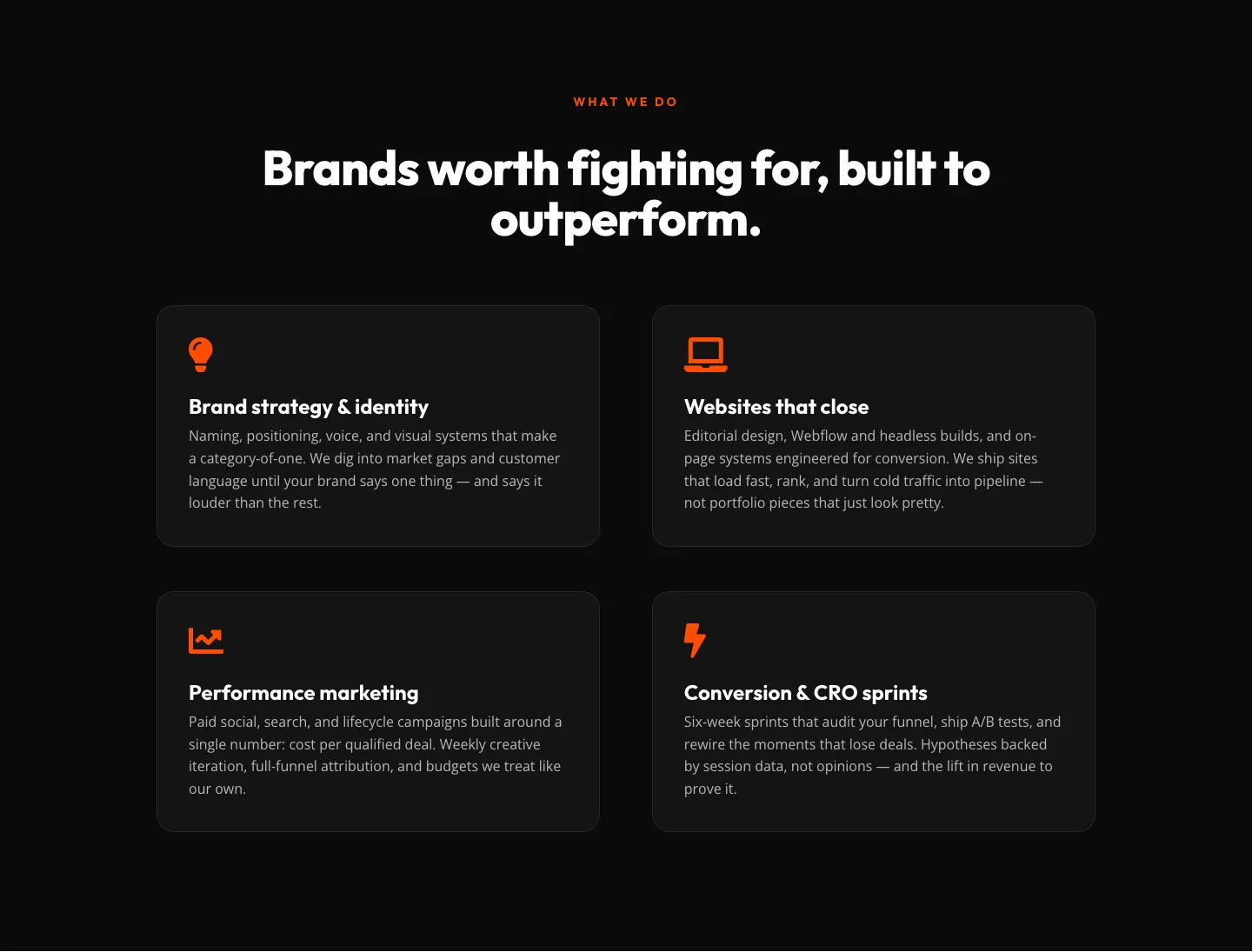
Bold Agency Features Section: Divi 5 Services Grid Layout
features · agency · bold
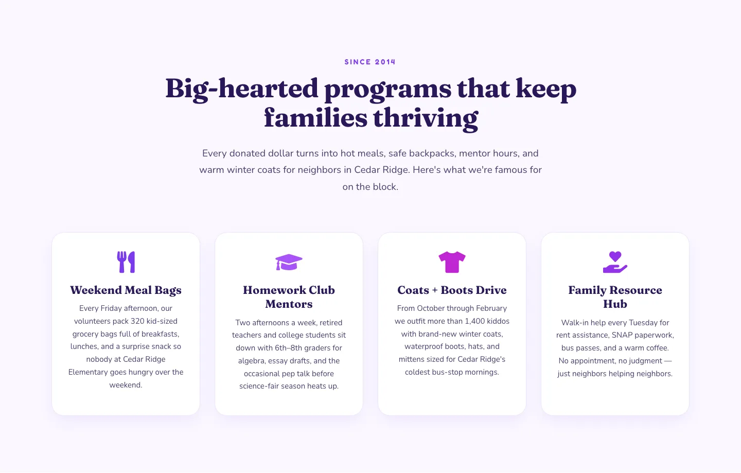
Playful Nonprofit Features Section: Four-Column Icon Cards for Divi 5
features · nonprofit · playful
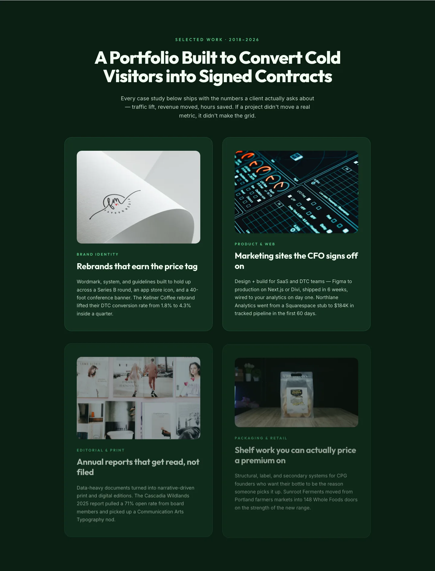
Bold Portfolio Features Grid: Divi 5 Case Study Layout
features · portfolio · bold
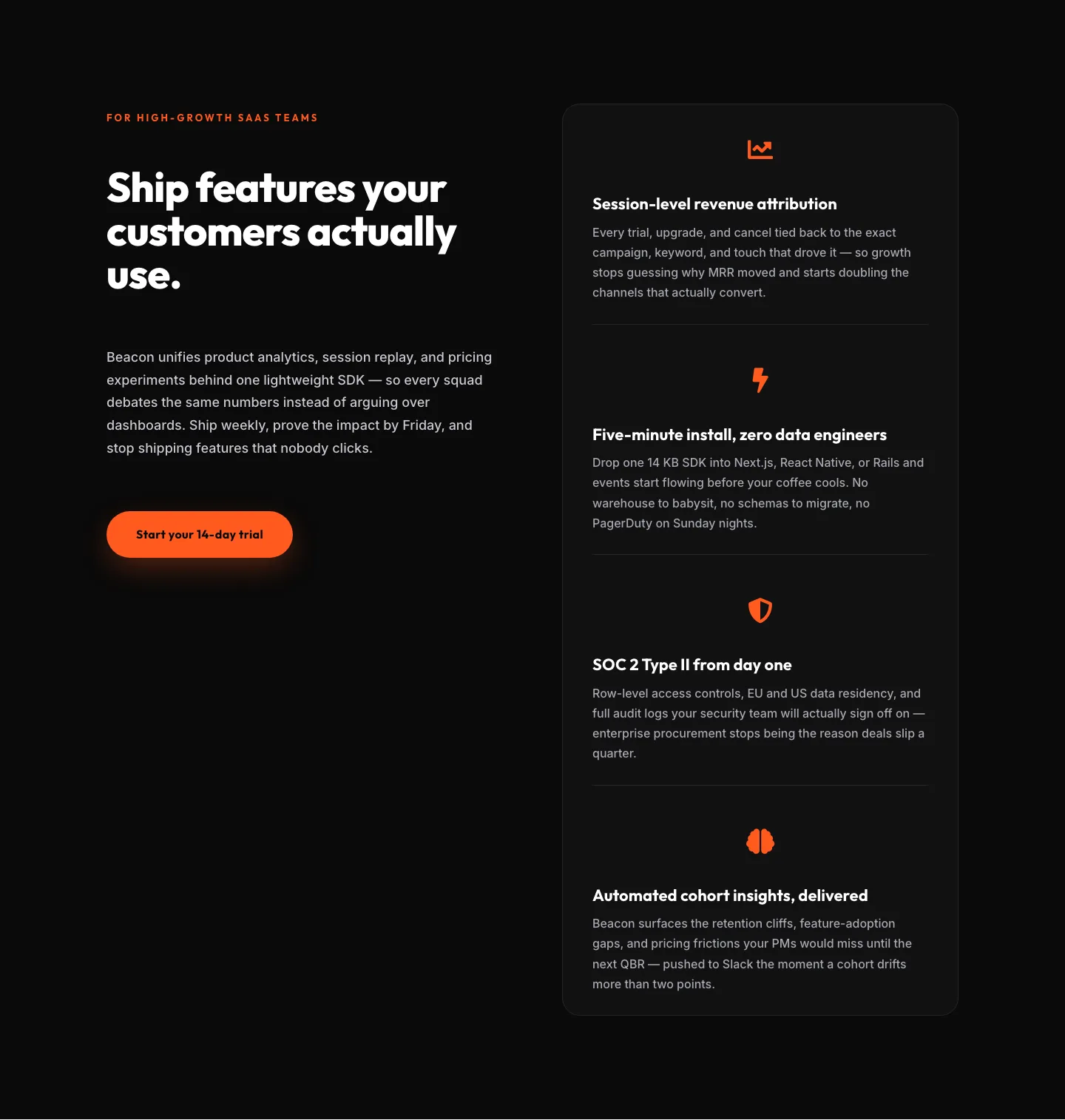
SaaS Features Section: Ship Features Customers Actually Use | Divi 5 Bold Layout
features · saas · bold
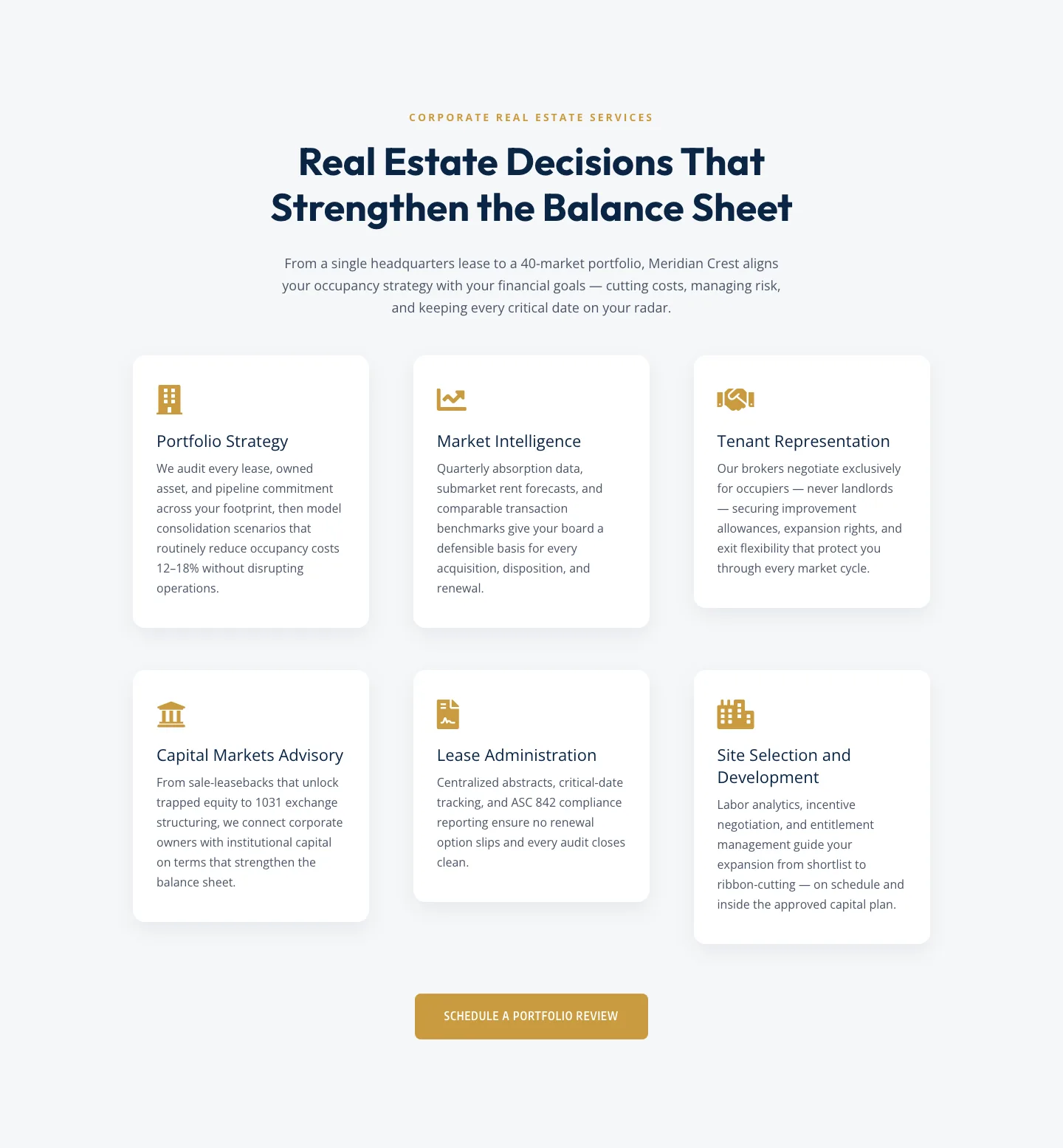
Corporate Real Estate Features Section: Six-Pillar Service Grid for Divi 5
features · real_estate · corporate
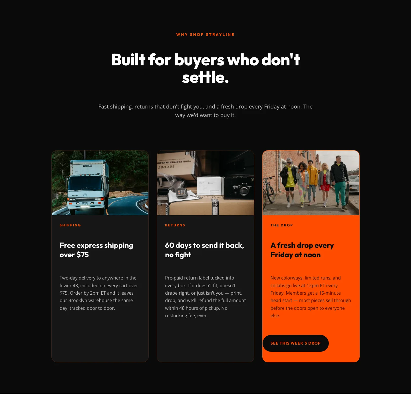
Bold Ecommerce Features Section: Free Shipping, Returns & Weekly Drops
features · ecommerce · bold