
Playful Agency Portfolio Gallery: Divi 5 Case Study Grid
Bright, playful Divi 5 gallery layout for creative agencies and branding studios: six project cards with tags, titles, and a rounded CTA on a cream backdrop.
Rate this element
Download this section, free
- Divi 5 JSON, imports in seconds
- Commercial license included
- No account needed
Click to view the full page
Overview
The section opens on a warm cream canvas (#fff8ee) with 120px of breathing room top and bottom, framing an intro row capped at 960px so the copy stays a comfortable read length. A coral eyebrow ("Selected Work 2019 (2026") in uppercase Outfit with 3px letter-spacing sits above an 800-weight, 64px headline in near-black, then a single paragraph of intro copy), a classic three-beat hierarchy that reads like a magazine opener rather than a landing page.
Below the intro sit two three-column rows (1_3 / 1_3 / 1_3) inside a 1240px flex container with 32px column and row gaps, so cards align to a shared baseline whether the last row is full or not. Each card is a white surface with 22px rounded corners, a soft 32px shadow that deepens on hover (12→22px vertical offset, 8%→16% opacity), and inner padding that lets the image sit edge-to-edge while the text block gets a comfortable 28px of side padding.
Every card follows the same rhythm: full-bleed image on top, a coral 12px uppercase category label ("Packaging · Identity"), a 24px Outfit project name, then a short 15px body line. That repetition is what makes six wildly different projects (cereal packaging, a popsicle museum, a summer camp poster series, a coffee bar, a record store) read as one coherent portfolio. The palette leans on coral accents against cream and white, with #1a1a1a headlines and #5a5a5a body copy for readable contrast without going grayscale.
On phone, both project rows flip to flexDirection: column so the cards stack full-width in source order, and the intro copy stays centered, no horizontal scroll, no cramped grid. The section closes with a single pill-shaped coral CTA button, centered in its own row with a matching coral drop shadow so it reads as the deliberate next step after browsing the grid.
What’s inside
- Intro row capped at 960px with a coral uppercase eyebrow, 64px 800-weight Outfit headline, and a supporting studio paragraph. All centered
- Six-card project grid arranged as two 1_3 / 1_3 / 1_3 rows inside a 1240px flex container with 32px column and row gaps
- White project cards with 22px border radius and a soft drop shadow that lifts on hover (12→22px vertical, blur 32→48px)
- Consistent card rhythm: full-bleed Image module → coral 12px category eyebrow → 24px project heading → short description Text module
- Pill-shaped CTA button (999px radius) in coral with a matching coral-tinted shadow, centered in its own trailing row
- Outfit typeface throughout, paired with a coral (#ff5a5f) / cream (#fff8ee) / near-black (#1a1a1a) / warm-gray (#5a5a5a) palette
- Phone breakpoint flips both grids to a single-column stack so cards go full-width in source order
Who it’s for
Independent branding studios, design agencies, illustration collectives, and freelance creatives with three to nine named projects worth showing. The playful tone (warm cream, hot coral, rounded corners, hover lift) lands best in categories that already welcome personality: food and beverage packaging, kids and family brands, hospitality (coffee bars, restaurants, pop-ups), music and culture, illustration, and small e-commerce. Studios with a more corporate B2B client list can still use the structure (it's genuinely just a photo grid with categories) but will want to cool the palette down. Works equally as a homepage "selected work" teaser (with the button linking out to a full portfolio) or as the portfolio index page itself.
Customization tips
Palette swap: the coral #ff5a5f appears in the eyebrow labels, card category tags, button background, and button shadow. Recolor it once via Divi's global colors and the whole section shifts. The cream section background #fff8ee is separate; adjust it to match. Image ratio: each source photo is 940×650 (~1.45:1 landscape). Keep new images near that ratio or the card heights start diverging. Copy length: project names hold up to ~28 characters before wrapping to two lines at 24px; descriptions read best at 25–40 words. Category labels are two short words joined by a middle dot ("Packaging · Identity"), anything past 24 characters breaks the eyebrow rhythm. To add or remove projects, duplicate a column inside either row. The row uses flexWrap so a seventh card drops cleanly to a new visual line and the 32px gaps still apply. Update the CTA link and text but keep the 999px pill radius and coral shadow so it still reads as the intended punctuation mark.
How to install this layout
- Download the layout JSON file from this page.
- Open the target page in the Divi 5 builder.
- Open the portability panel (up/down arrows icon) and choose the Import tab.
- Upload the JSON. Tick “replace existing content” only for full-page imports.
- Check the page at desktop and mobile widths, then swap in your copy and images.
Full walkthrough with troubleshooting: How to Import a Divi 5 Layout.
Questions about Playful Agency Portfolio Gallery: Divi 5 Case Study Grid
How does the six-card grid behave on mobile?
Both project rows switch to flexDirection: column at the phone breakpoint, so cards stack full-width in source order. The 32px row gap becomes the vertical spacing between stacked cards, and the intro copy stays centered.
Which Divi 5 modules make up each project card?
Each card is a single column containing an Image module, a Text module for the coral category eyebrow, a Heading module for the project name, and a second Text module for the description. No Blurb module, no custom code: the styling is all column-level (background, radius, shadow, padding).
What image ratio should I use for project photos?
The layout ships with 940×650 Pexels photos, roughly a 1.45:1 landscape. Sticking close to that ratio keeps the card heights aligned across the row; portrait crops or square images will create uneven columns because the text block sits under a shorter/taller image.
Can I run more than six projects in this section?
Yes. Duplicate a column inside either row: the row is a flex container with wrap enabled, so a seventh or eighth card drops onto a new visual line and the 32px column/row gaps still apply. For very long portfolios, add a third project row rather than a single very tall row.
What's the first thing I should edit after installing the layout?
The intro block. The heading ("Bright ideas, bolder brands.") and paragraph are written for a fictional Lisbon studio called Peppermint & Co. You'll want your own studio name, city, and one-line positioning. After that, swap the six project images, the category eyebrows, project names, and blurbs one card at a time.
Where does the CTA button link, and should I keep it?
It points to peppermintco.com/work as a placeholder. Repoint it to your own case-studies index page, or delete the last row entirely if this section already IS your portfolio index and there's nothing further to browse.
Which Divi version does this layout need?
Divi 5. The layout is generated natively for Divi 5 and validated against its real module structure before publication, so it imports clean into the current builder.
Can I use this layout on client websites?
Yes. Every download includes a commercial license covering unlimited sites you own or build for clients. Only reselling or redistributing the layout file itself is prohibited.
More galleries
Browse all galleries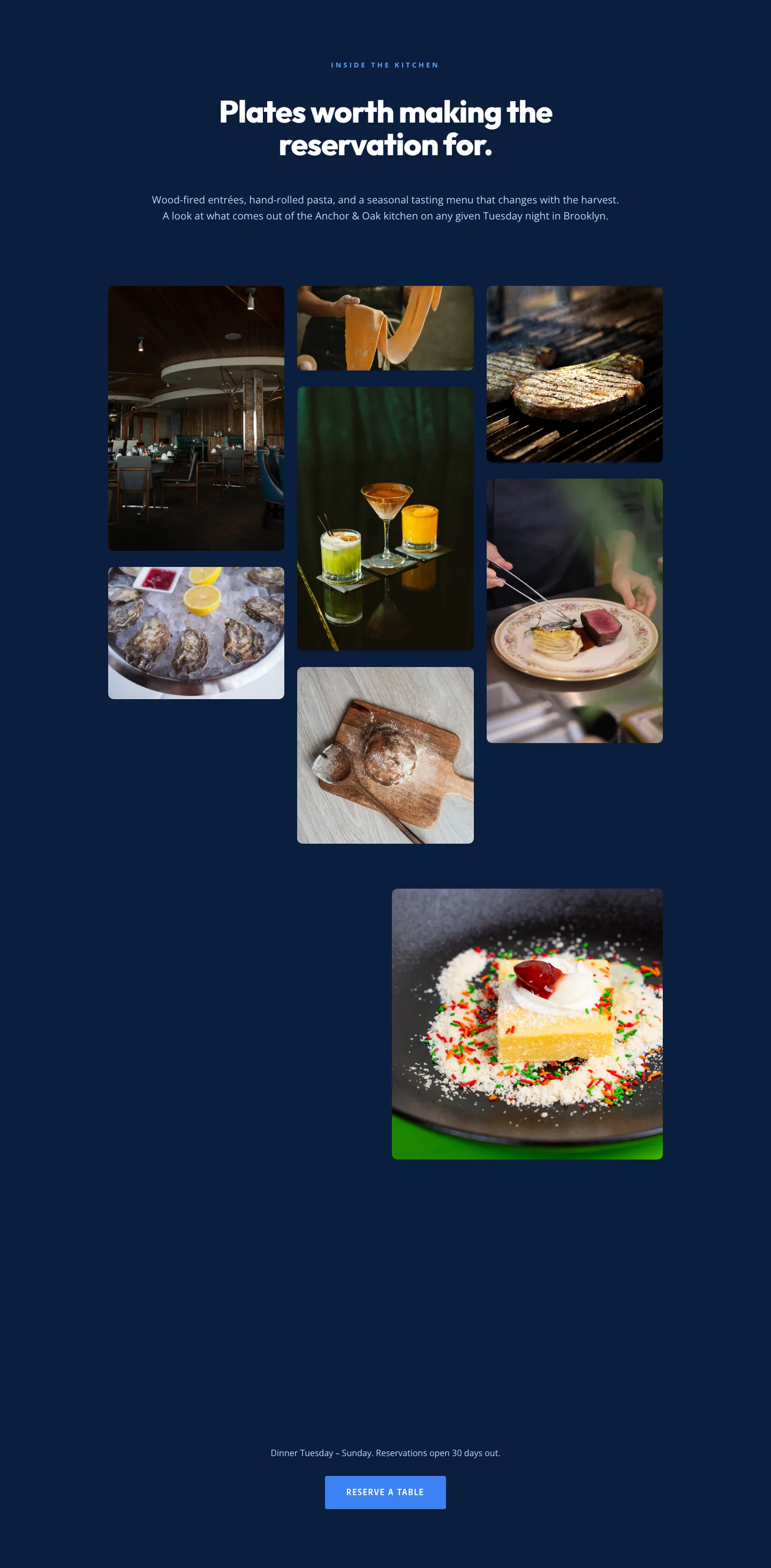
Restaurant Gallery: Bold Blue (Anchor & Oak) | Divi 5 Layout
gallery · restaurant · bold
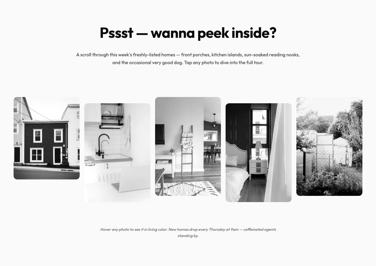
Playful Real Estate Listings Gallery: Divi 5 Layout
gallery · real_estate · playful
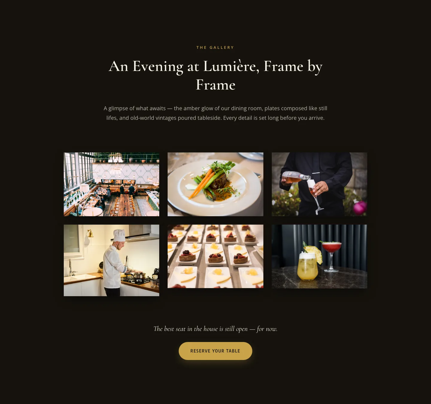
Elegant Restaurant Gallery Divi 5 Layout: Dark & Gold Photo Grid
gallery · restaurant · elegant
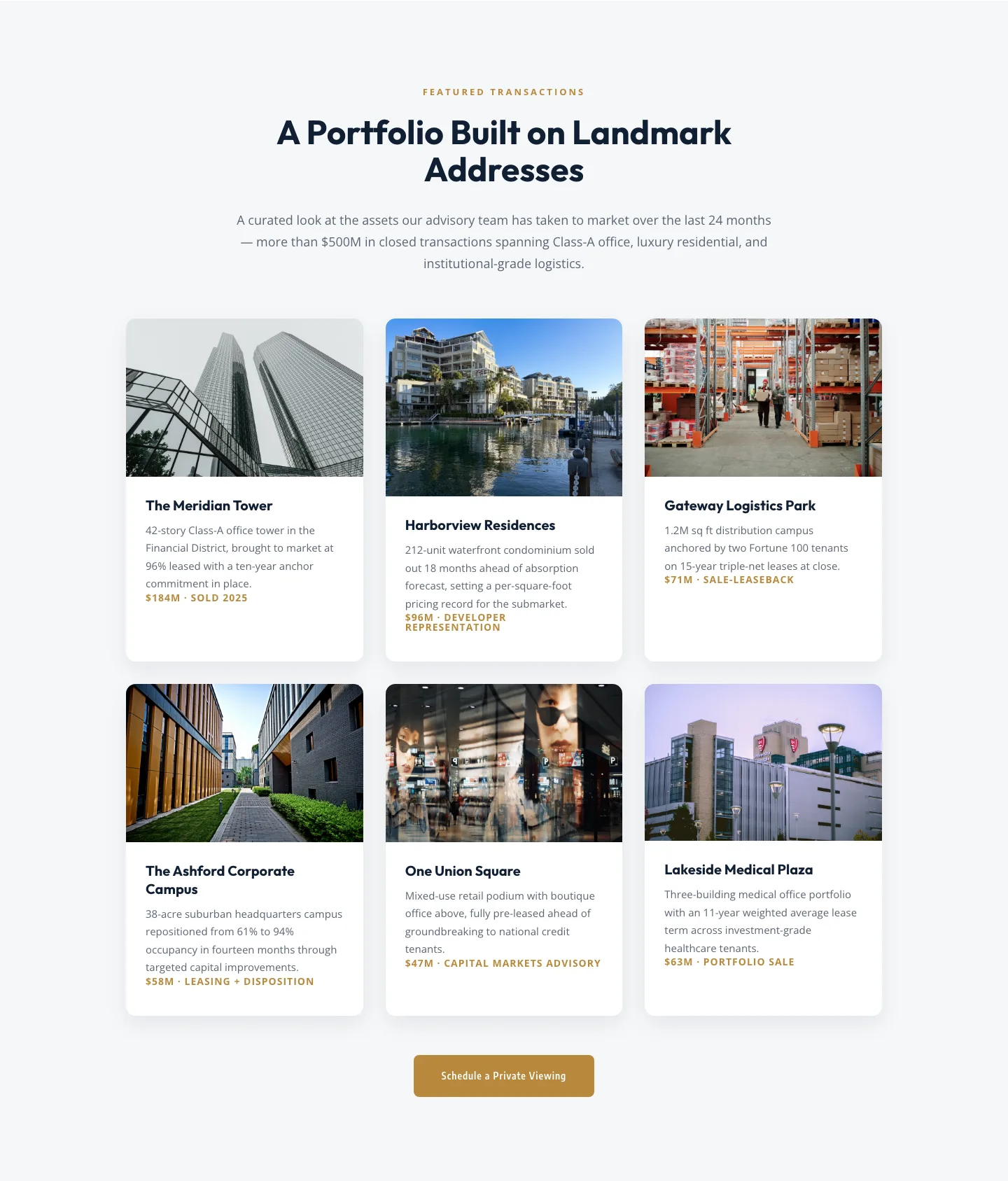
Corporate Real Estate Featured Listings Gallery: Divi 5 Layout
gallery · real_estate · corporate
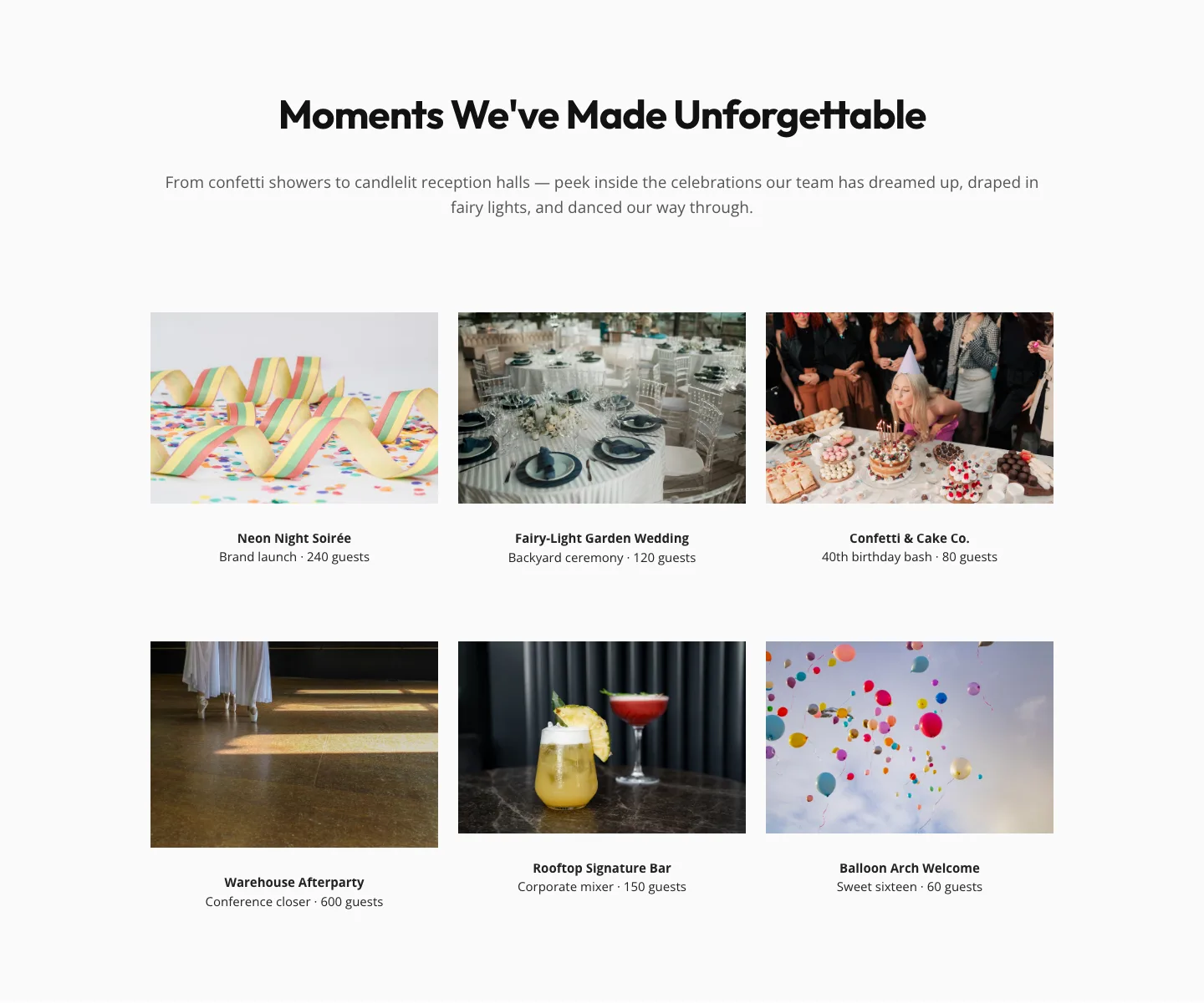
Playful Events Gallery Layout for Divi 5: Free Download
gallery · events · playful
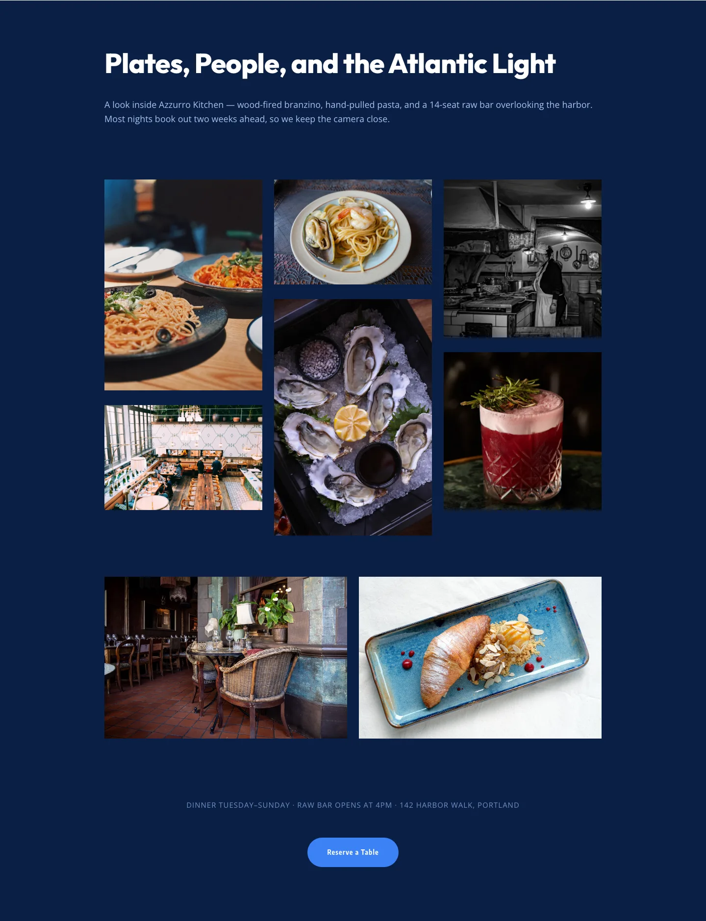
Bold Restaurant Gallery Layout for Divi 5: Coastal Dining Showcase
gallery · restaurant · bold