
Playful Agency Portfolio Gallery: Free Divi 5 Layout
Free Divi 5 gallery layout for playful creative agencies. Showcase 6 case studies in a bold, card-style grid with bright accents, rounded corners, and snort-laugh copy.
Rate this element
Download this section, free
- Divi 5 JSON, imports in seconds
- Commercial license included
- No account needed
Click to view the full page
Overview
This gallery section leads with a centered pink-tinged canvas (#fff5f5) and 100px of vertical breathing room, so the work sits calmly on the page instead of shouting over neighboring sections. The intro pair (a chunky 54px Outfit headline in #d62828 ("The Work That Made Us Snort-Laugh") and a single 18px supporting paragraph in a deeper red-brown) does the tone-setting in one column so the eye lands squarely before it fans out across the grid.
Below the intro sits a 2x3 case-study grid: two rows of three equal (1_3, 1_3, 1_3) columns with a 30px column gap and a 30px row gap. Each card is a white block with a 16px border radius and a soft red drop shadow (rgba(214,40,40,0.15) at 30px blur), so the cards feel like they're floating on the blush background instead of being cut into it. Inside each card, a rounded 10px image sits above a 24px project title and a 15px description. The hierarchy stays consistent so the buyer's eye can compare projects at a glance rather than re-reading every card.
On phone widths, both rows flip to flexDirection: column, so the six cards restack into a single scrollable ribbon while keeping the same padding, radius, and shadow. Nothing shrinks awkwardly; the grid just becomes a stack. The palette leans into one warm red family (#d62828 for headings and shadows, #7a1f1f and #4a1414 for body copy, white cards on blush) which is what gives the section its playful, hand-made agency energy without needing decorative graphics.
What’s inside
- One-column intro row with a 54px Outfit headline and supporting paragraph, both center-aligned
- 2x3 case-study grid built from two `1_3, 1_3, 1_3` rows with matching 30px column and row gaps
- Six identical project cards: rounded image, 24px title, 15px description. No icon or button clutter
- White cards on a blush `#fff5f5` section background, tied together by a soft red drop shadow
- 16px card radius plus 10px image radius, so the whole grid reads soft and friendly without feeling toy-like
- Fully mobile-stacked: both rows use `flexDirection: column` on phone, keeping every card full-width
- Native Divi 5 modules only (Section, Row, Column, Heading, Text, Image) no third-party plugins required
- Real placeholder copy written like agency case studies (results, numbers, personality), not lorem ipsum
Who it’s for
Built for creative and branding agencies that need a recent-work grid without going full portfolio-page. It also slots comfortably onto studio sites, freelance designer landing pages, illustration and packaging portfolios, motion or podcast production shops, and any small team that wants their case studies to feel handmade and warm instead of corporate. Because the layout uses a neutral 2x3 project structure, it's equally at home on a home page's "selected work" section, on an about page under a founder bio, or as the opening block of a dedicated /work page. The playful tone comes entirely from copy and palette: swap the red family for a calmer neutral and the same grid also fits interior design, catering, or wedding planners.
Customization tips
The whole warm-red mood is driven by three hex values: #d62828 (headline, card titles, shadow tint), #7a1f1f (intro body), and #4a1414 (card body). Change those three and the section reads completely differently: try teal on cream, or navy on soft grey, before touching anything else. Card images should ship at roughly a 3:2 landscape aspect ratio (the placeholders are 940x650) so the row of three lines up cleanly; anything much taller will make the grid rows uneven. Project titles work best at three to five words, long titles wrap into two lines and break the visual rhythm across cards. Descriptions want to stay around 30-45 words each so all six cards land at similar heights. If you only have four projects, delete one card from each row rather than one whole row. The section is designed around that balanced two-row silhouette. To add a seventh, start a new 1_3, 1_3, 1_3 row and duplicate an existing column module.
How to install this layout
- Download the layout JSON file from this page.
- Open the target page in the Divi 5 builder.
- Open the portability panel (up/down arrows icon) and choose the Import tab.
- Upload the JSON. Tick “replace existing content” only for full-page imports.
- Check the page at desktop and mobile widths, then swap in your copy and images.
Full walkthrough with troubleshooting: How to Import a Divi 5 Layout.
Questions about Playful Agency Portfolio Gallery: Free Divi 5 Layout
How does the six-card grid behave on mobile?
Both rows are set to `flexDirection: column` at the phone breakpoint, so the grid restacks into a single column of six cards. Card radius, padding, image radius, and shadow all carry over unchanged. Nothing has to be re-styled for small screens.
Which Divi 5 modules is this section actually built from?
Only the core primitives: Section, Row, Column, Heading, Text, and Image. There is no Blurb, Gallery, or third-party module in the layout, so it imports cleanly on any Divi 5 site without extra plugins.
What should I edit first after importing?
Start with the six card images and the six project titles, those carry most of the visual identity. Then rewrite the six description paragraphs to match your real results, and last, retune the three red hex values (`#d62828`, `#7a1f1f`, `#4a1414`) if the warm palette doesn't fit your brand.
Can I swap the 2x3 grid for a 3x2 or a single row of three?
Yes. Each row is an independent `1_3, 1_3, 1_3` structure, so you can delete the second row for a compact three-card version, or duplicate a row for a nine-card portfolio. Keep the 30px column and row gaps consistent so the rhythm stays intact.
Do I have to use Pexels images, or bring my own?
The placeholders point at Pexels URLs so the section renders instantly after import, but you should absolutely replace them with your own case-study photography or mockups. Target roughly 940x650 (a 3:2 landscape crop) so the three cards in each row stay perfectly aligned.
Is the playful red palette locked in, or preset-swappable?
It's fully open, no global presets are enforced by the layout. The mood lives in three hex values on the headings, body text, and shadow color. Change those and the section quietly shifts from playful agency red to any other palette without touching structure or spacing.
Which Divi version does this layout need?
Divi 5. The layout is generated natively for Divi 5 and validated against its real module structure before publication, so it imports clean into the current builder.
Can I use this layout on client websites?
Yes. Every download includes a commercial license covering unlimited sites you own or build for clients. Only reselling or redistributing the layout file itself is prohibited.
More galleries
Browse all galleries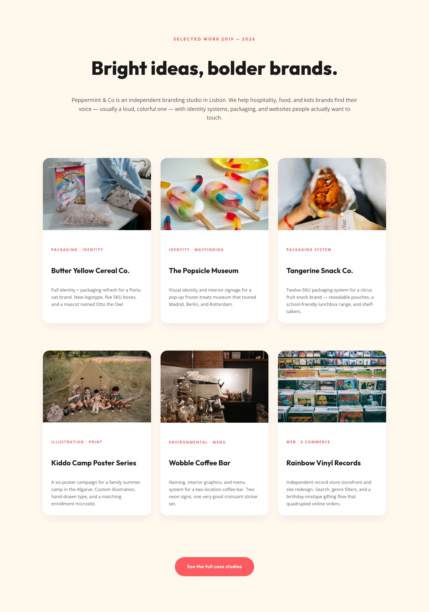
Playful Agency Portfolio Gallery: Divi 5 Case Study Grid
gallery · agency · playful
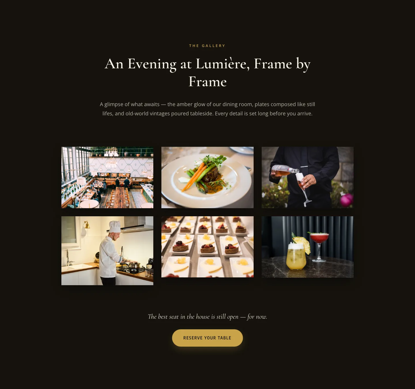
Elegant Restaurant Gallery Divi 5 Layout: Dark & Gold Photo Grid
gallery · restaurant · elegant
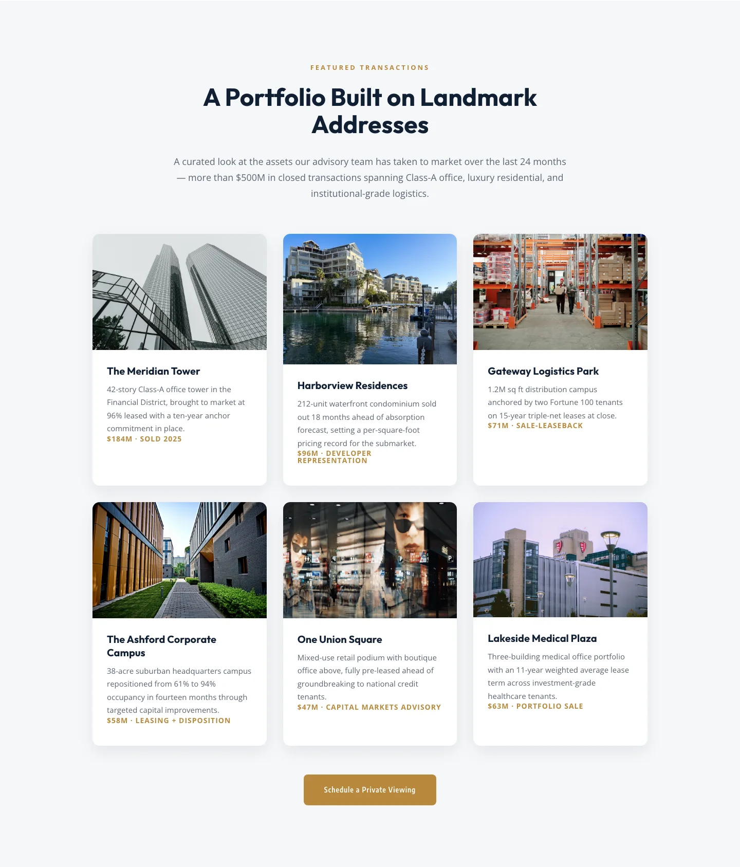
Corporate Real Estate Featured Listings Gallery: Divi 5 Layout
gallery · real_estate · corporate
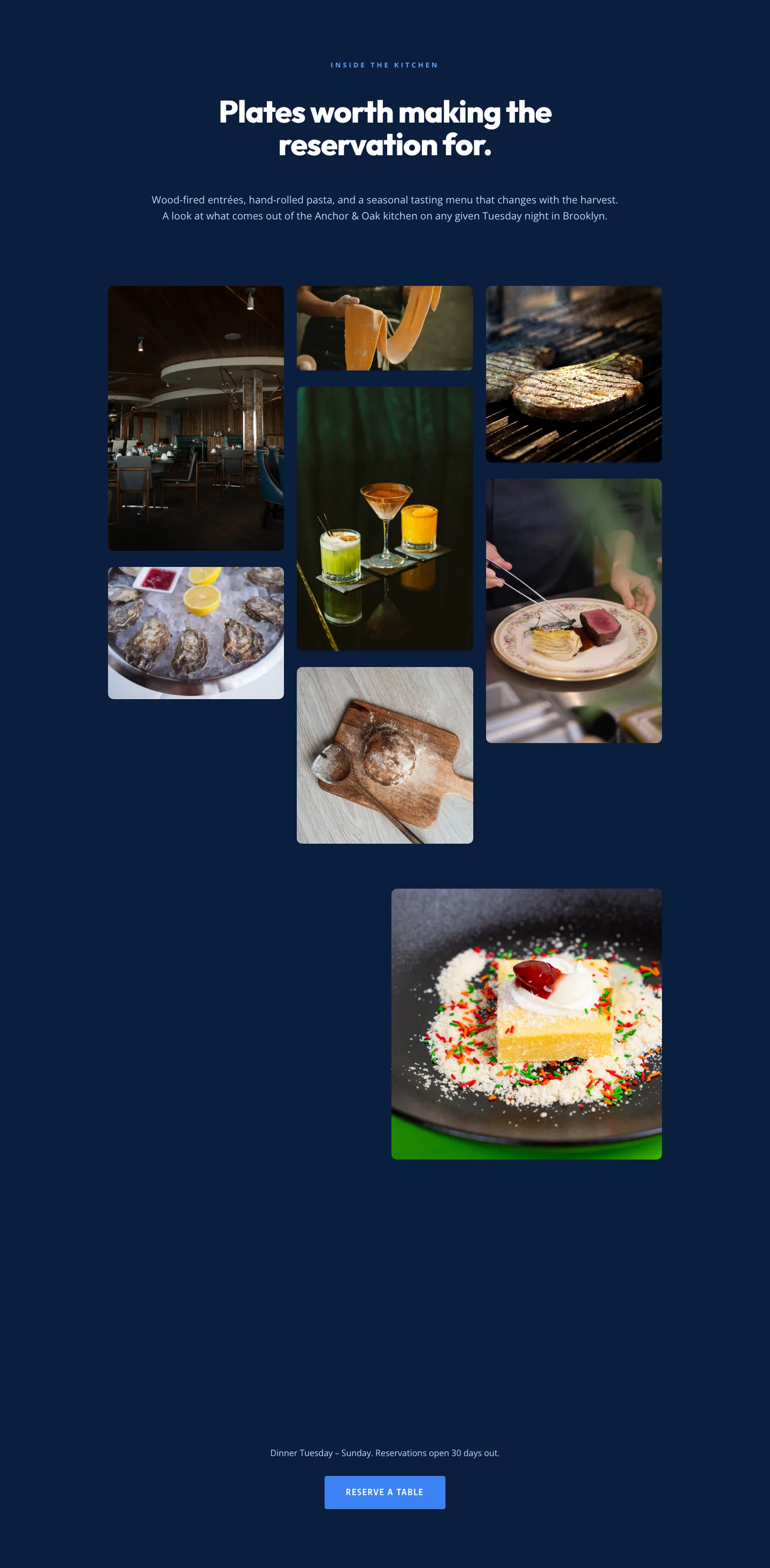
Restaurant Gallery: Bold Blue (Anchor & Oak) | Divi 5 Layout
gallery · restaurant · bold
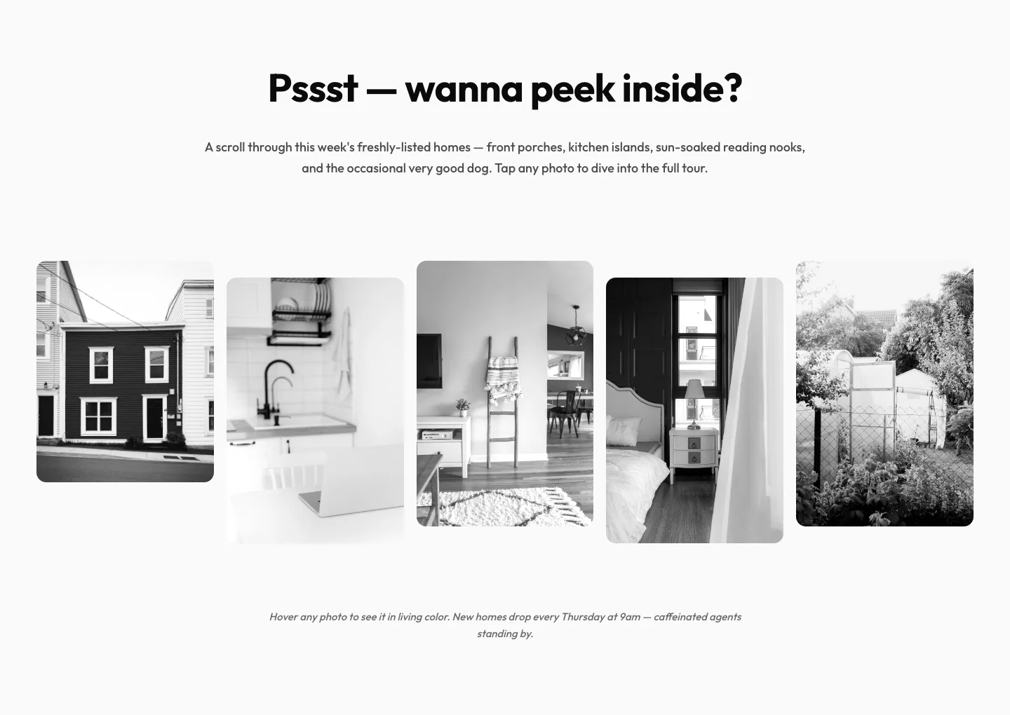
Playful Real Estate Listings Gallery: Divi 5 Layout
gallery · real_estate · playful
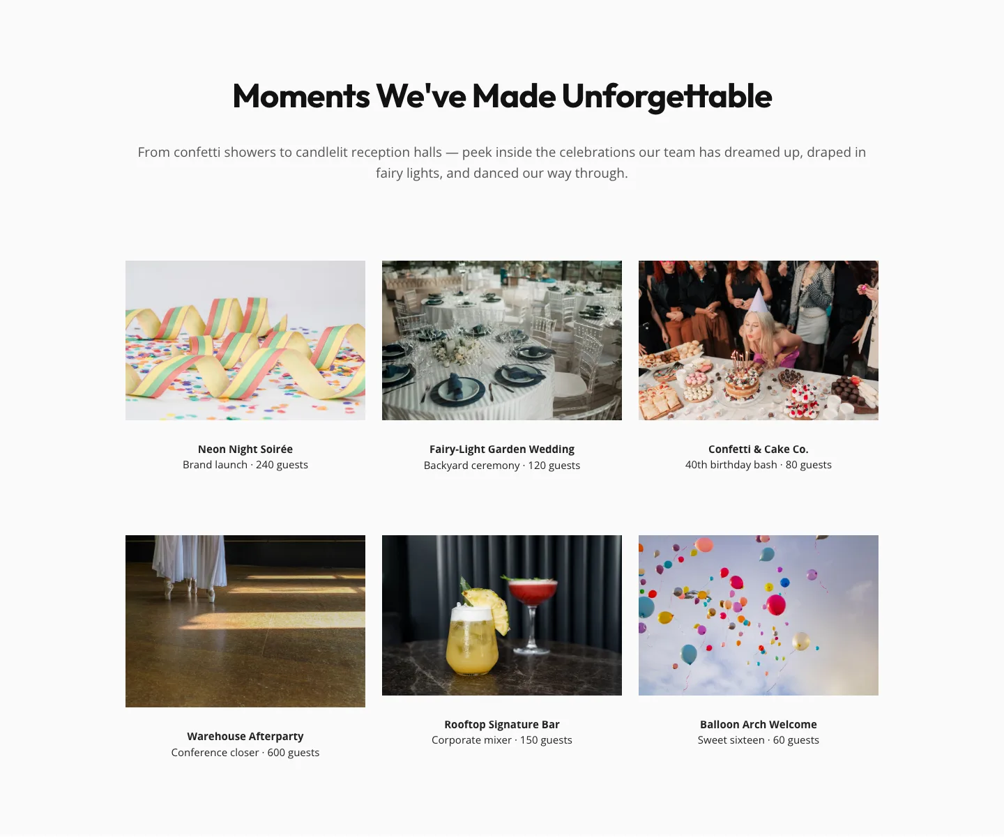
Playful Events Gallery Layout for Divi 5: Free Download
gallery · events · playful