
Playful Events Features Section: Alternating Rows Divi 5 Layout
Playful, pastel-toned Divi 5 features section for event planners. Alternating image/text rows highlight signature sets, coordination, and guest experience.
Rate this element
Download this section, free
- Divi 5 JSON, imports in seconds
- Commercial license included
- No account needed
Click to view the full page
Overview
This features section leans into an editorial rhythm: an intro block (max-width 820px, centered) sits above three alternating image-and-text rows that swap sides as you scroll, image left, image right, image left. A soft blush background (#fff5f7) with 120px vertical padding on desktop (90px tablet, 72px phone) gives the whole block room to breathe, while an eyebrow-first hierarchy anchors each row: a small uppercase Outfit label at 13px with 3px letter-spacing, a Fraunces serif heading at 38px (30/26 on smaller viewports), a 17px body paragraph at 1.7 line-height, then a rounded pill button.
Color is doing the heavy lifting. Each row is keyed to one of three accents (pink #ff6b9d, plum #7d5ba6, teal #3fa89b) that appear in the eyebrow, the button fill, and the tinted drop shadow behind the paired image. That triad turns three parallel features into three distinct 'chapters' without adding decorative clutter. Text stays consistent: #2a1f3d for headings, #5a4a6a for body, so the accents pop.
The intro headline runs at 52px in Fraunces (Fraunces 600 with -0.5px tracking), a proper serif display voice paired with Outfit for anything utilitarian. Images sit inside 32px rounded corners with an oversized preset3 shadow (60px blur, colored at ~22% alpha) that visually connects each visual to its row accent. Rows use flexbox with a 64px column gap and 48px row gap, and on phone the row flexDirection flips to column so the image always stacks above its copy. No zig-zag confusion on small screens.
What’s inside
- Intro row with uppercase eyebrow, 52px Fraunces H2, and centered supporting paragraph inside a 820px max-width container
- Three alternating 1/2 + 1/2 rows (image left → image right → image left) built on native Divi 5 rows with 64px column gap
- Six accent-tinted rounded images (32px radius) with color-matched preset3 box shadows keyed to each row's palette
- Per-row eyebrow labels (Outfit 700, 13px, 3px letter-spacing, uppercase) numbered 01 / 02 / 03 for quick scanning
- Three pill-shaped CTA buttons (999px radius) with matching hover-lifting shadows in pink, plum, and teal
- Fraunces serif headings paired with Outfit body copy: H2 52/40/32px, H3 38/30/26px across breakpoints
- Responsive stacking: rows collapse to a single phone-column so images always land above their text
- Blush `#fff5f7` section background with 120 / 90 / 72px vertical padding across desktop, tablet, and phone
Who it’s for
Built for celebration and event brands that want personality without looking amateur: private event planners, wedding coordinators, kids' and milestone-party specialists, brand-activation and pop-up producers, catering companies, balloon-and-backdrop stylists, DJ services, and small venues. The playful palette and confetti-forward copy also translate cleanly to florists, cake studios, photo-booth rentals, and coworking spaces that host member events. Anywhere you'd normally list three complementary services (themed décor, day-of coordination, guest experience) the alternating rhythm gives each pillar its own visual chapter. It's less appropriate for very corporate B2B or luxury minimal brands; the pink/plum/teal triad and rounded shapes are unmistakably fun.
Customization tips
Swap the palette at the section level first: recolor the eyebrow, button background, and image boxShadow per row (each row uses a matching accent). Keep the tinted shadow alpha near 0.22 for the image and 0.35 for the button. That's what makes the accents feel intentional rather than loud. Copy limits: headings read best under 42 characters (they wrap at H3 38px); body paragraphs cap at ~55 words before the image starts to look short next to the text column. Eyebrow labels should stay under 24 characters so the 3px letter-spacing doesn't force a wrap. Images target roughly 940×650 (a 1.45:1 landscape ratio) at 32px corner radius, anything closer to square starts to feel unbalanced against the copy column. To add a fourth row, duplicate the last one, swap image + column order (image right this time), and introduce a new accent, or reuse one of the three for a wrap-around feel.
How to install this layout
- Download the layout JSON file from this page.
- Open the target page in the Divi 5 builder.
- Open the portability panel (up/down arrows icon) and choose the Import tab.
- Upload the JSON. Tick “replace existing content” only for full-page imports.
- Check the page at desktop and mobile widths, then swap in your copy and images.
Full walkthrough with troubleshooting: How to Import a Divi 5 Layout.
Questions about Playful Events Features Section: Alternating Rows Divi 5 Layout
Does the alternating layout still make sense on mobile?
Yes: on phone widths each row's `flexDirection` flips to `column`, so the image always sits above its text. You never end up with copy stranded above an image, which is the usual failure mode of alternating row designs.
Which Divi 5 modules is this actually built from?
Only native ones: Section, Row, Column, Text (for eyebrows and body), Heading, Image, and Button. No third-party module, no custom CSS block. Every style is set through Divi 5's design controls.
Can I add a fourth feature row without breaking the rhythm?
Yes. Duplicate row 3, then flip the column order (image right, text left) and assign a new accent color to the eyebrow, button, and image shadow. Keep the 56px vertical padding and 64px column gap so the cadence stays consistent.
What should I edit first after importing?
Replace the three Pexels images with your own event photography at roughly 940×650, then rewrite the eyebrows (01 / 02 / 03 labels), H3 headings, and paragraph copy. The accent colors and rounded shapes will carry the design even before you touch typography.
How opinionated are the fonts?
Fairly, Fraunces (serif display) and Outfit (sans) are the whole voice. If you swap them, keep the same pairing shape: a soft, slightly quirky serif for headings and a geometric humanist sans for eyebrows, body, and buttons. Otherwise the playful tone flattens out.
Can I use this as a full page instead of a section?
It's designed as a section, one intro block plus three feature rows. Stack it under a hero and above testimonials or a CTA and it slots straight into a landing page without any layout gymnastics.
Which Divi version does this layout need?
Divi 5. The layout is generated natively for Divi 5 and validated against its real module structure before publication, so it imports clean into the current builder.
Can I use this layout on client websites?
Yes. Every download includes a commercial license covering unlimited sites you own or build for clients. Only reselling or redistributing the layout file itself is prohibited.
More feature grids
Browse all feature grids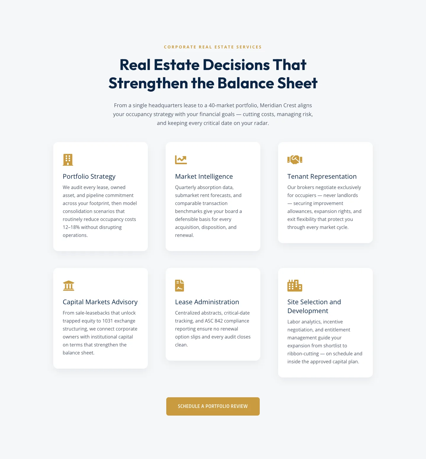
Corporate Real Estate Features Section: Six-Pillar Service Grid for Divi 5
features · real_estate · corporate
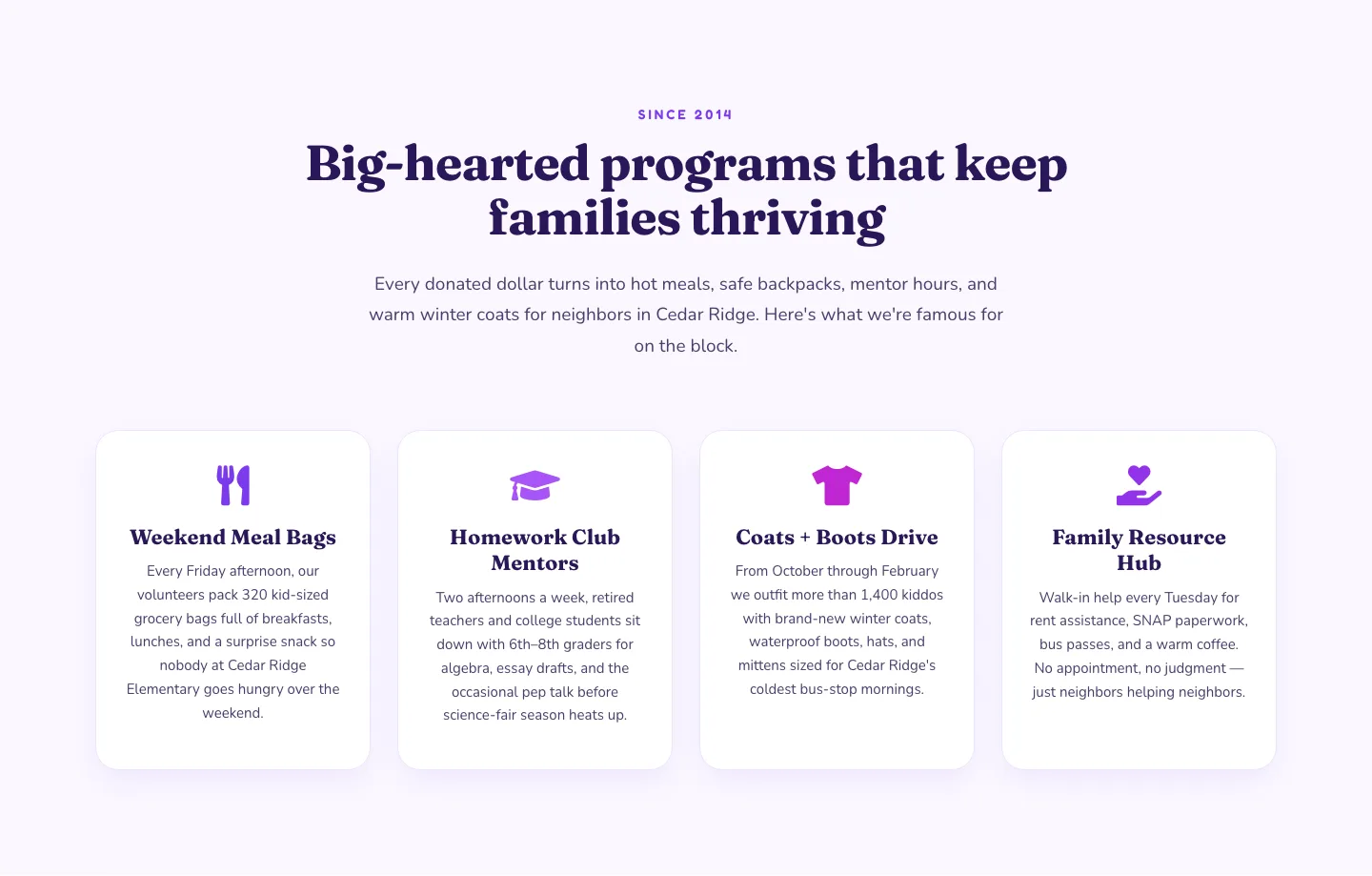
Playful Nonprofit Features Section: Four-Column Icon Cards for Divi 5
features · nonprofit · playful
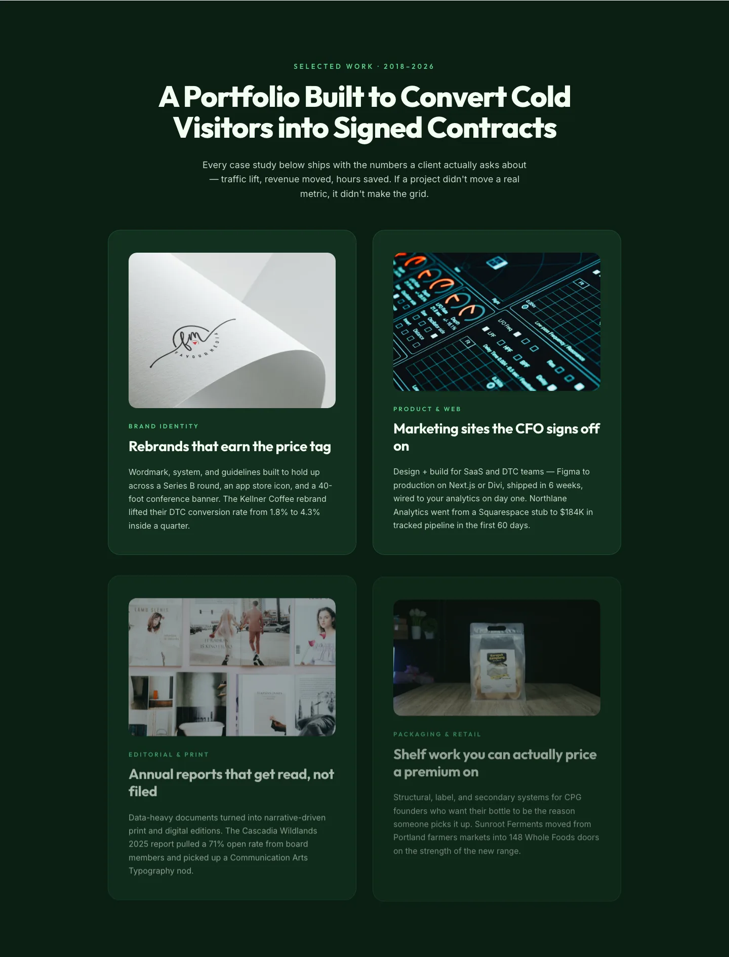
Bold Portfolio Features Grid: Divi 5 Case Study Layout
features · portfolio · bold
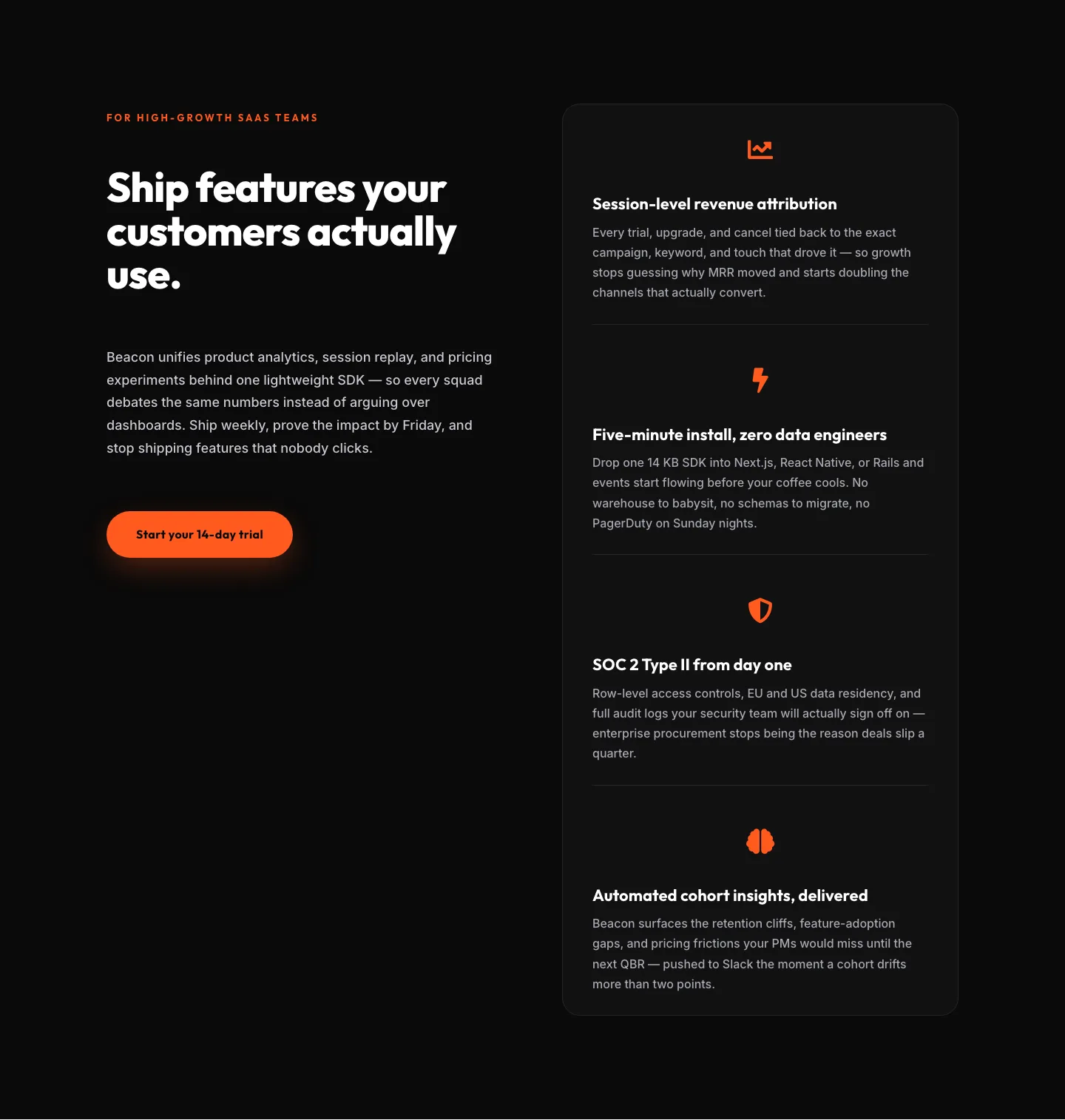
SaaS Features Section: Ship Features Customers Actually Use | Divi 5 Bold Layout
features · saas · bold
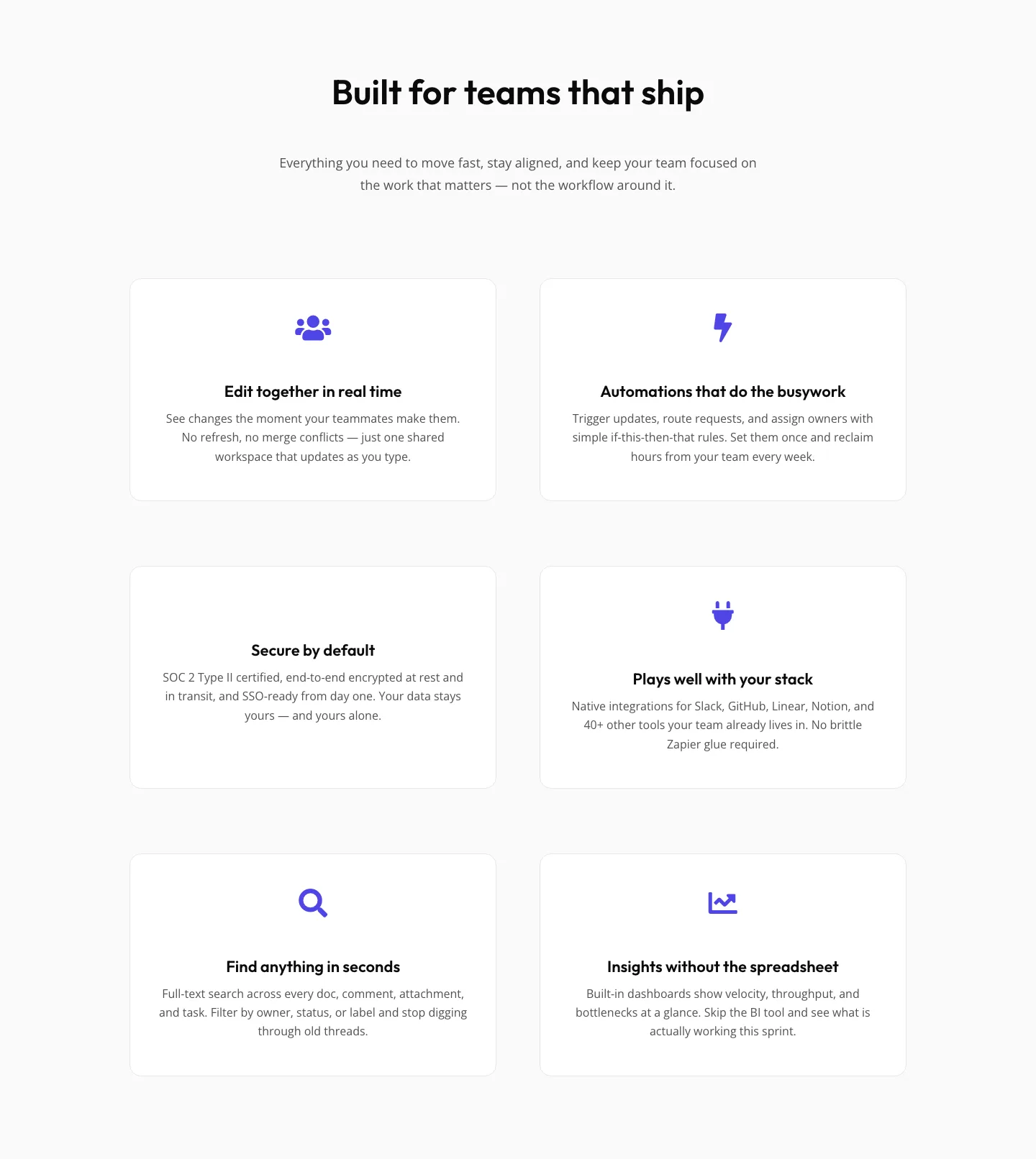
SaaS Features Section: Minimal Divi 5 Layout for Product Teams
features · saas · minimal
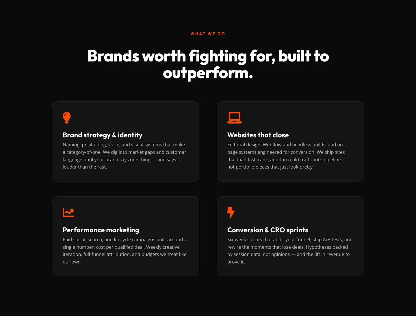
Bold Agency Features Section: Divi 5 Services Grid Layout
features · agency · bold